Versuchsmuster der ProjectGroup1777, der Zine-Reihe Project1777 der Kunsthochschule Kassel, die Zahl bezieht sich dabei auf das Gründungsjahr der Schule (1777). Im Jahre 2023 entstanden diverse Hefte in denen sich Studierende künstlerisch mit verschiedenen Themen auseinandersetzen.
Zweites Versuchsmuster der ProjectGroup1777, der Zine-Reihe Project1777 der Kunsthochschule Kassel, die Zahl bezieht sich dabei auf das Gründungsjahr der Schule (1777). Im Jahre 2023 entstanden diverse Hefte in denen sich Studierende künstlerisch mit verschiedenen Themen auseinandersetzen.
Fünftes Heft der Zine-Reihe Project1777 der Kunsthochschule Kassel, die Zahl bezieht sich dabei auf das Gründungsjahr der Schule (1777). Im Jahre 2023 entstanden diverse Hefte in denen sich Studierende künstlerisch mit verschiedenen Themen auseinandersetzen.
Anleitung für die Erstellung eines Zines. Teil der "Project1777" Reihe der Kunsthochschule in Kassel. Die Zahl bezieht sich auf das Gründungsjahr 1777 der Schule.
Zweites Heft der Zine-Reihe Project1777 der Kunsthochschule Kassel, die Zahl bezieht sich dabei auf das Gründungsjahr der Schule (1777). Im Jahre 2023 entstanden diverse Hefte in denen sich Studierende künstlerisch mit verschiedenen Themen auseinandersetzen. Ausgehend der Idee, dass die ersten Lebensformen im Ozean entstanden sind und die Lebensweise des Menschen ein Ungleichgewicht auf der Welt produziert, was sich in vielfältiger Weise äußert beschäftigen sich die Studierenden (der Klasse Virtuelle Realitäten) und ihre Arbeiten in dieser Ausgabe mit Konsum, Klimawandel und dem Zusammenleben, den Konsequenzen und der Dynamik...
[24] S., 25,5x20,2 cm, Auflage: 100, numeriert, ISBN/ISSN 9783945824139 Drahtheftung, handnummeriert. Dreifarbiger Risodruck, mit zwei eingehefteten Transparentpapierbögen (bedruckt). Mit Banderole
Fünftes Heft der Zine-Reihe Project1777 der Kunsthochschule Kassel, die Zahl bezieht sich dabei auf das Gründungsjahr der Schule (1777). Im Jahre 2023 entstanden diverse Hefte in denen sich Studierende künstlerisch mit verschiedenen Themen auseinandersetzen. Diese Ausgabe der Klasse "Mehrdimensionale Strategien" beschäftigt sich mit der Raum, Ausstellung, Sprache und dem (Nicht-)Dazugehören.
Sechstes Heft der Zine-Reihe Project1777 der Kunsthochschule Kassel, die Zahl bezieht sich dabei auf das Gründungsjahr der Schule (1777). Im Jahre 2023 entstanden diverse Hefte in denen sich Studierende künstlerisch mit verschiedenen Themen auseinandersetzen.
Siebtes Heft der Zine-Reihe Project1777 der Kunsthochschule Kassel, die Zahl bezieht sich dabei auf das Gründungsjahr der Schule (1777). Im Jahre 2023 entstanden diverse Hefte in denen sich Studierende künstlerisch mit verschiedenen Themen auseinandersetzen. Diese Ausgabe, der Klasse aus dem Studiengang Produktdesign, setzt sich mit künstlicher Intelligenz auseinander.
Achtes Heft der Zine-Reihe Project1777 der Kunsthochschule Kassel, die Zahl bezieht sich dabei auf das Gründungsjahr der Schule (1777). Dieses Heft ist eine Hommage an acht Designer*inne die auch an der Kunsthochschule Kassel dozierten: Ineke Hans (2014-2015), Yael Mer (2015-2016), Mischer + traxler (2016-2017), Stefan Diez (2017-2018), Nils Holger Moormann (2018-2019), Robert Suk (2019-2021), Nicola Stattmann (2021-2022) und Sebastian Bergne (2022-2023).
Neuntes Heft der Zine-Reihe Project1777 der Kunsthochschule Kassel, die Zahl bezieht sich dabei auf das Gründungsjahr der Schule (1777). Dieses Zine ist innerhalb eines Workshops, gegeben von Aafke Mertens, entstanden. Das Heft besteht aus Zeichnungen und Illustrationen von Studierenden und setzte sich mit der Pandemie, dem Zuhause (eingesperrt) sein auseinander.
140 S., 25x21,4 cm, ISBN/ISSN 9781907840104 Gelochte Seiten mit Musterbeutelklammern zusammen gehalten, in Klappumschlag, mit 18 roten Punkten beklebt. Innen teils andere Papiere
The Piracy Project is an international publishing and exhibition project exploring the philosophical, legal and practical implications of book piracy and creative modes of reproduction. Through research and an international call for submissions, the Project has gathered a collection of more than 150 modified, appropriated and copied books from all over the world. The collection, which is catalogued online, is the starting point for talks and work groups around the concept of originality, the notion of authorship and politics of copyright. The Piracy Project is not about stealing or forgery. It is about creating a platform to innovatively explore the spectrum of copying, re-editing, translating, paraphrasing, imitating, re-organising, manipulating of already existing works. Here creativity and originality sit not in the borrowed material itself, but in the way it is handled. The Piracy Project is an collaboration between AND Publishing and Andrea Francke. The Piracy Project The Piracy Project is an international publishing and exhibition project exploring the philosophical, legal and practical implications of book piracy and creative modes of reproduction. Through research and an international call for submissions, the Project has gathered a collection of more than 150 modified, appropriated and copied books from all over the world. The collection, which is catalogued online, is the starting point for talks and work groups around the concept of originality, the notion of authorship and politics of copyright. The Piracy Project is not about stealing or forgery. It is about creating a platform to innovatively explore the spectrum of copying, re-editing, translating, paraphrasing, imitating, re-organising, manipulating of already existing works. Here creativity and originality sit not in the borrowed material itself, but in the way it is handled. The Piracy Project is an collaboration between AND Publishing and Andrea Francke.
Text von der Webseite
Karaoke – spoken not sung!
Speech Karaoke – as the name suggests – works in a similar way as a traditional karaoke. Instead of choosing between songs from a booklet, the user chooses between speeches. Within a relaxed atmosphere one can listen to speeches delivered by other karaoke bar guests – or try out how it feels to interpret someone´s speech.
Speech Karaoke is a constantly expanding project by The Speech Karaoke Action Group. When the Speech Karaoke-project arrives to a new city, local speeches are added to the Karaoke archive.
The project was created in Finland, the promised land of karaoke bars.
Karaoke - gesprochen, nicht gesungen!
Speech Karaoke - wie der Name schon sagt - funktioniert ähnlich wie eine traditionelle Karaoke. Anstatt zwischen Liedern aus einem Booklet zu wählen, wählt der Benutzer zwischen Reden. In entspannter Atmosphäre kann man sich die Reden anderer Karaoke-Bar-Gäste anhören - oder ausprobieren, wie es sich anfühlt, die Rede eines anderen zu interpretieren.
Speech Karaoke ist ein ständig wachsendes Projekt von The Speech Karaoke Action Group. Wenn das Speech Karaoke-Projekt in einer neuen Stadt ankommt, werden die dortigen Reden dem Karaoke-Archiv hinzugefügt.
Das Projekt wurde in Finnland ins Leben gerufen, dem gelobten Land der Karaoke-Bars.
Übersetzt mit DeepL, Text von der Webseite
2. Auflage von 2018. In recent years, a little-known research group named Forensic Architecture began using novel research methods to undertake a series of investigations into human rights abuses. Today, the group provides crucial evidence for international courts and works with a wide range of activist groups, NGOs, Amnesty International, and the UN.
Beyond shedding new light on human rights violations and state crimes across the globe, Forensic Architecture has also created a new form of investigative practice that bears its name. The group uses architecture as an optical device to investigate armed conflicts and environmental destruction, as well as to cross-reference a variety of evidence sources, such as new media, remote sensing, material analysis, witness testimony, and crowd-sourcing.
In Forensic Architecture, Eyal Weizman, the group’s founder, provides, for the first time, an in-depth introduction to the history, practice, assumptions, potentials, and double binds of this practice. The book includes an extensive array of images, maps, and detailed documentation that records the intricate work the group has performed.
Text von der Webseite
• Postkarte adressiert an Kattenstroth, rückseitig beklebt mit Schwarz-Weiß Xerox, weiße Farbe, Marker, Poststempel 1984
• Brief adressiert an Kattenstroth, Umschlag Collageartig gestaltet; ärztlicher Mitteilungsschein; A4 beidseitig handschriftliche Nachricht an Kattenstroth, Poststempel 1984
• 2 A4 Schwarz-Weiß Kopien Einladung, Infos und Ausstellungseinladung zum internationalen "Work/study camp 16.121984-06.01.1985"
• Brief adressiert an Kattenstroth, Künstlerbriefmarken, Stempel, Künstlerstempel von Rehfeldt und Jupitter-Larssen; 15 postkartengroße Kopien über das "Anthroart Ghana Project" mit umfassendem Material über teilnehmende Künstler*innen, Erklärungen, Dokumentation. Poststempel 1986
• A4 Schwarz-Weiß Xerox von Fotografie
• A4 Schwarz-Weiß Xerox "Anthropology"
• 2 A4 Schwarz-Weiß Kopien Zeitungsartikel von Volker Hamann aus der Berliner Szene
• Postkarte "Anthro Art" beklebt mit Info über verbindendes Projekt des Austauschs, Stempel, gelocht
"ANTHROART GHANA PROJECT
Seit 1979 experimentiere ich mit Anthroart, einem weltweiten Netzwerk von Menschen in verschiedenen kulturellen Situationen, die schöferisch zusammenarbeiten wollen. Viele von ihnen sind Mailartisten, denn die Konzepte von Mailart/Correspondenceart und Anthroart überschneiden sich. Die intensivste Begegnung im Anthroart Netzwerk hatte jedoch nichts mit Mailart zu tun. 1981 antwortete ich Ayah Okwabi auf seinen in "Fourth World Review" (For Small Nations, Small Communities & The Human Spirit) veröffentlichten Brief aus Ghana. Avah und ich entwickelten die Idee eine Mailartausstellung mit einem Workcamp in Ghana zu verbinden.
Die Ausstellungen in Ghana, vielleicht die ersten dieser Art in Afrika, verbanden teils symbolisch, teils ganz praktisch Menschen in verschiedenen Netzwerken (Mailart/Correspondenceart/Anthroart/The Fourth World), Institutionen (Ghana Institute of Journalism/Mfantsi-man Secondary School, GUNSA), Menschen in Ghana und die Freiwilligen des Workcamps (VOLU). Die zur Ausstellung gesendeten Konzepte für Künstlerische- und Netzwerkarbeit waren unter den gegebenen Umständen nicht realisierbar (zu intellektuell, technisch zu anspruchsvoll, politisch unpassend für die Situation in Ghana), obwohl sie mit zu den reizvollsten Einsendungen gehörten?
Die Abteilungen der Ausstellung: APARTHEID - BLACK&WHITE - AFRIKA TOKOKOE PROJECT - PEACE AND POLITICS - MAILART - ABOUT MAILART - JUNKMAIL - MAILART PUBLICATIONS - NETWORKING ADRESSES - ANNOUNCED SHOWS - OTHER NETWORKS"
"VORSCHLAG FÜR EIN "FOURTH WORLD NETZWERK GHANA"
In Ghana gibt es viele Selbsthilfe Initiativen. Kreative Menschen, die Probleme aus eigener Kraft lösen wollen müssen jedoch ihre Energie meist schon für die Beschaffung der einfachsten Materialien verschwenden. In Schulen fehlt es an Kreide, Füllern, Heften, Papier; Musikern fehlt das Zubehör für Instrumente; Malern fehlen die Pinsel und Farben, Kinder die lesen lernen wollen finden keine Bücher. Diese Dinge sind in den materiell reichen Ländern oft im Überfluss vorhanden und werden weggeschmissen statt sie dorthin zu schicken wo sie wirklich gebraucht würden. Es ginge nicht darum ein schlechtes Gewissen durch Almosen zu erleichtern. Der Austausch von Dingen ist nur EINE Möglichkeit freundschaftliche oder solidarische Beziehungen entstehen zu lassen.
Entscheidend ist ein immaterieller Austausch in beide Richtungen."
Text aus dem Brief mit Material zum "Anthroart Ghana Project"
Seit 1966 erweitert The Poetry Project den Zugang zu Literatur, Bildung und Möglichkeiten zum Austausch der eigenen kreativen Arbeit in einem gegenhierarchischen, radikal offenen Raum und einer Gemeinschaft. Ausgehend von der Vision, dass kulturelles Handeln auf lokaler Ebene einen breiteren Wandel des öffentlichen Bewusstseins inspirieren kann, hat sich das Projekt der Entwicklung und Zusammenarbeit bei wiederholbaren Programmmodellen verschrieben, die hartnäckige soziale Narrative in Frage stellen, insbesondere durch die verbale Neuausrichtung, die durch Poesie möglich wird. Wir tun dies durch eine Kombination von Live-Lesungen, Performances, Vorträgen, Veranstaltungen und Workshops, zusätzlich zu literarischen und kritischen Publikationen und aufstrebenden Schriftstellern und kuratorischen Stipendienprogrammen.
Das Poetry Project hat seinen Sitz in der St. Mark's Church in-the-Bowery, einem lebendigen Kunst- und Gemeinschaftsraum, zu dem auch die St. Mark's Church-Gemeinde, das Danspace Project und das New York Theatre Ballet gehören.
Text von der Website., übersetzt mit DeepL
Mit Texten von Heon Ki Jeong, Annekathrin Kohout, Christian Landspersky, Yang Woo Park, Teresa Retzer, Jamila Schäfer, Gitte Zschoch, Fabian Feichter, Youlee Ku, Siyoung Kim, Nele Ka, Oliver Haussmann
Gestaltung/design: Mara Weyel Übersetzung/translation (Koreanisch/Englisch): Mary Kim Lektorat/editor: Sophie Slade, Carina Essl.
Begleitend zur Ausstellung im ersten deutschen Pavillon auf der Gwangju Biennale 2024 in Südkorea erscheint die Publikation „in between water – 두물마을“. Neben einer umfassenden Fotodokumentation und einer detaillierten Projektbeschreibung umfasst diese auch ein Interview von Teresa Retzer mit den Künstler*innen des Kollektivs Longega Project sowie einen Essaybeitrag von Annekathrin Kohout.
Unser Ziel ist es, die Erfahrungen der Biennale nach München zu bringen und allen, die nicht vor Ort sein konnten, einen lebendigen Einblick in das Projekt zu ermöglichen. Zum Programm zählt ein Artist Talk mit den Künstler*innen von Longega Project – Fabian Feichter, Youlee Ku, Siyoung Kim, Nele Ka und Oliver Haussmann – sowie Christian Landspersky, Leiter der PLATFORM, moderiert von der Volontärin Sophie Slade.
Erstmals in der Geschichte der Gwangju Biennale für zeitgenössische Kunst in Südkorea gab es 2024 einen deutschen Pavillon. Unter dem Titel „in between water – 두물마을“ kreierte das Künstler*innenkollektiv Longega Project einen Ort der Begegnung und des gemeinsamen Kunstschaffens und zeigt mehrere, teilweise begehbaren Installationen. Die «Sieben Elemente“ transportieren in ihrer universellen Sprache natur- und kulturverbundene Lebensweisen: WALD, HÜTTE, LAGERFEUER, FLUSS, SUCHEN & SAMMELN, WERSTATT, FEDERBALL
Kuration der Ausstellung: Longega Project in Zusammenarbeit mit PLATFORM München und Sophie-Charlotte Bombeck
Schon seit 2018 fördert die südkoreanische Künstlerin Siyoung Kim aus München den Künstler*innenaustausch zwischen der Stadt München (Villa Waldberta) und der Stadt Gwangju (Gwangju Museum of Art). Der kulturelle Austausch mit Südkorea und der Stadt Gwangju gewann spätestens mit der diesjährigen Literatur-Nobelpreis-Verleihung an Han Kang an Bedeutung. Han Kang, die in Gwangju geboren wurde, nahm an der Eröffnungszeremonie der 15. Gwangju Biennale teil. In ihrem Roman "Menschenwerk” thematisiert sie die Demonstrationen und das Massaker des Gwangju-Aufstandes von 1980. Die Gwangju Biennale wurde ins Leben gerufen, um an diesen Kampf für Demokratie und Freiheit zu erinnern.
Das Künstler*innenkollektiv Longega Project kreiert vor dem historischen Hintergrund einen demokratischen Raum für interkulturellen transnationalen Austausch: Ihre kollektiven Prozesse, Installationen und Werke, welche sich über nationale Grenzen hinweg entwickelt haben, laden sowohl Gastkünstler*innen als auch Besucher*innen zur aktiven Partizipation und Teilhabe ein. Ein umfangreiches Veranstaltungsprogramm mit Lesungen, Performances und Workshops begleitet die Ausstellung und füllt sie mit Leben und neuen Geschichten.
Der Deutsche Pavillon auf der 15. Gwangju Biennale und die Publikation „in between water“ wurden mit finanzieller Förderung des Auswärtigen Amts durch das Institut für Auslandsbeziehungen (ifa) realisiert.
A Scottish Photography group exhibition:
12.08.-16.09.1978, Stills, the Scottish Photography Group Gallery, Edinburgh,
22.09.- 20.10.1978, Aberdeen Art Gallery and Museum, Aberdeen,
19.11.- 24.12.1978, Museum of Modern Art, Oxford,
17.01. 18.02.1979, Kelvingrove Art Gallery and Museum, Glasgow
16x11,5 cm, keine weiteren Angaben vorhanden Einladungskarte des Studienzentrums für Künstlerpublikationen
ZusatzInfos
Die 1969 von Jon Hendricks, Jean Toche und Poppy Johnson gegründeteThe Guerrilla Art Action Group (GAAG) agierte in New York über mehrere Jahre in politischen Kunstaktionen und provokanten Performances. Sie richteten sich unter anderem gegen den Vietnam-Krieg, die US-Regierung oder das Kunst-Establishment. Eine Sammlung von Manifesten, Pressemitteilungen, Briefen und weiteren Dokumenten der Gruppe erschien erstmals 1978 bei Printed Matter, New York, und 2011 in einer Neuauflage, herausgegeben von Printed Matter, Kunstverein Publishing (Amsterdam) und dem Studienzentrum für Künstlerpublikationen (Bremen). Diese Publikation steht im Zentrum der Präsentation. Weitere Fotos und Künstlerbücher veranschaulichen die eindrucksvollen Aktivitäten der GAAG. Fotos: Jan van Raay.
Text von der Webseite
Die GruppeThe Guerrilla Art Action Group (GAAG) wurde 1969 von Jon Hendricks, Jean Toche und Poppy Johnson gegründet. Sie war in New York über eine Zeit von mehreren Jahren mit politischer Kunst und provokativen Performances aktiv. Ihre Position richtete sich gegen den Vietnam Krieg, die US-Regierung und den Kunstbetrieb. Eine Sammlung von Manifesten, Presseveröffentlichungen, Briefen und anderen Dokumenten wurde in einem Buch 1978 publiziert
Karte zum Abholen eines Kleidungsstückes am 13.09.2021, das von einer amerikanischen Näherin während der Ausstellung Geschenke und Rituale von Lee Mingwei in der Villa Stuck am 29.06.2021 veredelt wurde. Das Projekt heißt The Mendiung Project (13.05.-12.09.2021).
Das Mending Project ist eine interaktive, konzeptionelle Installation, in der ich sehr einfache Elemente - Faden, Farbe, Nähen - als Ausgangspunkte verwende, um Einblicke in die Beziehungen zwischen mir selbst, anderen und der unmittelbaren Umgebung zu gewinnen. Es ist auch ein Akt des Teilens zwischen mir und einem Fremden.
Der Besucher sieht zunächst einen langen Tisch, zwei Stühle und eine Wand mit bunten, kegelförmigen Garnspulen. Während der Öffnungszeiten der Galerie sitze ich an diesem Tisch, an den die Besucher verschiedene beschädigte Textilartikel bringen können, die Farbe des Fadens auswählen und zusehen, wie ich den Artikel flicke. Der geflickte Artikel, an dem die Fadenenden noch befestigt sind, wird dann zusammen mit den bereits geflickten Gegenständen auf den Tisch gelegt. Die Besitzer kommen am letzten Tag der Ausstellung zurück in die Galerie, um ihre geflickten Artikel abzuholen. ...
Übersetzt mit www.DeepL.com, Text von der Webseite
Foto Hubert Kretschmer
11,8x18 cm, Auflage: 80, numeriert, keine weiteren Angaben vorhanden Sammelmappe mit 16 Arbeiten, ein Blatt gefaltet, Grafiken in Farbe, Textarbeiten in Schwarz-Weiß
ZusatzInfos
Edition zur gleichnamigen Ausstellung.
Tell me a secret is an sharing secret project between communities. The secrets – written experiences – are graphically depicted by participants during a visual communication workshop. At the end of the workshop participants are invited to anonymously shared their own secrets in order to feed the project flow. As well we collect the secrets within this website. The project considers as secrets both, the written stories and their graphical depiction. Tell me a secret project is an archive as well. The main point of the archive is to preserve the popular stories of anonymous people.
Text von der Webseite
Die Geschichten »Von dem Fischer un syner Fru« und »Von dem Machandelboom« gehören zu den schönsten deutschen Märchen, deren Handlung und Erzählstil bis heute faszinieren. Vor über 200 Jahren zeichnete Philipp Otto Runge (1777–1810) die bis dahin nur mündlich überlieferten Geschichten erstmals auf, Jahre bevor die Brüder Grimm sie von ihm in ihre Sammlung von Kinder- und Hausmärchen übernahmen. In diesem liebevoll gestalteten Künstlerbuch können sie nun wiederentdeckt werden.
Die Künstlerin Nathalie David bebildert die Märchen mit Collagen aus Motiven des Künstlers Runge, Fragmenten und Details aus seinen Zeichnungen, Aquarellen und Spielkartenentwürfen. Die Märchen lassen sich so nicht nur lesend, sondern auch schauend erleben und eignen sich damit wunderbar zum Vorlesen – wahlweise op Plattdüütsch oder in der gegenübergestellten hochdeutschen Fassung. Ergänzt wird das Buch durch zwei CDs (Hörbuch und Hörspiel auf Hochdeutsch), auf denen die Märchen mit Musik von Vladyslav Sendecki, mit Gesang von Ursula Wittich und den Stimmen von Hildegard Schmahl, Patrycia Ziolkowska, Werner Grassmann und Hermann Book lebendig werden. Dieses multimediale Künstlerbuch bietet ein reiches Angebot zum Schauen, Selbstlesen, Vorlesen und Hören.
Text von der Webseite.
Final Group Performance in der Galerie FOE 29.11.2019, 19:00 Uhr. 13.-28.11.2019 Ort @platformmuc Instagram.
LIVE SCREENING INAUGURATION 16 DAYS – RESEARCH PREPARING PERFORMANCES 13.-28.11.2019, Every day at 6 pm on Instagram @platformmuc.
FINAL GROUP PERFORMANCE Saturday, 29.11.2019 7 pm open end
Music selection by guest artist DJ Gerundio. Galerie Foe, Oberföhringer Str. 156, 81925 Munich.
16 Days 15 Artists 9 Heritages. Project AKVO aims to build bridges between cultures, traditions and people. This special occasion marks the start of a journey that will take AKVO around the globe. An inauguration so to say, a holy moment which is celebrated in a myriad of ways. Research into these traditions and performative interventions will culminate in our own rituals of inauguration, a transformation of the expected and unexpected into a new experience.
Text von der Webseite
31,5x22,5 cm, Auflage: 150, numeriert, signiert, keine weiteren Angaben vorhanden Box aus braunem Stülpdeckel Karton, Siebdruck, eingelegt 16-seitiges redaktionelles Schwarz-Weiss Heft, 55 Arbeiten von 65 Künstlern. Diverse Techniken auf Papier, dünnem Karton, Folie, Metall, plus 6 Multimedia Discs. Cover und Layout: Carlo Battisti. Zollinhaltserklärung beigelegt
BAU was founded in 2004 in Viareggio, on the coast of Tuscany, by a group of artists and individuals interested in the many-sided aspects of the culture of our times. Thanks to a widespread and constantly expanding network of contacts, every year the project takes the shape of an expressly designed UniA4 sized box: BAU container of contemporary culture. This non-profit box is produced in a limited edition of 150 copies (120 for issue 1 and 200 for issues 9-10) and contains original works, signed and numbered, from a large number of international contributors.
The BAU container fits in the vast tradition of assembling publications and artists‘ magazines that developed since the early sixties. It intends to experiment with new languages, technologies and materials, operating in a peculiar dimension of group work that is open also to contributions from non-artists: outsiders, travellers, collectors of curiosities, creative gastronomers, anomalous scientists.
In a relational and non competitive perspective that is responsive to the relationships between art and science, politics and environment, BAU acts as a meeting point in order to stimulate dialogues, interactions and exchanges among the most diverse disciplines: graphics, collage, photography and the visual arts in general, but also poetical and narrative researches, acoustic and performative experiences, documents pertaining the fields of fashion and design, etc. The operative network expresses itself also through the planning of exhibitions, meetings, festivals and events, organized in institutional spaces (libraries, galleries, museums) and in atypic locations.
Text von der Webseite
24 S., 29,5x21 cm, 2 Stück. keine weiteren Angaben vorhanden Drahtheftung, matt-glänzendes Umschlagpapier, dünne hellgraue Innenseiten, farbiges Beiheft mit Abbildungen, ebenfalls Drahtheftung
ZusatzInfos
"A musical adaptation of the multifaceted, facetious, ongoing project «How to Start a Revolution» by – Anna McCarthy. It deals with the romanticization and synaesthetic manipulation tactics entailed in depictions – of revolution, rebellion and recent history acted out by an ever-same group of bored rebels. Facts are mixed with fiction, layers are built upon layers, translations occur to create scenarios that manipulate a viewer’s perception of what was and is truly real. 2-D actors and scenarios mix with 3-D action going on onstage. The «How To Start A Revolution» project has thus far manifested itself in the form of arrests, archives, films, photographs, and songs. But now it is time for the ultimate grand romantic gesture: A MUSICAL – singing, dancing, screaming, and laughing at the question ‘what time is it’? It’s a prophecy, it’s a poetic pop spectacle."
Text von der Website
24 S., 29,5x21 cm, Auflage: 50, numeriert, keine weiteren Angaben vorhanden Drahtheftung, Heft in Kunststoffumschlag für Schulhefte, mit Aufkleber drauf, Buntstift mit Schnur angehängt, matt-glänzendes Umschlagpapier, dünne hellgraue Innenseiten, farbiges Beiheft mit Abbildungen, ebenfalls Drahtheftung, mit Originalzeichnungen, vier signierte Riso-Karten und eine CD eingelegt
ZusatzInfos
A musical adaptation of the multifaceted, facetious, ongoing project «How to Start a Revolution» by – Anna McCarthy. It deals with the romanticization and synaesthetic manipulation tactics entailed in depictions – of revolution, rebellion and recent history acted out by an ever-same group of bored rebels. Facts are mixed with fiction, layers are built upon layers, translations occur to create scenarios that manipulate a viewer’s perception of what was and is truly real. 2-D actors and scenarios mix with 3-D action going on onstage. The «How To Start A Revolution» project has thus far manifested itself in the form of arrests, archives, films, photographs, and songs. But now it is time for the ultimate grand romantic gesture: A MUSICAL – singing, dancing, screaming, and laughing at the question ‘what time is it’? It’s a prophecy, it’s a poetic pop spectacle.
Text von der Website
The Face in the Desert (1999) was a public art project commissioned by and realized in collaboration with the National Museum of Photography, Film and Television, Bradford. The project consisted of both an installation in Bradford city center and a newspaper. The images used for this project were found in the museum’s vast Daily Herald newspaper archive.
Text Website
Auszüge von Übersetzungen aus dem Englischen von Klaus Groh aus den Büchern: Artist Stamps and Stamp Images, Project by James Warren Felter, Ausstellungskatalog 1976, Marke Umetnika - Artists' Postage Stamps, Project Miroljub Todorovic 1981, Artists' Postage Stamps 1981, Mail-(Art)-Stamps & Treated Stamps, Project Guy Schraen 1982.
Ausdruck nach Datenbank, Titel des icon Verlags, die auf der Messe gezeigt wurden. It's a book It's a library - Independent Publishing Project in der Hochschule für Grafik und Buchkunst, Leipzig am Sa, 29.03.2025 von 12:00-20:00 Uhr.
... I am writing you because I interviewed you for my research project ARTZINES, in which I explored the world of zines made by artists.
The project started in 2015, so the interview in question might have happened ages ago. If it was a video interview, it should be on Vimeo and here: https://www.youtube.com/@ARTZINESINFO
I have been collecting 88 testimonies from various people interested in zines for a very long time, and I wanted to gather all of them into a book about zines made by artists.
Then life happened, the good and the bad, until I met the Objet Papier collective, who published Print It, a web-to-print magazine generated from a website to be different each time.
For the past two years, I worked with them to create an interactive and generative ARTZINES book that is different each time it is downloaded (I counted 130.749.696 possibilities, but that’s a low estimate).
I wrote my research journey as a " Choose Your Own Adventure Book," and I am happy to tell you that you are a character in this story, since your interview is featured in the book! There are a maximum of 6 interviews in each generated PDF, so your interview won’t show in every book.
If you want to see what it looks like, you can generate PDFs of the book directly from the platform ...
Auszug aus der Email vom 05.11.2024
The project Gaudeamus igitur: self-organized artist in the state of domestic agoraphobia is an artist’s book titled Gaudeamus igitur and edited in limited edition. A public lecture that presents the work will be a part of the project. The artist’s book consists of photos depicting piles and floors, in general from all the institutions the artist has passed through in the process of becoming a self-organized individual-artist who constitutes her own artistic practice. The following text in the book is a popular academic song mainly performed at university/school graduation ceremonies – Gaudeamus igitur. The project thereby questions the role of (educational) institutions in the age of self-organization in art.
Text von der Webseite
Altered book pages mail art project - August 2016. You are invited to participate in a Mail Art project entitled “Altered book pages”. You may paint, make a collage, use photos and more on a book page. You can use any kind of book pages you want and as many pages you want or an entire book. If you like I can send you some pages from Greek books to use. Theme: Altered book pages. Size, media, number of submissions: Free. No fees, no jury, no returns. Deadline: May 1st 2017.
Text von der Webseite.
Das von dem Kurator Pierre Bal-Blanc organisierte experimentelle Architekturprogramm "Project Phalanstère" bestand aus einer Reihe von ortsspezifischen Kunstwerken in den Pariser Vororten. Diese Projekte, die von 2003 bis 2014 stattfanden, entwickelten einen kreativen, zeitlich ausgedehnten Raum. Im Gegensatz zur Dauer des Arbeitsplans, in dem eine Aufgabe auf die andere folgt, behauptete hier die Gleichzeitigkeit der Lebenskräfte ihren Rhythmus. Einige Werke sprengten den konventionellen Zeit- und Raumrahmen einer Ausstellung: Lionel Estèves "myope et amnésique" (2005) zum Beispiel ist so konzipiert, dass es größer ist, als ein einzelner Betrachter sehen kann; durch die Verschiebung bestehender Objekte reflektierten sowohl Cyprien Gaillard als auch Lois Weinberger über Dauerhaftigkeit und das Denkmal; Christodolous Panayiotou und Jens Hanning nahmen subtile Veränderungen an der bestehenden Architektur vor und spielten mit der materiellen Präsenz und der Erfahrung von Licht usw.
Dieses Buch schlägt eine neue Syntax vor. Es fordert nicht nur eine Erneuerung der im Bereich der zeitgenössischen Kunstprogrammierung verwendeten Terminologie. Seine Syntax hat sich aus der komplexen Materialität von Kunstwerken in einem spezifischen Kontext - einem Kunstzentrum in einem Pariser Vorort - entwickelt, und nicht aus Worten und Diskursen, die aus einer abstrakten Perspektive heraus formuliert wurden. Die politischen Ziele des "Project Phalanstère" zeigen sich in den ungrammatischen Formeln, die die Werke artikulieren, und in dem aktiven Widerstand, den sie gegen eine normative Autorität leisten, die sich nicht an die Regeln hält.
Text von der Website, übersetzt mit Hilfe von DeepL.
Techno-somatics and physical experience - Memory on the Internet - Our ears open a whole world to us: about the experiment to program an exhibition on a vinyl record
‘Curated by Weekly’ is a digital art project. It aims to raise questions regarding online formats, web-based distribution and the acceleration of digital platforms in contemporary art. The project is made up of a website and a magazine, which will be released in irregular intervals. The latter will include essays and interventions about digital exhibition formats, the experiences of digital curation and the questions about media and matter in the post-analogue space. Every week, an artwork will be “curated” and published on the website. In cooperation with different individuals, institutions and independent projects from the art field, artistic positions and works will be displayed. They can function as pieces of art in the digital sphere as well as be critical about it, or to contrast itself with the functions of the web. The project’s pace and composition orientates itself around the relevant visual environment of the present day.
The format of the website is consciously purely visual, while complementary content will be published in the magazine. This content will consist of essays and contributions around certain questions. For example: How new formats will be established in contemporary art, which technological tools are required or how curation is practiced in a digital space. What should particularly be highlighted is determining which artistic media, surfaces and materialities provide an adequate digital environment.
'Curated by Weekly' aims for an experimental format, which uses the speed and the possibilities of the digital space, but instead of reproductions and documentations we want to show artistic work itself, to address availability in the digital space and to use catchy visual surfaces. At the same time, the discourse and the self-reflection of the format is discussed in the appearing magazines/readers online and offline.
Text von der Webseite
30x30 cm, keine weiteren Angaben vorhanden BMW Group Pavillion, Drahtheftung, Druck auf Transparentpapier
ZusatzInfos
Dieser Katalog begleitet die Rauminszenierung "Experience Paradise/Lost Paradise" von Marie-Jo Lafontaine zur Cabrio-Ausstellung "Offen fahren" im BMW Group Pavillon, München, vom 31.05.-16.09.2002
Infoheft zur Ausstellung "Market" des News Yorker Kunstlerkollektivs "Group Material" im Kunstverein München vom 06.05.-18.06.1995. Das Kollektiv wurde 1979 gegründet und organisierte Projekte und Ausstellungen zu gesellschaftlichen und kulturellen Zusammenhängen
15,3x8,5 cm, keine weiteren Angaben vorhanden 10 Karten der Guerilla Art Action Group (GAAG), für Jockel Heenes, handschriftlich ausgefüllte Karten aus rotem Karton mit Stempeldruck, in gelben Briefumschlag mit Stempel und handschriftlichen Namen Jockel Heenes
Werbeplakat zur Großveranstaltung Nigeria Tage. Inhaltlich befasst es sich mit dem Austausch von afrikanischer Kultur mittels diverser Unterhaltungsprogramme.
Schwarz-Weiß-Drucke, Nr. 014 aus der Reihe 100for10.
After graduating with a degree in Graphic Design (London and Augsburg) Mirko Borsche worked as an art director for advertising agency Springer & Jacoby where he was responsible for several campaigns. From 1999 to 2002 he was art director of jetzt magazine (spin-off of Süddeutsche Zeitung). From 2002 M. Borsche was art director for Mini-International BMW Group for several years. Also in 2002 he launched the youth magazine NEON for Stern/Gruner+Jahr as art director. In 2004, he returned to jetzt for the magazine’s relaunch and stayed until 2007. Since 2007 he is creative director for weekly newspaper DIE ZEIT and every other publication of the Zeit-Verlag such as Zeitmagazin and Zeit Wissen. In 2007 Borsche also founded his design studio Bureau Mirko Borsche in Munich. His clients hail from all fields, from culture and media to business: Bavarian State Opera, Bavarian Radio Symphony Orchestra, Thalia Theater, Harper’s Bazaar, Audi, BMW Group, Saskia Diez, Stefan Diez, Kostas Murkudis, Nike… Mirko Borsche received numerous national and international awards for his work. Amongst many national exhibtions, his work was exhibited in Amsterdam, Barcelona, Florence, Stockholm, Seoul and Tokyo.
Schwarz-Weiß-Drucke, Nr. 095 aus der Reihe 100for10
Æther-Design is a collaborative creative group based in Heidelberg, Germany. Æther-Design consists of Götz Gramlich, Max Hathaway, Lukas Breitkreutz and friends. The group is dedicated to creating unique designs and aesthetics, merging contemporary visual influences with a constant craving for new perspectives and fresh impulses.
Text von der Webseite.
Schwarz-Weiß-Drucke
Æther-Design is a collaborative creative group based in Heidelberg, Germany. Æther-Design consists of Götz Gramlich, Max Hathaway, Lukas Breitkreutz and friends. The group is dedicated to creating unique designs and aesthetics, merging contemporary visual influences with a constant craving for new perspectives and fresh impulses.
29,7x21 cm, Auflage: 4.000, 2 Stück. keine weiteren Angaben vorhanden Broschur mit Leinenband, Aufkleber auf dem Cover, Originalbeiträge vieler beteiligter Künstler, verschiedene Papiere und Techniken. Die letzten 9 Blätter verkehrt herum eingebunden
Katalog der ersten freien Produzentenmess 07.-12.09.1971 auf dem Jakobsplatz München, nach einer Initiative des Genossenschaftlichen Kunstvertriebs zehn neun
1 S., 42x29,6 cm, keine weiteren Angaben vorhanden Flyer, einmal gefaltet, beidseitig bedruckt
ZusatzInfos
Ankündigung diverser Filmreihen und Ausstellungen, im Rahmen des Workshops der Cinenova Working Group, anlässlich der Sommerakademie Group Affinity, veranstaltet vom Kunstverein München. Beteiligte Institutionen und Gruppen: Lothringer13 Laden, Bimovie, Salong, Cinenova, Daneben
München inspiriert - eine Initiative der Werbeagentur Heye mit Unterstützung der Süddeutschen Zeitung und des Literaturhauses München anlässlich der 850-Jahr-Feier der Stadt München
88 S., 31,2x24,2 cm, keine weiteren Angaben vorhanden Klappbroschur, in Schuber
ZusatzInfos
München inspiriert versammelt insgesamt 36 Beiträge von Persönlichkeiten aus Kultur, Wissenschaft und Wirtschaft. Anhand von Bildern, Fotos und Statements haben sie ihr Verhältnis zu München skizziert. Entdecken Sie eine einzigartige Sammlung von Momentaufnahmen kreativen Schaffens. Ob Schauspielerin oder Schritsteller, Physiker oder Architekt, Maler oder Hutmacherin - die Stadt hat viele Gesichter
33,0x33,0 cm, Auflage: 100, numeriert, keine weiteren Angaben vorhanden LP, vorderseitig bedruckter Karton in transparenter Hülle fest vernietet, weiße one-side LP
ZusatzInfos
Beiträge von:
FluxRus Gr. Belka & Strelka (Viktoria Barwenko/Svetlana Pesetskaya) - BI
Daniel Spicer - The Diamond Life (for Henry Flynt)
Keith A. Buchholz - sound sample #2
Wolf Vostell - de-coll/age manifesto
DADA Action Group (James Banner/Mark Schomburg) & Kommissar Hjuler und Frau - Die Antizipation des Generalized Other #1
Milan Knizak - Multisong
Paul Ramsey - eTude 23 (Flux Mix)
21,8x24,8x6 cm, Auflage: 100, signiert, 86 Teile. keine weiteren Angaben vorhanden Konvolut mit 17 Heften (Drahtheftung, geklammert, Fadenheftung, genäht), ein Bogen mit 42 Künstlerbiefmarken mit unterschiedlichen Motiven, 8 Einzelblätter, ein Papiertütchen mit Karten, 8 Leporellos/selbstgemachte Zines. Zwei eigene Konvolute: 8 Miniheften in transparenter Plastiktüte und Leporello in Papiertüte, mit Plastikklammern verschlossen und beklebt.
Alles nummeriert und meist signiert, teils beklebt, bestempelt, mit angeheftete Objekten o.a. Alles in beklebtem Karton.
The International Society of Copier Artists (I.S.C.A) was a non-profit group founded by Louise Neaderland in 1981, intended to promote the work of copier artists and to advocate for the recognition of copier art as a legitimate form. The group is best known for producing The I.S.C.A Quarterly as well as for coordinating exhibitions of xerographic artwork, and the distribution of "The I.S.C.A Newsletter". Women made up the majority of society's membership.
The I.S.C.A. Quarterly was published from 1982-2003. Typically, issues were produced in limited editions of 200 copies, with an average of 45 pages of original copier art supplied by I.S.C.A. members. Over the years the form of the Quarterly mutated from a collection of unbound pages to a spiral bound journal with an Annual Bookworks Edition composed of a box of books made by I.S.C.A. members. The work produced for the Quarterly ranged widely in focus from social and political issues to personal and emotional themes. The final issue (Volume 21, #4) was published in June 2003.
Text von Wikipedia
Die AkademieGalerie – ein Raum am Schnittpunkt von Kunst, Öffentlichkeit und Lehre – ist seit vielen Jahren ein lebendiger Ausstellungsort für Studentinnen der Akademie der Bildenden Künste München. Zentral gelegen im Zwischengeschoss der U-Bahnstation Universität, bietet sie jungen Künstlerinnen eine erste Gelegenheit, ihre Arbeiten außerhalb des geschützten Hochschulrahmens einem breiteren Publikum zu präsentieren. Dabei steht nicht die Vollendung eines Werkes im Vordergrund, sondern das Sichtbarmachen von Prozessen, Experimenten und Haltungen. Die räumliche wie konzeptuelle Offenheit der AkademieGalerie macht sie zu einem Ort des Austauschs, der Reibung und der Reflexion – für die Ausstellenden ebenso wie für die Betrachtenden.
Begleitet von Professorinnen und unterstützt vom Kulturreferat der Landeshauptstadt München, von den Stadtwerken, der BMW Group und weiteren Förderinnen, ist die AkademieGalerie ein integraler Bestandteil der Ausbildung. Sie bietet reale Bedingungen für das Kuratieren, das Zeigen und das Kommunizieren von Kunst – Erfahrungen, die für den weiteren künstlerischen Weg von unschätzbarem Wert sind.
Text aus dem Vorwort zusammengefaßt mit ChatGPT
40 S., 29,7x21 cm, keine weiteren Angaben vorhanden Lose Blätter ineinander gelegt, Farbkopien nach PDF
ZusatzInfos
A simple and straightforward layout, an awesome format, no advertising, 500 hand numbered copies and a free and selected distribution. Unpublished is a democratic and exchange place where photography meets the public, without any filter. Unpublished gathers the best unpublished images of young photographers from all over the world, selected not only for their aesthetic value, but through a careful analysis of the cultural context, the artistic and human paths.
A large project that ends each edition of Unpublished with a group exhibition in which it will be possible to buy at affordable prices the original and signed prints of the published works, donated and assessed by the authors themselves. No art dealers, no galleries and outside the market logic. Unpublished is a "call for freedom", a pure and direct line that connects the artist and his work with the outside world. And vice versa.
Von der Webseite
[20] S., 30,8x41,4 cm, Auflage: 1.000, keine weiteren Angaben vorhanden Blätter lose zusammengelegt, einmal gefaltet, Schwarz-weiß Druck auf Zeitungspapier, Vorderseite gesprüht, Rückseite vom Verlag gestempelt
ZusatzInfos
journal documenting a groupproject by the class of Olaf Metzel for the annual exhibition of the Academy of Fine Arts, Munich.
Text von der Verlagswebseite
Girlcore is an all-female collective based in London. Originally founded on a desire to promote international female talent in creative industries - Girlcore's resume has grown far and beyond anything originally hoped for. Be it showcasing new DJ's alongside the likes of veterans such as Peaches and Annie Mac, to creating a website dedicated to promoting recent flair in the visual arts. All the work done by the group is a labour of love, each member of the collective having their own careers in the creative industries. This side-project is a way of celebrating the amazing work we encounter along the way.
Text von der Webseite
2. Auflage 0817. Index is curated by Café Royal Books and supported by the Contemporary Arts Development Group at the University of Central Lancashire (Impressum)
Index began as an online open submission project. Criteria being, ‘submissions must have already been used to communicate, or be communicative in their own right’. All submissions have been removed from their original context, breaking the messages or ideas for which they were created. Using Index as a container, exhibition space and story telling device, the pages that follow have been edited to create pairs or combinations of images that can be read as new narratives. The book is an experimental exchange of out-of-context, repurposed text and image. Café Royal Books produce weekly photographic publications focussing broadly on aspects of change, usually within the UK. Founded in 2005 Café Royal Books is an independent publisher based in the North West of England.
(Text von der Webseite)
Hundert Jahre nach Marcel Duchamps dreimonatigem Besuch in München (1912) wird ... eine ... Lücke ("le mystère") im kunsthistorischen Wissen zu füllen versucht. ... mit einer Ausstellung, gut organisiert vom Lenbachhaus, zwei beachtlichen Publikationen, einem Duchamp Journal und einem seltsam gekippten Wohnungsmodell neben der Alten Pinakothek, das dem Betrachter mit 'kalten' Wänden in etwa Duchamps ehemalige Wohnsituation in der (später ausgebombten) Barerstr. 65 vorführt. Dieses Modell ist das Werk des Bildhauers und promovierten Kunsthistorikers Rudolf Herz, der auch eines der beiden Veröffentlichungen und das Journal verantwortet ...
Text von der Webseite: www.sehepunkte.de
On June 21, 2012, precisely one hundred years will have passed since Marcel Duchamp arrived in Munich. He spent three months in the city, three months that were to radically change his art and turn him into one of the most influential artist of modernism. He is regarded as pioneer of conceptual art influencing numerous artists from Sol LeWitt to Ai Weiwei and still today continuously inspires new generations of artists.
On the anniversary of the French artist’s arrival, Munich’s Architecture Museum is presenting Rudolf Herz’s latest art project “Marcel Duchamp – Le mystère de Munich”, in which the artist investigates the background story of his predecessor’s stay in the Bavarian capital. The project includes a sculpture as well as a new book.
Text von der Webseite duchamp-munich.org
14,7x10,5 cm, numeriert, signiert, keine weiteren Angaben vorhanden Karte mit Stempeln an Wolfgang Rostek mit Dank zu Beitrag zu "Castle Peace Project" von Matthes.
Die Ausstellung dazu fand im Dezember 1985 bis Januar 1986 im Museum der Rochsburg in Rochsburg statt.
27,7x20 cm, keine weiteren Angaben vorhanden Zwei Blätter, getackert mit Schwarz-Weiß Fotografien der Ausstellung des Castle Peace Projects von Karsten Matthes im Museum der Rochsburg. Auf dem zweiten Blatt Adressen der Teilnehmer.
Die Ausstellung dazu fand im Dezember 1985 bis Januar 1986 statt.
28,2x43,8 cm, keine weiteren Angaben vorhanden Mehrfach gefaltetes Poster, doppelseitig bedruckt
ZusatzInfos
Die Arbeit ist Teil des "Equilibrium Projects": Equilibrium is a collaborative initiative to develop creative contexts for women in towns and cities to explore practices that stay immersed in everyday. The project gave a platform for artists from Europe and Asia to come together, interact and work with the women members of self-help groups from Partapur and nearby villages. The artists and women members worked together as equals through sharing their experiences, skills, stories, and recipes through several creative projects. Now these creative projects are going to be displayed in an interactive exhibition at Walpodenakademie Mainz from May 08, 2015.Equilibrium is a project of Walpodenakademie (Mainz), Sandarbh (Partapur/ New Delhi), and Beneshwer Lok Vikas Sansthan (Partapur), curated by Shilpa Upadhyay and h.i.s.(Tanja Roolfs and Stefan Brand).
Text von Website
Inhalt:
• Künstler Katalog über Umberto Basso, Edition Mario Adda, Bari, S.32, Drahtheftung, 23,8x17cm
• "Basso's Bag" Plastiktüte, 40x30cm, Sprühfarbe lila, rot, gold, schwarz, schwarzer Acrylstift, mit Jahreszahl "86", signiert
• Postkarte Illustrierte Gebrauchsanweisung "Basso's Bags", Stempel "valid for mail art - basso", mit Jahreszahl "86", signiert, nummeriert 66, Auflage 75
• A4 Brief "Mail Art Project 1993 - F.R.E.D" Schwarz-Weiß Kopie, dreifach gefaltet, Illustration, handschriftliche Notizen, Datumsstempel
• Postkarte zum neuen Jahr, adressiert an Ulrich Kattenstroth, farbig bestempelt, collagiert, signiert
Umberto Basso:
Übersetzer, Graveur, Maler und Mail Artist, geboren in Barletta; besuchte die Grafikschule "G. VASI"
unter der Leitung der Meister R. Bussi und M. Buonaccorsi.
Er ist Mitglied der International Association of Graphics und der Ce.S.A. Coo.P. und nimmt aktiv am künstlerischen Leben teil, indem er an zahlreichen kollektiven Ausstellungen in Italien und im Ausland teilnimmt, die von der Kritik sehr gelobt werden und ihm bedeutende Anerkennungen eingebracht haben. Er lebt und arbeitet in Barletta. Seine Werke sind in Italien und im Ausland zu sehen.
Aus dem Künstler Katalog über Umberto Basso, Edition Mario Adda, Bari, übersetzt mit DeepL
INTERNATIONALE BRIEFKUNST
FÜR DAS F.R.E.D. (FORUM FÜR DIE WIEDERVERWENDUNG DER EX-DISTILLERIE)
IN BARLETTA - ITALIEN
1991 wurde das F.R.E.D. in BARLETTA von einigen lokalen Vereinigungen gegründet, um eine Struktur aus dem neunzehnten Jahrhundert, die einst eine Brennerei war und sich heute in einem Zustand des Verfalls befindet, wiederherzustellen -
Nach Ansicht des F.R.E.D. handelt es sich um eine
Frage der industriellen Archäologie.
Im Jahr 1990 unterstellte das Ministerium für Kultur und Umwelteigentum die ehemalige Brennerei dem Schutz.
Die F.R.E.D., die damit einverstanden ist, beabsichtigt, die Wiederherstellung, die Nutzung und die öffentliche, soziale, kulturelle und ökologische Verwendung dieses Gebietes zu verfolgen. Ziel ist es, ein polyfunktionales Gebiet zu realisieren und einen mediterranen Park zu schaffen. Bisher wurde noch kein Projekt ausgearbeitet, das auf die Wiederverwendung der ehemaligen Brennerei mit ihrer derzeitigen Struktur ausgerichtet ist und die Verteilung der Volumina und Freiräume des Geländes berücksichtigt.
Deshalb schlug die F.R.E. D. 1992 der Gemeinde Barletta vor, einen NATIONALEN IDEENWETTBEWERB für die Wiederbelebung der ehemaligen Brennerei zu veröffentlichen. Obwohl dieser Vorschlag angenommen wurde, hat die Stadtverwaltung bis heute nichts unternommen.
Bitte kopieren und weiterschicken.
Schicke deine Kunstwerke, Ideen, Vorschläge, Projekte ein die die Wiederherstellung dieses Beispiels der Industriearchäologie unterstützen.
Medium: offen
Größe: frei
Keine Rücksendung
(Neue) Deadline 31. Dezember 1993
Dokumentation an alle Künstler
Übersetzung des A4 Briefs "Mail Art Project 1993" - F.R.E.D mit DeepL
• A4 Dokument, Verwaltung der Lehre, gelocht, beklebt mit 21x14cm Papier, klappbar, 07.07.83
• Briefumschlag ohne Inhalt an Kattenstroth, datiert 13.12.1983, Künstlerstempel
• Brief an Kattenstroth, datiert 06.08.1984, diverse Künstlerstempel, "Correspondence N°: 8426"; Postkarte "North-Poland", Schwarz-Weiß Xerox, Künstlerstempel, "Document dedicated to Pawel Petasz"; 5 Schwarz-Weiß Xerox Drucke von Künstlerstempel auf Druckerpapier
Guy Bleus wurde 1950 in Hasselt, Belgien, geboren. Er studierte Philosophie an der Freien Universität in Brüssel. Das Hauptthema in seinen künstlerischen Arbeiten ist „artministration“, wobei er darunter eine kritische Analyse der Verwaltung und ihrer Entartung zur Bürokratie versteht, denn aus seiner Sicht findet man die „Banalität des Bösen“ (Hannah Arendt) in jeder Verwaltung. Er stempelt „make (mail) art not war“. 1979 taucht er bei der Administrative Art Performance mit seiner administrativen Registriernummer „42.292″ auf, in die sein Name “Guy Bleus" umgewandelt wurde. Seit diesem Tag verwendet er diese Nummer als Pseudonym sowie alte Verwaltungspapiere, offizielle Verwaltungsstempel und alte Familienporträts als Ausgangsmaterial für seine Arbeiten.
Text von der Seite des Lomholt Mail Art Archive, übersetzt mit DeepL
• Briefumschlag ohne Inhalt adressiert an Kattenstroth, Künstlerstempel, Künstlerbriefmarke, 1983
• Brief adressiert an Kattenstroth, Schwarz-Weiß Xerox "Darinka - a performance studio" - "Postal art international" Performance Pan International by Mark Bloch, mit Klammer angehefteter Papierstreifen mit Zusatz, signiert; Schwarz-Weiß Kopie Zeitungsartikel "The P.A.N. PROJECT by Mark Bloch" 1984
• Postkarte Galleria della occhio "THE LAST (LOST) (LATE) MAIL ART SHOW", Künstlerstempel
• Postkarte mit Nachricht an Kattenstroth, Künstlerstempel, Aufkleber, Künstlerbriefmarke
Mark Bloch ist ein amerikanischer bildender Künstler und Schriftsteller, der sich in seinen Bildern und Texten mit dem Thema der Kommunikation über große Entfernungen auseinandersetzt. Bloch wurde 1956 in Würzburg, Deutschland, geboren, wo sein Vater als Soldat der US-Armee stationiert war, und wuchs in den Vororten von Cleveland und Akron, Ohio, auf. Bloch besuchte die Kent State University, wo er seinen Bachelor-Abschluss in Rundfunkwissenschaften machte. Nachdem er traditionelle Kunstformen sowie Performance- und Videokunst studiert hatte, entdeckte Bloch 1977 das internationale Mail Art-Netzwerk und begann, mit Schlüsselfiguren dieser Bewegung zu korrespondieren.
Text von der Website, übersetzt mit DeepL
A project on digital communications. Based on Caren Florance's project. swiping as a momentary way of making something move in a long time row of other developments. This is about pressure and leaving impressions. Or not being able to.
Text aus dem Heft.
[68] S., 27,5x21 cm, 2 Teile. keine weiteren Angaben vorhanden Broschur, Katalog mit eingelegter Einladungskarte A5 zur Ausstellung in der Galerie Boutwell Schabrowsky, Theresienstr.48, München, 15.06 -20.06.2021
"The Apple Tree Submarine is a unique art project with which artist Oh-Seok Kwon wants to create an “Art Community”.
You – as an art lover – will be involved in it. How? Learn more at the opening and the following days of the project week.
Apple Tree Submarine reflects the artist’s life stages, feelings and aspirations. In a series of drawings, he captures these milestones. The drawings are to be understood as Oh-Seok Kwon’s diary. Like the submarine, the artist looks at the world from a distance. He asks himself questions about being human, being rushed in the modern world, the excesses of striving “higher and higher – more and more” and the current insecurity. Thus, the flying submarine is like the artist’s eyes with which he permeates the world. As the title suggests, Oh-Seok Kwon has taken an apple tree on his journey through Munich and further around the world. Why? That would be too long a story at this point."
Text von der Webseite
Dieser Faksimile-Nachdruck der Ausgabe von 1972 aus dem Jahr 2022 wurde von der UDP-Ausgabe von SONNET(S) aus dem Jahr 2021 inspiriert.
Im Taschenformat, mit digitalem Satz und ohne die leeren Rückseiten im ganzen Buch, erinnert der Nachdruck von Carrións SONNET(S) der Ugly Duckling Presse aus dem Jahr 2021 ein wenig an hellenistische Kopien klassischer griechischer Skulpturen aus der Römerzeit. Sie sind nicht sehr originalgetreu; sie sind eine Aktualisierung, eine Verwertung und Aufrechterhaltung innerhalb der Ökonomie der Mittel ihrer eigenen Zeit. Es waren vor allem die hellenistischen Kopien klassischer Skulpturen, die dazu beitrugen, die Wertschätzung der Antike zu fördern. Abgesehen von den Skulpturen von Lysipp, die nur als römische Kopien erhalten sind, haben einige physische Exemplare von Carrións verschiedenen Büchern in ihrer ursprünglichen Form überlebt, und der Nachdruck in der Reihe Lost Literature bei Ugly Duckling Presse wird die Leser dazu motivieren, sich mit Ausgrabungen zu beschäftigen. Der Nachdruck ist jedenfalls eine großartige Lektion im Lesen.
In Anlehnung an Rilke lautet der Imperativ: „Du musst dein Lesen ändern.“ Oder anders ausgedrückt: Wie Carrión schon wusste, impliziert The New Art of Making Books eine neue Kunst, Bücher zu lesen.
Text von der Website, übersetzt mit DeepL
Beschriftet mit "(a "greatest hits" project )" auf der Rückseite
The publication I'm On Your Side is the fourth part of a project conceived by Heman Chong for Kunstverein (Milano). After the three-fold project of the same name, presented in Milan in November 2010 the publication is understood as a compendium of the entire enterprise.
I'm On Your Side developed out of a series of conversations with the artist on the formation of Kunstverein (Milano). Upon invitation of the artist Alessandra Poggianti, Katia Anguelova and Andrea Wiarda, co-directors and founders of Kunstverein (Milano), contributed individual toughts and reflections on the introduction of a node into the cultural landscape of Milan.
Text von der Webseite
32 S., 23x11 cm, Auflage: 20, numeriert, signiert, keine weiteren Angaben vorhanden Heft aus rosa Papier, signierter Karton, (vermutlich Linolschnitt auf) Japanpapier, alles zusammen in transparenter Kunststoffhülle
ZusatzInfos
Finally finished the first personal project of the year. It's a zine and print package about a pretend statistical analysis I did to kill some time in 2010. It's taken me a couple of years to get round to collecting all the raw material I collected into this 32 page zine. I limited the run to 20 and I tried to make it as nice as possible. I'm pleased with it. In some ways it's the most complex personal project I've made in the real world...
Text von der Webseite
The project “Enseignement Universel” consists of a series of new textual compositions made by re-organizing the words of three original texts that were involved in Professor Jacotot’s experience (1824). The criterions that I followed are the ones which are common in the process of learning and understanding a language (the alphabetical order, grammatical categories, types of phrases, synonims, among others). The original texts that have been recomposed during the elaboration of the project are: “Enseignement Universel. Langue étrangère”, by Joseph Jacotot; “Le Maître ignorant. Cinq leçons sur l’émancipation intellectuelle”, by Jacques Rancière; and “De Gevallen van Telemachus”, by Fénelon.
Text von der Webiste.
[48] S., 32x22 cm, Auflage: 500, 5 Teile. ISBN/ISSN 9788461723997 Klappumschlag, Fadenheftung. Buchlaufkarte eingelegt. Zwei Seiten sind aufklappbar. Vier Werbekarten zum Buch beiliegend.
I have always thought that arriving to a certain age, we become invisible, towards ourselves and towards the rest of the people. The project Viv(r)e la vie! pays homage to those who decide not to become invisible, to those who continue to live “in the moment”. With curiosity, being the main character of their lives and surrounded by family or friends.
Photographs of couples in profile before a wide coniferous landscape in three planes: landscape representing the power of vital force, of immortality.
Couples of a certain age, people barely seen socially, but who have not stopped living life fully and whose close relation is photographed in the outing dances of their area. The photographs give visibility to people that, for a certain time, have lacked such visibility. This series, at the same time, documents the cultural diversity that exists between different cities and countries: Guadalajara, Spain; Philadelphia, USA; Pirkanmaa, Finland and Leyte, Philippines. This project would like to honor those that live life fully, those people that are reaching a mature age, but remain active.
Text von der Website
This Publication was released on the occasion of Maria Loizidou's installation A Transfer, as part of Neon's City Project. City Project is an initiative on public art and the city wich is conceived and commissioned by Neon, realized annually.
Text aus dem Buch
This artist’s book is the result of Herbarium Cataplasma, a twofold community art project that Laurence Aëgerter developed at the invitation of the city of Leeuwarden in Friesland, the Netherlands. Aëgerter led a careful reconstruction of the plan of the medicinal garden of the medieval Abbey of Saint Gall on an unused plot of land in Leeuwarden, which was once part of a convent. This project was realized in collaboration with the local residents. Aëgerter also invited the residents for a symbolical healing ritual of destroyed landscapes. She selected 100 images by searching the web for photographs of disasters created by nature and man throughout the world.
Participants were invited to treat the photographs of destroyed landscapes with the medicinal plants from their newly built garden, with appropriate herbal therapies (e.g. cannabis for anxiety relief or ginger against pain from burns). As the source images were mainly used as news photographs, Aëgerter’s book relates to a newspaper design.
The research, proces and results of Herbarium Cataplasma are gathered on the blog Herbarium Cataplasma
Text von der Webseite.
Schwarz-Weiß-Drucke, Nr. 024 aus der Reihe 100for10.
Alexander Branczyk, born 1959, studied visual communication at HfG Offenbach in Germany. From 1988 until 1994, he was project manager at Erik Spiekermann’s MetaDesign. Since 1994 Alexander is partner and managing director of xplicit Gesellschaft für visuelle Kommunikation mbH based in Frankfurt/Main and Berlin. In addition he is art director emeritus of the 1990s cult magazine “Frontpage” and founding member of the collaborative type’n’typo project Face2Face. Alexander Branczyk was from 2003 until 2005 professor for typography at the Bauhaus University Weimar and since 2012 at FH Dortmund, University of Applied Sciences and Arts.
Schwarz-Weiß-Drucke, Nr. 029 aus der Reihe 100for10.
Christoph Vieweg is a drawer and illustrator, based in Berlin. He realizes his art mainly through drawings which focus on everyday observations. Most recently, Vieweg was engaged in the project SOWEIT DIE MELDUNGEN in which he attempts to artistically explore daily news delivered through radio podcasts. The challenge of the project is to keep up the artistic output of at least one drawing per day, each of it representing one received news item. Vieweg’s work presents itself in complex serial blocks which again and again aim to visualize and capture the undertone of the society we live in.
Schwarz-Weiß-Drucke, Nr 038 aus der Reihe 100for10.
75 g/m² started as a black and white photocopy exhibition. The project was initiated by Maycec, a photographer, self-publisher and graphic designer who draws inspiration from alternative culture and her personal life. She is co-founder of Vesselroom Project and Atelier29. The first 75 g/m² exhibition took place in Berlin in 2014 with Maycec alongside Vonverhille and Damien Sayer whom both grew up in the suburbs of Paris. Vonverhille started in the graffiti scene in the 90s. He diversified his means of expression and explored photography and experimental electronic music. He now lives in Berlin where he founded Erratum galerie. Damien Sayer has photographed his family, friends and encounters over the course of five years. His small format pictures remain simple documentary pages, simple facts or portraits recorded on a sheet of paper. Alizee Lenox joined the exhibitions 75 g/m2 part II and part III. She is a poet DeepLy influenced by Pop Culture mostly because you cannot not be influenced by a soft machine that creates so many idols you can hate and worship at the same time. She is currently working on her first chapbook manuscript.
This book is published on the occasion of the project Dandilands at Troodos, Cyprus, August 2014 to October 2015. This publication is the unfolding of the first part of Dandilands, an art project in collaboration with visual artists, Marc Bijl, Mustafa Hulusi, Mahony, Jumana Manna, Michelle Padeli, Liliana Porter, Kevin Schmidt, Socratis Socratous, Kostis Velonis, and Carla Zaccagnini, which took place between autumn of 2014-15. A random audience could walk along a circular trail of 7km through a rocky path overlooking wild trees with a view beyond the forest and over the island of Cyprus, and come into contact with a standing sign exhibiting the artists’ work. A sign as both site and object. a place of intention and image. a setting of the social.
Text von der Webseite
Maria Balea (geb. 1990 in Sighetu Marmației, lebt und arbeitet in Cluj-Napoca, Rumänien) und George Crîngașu (geb. 1988 in Focșani, lebt und arbeitet in Cluj-Napoca und Rom) gehören zur jüngsten Generation der Schule von Cluj, die durch Adrian Ghenie, Hortensia Mi Kafchin und Ciprian Mureșan zu internationaler Berühmtheit gelangt ist. Übergreifendes Thema ihrer in verschiedenen Medien ausgeführten Arbeiten ist die Lebensrealität junger Menschen zwischen einer von Unsicherheiten geprägten physischen Welt und einem virtuellen Paralleluniversum, das mit seinen grenzenlosen Möglichkeiten ein faszinierender, oft aber auch trügerischer Zufluchtsort ist. Beide Künstler:innen suchen in diesem verwirrenden Kaleidoskop der Welten die Schönheit: Balea durch einen romantisch verklärten Fokus auf Reste unberührter oder vom Menschen verlassener Natur; Crîngașu durch die bedingungslose Hingabe an die grafischen Möglichkeiten der digitalen Welt, in welcher Schönheit oft gekoppelt ist an die Verdrehung von Naturgesetzen und die physische Unmöglichkeit von Architektur. Hinter beidem, dem Rückzug in einen vermeintlichen Naturzustand und der Flucht in die grelle Künstlichkeit, lauert allerdings immer auch die Bedrohung. Text der Website entnommen.
185 Blatt S., 28x21,5 cm, Auflage: 1.000, keine weiteren Angaben vorhanden Offsetdruck nach original Fotokopierarbeiten, je Künstler 25 Seiten, First Edition
Siegelaub in einem Interview: The Xerox book - I now would prefer to call it the Photocopy book, so that no one gets the mistaken impression that the project has something to do with Xerox – was perhaps one of the most interesting because it was the first where I proposed a series of requirements for the project, concerning the use of a standard size paper and the amount of pages the container within which the artist was asked to work.
Das Buch ist/war die Ausstellung
The Bloomberg website says of the project:
For Comma 38, artist and publisher Arnaud Desjardin will exhibit new, old, rare, and popular books while running an active printing press in Bloomberg Space. His COMMA commission, part of an ongoing project titled The Book on Books on Artists' Books, is intended to create an active and participatory review of current and historical practice. This exhibition is about both the display of books on artists' books and the production of a book about the books displayed. He intends to print a first edition, a book of books, a critical anthology and source book, alongside which a large range of books on artists' books will be displayed in a series of vitrines.
Artists' books have normally been sold and distributed through small networks of bookshops and galleries that often produce lists of available titles in printed form. The advent of the Internet has meant that information online has changed the nature of this documentary evidence. Desjardin's unique and extraordinary combination of display and production makes an exhibition that actively engages in both the making and disseminating in real time. The books themselves become both vehicles for information and documents that testify for artistic activity in its own right
16,5x12,5 cm, keine weiteren Angaben vorhanden 71 beidseitig bedruckte Karten, 17 davon gefaltet, verschiedenfarbige Papiere, lose zusammengelegt, eingeschlagen in Umschlag, gestanzt, mit Gummbiband umbunden
ZusatzInfos
Katalog zur Buchmesse mit Einzeldarstellungen der Aussteller.
Raíña Lupa was born in Paris in 1994 as an editorial project specialised in artists books and original graphic work. In 1998 Raíña Lupa’s art gallery
opened in the same city, orienting its work towards a relationship among art and literature. From 2002 the project continues in Barcelona, with a new editorial line in which photography and the new digital tehcniques take a predominant place.
Text von der Webseite
80 S., 20,8x14,8 cm, keine weiteren Angaben vorhanden Broschur, Softcover, Druck auf hellblauem Papier
ZusatzInfos
Modul-dance was a multi-annual cooperation project with the participation of 20 European dance houses from 16 countries.
Its main aim was to support development, mobility and exchange for dance artists.
Led by Mercat de les Flors in Barcelona, the project operated under the umbrella of the European Dancehouse Network (EDN) and was funded by the European Commission through its Culture Programme.
Modul-dance lasted from June 2010 to December 2014 and it was one of the most important sponsored EU cultural projects.
Text von der Webseite
21x14,9 cm, 2 Stück. keine weiteren Angaben vorhanden Drahtheftung, Softcover mit Prägung
ZusatzInfos
Modul-dance was a multi-annual cooperation project with the participation of 20 European dance houses from 16 countries. Its main aim was to support development, mobility and exchange for dance artists.
Led by Mercat de les Flors in Barcelona, the project operated under the umbrella of the European Dancehouse Network (EDN) and was funded by the European Commission through its Culture Programme. Modul-dance lasted from June 2010 to December 2014 and it was one of the most important sponsored EU cultural projects.
Text von der Webseite
226 S., 23,8x16,7x2 cm, 2 Stück. keine weiteren Angaben vorhanden Broschur, Softcover, schwarzer Rundumfarbschnitt
ZusatzInfos
Modul-dance was a multi-annual cooperation project with the participation of 20 European dance houses from 16 countries.
Its main aim was to support development, mobility and exchange for dance artists. Led by Mercat de les Flors in Barcelona, the project operated under the umbrella of the European Dancehouse Network (EDN) and was funded by the European Commission through its Culture Programme. Modul-dance lasted from June 2010 to December 2014 and it was one of the most important sponsored EU cultural projects.
Text von der Webseite
Infoflyer zum Mailart-Project, ausgestellt in der Skuc Gallery, Ljubljana, 11.03.-13.04.2015 und im MMSU, Rijeka, 23.04.-14.05.2015. Mit einem Artikel von Vittore Baroni: cronicle of a mail art project
The project Tipo.pt is dedicated to editions created by Portuguese artists, illustrators and designers or related with Portugal. Tipo.pt aims to collect information on the largest number of books and other printed objects, produced in the context of contemporary art. The project comprises the www.Tipo.pt database and the Portuguese Small Press Yearbook.
www.Tipo.pt, still in development, is divided in two sections:
- Archive: Editions
- Archive: Periodicals and collections
Each file is on a piece of work and contains photos, technical information, a short description and, when available, critical texts.
Text von Website
[12] S., 21x14,8 cm, keine weiteren Angaben vorhanden Blätter gefaltet, lose ineinander gelegt,
ZusatzInfos
Begleitheft zum Projekt. The idea to initiate the FAX HeART project had been conceived during the total blockade of Serbia by the whole world community, when even cultural relations with us, i.e. exchange of art works, exhibitions and publications, were bannend. Our desire had been to break through the blockade by telefax and make contact with as many artists from all over the world as possible. The effects and results of this campaign were splendid. As scheduled, on October 20, 1994, between 5 and 9 o'clock p.m. more than a hundred faxes arrived from various parts of the world.
Text aus dem Heft.
Onomatopee 95. 11”x17” by Elisa van Joolen is an on-going project that examines and challenges the fashion industry’s prevailing value systems and proposes new methods of production. The project began in 2013 with a series of conversations with representatives of various fashion brands including G-Star, O’Neill, gsus sindustries, Rockwell by Parra, Converse, moniquevanheist, and Nike. These companies then contributed by donating clothing and footwear in the form of samples, archival pieces and stock. A selection of these, complemented with pieces of second-hand and no-brand clothing have undergone a process of cutting out and reconstructing to become 11”x17” Sweaters and Invert Footwear. 11”x17” creates a network. It unites different categories of clothing and different values within fashion. an eclectic mixture of mid-market, second-hand, and high-end items.
Text von der Website.
Katalog zur Ausstellung DAS TREFFEN DREIER PUNKTE, 01.-31.07.2019, Berlin, im Rahmen von INTERIORS TO BEING.
INTERIORS TO BEING takes visitors and invited artists into an intimate encounter within the homes, gardens and streets of Berlin as well as the lives of strangers.
Text von der Webseite.
INTERIORS TO BEING spans time and space as a collective happening through the cityscape of Berlin. Six curators from Berlin have developed formats around the specifics of the work of a total of 51 artists and curators. The chosen formats range from traditional exhibitions, walks, salons and discussions to gatherings and performances.
The project unfolds over the course of the month of July in six chapters that flow into one another, occasionally overlapping. INTERIORS TO BEING expands radically outwards, realizing half of its projects in Berlin’s public space.
The city of Berlin is a partner of INTERIORS TO BEING as any curator or participating artists in the program would be. The cityscape functions anthropomorphically–with the city’s growth and continual change impacting the way artists move within it. INTERIORS TO BEING internalizes these changes through the framework of its community. All contributors to INTERIORS TO BEING are part of the extensive creative network of PICTURE BERLIN (founded in 2009, a not-for-profit artist initiated hybrid residency/art academy), which is a community made up of more than two hundred international artists and curators, two-thirds of whom are based in Berlin.
The red thread running through all events is the dérive, a term devised by Situationist Guy Debord to describe an aimless wandering through different urban environments that leads to the development of a psycho-geographical awareness. This concept beautifully sums up the way INTERIORS TO BEING works as a project in the city of Berlin.
Text von der Webseite.
Katalog zur Ausstellung HIDDEN TREASURES, 03.,07.,13.07.2019, Berlin, im Rahmen von INTERIORS TO BEING.
INTERIORS TO BEING takes visitors and invited artists into an intimate encounter within the homes, gardens and streets of Berlin as well as the lives of strangers.
INTERIORS TO BEING spans time and space as a collective happening through the cityscape of Berlin. Six curators from Berlin have developed formats around the specifics of the work of a total of 51 artists and curators. The chosen formats range from traditional exhibitions, walks, salons and discussions to gatherings and performances.
The project unfolds over the course of the month of July in six chapters that flow into one another, occasionally overlapping. INTERIORS TO BEING expands radically outwards, realizing half of its projects in Berlin’s public space.
The city of Berlin is a partner of INTERIORS TO BEING as any curator or participating artists in the program would be. The cityscape functions anthropomorphically–with the city’s growth and continual change impacting the way artists move within it. INTERIORS TO BEING internalizes these changes through the framework of its community. All contributors to INTERIORS TO BEING are part of the extensive creative network of PICTURE BERLIN (founded in 2009, a not-for-profit artist initiated hybrid residency/art academy), which is a community made up of more than two hundred international artists and curators, two-thirds of whom are based in Berlin.
The red thread running through all events is the dérive, a term devised by Situationist Guy Debord to describe an aimless wandering through different urban environments that leads to the development of a psycho-geographical awareness. This concept beautifully sums up the way INTERIORS TO BEING works as a project in the city of Berlin.
Text von Der Webseite.
Katalog zur Ausstellung THE MIDDLE STUFF, 05.-12.07.2019, Berlin, im Rahmen von INTERIORS TO BEING.
INTERIORS TO BEING takes visitors and invited artists into an intimate encounter within the homes, gardens and streets of Berlin as well as the lives of strangers.
INTERIORS TO BEING spans time and space as a collective happening through the cityscape of Berlin. Six curators from Berlin have developed formats around the specifics of the work of a total of 51 artists and curators. The chosen formats range from traditional exhibitions, walks, salons and discussions to gatherings and performances.
The project unfolds over the course of the month of July in six chapters that flow into one another, occasionally overlapping. INTERIORS TO BEING expands radically outwards, realizing half of its projects in Berlin’s public space.
The city of Berlin is a partner of INTERIORS TO BEING as any curator or participating artists in the program would be. The cityscape functions anthropomorphically–with the city’s growth and continual change impacting the way artists move within it. INTERIORS TO BEING internalizes these changes through the framework of its community. All contributors to INTERIORS TO BEING are part of the extensive creative network of PICTURE BERLIN (founded in 2009, a not-for-profit artist initiated hybrid residency/art academy), which is a community made up of more than two hundred international artists and curators, two-thirds of whom are based in Berlin.
The red thread running through all events is the dérive, a term devised by Situationist Guy Debord to describe an aimless wandering through different urban environments that leads to the development of a psycho-geographical awareness. This concept beautifully sums up the way INTERIORS TO BEING works as a project in the city of Berlin.
Text von der Webseite.
Katalog zur Ausstellung HOSTING, 02.-31.07.2019, Berlin, im Rahmen von INTERIORS TO BEING.
INTERIORS TO BEING takes visitors and invited artists into an intimate encounter within the homes, gardens and streets of Berlin as well as the lives of strangers.
INTERIORS TO BEING spans time and space as a collective happening through the cityscape of Berlin. Six curators from Berlin have developed formats around the specifics of the work of a total of 51 artists and curators. The chosen formats range from traditional exhibitions, walks, salons and discussions to gatherings and performances.
The project unfolds over the course of the month of July in six chapters that flow into one another, occasionally overlapping. INTERIORS TO BEING expands radically outwards, realizing half of its projects in Berlin’s public space.
The city of Berlin is a partner of INTERIORS TO BEING as any curator or participating artists in the program would be. The cityscape functions anthropomorphically–with the city’s growth and continual change impacting the way artists move within it. INTERIORS TO BEING internalizes these changes through the framework of its community. All contributors to INTERIORS TO BEING are part of the extensive creative network of PICTURE BERLIN (founded in 2009, a not-for-profit artist initiated hybrid residency/art academy), which is a community made up of more than two hundred international artists and curators, two-thirds of whom are based in Berlin.
The red thread running through all events is the dérive, a term devised by Situationist Guy Debord to describe an aimless wandering through different urban environments that leads to the development of a psycho-geographical awareness. This concept beautifully sums up the way INTERIORS TO BEING works as a project in the city of Berlin.
Text von der Webseite.
Katalog zur Ausstellung RAUMANEIGNUNG, 19.-31.07.2019, Berlin, im Rahmen von INTERIORS TO BEING.
INTERIORS TO BEING takes visitors and invited artists into an intimate encounter within the homes, gardens and streets of Berlin as well as the lives of strangers.
INTERIORS TO BEING spans time and space as a collective happening through the cityscape of Berlin. Six curators from Berlin have developed formats around the specifics of the work of a total of 51 artists and curators. The chosen formats range from traditional exhibitions, walks, salons and discussions to gatherings and performances.
The project unfolds over the course of the month of July in six chapters that flow into one another, occasionally overlapping. INTERIORS TO BEING expands radically outwards, realizing half of its projects in Berlin’s public space.
The city of Berlin is a partner of INTERIORS TO BEING as any curator or participating artists in the program would be. The cityscape functions anthropomorphically–with the city’s growth and continual change impacting the way artists move within it. INTERIORS TO BEING internalizes these changes through the framework of its community. All contributors to INTERIORS TO BEING are part of the extensive creative network of PICTURE BERLIN (founded in 2009, a not-for-profit artist initiated hybrid residency/art academy), which is a community made up of more than two hundred international artists and curators, two-thirds of whom are based in Berlin.
The red thread running through all events is the dérive, a term devised by Situationist Guy Debord to describe an aimless wandering through different urban environments that leads to the development of a psycho-geographical awareness. This concept beautifully sums up the way INTERIORS TO BEING works as a project in the city of Berlin.
Text von der Webseite.
Ausgangspunkt war das Forschungsinteresse an Sprache und dem geschriebenen Wort als Träger von Botschaften in der Kommunikation. Das vorliegende Objekt versucht, die Idee der Zeitung und das, was Nachrichten ausmacht, neu zu definieren und gleichzeitig der Beziehung zwischen Leser und Text eine romantischere Dimension zu verleihen. Das Verfassen der einzelnen Texte durch acht Autoren unterstreicht die Komplexität der Kommunikation, die wechselseitige Beziehung zwischen Sender und Empfänger sowie die Bedeutung mehrerer Interpretationen ein und derselben Nachricht, die jeder Leser entsprechend seiner eigenen Erfahrungen entschlüsselt und sich einen Sinn daraus macht. Die acht Autoren wurden gebeten, Schlagzeilen aus der "realen" Welt zu verwenden und darauf eine eigene Welt aufzubauen, die sich auf der Grenze zwischen Realität und Fiktion bewegt.
Das Heft war Teil der Ausstellung "Fusion is Future" von 2016 der Artos Foundation. Dieses Projekt bringt ein breites Spektrum an disziplinären Perspektiven zusammen, um die Dynamik transdisziplinärer Kooperationen zu erforschen, die die traditionellen Grenzen von Kunst und Kunstschaffen überschreiten. Zehn bildende Künstler werden mit zehn Fachleuten aus den Natur- oder Geisteswissenschaften zusammengebracht, um gemeinsam ein Werk zu schaffen, das eine visuelle, auditive, sensorische oder virtuelle Form annehmen kann.
Text von der Webseite, mithilfe mit DeepL übersetzt
Buch zum "Butterfly Project", welches während der documenta 14 an der Kunsthochschule Kassel initiiert wurde. Dabei wurden verschiedene Hocker-Entwürfe von ehemaligen und aktiven Studierende und Dozierende der Hochschule vorgestellt. Drittes Heft der Klasse für Gestaltung (KFG) des Studiengangs Produktdesign
264 S., 25,5x19,5 cm, keine weiteren Angaben vorhanden Zwei Bücher mit offenem Rücken, Fadenheftung, lose in Hardcover eingelegt, mit Kreuzgummiband zusammengehalten
Kunst neu gedacht. Kirche neu gedacht. Ein Format, das sich den aktuellen Umständen anpasst und trotzdem einen Weg findet, Menschen zusammenzubringen. Mit dem Titel „Holy Place – No Kiss, No Touch“ entwirft Bruno Wank ein Kunstprojekt, das sowohl Kunst und Kirche, Kirche und Menschen, Menschen und Natur und Natur und Kunst zusammenbringt und trotzdem den nötigen Abstand einhält.
MANA ist ein hybrides Ausstellungskonzept, das sowohl virtuell als auch physisch stattfindet. Mit der Verknüpfung von zwei Ausstellungswelten reizt MANA die Grenzen zwischen Räumen, Dimensionen und Wirklichkeiten aus. Zehn Künstler*innen setzen sich mit diesem Spannungsfeld auseinander und zeigen jeweils ein physisches sowie ein virtuelles Werk. Die Positionen ergänzen, beantworten und vervollständigen einander ohne sich dabei zu gleichen.
Texte von Website übernommen.
Ausstellungsprojekt in München, Mostar und Belgrad. Erste Station 12.09.–18.10.2014 "UNDER (DE)CONSRUCTION", Kreativquartier München, kuratiert von Laura Sánchez Serrano. 29.09.-02.10.2014 "Corovica cuca", Mostar, kuratiert von Anton Bosnjak. 06.10.- 08.10.2014 "ROTONDA", Belgrade Design District, Belgrad, kuratiert von Sandra Filic.
COLLABORATION was a kind of journey of 8 Munich based artists. They made a "tour" from Munich to Mostar and later on to Belgrade and after back again to Munich. In August 2013 and March 2014 they made research in both cities. In May 2015 Iva Kontic and Mihael Milunovic had a one month residdency in Munich and made a project at MaximiliansForum.
Text von der Website
Begleitmaterial zur gleichnamigen Ausstellung.
Filiz Ankac stellte von 19.01.-16.02.2018 ihre Werke der letzten vier Jahren in der Galerie Art Rooms aus. Die Ausstellung dreht sich um die Dreiecksbeziehung zwischen den Symbolen Schönheit, welche in Form der weiblichen Figur dargestellt wird, Munition, die für Gewalt steht, und Flugzeug, das Liebe und Gewalt vereint.
Text von der Webseite, übersetzt mihilfe von DeepL.
Anti-embargo is a term given to a group of actions by Yugoslavian (Serbia & Montenegro) Mail-artists, after they were imposed on an international blockade on June the first 1992. This embargo was imposed by the United Nations with the aim of stopping the involvement of Yugoslavia in the civil war of Bosnia-Herzegovina. May 31 was the deadline for the Yugoslavian army to withdraw from Bosnia-Herzegovina.
Text von der Website
116 S., 23,4x16 cm, Auflage: 450, ISBN/ISSN 9783960982692 Broschur, Cover aus biegsamen gefrästen Flexointegralstäben mit türkiser Deckelpappe. eingelegt Lesezeichen, Schriftentausch mit der mumok-Bibliothek.
Katalog zur Ausstellung "Julian Turner. warum nicht" anlässlich der Vergabe des Kapsch Contemporary Art Prize 2017, 10.11.2017 - 11.03.2018 im mumok, Wien.
Der 1985 in Hamburg geborene Künstler Julian Turner ist der zweite Preisträger des Kapsch Contemporary Art Prize, einer Auszeichnung zur Förderung junger Künstler_innen mit Lebensmittelpunkt in Österreich, die erstmals 2016 von der Kapsch Group gemeinsam mit dem mumok ausgelobt wurde. „Geplante Imperfektion“ durchdringt die multimedialen Arbeiten Turners, in denen er Konventionen des Kunstbetriebes zitiert und humorvoll infrage stellt. Mit seiner Bar du Bois – einem Hybrid aus Ausstellungsraum, funktioneller Bar und kollaborativem Kunstprojekt – hat der Künstler ein sich immer weiter entwickelndes Format kreiert, das eine soziale Unterwanderung des Ausstellungsraums unternimmt.
Für seine erste museale Einzelausstellung warum nicht beschäftigt sich Turner mit dem Begriff des Displays, musealen und nicht musealen Präsentationsformen, sowie mit unterschiedlichsten Sammlungsprozessen: Wie sammeln wir, was sammeln wir und warum sammeln wir? Oder warum eigentlich nicht? Wie stellen wir eben jene Sammlungen aus? Oder warum nicht? Die unsichtbare Imperfektion steht im Mittelpunkt. Der Prozess wird zum ausgestellten Objekt.
(Text von der Webseite.)
Begleitmaterial der gleichnamigen Ausstellung vom 26.06.-17.07.2013 in der Galerie Art Rooms.
Diese Ausstellung, bestehend aus Gemälden, die Bahar Cirali in den Jahren 2005-2012 geschaffen hat, spiegelt ein inneres Abenteuer und die Suche nach einer tieferen Identität während dieser Zeit wider. Dabei verfolgte sie eine experimentelle Haltung. Dadurch ist es ihr gelungen, eine einzigartige und unabhängige Sprache zu entwickeln, unabhängig von Technik, Stil und Material.
Text von Heidi Trautmanns Webseite, übersetzt mithilfe von DeepL.
Begleitmaterial zur gleichnamigen Ausstellung vom 21.11.2017-02.01.2018 in der Galerie Art Rooms.
Turan Aksoy präsentiert eine Auswahl seiner Werke unter 5 Gruppen und 15 Überschriften, die er in den letzten zwei Jahrzehnten geschaffen hat und die sich aufgrund der Vielfalt der Herangehensweise unmöglich zusammenfassen lassen. Es ist der Wandel in der Natur der Linie und der Zeichnung, der die Werke in der Ausstellung miteinander in Beziehung setzt, aber auch die Unterschiede zwischen ihnen aufzeigt. Aksoys auf die Zeichnung konzentrierte Auswahl spiegelt nicht nur die innere Befindlichkeit des Künstlers wider, sondern auch seine Ansichten über die räumlichen Veränderungen in der Zeit und an den Orten, an denen er lebte.
Text von der Webseite, übersetzt mithilfe von DeepL.
Begleitmaterial zur Ausstellung "KÜLTÜRKIRIM - CULTURAL MASSACRE".
Kemal Ankac stellt von 05.03.-19.04.2016 in der Galerie Art Rooms aus und präsentiert Installationen, Drucke, Objekte und Zeichnungen.
Die Ausstellung ist das Ergebnis einer kontinuierlichen Recherche und Arbeit, die 2002 mit Zeichnungen und Skizzen begann. Ankaç hat die Beziehungen zwischen Identitätspolitik und den Mechanismen systematischer kollektiver Gedächtnis(re)konstruktionsprozesse hinterfragt, indem er sich durch den Kriegsapparat, kulturelle Objekte und eine Reihe von Werten und Definitionen bewegte, die von verschiedenen Machtzentren auferlegt wurden. In diesem Zusammenhang konzentriert sich Kemal Ankaç in seinem umfangreichen Werk auf den Begriff des „kulturellen Massakers“ in Zypern, das durch die brutale Herrschaft des Nationalismus und Faschismus, die vom Imperialismus genährt wurde, verursacht wurde.
Text von der Webseite, übersetzt mihilfe von DeepL.
[16] S., 21x29,7 cm, keine weiteren Angaben vorhanden Lose Blätter mit Foldback-Klammern zusammen gehalten, Farbausdrucke, einseitig bedruckt, jedes Blatt doppelt vorhanden
Infoblätter zu den Werken einer Ausstellung über Computer Kunst - a one day private exhibition bezüglich eines Fests am 08.03.2025 zur BA in Kunstgeschichte.
• Bestempelte Versandtasche, Poststempel 1983
• Ornament butosaho edition, Nummer 20, gewidmet an Kattenstroth, 5 Teile, zusammengehalten mit Büroklammer, signiert, 1983
• Roter Xerox auf gummiertem Papier, grafisch, zweimal gefaltet, signiert, 1985
• Brief an Kattenstroth auf 2 A4 Papieren, handschriftlch, rückseitig ein grafischer Druck in braun, Künstlerstempel, signiert, versandt in einer gefalteten A3 Schwarz-Weiß Kopie eines Zeitungsartikel über den artspace in der Kunoldstraße 34 in Kassel, Poststempel 1985
• 3 Schwarz-Weiß Kopie, interaktiv, Bastelanleitung, signiert
• A4 Brief, gelocht, viermal gefaltet, maschienengeschrieben mit rotem und schwarzem Farbband, Künstlerstempel, "MARK PAWSON" Letter Cutout
• A4 Grafik Schwarz-Weiß Sterne
• Handschriftlicher Brief auf Glanzpapier, Stempel, gelocht, Umrissschnitt, signiert
• Künstlerpostkarte, roter Druck auf pinkem Karton
• Künstlerpostkarte, blauer Druck auf pinkem Karton
• Künstlerpostkarte, bestempelt in rot und blau "Mailart stamp out"
• Schwarz-Weiß Kopie, Fotografie von Mark Pawson
• Heft mit Drahtheftung "Communication", 21 S., Schwarz-Weiß und Farbkopien, Xerox Schwarz-Weiß und farbig, Künstlerstempel
• Schwarz-Weiß Kopie, Kartenausschnitt Lymm, Cheshire, England
• 5 Künstlerbriefmarken, signiert
• 4 kleinere Zettel, bestempelt, beklebt
• A4 Brief, handschriftlich, signiert, rückseitig Schwarz-Weiß Kopie, Grafik
• Brief an Kattenstroth, zweiseitig, handschriftlich, mit Adressen von "fanzyjournals" und "little medias"
In einem der Briefe erklärt Pawson, dass "butosaho" eher ein Pseudonym für seine Arbeit, als für seine Person sei. Er entschlüsselt "butosaho" so: "b= burros, to= torritos, sa= saddlesores, ho= honchos"
• Postkarte adressiert an Kattenstroth, Schwarz-Weiß Offset, Künstlerstempel, Poststempel 1984
• Brief adressiert an Kattenstroth, Stempel, Künstlerstempel, 3 A4 Schwarz-Weiß Kopien von Zeitungsartikeln über Gutai Art aus "The Mainichi" und "lightworks"; A3 Schwarz-Weiß Kopie "Gutai as an exceptional Group"; Poststempel 1985
• Klappkarte mit Aufruf zu Mailart Projekt "Art Unidentified 82" in Zusammenarbeit mit Jacques Massa, 14,5x10cm, 1986
• A4 Farbkopie blau, Motiv Sumoringer, bunter Stempel, Künstlerstempel, zweimal gefaltet
• Origami Papier, gemustert, 14,6x14,6cm, einmal gefaltet, Tintenmarker, beklebt mit Silberfolie mit rotem Zeichen, rückseitig Stempel
• Collageobjekt, ca. 11x14cm, farbiger Druck auf Pappe Mann mit Fisch, beklebt mit Silberfolie und Zettel mit pinken und blauen Zeichen
... Sind das Entwicklungen, die unruhigen politischen Zeiten geschuldet sind? Oder werden die Dokumentationen solcher künstlerischen Aufbrüche eines Tages Eingang finden in die Kunstgeschichte, in die Sammlungen großer Museen - als die Avantgarde der Zwanzigerjahre, die einen grundlegenden Wandel im Verständnis der Kunst von ihren Aufgaben anzeigt. ...
Text aus dem Artikel
Entstanden zur Ausstellung The Youngest Day, a group show from Los Angeles curated by Mathew Hale, 24.07.–08.09.2021.
Eddie Ruscha, known in music as E Ruscha V (son of artist Ed Ruscha), is an electronic musician using all manner of drum machines and synthesizers as well as traditional instruments to make what some deem natural electronic music.
Text von diskogs
Andrea Stultiens (1974, NL) received a Bfa and Mfa in photography at HKU University of the Arts and AKV St Joost in Breda respectively, and a Ma in photographic studies from Leiden University. Currently she divides her time between the Netherlands and Uganda.
Stultiens' artistic practice deal with photography in relation to understandings of the presentations of histories. Since 2007 her work originates mostly on the African continent and always develops in collaborations with others.
Since 2002 Stultiens has been teaching at Academy Minerva in Groningen (NL), where she was involved in setting up, and and recently started leading, a research group that looks at the use of photography in cross-disciplinary and cross-cultural artistic practices (PRICCAPractice). Stultiens won several awards, among others the Steenbergen Stipendium 1998, Bouw in Beeld Prijs 2009, GiDi Photo Art Award 2012. She exhibits and publishes internationally, with a focus on Uganda and the Netherlands.
Text von der Webseite.
24 S., 47x30 cm, Auflage: 1.000, ISBN/ISSN 9789953016917 Drahtheftung
ZusatzInfos
Each year, as tourist vacationers, tens of millions of humans yield to an extra conditioning: they follow the directives of a guide, the rhythm of a group, and are instructed cursorily in the doxa on various countries turned venues. Under the pretext of anticipating their needs, desires, and even their whims, they are dissuaded from any independent choice. In a sightseeing boat during a guided tour of Berlin, Gilbert Hage resisted—while fixed to his seat—by means of photography the concomitant insidious screening of Berlin. The result, Screening Berlin, is a number of moving encounters in the form of chance compositions of landscapes and people.
Text von der Webseite
I encountered the work of Susanne Thiemann for the first time in a group exhibition of Munich artists at the "Haus der Kunst". Her work fascinated me because Thiemann works on the thin line between the applied arts -handicraft- and sculpture. At the same time she does not shy away from heavy loaded themes such as femininity or domestication, but she does so in a highly personal way. It struck me that I find echos in her work of leading feminist artists such as Eva Hesse, Lygia Clark or even Yayoi Kusama. A deep interest in the viewer's reaction and participation is what Thiemann is after as well. Thiemann strive for a renewal of what it means "to have" a craft and at the same time "to deviate" from it.
Chris Decron über die Künstlerin, Text aus dem Heft.
Sarah Bodman made her first artist’s book tribute to Kurt Johannessen after Tanya Peixoto introduced her to his books at bookartbookshop.
She produced ‘An Exercise for Kurt Johannessen’ in 2010, in tribute to his book ‘Exercises’. The titles of the 100 short stories she wrote and buried for her exercise, have since been taken up by BookArtObject an international book arts group, founded in Australia by Sara Bowen, with 84 artists currently making a book using one of Sarah’s short story titles.
As it is now the 10th anniversary of bookartbookshop in February 2012, and the celebrations are based on theme of: x or what is to be done? Sarah asked Kurt Johannessen if she could select a further 10 (x) exercises from his artist’s book to carry out.
The result is ‘X Exercises for Kurt Johannessen’ an image only artist’s book, published as a free download, DIY self-assembly book on 21.02.2012. The exercises can be identified through reading the texts in Kurt Johannessen’s ‘Exercises’. Sarah has made her book as a free PDF download for you to print out and assemble yourself, you will need 4 sheets of A4 paper and a stapler
52 S., 14,7x21 cm, Auflage: 350, numeriert, ISBN/ISSN 9789078937166 Drahtheftung, Katalog zur Ausstellung vom 18. Februar bis 11. März 2012
ZusatzInfos
The 16mm film Bike and Bolex echoes Mai Hofstad Gunnes’ ongoing reflection on the construction of identity. A group of five women bicycle in circular paths while filming each other with Bolex cameras. The revolving movements captured by the five subjective cameras draw a molecular structure without a fixed center and convey an idea of a non-hierarchical multiple subjectivity. A publication will be launched alongside the exhibition.
Text von der Webseite
352 S., 21x15 cm, ISBN/ISSN 9782915859416 Broschur mit Banderole, eingelegt ein Informationsblatt
ZusatzInfos
Originalausgabe erschienen bei Artists Press, Bern, 1980.
This book is the third and final version of the first artist’s book published in 1960 by herman de vries, who is currently the author of more than one hundred publications.
The story of this book dates back to 1960. Closely associated with the Zero Group, but also drawn to the buddhist concept of emptiness, herman de vries had just produced a series of white monochromes when he self-published a twenty-page booklet in Arnhem. It had no title, its cover was blank and its pages were unprinted. It contained nothing but a short final poem celebrating, in four languages, the superabundance of white: “wit is overdaad”. In 1962, this manifesto appeared in another version, now entitled wit: two hundred blank pages, four white collages by the artist and an introduction, itself completely blank, by the poet J. C. van Schagen, published in arnhem in only five copies by M. J. Israel. It was followed in 1967 by a second “revised” edition, wit weiss: two hundred and fifty blank pages, pocket-sized, in five hundred copies, published by Hansjörg Mayer in Stuttgart. The only printed elements were the artist’s name, the title and the publisher’s name on the cover, the word “introduction” and the name of its author on the very first page and a colophon on the final page. In 1980 the Artists Press in Berne published the “third revised edition”, in a larger format and with more pages. The original title wit was translated into english and japanese and into sanskrit with a word that means “white” in the sense of bright, pure, immaculate. The title itself does not appear on the book, which remains completely blank. It is printed with the paratext on a broad strip of paper in the form of a detachable publicity strip. The inside flap contains a brief statement initially dating back to the 1962 edition, stating that this book incorporates all aspects of reality. Of the five thousand copies advertised, only a hundred were published. It is this last edition, the most radical, which is republished here, the only addition being the french translation of the statement.
On 1 april 2012, herman de vries wrote of his book, insisting on the importance of the final comma:
white is white
0 = 0
no name
no idea
not even emptiness,
Every year thousands of peolpe from Central America cross the US/Mexico border on foot, pushed north by economic imperative, systematic violence and family ties. In September I took a month out of my life as a paramedic in the north of England to work with No More Deaths, a group providing humanitarian aid to people crossing the dessert.
Text aus dem Heft
Lone Wolf is a picture book whose name is derived from the provision of the U.S.A. Patriot act which seeks to create a legal framework that allows the government to surveil individuals not associated with any group or country who are believed to be engaged in terrorist activities. Comprised of screenshots from reality television shows depicting expressions of physical force within three sectors of american society: police, local militia, and the U.S. military, excerpts from congressional hearings of the 112th and 113th congresses on the Patriot act give context to the images. The photographic images have been converted into large halftone dot compositions, which might imply an information flow—or lack of—that exposes the roots of suspicion and intolerance that culminate in statements like “see something, say something.”
"Texts from 'Let there be light,' directed by John Huston, 1946, and four congressional hearings on the USA Patriot Act between 2009 and 2011 (111th and 112th Congress). Images from various reality television shows including Cops, Moonshiners, Sons of Guns, The Colony, American Guns and Alaska State Troopers, as well as Flickr.com"--Colophon
Title based on the Lone Wolf provision on surveillance in the USA Patriot Act.
Texte von verschiedenen Webseiten.
This book focuses on John Armleder’s early Fluxus-related works with Ecart, a group he founded in 1969 with Patrick Lucchini and Claude Rychner. Between 1972 and 1980, Ecart established itself as both bookshop and gallery in Geneva.
Text von der Webseite
Der Canaletto View dokumentiert ein Kunst-am-Bau-Projekt mit Werken von Olga Chernysheva, Marcus Geiger, Tomislav Gotovac, Sanja Iveković, Edward Krasiński, Roman Ondák, Florian Pumhösl, Hans Scheirl, Slaven Tolj, Franz Erhard Walther, Clemens von Wedemeyer und Lois Weinberger. Das Projekt wurde 2015 anlässlich der Einweihung des von den Architekten Dieter Henke und Marta Schreieck entworfenen Neubaus realisiert. Das Gebäude mit seinen Kunstwerken befindet sich auf dem Gelände des ehemaligen Südbahnhofs und gilt als das größte Stadterweiterungsprojekt Wiens seit der Gründerzeit im späten 19. Jahrhundert.
Text von der Website mit Hilfe DeepL übersetzt.
Vorzugsausgabe
31,6x31,4 cm, 2 Stück. keine weiteren Angaben vorhanden Schallplatte in Schutzumschlag mit Mundschutz und individuell gestalteter Karte mit Downloadcode in transparenter Hülle
Erstes Album des multikulturellen Musiker- und Künstlerkollektivs Alligator Gozaimasu.
The music and art group ALLIGATOR GOZAIMASU was started by the Munich based duo beißpony in 2014. Artists and musicians from Munich, Berlin, Cape Town (South Africa), Ivano Frankivsk (Ukraine), Kailua-Kona (Hawaii), Oxford (UK), São Paulo (Brasilien), Sapporo (Japan) and Tokyo (Japan) are part of the vibrant exchange.
Text von der Webseite
24.01.2017, 19–22 Uhr im Parko Eleftherias, Städtisches Kunstzentrum Athen und Museum des Demokratischen Widerstands gegen die Diktatur, Vassilissis Sofias, Athen.
The Visual Poetry Group operiert an der Schnittstelle von Literatur und Bildender Kunst.
Anlässlich der gleichnamigen Posterausstellung in der PLATFORM München, 06.09.-04.10.2017, von Philipp Gufler mit dem Archiv Forum Homosexualität München e.V.
Anlässlich der gleichnamigen Posterausstellung in der PLATFORM München, 06.09.-04.10.2017, von Philipp Gufler mit dem Archiv Forum Homosexualität München e.V.
112 S., 24x17 cm, Auflage: 600, 2 Stück. keine weiteren Angaben vorhanden Broschur mit transparentem Aufkleber auf dem Cover und beigelegtem, mehrfach gefaltetem Ausstellungsplan (Siebdruck)
Künstlerbuch zur gleichnamigen Ausstellung in der PLATFORM, 06.09.-04.10.2017, einer Posterausstellung von Philipp Gufler in Zusammenarbeit mit dem forum homosexualität münchen e.V.. Buch mit neuen Posterbeiträgen von 29 Künstler_innen und Kollektiven, Texten von Mitgliedern des forums, Kerstin Stakemeier, Philipp Gufler und Laura Lang.
Schwarz-Weiß-Drucke, Nr. 010 aus der Reihe 100for10.
Leo-Leander Namislow, born in 1983 in Essen, lives and works as a freelance artist in Essen. Growing up in a rural environment in Rhineland-Palatinate, he started to creatively engage with his surroundings early on. After his training
as a stonemason, Leo worked for an animation company in Frankfurt. When he moved back to Essen in 2007 he eventually started living off his creative output. Since then he has had several solo exhibitions and took part in
many group shows in a variety of institutions such as the Kunstverein Essen-Werden. His works fascinate by opening up new fantastic worlds to the viewer on the one hand and by proving of a large multiplicity of techniques on the other hand. This book gives an insight into a sample, mainly comprised of black and white works, of a much larger, colourful and ever increasing artistic universe.
Schwarz-Weiß-Drucke, Nr. 011 aus der Reihe 100for10.
David Leitner is a painter and illustrator based in Vienna. Over the last years he has worked with and for various brands and agencies, such as Jung von Matt, Absolut Vodka, Makava, Faux Fox etc. His work has been shown in group and solo shows all over Europe.
Schwarz-Weiß-Drucke
Peter is a multi-talented illustrator and printmaker based in London inspired by such luminaries as the Memphis Group and Dieter Rams.
The starting point of this publication—and its eponymous exhibition held in Zurich in Spring 2017—is the conceptual encounter between English Pop art artist Richard Hamilton (1922–2011) and Swiss historian and critic of architecture Sigfried Giedion (1888–1968), famous for his landmark book "Space, Time, and Architecture," an influential history of modern architecture published in 1941.
In 1949 Richard Hamilton—then a member of the London-based Independent Group— realized the “Reaper” print series as a reaction to Giedion’s 1948 book “Mechanization Takes Command” in which he describes the mechanization of everyday life. Reproducing Hamilton’s complete “Reaper” series juxtaposed with selected examples of illustrations created by Giedion alongside many related illustrations, this publication brings together seven essays by renowned international scholars, all of whom question the relationships between visual arts, technology, science, and architecture. Among the many topics discussed are Hamilton’s early works and exhibition installation practice, postwar British biotechnology and architecture, “Hippie Modernism,” and the visual strategy of Giedion’s books.
Published on the occasion of the exhibition "Reaper. Richard Hamilton and Sigfried Giedion" at the Graphische Sammlung ETH Zürich (May 3–June 25 2017), a cooperation between Graphische Sammlung ETH Zürich, gta exhibitions, and gta archive.
Text von der Webseite
27x26 cm, Auflage: 50 ca., 2 Stück. keine weiteren Angaben vorhanden sechs Schallplatten in grünen Papierhüllen, Seitenangabe, Plattennummer und Monogramm einzeln eingeritzt, im rot bemalten Schuber, mit Titelsticker auf dem Rücken
Katalog Nr Neutral 7
Als Performance-Künstler mit Wurzeln in der minimalistischen Bildhauerei und als Konzeptkünstler, der Experimentalfilme und deren Audio-Äquivalent auf Vinyl-Schallplatten herstellte, teilte Goldstein seine Zeit in den 1970er Jahren zwischen Los Angeles und New York auf und wurde schließlich zu einem der Dreh- und Angelpunkte der Pictures Group, die im Herbst 1977 im Artist's Space in New York City ihre erste Anerkennung erfuhr.
Goldstein mag für einen bestimmten konzeptuellen/gegenständlichen Ansatz in der Bildgestaltung in Erinnerung bleiben, der eine ganze Generation von Künstlern und darüber hinaus geprägt hat, auch wenn sie sich seiner vielleicht gar nicht bewusst sind.
Martha Rosler works in video, photography, text, installation, and performance. Her work focuses on the public sphere, exploring issues from everyday life and the media to architecture and the built environment, especially as they affect women.
Rosler has for many years produced works on war and the national security climate, connecting life at home with the conduct of war abroad, in which her photomontage series played a critical part. She has also published several books of photographs, texts, and commentary on public space, ranging from airports and roads to housing and gentrification.A retrospective of her work has been shown internationally, and her writing is published widely in publications such as Artforum, e-flux journal, and Texte zur Kunst Rosler has been included in numerous group exhibitions and biennials. In 2012, she presented a new series of photographs, taken during her trip to Cuba in January 1981, and in November, she presented the Meta-Monumental Garage Sale at MoMA in New York. Her most recent publications include Culture Class (2013; Spanish trans.: Clase cultural. Arte y gentrificación, 2014), on artists and gentrification; Martha Rosler: Irrespective (2018), accompanying her survey show in New York; and La Dominación y lo cotidiano: ensayos y guiones (2019), a book of essays and scripts in translation. Text der Website entnommen.
der vierte BMW Art Guide Independent Collectors - BMW Art Guide by Independent Collectors - der globale Führer zu privaten Sammlungen zeitgenössischer Kunst
The fourth edition of the BMW Art Guide by Independent Collectors presents 256 private yet publicly accessible collections of contemporary art — featuring large and small, famous and the relatively unknown. Succinct portraits of the collections with color photographs take the reader to forty-three countries and 180 cities, often to regions that are off the beaten path.
Text von der Webseite
Messezeitung 09.-12.05.1991, mit Beiträgen über die Autorenvereinigung K. C. aus Leningrad, The Small Press Group of Britain, Fünf Thesen zur Typografie, V.O. Stomps Preis, Pressendrucke aus der DDR
66 S., 29,7x21 cm, ISBN/ISSN 09368930 Softcover, Broschur, beiliegend eine Papierarbeit von Elisabeth Bartling
ZusatzInfos
Mit Künstler-Portraits über: Dietmar Brandstädter, Heiner Blum, Ilze Orinska, Leni Hoffmann, Monika Brandmeier, Nick Zedd, Salome Haettenschweiler, Tony Bevan, Wooster Group und Yasmin Boeck
40 S., 29,7x21 cm, 2 Stück. keine weiteren Angaben vorhanden Drahtheftung. Beigelegt eine grüne Infokarte mit abgerundeten Ecken, ähnlich eines Flugscheins
Zur Ausstellung 11.06.-18.07.2010 in der Galerie und Grünfläche des Puchheimer Kulturcentrum PUC der Klasse Hien der Akademie der Bildenden Künste München, Arbeitskreis Geschichte des Flugfelds Puchheim zusammen mit der vhs Puchheim.
100 jahre Flugfeld Puchheim. Eine Trabantenstadt auf der Suche nach ihrer Identität. Titelbild von Stefanie Müller
Group Affinity – Sommerakademie und Ausstellung über Praktiken der Selbstorganisation und das Phänomen der Affinität innerhalb der kulturellen Produktion.
17,5x12 cm, keine weiteren Angaben vorhanden vierseitiger Klappumschlag, Blätter lose ineinander gelegt, Teil der Publikationssammlung von Bom Dia Boa Tarde Boa Noite
The Ecart Group published artists’ books, presented exhibitions and performances, and opened a bookstore/gallery that is considered to be “one of the most important alternative spaces in Europe in the 1970s” (Ken Friedman). Ecart worked with many artists. The exhibition features artworks made by Armleder and Ecart and includes a complete set of Ecart publications, works on paper, mail art projects, films, and sound works created for Paul McCarthy’s Close Radio.
Text von der Webseite
For several years, Paul Kooiker and Erik Kessels have organized evenings for friends in which they share the strangest photo books in their collections. The books shown are rarely available in regular shops, but are picked up in thrift stores and from antiquaries. The group’s fascination for these pictorial non-fiction books comes from the need to find images that exist on the fringe of regular commercial photo books. It’s only in this area that it’s possible to find images with an uncontrived quality. What’s noticeable from these publications is that there’s a thin line between being terrible and being awesome. This constant tension makes the books interesting. It’s also worth noting that these tomes all fall within certain categories: the medical, instructional, scientific, sex, humour or propaganda. Paul Kooiker and Erik Kessels have made a selection of their finest books from within this questionable new genre.
Text von der Verlagswebseite
[40] S., 27x18 cm, Auflage: 200, numeriert, keine weiteren Angaben vorhanden Drahtheftung, Umschlag kleinerformatig geschnitten und auf andersfarbigem Papier
ZusatzInfos
Katalog zur Ausstellung der Fundación Chirivella Soriano und sala d'arcs vom 25.10.12-30.12.12
500 S., 29,7x21 cm, ISBN/ISSN 9783950237269 Softcover. 1900 gr
ZusatzInfos
WTF is monochrom print? monochrom is a magazine object appearing in telephone book format, which is published by the art/tech group of the same name. monochrom came into being in the mid-1990s as a fanzine for cyberculture, science, theory, cultural studies and the archaeology of pop culture in everyday life. Its collage format is reminiscent both of the early DIY fanzines of the punk and new wave underground and of the artist books of figures such as Dieter Roth, Martin Kippenberger and others. With a great deal of forced discontinuity, a cohesive potpourri of digital and analog subversion is pressed between the covers of monochrom. Each issue is an unnostalgic amalgam of 125 years of Western counterculture cocked, aimed and ready to fire at the present. It is a Sears catalog of subjective and objective irreconcilability -- the Godzilla version of the conventional coffee table book.
Text von der Webseite
This issue of Bulletins of the Serving Library doubles as a catalog of sorts to "Ecstatic Alphabets/Heaps of Language," a group exhibition curated by Laura Hoptman at the Museum of Modern Art, New York, from May 6 to August 27, 2012. It is a *pseudo*-catalog in the sense that, other than a section of images at the back, it bears no direct relation to the works in the exhibition. Instead, the bulletins extend in different directions from the same title, and could be collectively summarized as preoccupied with the more social aspects of Typography.
Text von der Webseite
[44] S., 25,3x17,8 cm, keine weiteren Angaben vorhanden Drahtheftung, in losem Pappumschlag, zwei verschiedene Papiere, in transparenter Kunststoffhülle mit Aufklebern
Begleitheft zur Ausstellung "Gasworks Yaoi" vom 26.11.2010 - 23.01.2011 im Gasworks in London.
"Gasworks Yaoi" is the first solo exhibition by Spanish artist Francesc Ruiz in London. The show is the culmination of Ruiz's research in the local area, conducted during his residency at Gasworks. Inspired by the longstanding gay establishments in Vauxhall, the artist has created a semi-fictional narrative that overemphasises the clichés around sexuality and lifestyle in the area.
For "Gasworks Yaoi", Ruiz will transform the front of the gallery into a bookshop specialising in yaoi comic books. Originating in Japan, this genre (translated as 'boys love') depicts male homoerotic narratives. However, unlike male-oriented gay erotica, yaoi comic books are both produced and consumed by women.
The yaoi comics, featured in Ruiz's bookshop at Gasworks are allegedly produced by female amateur illustrators who portray the encounters of a group of men whose nightlives revolve around Vauxhall's sprawling gay club and bar scene. By adopting the yaoi comic format and resorting to female authorship, Ruiz distances himself from the stories and characters he depicts, allowing for the imagination to run wild, indulging in stereotypes and idealised situations. Through the comics' humour and distortion of reality Ruiz gives himself license to explore a specific subculture and the way it sits within the wider fabric of the neighbourhood.
Turned into a specialised comic bookshop for women, Gasworks' space becomes an environment where sexuality, local context and its social dynamics are fictionalised and packaged into a product for consumption.
Text von der Webseite
192 S., 24x17 cm, Auflage: 500, keine weiteren Angaben vorhanden Broschur
ZusatzInfos
A Nice Magazine is a collaborative platform for emerging and established talent, including work from a group of friends, and names such as Tyrone and Mark Lebon. A space that aims to define a counter culture through imagery and humour, A Nice Magazine rejects seriousness, whilst celebrating collaboration and being young!
Abschlussarbeit bei Central Saint Martins
Inhalt: Einzelblatt (Manifest contra el Populisme Pervers), gefaltete Pappe mit Baumwollsocke, 3 Hefte, Leporello, Heft mit Originalnegativ, geschlossener Umschlag, gefaltetes Poster mit Sand, Folder.
In the wake of the worldwide glorification of Barcelona via the 1992 Olympics Games, a group of publishers felt that it was time to revive the creative and critical spirit at a cultural level, in the form of a magazine, in order to demonstrate the prevailing level of creativity - via manifestos and works without intermediaries. As a result, Vicenc Altaió, Claret Serrahima, Manel Guerrero, Joaquim Pibernat and Manel Sala launched the magazine, Cave Canis, (which literally means "beware of the dogs") in Barcelona, in 1996.
Starting with its first edition the magazine announced that it would have a short-lived existence - only 9 issues were published, each corresponding to one letter of the publication’s name. The magazine was constituted by a cardboard box, designed by Claret Serrahima, a manifesto, an artist’s book and sometimes contained CDs with recordings and other artistic objects, all associated with the same monographic topic. Each issue had a letter on the front cover designed by an artist. Cave Canis wasn’t available in the usual retail outlets. Each issue was presented in an unusual place in the city, where the manifesto was read, copies were distributed and the magazine then disappeared from sight. The last issue was published in 1999.
Text von der Website
The Impossuível talks were held at the Navio Vazio, in the city of Porto, between 29.04.-08.05. 2010. A group of artists, designers, curators and art & design critics were invited to share with the public a choice of books from their own private libraries. The texts collected in this book are the reflections that took shape in these encounters
Text von der Webseite
14,9x15 cm, keine weiteren Angaben vorhanden Einladungsflyer, einmal gefaltet, drei beidseitig bedruckte Karten (14,8x14,7 cm) inneliegend, in frankiertem Briefumschlag
ZusatzInfos
zur Ausstellung der nominierten Künstlerinnen und Künstler Andreas Duscha, Nilbar Güres, Sarah Pichlkostner und Hannes Zebedin vom 26.09.-29.11.2015 im 21er Haus, Wien.
Bereits zum fünften Mal vergeben die Boston Consulting Group und das Belvedere den mit 20.000 Euro dotierten BC21 Art Award: Die vier nominierten Künstlerinnen und Künstler werden von 26.09.-29. November in einer Ausstellung im 21er Haus zu sehen sein. Ende Oktober entscheidet eine internationale Auswahljury darüber, wer den Preis erhält.
Text von der Webseite
Spezial mit deutschen und finnischen Künstlerbeiträgen, Ausgabe einmal in Finnisch und einmal in Deutsch erschienen, beide jeweils untertitelt mit englischer Übersetzung. Mit einem Artikel zur deutschen Comicszene von Brigitte Helbling.
KUTI is a quarterly 4-colour tabloid focusing on comics and their authors. The main reader group of the magazine are culturally active young adults. Kuti does not present any political or religious connections. The magazine is circulated through cafes, galleries, comic stores, schools, restaurants, book and comic fairs. In Finland the circulation covers ca. 250 places in 11 cities - Helsinki, Tampere, Turku, Lahti, Joensuu, Jyväskylä, Kuopio, Oulu, Pori, Imatra and Lappeenranta. Abroad Kuti is distributed in several countries through our partners in crime.
Text von der Webseite
256 S., 26,5x20,5 cm, ISBN/ISSN 9783902947239 Schweizer Broschur, beigelegt eine Karte mit handschriftlichem Vermerk
ZusatzInfos
Katalog zur Ausstellung vom 10.10.2015 bis Sonntag bis 24.01.2016 im mumok (museum moderner kunst stiftung ludwig wien)
Vor dem Hintergrund großer gesellschaftlicher Herausforderungen fand um 1990 eine Auseinandersetzung mit den sozialen Funktionen und Grundlagen künstlerischer Arbeit statt. Die Reflexion von künstlerischen Rahmenbedingungen und Ausstellungsfragen verschränkte sich dabei auf vielfache Weise mit der Bearbeitung konkreter gesellschaftlicher Anliegen. Es wurden der Objektstatus und die ökonomischen Bedingungen des Kunstwerks hinterfragt. Soziale Ausschlussmechanismen wurden zu einem zentralen Thema. Identitäts- und Genderfragen wurden heftig diskutiert, und die AIDS-Krise steuerte ihrem Höhepunkt entgegen. Ebenso waren die Folgen der Osteuropaöffnung und die rasant voranschreitende Globalisierung allerorts spürbar.
Text von der Webseite
152 S., 29,7x21 cm, ISBN/ISSN 0728702002 Softcover, Fadenheftung
ZusatzInfos
Ausstellung vom 03.05-17.06.1979. Veranstaltet vom Arts Coucil of Great Britain.
Part 1. 1910-40: Birgit Hein: Futurist Film, Herzogenrath: Light-play & Kinetic Theatre, Documts on German Abstract Film, LeGrice: German Abstract Film, Christie: French Avantgarde Film in the 20s, Weibel: Eisenstein, Vertov & Foormal Film, Dusinberre: Other Avantgardes, Moritz: Nonobjective Film: 2nd Generation.
Part 2: 1940-75: Hein: Structural Film, Weibel: Viennese Formal Film, Le Grice: The History We Need, Group Statement: Women & the Formal Film, Lis Rhodes: Whose History? Maya Deren: The Artist as God in Haiti, and Statement of Principles, Writings by Alice Guy and Germaine Dulac, Filmographies 1940-75
23,8x16 cm, keine weiteren Angaben vorhanden Schweizer Broschur, verschiedene Papiere, teilweise mit Klappen
ZusatzInfos
Erschienen zum Venice International Film Festival, 02.-12.09.2015. Begleitbuch zu den Kurzfilmen von Zoe Cassavetes, Lucrecia Martel, Giada Colagrande und Massy Tadjedin
33,0x33,0 cm, Auflage: 100, numeriert, keine weiteren Angaben vorhanden LP, beidseitig bedruckter Karton in transparenter Hülle fest vernietet, grüne one-side LP
ZusatzInfos
Beiträge von:
Ditterich von Euler-Donnersperg - Knurrhahn (erste Version)
Wataru Kasahara (GROUP ThERRORPY:2004) - exploded roses
FluxRus Gr. Belka & Strelka (Viktoria Barwenko/Svetlana Pesetskaya) - delusion
Ludo Mich & Kommissar Hjuler und Frau - flowers are growing, people would cry
Family Fodder - organ grinder
Tim Berresheim & Jonathan Meese - for the duck (alternative version)
Anlässlich der gleichnamigen Ausstellung der C.A.G.E. (Cincinnati Artists Group Effort), Cincinnati, 23.10.-21.11.1987. Mit 111 internationalen Mailart-Künstlern
Zur Ausstellung und Performance in der Galerie hipol in Odzaci. Anti-embargo is a term given to a group of actions by Yugoslavian (Serbia & Montenegro) Mail-artists, after they were imposed on an international blockade on June the first 1992. This embargo was imposed by the United Nations with the aim of stopping the involvement of Yugoslavia in the civil war of Bosnia-Herzegovina. May 31 was the deadline for the Yugoslavian army to withdraw from Bosnia-Herzegovina. ...
Text von der Webseite
Two years of embargo 31.05.1992-31.05.1994
Beiliegend ein zur Publikation passendes Plakat.
Inhalte: Tal Coat - Barnett Newman, une peinture debout - Jirí Kolár - Christo, dialecticien de l'éphémère - Jean-François Ferriol autour de Viva Superstar et du milieu underground newyorkais - Pol Bury - Commune par le Performance Group - Merce Cuningham - Xenakis, dominer la technologie de notre époque - Luis de Pablo - Palazuelo
[12] S., 21x29,6 cm, keine weiteren Angaben vorhanden geklammert, Schwarz-Weiß-Kopien, einseitig bedruckt, Rückseite mit Adresse beschrieben, gestempelt und mit Briefmarke
ZusatzInfos
Katalog anlässlich der gleichnamigen Ausstellung, 02.10.-13.11.1982
Wasser von Joseph Huber, Kunst Schutz Gebiet von ruth Wolf-Rehfeld, uvm.
Konzept, Gestaltung und Illustrationen von Hamman & von Mier.
Dokumentation von 5 Jahren der AkademieGalerie, Ausstellungsraum im U-Bahn-ZwischenGeschoss Universität Ausgang Nord, für die Studenten der Akademie der Bildenden Künste München
The small publishing house is specialized in high quality artist books that are conceived as an integral part of an art work or as the art work itself that, often, plays with the format of the book and reflects its medium. In 2014, the first book of Bom Dia Kinder, a new series of children books made by artists, was launched.The books of Bom Dia are produced in close collaboration with a group of fellow artists.
Text von der Webseite
Stonemasons, cinema staff, a climbers’ cooperative, a group of 1970s militants. These communities testify to a period of upheaval that swept across Europe from the late 1960s to 1989. The fragments of biographies and the social relationships that Cora Piantoni depicts, are episodes in the context of this historic narrative: the legacy of anti-fascism in Italy, political dissent in the former Eastern Bloc, the fall of the Berlin Wall and the end of Portuguese colonialism.
„Arts of the Working Class“ ist eine Straßenzeitung für Armut, Reichtum und Kunst. Sie erscheint alle zwei Monate und enthält Beiträge von Künstlern und Denkern aus verschiedenen Feldern und in verschiedenen Sprachen. Sie richtet sich an die Arbeiterklasse, also an alle, und es geht um alles, das allen gehört. Jeder, der sie verkauft, verdient mit. Jeder Künstler, dessen Arbeit beworben wird, gestaltet mit.
„Arts of the Working Class“ wird vom Künstler Paul Sochacki und der Kuratorin Maria Ines Plaza Lazo entwickelt und erscheint bei Reflektor M. Die Straßenzeitung erscheint am 26. April 2018 im Rahmen von Paul Sochackis Ausstellung „Self-reflection“. Sie wird unter anderem in der Galerie Exile und auf der Straße vertrieben. Verkäufer erhalten Kontingente zum halben Preis.
Text von der Webseite.
256 S., 24x16 cm, 2 Stück. ISBN/ISSN 18676510 Klappbroschur. Verschiedene Papiere. Hinten eingelegt ein 48-seitiges Booklet mit Contemporary Typefaces, international und griechisch
Im Herbst/Winter 2017/18 warf das Slanted Team einen Blick auf die zeitgenössische Designszene Athens. Die Ausgabe wird thematisch ergänzt durch Illustrationen, Fotografien, Interviews und Essays
The independent publisher's quarterly by Drucken Heften Laden. Drucken Heften Laden discusses and analyses the conditions and possibilities for independent publishing in the context of art and city (politics). Drucken Heften Laden derives from an eponymous exhibition, workshop and series of events at neue Gesellschaft für bildende Kunst (nGbK) in Berlin which took place in January 2015. Since then a small group of Berlin-based producers and publishers gathers regularly: “We share experiences and resources, and build a discourse around production methods and values as well as the distribution of books and booklets.Publishing is always set in distinct time and space. Today’s diversity of media fosters hybrid formats between the analogue and the digital. We are interested to negotiate and sharpen our idea of what „independent“ and „self“ publishing means today.Drucken Heften Laden filters and disseminates information, and creates a public platform for exchange and discussion, accessible to everyone interested in such practice.”
Text von der Website.
The Museum of Lost Public Notices (24.05.-02.06.2017) is a community noticeboard installation consisting of posters which explore the role of art in relation to the individual and society. Contributions from local and international artists from all stages of their careers are invited. The Museum of Lost Public Notices is anopen exhibition that both celebrates and critiques the role of conventional gallery spaces and public noticeboards as sites which use a community space to promote, herald and advertise personal and group concerns.
Text von der Website.
BOM DIA BOA TARDE BOA NOITE — ‘good day, good afternoon, good night’ in Portuguese — conveys the idea that books can become part of everyday life, regardless of the time of day. BOM DIA was founded in 2011 by Manuel Raeder and Manuel Goller in Berlin, solely run by Manuel Raeder since 2013. BOM DIA is specialized in high quality artist books that are conceived as an integral part of an art work or as the art work itself that, often, plays with the format of the book and reflects its medium. A focus of BOM DIA lies in publishing contemporary artists from Latin America. The books of BOM DIA are produced in close collaboration with a group of fellow artists, among others Henning Bohl, Daniel Steegmann Mangrané, Mariana Castillo Deball, Haegue Yang, Leonor Antunes, Abraham Cruzvillegas, Danh Vo, Nina Canell, and BLESS.
Text von der Webseite
The other New Zealand literary journal. Brief is an independent biannual print journal. It is primarily a space for writing that does something interesting, experimental, adventurous, challenging, or exploratory. Brief publishes poetry, prose, essays and criticism, hybrid forms, and occasionally visual art. Issues typically contain a mixture of new, established and emerging writers. The present issue is wide-ranging and engages with everything from aestethic to the ontological, rats and war and love and art.
Text von der Website und aus der Publikation.
Einladung und Programm zur Ausstellung The Big Sleep, 4. Biennale der Künstler, Gastland USA, im Westflügel des Haus der Kunst München, 19.07.-08.09.2019, mit einer Präsentation 70 Jahre Ausstellungen des Künstlerverbundes, Große Kunstausstellung im Haus der Kunst, Anna Frydman, Rasso Rottenfußer in Zusammenarbeit mit Kurt Fendt, Ben Silverman, MIT Cambridge/USA
244 S., 24,2x17,3 cm, ISBN/ISSN 9783903131866 Pappeinband, Vorsatz/Nachsatz mit farbigem, rotem Papier mit Landkartendarstellung, als Trennblätter zwischen den Abschnitten/Kapiteln jeweils zwei kleinformatigere Blätter mit Informationen eingebunden.
Die Stadt Florenz gilt als Wiege der Renaissance, jener Wiedergeburt antiker Orientierungen und Beginn einer europäischen Neuzeit. Dass die Renaissance in einer Kombination von ökonomisch-kommerzieller Macht sowie Sprach- und Zeichenhegemonie auch die Kolonialisierung außereuropäischer Welten betrieb, scheint in der „Wiege der Renaissance“ auf den ersten Blick bis heute kaum der Rede wert.
In den letzten Jahren formierte sich vor dem Hintergrund eines übergreifenden »transcultural turn« allerdings auch ein zunehmendes Bewusstsein für die damit verbundenen Kategorien und Wahrnehmungsprozesse. Postkolonial gedachte Ansätze fragen etwa nach der Rolle des lateinischen Alphabets, des Buchdrucks, der Sprache oder bestimmter sozialer Ideale, auf deren Rückseite sich Enteignungs-, Kanonisierungs- und Hierarchisierungsprozesse von Kultur, Erinnerung und Raum vollzogen und im Nachleben des Renaissance-Narrativs bis heute vollziehen können.
Das Symposium „Unmapping the Renaissance“ folgt in diesem Sinne kritischen Neuvermessungen der mentalen Landkarte eines kanonischen und kanonisierenden Kultur- und Epochenbegriffs.
Die Veranstaltung wird konzipiert und durchgeführt als eine Kooperation zwischen der Villa Romana Florenz und der Max Planck Research Group „Objects in the Contact Zone – The Cross-Cultural Lives of Things“ am Kunsthistorischen Institut in Florenz – Max-Planck-Institut. Das Symposium findet an verschiedenen Orten in Florenz statt. Die Publikation erscheint begleitend zu dem Symposium (12.-15.03.2015).
Text von der Webseite
10,8x7,3 cm, keine weiteren Angaben vorhanden weisse Faltschachtel, golden bedruckt, darin ein einfarbig violett gedrucktes 16 seitiges Booklet (drahtgeheftet) und 36 beidseitig farbig bedruckte Karten 10,5x7
a colour box set with 36 alternative saints of the FUNtastic Nations by international authors (Giacon, Ruijters, Zattera, Chiarotto, Staffa, King, Echaurren, Biancuzzi, etc.) plus 16 pp booklet.
F.U.N. (Funtastic United Nations) is an independent and supranational organization that intends to stimulate a cooperation amongst all kinds of imaginary countries and worlds, coordinating meetings, publications, exhibitions and events. We offer our skills and resources to create a bridge between creative and funtastic geographical entities, representing numberless and mutable virtual countries, multiethnical and transgender, where the passports, postage stamps and banknotes are real but not the wars.
F.U.N.’s vocation to interact in an horizontal “networking” attitude with local and distant, real and imaginary situations, to create unexpected interferences between art and daily life, is a strategy aimed at preserving the biodiversity of cultures and encouraging an eco-friendly, free and open participation to the creative experience. F.U.N. is the logic evolution of over twenty years of networking activities in the fields of mail art, of independent music (The Great Complotto, Le Forbici di Manitù), of collective multimedia projects (Trax), of multiple names (Lieutenant Murnau, Mind Invaders, Luther Blissett), of imaginary worlds and characters (Stickerman-Stickerland) and of counter-cultural documentation (various fanzines, AAA Editions).
Text von der Webseite
Zur Veranstaltung vom 03.-05.03.2020 im Lyrik Kabinett.
Klang Farben Text ist ein dreitägiges Festival für Visuelle Poesie, das von der internationalen Bewegung für Konkrete Poesie der 1950er und 60er Jahre inspiriert ist. Das Projekt feiert, wie sich diese Bewegung in neue Generationen von Dichtern und Künstlern fortzeugt: Zwölf der einfallsreichsten Vertreter dieser Richtung aus Großbritannien und Deutschland treffen sich zu gemeinsamen Arbeiten und Auftritten in München. Sie lassen erleben, wie das gedruckte Wort sich auch in Film und Performance verwandelt und wie die Konkrete oder Visuelle Poesie über das Medium der Druckseite hinausgewachsen und zu einer Form der Erlebniskunst für das 21. Jahrhundert geworden ist. Die teilnehmenden Dichterinnen und Dichter arbeiten paarweise miteinander und präsentieren an den Abenden neue Performances, kurze Poesiefilme sowie auch Impressionen zu einem bedeutenden klassischen Werk Konkreter Poesie.
Text von der Webseite
aufwändig gestalteter und reich illustrierter Überblick über die Ausstellungen des Kunstverein München unter der Direktion von Bart van der Heide 2010-2015, Gestaltung Studio Manuel Raeder
Ausgabe Februar 2020. „Arts of the Working Class“ ist eine Straßenzeitung für Armut, Reichtum und Kunst. Sie erscheint alle zwei Monate und enthält Beiträge von Künstlern und Denkern aus verschiedenen Feldern und in verschiedenen Sprachen. Sie richtet sich an die Arbeiterklasse, also an alle, und es geht um alles, das allen gehört. Jeder, der sie verkauft, verdient mit. Jeder Künstler, dessen Arbeit beworben wird, gestaltet mit.
Century-old lore holds fast to the idea that a mirror is not only a reflection but a window from the facade of appearance into one's soul. For the superstitious, breaking a mirror tempts malignant forces, soul-splintering demons and seven years of bad luck. But what of the cracks at the edges of ancient mirrors or the spider web splintering across the screen in your pocket? We have yet to devise a reflection of ourselves that can weather time or violence. For what spills forth from cracks? What use is the time you spend looking in the mirror? For the survival of our souls we need to reflect one another and cultivate solidarity. To turn away from capitalist hegemony we must abandon our reflection and turn towards the other humans, and pull each other up through the cracks.
Text von der Webseite.
100 S., 35x24,6 cm, keine weiteren Angaben vorhanden Drahtheftung, Beilage in der Süddeutschen Zeitung, beigelegt eine Postkarte (Gutschein), eingeklebte parfümprobe
The second issue of this street newspaper attempts to glimpse what social cohesion can be; seen through contemporary art practices coming together in different texts and interventions by our contributors. Dialectical cohesion presents itself in the archives of arts in the 21st century as an accumulation of reactionary movements. The impressionists against academism, surrealists against social standards, post-modernism against modernism, content-based interpretation against formalist interpolation.
“May the bridges I burn light the way” looks at both ends of the revolutionary act: the will to reach utopias and the urge to provoke dystopia. Artists always situate themselves in history by breaking with what they believed this profession to be before becoming artists. As a title, it implies a certain pessimism; anticipating the worst outcomes of a given situation. However, it also reveals the unfortunate desire to (always) be right.
“May the bridges I burn light the way” was the title of the summer camp we organized with EXILE gallery for the collateral events of the European Biennial in Palermo, the Manifesta 12. Many of this issue’s contributors intervened in Palermo following the curatorial idea of working together with the community at the Ballarò market and the community kitchen Cre.Zi Plus. Utopia here is not a promise but a joint venture. The group of people was deliberately brought together by invitation, but the summer camp was left to the unpredictable nature of the market vendors’ routines.
Text von der Webseite
[350 ca.] S., 25x18 cm, 2 Stück. keine weiteren Angaben vorhanden Broschur. Abbildungen in Schwarzweiß. Umfangreicher Teil mit Werbung/Inseraten. Mit alphabetischem Inserentenverzeichnis im Anhang. Mit Plan der Ausstellungsräume Haus der Kunst. Mit farbigen Trennblättern zwischen den einzelnen Künstlergruppen. Preisliste beigelegt.
Katalog zur Großen Kunstausstellung im Haus der Kunst München, 17.06.-23.09.1979. Veranstalter: Ausstellungsleitung Haus der Kunst München e.V., Präsident: Franz Mikorey, Konzept und Jury: Mitglieder der drei Künstlergruppen Neue Gruppe, Münchener Secession, Neue Münchner Künstlergenossenschaft.
Die Ausstellungsleitung Haus der Kunst München e.V. konzentrierte sich ab den 1990er Jahren auf die jährliche Große Kunstausstellung und benannte sich deshalb um in "Ausstellungsleitung Große Kunstausstellung im Haus der Kunst München". 2014 benannte sie sich um in "Künstlerverbund im Haus der Kunst München e.V."
[350 ca.] S., 25x18 cm, keine weiteren Angaben vorhanden Broschur. Abbildungen in Schwarzweiß. Umfangreicher Teil mit Werbung/Inseraten. Mit alphabetischem Inserentenverzeichnis im Anhang. Mit Plan der Ausstellungsräume Haus der Kunst. Mit farbigen Trennblättern zwischen den einzelnen Künstlergruppen.
Katalog zur Großen Kunstausstellung im Haus der Kunst München, 17.06.-21.09.1980. Veranstalter: Ausstellungsleitung Haus der Kunst München e.V., Präsident: Mac Zimmermann, Neue Gruppe, Konzept und Jury: Mitglieder der drei Künstlergruppen Neue Gruppe, Münchener Secession, Neue Münchner Künstlergenossenschaft.
Sonderausstellung der Secesson anläßlich des 100. Geburtstags von Josef Wackerle.
Die Ausstellungsleitung Haus der Kunst München e.V. konzentrierte sich ab den 1990er Jahren auf die jährliche Große Kunstausstellung und benannte sich deshalb um in "Ausstellungsleitung Große Kunstausstellung im Haus der Kunst München". 2014 benannte sie sich um in "Künstlerverbund im Haus der Kunst München e.V."
Mailart-Projekt mit mehreren Kapiteln, Text-Konzepte & Mail-Ideas über Kommunikation, von den Künstlern ausgefüllte Antwortkarten, Weiterleitungskarte, und einige Karten bekannter Künstler die Günther Ruch kontaktiert haben
Werkschau-Buch der Absolventen des Fachbereichs Gestaltung - Mode, Grafik und Kommunikationsdesign, Fotografie und Medien - der Fachhochschule Bielefeld.
Arbeiten der Studenten auf je einer andersfarbigen Seite. Motto des Jahresheftes United Colours of Bielefeld.
36 S., 27x20 cm, keine weiteren Angaben vorhanden 18 Texttafeln, beidseitig rot bedruckt, am oberen Rand gelocht, konnten bei der Ausstellung vom Haken genommen werden
Ausstellung im Lenbachhaus München19.10.2021-12.06.2022.
Beijing, Buenos Aires, Bombay (heute Mumbai), Casablanca, Khartum, Kyoto, Lahore, Łódź, Nsukka, São Paulo, Tokyo: Überall auf der Welt schlossen sich im 20. Jahrhundert Künstler*innen zu Kollektiven zusammen. Die Tendenz zur gleichgesinnten und solidarischen Gruppenarbeit war und ist universell; die Anliegen der Mitglieder, ihre ästhetischen Methoden, politischen Ziele und utopischen Ideen sind jedoch – je nach Zeit und Ort – durchaus verschieden. Die Ausstellung "Gruppendynamik – Kollektive der Moderne" beleuchtet exemplarisch die Entstehung und Entwicklung von Künstler*innengruppen vor dem Hintergrund ihrer jeweiligen gesellschaftlichen und kulturellen Zeitgenossenschaft. Der gewählte Zeitraum von etwa 1910 bis in die 1980er Jahre umfasst internationale Modernisierungsbewegungen und antikoloniale Befreiungskämpfe. ...
Text von der Webseite
«legal, illegal» stellt Aktionen von KünstlerInnen in den Mittelpunkt, bei denen die Grenzen zwischen künstlerischer Inszenierung und politischer Tat verschwinden, bei denen das Symbolische in Aktionismus, Illegalität oder gar Kriminalität mündet. Aktionen, die den Konflikt zwischen den Systemen Politik, Kunst und Leben deutlich machen. Das reichlich bebilderte Buch begleitete die gleichnamige Ausstellung, die vom 16.10.-28.11.2004 in den Räumen der «Neuen Gesellschaft für bildende Kunst» in Berlin stattfand. Neben der Ausstellung gab es Aktionen und Interventionen im Stadtraum Berlin. Im Anschluss war die Ausstellung in Neuhausen/Fildern zu sehen, ehe sie nach Venedig zur Biennale wanderte. Ausgangspunkt des Projektes bildet die Untersuchung von künstlerischen Aktionen in ihrem jeweiligen Medien und Politikkontext. Es werden Aktionen präsentiert und analysiert, die in einem Rahmen entstehen, in dem formell Kunst- und Meinungsfreiheit besteht, die jedoch bewusst als Provokation und Skandalproduktion die Grenzen der Legitimität überschreiten, um auf politische und gesellschaftliche Bedingungen aufmerksam zu machen oder um das Kunstsystem selbst in Frage zu stellen.
Text von der Verlagsseite
Prolog - Heft für Zeichnung und Text erscheint seit 2007 als nicht-kommerzielles Kunstprojekt in Form einer Zeitschrift. Aus den Heften entstehen Ausstellungen, Lesungen, der Salon tz-p, Kooperationen und...
Text von der Webseite
Internationales Mail Art Magazin mit Arbeiten von zeitgenössischen und konzeptuellen Künstler*innen. Neben Collagen und Arbeiten auf Papier finden sich Fotografien, Gedichte und Kurztexte.
112 S., 29,7x21,5 cm, keine weiteren Angaben vorhanden Schwarz-weiß Kopien und farbige Prints auf unterschiedlichen Papiere: 66 Bögen in Din A3 1x gefaltet und mit einem rundum Band mittig zusammen gehalten. Mittig - eingelegt in das dünne blaue Band - ein weiteres kleinformatigeres Heft mit 24 Seiten mit drei Theatertexten zum Thema sexueller Politik im Theater.
Dieses Arbeitsbuch wurde für Let's Mobilize - einer dreitägigen Untersuchung queerer und feministischer Pädagogik an der Valand Academy in Göteborg vom 12.10.-14.10.2016 - veröffentlicht: Was ist Feministische Pädagogik? Es enthält Auszüge aus Texten, die wir im Laufe der Zeit gelesen haben, Beiträge von InitiatorInnen und TeilnehmerInnen der Mobilisierung, MitarbeiterInnen und Studierenden von Valand und andere Formen von Äußerungen. Sie dient als Instrument zur Information und zum Austausch über die Diskussionen, die die Arbeitsgruppe im Vorfeld der Mobilisierung geführt hat. Sie ist auch ein Hilfsmittel, um die kritische Reflexion in der Studentenschaft der Kunstakademie Valand zu fördern.
Die Arbeitsgruppe wurde durch den Wunsch ausgelöst, eine queere und feministische Perspektive auf das Lernen und Lehren innerhalb und außerhalb der Kunsthochschule zu artikulieren und Raum dafür zu schaffen. Sie baut auf der Critical Practices: Education from Arts and Artists Conference an der Valand Academy (Oktober 2015) und der Ausstellung Meaning Making Meaning im A-venue (März 2016) in Göteborg.
Alle Studierenden und Mitarbeiter der Valand Academy waren eingeladen, sich dieser offenen Arbeitsgruppe anzuschließen. Im Laufe des vergangenen Jahres haben wir uns mittags getroffen, zu Hause zu Abend gegessen, uns in Bars oder über Skype, in unseren Ateliers und Büros getroffen, Spaziergänge und Exkursionen unternommen, ganztägige Sitzungen abgehalten und Gäste eingeladen, um mit ihnen zu brainstormen und von ihnen zu lernen. Wir haben Texte gelesen, Erfahrungen ausgetauscht, Zweifel und Bedenken geäußert. Wir folgten unserem Wunsch, nicht als Einzelne zu kämpfen, sondern zusammenzukommen und die Bedeutung von queeren und feministischen Themen in der Bildung anzuerkennen.
Die Kernarbeitsgruppe bestand aus Andreas Engman, Eva Weinmayr, Gabo Camnitzer, Kanchan Burathoki, Mary Coble und Rose Borthwick; die erweiterte Gruppe aus vielen weiteren Mitgliedern des Personals, der Verwaltung und der Studierenden der Valand Academy, ... Lasst uns mobilisieren: Was ist Feministische Pädagogik? war die Abschlussveranstaltung des 150-jährigen Jubiläums der Valand Academy.
Übersetzt mit www.DeepL.com/Translator (kostenlose Version)
Artists' Books, booklets, pamphlets, catalogues, periodicals, anthologies and magazines almost all published since 1970, selected for a travelling exhibition organised by the Arts Council of Great Britain.
Künstlerbücher, Broschüren, Prospekte, Kataloge, Zeitschriften, Anthologien und Magazine, fast alle seit 1970 veröffentlicht, ausgewählt für eine vom Arts Council of Great Britain organisierte Wanderausstellung.
Text aus dem Buch, Übersetzung mit Deepl
Beispiele für die höchst originellen und einfallsreichen Konzept-Performances und Non-Performances der ersten spanischen Avantgarde-Gruppe Zaj Group von internationaler Bedeutung seit dem Spanischen Bürgerkrieg.
Text von der Webseite, Übersetzung mit DeepL
Die Great Bear Pamphlet Reihe wurde 1965-67 von Dick Higgins in der Something Else Press veröffentlicht. Die insgesamt 20 dünnen Broschüren repräsentieren einige der zukunftsweisenden Themen der Avantgarde- und Kulturszene der Zeit. Jede Broschüre, außer der Manifest-Ausgabe, enthält einen einzigen Autor, darunter u.a. John Cage, Allan Kaprow, Dieter Roth, Claes Oldenburg, George Brecht, Jerome Rothenberg und Jackson Mac Low. Die Künstlerhefte zeigen u.a. konkreten Gedichten und Theaterstücken bis hin zu Happenings/Events und Collagen.
Enthält Projekte der Künstlergruppe 2012-2022, u.a. bei Ep.contemporary, Berlin 2022, kuratiert von Albert Coers, Galerie der Künstler, München, 2021, kuratiert von Ezgi Bakçay, und Baris Seyitvan, Karşi Sanat Çalişmalari, Istanbul 2020, kuratiert von Sophie-Charlotte Bombeck und Ezgi Bakçay, Digital Art Space, München, 2019, kuratiert von Karin Wimmer.
The Beautiful Formula Collective is about painting and creating collective works based on The Beautiful Formula Language. We use the combination of spontaneity, improvisation and logic of rhythm, which gives us structures and rules while painting. The Beautiful Formula Collective produces and stages group works not only in the studio, but also as a live painting performance in front of the public.
Text S. 3 und von der Webseite
Die vierte Ausgabe des Buffer Fringe Festivals wurde unter der künstlerischen Leitung von Charalambia Theophanous organisiert und fand zwischen dem 08.-11.11.2017 in der Altstadt von Nikosia statt. Das Festival fand an verschiedenen nicht-theatergebundenen Orten und öffentlichen Plätzen statt: in Garage, am Faneromeni-Platz, am Selimiye-Platz, am Arasta-Platz, am Bedesten und im Bandabulya.
Alle Aktivitäten im Rahmen des Festivalprogramms waren öffentlich, für alle zugänglich und kostenlos. Das Publikum hatte die Möglichkeit, insgesamt 14 einzigartige Darbietungen aus verschiedenen Genres zu genießen, darunter Tanz, Theater, Musik, Malerei und Installationen. Zusätzlich zu den 7 lokalen Darbietungen aus ganz Zypern kamen auch 7 internationale Darbietungen aus Spanien, Deutschland, Irland, Japan, dem Vereinigten Königreich und Griechenland hinzu. Veranstalter ist Home for Cooperation.
Text von der Webseite
Plakat erschien im Rahmen der Reihe Soundtrack für die Stadt 2023 Pop-up-Performances im öffentlichen Raum München; Session /04 am 10.09.2023, 17-21 Uhr
4 Blätter mit den Informationen zu den einzelnen Sessions, das 5. Blatt ist ein Zusammendruck aller 4 Motive.
... Wie kann man den öffentlichen Raum als möglichen (aufgeschlossenen) Resonanzkörper nutzen, seine Klänge als interaktives Werkzeug verwenden und selbst nachhaltig mitwirken?
Das ist ein Teil der Fragen, die wir den auftretenden Künstler*innen bei der Reihe: Soundtrack für die Stadt 2023, stellen möchten und ihnen mit dem DJ-BIKE, einer nachhaltigen mobilen Bühne, die Gelegenheit geben, den öffentlichen Raum mit Klang-und-Kunst-Performances zu transformieren.
Ziel ist es: Den Bewohner*innen und Passant*innen ein unkonventionelles Sounderlebnis zu schenken, sowie subkulturellen Künstler*innen eine öffentliche Bühne für Performances zu bieten und damit neue Kommunikationsformen zwischen Stadtbewohner*innen und kulturellen Akteur*innen zu ermöglichen. Die nicht-kommerzielle Reihe bricht die Alltags-Monotonie der Passant*innen und bietet ihnen die Möglichkeit, Orte in der Stadt anders zu erleben und präsentiert neue Perspektiven der interaktiven Nutzung des öffentlichen Raums.
Im Zeitraum von Juli bis September 2023 wird das DJ-BIKE die Menschen viermal mit einer Pop-up-Session in ihrem Alltag überraschen. Je an verschiedenen Orten in München, jede Session ist einzigartig und wird in vier unterschiedlichen Konstellationen von Soundkünstler*innen und/oder Kunst-Kollektiven konzipiert. ...
Text von der Webseite
Sessions: 12.07., 04.08., 12.08., 10.09. am St. Pauls-Platz, Max-Joseph-Platz, Außenanlage des Europäischen Patentamts, Frauenplatz (Wasserpilz Brunnen).
Ein Heft von Oberpollinger (München) über Mode, passend zu Weihnachten und Winter. Neben Mode werden in dem Heft außerdem Design-Geschenke beworben die jeweils Muster und farblich passend mit bemalten Gesichtern unter dem Titel "Wunschgesichter" präsentiert werden. Hierbei handelt es sich um die dritte und letzte Ausgabe des Jahres 2023.
Seit über 30 Jahren erproben Kunststudierende der Akademie der Bildenden Künste München mit einer Ausstellung ihrer Kunst in der AkademieGalerie den ersten Schritt in die Öffentlichkeit. Das Ausstellen von Werken ist genauso Teil der Ausbildung zur Künstlerin und zum Künstler, wie das Herstellen. Deshalb bin ich als Präsident der Akademie mehr als dankbar, dass es die Akademie Galerie gibt. Hier lernen die Studierenden das ganze Paket des Präsentierens und Vermittelns künstlerischer Arbeiten. Wie vielfältig, individuell und schier endlos variabel ein Raum kreativ genutzt werden kann, wird schon beim ernsten Durchblättern des Kataloges deutlich-es ist faszinierend! Mein erster Dank geht wie immer an die Künstlerinnen. und Künstler. Zum Ausstellen gehört auch das Gestalten und Her- stellen von Plakaten und Einladungen, das richtige Fotografieren der Arbeiten, das Schreiben von Presse- texten und heutzutage natürlich die Verbreitung über digitale Kanäle. Dies alles liegt ebenfalls in den Händen der Studierenden und fordert sie. Denn auch hierfür braucht es ein Konzept, um die eigene Kunst in verschiedenen Medien zu präsentieren und die Fähigkeit, über sie zu sprechen. Der Katalog ist aus einem Workshop zur Herstellung von Katalogen in der Studienwerkstatt für Hochdruck und Typographie unter Leitung von Dr. Martin Schmidl hervorgegangen.
Text aus dem Grußwort entnommen.
Katalog zur Gruppenausstellung "9/11 und die Koenig Kugel ", die vom 11.09.2021-13.03.2022 im KOENIGmuseum in Landshut stattfand.
Mit dem Terroranschlag vom 11. September 2001 veränderte sich die Rezeption der Kugel (Große Kugelkaryatide) von Fritz Koenig, die 30 Jahre lang im New Yorker Zentrum zwischen den Zwillingstürmen des World Trade Centers positioniert war. Die Bronzeskulptur wurde am 11. September 2001 durch den Terroranschlag beschädigt, jedoch nicht völlig zerstört. Das Überleben dieses Kunstwerkes war für die New Yorker ein starkes Symbol und Erinnerungsträger. Sie steht als Zeichen von Hoffnung und Überlebenswillen einer ganzen Nation über die Katastrophe von 9/11 hinaus. Durch ihr Schicksal erfuhr die Koenig-Kugel, in New York »The Sphere« genannt, eine zeitgeschichtliche Bedeutungserweiterung, die sie jenseits ihrer Rolle in der Kunstgeschichte des 20. Jahrhunderts zu einem Kunstwerk von außergewöhnlichem Wert macht. Bis zum 13. März 2022 können Sie die aktuelle Ausstellung »9/11 und die Koenig Kugel“ besichtigen und die Zeichnungen und Modelle zur Entstehung der Großen Kugelkaryatide betrachten. Neben den Werken von Fritz Koenig sind auch Arbeiten zum Thema 9/11 von zeitgenössischen Künstlern ausgestellt, die das Ereignis aufgrund von zeithistorischen Dokumenten künstlerisch verarbeiten.
Text von der Webseite des Museums.
Infoheft zur gleichnamigen Gruppenausstellung, die vom 03.06.-16.08.2015 im MQ Freiraum (Museumsquartier Wien) stattfand.
„Anmerkungen zum Beginn des kurzen 20. Jahrhunderts“ begibt sich auf den Weg, die geschichtlichen Spuren des Ersten Weltkrieges in der Gegenwart darzulegen und den Umgang mit ihnen zu reflektieren. Was bedeutet diese Zeit, was bedeuten diese lange zurück liegenden Geschehnisse für uns? Was fordert eine heutige Stellungnahme und gegenwärtige künstlerische Auseinandersetzung heraus? Wie und wo lässt sich der geschichtliche Einfluss in Kunstwerken greifen? Welche Intentionen und Bildpolitiken stehen hinter den unterschiedlichen Formen der Auseinandersetzung mit der Vergangenheit? Die Ausstellung geht der Frage nach, inwieweit es zeitgenössischer Kunst zwischen Konstruktion, Referenz und Abbild möglich ist, das kulturelle Gedächtnis zu erweitern, zu korrigieren oder gar zu einer Wirklichkeitsfindung von Geschichte beizutragen. Gleichzeitig zeigen die Exponate veränderte, nicht gesellschaftskonforme Geschichtsbilder und verdeutlichen die Unterschiede von nationalen Erzählungen und Erinnerungskulturen über den Krieg.
Text von der Webseite
[54] S., 24x21 cm, Auflage: 300, keine weiteren Angaben vorhanden Drahtheftung, Offsetdruck auf farbigem Papier, Din A4 Liste mit Geschenken von Artpool an das Archiv beigelegt
Reprint der ursprünglich 1984 erschienen Commonpress Nr. 51, die von der politischen Polizei in Ungarn sofort verboten wurde, Originalauflage: 25.
Es nahmen 110 Künstler*innen aus aller Welt teil.
1989 wurde die Ausgabe gemeinsam mit der gleichnamigen Ausstellung in einer Auflage von 300 repoduziert.
Commonpress wurde im Dezember 1977 von Pawel Petasz (Polen) gegründet.
Begleitmaterial zur gleichnamigen Ausstellung von 05.-30.09.2019 in DOX, Malá věž.
Die Ausstellung beschäftigt sich der ursprünglich 1984 erschienen Commonpress Nr. 51, die von der politischen Polizei in Ungarn sofort verboten und 1989 erneut gedruckt wurde.
Commonpress wurde 1977 von Pawel Petasz (Polen) gegründet und wird jeweils von anderen Künstlern weitergeführt.
Liebe Leser*innen,
eine Frankfurter Gedächtniskünstlerin hat im März bei einem Wettbewerb 15.637 Nachkommastellen der Kreiszahl Pi auswendig aufsagen können. Die meisten Redakteur*innen aus eurer Lieblingsredaktion haben hingegen schon Schwierigkeiten dabei, sich an die eigene Handynummer zu erinnern. Es ist faszinierend, wie der Speichervorgang auf der menschlichen Festplatte funktioniert. Wenn wie bei Demenz- oder Alzheimererkrankten alles langsam verschwindet und zum Teil nur die ältesten Erinnerungen bleiben – dann wird ein Gedicht aus der Kindheit erinnert, der Name der eigenen Kinder aber nicht. Wenn sich Zeug*innen vor Gericht felsenfest an Dinge erinnern, die sie niemals gesehen haben – weil sie davon in der Zeitung gelesen haben und ihr Verstand das für eine erlebte eigene Erinnerung hält. Wenn wie bei Savants, einer Gruppe auf dem autistischen Spektrum mit Inselbegabung, das Gehirn einfach alles Wahrgenommene erinnert – bis hin zum kleinsten Detail wie der Anzahl der Fenster eines einmalig gesehenen Gebäudes. Ob das ein Segen oder ein Fluch ist, sei dahingestellt.
Text von Website übernommen.
Schauspieler Lars Eidinger (42) hat sein heiß ersehntes Poster in der «Bravo» bekommen. Das Teeniemagazin druckt ihn in der neuen Ausgabe als Hamlet. Das Heft liegt seit Mittwoch am Kiosk, wie eine Sprecherin der Bauer Media Group am Donnerstag sagte. Angestoßen hatte das Ganze: Linken-Politiker Gregor Gysi (71). Der Bundestagsabgeordnete hatte erfahren, dass sich Eidinger ein «Bravo»-Poster wünscht. Er habe ihm «leichtfertig Hilfe zugesagt», schrieb Gysi im Dezember bei Facebook. Gysi wandte sich also mit einem Brief an die Redaktion. Die «Bravo» ließ bei Twitter abstimmen, ob Eidinger die Seite bekommt. Die vielen Pro-Stimmen seien «aus dem erwachsenen Fan-Lager von Lars» gekommen, erklärte «Bravo»-Chefin Yvonne Huckenholz in einem Interview des Verlagsblogs. Eidinger habe sich «Hamlet» als Motiv gewünscht. «Nicht ganz die Lieblings-Welt der Jugendlichen, aber wir haben das trotzdem gern gemacht.» Eidinger postete das Ergebnis bei Instagram. Der Schauspieler macht unter anderem in der TV-Serie «Babylon Berlin» mit und tritt an der Berliner Schaubühne auf. Die «Bravo»-Poster seien für ihn früher Ikonen gewesen. «Götter, die ich als Jugendlicher angebetet habe», sagte er einmal der «Frankfurter Allgemeinen Zeitung».
Artikel auf spiegel.de.
292 S., 21,4x15,2 cm, Auflage: 550, ISBN/ISSN 3865880940 Fadenheftung mit flexiblem Plastikeinband
ZusatzInfos
First this was was a series of ephemeral situations in public space in New York 2002–2003. They become comprehensible through the publication of a book. The New York Garbage Flag Profile presents Berlin-based artist Michalis Pichler’s six month long project in which he collected and documented discarded paper cups, plastic bags, pizza boxes, newspapers and other mass-produced materials emblazoned with the American Flag.
Photographed in the public waste baskets, gutters and snow drifts of New York where he found them, the individual items are catalogued on a facing page with uniformly formatted information about their location, the date of their collection, number of flags depicted, number of stars, number of stripes, etc. Each record also includes a full transcription of the text found on the item. The nearly three hundred color photographs in the book are organized into forensic pairs showing the collection site before and after the artist’s intervention. This clinical presentation however belies the artist’s gentle, almost reverent approach to his material-garbage, after all. (Rachel Bers)
Text von der Webseite
Published within the framework of Untrue stories, an exibition that took place at Media Art Farm in November 2004. The exhibition was a part of the Swedish-Georgian collaborative project Absolute Mythologies, EKEA
Produced to accompany the exhibition To Dust We Will Return by Christine Borland in Galleri Enkehuset, Stockholm as part of the project SAWN-OFF organised by Maria Lind March 9th - April 14th, 1996.
Text aus dem Heft entnommen
The Perfect Picture is a project on CD-ROM. It is an attempt to make a perfect picture of a formerly impassible part of the town of Utrecht: the military barracks The Kromhoutkazerne. The goal of The Perfect Picture is not to formulate a representative photographic vision of the subject. It seeks rather to present a method whereby the subject can be experienced - experienced in a manner that verges on the way we do that in reality: one that is complex, abundant, and not always equally clear and unambiguous.
Text von der Website
CD-Rom zum Projekt Arte/Cidade der Grupo de Intervencao Urbana. Arte/Cidade is a project of urban interventions realized in São Paulo, Brazil, since 1994. It seeks interventions that relate to the vast territory of megacities and the global reconfigurations of economy, power and art. It seeks to trigger our perception of situations that no longer reveal themselves solely to visual scrutiny, through interventions that consider the great scales of global and metropolitan restructuring processes.
Text von Website
Zur Ausstellung in der Hatton Gallery, Newcastle Upon Tyne vom 27.09.-27.10.1974 und bei Annely Juda Fine Art, London, 12.11.-21.12.1974
Zeichnungen, Fotos und Konstruktionspläne: 242,945 Ölfässer. Höhe: 25 Meter. Breite: 63,2. Meter. Tiefe: 52,4 Meter
As time doesn't stop, we are proud to devote this second edition of BEK to EVIL's newest project: his alter-ego SUPER A. EVIL will be in Langenhagen (Germany) in March and April to give us guys an insight into his personal well being. SUPER A of course, is just one little facet, but as you will hopefully discover, a more than eye-popping one. Therefore we are especially happy to feature both an extensive interview with EVIL KNIEVEL on his alter-ego and a mind-blowing photo story of SUPER A himself. Also we are introducing a new column at the end of the mag that tries to show a wider perspective of our so beloved EVIL KNIEVEL." (Peter Hush)
Mit Textbeiträgen von Peter Hush und Andy Reid sowie einem Interview mit Evil Knievel von Ken T. Evans.
Text von der Webseite
mail art collages, more or less collectively created presently supported by computer-generated images of wasted dreams and indoctrinations. Assembled in 1991.
Text aus dem Heft
Ghosts of Hiroshima was a multi-media production written by Deborah Lubar and conceived and performed by the Lantern Theater Company. Harley designed and executed banners, masks, sets, and graphics for this documentary drama sponsored by Oberlin College and the Ohio Humanities Council. This project was on tour in 1983 and 1984 with Harley in attendance.
Text von der Website.
14,5x10,6 cm, 2 Teile. keine weiteren Angaben vorhanden Postkarte, beidseitig bedruckt mit Künstlerbriefmarke, gestempelt und eine lose Künstlerbriefmarke
2000 artist postcards in 2000 days, one by one handmade in a rich variety of themes and techniques by Angela and Peter Netmail, and mailed out during the last 2000 days of this millenium.
Text von Postkarte.
B.E.R.M. war ein Künstlerkollegium in Ost-Berlin, bestehend aus: Andreas Braune, Wolfgang Eigendorf, Kurt Rose und Norwid Mechow. Im Frühjahr 1989 organisierten sie die größte Mail Art-Ausstellung in der DDR: Recycling Mail Art Project.
Average Places uses the souvenir genre to examine and document the seemly ordinary locations within cities where something historic happened. This ongoing multi-city project is a joint venture by designer Tim Hossler and photographer Silvia Ros.
Text von den Postkarten.
U.a. mit Miami Municipal Airport, Sunny Isles Bidge, Hampton House Motel and Villas.
Organized so as to encourage creativity, serendipitous discovery, and inspiration, Layout Look Book 2 is an essential guide to layout design for both amateur and professional designers. The book includes techniques that can be used to enhance any layout, as well as insights into the factors that helped make each layout an effective piece. The styles covered in the volume range from traditional to cutting edge, and will enable any designer to become a more creative thinker and produce fantastic work. Layout Look Book 2 showcases outstanding work by more than fifty of the world's best design studios and professionals working in print design today.
Text von der Webseite.
Resonance Audio Distro is a new anarchist project that is recording and distributing anarchist and related texts and distributing them in audio form. The idea is that it will increase the availability of the texts and inspire lively anarchist discussions that “…lead us into the streets.”
Text von sproutdistro 2015
"Luc Fierens beendete das Jahr 2011 mit einer kurzen, aber bedeutenden Ausstellung seiner Werke unter dem Titel SULLA STRADA ON THE ROAD im U-Man, Contemporary, Art, Space, Project in Marano d'Isera, Trento, Italien. Der Ausstellungskatalog präsentiert die Werke in chronologischer Reihenfolge, so dass man sehen kann, wie sich der Stil von Luc Fierens von einem eher groben zu einem fast so ausgefeilten Stil entwickelt hat wie die Hochglanzwerbung, aus der er seine Gedichte schöpft."
Text von der Webseite
14,7x10,5 cm, numeriert, signiert, keine weiteren Angaben vorhanden Schwarz-Weiß Fotografie mit "Castle Art" Stempel auf der Rückseite, Bild befand sich in einem Briefumschlag von Manfred Martin.
13x13 cm, keine weiteren Angaben vorhanden Musik-CD in Papphülle und transparenter Kunststoffhülle, cover art: Stephane Leonard
ZusatzInfos
recorded in 2007 at the Leo Mars studio.
´Lightears´ is the long awaited debut album by Berlin duo Leo Mars. After a year of trial and error, a lot of sessions, sound collecting and analysation of possibilities a precisely crafted, yet astonishingly free floating album came to life. In times of almost infinite sounds, instruments and styles it took the duo some time to come up with the basic material, form a language and then of course learn to speak it. Hours were spent in the studio and their favourite lebanese restaurant discussing the world of sound.
´Lightears´ intelligently smudges the borders between a classic drone, an underground noise, a playful improvisation and an old fashion musique concrete record. All the genres fall into place rather unpretentious with pure sound excitingly assembled to challenge ones listening habits.
It is a rather harsh production always bouncing back and forth between digital, crisp electronics and field recordings pushed way over the edge.
With minimal gear and set up Leo Mars managed to manoveur themselves somewhere inbetween a bedroom thrashing noise keyboard project and a theoratical paper score composer duo. Performing in a trance - allowing things to happen - awaken - making a conscious decision - slipping back into space
13x13 cm, keine weiteren Angaben vorhanden Musik-CD in KlappPapphülle, transparenter Kunststoff, mit Infoblatt in transparenter Kunststoffhülle, cover art: Stephane Leonard
ZusatzInfos
1 - 26 performed and recorded live by Plastic Doll. Plastik Doll is Stephane Leonard, Claudio Pfeifer. additional sounds by Lars Trimborn
mixed by Stephane Leonard in Bremen, Germany.
26 Secret Codes to Brainwash your Neighbour is a lofi noisy impro album. Wild loops, crackling electronics, analog hiss and glitch, small and quiet, loud and noisy... a record as diverse as the members of this project.
The sound is fresh and direct and completely produced without overdubs
Dieses Heft ist das Produkt aus einer Live-Performance, bei welcher das Heft live vor Ort erschien. In dem Heft befinden sich einige Texte und kurze Gedanken, sowie Fotografien der Performance. Der Titel des Posters steht für Life, Light, Public, Print, Performance und Project und das Heft wurde mit 'this must be the place' betitelt.
• Artikel "Johan Van Geluwe: ART-chitect" The Museum Of Museums, Zwei Blätter, 29,7x19,5cm, geklammert, Künstlerstempel, handschriftliche Widmung und Nachricht an "Ulli" (Kattenstroth), 16.01.1981
• 30,4x42,5 Artikel "johan van geluwe - BUROCRAZIA", zweimal gefaltet, rückseitig Abbildung Logo "THE MUSEUM OF MUSEUMS", gestempelt 26.11.1982
• DIN-C5-Format Brief an Kattenstroth, gestempelt, A4 Kopie Schwarz-Weiß, rote Stempel, einmal gefaltet, Anleitung zur Partizipation "Museum Project, The Museum Of Museums", A3 Kopie Schwarz-Weiß, zu A5 gefaltet, fotografische Selbstportraits, gestempelt 22.04.1985, Künstlerstempel, handschriftlich "Lieber Ulrich. Keep in Mail."
DAS MUSEUM DER MUSEEN
Seit den 1970er Jahren hat Johan Van Geluwe ein Werk entwickelt, das sich allen Kunstkategorien entzieht. Er schafft fiktive Institutionen wie das Museum of Museums (MOM), das als universelle Sammlung konzipiert ist. Thematisch und historisch deckt dies einen viel breiteren Rahmen ab als die westliche Gegenwartskunst. Gemeint ist damit die fortschreitende Verflechtung von Kunst und Allgemeinkultur. Museen sind eine unerschöpfliche Quelle geistiger Bereicherung. Durch das Sammeln und Erschließen des materiellen Erbes inspirieren diese Institutionen zu neuen Visionen von Kunst und Gesellschaft. Die andere Seite der Medaille besteht darin, dass die Institutionen das Erbe in Totenstille begraben oder es im Spektakel ertränken. Aus ihrer erhabenen Position heraus kappen Institutionen allzu oft die Verbindung zur harten Realität außerhalb ihrer Mauern.
Das Konzept des Museums der Museen zieht sich wie ein roter Faden durch die Arbeit von Johan Van Geluwe. Es umfasst gewissermaßen neben allen fiktiven und existierenden Museen auch sein gesamtes künstlerisches Schaffen. Das Museum des Museums ist eine immaterielle und nomadische Institution, die sich durch Logos, Referenzen und Installationen verbreitet. Unter letzteren ist „The Conservator’s Office“ zweifellos eines der bekanntesten. Ausgehend von einer Reihe temporärer Installationen in Ausstellungen entwickelte sich eine Version zu einer permanenten Installation im Karl Ernst Osthaus Museum in Hagen (D). Es fungiert als eine Art „Wallfahrtsort“ für Kunstliebhaber aller Art. Der fiktive „Chefkurator“ weist einerseits auf die Verantwortung der Institutionen hin, andererseits zollt er allen Museumsmitarbeitern und Förderern seine Anerkennung. Im Gegensatz zur Macht der Institution und der Kommerzialisierung der Kunst vertritt er eine kritische Sichtweise, die auf Qualität und öffentliche Verantwortung ausgerichtet ist.
Text (Filip Luyckx) von der Website.
• Postkarte "poema visual", Siebdruck, handschriftliche Nachricht, signiert, ohne Poststempel, 1984
• Brief, adressiert an Kattenstroth, Künstlerstempel; Collage; Siebdruck "Visual Poem to Ulrich Kattenstroth"; Handschriftliche Nachricht auf der Rückseite eines Mail-Art Projektaufrufs von Chuck Stake; Poststempel 1984
• Brief, adressiert an Kattenstroth, Künstlerstempel; Postkarte "poema visual - peace", Offset-Druck, handschriftliche Nachricht, signiert, Poststempel 1984
• Briefumschlag ohne Inhalt, adressiert an Kattenstroth, Poststempel 1985
• Postkarte, Siebdruck, signiert, Stempel, Künstlerstempel
• Postkarte, Siebdruck, handschriftliche Nachricht, ohne Poststempel
• Postkarte "Need for invention, peace - habitat", Offset-Druck, signiert
Mail Art Produktion
Guillermo Deislers Werke sind von einem ganz besonderen Stil. „Alle seine Mails schienen mühelos gedruckt, gezeichnet, geschrieben, gestempelt, gesät und geklebt und luden dazu ein, mit ihm an dem subversiven Prozess der Verwandlung teilzunehmen, der selbst den banalsten Gegenständen und Texten Schönheit und Bewusstsein abringt, und sie luden dazu ein, ihnen eine poetische Verdichtung abzuringen.“ (Karla Sachse)
Text von der Website des Lomholt Mail Art Archive, übersetzt mit DeepL.com (kostenlose Version)
• A4 Papier mit diversen Künstlerstempeln, bunt, signiert, 28.05.1984
• Brief adressiert an Kattenstroth mit diversen Künstlerstempeln; A4 Schwarz-Weiß Kopie, zweimal gefaltet, "This is a postcard event-chain for the serious/committed/never-say-die collector" mit Bruce Boone, Michael Pickman, Judy Pruzinsky, Bovine Productions, Bob Kirkman, Janice Peshke, Almeida E. Sousa, Klaus Groh, Thomas Westermann; A4 Stempel-Grafik "Spartanische Balance-Übung am Nordpol", signiert, 02.10.1984; Flyer Tusculum-Galerie Heinz Nied "Eindrücke - Abdrücke" von Henning Mittendorf 1984
• Postkarte "MERRY XMAS PEACEDREAM-PROJECT", Stempel, signiert, 21.11.1984
• Brief adressiert an Kattenstroth, A4 Brief mit handschriftlicher Nachricht, signiert, Künstlerstempel, zweimal gefaltet; A4 mit diversen Stempeln und Künstlerstempeln, zweimal gefaltet; Poststempel vom 18.12.1984
• Brief adressiert an Kattenstroth, Künstlerstempel, Postkarte mit gestempeltem Motiv, rückseitig handschriftliche Nachricht; 2 A4 Schwarz-Weiß Kopien von Grafikarbeiten "Poema colectivo" und "One Riders Apocalypse..."; Poststempel vom 08.01.1985
• Postkarte "Orig. Mail Art Grafik 11 Henning Mittendorf", Offset-Druck, in Briefumschlag mit Künstlerstempel, Poststempel vom 16.03.1985
• Poststempel vom 12.04.1985
• Brief adressiert an Kattenstroth mit diversen Künstlerstempeln; 2 A4 Blätter, zweimal gefaltet, Grafik aus Stempeln, Schwarz-Weiß Druck, signiert; handschriftlicher Brief, rückseitig Schwarz-Weiß Kopie; Poststempel vom 22.06.1985
• Brief adressiert an Kattenstroth mit diversen Künstlerstempeln; Handzettel mit Künstlerbriefmarke, Künstlerstempeln und handschriftlicher Nachricht; 2 Postkarten, Motive aus Künstlerstempel, rückseitig handschriftliche Nachricht; Postkarte "Orig. Mail Art Grafik 11 Henning Mittendorf", Offset-Druck,
• A5 "Fröhliche Osten" Stempeldruck, einfach gefaltet, rückseitig handschriftliche Nachricht
• 2 A4 Seiten, zweimal gefaltet, Text "MAIL-ART - my dream of freedom and love"
[300] S., 28,5x21,3 cm, Auflage: 100, numeriert, signiert, keine weiteren Angaben vorhanden Hardcover mit Schnürsenkel verschlossen, Digitaldruck, 11 eingelegte Risodrucke, gedruckt bei Extrapool/Nijmegen, mit handschriftlicher Widmung
ZusatzInfos
So what was it like before everything went hell-bent batshit crazy? Enter Prof. Dr. of Pseudology, Anna McCarthy, with her HOW TO START A REVOLUTION book and its endless footnotes and twists and turns. She explains to us the chronology of politics and personal occurrences through this haze of a microcosm.
HOW TO START A REVOLUTION is a multi-layered work that deals with clichés of rebelliousness. It is embedded in socio-political events from 2007 to 2015 and their mediated and subjective reception. It deals with rebellion in limbo, in which change seems ominent, mirroring the current political atmosphere. Geographically anchored in Munich and Bavaria, it reaches beyond the local peculiarities and relocates them into the context of historical global events. A microcosm of reoccuring people and places stand in as exemplary figures for global events in a humorous, absurd, and critical manner. Examples are documentaries such as 'Bored Rebel in Oberpfaffenhofen' or ridiculously provocative political actions in public spaces, numerous "in-flux" archives, a pathetic musical, which was first performed in 2013 at Haus der Kunst, and even a permanent installation in Tito’s ex-Bunker in the hills of Bosnia and Herzegovina.
The project has been exhibited internationally, including at Nottingham Gallery for Contemporary Art, Chisenhale Gallery London, Schloss Ringenberg, Galleribox Akureyri Iceland, Goethe University Frankfurt, D-0 Ark Underground, Konjic, and at Transmission Gallery in Glasgow, amongst other locations. ...
Text von der Website
• Brief adressiert an Kattenstroth; Künstlerpostkarte "News from B.E.R.M.", diverse Künstlerstempel, beklebt mit quadratischem Schwarz-Weiß Xerox, nachträglich coloriert, signiert; Poststempel 1986
• Klappkarte, ohne Umschlag versandt, adressiert an Kattenstroth, ursprünglich verschlossen mit 3 silbernen Aufklebern, signiert, Künstlerstempel; eingelegt eine Künstlerpostkarte, beklebt mit quadratischem Schwarz-Weiß Xerox, nachträglich coloriert, signiert, Künstlerstempel; Poststempel 1986
• Klappkarte, ohne Umschlag versandt, adressiert an Kattenstroth, ursprünglich verschlossen mit 3 blauen Aufklebern, signiert, Künstlerstempel; eingelegt eine Künstlerpostkarte, Zeichnung mit Filzstiften, signiert, datiert 1985; Poststempel 1986
• Schwarz-Weiß Xerox, nachträglich coloriert, aufgeklebt auf weißem Karton, 21,2x15,8cm, nummeriert mit 4/10, signiert, datiert 1986
Norwid Mechow wurde am 2. März 1947 in einem Dorf bei Berlin geboren. Nach seiner Lehre als Schlosser folgten ein Abendstudium an der Kunsthochschule in Berlin-Weißensee und ein Studium der Farb- und Oberflächengestaltung an der Außenstelle der Fachschule für Werbung und Gestaltung Berlin in Potsdam. Von 1983 bis 1991 war er Mitglied des Künstlerkollegiums B.E.R.M. Danach war er als freischaffender Designer tätig. Er starb am 15. September 2019 an Krebs.
B.E.R.M. war ein Künstlerkollegium in Ost-Berlin, zu dem Andreas Braune, Wolfgang Eigendorf, Kurt Rose und Norwid Mechow gehörten. Sie wurden besonders dadurch bekannt, dass sie im Frühjahr 1989 mit dem “Recycling Mail Art Project” die größte Mail Art-Ausstellung der DDR (im Kulturhaus Potsdam) veranstalteten. 1986 stellte Kees Francke in den Räumen von B.E.R.M. in Berlin-Friedrichshain inoffiziell sein “Arbeiterparadies” aus.
Text übernommen von der Website Wordpress Mailartists.
• Mit Fotos gestalteter Briefumschlag; Schwarz-Weiß Kopie "Map of Tokokoe"; Schwarz-Weiß Kopie Aufruf zu Polaroid Projekt von Kowa Kato, rückseitig handschriftlicher Brief von Okwabi an Kattenstroth, 18.10.84; Schwarz-Weiß Kopie eines Zeitungsartikels über Afrikanisches Forum "Small Nations, Small Communities & the Human Spirit", rückseitig handschriftlicher Brief von Okwabi an Kattenstroth, 19.10.84
• Aerogramm adressiert an Kattenstroth, handschriftlicher Brief über das Tokokoe Projekt und Mail Art in Ghana, Künstlerbriefmarke, 02.01.1985
• Aerogramm adressiert an Kattenstroth, handschriftlicher Brief, Künstlerbriefmarken, 25.01.1985
• Postkarte "Chief's Linguist with Staff", adressiert an Kattenstroth, Poststempel 05.11.1985
Der deutsche Mail Artist Klaus Groh bemühte sich frühzeitig, südafrikanische Künstler über seine Mail Art-Zeitschrift IAC-Info zu erreichen. Ein anderer deutscher Künstler, Volker Hamann, knüpfte Verbindungen nach Ghana und Südafrika. Hamann organisierte auch zwei der frühesten afrikanischen Mail Art-Ausstellungen in Accra, Ghana und Lagos, Nigeria. Aber es war der afrikanische Mail Artist und Journalist Ayah Okwabi, der die führende Rolle dabei spielte, afrikanische Bürger in das weltweite Netzwerk einzubeziehen. Okwabi unternahm 1987 schrittweise Versuche, Afrika mit dem Mail Art-Netz zu verbinden, mit Africa Arise and Talk with the World und 1994 mit Women in Africa. Im März 1992 fand in der Voluntary Workcamps Association of Ghana (VOLU) der African Mutant Congress von Ayah Okwabi statt. 1985 verteilten südafrikanische Künstler illegale Anti-Apartheid Künstler-Briefmarken, die von Chuck Welch zur Verteilung geschaffen wurden.
Text von der Website von Hans Braumüller
Künstlerbuch-Zine in A4-Format, monochrom (s/w). Beiträger*innen (Künstler*innen, Autor*innen, Kurator*innen etc.) wurden eingeladen, ihre Interpretation des Formats „Art Book“ visuell und textlich umzusetzen – von Zeichnungen über Skulpturideen, Performance-Elemente bis hin zu Audio/Video-Konzepten, solange das Ergebnis letztlich druckbar war.Es handelt sich dabei um ein gedrucktes, thematisch aufbereitetes Zeitdokument, welches bei einem „Artist Books Weekend“ im Mews Project Space / Whitechapel Art Gallery in London veröffentlicht wurde.
11,6x21 cm, numeriert, signiert, keine weiteren Angaben vorhanden Drahtheftung, mit Widmung, beiliegend ein Brief, in brauner Versandtasche mit Graffiti
14,6x24,1 cm, 3 Teile. keine weiteren Angaben vorhanden Ein Flyer, Rückseite mit handschriftlichem Gruß, eine Visitenkarte, mehrfach gestempelt und mit Künstlerbriefmarken beklebter Briefumschlag
Flyer zu Dame's Portrait Palace. Many Thanks for your participation in my ongoing Mail Art Project. It has been 9 years of exciting trips to the mailbox with fabulous visual responses from artists in all walks of life. I invite you to join in again as I prepare to focus on an exhibition of 8" x 10" portrait images that will be part of "Portraits II"
Text vom Flyer.
Since the beginning, the ARTZINES project was supposed to be a book. The 12 zines published and the website were only preparation for that. This issue 12,5 is the description of what the book would look like. Writing that book was supposed to be my main focus for 2020 but nothing happened as planned.
Das Projekt ARTZINES war von Anfang an als Buch geplant. Die 12 veröffentlichten Zines und die Website waren nur die Vorbereitung dafür. Diese Ausgabe 12,5 ist die Beschreibung dessen, wie das Buch aussehen würde. Das Schreiben dieses Buches sollte mein Hauptaugenmerk im Jahr 2020 sein, aber nichts geschah wie geplant.
Text von der Webseite, übersetzt mit DeepL
Dies ist ein Malbuch mit 20 Schwarz-Weißen Strichzeichnungen, die auf der cooperation cats Druckserie basieren. Das Cooperation Cats Print Project begann 2009 und besteht zehn Jahre später aus 20 Bildern. Jedes Bild der Serie erscheint in diesem Buch. Die Bilder zeigen Katzen, die bei verschiedenen Projekten zusammenarbeiten, z. B. beim gemeinsamen Bauen, beim Essen, beim Sägen von Holz, beim Kochen, beim Abwaschen, beim Protestieren und beim Pilzesammeln.
Text von der Webseite, übersetzt mithilfe von DeepL.
This chapbook of short fiction was written for the Worm Wood project, a five year collaboration between SJ Fowler and Tereza Stehlikova taking in film, performance, literature and exhibition, and was launched at the Whitechapel Gallery in January 2020.
Steven J Fowler is a writer and poet living in London.
96 S., 22,5x16,5 cm, signiert, keine weiteren Angaben vorhanden Broschur mit Klappen. Signiert S. 95 "Ex. 45 / 2020. Cover und Innenteil in Blau. Beiliegend ein Inkjetausdruck mit handschriftlichem Gruß. In Umschlag aus goldener Luftpolsterfolie.
Erscheint anlässlich von Jürgen Claus' 85. Geburtstag. Mit Text von Frieder Nake: The Revolutionary must be like a Fish in Water. A Remark for Jürgen Claus.
29,7x21 cm, signiert, 5 Teile. keine weiteren Angaben vorhanden 4 Blätter, Laserdruck. Briefumschlag mit Stempeln, Briefmarken und Aufklebern, mit handschriftlicher Notiz
Ausstellung vom 13.05.-12.09.2021 in der Villa Stuck in München
Das Museum Villa Stuck präsentiert zum ersten Mal in München die Arbeiten des in Taiwan geborenen Künstlers Lee Mingwei (*1964), der in Paris und New York lebt und arbeitet. Zu sehen sind Installationen und Performances der letzten 30 Jahre, mit denen der Künstler Rituale des Schenkens und Beschenktwerdens in den Mittelpunkt der Aufmerksamkeit stellt – zentral ist dabei die aktive Einbindung des Publikums. Lee Mingwei stellt die Kunst als immaterielles und transformatives Geschenk dar. Die Darbietung von Liedern, Gesprächen und kontemplativen Momenten regt die Besucher*innen zur Mitwirkung an. Nicht zuletzt eröffnet Lees künstlerische Praxis damit Möglichkeiten einer Verarbeitung der sozialen Folgen der Pandemie.
LEE MINGWEI: 禮 Li, Geschenke und Rituale feiert das Schenken und das Empfangen von Zeit und Hingabe. Einer der wichtigsten Einflüsse für Lee Mingwei ist das konfuzianische Prinzip Li (禮). Dieser Begriff umfasst Gedanken zu Riten, Ritualen, Geschenken und Anstandsregeln. Darauf aufbauend untersucht die Ausstellung Gesten der Gastfreundschaft und Rituale des Gebens und Nehmens. ...
Für drei Projekte startete die Villa Stuck im Vorfeld Aufrufe zur Beteiligung an Interessierte. Für Fabric of Memory suchte Lee nach textilen Erinnerungsstücken und für The Mending Project nach Personen, die vor Ort Kleidung flicken und dabei Gespräche mit den Besucher*innen führen. The Living Room lädt Münchner*innen dazu ein, ihre persönlichen Sammlungen im Rahmen der Ausstellung zu zeigen.
Text von der Webseite
27,8x21 cm, signiert, 4 Teile. keine weiteren Angaben vorhanden Farblaserkopie mit handschriftlichem Hinweis, 3 Postkarten, einmal mit handschriftlichem Gruß an Klaus Groh
QR-Codes zu einem Video mit der Geschichte der Mail Art. Postkarten von DODODADA zum Burma Pavillon, The saga of Gina (dem Schwein), zum Hiroshima Shadow Project 1988
Auslage bei UNLIMITED SYSTEMS - INFINITE LOOP im digitalartspace Galerie Karin Wimmer 16.07.-04.09.2022. Artistic design Annegret Bleisteiner und Wolfgang Diller, Project Concept Annegret Bleisteiner und Toni Wirthmüller, Curatorin Lotte van den Hoogen.
Infoblatt zur Videoarbeit über Digitalisierung und Künstliche Intelligenz (KI), Die Rettung der Erde ist digital, KI und virtuelle Welten.
Das Zine dient als Begleitmaterial zur gleichnamigen Ausstellung am 06.2022 in der Ria Keburia Foundation.
Die Untitled Gallery Tbilisi präsentiert in Kollaboration mit Project Fungus das Ergebnis eines zweiwöchigen Besuchs queerer Gastkünstler*innen aus der Ukraine.
Der Terror, den wir alle in der Region erleben, verstärkt die Ängste in vielerlei Hinsicht. In dieser Situation sind queere Menschen mit großen traumatisierenden Herausforderungen konfontiert: Sie sind nicht nur der erzwungenen Umsiedlung und dem Verlust der vertrauten Orte ausgesetzt, sondern sie stehen auch gezwungenermaßen vor der Frage, was es bedeutet, im Kontext einer militärischen Invasion queer zu sein. Gleichzeitig empfinden sie Hoffnungen und Ängste in Bezug auf die Zukunft und fragen sich, wie man sein eigenes Leben von Grund auf neu aufbauen kann und was mit der Anerkennung und dem Schutz ihrer Menschenrechte geschieht, je nachdem, wie der Krieg ausgehen wird.
Text teilweise von der Website, übersetzt mithilfe von DeepL.
Ausstellung mit Workshops im Rupertinum, Museum der Moderne in Salzburg, 25.02.-04.06.2023.
Die Ausstellung widmet sich Zeitschriften, Zines und Comics, die feministischen und queeren Perspektiven in Kunst und Populärkultur eine Plattform bieten. Sie beleuchtet nicht nur, wie wichtig derartige Publikationsprojekte für die Verbreitung und Sichtbarkeit feministischer und queerer Kunst sind, sondern auch, wie das künstlerische Publizieren queer-feministisch gedacht werden kann. ...
Ausgestellte Publikationen: Aquarium, Borrowed Faces, Crip Magazine, Eye Mama Project, Heresies. A Feminist Publication on Art and Politics, Homestories. Koreanische Diaspora in Wien, Linda Nochlin Fanzine, LTTR, Migrazine, n.paradoxa. international feminist art journal, Perilla Zine, Polysème, regina, The Pamina Effect sowie eine Sammlung queerer Zines.
Begleitmatierial zur Reanimation von Hans Wimmers Ochsenbrunnen.
Auf der Karte sind zwei Fotografien des Künstlers: "ACAB", das Kühe auf der Weide abbildet und durch die Doppelbedeutung "All Cows Are Beautiful" bzw. "All Cops Are Bastards" eine Brücke zum zweiten Foto "Vegan-" schlägt.
Intervention, Fotos und Text von Jörg Koopmann. Project von Public Art München, Annuale 2023.
Wimmers grandiose Ochsenskulptur (1958) in dem nun verhüllten und befüllten Brunnen (2024) inspiriert einige, über unsere Verbindung zu Nutztieren nachzudenken. Was bedeuten uns solch friedliche, bescheidenen Geschöpfe eigentlich? Warum Muttermilch trinken, wenn die Mutter eine Kuh ist und wir offensichtlich nicht? Wir brauchen ihre Milch nicht, wir hatten genug von unserer Mutter! Sind wir nicht erwachsen genug um uns der Realität zu stellen: hiesige Ernährungsgewohnheiten missbrauchen Tiere und verursachen Schmerz, Elend, Tod für Rinder und viele andere Arten. Nutzt uns das? Wollen wir der verlogenen und barbarischen Nutztier-Industrie nicht entgegnen und einen respektvollen Weg gehen? Wäre es nicht modern, mutig und angemessen Rinder zu verehren und von ihnen zu lernen? Hinweise auf solche Position leuchten mitunter ...
Text von der Karte.
6 S., 29,7x21 cm, Auflage: Unikat, 4 Teile. keine weiteren Angaben vorhanden Laserausdrucke nach PDF von Webseite, gefaltet, Laserausdrucke einer Email
Mit Gastspielen von Lion Bischof, Böhler & Orendt, Otakar Skala und Sophia Süßmilch und Texten von Felix Burger, Lion Bischof, Otakar Skala und Sophia Süßmilch.
Das Buch dokumentiert Felix Burgers Ausstellungsprojekt »Medizinisch Psychologische Untersuchung« in Brutus, Rotterdam von 05.04.-23.06.2024.
Burger verwandelte den ehemaligen Industriekomplex in eine Wunderkammer voll absurder Weltentwürfe. Singende Puppen, verwaiste Zirkusartisten, kleine Männer, sprechende Hunde, belehrende Eisbären und debile Priester besetzten das Gebäude. Die fast 5000qm große Ausstellungsfläche wurde zum begehbaren Bühnenbild und in sich geschlossenem Mikrokosmos. Neben seinem monografischen Werk wurden auch Kollaborationen mit Lion Bischof, Böhler & Orendt und Otakar Skala, Sophia Süßmilch gezeigt.
The book documents Felix Burger’s exhibition project »Medizinisch Psychologische Untersuchung« in Brutus, Rotterdam from April 5 to June 23, 2024.
Burger transformed the former industrial complex into a chamber of wonders full of absurd world concepts. Singing puppets, orphaned circus performers, little men, talking dogs, lecturing polar bears and moronic priests occupied the building. The almost 5000 square meter exhibition space became a walk-in stage set and a self-contained microcosm. In addition to his monographic work, collaborations with Lion Bischof, Böhler & Orendt and Otakar Skala, Sophia Süßmilch were also shown.
Im Manuskript dokumentiert John Held Jr. die Bewegung von Mail Art-Künstler-Netzwerken in den 1970er und 1980er Jahren und beschreibt die Entwicklung und Umsetzung des Shadow Projektes - Hiroshima Schatten Projekt. Siehe auch Weblink unten zu weiteren Exponaten bzgl. Hiroshima Shadows, Ruggero Maggi
Dyke Action Machine! (DAM!) is a two-person public art project founded in 1991 by artist Carrie Moyer and photographer Sue Schaffner. Between 1991 and 2004 DAM! blitzed the streets of New York City with public art projects that combined Madison Avenue savvy with Situationist tactics. The campaigns dissected mainstream media by inserting lesbian images into recognizably commercial contexts, revealing how lesbians are and are not depicted in American popular culture.
Text von der Webseite.
This magazine project asked students to enter a believable altered persona on the website hotornot.com. Human relationships in the future have a lot to answer for.
Text von der Webseite
[228] S., 33x26 cm, 2 Stück. ISBN/ISSN 9781861542656 Hardcover, Buchdeckel mit verschiednen Konturen gestanzt, innen verschiedene Blätter unterschiedlicher Größe - kein Beschnitt, teilweise zum Ausklappen. Zum Buch gehört ein bedruckter Stoffbeutel mit 5 Beilagen: farbig bedrucktes unisex-Kleid, Stoffmusterbogen für ein unisex Shift-Kleid, Plakat, Infoblatt und eine CD (Chicks on Speed: "Archive I")in weißer Papierhülle. 1 Flyer. Text weitgehend Eng
ZusatzInfos
Bless your dress, you're out of style, you're a brainwash victim for a while (Chicks on Speed). »Chicks on Speed« sind ein Phänomen. Früh haben sie als Kunststudentinnen an der Münchner Akademie erkannt, dass dort ein althergebrachter Kunstbegriff gepflegt wird und dass eine Kunstindustrie Stars für eine Saison produziert und dann wieder vergisst und Selbstvermarktung in diesem Kontext zielführender ist als echte Qualität. Sie haben sich abgewandt und vollführen ihre subversiven Gesamtkunstwerke vor allem im Bereich der Musik. Durch die Hintertür betreten sie dann wieder die etablierte Kunstszene und schlagen sie mit ihren eigenen Waffen. Verstanden? Dieser Band verfolgt die »Chicks on Speed« anhand von zahlreichen Quellen, darunter Covers, Plakate, Texte u.v.m.
Text von der Website
Fazal Sheikh made his first trip to the holy Indian city of Vrindavan in 2003. Each year thousands of women make their way there to join the community of widows who spend their days in the temples, worshipping their god Krishna, and preparing for death. Over the next three years, Fazal Sheikh became accepted by the widows, who agreed to sit for their portraits and talked to him about their lives. Their stories revealed how powerless some of the women had been under the strictures of traditional Hindu law. They were victims of enforced marriage, physical violence, sexual abuse and neglect. Some had been evicted from the family home once their children were married. Others had left of their own accord. As Fazal Sheikh discovered, what the women find in Vrindavan is not just religious solace, but in the sisterhood of other widows they find companionship and support. In his portraits their faces are suffused with calm – in some cases they already seem to have reached a half-life, somewhere between this world and the next – and their religious faith, in many ways the source of their past troubles, finally brings them peace. This project was published as Moksha
Text von Website
194 S., 27x22,5 cm, ISBN/ISSN 9783865213815 Hardcover, fadengeheftet, mit Schutzumschlag
ZusatzInfos
In 2005, as the result of his earlier project, Moksha, Fazal Sheikh began to focus on the situation of young women living in India today. His hope was that the resulting work could provoke discussion at a time when many women’s groups were fighting for social change. As in earlier projects, he made portraits of the young women he met, respecting the wish, in some cases, to remain anonymous.
Text von Website
Zur Ausstellung 02.07.-13.09.2008 im Centre Culturel Jean-Pierre Fabrègue in Saint-Yrieix
This project looks at the poster campaigns of the 2007 French presidential elections, attempting to reveal what lies behind the semiotic construction of the messages. In the 10 days between the 2 rounds of the elections, Waeckerle took close up photographs of the 12 posters displayed in every town square in France, ending up with around 60 fragments of smiles, eyes, slogans and textures. These deconstructions display new banners, political candidates, and slogans in this artists' book.
Text von der Webseite.
Begleitpublikation zur Ausstellung "Daniel Knorr - Scherben bringen Glück" in der Kunsthalle Fridericianum Kassel, 07.12.2008-04.01.2009, und der Ausstellung "Daniel Knorr - Led R. Nanirok", Kunsthalle Basel, 20.09.–15.11.2009.
The book is the first monograph on Daniel Knorr, one of the most important Romanian artists of the younger generation. Designed by Ludovic Balland in close collaboration with the artist, the publication is produced as an independent project alongside with Knorr's comprehensive survey exhibition at Kunsthalle Basel.
Text von der Webseite
During nine months of research at the Library, Leti examined the works of a diverse range of artists who utilise the form of the cross, including Antoni Tàpies, Piet Mondrian, Arthur Boyd and Rover Thomas. Throughout the project, Leti kept a daily journal recording his observations and inspiration. His jottings and sketches in the journal served as a springboard to larger works made on paper, metal, glass, canvas and wood.
Bruno's book The matrix was published in 2010.
Text von der Website.
[24] S., 26,5x26,5 cm, Auflage: 1.000, numeriert, keine weiteren Angaben vorhanden Drahtheftung, Heft in Pappschuber mit Aufkleber
ZusatzInfos
Edition 09 in the ongoing Artist Music Journals series features the work of the Montreal based artists and musicians Chloe Lum and Yannick Desranleau, known as Seripop. Known for their original illustration and design work, as well as their longstanding tenure as founders and members of the musical outfit Aids Wolf, Seripop have a broad following around the globe. For their AMJ, Seripop compiled years of original gig poster work, the first collection of its kind for the studio, which has made thousands of prints over the years.
About Seripop: Yannick Desranleau and Chloe Lum are visual artists and musicians who started collaborating in 2002 under the nom de guerre Seripop. Based in Montreal, Seripop has earned international attention for its stylistically distinct, silkscreened street posters. In 2005, Lum and Desranleau began experimenting with sculptural print installations which merge notions of city politics and visual perception. The duo has been speaking and exhibiting their work at various art institutions including Baltic Centre for Contemporary Art in Gateshead, England, Peacock Visual Arts in Aberdeen, Scotland, and the University of North Texas, Denton, USA. In addition to Seripop, Lum and Desranleau play in AIDS Wolf, a noise-rock band and Hamborghinni, a drums and electronics project.
Text von der Webseite
[24] S., 26,5x26,5 cm, Auflage: 1.000, numeriert, keine weiteren Angaben vorhanden Drahtheftung, Heft in Pappschuber mit Aufkleber
ZusatzInfos
This is the twelfth and final edition of Soundscreen Design's Artist Music Journals series, featuring the work of Eye, known primarily as the vocalist for the Japanese band Boredoms and also for his prolific visual art portfolio. He used this project as an opportunity to design for dozens of imaginary bands, including original album art and vinyl details.
Eye lives and works in Japan, and is known primarily as the vocalist of the Boredoms (Voredoms), but has also worked with artists such as Nam June Paik and John Zorn, and has recently started performing solo as DJ Pika Pika Pika. In addition to his musical activities, Eye is an accomplished visual artist - his work includes collaborations with Shinro Otake (as Puzzle Punks), and he has designed many record covers, including the jacket of the Beck album Midnight Vultures
Morris’ new bookwork, Getting Inside Jack Kerouac’s Head, is a performative retyping of the recently published original scroll edition of Jack Kerouac’s beat classic, On the Road. Morris’ project first appeared as an ongoing journey through the book, read and re-typed on a WordPress blog one page per day. This newly published codex version pours the content of that performative retyping back into the format of the paperback source book. It follows the default logic of a blog archive to put the last post, page at the start and stores the rest of the entries in reverse order. In other words, whereas Kerouac traveled from the East coast to the West coast, Morris crosses America from West to East.
Text von der Webseite
In the book project A Narrow Scene of Hypothetical Circumstances we access a visual universe revolving around dismembered pieces of familiar objects. Sketches, pictures and materials are united into a steady flow of everyday examination, in which apparent contradictions — painstaking exactitude and violence, empathy and calculation — bubble away beneath the surface. Rearrangement, representation and repression melt together on the border between construction and collapse, with an elegant sense of seriousness.
Text von der Webseite
[144] S., 21,3x14,2 cm, Auflage: 100, numeriert, keine weiteren Angaben vorhanden Fadenheftung, offener Rücken. Farblaserdruck. Teils perforierte Seiten zum Heraustrennen.
Angelehnt an das Buch "Man's Place in Nature" von Thomas Henry Huxley beschäftigen sich die zwei Künstler mit der vom Mensch geschaffenen Landschaft. Das Buch besteht aus 64 Fragmenten, auf denen Bildausschnitte zu sehen sind, die zu 8 Postern zusammengesetzt werden können.
The man creates dysfunctional and entropic spaces during its landscape construction.
Their own story has displaced them from the cause-effect line, dooming them to an eternal defeated present.
Carlos Albalá & Ignasi López go through these places and represent them in a sort of emotional topography, creating emotional links with only exits for itself landscape which produces monuments with a maximum degree of iconicity.
Evidences as to Man's Place in Nature is published as a book in which are included, fragmented, 8 photographs that forms this project and can be detached and mounted as wall photographs.
Text von der Website.
44 S., 29x22,5 cm, ISBN/ISSN 9781935202592 Drahtheftung
ZusatzInfos
Brought to you by the aberrant, animated mind of Italian-born provocateur, mischief-maker, and macabre witness to our times Maurizio Cattelan, Toilet Paper 2 follows closely on the heels of the inaugural issue of Cattelan's most recent print extravaganza. "The magazine springs from a passion/obsession that Maurizio and I have in common," collaborator photographer Pierpaolo Ferrari said in an interview in Vogue Italia. "Each picture springs from an idea, even a simple one, and then becomes a complex orchestration of people who build tableaux vivants. This project is also a sort of mental outburst." Published by Deste, this part magazine, part artist's book blends commercial photography with warped narratives and surrealistic imagery, creating a series of powerful images that are as appropriate for the coffee table as they are for the WC
56 S., 30,5x21,5 cm, ISBN/ISSN 9788896501610 mit Kunststoffumschlag, geklammert
ZusatzInfos
This publication documents the monumental collaborative work which Liam Gillick and Lawrence Weiner produced for the Antwerp museum of contemporary art MuHKA in the spring of 2011. Tellingly titled A Syntax of Dependency:, the project could be viewed as the outcome of a twenty-year dialogue between artists, artistic practices, generations. This giant floor piece, consisting of an abstract linoleum pattern containing an array of phrases, took up the museum's entire first floor - its site-specifity meaning that the end of the exhibition also entailed the work's irreversible destruction. This photo novella - complete with fragments of a conversation between both artists and a short text by exhibition curator Dieter Roelstraete - captures the work in its unique desolate splendor
44 S., 29x22,5 cm, ISBN/ISSN 9781935202783 Softcover Drahtheftung
ZusatzInfos
Specially created by Maurizio Cattelan in collaboration with fellow countryman Pierpaolo Ferrari for Cattelan's major retrospective at the Guggenheim Museum in New York City, Toilet Paper 4 is a brilliant new creation from the aberrant, animated mind of the Italian-born provocateur, mischief-maker and macabre witness to our times. Published by Deste, this part artist's book, part magazine contains no text. only full spreads of color photographs with imagery that often appropriates the slick production values of commercial photography to deliver dreamlike (or nightmarish) images that are as appropriate for the coffee table as they are for the WC. In an interview with Vogue Italia, Ferrari said that "the magazine springs from a passion/obsession that Maurizio and I have in common. Each picture springs from an idea, even a simple one, and then becomes a complex orchestration of people who build tableaux vivants. This project is also a sort of mental outburst."
44 S., 29x22,5 cm, ISBN/ISSN 9781935202608 Drahtheftung
ZusatzInfos
Brought to you by the aberrant, animated mind of Italian-born provocateur, mischief-maker, and macabre witness to our times Maurizio Cattelan, Toilet Paper 2 follows closely on the heels of the inaugural issue of Cattelan's most recent print extravaganza. "The magazine springs from a passion/obsession that Maurizio and I have in common," collaborator photographer Pierpaolo Ferrari said in an interview in Vogue Italia. "Each picture springs from an idea, even a simple one, and then becomes a complex orchestration of people who build tableaux vivants. This project is also a sort of mental outburst." Published by Deste, this part magazine, part artist's book blends commercial photography with warped narratives and surrealistic imagery, creating a series of powerful images that are as appropriate for the coffee table as they are for the WC
120 S., 21x19,3 cm, Auflage: 500, ISBN/ISSN 9783000361722 eingelegt, Karte mit handgeschriebenem Text
ZusatzInfos
»Mensch Münzesheim« ist ein persönliches Fotoprojekt, das ich zusammen mit meinem Vater Dieter Hassler realisiert habe. Aus dem Projekt resultiert jetzt ein Bildband, der ab sofort in einer Auflage von 500 Exemplaren zum Verkauf steht. Das Buch portraitiert mein Heimatdorf Münzesheim in Süddeutschland indem es die Menschen portratiert, die darin wohnen. Es ist eine Suche nach dem Speziellen im Alltäglichen, denn an den Menschen, die wir fotografiert haben, ist auf den ersten Blick nichts besonderes. Doch bei genauerem Hinsehen sind sie alle so einzigartig, wie man nur sein kann.Text von der Webseite
500 ca. S., 31x22 cm, ISBN/ISSN 9783905509977 Irisierendes Softcover, Edition Patrick Frey N° 97, mit einem Text von Martin Jaeggi in Englisch
ZusatzInfos
For two and a half years Rico Scagliola and Michael Meier took pictures and filmed teenagers, creating an archive of photographs and videos. Neue Menschen (New Human Beings) provides a glimpse into this project.
Text von der Webseite
Speeches that George W. Bush made shortly after the 9/11 attacks, are turned into poetry in this book. The tone varies as we witness consolatory words and war speech. What does not change is the intensity of the rhetoric used. The poems first appeared in the Dutch literary magazine Armada, tijdschrift voor wereldliteratuur, No. 24, December 2001. The edition is printed on a paper that adds its own voice to the project in the form of a watermark. It reads “conqueror”, the brand name of the paper. Not only does that word seem to describe the voice in the book, it is also a description of itself. the watermark as a rhetoric, as a conquest.
40 S., 17,5x10,8 cm, Auflage: Print on Demand, ISBN/ISSN 9781471068560 Broschur
ZusatzInfos
Print on Demand technology allows to make a book without the intermediation of a publisher, setting autonomously size, amount of pages and price. Blank on Demand is an experiment that aims to probe the limits imposed by this production process. The two volumes constituting the project are produced through the self-publishing platform Lulu.com. The volumes’ formats correspond respectively to the maximum and minimum dimensions currently available for the print. similarly, page amount and price are set according to the limit values allowed by the platform. The two volumes are completely blank, except for the presence of the ISBN code. The experiment investigates the influence of the current technological context on the materiality of the book object.
Text von der Webseite
Dieses Büchlein ist das kleinste Produkt das LuLu anbietet. Das teuerte Blank on Demand von Silvio Lorusso & Giulia Ciliberto is in Hardcover, hat 740 Seiten und kostet den größtmöglichen Preis von 999.999,99 € (exkl. MwSt)
Für Katja Stuke ist die Kamera nie nur eine Maschine zum Abbilden gewesen, sondern immer ein problematisches Instrument in der Bewältigung von Bilderwelten. So ist ihre neue kleine Publikation, die mittels generischer und generierter Bilder der Unsichtbarkeit von den das Internet bestimmenden Firmen wie Facebook, Google oder Yahoo gewidmet ist, sowohl ein Guidebook, ein ironischer Kommentar als auch ein kleines unauffälliges Künstlerbuch in der Nachfolge der Eigenpublikationen Ed Ruschas. Es ist ein handliches Taschenbuch mit Schwarz-Weiss-Fotografien und kleinen Texten. Neben den Bildern, die Frau Stuke in Los Angeles und dem Silicon Valley gemacht hat, finden sich aus dem Netz gegrabbte Bilder: Portraits der Angestellten Googles, Aussenansichten von Firmenzentralen der …
Text von der Webseite.
I had been in Cuba for almost a year studying in the Behavior Art School. One night, when my parents and I were having dinner at a tourist restaurant during one of their visits, I observed that most of the tables were occupied by couples made up of middle-aged tourists and Cuban girls. At the time (2008) the only option Cubans had to leave the country legally was to make a tourist man or woman fall in love with them and marry him or her. Love had become a kind of passport to freedom—or to the illusion of freedom, and winning someone’s heart and seducing them allowed Cubans to dream with a new life, a better—or different—life, regardless of it being real or unreal. That very day I decided to marry a Cuban man in order to understand and draw attention to what was happening in the country, that exchange of interests, that market of dreams, sex and company. My plan was to follow the same pattern. I would marry a Cuban man; I would give him the means to obtain the coveted papers and permits to leave the country in exchange of being able to use him in a work of art. I would use love to fool Cuban and Spanish bureaucracy. This is how the project Humanitarian Help was born. With that in mind, I organised a kind of public open call in which I offered to marry the Cuban man who wrote me “the most beautiful love letter in the world”, offering also to pay for the wedding expenses, his ticket to Spain and all the formalities to obtain Spanish nationality. This offer was aimed at those Cuban men who were interested in emigrating. A jury made up of three Cuban prostitutes would pick the winning letter and, therefore, my future husband. Mirroring the interested conditions that are usually applied in humanitarian aid, I required in the terms that the selected man be at my disposal for any request for the duration of the marriage. Once he acquired the Spanish citizenship, we divorced in accordance with the agreed terms and conditions. In the event that the work is sold, the profits will be shared out in equal parts.
Text von der Website
Begleitmaterial zur gleichnamigen Ausstellung im NiMAC, Nikosia vom 10.2011-02.2012. im Rahmen von Project Room #3.
Im Oktober 2011 stellte ich im NiMAC in Nikosia das Projekt Scenic Affairs vor, eine Zusammenarbeit mit Fachleuten aus dem Theaterbereich. Im November 2010 stellte ich drei Dramatikern eine DVD zur Verfügung, die eine 3D-Animation, den Front- und Grundriss eines meiner Kunstwerke und ein zehnminütiges Video eines Gartens enthielt. Die Dramatiker wurden gebeten, jeweils einen 20-minütigen Einakter zu schreiben, der von diesem "Objekt" als imaginäre Bühne für ihre Geschichte inspiriert ist. Diese Stücke sollten ausschließlich auf der Interpretation der Dramatiker basieren, was dieses Objekt als Bühne sein könnte. Schließlich wurden drei Regisseure gebeten, jeweils ein Stück zu inszenieren und dabei mit Schauspielern, Musikern und Kostümbildnern ihrer Wahl zusammenzuarbeiten. Die drei Stücke wurden nacheinander aufgeführt, mit einer kurzen Pause zwischen ihnen. Im Anschluss an die Aufführungen fand eine Ausstellung statt, in der die Kunstwerke und visuellen Dokumentationen der Stücke in Form von Videoprojektionen gezeigt wurden. Parallel dazu erstellte ich ein Handbuch (ähnlich dem von IKEA) mit Anleitungen zum Bau des Kunstwerks. Das Handbuch und die DVD, die den Autoren zur Verfügung gestellt wurden, wurden dann während der Aufführungen an das Publikum verteilt.
Text von der Webseite, übersetzt mit DeepL.
42 S., 22x16,5 cm, keine weiteren Angaben vorhanden eingelegt eine Rubbelkarte und ein Verzeichnis der Läden, Cover mit geschäumter Farbe
ZusatzInfos
Agentur: Wieden+Kennedy Amsterdam
Originaly call “Let the bitch out” No more miss nice guy is a 42 pages book capturing the theme of the rebel aspect of women in sports, pictured in a colorful and funny way, it catch the subtil attitude of sometime mad girl practicing sports. The idea of book/catalogue was firts adopte to suit better the fashion aspect of the whole project than normal press ads and created a collectable factor.
The photography playing a big role,in this sens, it was given to star photographer Elaine Constentine.
No More Miss Nice Guy was first made in english and specificaly adapted to the 7 main languages to fit the europeen market.
Text von www.cargocollective.com
40 S., 28,5x20,5 cm, Auflage: 2.600, numeriert, ISBN/ISSN 20148542 Drahtheftung, Fanzine Deluxe Limited Edition Number
ZusatzInfos
This is an innovating project with personality..!
Box1466 concept is directly related to new tendencies, being music and visual arts in general the leitmotiv of each issue.
Photography, music, fashion, illustration, drawing, words and fantasies…!
Seeing, looking, reading, watching, listening..
Thanks to all those QR codes you will find in the magazine, you will be directly guided to more information online..!
The new concept of Box1466 is in its interactivity, that made it totally fresh and different to any other publication.
A new endless way to discover, to learn, to find out..
The aim of Box1466 is to transmit and divulge from an original point of view, its contents of interviews and visual proposal of fashion.
Box1466 is an Arty numbered deluxe limited edition independent publication.
Text von der Webseite und facebook
[132] S., 28x21 cm, Auflage: 1.000, ISBN/ISSN 9781908806017 Drahtheftung, eingelegt ein Werbeflyer
ZusatzInfos
Estate Of is the new publication series from Antenne Publishing. Published twice a year in a magazine-like stapled format, each edition is given to a single artist working with photographs as a space to realise projects. Estate Of aims to become a meeting point between an informal physical object, and a substantial body of work from an individual artist.
Kronos by Victor Boullet is the first publication in the Estate Of series.
Victor Boullet’s title refers to the Greek god Kronos, a deity known for its doublesidedness, a concept closely connected to his project The Institute of Social Hypocrisy. The publication Kronos is a means to carry his work forward into a newer form of expression, whilst maintaining a constant sense of dichotomy.
Text von der Webseite
[36] S., 17,6x12,6 cm, Auflage: 250, keine weiteren Angaben vorhanden Drahtheftung
ZusatzInfos
With abstract painting, decisions that lead to a completed work can seem arbitrary or, worst of all, inconsequential. With this project, we've attempted to open up the decision making process, shedding light on both our collaborative approach and the individual choices that lead to the completion of a painting. Two people, two colors, one painting. A painting in 31 marks.
Text von der Webseite
Blue Seven Phenomenon is the result of the Sant Andreu Contemporani (SAC) order to the jury members of Miquel Casablancas prize: the organization of an exhibition with the selection of several artists who signed up at the last 2012 call. Blue Seven Phenomenon is the result of the collaboration between hablarenarte: and Sonia Fernández Pan and presents the publications by:
Paco Chanivet, "Mi reino no es de este mundo"
Raúl Díaz Reyes, "Sasquatch"
Cristian Herrera Dalmau, "Rescatar un elefante"
Marla Jacarilla, "Sacchoaromyces Cerevisae"
Samuel Labadie, "The flying skull fragment"
Martín Llavaneras, "Esto no es alpinismo"
Pep Vidal, "Movimiento 44".
The project don't seek to work with artists who have a wide experience directly working with this medium, but working with those their production is focused on other artistic formats, emphasizing the ability to generate explicit or remembered storys more than an experience and knowledge on the formats of the book as a medium of artistic production
40 S., 20,3x12,7 cm, 2 Stück. keine weiteren Angaben vorhanden Hardcover, Broschur
ZusatzInfos
According to popular belief, there were no urinals in museums and art galleries before 1917. Allegedly, Marcel Duchamp was the first to introduce one of these useful objects into an exhibition space. Nearly a century later they are ubiquitous. Captured during a six month sojourn through Europe, this book presents a selection of the finest art museum urinals on the continent.
Published in 2012 as a contribution to ABCED, an ABC Artists’ Books Cooperative project in celebration of Ed Ruscha’s seventy-fifth birthday. The book was taken out of circulation on the occasion of Ed Ruscha’s seventy-sixth birthday on December 16th, 2013.
Text von der Webseite
Auflage: 100, 5 Teile. keine weiteren Angaben vorhanden transparenter bedruckter Kunststoffschuber mit 3 Heften und 2 gefalteten Plakaten
ZusatzInfos
WHAT THE SHOP is an art project that first took place in Vienna 2012. WHAT THE SHOP was foundet by Mirjam Schweiger in collaboration with Michael Bäckström and Judith Rohrmoser. WHAT THE SHOP does not stay at one place for long. WHAT THE SHOP speaks several languages. WHAT THE SHOP is run by people who have worked with each other before and trust each other. WHAT THE SHOP always ends with a publication. WHAT THE SHOP is an investigation of artistic practice and the city. WHAT THE SHOP is not about selling things but about everything else. WHAT THE SHOP is open for change. WHAT THE SHOP is always up for tasty food. WHAT THE SHOP is a social sculpture and an artwork. WHAT THE SHOP what the fuck haters?!
Text von der Webseite
This publication is the result of a book-residency of 14 days Mari Kanstad Johnsen did at Knust, Extrapool. It’s part of Art Prison, an ongoing project in which an artist gets invited to come and make a stencilprinted book at Knust, Extrapool. Blue Cabin contains detailed pencil and ink drawings of extraordinary sceneries and characters. It tells the story of a hermit man who is discovering a whole new world.
Text von Website
[44] S., 27,6x19,6 cm, Auflage: 330, keine weiteren Angaben vorhanden Fadengeheftet. Mehrfarbiger Risographie und Ricoh
ZusatzInfos
This publication is the result of a book-residency of 14 days Gijs Deddens did at Knust, Extrapool. It’s part of Art Prison, an ongoing project in which an artist gets invited to come and make a stencilprinted book at Knust, Extrapool. Som is filled with very detailed and hatched drawings of animals, structures/patterns, landscapes and other nature subjects with a hazy, yet a bit dark and pleasant feel.
Text von Website
This book was published in conjunction with Foerster’s on-site installation in a vacant lot in Miami [May, 17, 2012], put on by the New York gallery Shoot the Lobster. A conversation between Foerster and the show’s curator, Bob Nickas, is included in the book and offers insight into the artist’s process and experience with the project. The show emphasized the placement of printing plates and photographic paper in the lot and their interaction with the environment. This is highlighted by the photographs featured in the book, which document objects from the show, as well as its visitors and surroundings.
Text von der printed-matter-Webseite.
Thirty-four Madonna Inn postcards in a book with a red cover, entitled Replicated. If you prefer books with blue covers you may prefer Borrowed. Both books are part of ABCED, a multi-volume book project created by members of ABC Artists’ Books Cooperative to celebrate Ed Ruscha’s seventy-fifth birthday. ABCED was available from December 2012 until December 2013 only.
Text von der Webseite.
[124] S., 18x13,5 cm, ISBN/ISSN 9782954197401 Broschur, Buchrücken aufklappbar, gefaltetes Plakat in eingeklebter Papierhülle, Posterformat 85,4x64cm, in Schutzhülle mit Aufkleber
A journal written at the third person that seeks to depict Antoine d’Agata’s quest – the inexorable course from void to void.A literary and photographic experiment where words, sometimes descriptive, sometimes poetic, intersect with images in a narrative continuity. An example of the photographer’s existential choice and form of resistance which leads toward the subject’s disappearance and the ego’s negation within the neutral spectrum of the image while insisting on an intimate involvement with its matter and a perfect superposition of art and life. The pictures have been treated and reduced to the simple black and white contrast, following the main axis of this editorial project: shaplessness and the sense of fading-out. This flattening to a drawing effect releases the image as a shadow, a border between a recognizable sign and a blurry, ambiguous one, so that the photograph is both “trace” and “other”. The book, whose main language is English, also foresees a separate and folded poster, including texts in French on one side and, for the first time, in Italian on the other printed on a background colour image. The two languages allow to include texts in their original version, but allude as well to the artist’s double origins. In line with the book, the poster also reflects d’Agata’s search direction towards the interlacing of word and image and it finally refers to the idea of a topographic description of passions. Member of the Magnum agency, Antoine d’Agata (1961) is one of the most influential photographers of his generation. He lives in both Paris and Marseilles and he works around the world. He is represented by the gallery Les Filles du Calvaire, Paris.
Text von der Webseite.
Das Heft besteht aus Fotos der letzten Monarchen von Staaten, die mittlerweile Teil der UN sind. Alle Monarchien wurden durch Revolutionen, Coups d'état, Reformen oder Kriege gestürzt. Vermutlich in Portugal, Lissabon publiziert.
[24] S., 21x14,7 cm, Auflage: 30, numeriert, signiert, keine weiteren Angaben vorhanden Drahtheftung, zwei verschiedene Papiere, in Pergaminhülle
ZusatzInfos
'say cheese', 'please laugh', 'show your smile' - this is what people usually say, when they take a private picture of their friends or family. These pictures normally remain in the private sphere of the photographer and are only shown to a selected audience. For this conceptual and experimental photo-series such private images have been forcefully appropriated: individual prints have been taken randomly from drug stores and photo developers, the pictures where selected and then set in relation to others. The negatives of these images were not taken. Unlike the concept of the objet trouvé, where found objects and materials are the basis for creative work, the images used in this project are objets appropriés, they have been actively taken rather than found. They are documents of other peoples memories, memento mori of their existence, beautiful in their own right. By blurring and distorting them, the concept of remembering and forgetting, documentation and memory is questioned.
Text von der Webseite
[40] S., 27,5x19,5 cm, Auflage: 330, keine weiteren Angaben vorhanden Fadengeheftet. Mehrfarbiger Risographie und Ricoh
ZusatzInfos
This publication is the result of a book-residency of 14 days Anne Vagt did at Knust, Extrapool. It’s part of Art Prison, an ongoing project in which an artist gets invited to come and make a stencilprinted book at Knust, Extrapool. Beginners is filled with light coloured abstract drawings and notes, interspersed with small and funny figurative, suggestive elements. The general feel is subtle yet very intriguing.
Text von Website
[88] S., 32,5x21,5 cm, ISBN/ISSN 9783869306537 Hardcover, fadengeheftet
ZusatzInfos
The pictures in Ether, Sheikh’s first project in color, were made as a way to honor the experience of death and to try to comprehend its significance. Benares (Varanasi) is one of India’s sacred cities, where many Hindus come to die in the belief that they will find salvation. As he walked its streets by night, Sheikh observed sleeping figures, shrouded in blankets, lost to an oblivion that seemed, in that holy city, to offer a simulacrum of death.
Text von Website
This paper was realized as a part of the project studying climate change and its influence on the enviroment: impacts, adaption and migration financed by the Ministry of Education and Science of the Republic of Serbia within the framework of integrated and interdisciplinary research for the period 2011-2014.
Text aus dem Buch
Katalog anlässlich des Projektes COLLABORATION_1-5. Das freie Projekt COLLABORATION_ wurde von Thomas Thiede 2008 zusammen mit sechs Kollegen initiiert und möchte künstlerische Positionen aus München national sowie international präsentieren und im Austausch nationale sowie internationale Positionen nach München einladen. Es ist ein nicht-kommerzielles, seriell angelegtes Ausstellungsprojekt von Künstlern für Künstler. Die Umsetzung soll in Zusammenarbeit mit Ausstellungshäusern, Galerien und Projekträumen realisiert werden. Die Austauschprojekt COLLABORATION_ wird in seinem Verlauf ermöglichen, dass sich weitere künstlerische oder auch kuratorische Positionen mit einbringen und das Projekt erweitern. Text von der Webseite
Katalog zum Ausstellungsprojekt, das unter dem Titel "All ready made in China" vom 13.12.-29.12.2013 in Shanghai stattfand sowie unter dem Titel "Change & Exchange" vom 09.05.-18.05.2014 in München.
nur Bilder, ohne Text
"Toilet Paper" is an artists' magazine created and produced by Maurizio Cattelan and Pierpaolo Ferrari, born out of a passion or obsession they both cultivate: images. The magazine contains no text - each picture springs from an idea, often simple, and through a complex orchestration of people it becomes the materialization of the artists’ mental outbursts. Since the first issue, in June 2010, "Toilet Paper" has created a world that displays ambiguous narratives and a troubling imagination. It combines the vernacular of commercial photography with twisted narrative tableaux and surrealistic imagery. The result is a publication that is itself a work of art which, through its accessible form as a magazine, and through its wide distribution, challenges the limits of the contemporary art economy". A brand new, pristine example of the eighth issue of this fascinating, irregularly issued artist's project.
Text von der Webseite
324 S., 19,8x12,8 cm, Auflage: 500, ISBN/ISSN 9781907468216 Softcover, Taschenbuch
ZusatzInfos
Getting Inside Simon Morris’ Head is a performative retyping of Simon Morris’ conceptual bookwork Getting Inside Jack Kerouac’s Head. Like Morris’ original performance of retyping the scroll edition of Jack Kerouac’s On the Road, Joe Hale’s project first appeared as a blog. At the rate of one page per day, like Morris retyping Kerouac before him, Hale retyped Morris’ entire book and in doing so re-retraces Kerouac’s famous adventure. Morris gave us all of Kerouac’s pages in reverse order: each blog post presented one page and the default settings of the blog platform organised his posts in reverse order, from the newest to the oldest. Now inverted again, as a double negative, Hale has restored the direction of travel to the story and produced a wholly (un)original new text. This first printed edition takes the imitative gesture to a new extreme. It features an introductory essay by poet Kenneth Goldsmith and reuses Morris’ paratext. From the cover design to the choice of paper, Hale tests the limits of conceptual extension.
Text von der Webseite
Erschienen zur Ausstellung bei der FOR-SITE Foundation, San Francisco 27.09.2014-26.04.2015.
Internationally renowned Chinese artist and activist Ai Weiwei is one of contemporary art's most newsworthy figures, noted for both his groundbreaking work and his outspoken stance on human rights, which ultimately resulted in his controversial 2011 detainment. In an astonishing new large-scale project, he turns his attention to Alcatraz—a place he could not visit because he was not permitted to leave China, but that stands as a world-famous symbol of both incarceration and protest. This book showcases the major exhibition presented by FOR-SITE Foundation of site-specific, multimedia installations and sculptures Ai Weiwei create for the island, on view from the fall of 2014 through the spring of 2015. Featuring beautiful photographs and thought-provoking text, At Large is the essential document of this remarkable happening from one of today's most celebrated artists.
Text von der Website.
Heft mit einem "fotografischen Alphabet" bestehend Schwarz-Weiß Bildern, die bei der Buchstabensuche als erstes Ergebnis bei Google Bildern erschienen sind.
"Nowadays the alphabet, like other cultural paradigms and communication evolutions, hosts a new series of menaings. The digital era, despite it being liked by some and not by others, has arrived and not only that, but is there to stay. The following document tries to be an object of reflection, and the same time, a file for the posterity, as this precise digital era raises doubts about the sustainability of our culture over time that is to come, and the intangibility of it. With this document we capture the past in order to project it into the future. Based on a series of temporary parameters (pictures uploaded in the last 24 hours) and a format (black and white photography, medium size) we extract the following pictures to create the photographic alphabet of Google Images. This confirms the initial concept; the documentation which is exhibited here never again belonged to the momentary alphabet on the 3th of December in the present year, so we manage to capture the present (already the past as you read these precise words) and we leave it physically alive in the future, making the common belief of printing as old fashioned and didgital as actual lose its sense, finding the way to make contemporary, in other words, tangible or visible today, something which doesn't exist on the web anymore."
Text aus dem Heft
Erschienen zur Ausstellung vom 16.01.-15.03.2015 in der Galleri Susanne Ottensen Kobenhagen. (Anm. Im Katalog werden drei verschiedene Daten für die Dauer der Ausstellung angegeben).
Text von Magnus Thorø Clausen. Interviews von Hans Ulrich Obrist.
Per Kirkeby and Lawrence Weiner have known each other for many years. The idea of making a collaborative work and an exhibition together already evolved in the mid eighties, but due to practical reasons the project was not realized back then. Last year during the fall, the idea returned to us in a new form, and we decided together with the artists that now was the time to make it happen. Per Kirkeby shows two brick works built directly within the gallery space. One work is a tall stele with a deep niche, a black line or a "metaphysical shadow" running vertically through it. The other piece is a monumental quadrangular block, an open/closed building or, if you will, a hollow slightly rotten tree. This new installation is made in collaboration with Lawrence Weiner, who has contributed with texts across the inner and outer brick walls, so that words, matter and space overlap and transform the whole. Lawrence Weiner is also showing two other textbased sculptures made site specifically for the gallery space.
Text von der Webseite
14 S., 29,7x21 cm, Auflage: 1, signiert, keine weiteren Angaben vorhanden geklammert, Auflistung der Schenkung vom 01.12.2015 (Schallplatten), bedrucktes weißes Normalkopierpapier, auf letzter Seite handschriftlicher Gruß mit Unterschrift
ZusatzInfos
Beginning of 2014 the German label Psych.KG started a series of LP or MC releases by active fluxus artists and outsider artists, the project is curated by Kommissar Hjuler und Frau and by Matthias Horn.
Text von Liste übernommen
22x14 cm, Auflage: 9, numeriert, keine weiteren Angaben vorhanden VHS-Schachtel mit eingeschobenem Cover, innere linke Seite: schwarze Farbspritzer, Teelöffel, kleine Spritze, verschlossenes Glsröhrchen. Rechte Seite: Zwei zusammengeklebte Bilder, aufgeklebter Stoff mit Musikkassette (1h 26 min)
ZusatzInfos
Beiträge von:
Hate Poem - Blood In The Park
Hate Poem - Children Play With Corpses I
Hate Poem - Children Play With Corpses II
Hate Poem - Children Play With Corpses III
Hate Poem - Murder Minds
Hate Poem - Lullaby By Three Drowned Children
Kommissar Hjuler Und Frau - Gretchen Part 1
Kommissar Hjuler Und Frau - Gretchen Part 2
The New Movement (2) - Rejection
Split tape between the relatively new Swedish project Hate Poem and the prolific German duo Kommissar Hjuler Und Frau.
ANTi-X.x..x...-Mas Edition
Unterstützung durch Bandcamp
Dritte Auflage.
Consider these facts. In Italy the right to worship, without discrimination, is enshrined within the constitution. There are 1.35 million Muslims in Italy and yet, officially, only eight mosques in the whole country. One consequence is that the Muslim population have accumulated a huge number of makeshift and temporary places of worship. These are housed in a variety of buildings including lock ups, garages, shops, warehouses and old factories. This shortage of places to worship is particularly acute in north east Italy – where the photographer Nicolò Degiorgis lives – home to many anti-Islamic campaigns headed by the right wing party Lega Nord. The dull images of the many and diverse buildings that house the makeshift mosques are printed on folded pages. You open up the gatefold to reveal the scenes inside the mosques, shot in full colour. The size of the gatherings varies, from large crowds who sometimes pray outside to a small room full to bursting, or to intimate groups of two or three Muslims. Degiorgis provides a fascinating glimpse of hidden world and leaves the conclusions about this project entirely in our own hands.
In 2014 Hidden Islam was awarded the Gold Award - Deutscher Fotobuchpreis, First Book Award - Paris Photo/Aperture Foundation and Author Book Award - Les Rencontres des Arles.
Text aus dem Vorwort von Martin Parr.
From November 25 to December 26, 2014, it was possible to see a sculpture by the New York artist Ryan Foerster hung on a drink vendor's stand on a street in Saigon. In an extreme economy, the cost of this project, US$ 20, is equal to the salary offered to the street vandor to hang the artwork for a one-month period. The event happened without any publicity, leaving the artwork for public view without advertisement and stirring the curiosity of pasersby.
This experience, an idea of the gallerist José Martos, can be recreated in different contexts, always with the aim of asking questions about the status of the artwork and its autonomy, the exhibition and its form.
Frédérik Sanchez (Auszug aus dem Vorwort)
nur Bilder, ohne Text
The 11th issue of Maurizio Cattelan and Pierpaolo Ferrari's surrealist and provocative magazine Toilet Paper presents 22 new surreal scenes. After his final rétrospective at the Guggenheim Museum, New York, in early 2012, Maurizio Cattelan now focuses on his new magazine/artist's book project Toilet Paper together with photographer Pierpaolo Ferrari (Le Dictateur). In the wake of his previous cult magazines (Permanent Food, Charley), Maurizio Cattelan subverts the codes of established media iconography, digging into fashion, ads, movies & commercial photography to investigate our contemporary obsession with images, our overdose of visual consumption.
Text von der Webseite
Acclaimed artist Kenneth Goldsmith’s thousand-page beautiful homage to New York City. Here is a kaleidoscopic assemblage and poetic history of New York: an unparalleled and original homage to the city, composed entirely of quotations. Drawn from a huge array of sources—histories, memoirs, newspaper articles, novels, government documents, emails—and organized into interpretive categories that reveal the philosophical architecture of the city, Capital is the ne plus ultra of books on the ultimate megalopolis.
It is also a book of experimental literature that transposes Walter Benjamin’s unfinished magnum opus of literary montage on the modern city, The Arcades Project, from 19th-century Paris to 20th-century New York, bringing the streets to life in categories such as “Sex,” “Commodity,” “Downtown,” “Subway,” and “Mapplethorpe.”
Capital is a book designed to fascinate and to fail—for can a megalopolis truly be written? Can a history, no matter how extensive, ever be comprehensive? Each reading of this book, and of New York, is a unique and impossible passage.
44 S., 28,8x22,5 cm, ISBN/ISSN 9788862084901 Drahtheftung
ZusatzInfos
nur Bilder, ohne Text
The 13th issue of Maurizio Cattelan and Pierpaolo Ferrari's surrealist and provocative magazine Toilet Paper presents 22 new surreal scenes. After his final rétrospective at the Guggenheim Museum, New York, in early 2012, Maurizio Cattelan now focuses on his new magazine/artist's book project Toilet Paper together with photographer Pierpaolo Ferrari (Le Dictateur). In the wake of his previous cult magazines (Permanent Food, Charley), Maurizio Cattelan subverts the codes of established media iconography, digging into fashion, ads, movies & commercial photography to investigate our contemporary obsession with images, our overdose of visual consumption
Bast Fooks was one of my new years resolutions for 2016. I haven’t given up smoking yet, but I did end up spending my new years eve in, printing and sewing the first Bast Fook issue. There and then I had decided that it would be a project in 12 parts and that I would produce a book for each month of 2016. Each Bast Fook is a repository of ideas (in the form of notes, thoughts, readings and misreadings, assumptions, aphorisms, contemplations, stories, lists, observations and lost projects). Bast Fooks have evolved into a platform through which, I can organise - in a pretty disorganised way-ideas as they happen and material produced in different ways, under different circumstances, at different places and times and sometimes by totally different versions of myself. Bast Fook is an anagram of Fast Book and in a way each issue is offering a slow consumption of a fastness that often reads a lot like a facebook newsfeed, decentered, fragmented, multivoiced.
Text von der Website
Zeichnungen von Ivy Komenda, 2 Jahre alt.
Westphalie Verlag ist ein vom Künstler David Jourdan geleiteter Verlag für Sprache, Pig Latin, kulinarische Kritik, postkonzeptuelle Poesie, Alt Lit, redaktionelle Ästhetik und Shmoos. Seit 2007 sind in dem Verlag zwanzig Titel erschienen, darunter Cosima Rainer (Hg.), Vogelsbergeriana - 20 Jahre Galerie der Stadt Schwaz, Johannes Porsch. Project Proposal #8. Selective Memory Series*, David Jourdan (Hg.), Eight Years oder Elfriede Jelinek, Gesammelte Gedichte, Poésies complètes. Weitere drei Veröffentlichungen befinden sich derzeit in verschiedenen Stadien der Vervollständigung, darunter ein Künstlerinnenbuch von Tanja Widmann.
Text von der mumok-Webseite.
Schwarz-Weiß-Drucke, Nr. 002 aus der Reihe 100for10.
Michael was born 1964 in Stuttgart. He currently works as illustrator in his own studio for various agencies and publishers. In his current never ending project since 2010, he presents each day a new illustration on his website.
Schwarz-Weiß-Drucke, Nr. 020 aus der Reihe 100for10.
Adam Hayes is a specialist in hand-rendered typography and intricate, intelligent illustration. His prolific work style has generated an impressive portfolio that reflects an interest in vernacular lettering and a fascination with urban and natural landscapes. Adam’s creative process see’s his simple pencil sketches transformed and refined into elaborate and optimistic illustration. Each project is concept-driven, allowing his work to grow and maintain a sense of energy and sophistication. A graduate of the Royal College of Art, Adam has since established a diverse client base which welcomes collaboration with global companies, charitable organisations and small, local start-ups.
Schwarz-Weiß-Drucke, Nr. 045 aus der Reihe 100for10
British artist Anna McCarthy lives and works in Munich. She studied at the Glasgow School of Art and at the Academy of Fine Arts in Munich. McCarthy’s work combines paintings, drawings, installations, performances, music and film. She has exhibited in numerous international art institutions and museums, among them Northern Gallery for Contemporary Art, Sunderland, Shedhalle Zürich and at the Schaustelle, Pinakothek der Moderne in Munich. In 2013 she premiered the musical “How To Start A Revolution” at Haus der Kunst in Munich. The long-running multimedia project of the same title analyses the cliché of “the rebel” in a critical and humorous fashion. She attracted equal attention with her performative presentation: „Heute Nachmittag: Als wir noch an was glaubten“ (eng. It was only this afternoon that we still believed in something) as part of 1914/2014: Die Neuvermessung Europas. (Remeasuring Europe). In 2015 she was awarded a fellowship at the Villa Aurora, Los Angeles.
Text von der Webseite.
Schwarz-Weiß-Drucke
Jens Schwarz was born 1968 in Berlin and studied history of arts in Paris and photography in Munich. He works in the field of portraiture and reportage on german and international assignments. In his personal projects he focuses on sociopolitical issues that often deal with questions of both personal and collective social identity. 2014 his first monograph ›Beirut Eight Thirteen‹ has been published documenting a photographic long-term project on social instability in Beirut. His projects received several grants throughout his career and his work has been nominated, among others, for the German Henri-Nansen-Prize.
Schwarz-Weiß-Drucke
Rafael Bernardo is a German-Brazilian graphic designer and art director specializing in the field of brand communication. With his personal and ongoing project „BE WATER MY FRIEND“ he started a typographic journey to express and explore his fascination for type, illustration, black and white.
[100 ca.] S., 29,7x21 cm, keine weiteren Angaben vorhanden Drahtheftung, drei Hefte, Banderole
ZusatzInfos
The title of series ‹Mechanical Brides› refers to an early book by Marshall McLuhan with the same title. It deals with questions about newspapers, comics, and advertisements and also reflects the role of women in popular culture. With the camera I was taking lots of photos from billboards showing portraits of women in Japan, America and Europe. These image are interesting as these models become role models for a lot of women. I worked on some of these images and produced stickers which I put back into the streets — to react on advertising companies putting into the streets and public spaces to claim back these spaces.
Text von der Webseite.
Begleitheft zur gleichnamigen Ausstellung in Art Seen von 29.09.-03.11.2017.
Art Seen präsentiert die erste Einzelausstellung von Gary Colclough auf Zypern. Die Ausstellung umfasst eine Reihe neuer Werke, bestehend aus Gemälden, Zeichnungen und Skulpturen, und wird von Maria Stathi kuratiert.
Text von der Webseite, übersetzt mithilfe von DeepL.
Lebenslauf, Near the Edge Editions Preisliste, Collector's box sets from the E.O.N. Archive Preisliste, Werbezettel zur 15. Ausgabe von Bau contenitore di cultura contemporano, Flyer zu Le Forbici di Manitù GPS, GaPS, Postkarte zum 40-jährigen Jubiläum des Archivo E.O.N., Infoblatt des Kunstverein Milano - Anna Banana e le origini della Mail Art, 2 Flyer zum The Art Book Shop Project
Schwarz-Weiß-Drucke
C100 is a creative studio working for global brands, small businesses and private projects. It is headed by Christian Hundertmark who founded the studio in 2003. Specialised in delivering inventive and precise visual solutions C100 Studio implements each project with enthusiasm, dedicated hands and a individual style which is evident in the diverse output. Over the years C100 Studio’s work was published in many books and magazines. French publishing house Pyramyd released an edition in their ‘Design & Designers’ book series. From 2007-2011 C100 Studio was European correspondent for Hong Kong based IdN design magazine.
[8] S., 21x14,8 cm, Auflage: 30, signiert, keine weiteren Angaben vorhanden Klappkarte in gefaltetem Bogen aus Transparentpapier, in weißem Umschlag (mit Signatur und Widmung)
Passagen, das Konzept: Zwischen Himmel und Erde schweben • zwischen Furcht und Hoffnung schweben • zwischen zwei Stühlen sitzen • zwischen Heut’ und Morgen liegt eine lange Frist.
Der Mensch steht in elementarer Beziehung zum Raum: Er befindet und bewegt sich von Anfang an im Raum und kann sich ihm nicht entziehen. Raumerfahrung ist existenziell also gegeben. Zugleich aber werden Räume durch Handlungen auch geschaffen und strukturiert, so dass sie nicht als statisch, sondern als dynamisch zu betrachten sind. Im kantischen Sinne liegt unserer sinnlichen Wahrnehmung die Vorstellung von Raum und Zeit zu Grunde. Sie sind notwendige Voraussetzung für die Erfahrung der äußeren Welt.
Im Laufe der Geschichte haben sich unsere Vorstellungen vom Raum gewandelt und verschoben. Die Unterschiede der Raumkonzepte sind verknüpft mit den jeweiligen mathematischen und philosophischen Ansätzen, auf denen sie beruhen. Im allgemeinen Gebrauch basiert Orientierungsvermögen einerseits und Fähigkeit der Formgebung und des Größenvergleichs andererseits auf Ordnungsstrukturen und Lagebeziehungen im Raum. Die Dreidimensionalität beschreibt den Raum als Ausdehnung, in der den beweglichen Dingen ein Platz zugewiesen wird. Er ist Behälter (Container, Speicher, Territorium) und Ordnungsstruktur. Betrachtet man die Beziehungen der Dinge und Orte zueinander, dann definiert sich der Raum nicht mehr als statische Größe, sondern als Struktur aus Relationen, so zu sagen als Zwischenraum und steht in einem Handlungszusammenhang.
Text von der Webseite
25 S., 28,2x21,5 cm, keine weiteren Angaben vorhanden Fotokopien nach Skript, seitlich geklammert, Umschlag aus Karton mit handschriftlicher Notiz, Seiten ab Nr 7-32
29,7x42 cm, numeriert, signiert, 556 Teile. keine weiteren Angaben vorhanden 479 Einzelbogen, meist nummeriert und signiert, 3 Blöcke zusammengefasster Blätter mit 23, 23 und 31 Arbeiten. Original Stempeldrucke in verschiedenen Farben und auf teils unterschiedliche Papiere, teilweise mit beiliegendem Index der Künstler
Cohen, eigentlich Kōen, startete das Mail Art-Projekt Brain Cell im Juni 1985. Er verschickte original farbig gestempelte, collagierte und überzeichnete Blätter im DIN A3-Format mit jeweils einer Auflage zwischen 100 und 150 signierten und nummerierten Exemplaren an Tausende von Künstlern in mehr als 80 Ländern. Im August 2001 begann er das Fractal Portrait Project. Er unterrichtet seit Jahrzehnten Schulkinder im Fach Kunst.
abgeleitet aus Wikipedia
Das Künstlerbuch ECHO, ein Gemeinschaftsprojekt von ebs editions bieri susanne - ebs und phono/graph phono/graph Es wurde teils in Japan und teils in Bevagna (Italien) produziert und wird nun im ebs project space am 20. September in Bevagna präsentiert.
In vielerlei Hinsicht lässt sich ECHO als eine Antwort auf SILENCE–NAGOYA–2022 phono/graph 《SILENCE-NAGOYA-2022》2022 – ein gigantisches Buchprojekt von phono/graph, mittels hochauflösendem Digitaldruck kombiniert mit Buchdruck und weiteren grafischen Techniken das Leseerlebnis im dreidimensionalen Raum untersuchte, verstehen. silence; phono/graph|streaming heritage | Between the Plateaus and the Sea
ECHO basiert auf Typografie und dem grafischen Element, so spielt es mit dem 'Formalen' und der Bedeutung von 'ECHO'.
ECHO entstand in diversen herkömmlichen und digitalen Drucktechniken, integriert aber teilweise auch handgefertigte Drucke und Vinyl, womit einerseits das kreative Potenzial des gedruckten Buches ausgelotet wird aber vor allem untersucht die Arbeit, wie Bedeutung im zweidimensionalen Raum der Seite entstehen kann. Im Unterschied zu seinem Vorgänger ist ECHO in einem Ringordner zusammengefügt, eine Reihenfolge ist insofern nicht strikte vorgegeben, da das 'Lesen' von ECHO zu einer aktiven, sinnlichen Erfahrung werden soll – ganz im Sinne des zentralen Anliegens der Gruppe: die Schnittstellen von Klang, Schrift und Grafik zu erforschen und die Grenzen traditioneller Medien zu überschreiten.
phono/graph ist ein 2011 in Osaka gegründetes Künstlerkollektiv. Es erforscht die Schnittstellen von Klang, Schrift und Grafik durch experimentelle, medienübergreifende Arbeiten und hat in Japan und Deutschland phono/graph - sound letters graphics - Vanessa Zeissig | Experimentelle Szenographie ausgestellt.
Zu den Mitgliedern gehören: Fujimoto Yukio, Kishimoto Rinko, Hayashi Aoi, Suzuki Hiroyoshi, Jo Kazuhiro, intext, Yagi Lyota, Nicole Schmid und softpad.
Konzeptuelle und organisatorische Begleitung: Chikako Tatsuuma.
Text von Susanne Bieri aus einer Email
TRANS>, a multilingual journal, chronicles contemporary art and culture from around the world. The multidisciplinary publication is divided into three sections - Project Sites, Telesymposium, and Overviews, Views and Reviews - and includes theoretical, critical, art historical and fictional texts by leading thinkers and critics.
80 S., 26x21 cm, ISBN/ISSN 9783863350857 Katalog zur Ausstellung im MAK Wien, MGLC Ljubljana und UPM Prag, Klappumschlag
ZusatzInfos
Vorwort von Helena Koenigsmarková, Nevenka Sivavec & Christoph Thun-Hohenstein. Beiträge von Jianping He, Martina Kandeler-Fritsch, Kathrin Pokorny-Nagel, Florian Pumhösl, Lucie Vlcková, Lawrence Weiner & Maria White.
Um das vielschichtige Genre des Künstlerbuchs einer breiteren Öffentlichkeit näherzubringen, hat das MAK Wien in Kooperation mit dem UPM Prag und dem MGLC Ljubljana das EU-geförderte Projekt "Artists' Books on Tour. Artist Competition and Mobile Museum" initiiert. Im Rahmen des damit verbundenen europaweiten Wettbewerbs wurden Künstler dazu aufgefordert, sich mit der Thematik des Künstlerbuchs und seinen vielfältigen ästhetischen Ausdrucksformen auseinanderzusetzen. Die vorliegende Publikation stellt die fünf prämierten sowie 45 weitere ausgewählte Projekte vor.
To familiarize a broader public with the multi-faceted genre of artists' books, the MAK - Austrian Museum of Applied Arts, Contemporary Art in Vienna, the UPM - Museum of Decorative Arts based in Prague and Ljubljana's MGLC - International Centre of Graphic Arts have launched the EU-funded project "Artists' Books on Tour. Artist Competition and Mobile Museum". In a pan-European competition, artists were invited to deal with the subject of artists' books and their multiple forms of aesthetic expression. The present catalogue features the five winning projects and 45 other selected works.
112 S., 20,5x13,6 cm, Auflage: 40, numeriert, keine weiteren Angaben vorhanden zweifarbiger Risographie
ZusatzInfos
The publication is the catalogue to a subjective image archive that was collected from the people of Berlin Pankow. Edition Taube was invited to take part at the HomeBase residency program in Berlin in September 2010. The book is part of the Edition Taube room installation. Topografisches Bildarchiv Pankow is a project by Edition Taube
this book is a book project published by Viaindustriae that involves contemporary artists in thematic exhibitions and side vents. There are studies and researches by operators, curators, publishers, and specific artist's interventions in the pages. The discussion panels opened within a series of workshops are included in the publication that treats the archiving criteria in the artist's book practice. The operation focuses on three sections: INbook (filing and actions), OUTbook (multiplication and digression), IFbook (artist's book and infinite hypothesis). There are texts by Emanuele de Donno, Giorgio Maffei, and specific pages projects by Celine Comporelli, Imvermomuto, Dubbin/Davidson, Amedeo Marteghni, M+M, Daniela Comani, Banu Cennetoglu, Markus Miessen, Daniel Eatcock, Helen Sommer, Edamimomda/Cramer, and Documentation Celine Duval.
from the publisher
Atem Books is an independent publishing house based in Catalunya focused on photography & illustration, contemporary drawing and thinking created by emerging artists from around the world. Our aims are: to help emerging artists to get their work more known, create a collection of contemporary works, to gather illustrators, photographers & art lovers. Atem Books has been publishing Carpaccio Magazine since April 2009. Atem Books is a non-profit organization, so all the money earnt is always invested in new publications.
Why ‘Atem’?
‘Atem’ stands for “wind, breath” in german. This word is inspired by an illustrated poetry book published by Paul Celan (poet) and Gisèle Celan (illustrator) called Atemkristall.
Who we are
Atem Books curators are María Cerezo and Emma Llensa. We both do all the works involved with mantaining Atem Books.
What we can do
We’re also offering our services to help you self-publish your book (both digital -pdf, epub, mobipocket-, Ipad and Iphone apps and print). Whether if you need advise on how to start self publishing a book or you need our services as curators, designers, layouters and image retouchers, just ask us what we can do for you.
We’re also offering our services to help you create your own website and, if you need one, how to create an e-commerce to sell your own goods. And, of course, we can give you marketing and self-promotion advises and guidelines.
Atem Books is 100% independent!
We don’t receive any external money. This project survives with the earns we do selling our publications.
Von der Webseite
80 S., 27,4x21,2 cm, Auflage: 150, numeriert, keine weiteren Angaben vorhanden japanische Bindung, Vorder- und Rückseite ausklappbar, Vorderseite lackiert, Rückseite vom Verlag gestempelt, innen angeklammert eine Stanzarbeit auf anderem Papier und Farbfotos,
Students of the Eindhoven Design Academy, Faculty of Man and Communication, have worked on a project about the representation of terrorism under the guidance of designer and teacher Annelys de Vet. In collaboration with Freek Lomme, director of Eindhoven based presentation-institution and publishing company Onomatopee, a book and exposition became the result of this.
Text von der Webseite
536 S., 29,8x21 cm, Auflage: 500, numeriert, signiert, ISBN/ISSN 9789630872256 Schmutztitelseite gestempelt, mit Widmung und Aufkleber, Vorwort von Kristine Stiles
ZusatzInfos
Using authentic documents, numerous photographs and illustrations Artpool’s chronological volume containing a brief presentation of events and exhibitions, a detailed bibliography and references follows the history of the Artpool art project – launched more than forty years ago by fine artist György Galántai and later jointly realized with Júlia Klaniczay – from the exhibitions of the Chapel Studio active in Balatonboglár between 1970 and 1973, through the establishment of the Artpool archive in 1979 to the opening of the Artpool Art Research Center in Budapest in 1992 and its becoming an esteemed research facility by the 2010s.
Text von der Webseite
144 S., 30x22 cm, Auflage: 350, ISBN/ISSN 9781907468209 Broschur mit Klappeinband
ZusatzInfos
The Nabokov Paper is an experiment in novel-reading. The project takes as its starting point a now famous class taught during the 1950s by Vladimir Nabokov at Cornell University, New York State, entitled Literature 311-312: Masters of European Fiction. Nabokov’s approach to teaching literary reading was notoriously idiosyncratic. Convinced that one must teach the books themselves, not ideas or generalities, Nabokov would make diagrams of the floor plans of fictional buildings, map the routes taken by characters through the spaces of the novel, and draw items of clothing or furniture, he would also propose to track the course of a single letter, offer a visual representation of a stylistic device, and uncover what he called the mysteries of literary structures. His methods are striking for the range of gestures they call for in the name of good reading. The published Lectures on Literature (New York: Harcourt, 1980) concludes with an appendix of sample exam questions. Responding to those questions some sixty years after the fact offers a means to explore what Nabokov’s take on how to read might have to teach us today: about the novel, about how reading works across practices and disciplines, and about the past, present and future forms of literary criticism.
Text von der Webseite
40 S., 27.2x19.7 cm, Auflage: 150, keine weiteren Angaben vorhanden Blätter gefaltet, lose ineinander gelegt
ZusatzInfos
Micronaut is an editorial project initiated in 2011 with a critical and singular approach to publishing and artist book. In three years of activity, the book serie took several different forms, engaging a dialogue between disciplines and blurring the boundaries between actors involved in a book process. An independent editor and photographer based in Switzerland, Julien Gremaud runs Micronaut as an interface to produce and publish books but also as an artistic practice through collaborations whether it is an artist, a gallery, a museum or an artists collective.
Text von Website
[12] S., 19,7x14,2 cm, Auflage: 100, numeriert, keine weiteren Angaben vorhanden Drahtheftung
ZusatzInfos
Erste Auflage 07.2014. Ein Projekt von Hermes Villena, Worte von Jenny Dirksen, Design von Hugo Hoppmann.
(Intestine) is a small zine-series, dealing with the ideas of a Happening. It was iniated in the beginning of my studies at KHM (Cologne) as a project for the "Rundgang" and it is planned to resume.
Text von der Webseite
20,8x14,8x4 cm, 2 Stück. keine weiteren Angaben vorhanden 10 Hefte, Broschur und Drahtheftung, Softcover, mit Gummiband zusammen gehalten, Druck auf farbige Papiere
ZusatzInfos
One of the modul-dance project key elements is the promotion of mobility, so that artists receiving its support follow itineraries across Europe to develop their creative work and present it to different audiences.
Modul-dance presents a collection of modul-dance city guides. Each of the guides in this collection shows a city from the viewpoint of a local artist, who proposes his or her own particular route to artists in transit, seeking to put them in connection with their host city. While these city routes share some basic features, each one is different and in their differences lies a wealth of gazes, aesthetics, approximations to the local and much more. In a word, they form a mirror of the diversity that modul-dance has always fostered. Athens, Barcelona, Bassano del Grappa, Dresden, London, Stockholm, Vienna, Toulouse, Paris and Poznań, ready to be discovered.
Text von der Webseite
36 S., 30x25,5 cm, Auflage: 2.500, keine weiteren Angaben vorhanden Gedruckt mit Extrapool Ricoh priport JP8500 auf 150 gr Munken Artic White mit 12 Farben, in bedruckter Papiertüte
ZusatzInfos
The daily magazine of the international arts festival Wereld Van Witte De With. De With is the daily paper full of news, interviews, reviews and secret tips. An exciting cooperation between dutch art blog Trendbeheer.com and the Letterproeftuin. Editing, writing, designing, printing and distributing from the festival floor, the project became a self-sustaining magazine
[32] S., 14,8x10,5 cm, Auflage: 1.000, 2 Stück. keine weiteren Angaben vorhanden Drahtheftung, beigelegt ein Sticker
ZusatzInfos
Die erste Printausgabe des seit 2008 bestehenden online-Magazins mit Musik-Neuigkeiten. Interviews mit Das Weiße Pferd, Hobos, BELP feat, Kreisky, dAS bAND, Xiao Xiao Mentha Project, Julia Fortuny, Karaba u. a
16 S., 29,7x21 cm, keine weiteren Angaben vorhanden Drahtheftung, ein Sticker eingelegt. Cover mit Prägedruck. Risographie. In braunem Papierumschlag mit Aufkleber
OWK is an independent visual library for words and images that create linear or abstract stories providing a structure for publishing and archiving projects. We focus on graphic design, illustration, photography, art and creative writing.
OWK is a Riso print project, meaning that color will fail to present photographs in its purest form. Registration too will fail and colors will be imperfect. It is what it is. An experimental electronic single drum screenprint with its own unique aesthetic and feel.
128 S., 26,9x20,5 cm, Auflage: 12.000, 2 Stück. keine weiteren Angaben vorhanden KlappBroschur
ZusatzInfos
Ausstellung vom 14.10.2015-10.01.2016 im Stadtmuseum München im Rahmen des Festivals Fotodoks und der Wanderausstellung 2016/17 durch die Länder des ehemaligen Jugoslawiens, in Kooperation mit dem Goethe Institut.
Fotodoks ist ein anspruchsvolles und familiäres Festival für aktuelle Dokumentarfotografie, das alle zwei Jahre im Oktober in München stattfindet. Den Blick auf ein jeweils anderes Partnerland und Thema gerichtet, versteht sich das Festival als Forum, um unabhängig von den Reglements der Printmedien und des Kunstbetriebs offen nach den Beweggründen der Fotografen, den Produktionsbedingungen und den Interessen von Auftraggebern und Konsumenten zu fragen.
Text von der Webseite
184 S., 29,3x23 cm, ISBN/ISSN 9780981574547 Broschur, verschiedene Papiere, mit eingelegten und angeklammerten Teilen auf diversen Papieren, einlegte CD in Schutzhülle mit Musik und Film,
The 15th issue of ESOPUS is devoted entirely to television. Contents include artists' projects by Alex Bag, Dara Birnbaum, and Johan Grimonprez, as well as an interview with Lisa Kudrow and Michael Patrick King. Norman Lear's hand-notated script notes from an episode of "Mary Hartman, Mary Hartman." 100 frames from Rainer Werner Fassbinder's "World on a Wire,". Keith Arnatt's "Self-Burial: Television Interference Project," 1969. materials from the MoMA archives related to Alfred Barr. The issue closes with an audio CD featuring new songs inspired by specific TV shows. participants include Stephin Merritt ("Meerkat Manor"), Cloud Nothings ("Golden Girls"), and Freelance Whales (My So-Called Life).
Text von der Webseite
254 S., 29x23 cm, ISBN/ISSN 9780989911726 Klappbroschur, verbautes Fach mit eingelegtem Heft, diverse eingelegte, teils gefaltete Blätter auf verschiedenen Papieren, eingebundenes Plakat, gestanzte menschliche Figuren, eingeklebte Audio-CD in Schutzhülle,
Esopus 23 includes stunning artists’ projects by Marilyn Minter (a brand-new series of work—including a removable insert—incorporating metallic and translucent specialty papers.), Mickalene Thomas (a mesmerizing collection of collaged images created for the issue including die-cuts, embossing, and specialty varnishes—and another detachable insert). Karo Akpokiere (a beautiful series of drawings, perforated for easy removal by readers, by the Lagos- and Berlin-based artist dealing with the challenges related to moving between two distinctly different cultures). Jody Wood (an in-depth look at the artist’s most recent iteration of her “Beauty in Transition” project, in which she provides hair-care and therapeutic services to homeless-shelter residents and their caregivers). Chuck Kelton (the master printer for photographers such as Mary Ellen Mark and Danny Lyon creates his own series of dramatic photogram “landscapes,” including a stand-alone, frameable print). and Stefan Kürten (an exquisite series of drawings incorporating complex folds related to mirrored elements within the images themselves).
Text von der Webseite
2 S., 9,3x14 cm, keine weiteren Angaben vorhanden Beidseitig bedruckter Flyer
ZusatzInfos
STET – livros & fotografias is book shop in Lisbon, specialized in Photo books, artist books and author editions. This project was born as a critival platform for the debate and presentation of photo editions, promoting the circulation of Portuguese artist and importing international publishers. We have independent and classical editions, artist books, author editions, cheap and expensive, weird and special.
Text von der Webseite
1 S., 29,7x21 cm, keine weiteren Angaben vorhanden Laserausdruck nach Webseite
ZusatzInfos
Zur Ausstellung 10.-12.11.2016 in Reina Sofia, Nouvel Building, Auditoriums, Hall.
ZINES OF THE ZONE is a nomadic collection of self-published books & zines photo-related.
It is a non-profit project from France, visiting the far corners of Europe in order to meet local artists, organize book-exhibitions, and to share, more largely, the practice of DIY through different installations and events.
Text von der Webseite
1 S., 21x14,8 cm, keine weiteren Angaben vorhanden lose Blätter mit Metallklammer zusammen gehalten
ZusatzInfos
Zur Ausstellung 10.-12.11.2016 in Reina Sofia, Nouvel Building, Auditoriums, Hall.
ZINES OF THE ZONE is a nomadic collection of self-published books & zines photo-related.
It is a non-profit project from France, visiting the far corners of Europe in order to meet local artists, organize book-exhibitions, and to share, more largely, the practice of DIY through different installations and events.
Text von der Webseite
72 S., 13,8x21,5 cm, keine weiteren Angaben vorhanden Drahtheftung, farbiger Einband, Exlibris und braune Papiertüte mit Einstecker eingeklebt
ZusatzInfos
Katalog und Lieferverzeichnis zur Ausstellung in der Art Gallery of Southwestern Manitoba, 02.07.-21.08.1998.
Renegade Library was a major mail art project that challenged artists in the networks to collaboratively use postal systems to produce and circulate books, zines, book-objects, artists books, multiples and more. Over 700 artists participated, and over 500 artists books were produced.
Text von der Website
Heft zur gleichnamigen Ausstellung vom 06.11.-10.11.1974 im Kyoto Municipal Museum of Art. Ein independent project mit Symposium, Ausstellung, Katalog und Dokumentation
29,7x21 cm, keine weiteren Angaben vorhanden Drahtheftung, Briefmarken und Adressaufkleber auf dem Cover, ein Aufkleber auf der Rückseite, ein Blatt lose eingelegt,
ZusatzInfos
Heft mit diversen Mail Art Beiträgen von 180 Künstlern aus 28 Ländern, darunter Vittore Baroni, Jürgen O. Olbrich, Klaus Groh, Cesar Reglero, Nicola Frangione, Hannelore Huck-Groh
22,5x16,5 cm, Auflage: 250, 7 Teile. keine weiteren Angaben vorhanden Bedruckte Kartonschachtel, eine Fotografie, ein mehrteiliges Infoblatt, vier Hefte mit Drahtheftung, ein kleiner Briefumschlag, ,
So, here we are again. dienacht is not just a portfolio magazine, but also a personal project. That's why some personal circumstances lead to the fact that this issue is released much later as it should have been – but now it's here, on the last days of the year 2014!
We have, once again, outstanding photographers and artists, like Birgit Krause and her out-of-this-world-series "Pláně.tes", Jean-Marc Caimi showing a selection from "Daily Bread", Zhe Chen and her painfully intimate diary "The Bearable", the funny childhood memories translated into photography by Vendula Knopová, Magdalena Sawicka's raw but precise illustrations, Elena Montemurro's "Coming of Age" (which is also this issue's cover story) and many more incredible photographers and photobook reviews.
Text von der Webseite
Several parts of this issue are concerned with place, whether by definition or naming, or visibility and detail. Erica Van Horn’s description of the five separate named elements that comprise the postal address for the remote Irish location of Coracle, the publishing project she directs with Simon Cutts, is from the online journal that she has kept for almost ten years (somewordsforlivinglocally.com), extracts of which were published as Living Locally by Uniformbooks in 2014.
Text von der Website
Zeitung der Firma Schnitzer& zur CAD-Software Archicad.
Interview mit Matthias Marschner vom Project Bellevue di Monaco, basierend auf der Satireaktion Goldgrund Immobilien.
Hinweis zur Ausstellung Ach, Ich von beierle.goerlich über inszenierte Architekturfotografie.
Artikel zum deutschen Werkbundtag 2017 in Nürnberg
29,7x21 cm, 58 Teile. keine weiteren Angaben vorhanden Konvolut bestehend aus einem Brief, 58 Briefmarken in Sammelmappe, perforiert, teilweise Künstlerbriefmarken
Das Konvolut ist das Ergebnis eines Mail Art Projekts von Philippe Charron. Do you remember my mail-art project? It was about the least expensive stamps in your country. I did receive your letter and I thank very much. As promised, I enclose a leaf with the stamps you sent me and stamps of other friends.
Text aus dem Brief.
Werbekarte zum Festival vom 01.-04.09.2016 in New York. The festival is run by the Brooklyn based experimental audio/video project Pas Musique and Alrealon Musique. The festival focuses on new and innovative techniques of sound technique and performance. We are focused in developing a network of experimental arts that are supportive of their peers. It is not about ego but about community.
Text von der Webseite
Publikation zu den verschiedenen Plakativ Ausstellungen. 78 Künstler beteiligten sich mit rund 160 Arbeiten.
PLAKATIV is an exhibition project initiated by Bruno Kuhlmann in May 2013. Bruno Kuhlmann had the idea to invite artists from Munich to contribute a poster to an exhibition in his studio. There was no subject or theme given at the time - it was just about the idea of producing a poster that was not a unique artwork.
Text von der Website.
27x28,5 cm, keine weiteren Angaben vorhanden Plattenhülle, gestanzt mit 3 einklappbaren Teilen, beiliegend gestanzte Pappschlaufe mit handbeschrifteter DVD, Infoblatt zur Edition
What do Martin Luther and Pete Townshend, Ozzie Osbourne and Oscar Wilde, Ludwig Van Beethoven and Star Trek’s Dr. Spock have in common? They all painfully suffered from tinnitus, a permanent hiss heard in one or both ears. The condition affects a large percentage of the world population (5-10%) and represents a real “occupational illness” for musicians and rock fans. On the subject, surprisingly, an inexplicable silence is observed by the music press and industry. At the current state of medical research, there is no effective cure for chronic tinnitus and the unpleasant humming can only get worse if you do not protect the ears properly.
In the works for nearly five years, the triple concept album Tinnitus Tales (a 10" vinyl record and two CDs) conceived by Le Forbici di Manitù (i.e. Manitù Rossi and Vittore Baroni, the second long suffering from tinnitus) with the collaboration of over fifty guest musicians, bands and international visual artists, breaks the veil of silence with a series of songs that address the topic blending humor and empathy. The songs are inspired by well-known cases of people suffering from tinnitus, such as Andy Partridge of XTC or Bono and The Edge of U2. To make this "educational audio project" a more collective effort, several old and new friends - many of them with tinnitus problems - were invited to record their own versions of the songs by Le Forbici di Manitù or to contribute original compositions on the subject (included in the CD 1 Songs).
Text von der Webseite
As a pioneer in the field of Media Arts research, the ARCHIVE OF DIGITAL ART (ADA) documents the rapidly evolving field of digital installation art for more than a decade now. This complex, research-oriented overview of works at the intersection of art, science, and technology has been developed in cooperation with international media artists, researchers and institutions, as a collective project.
Since todays digital artworks are processual, ephemeral, interactive, multimedia-based, and fundamentally context dependent, because of their different structure, they require a modified, we called it an ‚expanded concept of documentation‘. ADA represents the scientific selection of 500 international artists of approx. 5.000 evaluated artists. We ascribe high importance to artistic inventions like innovative interfaces, displays or software.
Text von der Webseite
LUKS ist das studentische Illustrationsmagazin des Department Design der HAW Hamburg. Nach den ersten drei Ausgaben zu den Themen »Unglaublich laut!«, »Wolpertinger« und »Tabu«, sucht die vierte LUKS Augabe nun neue Wege, um sich mit dem Thema »Anfang« auseinander zu setzen. Wie in den Editionen zuvor, kann das Motiv frei interpretiert werden - diesmal nach dem Motto: Alles hat einen Anfang, nur die LUKS hat zwei!
Wir möchten den Studierenden im Department Design eine Plattform bieten, in die visuelle Öffentlichkeit zu treten. Damit entsteht eine Art Gesamtportfolio, das sowohl die einzelnen Illustratoren, als auch den Studiengang im Ganzen repräsentiert und darüber hinaus international erhältlich ist.
Text von der Webseite
... Dabei hat das Magazin auf 180 Seiten kein Anfang und kein Ende – sowohl inhaltlich als auch gestalterisch. Knapp 60 Illustratoren haben den Anfang auf unterschiedlichste Art und Weise interpretiert, von zarten Bleistiftlinien und Radierungen über farbenfrohe Malerei, närrische Comics und Collagen bis hin zu imposanten Papercrafts. Auch bei den Texten sind verschiedenste Anfänge vertreten, Reportagen, Kurzgeschichten, Gedichte. Sachlich, persönlich, kritisch, ironisch.
Nach dem Motto »Der Anfang ist die Hälfte des Ganzen« hat das Magazin zwei Leserichtungen, zwei Teile, zwei Inhalte. Durch eine offene Fadenheftung zusammengehalten und an den Buchrückseiten verbunden, muss die Broschüre zum Lesen des zweiten Teiles gewendet werden. So ist es dem Leser freigestellt, an welchem Anfang er beginnen möchte.
LUKS ist das preisgekrönte studentische Illustrationsmagazin der Fakultät DMI, HAW Hamburg. Die Redaktion besteht aus Studierenden des Studiengangs Illustration und Kommunikationdesign. Das Magazin sieht sich als Plattform des Studiengangs Design und arbeitet komplett autonom. In jeder Ausgabe entwickeln Studenten ein eigenes Konzept und verwirklichen ihre Ideen.
Das monothematische LUKSMagazin wurde 2012 von zehn Studierenden der HAW Hamburg in Eigenregie gegründet und gibt mit jeder Ausgabe einen aktuellen Einblick in das vorhandene Potenzial des Studiengangs Illustration. Die Redaktion stellt sich immer neu auf und mit jeder Ausgabe wächst das Heft und wird auch international bekannt. 2015 wurde es mit dem zweiten Platz beim European Design Award in der Kategorie »Student Project« ausgezeichnet.
Text von der slanted webseite
20,5x13,5 cm, keine weiteren Angaben vorhanden 4 Bände in Schuber. Schuber geprägt in Gold und Schwarz, Rückseite mit Umkehr der Farben. einzelne Cover mit Reliefprägung, geometrische Formen, Farbschnitt schwarz. Einzelne Bände in Schweizer Broschur (Umschlag nur auf Rückseite angeklebt, Rücken mit Gewebestreifen eingefasst). Bd. 1 130 S., letzte Seite mit Kalender als Fold-Out. Bd. 2 160 S., Bd. 3 96 S., Bd. 4 Blindband, (Notizbuch), 72 S.
The Typographic Society Munich is the largest organisation in Europe for typographers and people who are interested in typography and design. Since being founded in 1874 the designers’ club establishes a foundation for sophisticated and interdisciplinary thinking and dialogues among content and form, text and photo, tradition and innovation, design and technology. The tgm represents quality and education for the branch of communication and offers a huge accompanying training program. As Chairwoman of the club I curated several lectures in the last years, inviting design and typography celebrities.Throughout the years designers like Stefan Sagmeister, Mirko Borsche, Eike König, Mario Lombardo, Sascha Lobe, Fons Hickmann, Amir Kassaei or Kurt Weidemann to name a view, followed these invitations and appreciated the warm welcome of our community.
To show the wide range of offerings we traditionally create a yearbook. More over I tried to give the content based complexity of our proposal a clear and neat arrangement. Therefore the new release is a compilation of four different books, which should invite the reader to inform themselves, to browse, to experience and to participate. The first one exposes all the topics, facts and dates for the further education programs. Part two presents all the people and their stories who are involved in the club, who are on stage and behind the scenes. The third book is a journey into the past and also the future of tgm’s conferences, excursions and other specials. And finally there is room for the reader’s own ideas, experiences and criticism as a foundation for a future dialogue with tgm.
Every offer under the roof of tgm is a result of solidarity. It is a result of people and companies who are united by the common interest in typographic quality. This project has only been possible with the support of Kösel Druck GmbH & Co Kg, Geese Paper, mycolorserver and the collaboration with Boah Kim.
Text von der Webseite
Nr. 9, November 2018. Gedruckte Korrektur neben Jahreszahl 2019 in Pink.
OWK is an independent visual library for words and images that create linear or abstract stories providing a structure for publishing and archiving projects. We focus on graphic design, illustration, photography, art and creative writing.
OWK is a Riso print project, meaning that color will fail to present photographs in its purest form. Registration too will fail and colors will be imperfect. It is what it is. An experimental electronic single drum screenprint with its own unique aesthetic and feel.
Text von der Webseite
Erscheint anlässlich der Ausstellung Aphrodite, l’harmonie et l’inconcevable, Famagusta Gate in Nikosia, 10.09-28.09.1990.
Aphrodite: Harmony and the Inconceivable and its accompanying symposium (with the particiaption of Xavier Bordes, Demosthenes Davvetas, Michel Deguy, Manos Eleftheriou, Jean-Luc Nancy) create a kind of extended banquet where artists, poets, and philosophers participate in a series of dialogues on the theme of aesthetics and beauty, in what many consider to be the birthplace of Aphrodite.
Organized by the DESTE Foundation in collaboration with the Cypriot Ministry of Education and the Laiki Bank Cultural Center, the project was restaged two months later at the Musée d’Art Moderne, Réfectoire des Jacobins, Toulouse, France.
Text von der Webseite
The project is on show in collaboration with SFB 1258 Neutrinos and Dark Matter in Astro- and Particle Physics on 9 & 10 February 2019 at Reaktorhalle in Munich/Germany. Further presentations will follow up in the Ludwig Forum Aachen and abroad.
Text von der Webseite
Highlights of the fourth volume of Signal include: Imaging Palestine: Rochelle Davis and Emma Murphy take a look at Palestinian Affairs, one of the PLO’s major publications, Fighting Fire with Water: Lincoln Cushing discusses the Bay Area Peace Navy’s large-scale visual interventions. The Walls Speak Even If the Media Is Silent: Tennessee Watson documents a project made in response to the violence in Juárez, Revolutionary Continuum: Jared Davidson cracks open New Zealand’s Kotare Trust Poster Archive, Kommune 1: Michael McCanne teases out the early years of West Germany’s militant counterculture, Illustrating the 3rd World: Josh MacPhee interviews Max Karl Winkler, book cover designer for Three Continents Press, Dynamic Collectivity: Ryan Hayes traces the history of Toronto’s Punchclock Printing Collective
Text von der Website.
In collaboration with Naked Punch and Shoppinghour.
An intellectual journal with one intention, to initiate frequent cross-disciplinary dialogue on political, social and cultural issues faced by the island’s inhabitants, as diversely and impartially as possible.
The Cyprus Dossier was founded in 2011 in Nicosia, Cyprus. It was distributed for free across Cyprus at selected locations in print/online and concluded in 2015. In 2012 The Cyprus Dossier hosted Mag Dossier, a celebration of contemporary magazine publishing from across the world curated by Peter Eramian. Special issues have been published for the exhibition Terra Mediterranea: In Crisis (2012) at the Nicosia Municipal Arts Centre, the participation of Cyprus at the 55th Venice Biennale (2013) and International Artist Initiated, a project organised by David Dale Gallery as part of the Glasgow 2014 Culture Programme for the Commonwealth Games, for which Peter Eramian also curated the exhibition Non-Standard Testimonials.
Text von der Webseite
Zur Veranstaltung 12.09.-13.10.2019 in München
VARIOUS OTHERS initiates cooperative and international art projects in galleries, off spaces and museums in Munich. While serving as a content-driven forum for contemporary art that takes place each year in September, our mission is to intensify exchange and dialogue between the art scene in Munich and international partners, guests and media.
VARIOUS OTHERS is an event hosted by the association VFAMK e.V. We thank all of the supporting members of the association who make this project possible as well as the active members for their unflagging efforts and dedication.
Text von der Webseite
The fruit of a collaboration with artist/activist/creator of the Working Press archive Stefan Szczelkun and keeper archivist Rebekah Taylor.
Rise with your class not from it represents a lasting trace of and a vehicle for the Working Press project whose archive is now housed in UCA library special collections in Farnham. It highlights some important works by working-class artists while providing a valuable resource for anybody interested in working with archive material.
Working Press is a collective publishing imprint, which had the subtitle books by and about Working Class Artists, 1986-1996. Working Press includes the first computer generated comic (Harwood), the first book by Micheline Mason (disability and inclusion artist), and the first book about Greenham Common Yellowgate (Beth Junor).
Text von der Webseite
13,5x13,5 cm, Auflage: 1.000, 7 Teile. keine weiteren Angaben vorhanden CD Box ohne CD, 3 Booklets, 1 gefaltetes Plakat, 1 Aufkleber in Kartonbox, 3 Seiten Pressematerial
The catalogue from Pezzini Editore consisting of three illustrated booklets, a poster, a sticker, [a cd and a dvd] in original die-cut box designed by Gumdesign, documents the sound based Multimedia Festival curated by Vittore Baroni and BAU at the historical Villa Paolina in Viareggio on 7-8-9 August 2009. The exhibition included installations and audio art works from 20 international artists, plus the collective project Bzzzoing! with musical instruments created by over 60 authors. In the course of the three days, audiovisual works of over 40 authors have been projected and over 20 poets, artists and musicians performed at the villa. In the centenary of futurism, a singular and rich overview of the many interferences between sound and image, paying tribute in the logo to Luigi Russolo’s Noise Machines.
Text von der Webseite
Catalogue of Klang! exhibition/sound art festival held at Villa Paolina, Viareggio, Italy, august 7-9 2009, comprising sound installations, exhibition and performances of invented musical instruments, and performances by visual artists, sound poets and electronic musicians.
Cardboard box published in 500 copies freely distributed during the festival days, including 3 booklets, a sticker and a poster; 300 copies were later produced with additional cd + dvd documentation of the festival.
Text von discogs Webseite
36 S., 14,5x15 cm, Auflage: 100, keine weiteren Angaben vorhanden Drahtheftung, im Umschlag vorne 3 Booklets und 1 gefaltetes Poster (Klang! Suoni Contemporeani) in Einschubtasche, rückseitig eine selbstgebrannte und -gestempelte Multimedia CD, Heftseiten Schwarz-Weiss Kopien mit 4 eingeklebten Farbbildern, auf dem Cover das Klang! Logo ebenfalls aufgeklebt
ARTE POSTALE! (1979-2009)
One of the best known and probably the most long-live mail art magazine on the planet, Arte Postale! has assembled original works or published materials by hundreds of international networkers. The project is considered concluded with issue n.100 (december 2009).
Text von mailartprojects.blogspot.com
When, just over twenty, I was assembling the first issue of the magazine Arte Postale!, joining with brass rings a dozen of sheets printed in one hundred copies on pink paper, I would never have imagined that thirty years later I would have been still busy putting together with scissors and glue the very same publication. Instead, this issue n. 100, intentionally produced in the homemade cut-and-paste style typical of mail art, even shares the musical theme with that first experiment, in which I already rubberstamped and glued leaflats on the pages or I stapled on them a piece of magnetic tape.
Introduction by Vittore Baroni
Issue no. 100 of Vittore Baroni's Arte Postale! magazine dedicated to the Klang! exhibition/sonic arts festival held in Viareggio, Italy, august 7-9 2009.
36 pp. booklet with attached cd-r, published in 100 copies (standard edition, in the AAP) plus 100 copies with additional plastic pouch including 30 original cd-size works by 30 artists (Joel S. Cohen, David Dellafiora, Mike Dickau, Carol Stetser, Ruggero Maggi, Emilio Morandi, Jan-Willem Doornenbal, Ever Arts, Luc Fierens, Richard Kostelanetz, Jurgen O. Olbrich, Gianni Simone, Rod Summers, Bruno Cassaglia, Ruggero Maggi, Serse Luigetti, etc.
Among them comes a CD mini-album by Jarmo Sermilä: Mechanical Partnership, a complimentary copy of the official Jase 2000 release - see Jarmo Sermilä - Mechanical Partnership.
Text von discogs Webseite
Audio
1. Mike Dickau - Arte Postale!: Pax Vobiscum (2’54”)
2. Günther Ruch - Musica 123456 (2’09”)
3. Reid Wood - Future Sound (0’27”)
4. Krell - Bzzzoing! (5’00”)
5. Franco Piri Focardi - Concerto Per Bozuffo (3’41”)
6. Jan Willem Doornenbal - Lake Crocodile (2’16”)
7. Bruno De Angelis - 100: Game Over! (4’ 30”)
8. Joel Cohen - Last Song Reverse (2’17”)
Tempo Totale | Total Time: 23’54”
Flyer für die Künstlerbox BAU ART 1
Eleven authors part of the editorial staff of the BAU association have decided to create unique works inside the same cardboard boxes size UniA4 (cm. 21 x 29,7) that were used for the BAU magazine and also inside larger UniA3 boxes (cm. 29,7 x 42), giving shape to tridimensional creations that can be hung on walls, exhibited as sculptures or manipulated as containers of surprises and inventions.
Catalogue of this “side effect” of the assembling magazine BAU is the BAU ART 1 box, in edition of 30 copies, with signed and numbered works of the eleven authors. Graphic project by Carlo Battisti.
Text von der Webseite
16 S., 45,5x31,7 cm, Auflage: 500, keine weiteren Angaben vorhanden Blätter lose ineinander gelegt, Schwarz-Weiß-Druck, beigelegt ein handschriftlicher Gruß von Regine Ehleiter
ANT!FOTO ist 2010 aus der Motivation heraus entstanden, die unterschiedlichen Facetten des Mediums Fotografie in Düsseldorf zu zeigen.
In den verschiedenen ANT!FOTO-Ausstellungen stellten Katja STUKE und Oliver SIEBER Arbeiten von deutschen und internationalen Fotograf*innen aus, die unterschiedliche Herangehensweisen deutlich machen, aber auch ein vielfältiges Verständnis dessen widerspiegeln, was Fotografie überhaupt ist beziehungsweise was sie sein kann.
21x15 cm, 27 Teile. keine weiteren Angaben vorhanden Konvolut von diversen Postkarten in Folienumschlag, verschiedene Formate, A6, DIN lang und größer, Faltblätter
“Böhmkobayashi Encyclopedia” is an almanac covering the A to Z of Boehm/Kobayashi, from the projects they’ve done, places they’ve been, artists they’re connected to, books they’ve read and more. Entries appear in German or in the language in which they originated, including English, Japanese and French.
Text von der Webseite.
[48] S., 45x30 cm, Auflage: 150, keine weiteren Angaben vorhanden einzelne Blätter gefaltet, zusammengelegt, in transparenter Hülle, mit Aufkleber auf der Hülle
Ausgelegt im türkischen Pavillon auf der Biennale Venedig.
Oda Projesi is an artist collective based in Istanbul; composed of Özge Açıkkol, Güneş Savaş and Seçil Yersel who turned their collaboration into a project in 2000. From January 2000, their space in Galata functioned as a non-profit independent space, hosting projects, gatherings and acts up until march 16th2005, when Oda Projesi was evicted from the apartment due to the process of gentrification. Since then Oda Projesi has a mobile status and not any more space based; continues to raise questions on space and place creating relationship models by using different mediums like radio stations, books, postcards, newspapers or giving form to different meeting points; depending on and respecting to the creativity of Istanbul and its citizens.
Text von der Webseite
[60] S., 29,7x20,7 cm, Auflage: 400, numeriert, signiert, 2 Stück. keine weiteren Angaben vorhanden Drahtheftung, Risographie, Papier: Munken Pure Rough, zweifarbig in schwarz/rot, in Din A 4 Umschlag mit Aufklebern beklebt, mit schwarzem Faserschreiber/Filzstift beschriftet, darauf mit Gruß von Klaus Groh "Zwischendurchgruß bleib gesund" an Hubert Kretschmer, beiliegend in der Schenkung Tress ein schmaler Papierstreifen wie ein Lesezeichen im Design Artist Matter bedruckt mit den Infos über Ausgaben- und Abopreise sowie Paypal-Zahlmöglichkeit an Hans Braumüller.
Von 1987 bis 1992 war Braumüller Teil einer internationalen Künstlervereinigung namens La Preciosa Nativa. Sie produzierten gemeinsam 10 verschiedene Zines. Das vorliegende Zine "Artist Matter 01" fasst seine Erfahrungen und die Arbeiten von 177 Künstlern zusammen, um die Kreise international agierender Netzwerke und ihre Arbeiten sichtbar zu machen. Er beschreibt in seinem Vorwort die Bedeutung von Zines in Lateinamerika und anderen Regionen, wo Zines ein wichtiges politisches Gegengewicht zu den Massenmedien bilden, um jenseits des Mainstreams der Berichterstattung eine Stimme zu haben. Es geht um die Unterdrückung von Minderheiten, um Flucht, um das Klima ...
" ... Mail Art is an operation of hope, thinking globally but acting locally. ...." (Zitat aus dem Vorwort/Editorial).
Hans Braumüller bedankt sich darin für die Unterstützung von Gregorio Berchenko, Clemente Padin und Hugo Pontes und weist daraufhin, dass auf der Webseite sämtliche Einreichungen der 177 Künstler zu sehen sind, während in dieser Printausgabe von jedem ein Werk abgedruckt werden konnte.
"Hi Klaus I'm sending you Cheryl's booklet to alterate in asemic writing and send back to her. It's a collaborative project. Best wishes Ptrizia" Gemeint ist die Mail Art Künstlerin Cheryl Penn und unterschrieben hat Patrizia Tictac.
22 S., 21x15 cm, Auflage: 60, numeriert, signiert, 6 Teile. keine weiteren Angaben vorhanden Drahtheftung, Risographie auf Metapaper Recycling Extrarough, in Din A 4 Umschlag mit je einem braunroten Stempel von Ruggero Maggi, Clemente Padín, Hans Braumüller und Chuck Welch; Umschlag von H. Braumüller signiert
/ 60 von Hans Braumüller signierte und nummerierte Exemplare.
Die Hefte sind in je einer Sprache verfasst: Vorliegend sind je ein Heft auf Deutsch, Englisch, Italienisch, Spanisch und Französisch. Vorwort von Clemente Padín, Übersetzungen von Hans Braumüller, Kurzartikel zu den Themen Neoismus, Herausforderungen der Mail Art in Europa, Amerika, Osteuropa und Afrika sowie im Asiatisch-Pazifischen Raum und Australien, Mail Art von analog zu digital, Archive der Mail Art
Ausstellung vom 14.10.2015-10.01.2016 im Stadtmuseum München im Rahmen des Festivals Fotodoks und der Wanderausstellung 2016/17 durch die Länder des ehemaligen Jugoslawiens, in Kooperation mit dem Goethe Institut.
Fotodoks ist ein anspruchsvolles und familiäres Festival für aktuelle Dokumentarfotografie, das alle zwei Jahre im Oktober in München stattfindet. Den Blick auf ein jeweils anderes Partnerland und Thema gerichtet, versteht sich das Festival als Forum, um unabhängig von den Reglements der Printmedien und des Kunstbetriebs offen nach den Beweggründen der Fotografen, den Produktionsbedingungen und den Interessen von Auftraggebern und Konsumenten zu fragen.
Text von der Webseite
Kalender als Dokumentation des Mailart Projektes, 01.-13.10.2021 im Kunstraum Reuter, Berlin Neukölln mit 180 Künstlern aus 36 Ländern und 4 Kontinenten
Ausstellungskatalog der Studierenden der Nationalen Kunstakademie Sofia und der Kunsthochschule Mainz, zu einem Ausstellungsprojekt von 2019.
Relay was a collaboration between the class of Adrian Williams at the Kunsthochschule Mainz, and Swimming Pool, a non-profit art project space, including students from the class of Simeon Simeonov at the National Art Academy of Sofia. Relay is part of the Pool Education Initiative at Swimming Pool, Sofia, Bulgaria.
Text von der Webseite
Das soziale Straßenmagazin für Hannover und Niedersachsen ist Medienpartner der documenta 15 Kassel 2022.
In dieser Novemberausgabe finden sich als documenta Bezug drei Seiten über "majelis akbar". majelis bedeutet Versammlung. Es gibt Mini-majelis und in diesem Fall gab es eine viertägige große majelis - die majelis akbar. Dabei dokumentieren sogenannte Harvester (to harvest - ernten) den Prozess des Treffens. Täglich waren etwa 130 Teilnehmende im Gespräch. Die Versammlungsdokumentation des "Harvester" Sheree Domingo ist auf einer Doppelseite abgebildet.
Der kurze Introtext zu der Harvest-Dokumenation nennt außerdem u. a. folgende Beteiligte, welche bereits in der jüngeren Vergangenheit als Harvester tätig waren: Radio Alhara - Rayya Badran, Urol Shirhan, Studierende des Disarming Design Department, Sandberg Instituut - Siwar Kraitem, Ayman Hassan, Naira Nigrelli, The Refugee Art Project - Safdar Ahmed, Zeina Laali, Zeinab Mir.
Indem Asphalt Medienpartner der fünfzehnten documenta ist, wird der Bogen geschlagen von der Kunstwelt zu jener von Menschen mit essentiellen Existenzsorgen. "Asphalt-Verkäuferinnen und -Verkäufer sind oder waren wohnungslos, alle sind von Armut betroffen. Durch den Verkauf des Magazins versuchen sie, ihrem Leben wieder Struktur und Sinn zu verleihen", beschreibt Asphalt das eigene Medium. Die Hälfte des Verkaufspreises können die Straßenverkäufer*innen behalten.
Ergänzender Katalog zur Ausstellung Li,Geschenke & Rituale, 13.05.-12.09.2021 in der Villa Stuck in München.
LEE MINGWEI: 禮 Li, Geschenke und Rituale feiert das Schenken und das Empfangen von Zeit und Hingabe. Einer der wichtigsten Einflüsse für Lee Mingwei ist das konfuzianische Prinzip Li (禮). Dieser Begriff umfasst Gedanken zu Riten, Ritualen, Geschenken und Anstandsregeln. Darauf aufbauend untersucht die Ausstellung Gesten der Gastfreundschaft und Rituale des Gebens und Nehmens. ...
Für drei Projekte startete die Villa Stuck im Vorfeld Aufrufe zur Beteiligung an Interessierte. Für Fabric of Memory suchte Lee nach textilen Erinnerungsstücken und für The Mending Project nach Personen, die vor Ort Kleidung flicken und dabei Gespräche mit den Besucher*innen führen. The Living Room lädt Münchner*innen dazu ein, ihre persönlichen Sammlungen im Rahmen der Ausstellung zu zeigen.
Text von der Webseite
Dokumentation der 19 textilen Objekte von Fabric of Memory, die in Holzkisten präsentiert wurden.
Dokumentation der 15 Privatsammlungen, die im Living Room jeweils für eine Woche ausgestellt waren. Ardhi Engl, Selbstgebaute Musikinstrumente · Stefanie Parchmann, Spritzdekor-Keramik der 1930er Jahre · Birgitt Ballhausen, Bären mit Erinnerungen · Katharina Schweissguth, Schätze aus dem Poesiebriefkasten · Anna Meier-Ehlers, Griffelkunstsammlung – 30 Jahre: ein autobiographischer Spiegel · Birgit Brugger, Schokoladenpapier · Veronica Kirchner, My Home – My Gallery · Heike Gabriel, Radiergummis · Susanne Kathi Trapp, Ahnungengalerie – textile Objekte mit Familienfotos · Franziska Le Meur, Schneekugeln · Matthias Weigold, MitnahmeDinge · Christine Moarefi, Präparate · Hubert Kretschmer, AAP Archive Artist Publications, Münchner Independent-Magazine · Nina Orda, Die Schätze meiner Schwiegereltern · Jürgen Heldwein und Martin Levec, Sammlung Orange
This project auctions artworks from photographers, musicians, painters and other artists as NFTs and donates the contributions to organisations that support Afghans.
Text von der Webseite
Gefunden bei DRIFT Sympoietic Worldings in der Kaulbachstraße 1a in München, 16.-26.05.2022
Ausstellung; Artothek 16.09.-22.10.2022 + Halle der PLATFORM 16.09.-07.10.2022
2022 jährt sich die Städtepartnerschaft von München und Sapporo, die anlässlich der Olympischen Spiele 1972 initiiert wurde, zum fünfzigsten Mal.
Rimokon ist die Fortführung und Rückeinladung des Ausstellungsprojektes „Sister City Brother Project“ mit Münchner Künstler*innen, das von Oktober 2019 bis Januar 2020 in Sapporo im 500 m Museum stattfand. Ziel ist es, den interkulturellen Austausch zwischen München und Sapporo weiter zu vertiefen. Unter dem Titel Rimokon (Fern-Steuerung) werden bereits existierende Künstler*innenpartnerschaften in einer Zeit gepflegt, die widerspenstiger nicht sein könnte. Den Schwierigkeiten eines Arbeitsaufenthalts unter Pandemiebedingungen wird durch Steuerung künstlerischer und organisatorischer Handlungen aus der Ferne im Vorfeld begegnet. Dadurch entsteht eine Art der partizipativen Autorenschaft, die die Teilhabe an der künstlerischen Position des globalen Gegenübers intensiviert. Es werden fünf Teams aus je ein bis zwei japanischen und deutschen Künstler*innen gebildet, die verschiedene Arbeitsaufträge füreinander realisieren. Beim physischen Aufeinandertreffen werden die Ausstellungsformate in München gemeinsam finalisiert und die transkontinentale Zusammenarbeit reflektiert.
Text von der Webseite
Ausstellung mit Workshops im Rupertinum, Museum der Moderne in Salzburg, 25.02.-04.06.2023.
Die Ausstellung widmet sich Zeitschriften, Zines und Comics, die feministischen und queeren Perspektiven in Kunst und Populärkultur eine Plattform bieten. Sie beleuchtet nicht nur, wie wichtig derartige Publikationsprojekte für die Verbreitung und Sichtbarkeit feministischer und queerer Kunst sind, sondern auch, wie das künstlerische Publizieren queer-feministisch gedacht werden kann. Die Bandbreite reicht von Zeitschriften aus der zweiten Welle der Frauenbewegung, die Kunst und Politik zusammendachten; sie geht über alternative Formen des Self-Publishings und der Zine-Kultur, die über das Prinzip des Do-it-yourself zu einer emanzipatorischen und empowernden Haltung gelangen; und nicht zuletzt umfasst sie Publikationsprojekte, die Querverbindungen zu Fragen von Migration, Postkolonialität, Dis/Ability u.a. ziehen.
Die Ausstellung wird in Zusammenarbeit mit Studierenden der Paris Lodron Universität Salzburg und der Universität Mozarteum Salzburg entwickelt und umgesetzt.
Ausgestellte Publikationen: Aquarium, Borrowed Faces, Crip Magazine, Eye Mama Project, Heresies. A Feminist Publication on Art and Politics, Homestories. Koreanische Diaspora in Wien, Linda Nochlin Fanzine, LTTR, Migrazine, n.paradoxa. international feminist art journal, Perilla Zine, Polysème, regina, The Pamina Effect sowie eine Sammlung queerer Zines.
Das Heft beschreibt das kulturelle Angebot der Stadt Paphos, die sich im Jahre 2017 als Kulturhauptstadt Europas zeigte.
Das Pafos2017-Programm wurde auf der Grundlage einer jahrtausendealten Tradition entwickelt, in der Kultur unter freiem Himmel gelebt wurde, und aus der Erkenntnis geboren, dass eine neue Offenheit in unserem Denken, Leben und Handeln notwendig ist, um Räume und Menschen in unserer Region wieder miteinander zu verbinden. Die Open Air Factory garantiert eine größere Reichweite in allen Teilen der Region, eine breite Öffentlichkeit für die Aktivitäten von Pafos2017 und stellt einen gemeinsamen Raum dar, der für Kommunikation und Zusammenarbeit offen ist.
Bei dem Konzept der Open Air Factory geht es nicht nur um die Offenheit des Raums, sondern auch um Toleranz, Akzeptanz, Ermutigung und Einbeziehung unterschiedlicher Kulturen, Ideen und Überzeugungen. Die Open Air Factory wird die gesamte Stadt umfassen, sowohl räumlich als auch sozial. Sie wird eine dezentrale Struktur mit verschiedenen Lokalitäten im Zentrum von Pafos haben, die sich auf die Gemeinden des Bezirks ausdehnen.
Text von der Webseite.
Broschüre zur Ausstellung 08.03.-03.04.2022 im BBK München.
MANA ist ein hybrides Ausstellungskonzept, das sowohl virtuell als auch physisch stattfindet. Mit der Verknüpfung von zwei Ausstellungswelten lässt MANA die Grenzen zwischen virtuellem und physischem Raum verschwimmen und sorgt damit für eine Hinterfragung der Wirklichkeit. Zehn Künstler*innen setzen sich hierfür mit dem Spannungsfeld zwischen Realität, Fiktion und Dimension auseinander und zeigen jeweils ein physisches sowie ein virtuelles Werk. Die künstlerischen Positionen gleichen sich dabei im physischen und virtuellen Raum nicht, sondern erweitern, ergänzen, beantworten und vervollständigen sich.
Nachdem der physische Teil der Ausstellung von November bis Dezember 2021 in den Kellerhallen der VerpackereiGö im Allgäu zu sehen war, präsentiert nun die GALERIE DER KÜNSTLER*INNEN die hybride Ausstellung MANA in München. Die zehn jungen Münchner Künstler*innen zeigen dort großflächige Videoprojektionen, Soundinstallationen sowie raumgreifende Objekte. Die Verschmelzung der beiden Welten wird durch ein immersives Eintauchen in die virtuelle Ausstellung ermöglicht. Eine VR-Brille befördert die Betrachter*innen in die futuristische Kirche HOLY PLAZA, die als fiktives Bauprojekt des Münchner Architekturbüros Studio Paradiso der digitalen Kunst einen Raum bietet.
37x25,8 cm, Auflage: 100, numeriert, signiert, keine weiteren Angaben vorhanden Pappumschlag, Siebdruck, Tesakrepp, Inhalt 2 Pergamin-Umschläge mit Künstlerbriefmarken perforiert, Farbxerox auf verschiedene Papiere
Die internationale Künstlerbriefmarken-Edition ist in den Jahren 1985-87 entstanden. Jeder Briefmarkenbogen ist das Resultat der direkten Zusammenarbeit der beteiligten Künstler vor Ort in Kassel.
Begleitpublikation zur gleichnamigen Ausstellung vom 27.06.-07.09.24 im hinterland.
Seit mehr als einem Jahr protestieren Menschen im Iran für einen Regimewechsel, Demokratie, Freiheit, Gleichheit und Menschenrechte. Diese Revolutionsbestrebung, die zunächst von Frauen und Mädchen unter Einsatz ihres Lebens begonnen wurde, hat sich zu einer feministisch-intersektionellen Bewegung ausgeweitet. Menschen aus verschiedenen Gruppierungen (ethnische Gruppen, LGBTQI+, Beeinträchtigte) schlossen sich zusammen und versuchen gemeinsam, Demokratie und Gleichheit in den Iran zu bringen. Dieses kollektive Subjekt, dessen Stärke und Beharrlichkeit aus einer intersektionalen Verbindung resultiert, hat ein metaphorisches Vorbild in der Erzählung Konferenz der Vögel, die vor 800 Jahren von Farid Al-Din Attar verfasst wurde.
In einer transhistorischen Perspektive zielt das Projekt darauf ab, die Bedeutung dieser Erzählung für die heutige Zeit herauszuarbeiten und die Rolle von Kunst und Literatur im Kampf für Gleichheit und Demokratie zu untersuchen. Gleichzeitig wirft es die Frage auf, wie diese Erzählung so lange überleben konnte und wie sie das Denken und die Kunst auch außerhalb Irans beeinflusst hat.
10. Ausgabe des &journal (Mai 2024), mit Text- und Bildbeiträgen zum Thema Wasser. Es ist eine Postkarte beigelegt, die zur Ausstellung "The Project Justine" einlädt.
Erhalten als Spende in der Box, die im Rahmen der 7. KloHäuschen Biennale, die vom 13.07.-03.08.2024 in München stattfand, installiert wurde.
Buch mit Konversationen mit dem Künstler György Galántai über sein Mukhina Projekt, einer Performance von Júlia Klaniczay, György Galántai und Guglielmo Achille Cavellini namens "Homage to Vera Mukhina", die im Mai 1980 am Heldenplatz in Budapest stattfand.
Katalog zu einem von Nele Ströbel initiierten internationalen Kunstprojekt, bei dem verschiedene Künstler*innen aus Südafrika, Deutschland, Frankreich und Japan aus alten Telefonkabeln neue Kunstwerke knüpften, im Sinne einer Verbindung von neuer Technologie mit traditionellem Kunsthandwerk als auch einer symbolischen Annäherung an Zeiten globaler Vernetzung.
Einladungskarte zur Eröffnung am 16.03.2025 und Hinweise zu weiteren Veranstaltungen.
Angesichts der unzähligen Krisen unserer Zeit, die vom Zerfall lokaler Kulturräume, den Verwerfungen in unseren Gesellschaften, einer steigenden Anzahl bewaffneter Konflikte und faschistisch-autoritären Tendenzen weltweit, bis hin zur offensichtlich nicht mehr umkehrbaren globalen Klimakatastrophe reichen, wollen wir umso mehr nach vorne schauen. In unserem Gedankenaustausch und den fortlaufenden Gesprächen mit kreativen Menschen weltweit haben wir festgestellt, dass sich viele von uns ständig und immer häufiger grundlegende Fragen stellen, etwa: »Wie mache ich trotz alledem weiter? Was ist die sinnvolle und relevante Bedeutung meiner Arbeit? Wie schaffe ich es, motiviert zu bleiben?« usw. Und die überwiegende Mehrheit von uns findet fast täglich individuelle Antworten auf diese Fragen. Daher ist …and going on. ein Projekt, das darauf abzielt, die vielen verschiedenen Wege aufzuzeigen, um weiterzumachen – von den eigenen inneren Konflikten bis zur tiefen Entschlossenheit, durchzuhalten.
Daher hat dr.julius art projects seit 0ktober 2024 Künstler:innen, Kurator:innen, Direktor:innen, Sammler:innen konzeptueller minimaler und verwandter Bereiche der zeitgenössischen Kunst eingeladen, ihre persönlichen Antworten mit uns zu teilen, komprimiert auf das klassische Medium der Postkarte. Mehr als 350 Eingeladene sendeten eine Antwort per Post auf die Rote Insel in Berlin.
Die Frage „Was lässt DICH weitermachen?“ wurde höchst unterschiedlich umgesetzt. Es ist eine ganz besondere Auswahl an künstlerischen Gedanken, Haltungen, Ansätzen, Ideen und Werken zusammengekommen. Die kollektive Aussage, die daraus hervorgeht, kann als eine Art Gesamtkunstwerk gelten, das aus allen Beteiligten, dem Inhalt und dem Medium sowie der Zeit und dem Ort der Ausstellung besteht. Aus den Beiträgen unterschiedlichster Akteurinnen und Akteure dieses künstlerischen Feldes ist ein wertvoller Ausdruck der schöpferischen und widerständigen Kraft der Kunst an sich entstanden.
Als Zeitdokument von Ende 2024 bis Anfang 2025 kann man es auch als einen Querschnitt von Ideen und Konzepten lesen, welche Hoffnung wecken, gegen die Widrigkeiten der Welt, wie sie sich heute darstellt.
Die Essenz der Einladung war wie folgt formuliert:
die Frage: Was lässt DICH weitermachen?
das Medium: Schickt uns eine Postkarte!
das Ergebnis: Die 100. drj-Ausstellung.
der Inhalt: Eine kollektive künstlerische Aussage.
die Botschaft: Wir werden sehen…
Text von der Webseite
Géza Perneczky ist ein Protagonist der ungarischen Konzeptkunst und Teil der ungarischen Neo-Avantgarde. Im Jahr 1970 emigrierte der Künstler, Kunsthistoriker, Kunstkritiker und Autor nach Köln, wo er bis heute lebt und arbeitet.
Die von Patrick Urwyler herausgegebene Publikation ist die erste umfassende Präsentation von Géza Perneczkys konzeptueller Fotografie, die der Künstler zwischen 1970-75 als Dissident in Deutschland realisiert hat. Die Erfahrungen aus dieser Zeit und Perneczkys Selbstverständnis als Künstler und Kunsthistoriker prägen diese frühen Arbeiten. Der Kunsthistoriker David Fehér bezeichnet Perneczky in seinem einleitenden Essay treffend als „Kritiker der Kunst“ und „Künstler der Kritik“, seine konzeptuelle Praxis entsprechend als „The Art of Reflection“.
Wichtiger Bestandteil dieser Publikation ist Perneczkys 1983 erschienener Essay „How Can There Be Avant-garde If We Don't Have One - and Vice Versa“, der nun erstmals auf Englisch vorliegt. In diesem Essay beschreibt und kontextualisiert Perneczky alle Kunstwerke innerhalb der Kunstgeschichte, seiner künstlerischen Praxis und seiner frühen Jahre in Köln. Das Buch enthält außerdem eine Dokumentation der vergangenen Ausstellung im Robert Capa Contemporary Photography Center in Budapest 2019.
Die Publikation wird vom Verlag für moderne Kunst herausgegeben und vertrieben.
Patrick Urwyler, Kunsthistoriker, Herausgeber und Studioleiter von Géza Perneczky
Text von der Website, übersetzt mit DeepL
18 S., 21,7x14 cm, keine weiteren Angaben vorhanden Drahtheftung, Schwarz-Weiß-Fotokopien, 3 farbige Stempel auf dem Cover.
Aus dem Kattenstroth Konvolut "Perpetual Motion"
PERPETUAL MOTION is a publication of Circle Arts, Inc., a non-profit arts organization serving as a resource for the creative effort of the public.
CIRCLE ARTS InC.
M. Jankowski 1439 Ocean Ave 2F Brooklyn New York 11230
...is a non-profit, tax exempt public arts resource organization dedicated to providing an open forum for the promotion and nuturing of creative talent and art. Launched in 1982 and incorporated in 1983. Circle Arts activities include monthly performance parties and a quarterly arts journal. In addition, Circle Arts has acted as a clearing house for information for the arts and artists in the New York community. We are currently searching for contributions for the next issue of Perpetual Motion. Please send your contributions of poetry. fiction, reviews, statments-on-the-arts, graphics, photography, etchings, music scores, screen adeptations.
HAVING A GREAT TIME
WISH YOU WERE HERE
There's no deadline yet for this mail art project sponsored by Matty Jankowski at Circle Arts Inc., which is a non-profit arts resource organization.
If you send to the address below, you will receive a mail art kit with a blank post card, a gummed label in a celo-phane envelope and a sheet of in-structions. Matty also asks that you contribute - "perpetual motion, public property, circular commotion, video art, mail art and last but certainly not least, rubber stamp art...."
PERPETUAL MOTION ist eine Veröffentlichung von Circle Arts, Inc. einer gemeinnützigen Kunstorganisation, die als Ressource für die kreativen Bemühungen der Öffentlichkeit dient.
CIRCLE ARTS InC.
M. Jankowski 1439 Ocean Ave 2F Brooklyn New York 11230
...ist eine gemeinnützige, steuerbefreite Organisation, die ein offenes Forum für die Förderung und Pflege von kreativen Talenten und Kunst bietet. Sie wurde 1982 gegründet und 1983 eingetragen. Zu den Aktivitäten von Circle Arts gehören monatliche Performance-Partys und eine vierteljährlich erscheinende Kunstzeitschrift. Darüber hinaus fungiert Circle Arts als Clearingstelle für Informationen über Kunst und Künstler in der New Yorker Gemeinschaft. Wir suchen derzeit nach Beiträgen für die nächste Ausgabe von Perpetual Motion. Bitte senden Sie uns Ihre Beiträge in Form von Gedichten, Belletristik, Rezensionen, Stellungnahmen zu Kunstwerken, Grafiken, Fotografien, Radierungen, Musikpartituren und Bildschirmdarstellungen.
HAVING A GREAT TIME
WISH YOU WERE HERE
Es gibt noch keinen Abgabetermin für dieses Postkunstprojekt, das von Matty Jankowski von Circle Arts Inc. gesponsert wird, einer gemeinnützigen Organisation für Kunstressourcen.
Wenn Sie an die unten angegebene Adresse senden, erhalten Sie ein Mail Art Kit mit einer leeren Postkarte, einem gummierten Etikett in einem Zellophan-Umschlag und einem Anleitungsblatt. Matty bittet auch um Beiträge zu den Themen „Perpetuum Mobile, öffentliches Eigentum, kreisförmiger Aufruhr, Videokunst, Postkunst und nicht zuletzt Stempelkunst....“.
LINE IS AN ENTITY BORN FROM RESTLESS MOVEMENT, THE NECESSARY CONSECRATION OF THE PASSAGE FROM STILLNESS TO MOVEMENT DUE TO THE ACTION OF SEVERAL FORCES ON THE SAME POINT.
ITS ASSUMPTION IS TO TRACE A PATH THROUGH THE DIFFERENT CREATIVE AND EXPRESSIVE FIELDS OF HUMANKIND (FASHION, MUSIC, ART, PHOTOGRAPHY, CINEMA, AMONG OTHERS) AND TO ANALYZE THE INTERSECTIONS WHERE THESE DIFFERENT EXPERIENCES ARE FOUND TO HAVE A MOMENT THEY SHARE, AS A SOURCE WHOSE WATERS SCATTER IN DIFFERENT DIRECTIONS.
LINE IS A NEW MAGAZINE ABOUT ART, MUSIC AND FASHION. IT WILL BE A BIANNUAL PUBLICATION SUPPORTING YOUNG TALENTS WITH A STRONG IDENTITY. THE PRODUCTION WILL SUPPORT EVERY FORM OF CREATIVE EXPRESSION THAT MAY REFLECT THE UNICITY OF THE INDIVIDUAL CREATOR AND THAT IS, THEREFORE, ORIGINAL.
Text von der Webseite
Copyrighthinweis: Das Copyright für die abgebildeten Publikationen bleibt bei den jeweiligen Rechteinhabern (Autoren, Künstlern, Fotografen, Gestaltern, Publizisten). Die Abbildungen und Textzitate dienen der künstlerischen und wissenschaftlichen Recherche.
Hier werden Werke dokumentiert, die sonst nur schwer oder gar nicht zugänglich wären. Wer nicht damit einverstanden ist, dass sein Werk auf dieser Webseite gezeigt wird, kann die Abbildung umgehend durch mich löschen lassen.
Für wissenschaftliche Recherchen können die großen Abbildungen auf Antrag freigeschaltet werden.
Wenn Sie als Rechteinhaber möchten, dass Ihre Abbildungen bei Klick größer gezeigt werden (Höhe x Breite = ca. 800 x 1200 Px), dann melden Sie sich bitte bei mir:


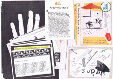
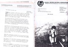


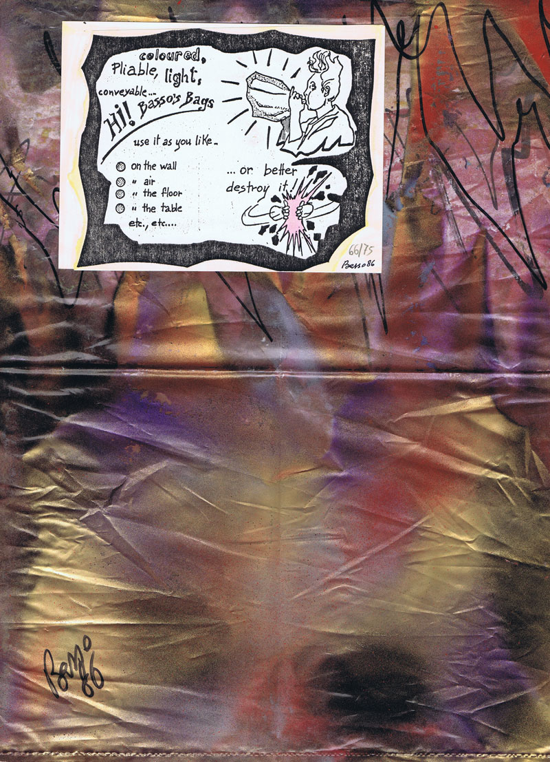
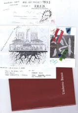

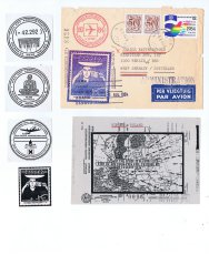

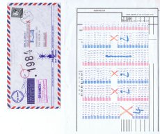


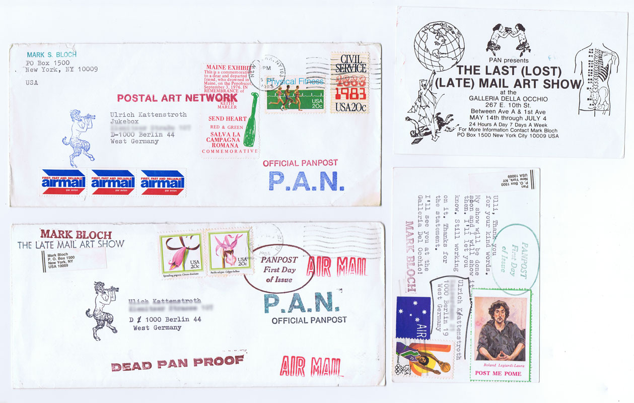
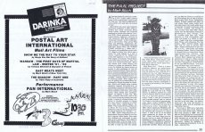
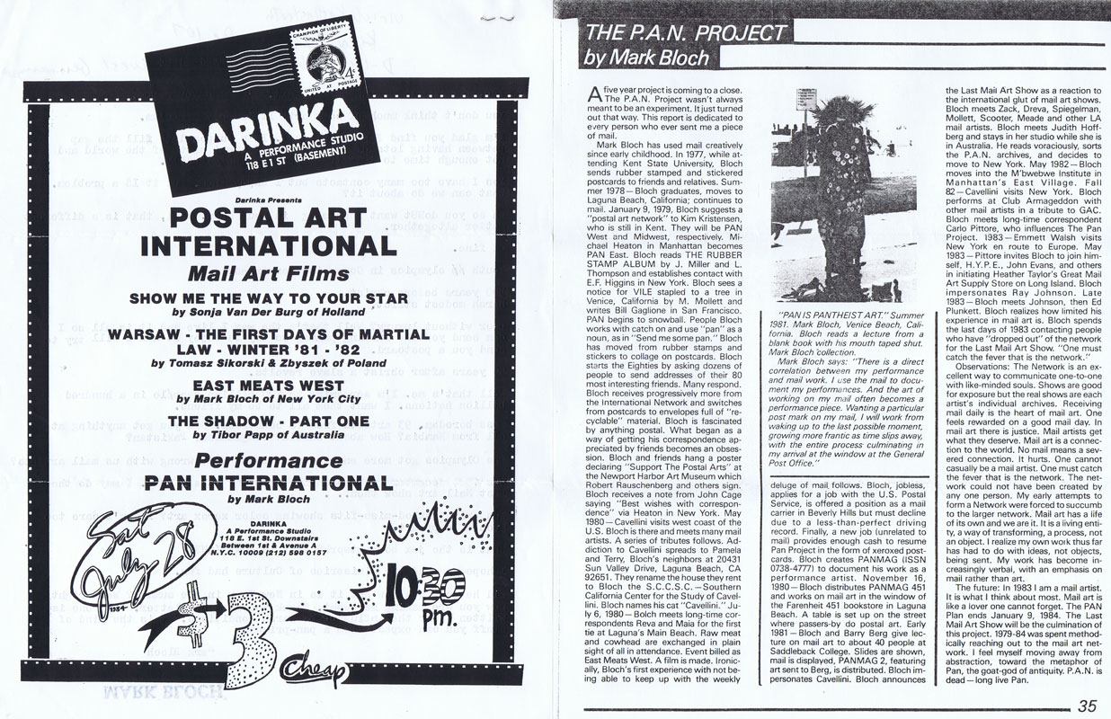


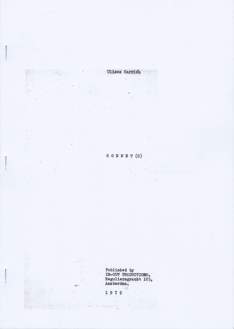


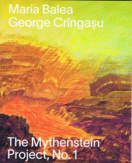


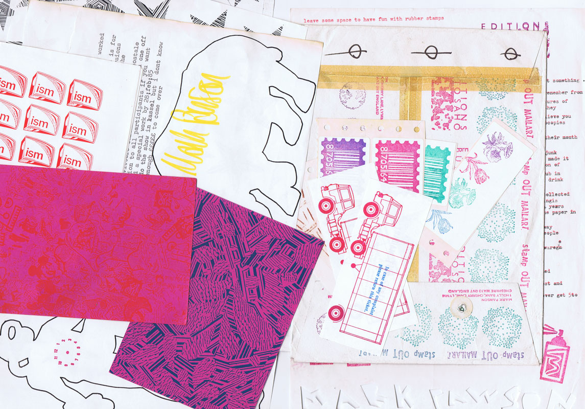
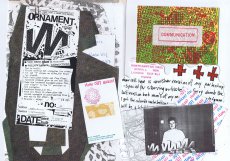
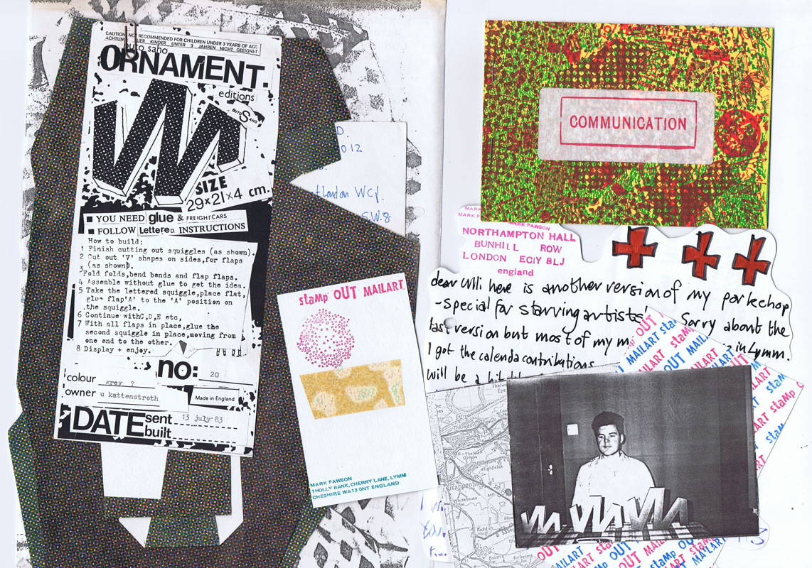
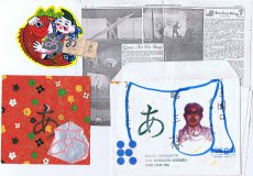


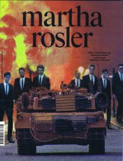


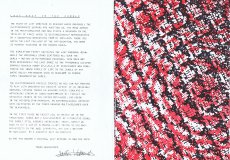
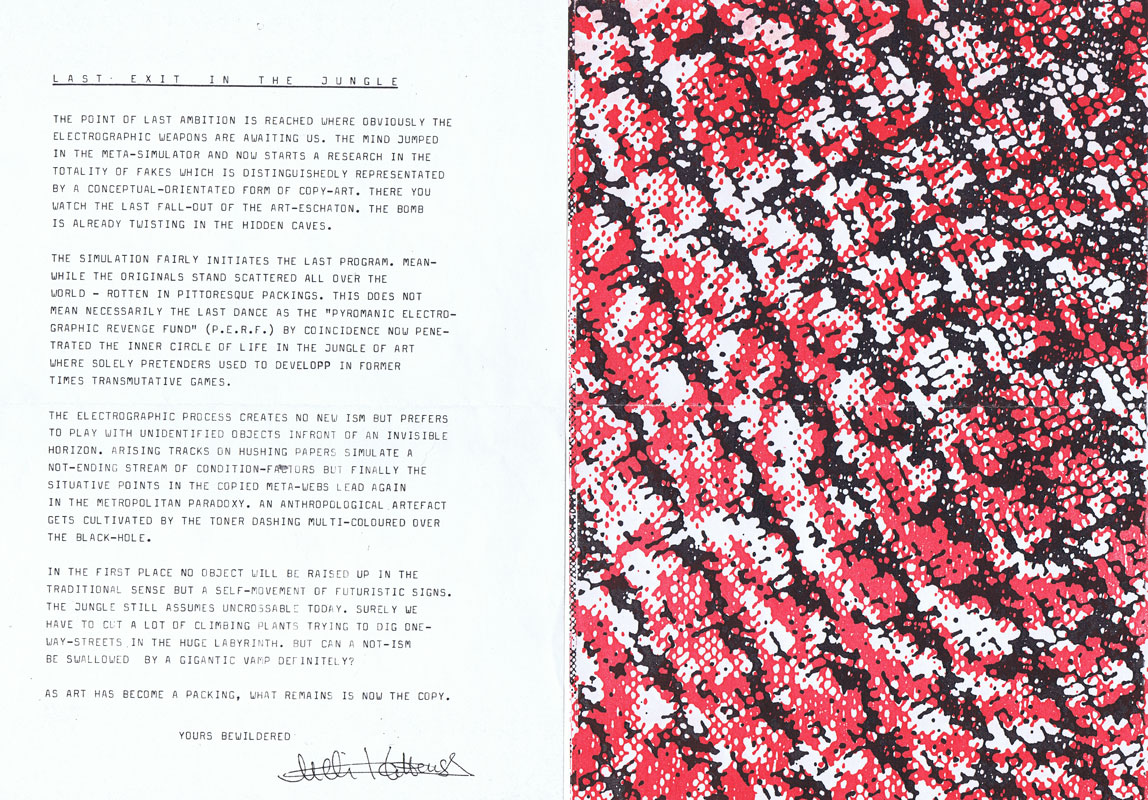
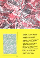

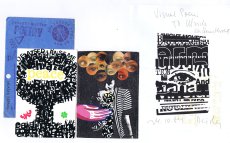
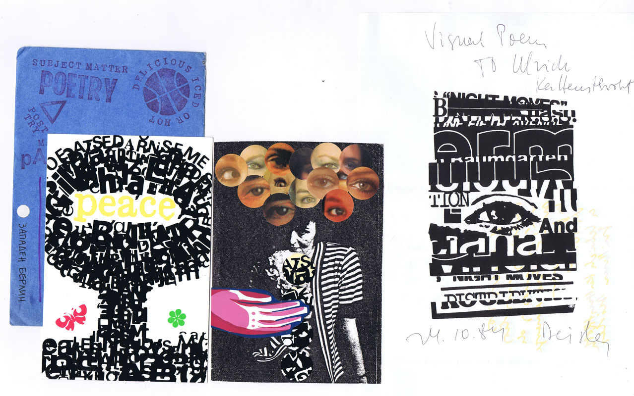

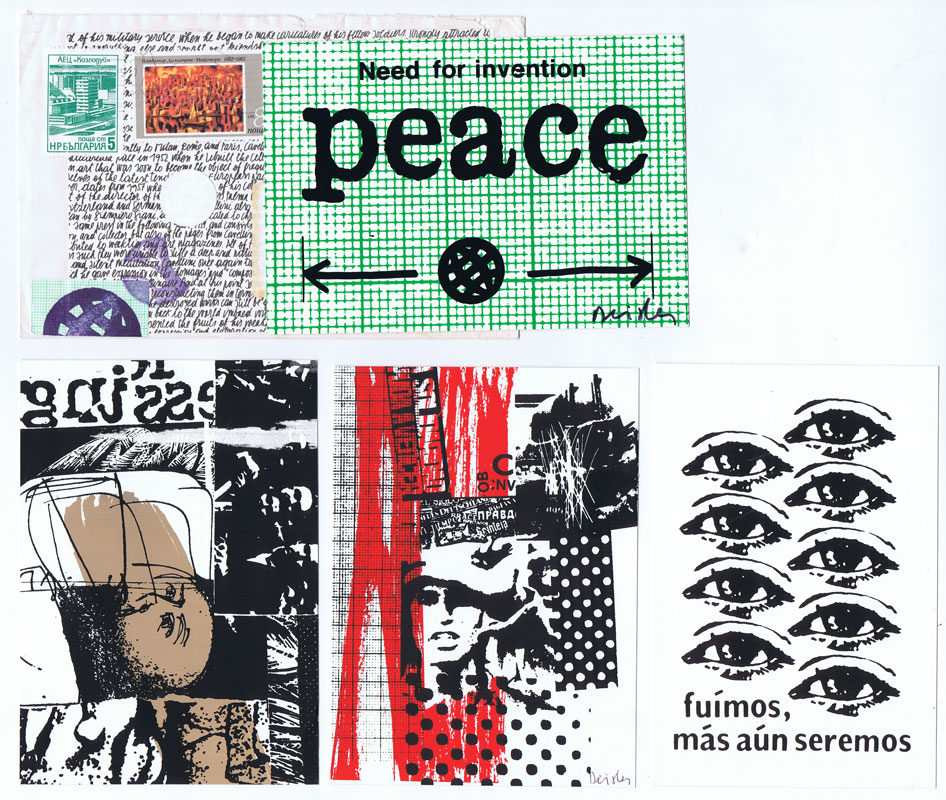
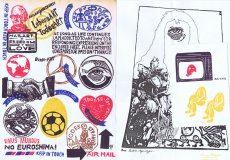
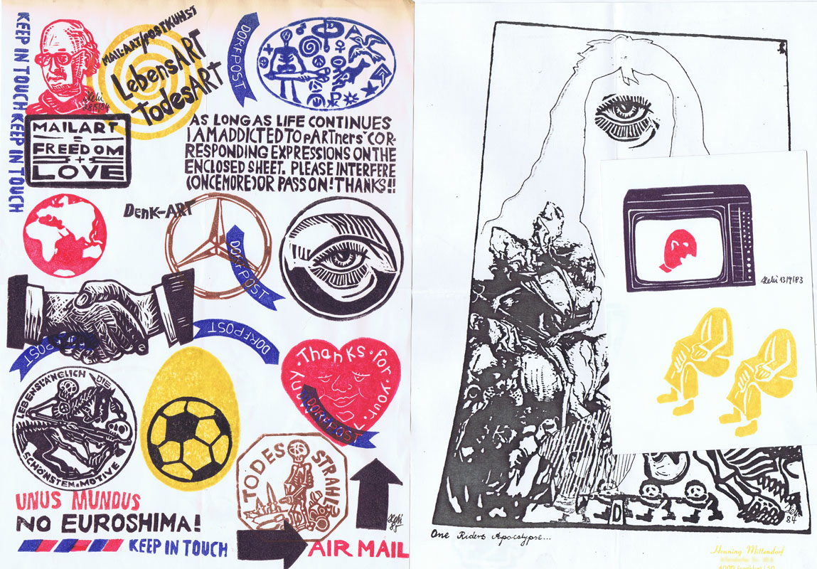
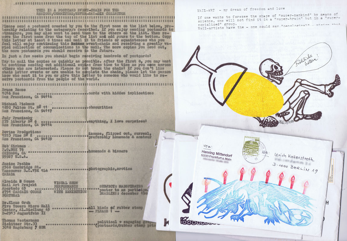


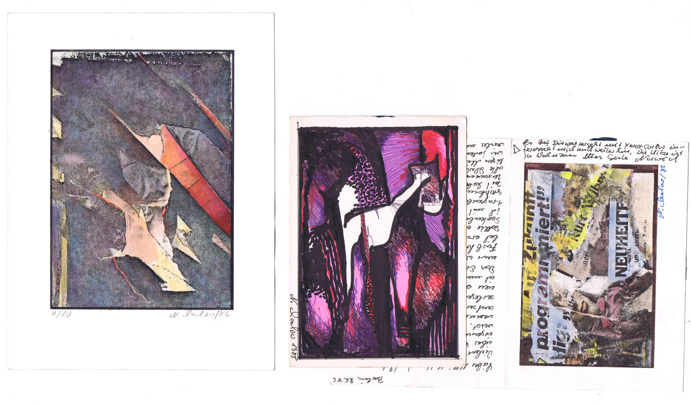

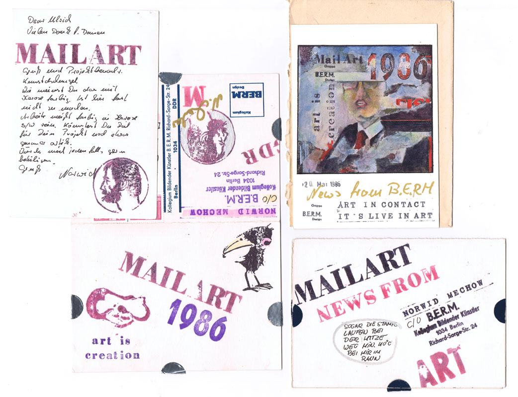
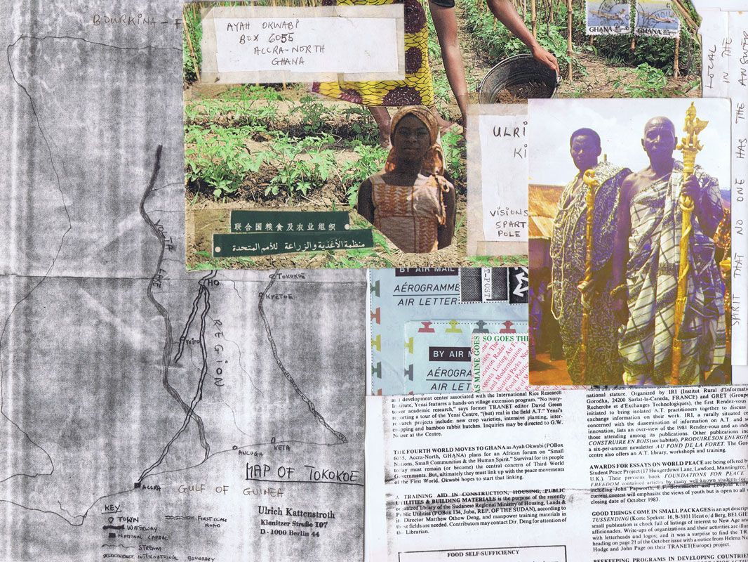


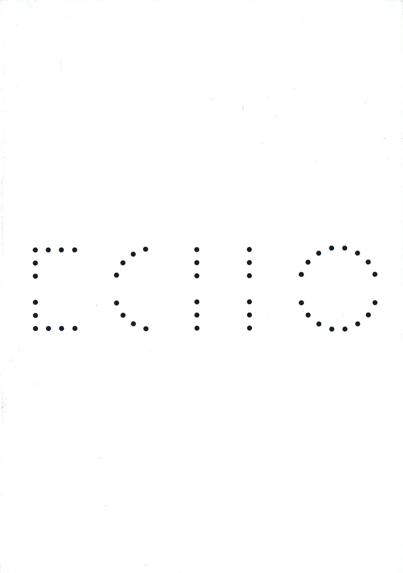


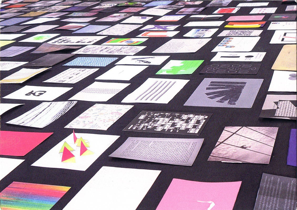


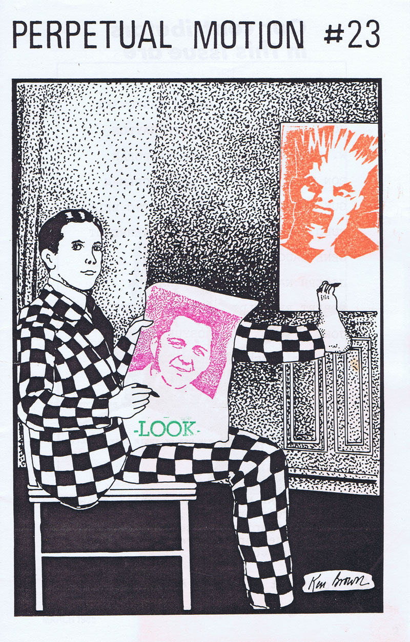


