Gesucht wurde Friends with Books Art Book Fair, Berlin, Medienart , Sortierung DatensatzNr., aufsteigend. Kein exaktes Ergebnis. Alternative Fundstellen: 500 Treffer
Hinweise zum Copyright und ServiceAAP Archive Artist Publications - Munich - www.artistbooks.de
Publikation zur New York ArtBook Fair 2017. Printed Matter presents the twelfth annual NY ArtBook Fair, from September 22 to 24, 2017, at MoMA PS1, Long Island City, Queens. Free and open to the public, the NY ArtBook Fair is the world’s premier event for artists’ books, catalogs, monographs, periodicals, and zines. The 2017 NY ArtBook Fair will feature over 370 booksellers, antiquarians, artists, institutions and independent publishers from twenty-eight countries. This year’s NY ArtBook Fair will include an ever-growing variety of exhibitors - from zinesters in (XE)ROX & PAPER + SCISSORS and the Small Press Dome representing publishing at its most innovative and affordable, to rare and antiquarian dealers offering out-of-print books and ephemera from art and artist book history, plus the NYABF-classic Friendly Fire, focused on the intersections of art and activism. NYABF17 will host an array of programming and special events, including: The Classroom, a curated engagement of informal conversations, workshops, readings, and other artist-led interventions, for the eighth year running, as well as The Contemporary Artists’ Book Conference (CABC), in its tenth year, featuring two full days of conversation on emerging practices and issues within art-book culture.
Text von der Website.
How to artbook fair features advice on how to plan, participate, and succeed in an artbook or zine fest. This second expanded edition features sections on pricing, selling, table layout, being a good tablemate, talking to fair organizers, trading, and more. With extra advice from over 15 artbook fair experts, this book will guide you through everything you need to table at an artbook fair.
Text von der Webseite.
Das Projekt Book Nomad ist eine Initiative der abC (artbook in China) ArtBook Fair. Mit dem Fokus auf „Asianness“ beteiligen sich Akteur*innen der Künstlerbuchszene aus verschiedenen Städten mit einer eigenen Auswahl an Kunstpublikationen, die verschiedene kulturelle Perspektiven offenbaren.
Das Projekt folgt dem Motto „Nomadic and Imagined“ und wird in Form einer wachsenden Wanderausstellung gezeigt: Beispielsweise präsentierte einBuch.haus in Berlin insgesamt 47 Bücher, wovon 42 Bücher von den vorherigen Teilnehmer*innen ausgewählt und bereits in deren Räumlichkeiten ausgestellt wurden. Die Vienna ArtBook Fair im Oktober 2023 folgte als bisher letzter Teilnehmer. Nach Mailand, Paris, Berlin und Rotterdam ist es die 5. Station der 2. Tour, welche durch Europa wanderte. Die 1. Tour war 2022 und reiste durch Stationen in Südostasien.
Nach dem Konzept von Book Nomad nimmt jeder Aussteller 5 weitere Publikationen von lokalen Künstler*innen und Verleger*innen in die Bücherliste auf, die zusammen mit den anderen Publikationen auch in den nachfolgenden Ausstellungsorten gezeigt und weiter ergänzt werden. Alle Publikation spiegeln auf ihre künstlerische Weise das Thema Asien wieder.
Mit Book Nomad sollen innovative, unabhängige Kunstpublikationen aus China und anderen Ländern einem globalen Publikum zugänglich gemacht werden.
Text von der Webseite
Flyer zur Zine Fair im Mildura Arts Centre, die vom 02.-04.08.2019 stattfand.
Currently in the midst of another comeback, zines are set to take centre stage at MAC from 2 – 4 August as part of Mildura Zine Fair 2019.
Councillor for Arts and Culture Jason Modica said the idea to host a zine fair in Mildura was sparked by a recent travelling exhibition by State Library Victoria entitled Self-Made: Zines and Artist Books. ...
“Based on the positive response to the exhibition, the Mildura Arts Centre team set about developing a national zine fair aimed at connecting and uniting zine-makers from across the country.” (Monica Syrette)
Next month’s event has attracted both local and metropolitan-based artists, who will feature their works with 20 zine-maker stalls set up in the MAC foyer.
Die Zines, die derzeit ein weiteres Comeback erleben, werden vom 2. bis 4. August im MAC im Rahmen der Mildura Zine Fair 2019 in den Mittelpunkt gestellt.
Jason Modica, Stadtrat für Kunst und Kultur, sagte, dass die Idee, eine Zine-Messe in Mildura zu veranstalten, sich durch eine kürzlich von der Staatsbibliothek Victoria veranstaltete Wanderausstellung mit dem Titel Self-Made: Zines and Artist Books entzündete. ...
"Aufgrund der positiven Resonanz auf die Ausstellung machte sich das Team des Mildura Arts Centre daran, eine nationale Zine-Messe zu entwickeln, um Zine-Macher aus dem ganzen Land zu verbinden und zu vereinen." (Monica Syrette)
Die Veranstaltung im nächsten Monat hat sowohl lokale als auch in der Metropole ansässige Künstler angezogen, die ihre Werke an 20 Zine-Macher-Ständen im MAC-Foyer ausstellen werden.
Text von der Webseite, übersetzt mit DeepL.
The Bloomberg website says of the project:
For Comma 38, artist and publisher Arnaud Desjardin will exhibit new, old, rare, and popular books while running an active printing press in Bloomberg Space. His COMMA commission, part of an ongoing project titled The Book on Books on Artists' Books, is intended to create an active and participatory review of current and historical practice. This exhibition is about both the display of books on artists' books and the production of a book about the books displayed. He intends to print a first edition, a book of books, a critical anthology and source book, alongside which a large range of books on artists' books will be displayed in a series of vitrines.
Artists' books have normally been sold and distributed through small networks of bookshops and galleries that often produce lists of available titles in printed form. The advent of the Internet has meant that information online has changed the nature of this documentary evidence. Desjardin's unique and extraordinary combination of display and production makes an exhibition that actively engages in both the making and disseminating in real time. The books themselves become both vehicles for information and documents that testify for artistic activity in its own right
50 S., 21,7x14,2 cm, Auflage: 850, keine weiteren Angaben vorhanden Drahtheftung, Risographie auf French Paper Company Pop-Tone Bubble Gum Pink, in Folienumschlag
3. Auflage.
How to artbook fair enthält Ratschläge für die Planung, die Teilnahme und den Erfolg bei einem Kunstbuch- oder Zine-Festival. Dieses Buch enthält Abschnitte über Preisgestaltung, Verkauf, Tischgestaltung, gute Tischnachbarn, Gespräche mit Messeorganisatoren, Handel und mehr. Mit zusätzlichen Ratschlägen von mehr als 15 Kunstbuchmesse-Experten wird dieses Buch Sie durch alles führen, was Sie für einen Tisch auf einer Kunstbuchmesse benötigen.
Diese dritte Auflage enthält außerdem neue Abschnitte über die virtuelle Kunstbuchmesse, die Teilnahme nach dem 19. November, das Packen und Ratschläge zur Gründung und Durchführung einer eigenen Kunstbuchmesse.
Text von der Webseite übersetzt mit Hilfe von DeepL.
3. erweiterte Auflage mit 600 farbigen Abbildungen, zur Ausstellung 03.02.-08.05.22 bei Allard Pierson der Universität von Amsterdam.
Die renommierte niederländische Designerin Irma Boom ist bekannt für ihre kühne und experimentelle Herangehensweise, mit der sie die Konventionen des traditionellen Buches sowohl in Bezug auf das Design als auch auf den gedruckten Inhalt in Frage stellt. Im "Book Manifest" (das 3. Buch der Reihe) präsentiert Irma Boom ihre Vision vom Wesen, von der Bedeutung und Relevanz des Buches. Grundlage hierzu waren intensive Nachforschungen, die Irma Boom zur Entwicklung des Buches in der Bibliothek des Vatikans angestellt hat. Die dabei gewonnenen Erkenntnisse teilt sie mit einer Auswahl von mehr als 350 von ihr gestalteten Büchern, in denen sie den Kontext und die Beziehung zum traditionallen Buch ausführlich erörtert. Mit diesem 1000seitigen, reich bebilderten Buch möchte Irma Boom die neue Generation von Designern inspirieren und zum Experimentieren anregen, um die Stellung des Buches für die Zukunft zu sichern. Die Bücher von Irma Boom befinden sich in der ständigen Sammlung des MoMA in New York und in den Sondersammlungen der Universität von Amsterdam: das Irma Boom Archiv.
World renowned Dutch designer Irma Boom is known for her bold experimental approach to her projects, often challenging the convention of traditional books in both physical design and printed content. In the book "Book Manifest" (the 3rd book in the series) Irma Boom presents her vision on the essence, meaning and relevance of the book. The basis for this book is formed by the in-depth research that Irma Boom carried out into the development of the book in the library of the Vatican. The knowledge she gained about this, and the inspiration it gave her, is shared with a selection of more than 350 books she designed, in which she extensively discusses the context and relationship with the old book. With this 1000-page, richly illustrated book, Irma Boom aims to inspire and encourage the new generation of designers to experiment, in order to ensure the book's position for the future. Boom's books in the permanent collection of MoMA in New York, and Special Collectons of the University of Amsterdam collect her complete oeuvre: the Irma Boom Archive.
Text von der Webseite des Verlages
776 S., 46x31 cm, Auflage: 60, keine weiteren Angaben vorhanden Pappmappe für Fair-Gesamtausgabe mit allen 13 Ausgaben + 3 Ausgaben fair CEE in, Leinenrücken, mit Bändern zusammen gebunden. Titel aufgeklebt. Zeitungen mit Trennblättern lose eingelegt
ZusatzInfos
Der inhaltliche Bogen spannt sich von bildender Kunst über Architektur, Design, Experimentalfilm bis zu aktuell philosophischen und gesellschaftskritischen Themen. Einen Schwerpunkt bildeten die Ausgaben über Zentral- und Osteuropa (fair CEE), wo wir aus den Ländern Polen, Rumänien, Ungarn, Serbien, Slowenien und Russland berichteten. Mit der Thematisierung der Kunst und Kultur aus diesen osteuropäischen Ländern versuchten wir geschichtliche Verantwortung wahrzunehmen und den Diskurs zwischen dem ehemaligen Osten und dem Westen zu intensivieren. Es ging hierbei nicht um einen oberflächlich flüchtigen Blick, sondern um eine in die Tiefe gehende Recherche und Sichtung. Eine Position, die die beiden Teile Europas – Ost wie West – auf Augenhöhe zusammen führt.
In 4 Jahren wurden 13 Ausgaben fair + 3 Ausgaben fair CEE mit einem Gesamtvolumen von 776 Seiten herausgegeben
[180] S., 14,8x10,5 cm, keine weiteren Angaben vorhanden Softcover, Umschlag hinten Klappbroschur, Grundriss/Floorplan mit Liste der Aussteller hintere Umschlagklappe, mit eingelegter Quittung
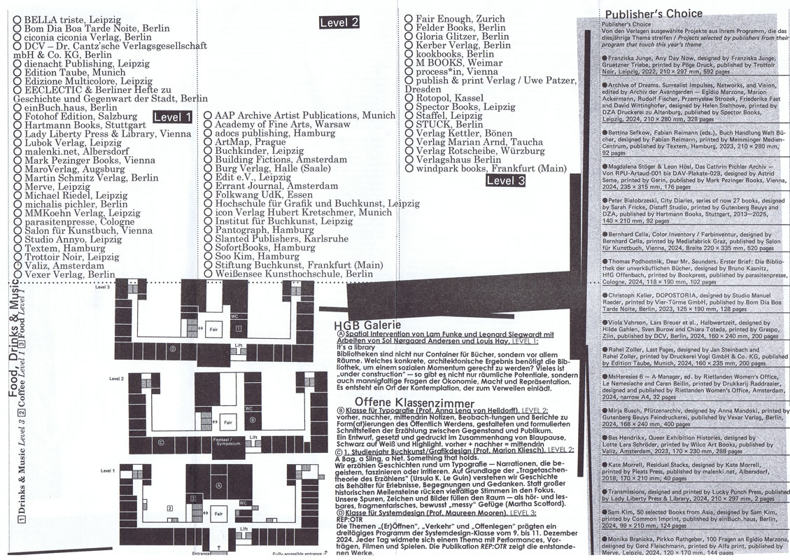
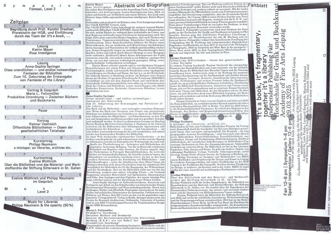
Die Independent Publishing Fair It’s a book, …, das jährliche Zusammenkommen von Publizierenden und unabhängigen Verlagsprojekten, findet 2025 zum fünfzehnten Mal statt. Sie ist Markt- und Tauschplatz von Publikationen verschiedenster Art wie auch von Ideen und Debatten und ist etabliert als ein offener Raum, der alle willkommen heißt.
Die ineinandergreifenden Bereiche der It’s a book, … – Buchmesse, Symposium, eine räumliche Intervention, grafische Gestaltung, Publikation und Website – wurden im Rahmen eines Projektseminars mit Studierenden der Hochschule für Grafik und Buchkunst Leipzig und in Kooperation mit dem Verein open book society e.V. entwickelt, ausgestaltet und organisiert.
Neben zahlreichen Verlagen aus dem In- und Ausland werden zum diesjährigen Symposium Maria L. Felixmüller, Katrin Mayer, Philipp Neumann, Raimar Oestreich, Anna-Sophie Springer und Eveline Wüthrich begrüßt.
Ein umfassender Reader mit Beiträgen von u.a. Gabriela Halac, Alessandro Ludovico, Abigail Reynolds, Yvonne Schürer und Eva Weinmayr lädt zur vertiefenden Lektüre und Nachlese ein.
Der Dreiklang It’s a book, it’s fragmentary, together it’s a library spricht das diesjährige Thema sehr konkret an und öffnet zugleich ein weites Feld: Bibliotheken werden als Orte für Bücher und als Räume für Menschen betrachtet.
In Bibliotheken sind Bücher und Menschen aufs Engste verbunden. So sind Architektur, Gestaltung und Ausstattung von Bedeutung, denn sie begrüßen, tragen und beherbergen Menschen wie Bücher gleichermaßen. Dies lässt auf die Formen und Formate von Bibliotheken blicken sowie auf Strukturen, die ihre Agency und den sozialen Raum, den sie bilden, prägen – ideengeschichtlich, als Konstellation und als Denkraum.
Bibliotheken sind vor allem auch Orte des Sammelns und Archivierens, des Organisierens und Teilens. Hier bilden einzelne Publikationen und ihre Inhalte zusammen ein größeres Wissensnetz. Ihre Vielstimmigkeit lässt neue Beziehungen und Assoziationsketten entstehen. Heute werden Bibliotheken zunehmend als dynamische Orte des Wissenstransfers neu gedacht. Denn Bibliotheken sind niemals nur architektonische und physische Räume, sondern immer auch kulturelle Konstrukte, die – historisch betrachtet – eng an hegemoniale Strukturen gekoppelt sind. Sowohl aus wissenschaftlichen wie auch aus künstlerischen Perspektiven wird dies kritisch hinterfragt und in vielen Initiativen und Projekten aufgebrochen.
Diese Entwicklungen sind eng mit Herausforderungen des digitalen Zeitalters verknüpft und digitale Bibliotheken, die Monopolisierung von Wissen und alternative anarchische, oft in den Schatten agierende Modelle bleiben weiterhin viel diskutierte Themen. Festhalten lässt sich, dass das totgesagte Buch seinen eigenen Untergang schon so oft überlebt hat, wie er verkündet wurde.
Text von der Website https://www.itsabook.de/books
zur Veranstaltung vom 10.-12.06.2016 in der Akademie der Künste Berlin.
Miss Read: The BerlinArtBook Fair brings together a wide selection of the most interesting artists/authors, artist periodicals and art publishers and is accompanied by a series of lectures, discussions, book launches and workshops exploring the boundaries of contemporary publishing and the possibilities of the book.
In conjunction, the Conceptual Poetics Day will explore the imaginary border between visual art and literature.
In 2016 Miss Read: The BerlinArtBook Fair will return to Akademie der Künste, Berlin, who will provide their main exhibition halls at Hanseatenweg.
Text von der Webseite
7 S., 29,7x21 cm, keine weiteren Angaben vorhanden Schwarz-Weiß-Laserdruck nach Webseite, Drahtheftung
ZusatzInfos
Independent Publishing Fair Leipzig, 15th of March 2014
Event: "It’s a Book…” is an independent publishing fair taking place on 15th of March 2014 at the Academy of Visual Arts Leipzig, in correspondence to the Leipzig Book Fair. Entrepreneurs of the international independent publishing-scene are looking forward to meeting interested visitors and exchanging books and ideas.
Organisation: students of the graphic design department, Academy of Visual Arts, Leipzig.
Reinhard Grüner is a collector from Monaco. His passion is artbooks, which he collects – and sometimes exhibits – since the 1960s.
His website, www.buchkunst.info is a real “online museum”, where international artist books are catalogued and photographed. Amongst the artists there are Marc Chagall, Anselm Kiefer, Henri Matisse, Pablo Picasso and Andy Warhol. Books, but also works of art made of images and text, created by the artist often in collaboration with a writer and a publisher. For the high artistic quality – original graphics, unique designs, paintings and collages – these works are different from the usual picture books. Their manifestations are multiple: bookswith graphic effects, objects-book, artist’s books, sometimes printed in offset or illustrated by works of artists.
At the centre of Grüner’s attention there are Eastern German and Eastern European books (mainly Russia, Hungary, Lithuania). many of these works were created in response to specific social, political and cultural issues, with unimaginable insights into the culture of modernity.
Reinhard first came in contact with the art in book form with the English Edition, printed privately, of “A Dissertation Upon Roast Pig”, printed in 1975 by Shoestring Press on paper of the legendary Chiswick Press: from here begins a life of a book maniac among thousands of books. As Grüner states in an essay, the acquisition of artist books is more than a simple purchase: the artist, the life as a collector and thoughts are tied together, they influence each other, and a network of contacts with other collectors begins. With nearly all the books in his collection Grüner forms a symbiotic relationship: each of them describes, explains, and gets to the heart of some chapters of his life.
Download the pdf file with the essay on the collection of Reinhard Grüner (in English)
Originally issued in parallel to Art Basel, I Never Read ArtBook Fair Basel involved international independant publishers in its Art Magazine and Zine Fair. I Never Read was also presented during the 2012 NY ArtBook Fair.
Text von der Website
82 S., 24x17 cm, Auflage: 2.000, 2 Stück. 4 Teile. ISBN/ISSN 978-3-868741056 Broschur. Mit eingelegtem Programm des Conceptual Poetics Day, von Natalie Czech, Ausstellerverzeichnis und -plan, Postkarte.
zur Veranstaltung vom 03.-05.05.2019 im Haus der Kulturen der Welt. Gestaltung des Kataloges Moritz Grünke. MISS READ: The BerlinArtBook Fair 2019 will take place on May 3th to 5th at Haus der Kulturen der Welt and will bring together a wide selection of publishers, art periodicals and artists/authors (267+ exhibitors for 2018). In conjunction, the seventh Conceptual Poetics Day will explore the imaginary border between visual art and literature. Founded in 2009, MISS READ is Europe’s major ArtBook Festival, dedicated to community-building and creating a public meeting place for discourse around artists’ books, conceptual publications and publishing as practice.
Text von der Webseite
17,6x13,8 cm, Auflage: 500, ISBN/ISSN 9780982969427 Buch zu einer Ausstellung in der Boo-Hooray Gallery New York, eingesteckt in ein mehrfach gefaltetes A2-Format-Blatt mit den Farbabbildungen der im Buch beschriebenen Bücher
ZusatzInfos
"Artists' book" is a troublesome term. There seems to be no single well-understood or generally-accepted working definition. Say "artists' book" in general conversation and you'll likely get a blank look, if not outright confusion. even with a specialized audience of bibliophiles, or art world cognoscenti, it may be necessary to clarify exactly what you mean...
Artists' Book Not Artists' Book is an exhibition co-curated by Johan Kugelberg and Jeremy Sanders. In it are about one hundred books and of course all of them either are, or are not, artists’ books, but whether it is even possible to say which ones fall into which category is a matter that's not entirely clear. And in any case, it's likely no two viewers would draw exactly the same conclusions.
Artists' Book Not Artists' Book.
Von der Webseite des Verlages
2 S., 29,7x21 cm, keine weiteren Angaben vorhanden Flyer, gefaltet
ZusatzInfos
Flyer zur Veranstaltung Drucken Heften Laden der neuen Gesellschaft für Bildende Kunst in Berlin, vom 08.-18.01.2015
Teilnehmer adocs, Hamburg. Architektur in Gebrauch, Berlin. Archive Books, Berlin. Michael J. Baers, Berlin. Books People Places, Berlin. Botopress, Berlin. Edition Bernward Reul, Berlin. ernstundmund, Leipzig. Errant Bodies, Berlin/Los Angeles. form und sinn, Berlin. Fulcrum, London. image-shift, Berlin. Wolfgang Kil, Berlin. Metabook, Amsterdam/Berlin. metroZones, Berlin. nGbK, Berlin. Revolver Publishing, Berlin. Scriptings/Achim Lengerer, Berlin. Spector Books, Leipzig. Temporary Services/Half Letter Press, Chicago/Kopenhagen. The Green Box, Berlin. von hundert, Berlin. ztscrpt, Wien/Berlin
Englische Ausgabe. Erschienen anlässlich der Ausstellung "The Line of Fate" im mumok, Wien, 04.03.-29.05.2011.
Seven Books Grey is an updated, expanded version of Tacita Dean’s Seven Books (2003), and is an exploration of Dean’s oeuvre as it straddles film, drawing, photography, writing and book-making. Each book has a different focus and together they are an accurate survey of Dean’s work to date. Book One: “Complete Works and Filmography 1991–2011” Book Two: “Selected Writings 1992–2011” (Dean’s writings) Book Three: “A Panegyric, Gaeta, Edwin Parker” (three projects made with and about Cy Twombly) Book Four: “Film Works with Merce Cunningham” Book Five: “Footage” (artist’s bookwith a text by Marina Warner taking a cultural-historical look at the foot and the significance of limping) Book Six: “Post-War Germany and ‘Objective Chance’: W.G. Sebald, Joseph Beuys and Tacita Dean” (essay by Christa-Maria Lerm Hayes) Book Seven: “Essays on the Work of Tacita Dean” (texts by Wolfram Pichler, Peter Bürger, Douglas Crimp and Achim Hochdörfer)
Text von der Webseite
Die Small Publishers Fair ist die jährliche Zusammenkunft von Schriftstellern, Künstlern, Dichtern, Komponisten, Buchgestaltern und ihren Verlegern.
Die Small Publishers Fair 2022 fand am 28.- 29.10.2022 in der historischen Conway Hall statt, dem Zentrum des Humanismus und des literarischen Bloomsbury.
69 britische und internationale Kleinverlage, Ausstellung Bibliopoe: books by Steven J Fowler und Programm mit Lesungen und Vorträgen.
Text von der Webseite
Übersetzt mit www.DeepL.com/Translator (kostenlose Version)
Ausstellerverzeichnis.Die Small Publishers Fair ist die jährliche Zusammenkunft von Schriftstellern, Künstlern, Dichtern, Komponisten, Buchgestaltern und ihren Verlegern.
Die Small Publishers Fair 2022 fand am 28.- 29.10.2022 in der historischen Conway Hall statt, dem Zentrum des Humanismus und des literarischen Bloomsbury.
69 britische und internationale Kleinverlage, Ausstellung Bibliopoe: books by Steven J Fowler und Programm mit Lesungen und Vorträgen.
Text von der Webseite
Übersetzt mit www.DeepL.com/Translator (kostenlose Version)
Am 02. & 03.11.24 richtet das Haus der Kunst die fünfte Ausgabe von Super BOOKS aus. Die jährlich veranstaltete, unabhängige Messe der Künstler*innenbuchszene bringt fast 70 Künstler*innen, Gestalter*innen und alternative Verleger*innen sowie Institutionen und Hochschulen zusammen, um ihre jeweils neuesten Produktionen zu präsentieren.
Der Schwerpunkt von Super BOOKS liegt auf Publikationen, die die Grenzen des Mediums Buch hinterfragen, neu denken und deren Themen, Formate und Techniken sich ständig erweitern. Mit ihrer Ethik der Zugänglichkeit, die in der Preisgestaltung und der Direktheit von Vertriebswegen zum Ausdruck kommt, bilden alternative Publizist*innen ein Gegengewicht zur herkömmlichen Verlagsbranche und ihren gängigen Spielregeln.
Super BOOKS wurde 2019 im Rahmen der Ausstellung „Archives in Residence: AAP Archiv Künstlerpublikationen“ im Haus der Kunst initiiert und hat sich seither zu einem wichtigen Forum für die unabhängige Kunstverlagslandschaft entwickelt. Das große Publikumsinteresse der vergangenen Jahre zeigt, wie sehr die Veranstaltung auch die breite Öffentlichkeit anspricht und zur lebendigen Auseinandersetzung mit Künstler*innenpublikationen inspiriert. Projektleitung: Sabine Brantl (Haus der Kunst)
Text von der Webseite
Druck von rosidruckt.de, Raumplan von Malte Wandel.
Mit der diesjährigen Ausgabe von Super BOOKS leitet das Haus der Kunst den Münchner Bücherherbst 2023 ein. Seit dem Auftakt im Jahr 2019 erhält die sehr lebendige und aktive Künstler*innenbuchszene zum vierten Mal die Fläche für einen gemeinsamen Auftritt.
Am 3. und 4. November zeigen über 50 Künstler*innen, Gestalter*innen und alternative Verleger*innen sowie drei Hochschulen ihre aktuellen Produktionen im Haus der Kunst. Neben Produzent*innen aus Deutschland sind in diesem Jahr auch Aussteller*innen aus Spanien, Italien, Frankreich, Österreich, England, Belgien, den Niederlanden und Südkorea vertreten. Die Teilnehmenden sehen sich in der Tradition der 1960er Jahre, als sich im Umfeld der postavantgardistischen Kunstszene neue Kommunikations- und Distributionsnetze bildeten. Ihre Produkte wie Künstler*innenbücher, Magazine oder Zines sind autonome Kunstwerke.
Der Schwerpunkt von Super BOOKS liegt auf Publikationen, die die Grenzen des Mediums Buch hinterfragen, neu denken und deren Themen, Formate und Techniken sich ständig erweitern. Mit ihrer Ethik der Zugänglichkeit, die in Preisgestaltung und der Direktheit von Vertriebswegen zum Ausdruck kommt, bilden sie ein Gegengewicht zu den gängigen Spielregeln des Kunstmarkts. ...
... Super BOOKS ist ein Kooperationsprojekt zwischen Haus der Kunst, AAP Archiv Künstlerpublikationen, Bayerischer Staatsbibliothek, Akademie der Bildenden Künste München und Kunsthochschule Kassel. Projektleitung: Sabine Brantl (Haus der Kunst)
Text von der Webseite
Eine Buchmesse zurück zum Buch bringen.
Die Rehearsal ArtBook Fair, die am 15. und 16.09.2023 in New York City stattfindet, will die Essenz unabhängiger Kunst- und Literaturveröffentlichungen in stark kapitalisierten und/oder zensierten Kontexten erkunden und präsentieren.
Abgeleitet vom französischen Wort "rehercier", bedeutet "rehearsal" "üben" oder "wiederholen, neu verstehen". Wir laden unabhängige Verlage, Editionen, Kollektive und Einzelpersonen aus New York und der ganzen Welt zur Teilnahme an dieser Messe ein. Außerdem wird zum ersten Mal eine Sammlung kuratierter Samizdat aus dem chinesischen Festland ausgestellt. Wir schätzen die kontinuierlichen Praktiken des Büchermachens als persönliche Proben und Revolutionen.
Die erste Rehearsal ArtBook Fair findet im Theaterraum und in den zum Badehaus umfunktionierten Klassenzimmern des University Settlement (184 Eldridge Street, Lower East Side) statt, einem historischen Gemeindezentrum, das seit dem 19. Jahrhundert eingewanderte Arbeiter und einkommensschwache Familien unterstützt.
Die Messe wird von Bungee Space (einer auf Fotografie, Bildstudien und Bildkritik spezialisierten Kunstbuchhandlung in New York) und Accent Sisters (einer Speakeasy-Literaturbuchhandlung und einem Verlagsstudio in New Jersey) ehrenamtlich mitorganisiert.
68 S., 29,8x21,2 cm, 2 Teile. ISBN/ISSN 9780954702571 Klemmbindung mit schwarzem Papierstreifen, Softcover, Exlibris von Jürgen Peter Wegner eingeklebt. Brief von Jürgen Wegner beigelegt
A guide for the book artist – as the producer, publisher and distributor of their own artwork, to discuss some of the practical issues arising from this. A series of case studies explores artists’ experiences of making and marketing their books in the UK, France, Germany, EIRE, Spain, Denmark, Japan, Argentina, Australia and the USA. We selected a range of artists with 2 - 30+ years experience in artists’ books, zines and multiples and asked them to share their working practice, experience of book fairs, interaction with purchasers, discuss problems and offer advice. We also asked private and institutional collectors to tell us about the ways in which they would prefer to interact with artists selling their books and any issues arising from their own collecting.
Text von der Website.
Mit der diesjährigen Ausgabe von Super BOOKS leitet das Haus der Kunst den Münchner Bücherherbst 2023 ein. Seit dem Auftakt im Jahr 2019 erhält die sehr lebendige und aktive Künstler*innenbuchszene zum vierten Mal die Fläche für einen gemeinsamen Auftritt.
Am 3. und 4. November zeigen über 50 Künstler*innen, Gestalter*innen und alternative Verleger*innen sowie drei Hochschulen ihre aktuellen Produktionen im Haus der Kunst. Neben Produzent*innen aus Deutschland sind in diesem Jahr auch Aussteller*innen aus Spanien, Italien, Frankreich, Österreich, England, Belgien, den Niederlanden und Südkorea vertreten. Die Teilnehmenden sehen sich in der Tradition der 1960er Jahre, als sich im Umfeld der postavantgardistischen Kunstszene neue Kommunikations- und Distributionsnetze bildeten. Ihre Produkte wie Künstler*innenbücher, Magazine oder Zines sind autonome Kunstwerke.
Der Schwerpunkt von Super BOOKS liegt auf Publikationen, die die Grenzen des Mediums Buch hinterfragen, neu denken und deren Themen, Formate und Techniken sich ständig erweitern. Mit ihrer Ethik der Zugänglichkeit, die in Preisgestaltung und der Direktheit von Vertriebswegen zum Ausdruck kommt, bilden sie ein Gegengewicht zu den gängigen Spielregeln des Kunstmarkts. ...
... Super BOOKS ist ein Kooperationsprojekt zwischen Haus der Kunst, AAP Archiv Künstlerpublikationen, Bayerischer Staatsbibliothek, Akademie der Bildenden Künste München und Kunsthochschule Kassel. Projektleitung: Sabine Brantl (Haus der Kunst)
Text von der Webseite
Atem Books is an independent publishing house based in Catalunya focused on photography & illustration, contemporary drawing and thinking created by emerging artists from around the world. Our aims are: to help emerging artists to get their work more known, create a collection of contemporary works, to gather illustrators, photographers & art lovers. Atem Books has been publishing Carpaccio Magazine since April 2009. Atem Books is a non-profit organization, so all the money earnt is always invested in new publications.
Why ‘Atem’?
‘Atem’ stands for “wind, breath” in german. This word is inspired by an illustrated poetry book published by Paul Celan (poet) and Gisèle Celan (illustrator) called Atemkristall.
Who we are
Atem Books curators are María Cerezo and Emma Llensa. We both do all the works involved with mantaining Atem Books.
What we can do
We’re also offering our services to help you self-publish your book (both digital -pdf, epub, mobipocket-, Ipad and Iphone apps and print). Whether if you need advise on how to start self publishing a book or you need our services as curators, designers, layouters and image retouchers, just ask us what we can do for you.
We’re also offering our services to help you create your own website and, if you need one, how to create an e-commerce to sell your own goods. And, of course, we can give you marketing and self-promotion advises and guidelines.
Atem Books is 100% independent!
We don’t receive any external money. This project survives with the earns we do selling our publications.
Von der Webseite
Werbematerialien zur Vienna ArtBook Fair #1, der ersten Künstlerbuchmesse in Wien in der Angewandten, 04.-06.10.2019. Opening performance von Paul Shortt, How to artbook fair
2 S., 5 Teile. keine weiteren Angaben vorhanden 1 Karte im Postkartenformat, beidseitig bedruckt, Schwarz-weiß,
2 Eintrittsausweise aus Plastik an einem langen Umhängeband der Vienna ArtBook Fair, mit kleinem Karabinerhaken und
2 Taschen der Messe aus weichem dünnem Zellulosestoff
Werbematerial zur Vienna ArtBook Fair #2, der zweiten Künstlerbuchmesse in Wien vom 20.-23.10.2023 mit diesmal 135 Ausstellern aus 26 Ländern, veranstaltet in der Universität für angewandte Kunst im 3. Wiener Gemeindebezirk. Die Karte zeigt die Angabe des Tischstandes C13 des teilnehmenden icon Verlag Hubert Kretschmer + AAP Archive Artist Publications Germany und die Angabe des Insta-Accounts @archiveartistpublications;
sowie zwei messetypische Eintrittsausweise mit dem Namen des Ausstellenden und seinem Messestandnummer auf einer Plastikkarte als Autorisierung der Teilnahme;
sowie 2 Taschen, welche den Aussteller*innen für ihren Verkauf von der Messeveranstaltung zur Verfügung gestelt wurden.
Die Rehearsal ArtBook Fair, die am 15. und 16. September 2023 in New York City stattfand, will die Essenz unabhängiger Kunst- und Literaturveröffentlichungen in stark kapitalisierten und/oder zensierten Kontexten erkunden und präsentieren. Abgeleitet vom französischen Wort "rehercier", bedeutet "rehearsal" "üben" oder "wiederholen, neu verstehen". Wir laden unabhängige Verlage, Editionen, Kollektive und Einzelpersonen aus New York und der ganzen Welt zur Teilnahme an dieser Messe ein. Außerdem wird zum ersten Mal eine Sammlung kuratierter Samizdat aus dem chinesischen Festland ausgestellt. Wir schätzen die kontinuierlichen Praktiken des Büchermachens als persönliche Proben und Revolutionen.
Die Buchmesse findet im Theaterraum und in den Klassenzimmern des University Settlement (184 Eldridge Street, Lower East Side) statt, einem historischen Gemeindezentrum, das seit dem 19. Jahrhundert eingewanderte Arbeiter und einkommensschwache Familien unterstützt.
Die Messe wird von Bungee Space (einer auf Fotografie, Bildstudien und Bildkritik spezialisierten Kunstbuchhandlung in New York) und Accent Sisters (einer Speakeasy-Literaturbuchhandlung und einem Verlagsstudio in New Jersey) ehrenamtlich mitorganisiert.
Text von der Webseite, übersetzt mithilfe von DeepL
For several years, Paul Kooiker and Erik Kessels have organized evenings for friends in which they share the strangest photo books in their collections. The books shown are rarely available in regular shops, but are picked up in thrift stores and from antiquaries. The group’s fascination for these pictorial non-fiction books comes from the need to find images that exist on the fringe of regular commercial photo books. It’s only in this area that it’s possible to find images with an uncontrived quality. What’s noticeable from these publications is that there’s a thin line between being terrible and being awesome. This constant tension makes the books interesting. It’s also worth noting that these tomes all fall within certain categories: the medical, instructional, scientific, sex, humour or propaganda. Paul Kooiker and Erik Kessels have made a selection of their finest books from within this questionable new genre.
Text von der Verlagswebseite
Sarah Bodman made her first artist’s book tribute to Kurt Johannessen after Tanya Peixoto introduced her to his books at bookartbookshop.
She produced ‘An Exercise for Kurt Johannessen’ in 2010, in tribute to his book ‘Exercises’. The titles of the 100 short stories she wrote and buried for her exercise, have since been taken up by BookArtObject an international book arts group, founded in Australia by Sara Bowen, with 84 artists currently making a book using one of Sarah’s short story titles.
As it is now the 10th anniversary of bookartbookshop in February 2012, and the celebrations are based on theme of: x or what is to be done? Sarah asked Kurt Johannessen if she could select a further 10 (x) exercises from his artist’s book to carry out.
The result is ‘X Exercises for Kurt Johannessen’ an image only artist’s book, published as a free download, DIY self-assembly book on 21.02.2012. The exercises can be identified through reading the texts in Kurt Johannessen’s ‘Exercises’. Sarah has made her book as a free PDF download for you to print out and assemble yourself, you will need 4 sheets of A4 paper and a stapler
The ABYB is a biennial reference publication focusing on international activity in the field of book arts. It serves as a resource for artists, academics, students, collectors, librarians, dealers, publishers and researchers, in fact anyone interested in artists’ books!
The 2020-2021 issue will have essays, articles, and lots of useful information on: Artist’s Book Publishers & Presses; Bookshops for artists’ books; Artist’s Book Dealers; Artist’s Book Galleries & Centres; Collections, Libraries & Archives; Artist’s Book Fairs and Events; Book Arts Courses and Workshops; Design, Print & Bind; Print Studios; Journals and Magazines; New Reference Publications; Organisations, People, Projects and Societies. Artists list up to 3 of their recent book works.
Text von der Webseite
S. 49, Text und Fotos von Jürgen Wegner, A visit to Archive Artist Publications and its exhibition in the Haus der Kunst, München, Germany
S. 111, Collections, Libraries & Archives
Altered book pages mail art project - August 2016. You are invited to participate in a Mail Art project entitled “Altered book pages”. You may paint, make a collage, use photos and more on a book page. You can use any kind of book pages you want and as many pages you want or an entire book. If you like I can send you some pages from Greek books to use. Theme: Altered book pages. Size, media, number of submissions: Free. No fees, no jury, no returns. Deadline: May 1st 2017.
Text von der Webseite.
Fyler anlässlich der Zine Fair im Museum of Contemporary Art, Sydney, 11.-12.06.2016. MCA Zine Fair is an annual festival featuring hundreds of zinesters, distros, independent presses, and artists. Showcasing over 100 creators of zines, small press and comics from across the country the festival also includes creative workshops dedicated to making, swapping and selling
Text von der Webseite
2. Auflage. This artists’ book by David Horvitz is a guide on how to steal books. It details 80 ways in which one can steal a book, from the very practical, to the witty, imaginative, and romantic.
This publication originated in 2012 as a conversation in The Classroom at Printed Matter's NY ArtBook Fair.
Text aus dem Buch und von der Webseite.
Die Independent Publishing Fair It’s a book, …, das jährliche Zusammenkommen von Publizierenden und unabhängigen Verlagsprojekten, findet 2025 zum fünfzehnten Mal statt. Sie ist Markt- und Tauschplatz von Publikationen verschiedenster Art wie auch von Ideen und Debatten und ist etabliert als ein offener Raum, der alle willkommen heißt.
Die ineinandergreifenden Bereiche der It’s a book, … – Buchmesse, Symposium, eine räumliche Intervention, grafische Gestaltung, Publikation und Website – wurden im Rahmen eines Projektseminars mit Studierenden der Hochschule für Grafik und Buchkunst Leipzig und in Kooperation mit dem Verein open book society e.V. entwickelt, ausgestaltet und organisiert.
Neben zahlreichen Verlagen aus dem In- und Ausland werden zum diesjährigen Symposium Maria L. Felixmüller, Katrin Mayer, Philipp Neumann, Raimar Oestreich, Anna-Sophie Springer und Eveline Wüthrich begrüßt.
Ein umfassender Reader mit Beiträgen von u.a. Gabriela Halac, Alessandro Ludovico, Abigail Reynolds, Yvonne Schürer und Eva Weinmayr lädt zur vertiefenden Lektüre und Nachlese ein.
Der Dreiklang It’s a book, it’s fragmentary, together it’s a library spricht das diesjährige Thema sehr konkret an und öffnet zugleich ein weites Feld: Bibliotheken werden als Orte für Bücher und als Räume für Menschen betrachtet.
In Bibliotheken sind Bücher und Menschen aufs Engste verbunden. So sind Architektur, Gestaltung und Ausstattung von Bedeutung, denn sie begrüßen, tragen und beherbergen Menschen wie Bücher gleichermaßen. Dies lässt auf die Formen und Formate von Bibliotheken blicken sowie auf Strukturen, die ihre Agency und den sozialen Raum, den sie bilden, prägen – ideengeschichtlich, als Konstellation und als Denkraum.
Bibliotheken sind vor allem auch Orte des Sammelns und Archivierens, des Organisierens und Teilens. Hier bilden einzelne Publikationen und ihre Inhalte zusammen ein größeres Wissensnetz. Ihre Vielstimmigkeit lässt neue Beziehungen und Assoziationsketten entstehen. Heute werden Bibliotheken zunehmend als dynamische Orte des Wissenstransfers neu gedacht. Denn Bibliotheken sind niemals nur architektonische und physische Räume, sondern immer auch kulturelle Konstrukte, die – historisch betrachtet – eng an hegemoniale Strukturen gekoppelt sind. Sowohl aus wissenschaftlichen wie auch aus künstlerischen Perspektiven wird dies kritisch hinterfragt und in vielen Initiativen und Projekten aufgebrochen.
Diese Entwicklungen sind eng mit Herausforderungen des digitalen Zeitalters verknüpft und digitale Bibliotheken, die Monopolisierung von Wissen und alternative anarchische, oft in den Schatten agierende Modelle bleiben weiterhin viel diskutierte Themen. Festhalten lässt sich, dass das totgesagte Buch seinen eigenen Untergang schon so oft überlebt hat, wie er verkündet wurde.
Text von der Website.
Dayanita Singh ist eine Buchkünstlerin, die die Vorstellungskraft dessen, was ein Buch sein kann, ausdehnt und die Grenzen zwischen Verlagswesen und Kunst überschreitet. Book Building zeichnet die Reise von Singhs Büchern nach, vom ersten, Zakir Hussain (1986), bis zu ihrem neuesten, Zakir Hussain Maquette (2019), und zeigt das Spektrum ihres Buchbauprozesses, von der Idee bis zum materiellen Objekt, und wie sie diese erfinderisch in der Kunstwelt und darüber hinaus in Umlauf bringt.
Dayanita Singh is a book artist who stretches the imagination of what a book can be, transcending the spaces between publishing and art. Book Building traces the journeys of Singh’s books, from the first, Zakir Hussain (1986), to her latest, Zakir Hussain Maquette (2019), showing the spectrum of her book-building process, from idea to material object and how she inventively circulates them in the art world and beyond.
Text von der Webseite
Übersetzt mit Deepl
Ausdruck nach Datenbank, alle Titel des icon Verlags, die auf den beiden Messen gezeigt wurden, mit Markierungen der Verkäufe. Vienna ArtBook Fair #2 20.-22.10.2023, Super Books 4 im Haus der Kunst 03.-04.11.2023
Veranstaltung im Rahmen der Miss Read: The BerlinArtBook Fair 2016 am 11.06.2016 in der Akademie der Künste Berlin.
CONCEPTUAL POETICS DAY 2016 is organized by Michalis Pichler at Miss Read: The BerlinArtBook Fair in collaboration with Akademie der Künste and Literaturwerkstatt Berlin.
The Conceptual Poetics Day is an annual event that exlores the imaginary border between visual art and literature.
Der Conceptual Poetics Day ist eine jährlich stattfindende Veranstaltung, die die Grenze zwischen bildender Kunst und Literatur auslotet.
Text von der Webseite
Werbekarte zur Messe vom 15.-16.11.2019 in der Conway Hall, Red Lion Square, London WC1R 4RL.
The Small Publishers Fair is the annual gathering of small press publishers, writers, artists, poets and book designers. 65 publishers from across the UK and around the world together with a featured exhibition, readings and talks in the historic Conway Hall, the centre of humanism and literary Bloomsbury. FREE ENTRY
Text von der Webseite
Postkarte zur Künstlerbuchmesse Miss Read Berlin, Haus der Kulturen der Welt, 29.04.–01.05.2022, die wegen Corona 2020 und 2021 ausgefallenen war.
MISS READ: The BerlinArtBook Fair 2022 will take place on April 29th to May 1st at Haus der Kulturen der Welt and will bring together a wide selection of 300+ publishers, art periodicals and artists/authors. In conjunction, the Conceptual Poetics Day will explore the imaginary border between visual art and literature.
...
Text von der Webseite
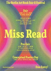
Postkarte zur Künstlerbuchmesse Miss Read Berlin, Haus der Kulturen der Welt, 13.06.–15.06.2025.
Wir freuen uns, die Termine für das diesjährige BerlinArtBook Fair & Festival bekannt geben zu können! Vom 13. bis 15. Juni 2025 wird Miss Read ins Haus der Kulturen der Welt (HKW) zurückkehren.
Im Rahmen unserer gemeinsamen Erforschung der Entkolonialisierung von Kunstbuchmessen sind wir bestrebt, Räume und Gemeinschaften zu fördern, die den Reichtum und die Breite des Verlagswesens aus aller Welt berücksichtigen. In diesem Zusammenhang wird die diesjährige Miss Read einen besonderen Schwerpunkt auf ökologisches Publizieren legen.
Der Tag der konzeptionellen Poesie findet am Samstag, den 14. Juni 2025 statt und wird die imaginäre Grenze zwischen bildender Kunst und Literatur erforschen.
Text von der Website, übersetzt mit DeepL
4 S., 28,6x20,1 cm, 4 Teile. keine weiteren Angaben vorhanden Eine Postkarte (14,9x10,5) und zwei Lesezeichen/Flyer (14,7x5), sowie Schwarz-Weiß bedruckter DIN A4-Bogen, einfach gefaltet
Werbematerial der Miss Read Berlin und des Conceptual Poetics Day. Die Buchmesse fand vom 11.10.-13.10.2024 im Haus der Kulturen in Berlin statt. Der Conceptual Poetics Day fand am 12.10.2024 Das diesjährige Design der Miss Read stammt von der mexikanischen Künstlerin Maira Fragoso Peña, das des Conceptual Poetics Day von Adrian Piper.
[4] S., 23x16 cm, Auflage: 700, 2 Stück. keine weiteren Angaben vorhanden Leichter Karton, bedruckt, einmal gefaltet, eingelegt ein Paar weiße Handschuhe bedruckt und in Plastikhülle, in bedrucktem Briefumschlag. Einmal ungeöffnet
ArtsLibris, International Fair of Artists' Books and Contemporary Edition, holds its 9th edition from 21.04.-23.04. at Arts Santa Mònica. The ArtsLibris Barcelona 2018 program includes the 5th International Symposium on Editions and Collecting and the Speakers' Corner presentations, as well as the exhibitions Biblioteques insòlites, curated by Glòria Picazo, and Nova York en fotollibres, curated by Horacio Fernández. the presentation of the fourth book of the AL Series, by Wilfredo Prieto, and several workshops. Besides, as every year, the ArtsLibris–Banc Sabadell Foundation Award will be granted. ArtsLibris has two projects of limited editions: the AL Series, a collection of artists' books produced with the support of Fundació Banc Sabadell, and the limited edition of tote bags and gloves, sponsored this year by Blueproject Foundation and designed by Ignasi Aballí.
8 S., 21x15 cm, 2 Stück. keine weiteren Angaben vorhanden Flyer (Festivalguide), leporelloartig gefaltet, beidseitig bedruckt
ZusatzInfos
Austellerverzeichnis und Kurzprogramm zu The Cologne ArtBook Fair, vom 19.-21.08.2016
Die diesjährige Messe wird 50 Aussteller präsentieren: Künstler und Verlage, die sich dem Medium Buch als Kunst verschrieben haben. Im kuratorischen Fokus steht England mit der dort beheimateten Artists’ Book-Szene. Präsentiert werden KünstlerbuchmacherInnen und selbst verlegende KünstlerInnen, die weniger auf internationalen Messen vertreten, aufgrund ihres Schaffens jedoch absolut prägend für die Künstlerbuch-Szene sind
Since 1975, Tina Barney (*1945) has been producing large-scale photographs of family and friends. Her meticulous tableaux chronicle the complexity of interpersonal relationships. In Players, Tina Barney expands her subject matter to include fashion, performers, and actors, as well as her own circle of friends. Emboldened by the cacophony when photographing on stage, Barney has embraced a more casual aesthetic that is visually exhilarating. Editor and designer Chip Kidd has translated this excitement to the pages of this new book. And Michael Stipe has contributed his poetic vertigo.
Text von der Webseite.
288 S., 23,6x15,8 cm, ISBN/ISSN 9780262018777 Hardcover Leinen
ZusatzInfos
In the 1960s and 1970s, the artist Ed Ruscha created a series of small photo-conceptual artist’s books, among them Twentysix Gas Stations, Various Small Fires, Every Building on the Sunset Strip, Thirtyfour Parking Lots, Real Estate Opportunities, and A Few Palm Trees. Featuring mundane subjects photographed prosaically, with idiosyncratically deadpan titles, these “small books” were sought after, collected, and loved by Ruscha’s fans and fellow artists. Over the past thirty years, close to 100 other small books that appropriated or paid homage to Ruscha’s have appeared throughout the world. This book collects ninety-one of these projects, showcasing the cover and sample layouts from each along with a description of the work. It also includes selections from Ruscha’s books and an appendix listing all known Ruscha book tributes.
Text von der Webseite
Ausstellerliste und Hallenplan mit den Ständen zur Messe vom 15.-16.11.2019 in der Conway Hall, Red Lion Square, London WC1R 4RL.
The Small Publishers Fair is the annual gathering of small press publishers, writers, artists, poets and book designers. 65 publishers from across the UK and around the world together with a featured exhibition, readings and talks in the historic Conway Hall, the centre of humanism and literary Bloomsbury. FREE ENTRY
Text von der Webseite
Katalog zur Messe vom 15.-16.11.2019 in der Conway Hall, Red Lion Square, London WC1R 4RL.
The Small Publishers Fair is the annual gathering of small press publishers, writers, artists, poets and book designers. 65 publishers from across the UK and around the world together with a featured exhibition, readings and talks in the historic Conway Hall, the centre of humanism and literary Bloomsbury. FREE ENTRY
Text von der Webseite
Male innerhalb und außerhalb der Linien in "Be The Change!" und fördere den sozialen Wandel und die Revolution. Mit Malvorlagen zu den Themen Einwanderung und Klimawandel kannst du deine rebellische Seite zeigen.
"Be the Change!" ist das erste Malbuch mit Kunst der Justseeds Artists' Cooperative, herausgegeben von Molly Fair, und veröffentlicht von Radix Media. Die 35 Illustrationen zeigen radikale soziale und ökologische Veränderungen und Wege zu einer gerechteren Zukunft.
Text von der Webseite, übersetzt mithilfe von DeepL.
Postkarte, von Teilnehmern auszufüllen, zum Projekt Books are Bridges, 11.03.-11.05.2021 bei A-Z, Berlin, Torstr.
How can we still find ways to connect with each other? Can books play a role in this connection? And from where to where can they take us? For the show in A — Z presents, I’ve come up with a strategy to bring people and ideas together. A participative, open, non-ending work that could exist in the space, but that couldn’t exist without a form of contact. A book that will construct itself throughout the duration of the show. The thickness, amount of pages, and content won’t depend on me but on the public. A book that functions as a bridge that connects people, ideas, ways of distribution and collaboration. The answers that are sent back to us before the end of the show, will be arranged into a growing bookwork inside of the exhibition space. Books are Bridges. Always under construction.
Text von der Webseite
George Maciunas was the founding member and leader of the most radical and experimental art movement of th 1960s: "Fluxus". Associated with artists such as Joseph Bueys and Yoko Ono, Fluxus rejected traditional systems of high art and practised a form of "anti-art" encompassing everything from photography and pavement art to poetry and drama. This biography of one of the key figures in the history of 20th-century art recounts in text and archive photographs the life story of this contradictory and unorthodox man. Emmett Williams provides anecdotes and impressions from former Fluxus colleagues and other friends (and enemies), to produce a portrait of this crusader, whose mission was to change the world - beginning with the world of art. Although tempered with wit and wisdom, his iconoclasm won him few friends amongst the art establishment during his lifetime, but Fluxus prevailed as an acknowledged force behind the upheavals in the art of the 20th century.
Text von der Webseite
720 S., 21x15x4.5 cm, Auflage: Print on demand, keine weiteren Angaben vorhanden Softcover, Schwarz-Druck auf Papiere, Titel und Autor in weißer Schrift auf dem Buchrücken. Gedruckt bei Lulu
Ink used for digital printing is one of the most precious substances in the world. A single gallon of ink costs over four thousand dollars and this is one reason why digitally printed books are so expensive.
However, the price of a book is not calculated according to the amount of ink used in its production. For example, a Lulu book of blank pages costs an artist as much to produce as a book filled with text or large photographs. Furthermore, as the number of pages increases, the price of each page decreases. A book containing the maximum number of pages printed entirely in black ink therefore results in the lowest cost and maximum value for the artist.
Combining these two features, buyers of The Black Book can do so with the guarantee that they are getting the best possible value for their money.
Text von der Webseite
Infobroschüre und Programm zur dritten Self-Publishing Fair for Design and Art, museum für angewandte kunst, Frankfurt am Main, 11.-12.10.2013.
Unter dem Titel „In Production“ untersuchen die Teilnehmer der Third Issue – Self-Publishing Fair for Design and Art am 11. und 12. Oktober im Frankfurter Museum Angewandte Kunst die Grenze zwischen Gestaltung und Druck. Im Rahmen einer Messe zeigen rund 30 junge Verlage ihre gestalterisch anspruchsvollen Bücher, Zeitschriften und Fanzines. Text von Website.
Programmheft zur Zine Fair im Museum of Contemporary Art Australia am 21.05.2018. Mit Kurzbeschreibungen der Aussteller und dem Programm, so wie einer Liste von Bezugsadressen in Australien
Elisabeth Tonnard is a Dutch artist and poet working in artists’ books, photography and literature.
She has published over forty books that are exhibited widely and held in numerous private and public collections including the Centre Pompidou, Columbia University, Getty Museum, Kunstbibliothek Berlin, MoMA Library, New York Public Library, Tate Library and the Walker Art Center. Much of her work involves responding to existing books, texts and images, reworking them into new (visual) literature. The works range in scale and method from a book that is completely invisible to a book that is a swimming pool. A catalogue of books is available here.
Text von der Webseite
Etwa 100 Betroffene, Künstler und Herausgeber von Künstlerbüchern, machen mit ihrer Social-Media-Aktion - #boycottmotto - darauf aufmerksam, dass der Berliner Buchladen und Onlineshop MottoBooks die Werke der Künstler und Verleger in sein Programm aufnimmt und verkauft, aber weder seine Mitarbeiter noch seine Autoren, Autorinnen und anliefernde Verleger*innen vollständig bezahlt. Am 28.11.2023 erscheint über diese Situation und Aktion ein Presseartikel in der taz, am 20.12.2023 erscheint ein weiterer Artikel in der Berliner Zeitung. Die Postkarte und die Visitenkarte lagen auf der Vienna ArtBook Fair 2023 aus.
About the series:
The For Everard zine series chronicles the 1977 fire at New York's Everard Baths, combining archival research with imagined narratives to re-focus attention to obscured histories. The series explores the media coverage of the subsequent investigation of the fire, and the lives of the nine men who perished. The zines bring together photographic images with primary news sources, as well as personal anecdotes collected from eyewitness testimonials.
About the individual zines:
For Everard, Vol. 1, 2013, ed. 100 (nr. 65)
This zine chronicles the May 25, 1977 fire at New York's Everard Baths and the media coverage of the subsequent investigation.
For Everard, Vol. 2 (Bloodbrothers), 2013, ed. 100 (Nr. 81)
In the second volume of his series chronicling the 1977 fire at New York’s Everard Baths, Anthony Malone focuses on Bellevue Hospital’s blood drive for the victims of the great bathhouse tragedy. Malone draws parallels between the 1977 restrictions placed on gay men for donating blood to their “brothers” and current FDA guidelines that indefinitely defer donations from men who have had sex with men since 1977. This black and white photocopied zine (ed 100) juxtaposes archival images, news clippings, and just a touch of fantasy.
For Everard, Vol. 3 (Remembering Jimmy), 2015, ed. 100 (Nr. 94)
Volume 3 of the series, For Everard is dedicated to the memory of Jimmy Stuard, who died in the tragic fire at the Everard Baths in 1977. Stuard was a rising star in the disco music scene. He spun records first at Boston’s 1270 Club, and later at New York’s 12 West, where he inspired an entire generation of musical artists and DJs. In this particular volume, Anthony Malone assembles images and archival texts that serve as a tribute to the great Jimmy Stuard.
For Everard, Vol. 4 (A Lovely Show), 2016, ed. 100 (Nr. 62)
For Everard, Vol. 4 (A Lovely Show) is a tribute to Kenneth Hill, one of the nine men who died in the devastating fire at the Everard Baths in 1977. Kenn played a vital role in the East Village/Lower East side countercultural movement in the late ‘60s and 1970s. He was a hippie, a bar tender at Phebe’s (a watering hole and salon for the experimental theater community in the 1970s), one of the founders of the Old Reliable Theatre Tavern, House Manager at La Mama Experimental Theatre Club, and a photographer. This zine celebrates Kenneth Hill by collaging archival documents with personal artifacts and pictures of Kenn from meaningful moments in his life.
For Everard, Vol. 5 (A Dearly Loved Man), 2017, ed. 100 (Nr. 95)
For Everard, Vol. 5 (A Dearly Loved Man) assembles images and stories from the life of Ira Landau, a gifted and dedicated teacher who died in the tragic fire at the Everard Baths in 1977. Ira left behind a devoted family (his mother, brother, niece, and lover) and is still greatly missed by his loved ones. This zine is a tribute to the life and accomplishments of a remarkable man who served in the Peace Corps and committed himself to educating young minds both abroad (in the Middle East) and at home in the US. It contains family photos and personal images generously contributed by Ira’s niece.
For Everard, Vol. 6 (Yosef’s Song), 2017, ed. 100 (Nr. 94)
Volume 6 of the series For Everard celebrates the life of a remarkable musical prodigy, Yosef Synovec. This zine tells the story of a young man with great aspirations who emigrated to the United States from Czechoslovakia to study classical violin. In 1976, Holly Woodlawn overheard Synovec vocalizing as he was painting the bathroom of his East Village apartment, and determined on the spot that she had discovered an emerging star. As a singer, Synovec used his extreme vocal range to imitate the voice and persona of Peruvian diva Yma Sumac. He performed Sumac’s exotic musical numbers at several New York City cabarets and show venues. Sadly, on May 25, 1977, Yosef perished in the tragic fire at the Everard Baths.
For Everard, Vol. 7 (Tony from the Bronx), 2017, ed. 100 (Nr. 86)
This zine brings together images and stories from the life of Tony Calarco, one of the nine men who died in the fire at the Everard Baths in 1977. Tony was only 26 when he died. He lived with his parents and siblings in a modest house in the Bronx. He had recently graduated from college and was working as a social worker in New York city at the time of his death. Tony had aspirations to become a lawyer and was scheduled to begin law school in September of 1977. This zine celebrates Tony Calarco’s memory through photos of Tony, artifacts from his high school and college years, and recent photographs of his home and final resting place.
For Everard, Vol. 8 (Looking for Amado), 2017, ed. 100 (Nr.84)
Amado Alamo, a young man only 17 years old, lost his life in the fire at the Everard Baths in 1977. In Volume 8 of For Everard, Anthony Malone documents his search for the identity of the youngest victim of the Everard fire. The zine is an abstracted portrait of Alamo that assembles the few extant fragments of his story culled from newspaper articles and documentary sources glued together with the artist’s imagination.
For Everard, Vol. 9 (Last Call), 2017, ed. 100 (Nr.72)
Life was difficult for Hillman Wesley Adams. He was born in Jacksonville FL in 1938. His mother died just a few months after his birth, and by the age of nine, he found himself in an orphanage with his older brother. Fast forward 30 years: Hillman moved to NYC, struggled to make ends meet while working on and off as a bartender, and he met his lover, Ralph, with whom he shared a modest apartment in New Jersey. On May 25, 1977, Hillman died in the fire at the Everard Baths. Vol. 9 of For Everard is an assemblage of newspaper articles and vintage photos chronicling the life and untimely death of Hillman Wesley Adams.
For Everard, Vol. 10 (In Memoriam: Patrick Nott), 2018, ed. 100 (Nr. 64)
Volume 10 of For Everard memorializes the life of Patrick Nott, one of the nine men who died in the fire at the Everard Baths. Nott, a native of Wales with a passion for theater, literature, and music, pursued a successful career in hairdressing. He fell in love with his pen pal (a young woman from Brooklyn) and after their marriage, they moved to New York City, where Nott worked at the Vidal Sassoon Salon. This zine weaves together elements from his story (shared with the artist by Patrick Nott’s wife), with photographs, newspaper clippings, and artifacts. It acts as a humble tribute, an “In Memoriam” for this greatly loved man.
For Everard, Vol. 11 (Thunderbird), 2019, ed. 100 (Nr. 79)
Brian Duffy was an aspiring artist. In 1966 he was accepted to Pratt Institute of Art and although he declined admission to the school, he seized the opportunity to move to NYC and start a new life for himself. In the city, he worked hard at various retail jobs and tried to break into the theater, but everything changed when he met the love of his life, Bradley. The couple moved to a “quieter life” in Boston. They worked in restaurants in the Back Bay area and created a community for themselves amongst their chosen family of friends. Volume 11 of For Everard celebrates the brief life of Brian Duffy, a young man who died in the fire at the Everard Baths in 1977. This zine compiles photographs and stories shared with Malone by Brian’s sister and dear friend.
The pseudonym "Anthony Malone" comes from a novel by Andrew Holleran (Dancer from the Dance). In this novel, Malone is the protagonist and at the end he disappears. Some of his friends believe that he may have committed suicide, others feel that he may have run away from New York, while some say that they saw him at the Everard Baths on the night of the fire. I imagine that Malone survived the fire and he is now making books and zines telling the story of the tragedy.
The Coloring Book by Dr. Lakra is the first BOM DIA KINDER book, a new series of children books made by artists. Dr. Lakra is a Mexican artist living in Oaxaca, Mexico. The images compiled inside this coloring book come from various references, inspirations, as well as drafts for the tattoos that Dr. Lakra has made, or wishes he’d made over the years. This is an insight into the world of Dr. Lakra, where many of the interests present in his work collide. ancient mythologies, punk rock fanzines, classic tattoo designs, popular culture icons, Japanese monsters, animal illustrations etc.
Text von der Website.
Programmheft zur Vienna ArtBook Fair #2, die vom 20.-22.10.2023 an der Universität für angewandte Kunst Wien stattfand. Mit einer Liste der 135 teilnehmenden Aussteller*innen, u.a. auch der icon Verlag Huber Kretschmer.
8 Teile. keine weiteren Angaben vorhanden 2 Taschen der Messe aus Papiermaterial von Europapier und
4 Aufkleber von >:eSel.at und
2 Flyer in Form einer Din A5 Aufkklappkarte von dem Wiener Fonds namens Wirtschaftsagentur Wien
Die Taschen der Messe - 4.10.-6.10.2019 - beinhalten jeweils eine Werbekarte der Wirtschaftsagentur Wien: Eine Agentur, welche kreative Ideen bis hin zu StartUps fördert und damit die Wiener Kreativszene unterstützt.
Außerdem befinden sich je Aufkleber der E.S.E.L. KG darin. Das ist eine Informationsplattform für Kunst und Kultur: für Veranstaltungen, Ausstellungen, Museen etc. – in Wien und Umgebung. Die Abkürzung steht für Erkennen, Sehen, Erfahren, Lernen.
Im Konvolut befinden sich vier Aufkleber (2 identisch) der >:eSel.at) (Schreibweise siehe Bild). Außer ihrer Präsenz in Socialmediakanälen befindet sich der tatsächliche Standort: eSeL Infobüro, Schauraum, Shop für Brauchbare Kunst im MQ – Museumsquartier Wien.
Messe für independent Künstlerpublikationen 11.-12.11.2022 im Haus der Kunst, München, mit radio 80000, das Internetradio, Eintritt frei
Im November wird das Haus der Kunst die dritte Ausgabe von Super BOOKS ausrichten. An zwei Tagen zeigen Künstler*innen, Gestalter*innen und alternative Verleger*innen ihre autonomen Produktionen. Super BOOKS wurde 2019 im Rahmen der von Sabine Brantl kuratierten Ausstellung „Archives in Residence: AAP Archiv Künstlerpublikationen“ erstmalig im Haus der Kunst veranstaltet. Das Projekt sieht sich in der Tradition unabhängiger, individueller Orte für Künstlerpublikationen, die sich seit den 1960er-Jahren im Umfeld der internationalen, post-avantgardistischen Kunstszene gebildet haben.
Aktionen
Carina Müller und Dominik Wendland bauen während der Messe vor Ort das Superbook, Jürgen O. Olbrich bietet mit seiner Bodeninstallation PaperPolice seine Objekte dem Publikum zur Mitnahme an.
Sound
Radio 80000 wird während der Veranstaltung sein Studio in der Nordgalerie des Haus der Kunst aufbauen und live ein Programm mit DJs, Performance und Sound senden.
Am 11.11.22 ab 21 Uhr wird Cosmica Bandida im Rahmen von Super Books 3 performen. Das Künstlerduo spielt experimentellen lo-fi Cumbia, begleitet von Visuals des Münchner Künstlers Merlin Stadler.
Super BOOKS wurde 2019 erstmalig im Haus der Kunst veranstaltet und ist ein Kooperationsprojekt zwischen Haus der Kunst, AAP Archiv Künstlerpublikationen, Bayerischer Staatsbibliothek, Akademie der Bildenden Künste München und Kunsthochschule Kassel.
Edited by Chapin Library of Williams College, Williamstown, texts by Robert L. Volz, Wayne G. Hammond.
The books from the Kaldewey Press are important documents of contemporary bookmaking that have been featured in exhibitions all over the world. Since the 1985 founding of his handpress, which Gunnar A. Kaldewey set up in Poestenkill, in upstate New York, over sixty unique artist books have been produced in cooperation with artists such as Jonathan Lasker, Mischa Kuball, or Richard Tuttle. Among the authors are famous names such as Samuel Beckett, Paul Celan, Marguerite Duras, and James Joyce. Published in small limited editions, the books are produced according to the highest level of craftsmanship. Kaldewey does the typesetting and prints the books, sometimes making the paper himself, too. The bookbinding is done by renowned workshops such as Christian Zwang's in Hamburg, or Jean de Gonet's in Paris.
This bibliophilic book is a catalogue raisonné of the books published to date by the press
Zum International Festival of the Artist’s Book Ljubljana 2010.
Ljubljana Artist Book Fair 2010 – the first fair of its kind in Ljubljana – which will take place at Jakopič Gallery (Slovenska cesta 9, Ljubljana) 17.-18.09.2010.
... I am writing you because I interviewed you for my research project ARTZINES, in which I explored the world of zines made by artists.
The project started in 2015, so the interview in question might have happened ages ago. If it was a video interview, it should be on Vimeo and here: https://www.youtube.com/@ARTZINESINFO
I have been collecting 88 testimonies from various people interested in zines for a very long time, and I wanted to gather all of them into a book about zines made by artists.
Then life happened, the good and the bad, until I met the Objet Papier collective, who published Print It, a web-to-print magazine generated from a website to be different each time.
For the past two years, I worked with them to create an interactive and generative ARTZINES book that is different each time it is downloaded (I counted 130.749.696 possibilities, but that’s a low estimate).
I wrote my research journey as a " Choose Your Own Adventure Book," and I am happy to tell you that you are a character in this story, since your interview is featured in the book! There are a maximum of 6 interviews in each generated PDF, so your interview won’t show in every book.
If you want to see what it looks like, you can generate PDFs of the book directly from the platform ...
Auszug aus der Email vom 05.11.2024
21x14,9 cm, Auflage: 1.000, numeriert, 2 Stück. keine weiteren Angaben vorhanden Leporello, auf Karte aus festerem Papier geklebt. Zwei Karten eingelegt.
Infoheft zur Cologne Book Fair 2017, mit Programm und Ausstellerverzeichnis. U. a. mit einer Ankündigung des Vortrags "GegenKultur entdecken - Beispiele aus dem Archive Artist Publications von den 60ern bis heute" am 02.09.2017.
Ausführliche Programmbeschreibung auf den zwei beigelegten Karten.
Allgemein Kunstinteressierten kaum bekannt und als Gegenstand eher verschlossen, ist das Künstlerbuch eine Art Ikone und Kultobjekt der Kunst- und Bibliotheksgeschichte geworden. Das Buch an sich ist einer der funktionalsten und liberalsten, oft auch preiswertesten Informationsträger der Kulturgeschichte. Doch welche Rolle spielt dabei das Künstlerbuch?
Ausgehend von einer der umfassendsten Künstlerbücher-Sammlungen der Schweiz, derjenigen der Nationalbibliothek, hat die Herausgeberin und Autorin Susanne Bieri anhand von 112 Interviews das schweizerische Artist’s Book im internationalen Kontext verhandelt, rund 450 Fragen gestellt, jedoch mehr als 450 Antworten erhalten, da diese erneut zu rund 650 Annotationen, Assoziationen und Anekdoten führten. Damit liegt mit Schweizer Künstlerbücher – Livres d’artistes suisses – Libri d’artista svizzeri – Swiss artists’ books erstmals ein einzigartiges enzyklopädisches Künstlerbücher-Kompendium vor.
Text von der Webseite
Im Kompendium sind alle Texte auf Englisch, je nach Nationalität der Interviewten zudem in der jeweiligen Landessprache - deutsch, französisch oder italienisch - publiziert worden. Das Nachwort von Susanne Bieri, Mitarbeiterin der Schweizer Nationalbibliothek, ist in allen vier Sprachen abgedruckt.
Die Buchvernissage fand am 17.06.2022 im Rahmen der Veranstaltung I Never Read, ArtBook Fair Basel in Basel statt.
Alle erwähnten Künstlerbuchtitel sind an Ort und Stelle mit einem Permalink versehen, welcher zu dem Bucheintrag in der Schweizer Nationalbibliothek führen soll.
Auf den Seiten 214-217 Interview mit Hubert Kretschmer vom AAP Archive Artist Publications. Weitere Interviewpartner aus München sind Albert Coers (Seite 60 ff), Lilian Landes von der Bayerischen Staatsbibliothek (Seite 226 ff), Jan Steinbach von der Edition Taube (Seite 350 ff).
8 S., 29x20,5 cm, keine weiteren Angaben vorhanden Faltblatt zur größten alternativen Buchmesse in Amerika, mit der Liste aller Aussteller und Distributoren, Lageplan
Programmheft mit Aufsätzen, Raumplan u.a. zum gleichnamigen Symposium, das am 25.03.2017 in der HGB Leipzig stattfand. Maike Aden über Ulises Carrion. Erik van der Weijde mit dem 4478Zine's publishing manifesto.
Titelergänzung: The dematerialization of the art object from 1966 to 1972 : a cross-reference book of information on some esthetic boundaries : consisting of a bibliography into which are inserted a fragmented text, art works, documents, interviews, and symposia, arranged chronologically and focused on so-called conceptual or information or idea artwith mentions of such vaguely designated areas as minimal, antiform, systems, earth, or process art, occurring now in the Americas, Europe, England, Australia, and Asia (with occasional political overtones), edited and annotated by Lucy R. Lippard.
In Six Years Lucy R. Lippard documents the chaotic network of ideas that has been labeled conceptual art. The book is arranged as an annotated chronology into which is woven a rich collection of original documents—including texts by and taped discussions among and with the artists involved and by Lippard, who has also provided a new preface for this edition. The result is a bookwith the character of a lively contemporary forum that offers an invaluable record of the thinking of the artists — a historical survey and essential reference book for the period.
Text von der Webseite
Ursprünglich publiziert 1973 bei Praeger, New York
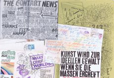
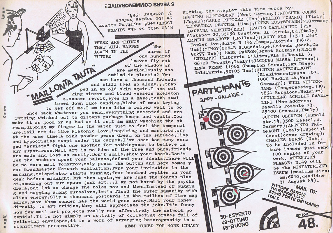
29,7x21 cm, 6 Teile. keine weiteren Angaben vorhanden 5 Schwarz-Weiss Kopien auf verschiedenfarbigen DIN A4 Papier, Briefumschlag mit Stempeln, aufgeklebten Papierstücken und Künstlerbriefmarken
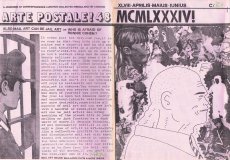
weisses Papier mit dem Lebenslauf des 1956 geborenen Vittore Baroni bis 2019, weißes Papier mit Hinweisen zu Veröffentlichungen des ARTE POSTALE! Magazins und anderen Publikationen, gelbes Papier mit Hinweis auf eine CD Veröffentlichung von Enrico Piva, blaues Papier mit Hinweis auf DVD Release "Le Forbici di Manitù & Friends - Zona Minata", fliederfarbenes Papier mit Hinweis auf die Veröffentlichung von "Tinnitus Tales", Vinyl und CDs von "Le Forbici die Manitù & Friends, Umschlag signiert
Anlässlich des 20-jährigen Bestehens des Kunstraums Factory ist dies eine Sammlung von Interviews und Briefen mit ehrlichen Geschichten und Glückwünschen über die Arbeit und das tägliche Leben von Freunden, die mit der Factory verbunden sind. Wir entfalten, wie die Factory-Freunde ihre Zeit unter demselben Dach verbringen, mit welchen Gedanken und Haltungen sie leben und welche Momente und Szenen ihnen in den Sinn kommen, wenn sie sich an ihre Tage in der Factory erinnern. Außerdem kann man sehen, welche Art von Freunden die Factory in den letzten 20 Jahren gepflegt hat und welche Art von Beziehungen sie durch die Kunst zu ihren Freunden aufgebaut hat.
Text von der Webseite, übersetzt mithilfe von DeepL.
2 S., 74x37,5 cm, 2 Stück. keine weiteren Angaben vorhanden schwarze Stofftasche, auf einer Seite mit dem weißen Aufdruck des Messenamens Super BOOKS und dem Logo des Münchner Haus der Kunst
Zum zweiten Mal seit dem Auftakt im Jahr 2019 zeigen über 50 Künstler*innen, Gestalter*innen und alternative Verleger*innen ihre Produktionen im Haus der Kunst. Damit erhält die in München sehr lebendige und aktive Künstlerbuchszene die Fläche für einen gemeinsamen Auftritt. Neben dem Schwerpunkt München sind diesmal auch Produzent*innen aus Österreich (Auslöser sowie Darja Shatalova und Kristian Ujhelji), der Schweiz (_957 Independent Art Magazine sowie GRRRR) und den Niederlanden (The Artist and the Others sowie Dutch Independent ArtBook Publishers und Lula Valletta & HOK) vertreten. Tobi Huschka aus Köln stellt Bücher vom Kunsthaus Kat18 vor, einer inklusiven Kunstwerkstatt. Die Münchner piratInnenpresse, ein Verlag von Kindern und Jugendlichen, stellt Taschenbücher und Faltkarten her. Ihr üblicher Versammlungsort ist „die Kajüte unterm Dach der Seidl-Villa in Schwabing“. Iwalewabooks hat die jüngsten Entwicklungen in der zeitgenössischen Kultur Afrikas im Fokus. Die Teilnehmenden sehen sich in der Tradition der 1960er-Jahre, als sich im Umfeld der postavantgardistischen Kunstszene neue Kommunikations- und Distributionsnetze bildeten. Ihre Produkte wie Künstlerbücher, Magazine oder Zines sind autonome Kunstwerke. Mit ihrer Ethik der Zugänglichkeit, die in Preisgestaltung und der Direktheit von Vertriebswegen zum Ausdruck kommt, bilden sie ein Gegengewicht zu den gängigen Spielregeln des Kunstmarkts.
Super BOOKS ist eine Kooperation mit AAP Archiv Künstlerpublikationen, Akademie der Bildenden Künste München und fructa space.
Kuratiert von Sabine Brantl mit Hubert Kretschmer, Martin Schmidl
Text von der Webseite
Texte: Markus Krajewski (“Bücher ungeschrieben lassen. Ein vergeblicher Versuch”), Jörg Scheller (“Bücher, Riegel, Bildungsbürger – und die Familie Mann”, E‑Mail-Dialog mit Albert Coers), Annette Gilbert (“Books to Do – Works to Do — Gespräch mit Albert Coers), Albert Coers (Kurztexte); Gestaltung: Andreas Koch mit Albert Coers Books to Do ist keine übliche Werkmonografie, sondern ein Meta-Buch über bereits realisierte und noch zu realisierende Buchprojekte von Albert Coers in Form einer To-do-Liste. Es ist Ideen- und Stoffsammlung, Dokumentation, Selbst-Anregung und lustvoll utopisches Arbeitsprogramm zugleich.
Text von der Webseite
Wide-ranging and multi-faceted this intriguing and beautifully produced book will change the way you relate to paper in an increasingly “paperless” society.
While sheets of paper are disappearing from our homes and offices, the medium is experiencing a renaissance in the worlds of art, design, and architecture. Suddenly, paper is everywhere— but not only in the old familiar places or forms. This fascinating book looks at every aspect of paper: its history, composition, production, application, and trade. Beginning with the anatomy of paper and its earliest forms, this book looks at paper as a symbol of political and economic importance and as a carrier of ideas, from literature to art, design, and music. It looks at the different surfaces, opacities, weights and volumes of paper and how it is used for printing, typography, graphics, and maps as well as a vehicle for origami, architecture, and fashion. Sumptuously illustrated with photographs and drawings, this book includes a variety of papers for readers to examine and feel, highlighting the sensual aspects of this seemingly ordinary product. Engaging, entertaining, and informative, this book contains a wealth of useful and surprising information on every printed, colored, and textured page.
Text von der Webseite
Mit Literaturverzeichnis und Liste der Museum, die sich mit Papier/Buch befassen
[2] S., 21x10 cm, 6 Teile. keine weiteren Angaben vorhanden Sechs Grafiken, Vorderseite Abbildung Stacheldraht und Schrift, Rückseite Stempel, Inkjetdruck
Peter Müller hat auf Fotografien einer Stacheldrahtinstallation den Satz Neue Freunde in aller Welt/new friends worldwide gedruckt.
Die Stacheldrahtabbildungen stammen vom Kunstwerk "Akropolis Redux" von Kendell Geers. Es war unter anderem 2017 auf der dodumenta 014 in Kassel zu sehen.
"... Alle diese freiliegenden gezackten Kanten und abrupten Ecken können ziemlich gefährlich sein, wenn Sie [Galeriebesucher] nicht vorsichtig sind. ... Der in Johannesburg aufgewachsene Künstler Kendell Geers hat potenziell schädliche Materialien genommen und einen neuzeitlichen Parthenon mit Anspielungen auf die Apartheid seines Geburtsortes gebaut. Akropolis Redux soll uns an die Gefahr und Gewalt erinnern, die die moderne Gesellschaft beherrschen, und gleichzeitig an die Segregation und all die anderen Spaltungen erinnern, die wir willkürlich errichten ..."
Text von der Webseite
This small publication is an edited reprint of the essay ‘The Book in Intermediary Form’ written by Kasper Andreasen. It was originally published by Wintertuin, Nijmegen as part of a compilation about the future of the book. Turning the Page also contains a script for the audiovisual book Tomorrow, which is a collaborative work between Hanne Lippard and Kasper Andreasen reflecting on the status of the (photography) book in audiovisual form.
Text von der Website
1. Auflage. Vermutlich unauthorisierte Kopie. Im Netz gefunden und aufgeklaubt.
The Invisible Book is a book produced in a limited edition at the affordable price of €0. It will work as a digital book too, on any platform. The edition is limited to 100 copies (neither numbered nor signed). This is a product without a single fault, available at the lowest price possible. The book was made as a reaction to both the trend of decreasing booksales and the trend of increasing expectations from audiences. Published by Elisabeth Tonnard, Leerdam, April 2012. A second edition became available in June 2012. It too was limited to 100 copies, neither numbered nor signed, but all made to perfection and available at the price of €0.
Text von der Website der Künstlerin
Das Buch kann man leider bei mir nicht anschauen. Es existiert nur in dieser Art als Datensatz auf einem Monitor
0 S., 21x29,7 cm, Auflage: 100, 2 Teile. keine weiteren Angaben vorhanden fiktives Buch, mit Zertifikat, Laserdruck auf Papier, Kaufbescheinigung von ebay und Mitteilung an den Käufer
1. Auflage. Mit Certificate of Ownership
The Invisible Book is a book produced in a limited edition at the affordable price of €0. It will work as a digital book too, on any platform. The edition is limited to 100 copies (neither numbered nor signed). This is a product without a single fault, available at the lowest price possible. The book was made as a reaction to both the trend of decreasing booksales and the trend of increasing expectations from audiences. Published by Elisabeth Tonnard, Leerdam, April 2012. A second edition became available in June 2012. It too was limited to 100 copies, neither numbered nor signed, but all made to perfection and available at the price of €0.
Text von der Website der Künstlerin
Das Buch kann man leider bei mir nicht anschauen. Es existiert nur in dieser Art als Datensatz auf einem Monitor
27x28,5 cm, keine weiteren Angaben vorhanden Plattenhülle, gestanzt mit 3 einklappbaren Teilen, beiliegend gestanzte Pappschlaufe mit handbeschrifteter DVD, Infoblatt zur Edition
What do Martin Luther and Pete Townshend, Ozzie Osbourne and Oscar Wilde, Ludwig Van Beethoven and Star Trek’s Dr. Spock have in common? They all painfully suffered from tinnitus, a permanent hiss heard in one or both ears. The condition affects a large percentage of the world population (5-10%) and represents a real “occupational illness” for musicians and rock fans. On the subject, surprisingly, an inexplicable silence is observed by the music press and industry. At the current state of medical research, there is no effective cure for chronic tinnitus and the unpleasant humming can only get worse if you do not protect the ears properly.
In the works for nearly five years, the triple concept album Tinnitus Tales (a 10" vinyl record and two CDs) conceived by Le Forbici di Manitù (i.e. Manitù Rossi and Vittore Baroni, the second long suffering from tinnitus) with the collaboration of over fifty guest musicians, bands and international visual artists, breaks the veil of silence with a series of songs that address the topic blending humor and empathy. The songs are inspired by well-known cases of people suffering from tinnitus, such as Andy Partridge of XTC or Bono and The Edge of U2. To make this "educational audio project" a more collective effort, several old and new friends - many of them with tinnitus problems - were invited to record their own versions of the songs by Le Forbici di Manitù or to contribute original compositions on the subject (included in the CD 1 Songs).
Text von der Webseite
Erschienen zur Mixed-Media-Ausstellung mit Künstler*innen aus dem LGBTQ+ Spektrum und FLINTA* vom 16.-19.02.2023 im Köşk in München im Westend.
PANTY PARADISE sind Aelita Le Quément und Veronica Burnuthian. Das queer-transbische Kunstler*innen-Duo zeigt ihre Arbeiten: Großformatige Leinwände mit Öl, Acryl, Drucktechnik, Lackfarben, Stifte, Pigmente. Aelita kommt aus Irland und Frankreich, Veronica kommt aus Armenien und Belgien, beide haben sich in der Akademie der bildenden Künste München kennengelernt und das Projekt Panty Paradise gegründet: sie malen zusammen bunte, großformatige Bilder, zeichnen kleine Comics über ihrer Lebenserfahrung als nicht-heteronormatives Paar, produzieren Musik und Videos und machen Live-Performances mit ihren analogen Maschinen. Ihre Bilder thematisieren Sexualität, Identität, das Gefühl des Andersseins und kombinieren popkulturelle Referenzen mit Spielereien.
Veronica Burnuthian ist außerdem als Musiker*in aktiv und spielt in folgenden Formationen: in der Postpunk-Noise Band Friends Of Gas, bei dem FLINTA*-Duo Spinnen sowie dem Orient-Cyber-Pop-Duo TAF – Türkisch-Armenische-Freundschaft zusammen mit der Künstlerin Gülbin Ünlü.
Text von der Webseite
1. Auflage, mit eingeklebtem Ex-Libris von Jürgen Wegner, mit Signatur Wegner mit Bleistift, "Melbourne '03". Preisangabe mit Bleistift "$ 15", mit einglegtem Papierstreifen mit Notiz.
"This work, one of the first full-length studies available of artists' books, provides both a critical analysis of the structures themselves and a basis for further reflection on the philosophical and conceptual roles they play. From codex to document, from performance to self-image, the world of artists' books is made available [...]
Text von der Webseite
2. Auflage 0817. Index is curated by Café Royal Books and supported by the Contemporary Arts Development Group at the University of Central Lancashire (Impressum)
Index began as an online open submission project. Criteria being, ‘submissions must have already been used to communicate, or be communicative in their own right’. All submissions have been removed from their original context, breaking the messages or ideas for which they were created. Using Index as a container, exhibition space and story telling device, the pages that follow have been edited to create pairs or combinations of images that can be read as new narratives. The book is an experimental exchange of out-of-context, repurposed text and image. Café Royal Books produce weekly photographic publications focussing broadly on aspects of change, usually within the UK. Founded in 2005 Café Royal Books is an independent publisher based in the North West of England.
(Text von der Webseite)
260 S., 16x11,5 cm, Auflage: 750, ISBN/ISSN 978-2-953934700 Softcover Klappeinband
ZusatzInfos
Das Buch basiert auf einem Gespräch von Christoph Schifferli, Christophe Daviet-Thery and Jérôme Saint-Loubert Bié über 12 Künstlerbücher.
The same year, in december 2009, Christophe Daviet-Thery asked to Jérôme Saint-Loubert Bié to take care of the catalog even if this book works independently from the exhibition. He invited Jonathan Monk and Yann Sérandour to have a conversation about 12 books: Bruce Nauman, Burning Small Fires, 1968 – Richard Prince, American English, London: Sadie Coles HQ and Cologne: Verlag der Buchhandlung Walther König, 2003 – Wade Guyton, Zeichnungen für ein grosse Bild, Cologne: Verlag der Buchhandlung Walther König, 2010 – Jonathan Monk, Cover Version, London: Book Works, 2004 – Mike Kelley, Reconstructed History, New York: Thea Weistreich and Cologne: Gisela Capitain, 1990 – Allen Ruppersberg, The New Five-Foot Shelf of Books, Brussels: Editions Micheline Szwajcer & Michèle Didier and Ljubljana: International Centre of Graphic Arts, 2003 – Claude Closky, Vacances à Arcachon, Paris: Editions Galerie Jennifer Flay, 2000 – Alejandro Cesarco, Dedications, New York: A.R.T Press, 2003 – Martin Kippenberger, The Happy End of Franz Kafka’s Amerika. Tisch Nr 3, Sankt Georgen: Sammlung Grässling, 1993 – Matt Mullican, Matt Mullican, Valenvia: IVAM Instituto Valenciano de Arte Moderno, 1995 – Batia Suter, Parallel Encyclopedia, Amsterdam: Roma Publications, 2009 – Yann Sérandour, Inside the White Cube: Overprinted Edition, Zurich : JRP Ringier, 2009.
Von der Webseite des Verlegers
Preface by Sarah Bodman, Essays by Walter Struve (librarian State Library of Victoria), Dr Scott McQuire (Associate Professor and Reader, School of Culture and Communication, University of Melbourne), Humphrey McQueen (freelance historian) and Des Cowley (Rare Printed Collections Manager, State Library of Victoria).
The Silent Scream: political and social comment in books by artists presents, not only a companion catalogue to an exhibition held at Monash University Rare Books, but also a journey through some of humanity's most inhumane and hypocritical moments. Reaching back to William Blake with a facsimile of his illuminated book America: A Prophecy then travelling through the two world wars and on to the modern era the catalogue provides insights into 77 influential books and works presented in book form.
Von der Webseite
332 S., 23,2x15,9 cm, ISBN/ISSN 978-3-775728331 Softcover, Klappbroschur mit Schutzumschlag, Text
ZusatzInfos
erschienen zur Ausstellung The Book(s) 1968-2010 im deSingel Antwerpen und im el Canodrom Barcelona 2011/2012.
Since the early seventies, he has incorporated text and line drawings into his books, later integrating maps and photos of urban spaces. His consistent and sharply delineated oeuvre is devoted to examining the meaning of “space.” In 1993, the publisher, book collector, and curator Guy Schraenen commented the following on Downsbrough’s publications: “We could talk about the zero degree of the book, since it presents itself here in its simplest form.” This catalogue provides an overview of the eighty-five books that have been published to date.
Text von der Webseite
Messe für independent Künstlerpublikationen 12.-13.11.2021 im Haus der Kunst, München, mit radio 80000, das Internetradio. Südgalerie 1. Stock, Eintritt frei
Zum zweiten Mal seit dem Auftakt im Jahr 2019 zeigen über 50 Künstler*innen, Gestalter*innen und alternative Verleger*innen ihre Produktionen im Haus der Kunst. Damit erhält die in München sehr lebendige und aktive Künstlerbuchszene die Fläche für einen gemeinsamen Auftritt. Neben dem Schwerpunkt München sind diesmal auch Produzent*innen aus Österreich (Auslöser sowie Darja Shatalova und Kristian Ujhelji), der Schweiz (_957 Independent Art Magazine sowie GRRRR) und den Niederlanden (The Artist and the Others sowie Dutch Independent ArtBook Publishers und Lula Valletta & HOK) vertreten. Tobi Huschka aus Köln stellt Bücher vom Kunsthaus Kat18 vor, einer inklusiven Kunstwerkstatt. Die Münchner piratInnenpresse, ein Verlag von Kindern und Jugendlichen, stellt Taschenbücher und Faltkarten her. Ihr üblicher Versammlungsort ist „die Kajüte unterm Dach der Seidl-Villa in Schwabing“. Iwalewabooks hat die jüngsten Entwicklungen in der zeitgenössischen Kultur Afrikas im Fokus.
Die Teilnehmenden sehen sich in der Tradition der 1960er-Jahre, als sich im Umfeld der postavantgardistischen Kunstszene neue Kommunikations- und Distributionsnetze bildeten. Ihre Produkte wie Künstlerbücher, Magazine oder Zines sind autonome Kunstwerke. Mit ihrer Ethik der Zugänglichkeit, die in Preisgestaltung und der Direktheit von Vertriebswegen zum Ausdruck kommt, bilden sie ein Gegengewicht zu den gängigen Spielregeln des Kunstmarkts.
Die Publikationen können direkt vor Ort gekauft werden.
Super BOOKS ist eine Kooperation mit AAP Archiv Künstlerpublikationen, Akademie der Bildenden Künste München und fructa space.
Kuratiert von Sabine Brantl mit Hubert Kretschmer, Martin Schmidl sowie Quirin Brunnmeier und Malte Wandel.
352 S., 21x15 cm, ISBN/ISSN 9782915859416 Broschur mit Banderole, eingelegt ein Informationsblatt
ZusatzInfos
Originalausgabe erschienen bei Artists Press, Bern, 1980.
This book is the third and final version of the first artist’s book published in 1960 by herman de vries, who is currently the author of more than one hundred publications.
The story of this book dates back to 1960. Closely associated with the Zero Group, but also drawn to the buddhist concept of emptiness, herman de vries had just produced a series of white monochromes when he self-published a twenty-page booklet in Arnhem. It had no title, its cover was blank and its pages were unprinted. It contained nothing but a short final poem celebrating, in four languages, the superabundance of white: “wit is overdaad”. In 1962, this manifesto appeared in another version, now entitled wit: two hundred blank pages, four white collages by the artist and an introduction, itself completely blank, by the poet J. C. van Schagen, published in arnhem in only five copies by M. J. Israel. It was followed in 1967 by a second “revised” edition, wit weiss: two hundred and fifty blank pages, pocket-sized, in five hundred copies, published by Hansjörg Mayer in Stuttgart. The only printed elements were the artist’s name, the title and the publisher’s name on the cover, the word “introduction” and the name of its author on the very first page and a colophon on the final page. In 1980 the Artists Press in Berne published the “third revised edition”, in a larger format and with more pages. The original title wit was translated into english and japanese and into sanskrit with a word that means “white” in the sense of bright, pure, immaculate. The title itself does not appear on the book, which remains completely blank. It is printed with the paratext on a broad strip of paper in the form of a detachable publicity strip. The inside flap contains a brief statement initially dating back to the 1962 edition, stating that this book incorporates all aspects of reality. Of the five thousand copies advertised, only a hundred were published. It is this last edition, the most radical, which is republished here, the only addition being the french translation of the statement.
On 1 april 2012, herman de vries wrote of his book, insisting on the importance of the final comma:
white is white
0 = 0
no name
no idea
not even emptiness,
Eine dreidimensionale Papierskulptur mit acht verschiedenen Ansichten. Ein Pop-up-Buch als Hommage an die zeitgenössische Kunstbuchszene.[...] Anders als bei normalen Büchern öffnet sich der Einband von The Space Book of Book Space in aufrechter Position um volle 360 Grad und verwandelt sich dank integrierter Magnete nahtlos in ein Objekt, das eine dreidimensionale Szenerie präsentiert. Wie Nebenräume in einem Haus zeigen seine vier Viertel dreidimensionale Momentaufnahmen von Buchpräsentationsräumen und Veranstaltungen, die den Prozess der Arbeit mit Büchern im Kunstbereich beleuchten.
Text von der Webseite übersetzt mit DeepL
The independent publisher's quarterly by Drucken Heften Laden. Drucken Heften Laden discusses and analyses the conditions and possibilities for independent publishing in the context of art and city (politics). Drucken Heften Laden derives from an eponymous exhibition, workshop and series of events at neue Gesellschaft für bildende Kunst (nGbK) in Berlin which took place in January 2015. Since then a small group of Berlin-based producers and publishers gathers regularly: “We share experiences and resources, and build a discourse around production methods and values as well as the distribution of books and booklets.Publishing is always set in distinct time and space. Today’s diversity of media fosters hybrid formats between the analogue and the digital. We are interested to negotiate and sharpen our idea of what „independent“ and „self“ publishing means today.Drucken Heften Laden filters and disseminates information, and creates a public platform for exchange and discussion, accessible to everyone interested in such practice.”
Text von der Website.
The small publishing house is specialized in high quality artist books that are conceived as an integral part of an art work or as the art work itself that, often, plays with the format of the book and reflects its medium. In 2014, the first book of Bom Dia Kinder, a new series of children books made by artists, was launched.The books of Bom Dia are produced in close collaboration with a group of fellow artists.
Text von der Webseite
72 S., 13,8x21,5 cm, keine weiteren Angaben vorhanden Drahtheftung, farbiger Einband, Exlibris und braune Papiertüte mit Einstecker eingeklebt
ZusatzInfos
Katalog und Lieferverzeichnis zur Ausstellung in der Art Gallery of Southwestern Manitoba, 02.07.-21.08.1998.
Renegade Library was a major mail art project that challenged artists in the networks to collaboratively use postal systems to produce and circulate books, zines, book-objects, artists books, multiples and more. Over 700 artists participated, and over 500 artists books were produced.
Text von der Website
Miss Read: The BerlinArtBook Fair is celebrating the 10th year of its existence by bringing together 263 exhibitors and with the publishing of an anthology called »Publishing Manifestos«. »Publishing Manifestos« features key texts of critical engagement with publishing from protagonists of the field. The book also features a comprehensive WHO IS WHO of publishers, as they showed up in 10 years Miss Read, with 600 separate entries, as well as information about activities of Miss Read since its inception in 2009. Text von der Webseite
Mit Eintrag Archive Artist Publications, S. 225
The title says it all, two hundred little known alternative facts. Count them. They are painstakingly researched and they are true. The full truth about Mr T, all you need to know in this time of fake news and demagogy. This is a great brochure. It’s true. It’s one of the best brochures ever. This very special brochure is only available as long as Mr T is in office.
It's sold at the fantastic price of just € 3 per copy. And things get better: There is a special unlimited quantity discount – just € 25 for a bundle of 10 copies. Get them for your friends.
The day he resigns or gets impeached or assassinated or is replaced by another president, the remaining stock will be sent to hell. Until then a free copy of this great brochure will be included in every book order. And that is a fact.
Text von der Website.
am 08.02.2021 wurde die Restauflage des Heftes vom Autor, wie versprochen, geschreddert
Thirty-four Madonna Inn postcards in a bookwith a red cover, entitled Replicated. If you prefer bookswith blue covers you may prefer Borrowed. Both books are part of ABCED, a multi-volume book project created by members of ABC Artists’ Books Cooperative to celebrate Ed Ruscha’s seventy-fifth birthday. ABCED was available from December 2012 until December 2013 only.
Text von der Webseite.
Die 1. Direkte Auktion ist eine Initiative des Auktionshauses Jeschke van Vliet mit der Zentralen Intelligenz Agentur und Freundinnen: eine Versteigerung aus Berlin, in Berlin, für Berlin und den Rest der Welt: 19 Kuratorinnen-Teams haben in 19 Chaptern eine einzigartige Mischung aus mehr als 400 Kunstwerken und Artefakten versammelt, die vom 26.–28.11.2020 unter den Hammer kommen: von Emerging bis Established. Von Cheap-Art bis Bluechip. Von Postcolonial über Post-Internet-Art bis Klassische Moderne. Bekannte Namen wie Neo Rauch, Banksy, Rosemarie Trockel, Julian Schnabel und Georg Baselitz stehen neben Berliner Lokalgrößen und Künstlern, die Ihr Publikum noch finden.
Die Direkte Auktion ist das erste Projekt seiner Art: Die Berliner Kunst- und Kulturszene hilft sich selbst. Zwei Drittel der Nettoerlöse landen direkt bei den Künstlerinnen und Einlieferinnen. Die Kuratorinnen aus Kultur- und Kunstprojekten erhalten noch einmal zehn Prozent. Zusätzlich besteht die Option für Kuratorinnen und Künstlerinnen ihre Honorare zu spenden. Jeschke van Vliet verzichtet auf das sonst im Auktionsmarkt übliche Provision. Lediglich die gesetzliche MwSt. von z.Zt. 16% und VG-Bildkunst von 4% fallen auf den Netto-Hammerpreis an. Als Auktionshaus ist es uns ein Anliegen, dieses bislang einzigartige Projekt partnerschaftlich und damit die in Berlin lebenden und ansässigen Künstlerinnen, Kunstvermittlerinnen und Galeristinnen zu unterstützen und zugleich unserer Verantwortung am Kunstmarkt Rechnung zu tragen.
Text von der Webseite
Where can artist publishers, zine makers, librarians, artist book archivists, print activists, and others in this self-organized community hang out when there isn’t a fair, a fest, an event, or gathering to bring us together? Temporary Services, 2019
Temporary Services have created a new online discussion forum for artist book publishing called Artist Publisher. Please tear off a tab, visit the site, spread the word, and join them in multiple discussions around artist book making, zine publishing, printing, distribution, archiving and more.
Text vom Flyer
80 S., 26x21 cm, ISBN/ISSN 978-3-863350857 Katalog zur Ausstellung im MAK Wien, MGLC Ljubljana und UPM Prag, Klappumschlag
ZusatzInfos
Vorwort von Helena Koenigsmarková, Nevenka Sivavec & Christoph Thun-Hohenstein. Beiträge von Jianping He, Martina Kandeler-Fritsch, Kathrin Pokorny-Nagel, Florian Pumhösl, Lucie Vlcková, Lawrence Weiner & Maria White.
Um das vielschichtige Genre des Künstlerbuchs einer breiteren Öffentlichkeit näherzubringen, hat das MAK Wien in Kooperation mit dem UPM Prag und dem MGLC Ljubljana das EU-geförderte Projekt "Artists' Books on Tour. Artist Competition and Mobile Museum" initiiert. Im Rahmen des damit verbundenen europaweiten Wettbewerbs wurden Künstler dazu aufgefordert, sich mit der Thematik des Künstlerbuchs und seinen vielfältigen ästhetischen Ausdrucksformen auseinanderzusetzen. Die vorliegende Publikation stellt die fünf prämierten sowie 45 weitere ausgewählte Projekte vor.
To familiarize a broader public with the multi-faceted genre of artists' books, the MAK - Austrian Museum of Applied Arts, Contemporary Art in Vienna, the UPM - Museum of Decorative Arts based in Prague and Ljubljana's MGLC - International Centre of Graphic Arts have launched the EU-funded project "Artists' Books on Tour. Artist Competition and Mobile Museum". In a pan-European competition, artists were invited to deal with the subject of artists' books and their multiple forms of aesthetic expression. The present catalogue features the five winning projects and 45 other selected works.
90 S., 29,6x20,9 cm, Auflage: 400, ISBN/ISSN 978-3-868740097 Broschur. Mit Sticker auf dem Cover
ZusatzInfos
In 1972, Ulises Carrión produced his first artist's book "SONNET(S)" which consists of a 44 variations of a sonnet by Dante Gabriel Rosetti titled "Heart"s Compass".Using the langage like a material, Carrión writes Rossetti's poem over and over again on a typewriter, in slightly different versions. This book today is considered Carrión’s first “artists book”, where he still uses language, but quite differently.
In 2009 Michalis Pichler, in a similar approach but using a computer, probably word or open office, created 44 new variations and published a book titled "SOME MORE SONNET(S)". - On the last page of this book announced a multitude of OTHER SONNET(S), mostly imaginary.
Text von der Webseite
Reprint der Erstausgabe von 1982. Martin Parr's Bad Weather is the debut book from Britain's most world-renown and prolific photographers. Armed with wry humor (and a water-proof camera), Parr captured the social landscape of the UK during downpours, snow storms and the most challenging elements. Published in 1982, Bad Weather has been long out of print and is one of Parr's most sought after books. Books on Books #17 offers an in-depth study of this important photobook including a new essay by Thomas Weski called Even the Queen Gets Wet.
Text von der Webseite.
Book functions as a mobile extension to the exhibition Book Show. Including a facsimile reprint of Ulises Carrión’s ‘The New Art of Making Books’ as it originally appeared in the journal Kontexts, an illustrated text by James Langdon and additional works, both existing and newly commissioned.
The Soviet Union was unique in its formidable and dynamic use of the illustrated book as a means of propaganda. Through the book, the U.S.S.R. articulated its totalitarian ideologies and expressed its absolute power in an unprecedented way—through avant-garde writing and radical artistic design that was in full flower during the 1920s and ’30s. No other country, nation, government or political system promoted itself more by attracting and employing acclaimed members of the avant-garde. Among them were writers like Semion Kirsanov, Vladimir Mayakovsky, Ilya Selvinsky, Sergei Tretyakov and Kornely Zelinsky. artistic designers like Gustav Klutsis, Valentina Kulagina, El Lissitzky, Sergei Senkin, Varvara Stepanova, Solomon Telingater and Nikolai Troshin. and photographers including Dmitry Debabov, Vladimir Griuntal, Boris Ignatovich, Alexander Khlebnikov, Yeleazar Langman, Alexander Rodchenko, Georgy Petrusov—not to mention many of the best printers and book binders.
The Soviet Photobook 1920–1941 presents 160 of the most stunning and elaborately produced photobooks from this period and includes more than 400 additional reference illustrations. The book also provides short biographies of the photobook contributors, some of whom are presented here for the first time.
Text von der Webseite.
BOM DIA BOA TARDE BOA NOITE — ‘good day, good afternoon, good night’ in Portuguese — conveys the idea that books can become part of everyday life, regardless of the time of day. BOM DIA was founded in 2011 by Manuel Raeder and Manuel Goller in Berlin, solely run by Manuel Raeder since 2013. BOM DIA is specialized in high quality artist books that are conceived as an integral part of an art work or as the art work itself that, often, plays with the format of the book and reflects its medium. A focus of BOM DIA lies in publishing contemporary artists from Latin America. The books of BOM DIA are produced in close collaboration with a group of fellow artists, among others Henning Bohl, Daniel Steegmann Mangrané, Mariana Castillo Deball, Haegue Yang, Leonor Antunes, Abraham Cruzvillegas, Danh Vo, Nina Canell, and BLESS.
Text von der Webseite
Programmheft zur Zine Fair im Museum of Contemporary Art Australia, 26.04.2013. Mit Kurzinterviews mit den Ausstellern und einer Liste mit Zine-Shops in Australien
Zur Veranstaltung 08.09.-09.10.2022 in München
VARIOUS OTHERS is the international format of the Munich art scene. Its most ambitious players—galleries, artist-run spaces, and institutions—invite you to get to know the city’s most important art venues in all their diversity. In collaboration with international partners, VARIOUS OTHERS offers artists, collectors, curators, gallery owners, and art enthusiasts from all over the world contemporary art of the highest quality and relevance. With its splendid kick-off during the second weekend of September, VARIOUS OTHERS heralds the start of the fall art season and is a fixed event in the international art calendar. With its up-to-date, varied, and high-quality program of exhibitions and events, VARIOUS OTHERS promotes the visibility of Munich as a vibrant art city.
Through our partnership concept—galleries and artist-run spaces invite partners to jointly realize exhibitions—we strengthen international exchange and collaboration and share those values with our guests and partners. During four rich weeks, we invite our guests and friends to experience great sites of contemporary art in Munich and get to know the artists who work here—and thus discover new things. ...
Text von der Webseite
29,7x21 cm, 4 Teile. keine weiteren Angaben vorhanden Gefaltetes Blatt, eingelegt ein Bogen Mail Order Form, eine Postkarte von Barbara Helmer mit handschriftlichem Gruß vom PrintRoom, eine gefaltete Risoprint Edition
Erschienen zu INEXISTENT BOOKS II at PrintRoom Rotterdam 17.11.2020-31.01.2021.
Inexistent Books wants to celebrate the invisible in times of hypervisibility, embrace paradox and explore the anti-heroic utopian potential of the anti-medium. We have asked artists for nonexistent books—a’ps that did not exist before, have been idle, deal with non-existence or simply refuse to exist.
The ephemeral bookstore organised by Jan Steinbach first appeared in collaboration with I Never Read at Schaulager in September 2020.
Text von der Webseite
Edition Holes [Special Edition], 2020 von Sveinn Fannar Johannsson, 13/50
Englische Version des Buchs "KRITZEL" der gleichen Autorinnen.
"Doodled is almost everything, always and everywhere. Even horses! Who knows what a great line is? A straight, clean one or a crooked, smeared one? In the picture book DOODLE, Doodle himself is talking. And we listen, look closely, and ask ourselves questions like, “When is a line an arm?” In this book, the arm is the beginning of a story. DOODLE shows kids that you can do quite a lot with just a few quick strokes. And that you should never underestimate Doodle."
(Text übernommen von der Internetseite https://www.felderbooksberlin.de/kritzel_doodle/)
Das Buch erschien im Rahmen der gleichnamigen Ausstellung "Streetopia" (2012) die in der Luggage Store Gallery in San Francisco eröffnet wurde und sich gegen ein geplantes Bauprojekt und damit gegen die Gentrifizierung der Stadt richtete.
After San Francisco’s new mayor announced imminent plans to “clean up” downtown with a new corporate “dot com corridor” and arts district - featuring the new headquarters of Twitter and Burning Man - curators Erick Lyle, Chris Johanson, and Kal Spelletich brought over one hundred artists and activists together with neighbourhood residents fearing displacement to consider Utopian aspirations and to plot alternate futures for the city. Opening in May 2012 at the Luggage Store Gallery, the resulting exhibition Streetopia was a massive anti-gentrification art fair that took place in venues throughout the city. For five weeks, Streetopia featured daily free talks, performances, and skillshares while operating a free community kitchen out of the gallery.
This book brings together all of the art and ephemera from the now-infamous show - featuring work by SWOON, Barry McGee, Emory Douglas, Monica Canilao, Rigo 23, Xara Thustra, Ryder Cooley, and many more. Using the format of an exhibition catalog as a jumping off point, the book also includes essays and interviews with key participants that consider the effectiveness of Streetopia’s projects while offering a deeper rumination on the continuing search for community - and for Utopia - in today’s increasingly homogeneous and gentrified neo-liberal cities in an era of unprecedented wealth disparity.
Text von der Website
[80] S., 29,7x22 cm, ISBN/ISSN 978-3-905999136 Rollo Nr. 22, 6. Auflage. Metallspiralbindung, Risographie
ZusatzInfos
Stefan Marx’ coloring book was the first publication ever to be released by Rollo Press in early 2008. Since then, due to popular demand, it has been extended and reprinted using the risograph for five times, adding up to a total print run of 1000 copies. In early 2012, we released this offset version, which features a whole bunch of new animals as well as it marks a step forward in terms of the object, employing a silkscreend hard cover and semi-concealed wire-o binding.
Text von der Webseite
Collected Works compiles eight of my books into one convenient volume. The books are combined together, so that page one of Collected Works is a "sandwich" of the first page of all eight books, page two contains the second page of each book, page three the third page, etc. Collected Works reproduces Squares With Sides And Corners Torn Off, Some Los Angeles Apartments, Real Estate Opportunities, The Location of Lines, and Records in their entirety, plus excerpts from 60 Years Later, Arcs Circles & Grids, and The Xeroxed Book. - Eric Doeringer
Text von der Webseite
A workshop and competition for book artists at the Bodleian Library, Oxford. 01.12.2017-11.03.2018
The exhibition Designing English at the Bodleian Library 2017-18 will illustrate the layout of English literature in handwritten manuscripts and inscriptions across the Middle Ages, from Old English picture books to early Tudor plays and manuals for handling swans. It will trace the different spaces granted to English through the first thousand years, from stray notes scratched into Anglo-Saxon herbals or fragments of lost medieval songs in the margins, to masterpieces placed centre-page and framed by illustration and illuminated borders. it will cover both books and other objects, from grisly tombs to charms written on food.
Text aus dem exhibition summery
Acclaimed artist Kenneth Goldsmith’s thousand-page beautiful homage to New York City. Here is a kaleidoscopic assemblage and poetic history of New York: an unparalleled and original homage to the city, composed entirely of quotations. Drawn from a huge array of sources—histories, memoirs, newspaper articles, novels, government documents, emails—and organized into interpretive categories that reveal the philosophical architecture of the city, Capital is the ne plus ultra of books on the ultimate megalopolis.
It is also a book of experimental literature that transposes Walter Benjamin’s unfinished magnum opus of literary montage on the modern city, The Arcades Project, from 19th-century Paris to 20th-century New York, bringing the streets to life in categories such as “Sex,” “Commodity,” “Downtown,” “Subway,” and “Mapplethorpe.”
Capital is a book designed to fascinate and to fail—for can a megalopolis truly be written? Can a history, no matter how extensive, ever be comprehensive? Each reading of this book, and of New York, is a unique and impossible passage.
this book is a book project published by Viaindustriae that involves contemporary artists in thematic exhibitions and side vents. There are studies and researches by operators, curators, publishers, and specific artist's interventions in the pages. The discussion panels opened within a series of workshops are included in the publication that treats the archiving criteria in the artist's book practice. The operation focuses on three sections: INbook (filing and actions), OUTbook (multiplication and digression), IFbook (artist's book and infinite hypothesis). There are texts by Emanuele de Donno, Giorgio Maffei, and specific pages projects by Celine Comporelli, Imvermomuto, Dubbin/Davidson, Amedeo Marteghni, M+M, Daniela Comani, Banu Cennetoglu, Markus Miessen, Daniel Eatcock, Helen Sommer, Edamimomda/Cramer, and Documentation Celine Duval.
from the publisher
Post-Deweyed, these works form an entirely new corpus, showcasing the artists’ book not as a by-product of the book per se, but both its antecedent and post-digital flowering, many salient twentieth-century features proleptically flickering here and there through time, its epigenetic influence finally come to permeate mainstream book design everywhere, the manifold traits and studio processes inherent to the artists’ book bursting from their stitched sheath, cheerfully pollinating the whole gamut of reading impedimenta and spaces.
Text von der Webseite
2004 winner of I.D. Magazine's Design Distinction award, Absence is the third book to come out of Printed Matter’s Publishing Program for Emerging Artists, a program made possible through the generous support of New York City's Department of Cultural Affairs, The Andy Warhol Foundation for the Visual Arts, the Elizabeth Firestone Graham Foundation, and the Heyday Foundation. The generosity of Whitney trustees Melva Bucksbaum and Raymond J. Learsy was instrumental to the Museum’s participation in the publication of this exciting new work.
Both a book and a sculptural object, Absence is a memorial to the twin towers of the World Trade Center. Yoon, an architect and designer who is currently an Assistant Professor of Architecture at the Massachusetts Institute of Technology, chose not to produce a traditional design proposal for the World Trade Center Memorial Competition. Instead she created a non-architectural, non site-specific space of remembrance: a portable personal memorial in the form of book.
At almost two pounds, Absence has a considerable physical presence, but it is in every way the ghost of a presence, and it is this ghostliness that gives it its particular emotional weight. A solid white block of thick stock cardboard pages, the book’s only "text" consists of one pinhole and two identical squares die-cut into each of its one-hundred-and-twenty pages – one for each story of the towers including the antenna mast. These removed elements lead the reader floor by floor through the missing buildings towards the final page where the footprint of the entire site of the World Trade Center is die-cut into a delicate lattice of absent structures.
Of all of the proposed monuments and grand designs for the twin towers to emerge in the last two years, Absence is remarkable for its employment of an under-used strategy: restraint. The simplicity of Yoon’s materials and her use of repetition speak, without words, about unspeakable loss. Quiet, respectful, mournful, the book does not aim to represent the magnitude of the disaster. Instead it appeals to the vastness of the reader’s imagination and capacity to grieve. The human scale of her memorial operates on a personal level – it delivers the memory of lives lost into the reader’s hands. At the same time, as a scale model of a vanished architectural site, it operates on a larger cultural level by commemorating the site itself.
Text von der Webseite. Fotos Xenia Fumbarev
Unfinished Memories: 30 Years of Exit Art is an intimate portrait of an institution that from 1982 to 2012 challenged social, political, aesthetic and curatorial norms. Committed to experimenting at the intersection of disciplines, publications and design, the gallery Exit Art remained steadfast in its mission to provide new possibilities and opportunities for artists, curators and viewers through its expansive historical shows, exhibitions of emerging and under-recognized artists, experimental theatre and performance works, as well as national and international film and video programs.
Conceived by Exit Art’s founders, Jeanette Ingberman and Papo Colo, this volume is a resource on more than 200 exhibitions, events, festivals and programs featuring more than 2,500 artists, presented within the larger context of the art world. More than seventy eyewitness accounts and idiosyncratic recollections from artists, curators, critics and friends create a vivid sense of the exhibitions, performances, screenings, discussions, ideas and people that were part of Exit Art during its three-decade run.
Text von der Webseite
Although the history of photography and the history of photo and artists’ books is widely documented, collected, exhibited, and discussed, the legacy of women using photography in print is underdocumented, cursory, fragmentary and too often, inaccurate. Women were always at the forefront of innovation and the political debate on photography, despite the harsh conditions in which they often lived and worked, but their voices and their historical contribution are still marginalised. As the feminist art historian Linda Nochlin asked, what are the implications of this rejection and what elements of these practices do we need to reevaluate? And why does it matter, beyond the historical inaccuracies? On the occasion of Paris Photo, Paper News is launching this Special Issue dedicated to women in print.
Text aus dem Heft.
Dieses Buch erschien im Rahmen der Ausstellung "How to maneuver: Shapeshifting texts and other publising tactics" in Abu Dhabi im Warehouse421 vom 10.12.2019-16.02.2020.
Publizieren ist der Akt des Öffentlichmachens. Es ist nicht auf bestimmte Produzenten, Produktionssprachen, geheiligte Vertriebswege und privilegierte Leser beschränkt. Dies ist kein Verlagswesen, wie wir es kennen. In der arabischen Welt gibt es eine wachsende Zahl von Buchmessen und Kunstbuchmessen. Diese beiden Arten von öffentlichen Plattformen laufen parallel zueinander und repräsentieren unterschiedliche, wenn nicht sogar gegensätzliche Ökonomien des kulturellen Kapitals, Systeme der Repräsentation von Subjekten und Subjektivitäten sowie Strategien der Begegnung und des Gesprächs mit einem Publikum. Diese Ausstellung entstand aus dem Bedürfnis heraus, die Grenzen zu hinterfragen, die das Verlagswesen vom unabhängigen Verlagswesen oder die Mainstream-Kulturproduktion von der alternativen Kulturproduktion trennen. Der Raum, der diese verschiedenen Regime von Autorschaft, Verlagswesen und Leserschaft trennt, ist auch der Raum, in dem diese Unterschiede manövriert werden können - in dem Grenzen kreativ in Frage gestellt und verfestigte Praktiken dazu verleitet werden, in verschiedenen Sprachen zu sprechen. Dies ist der Raum, in dem sich diese Ausstellung bewegt. How to maneuver folgt den Spuren ausgewählter künstlerischer und verlegerischer Praktiken und der Räume, die sie zu schaffen versuchen. Die präsentierten Werke bieten eine reiche Vielfalt an historischen und zeitgenössischen Reflexionen über die Sprachen und Formate, die von der dominanten Verlagsindustrie an den Rand gedrängt werden - die brüskierten Genres, die geächteten Themen, die beunruhigenden Subjektivitäten, das Exzessive, das Minimale, das Unrentable und das Unergründliche. Durch die Ausstellung, ihre Kunstwerke, Publikationen und strukturellen Interventionen erhalten wir einen Einblick in einige der kulturellen Räume und Agenturen, die durch unabhängige künstlerische und verlegerische Praktiken zurückgewonnen werden. (Quelle: salonfürkunstbuch)
This gorgeously illustrated deluxe volume shows the full range of Warhol’s work for magazines—which will surprise even his most ardent fans—and includes cover art, editorial illustration, and ad work.
Beginning with the cover of a 1948 issue of Carnegie Tech’s student magazine, Cano, and ending with a 1987 issue of Jet Society International, this stunning book explores, for the very first time, the full story of Warhol’s collaborations with some of the most influential publications of the 20th century, including Harper’s Bazaar, Vogue, Time, TV Guide, Vanity Fair, and Playboy. Generously illustrated with images of the magazine layouts, this landmark publication collects more than 400 issues, revealing the artist’s full range of styles while also charting his artistic development over the decades. From charming drawings of shoes, hats, flowers, and cats to iconic illustrations of cars and cosmetics, from glitzy celebrity portraits to sexy pinups made with collaged Polaroids, this catalogue raisonné sheds new light on the influence of the media and consumerism on contemporary art (and vice versa) even as it offers a unique perspective on Warhol’s deep and lifelong connection to popular culture.
Text von der Webseite
• Postkarte mit per Schreibmaschine geschriebener Nachricht an Kattenstroth, diverse Stempel, signiert, 06.05.1984
• A4 Schwarz-Weiß Kopie, zweimal gefaltet, Illustration, signiert, rückseitig handschriftlicher Brief, Stempel, Künstlerstempel,13.06.1984
• Handschriftlicher Brief an Kattenstroth vom 14.07.1984, diverse Buntstifte, Stempel
• A4 Schwarz-Weiß Kopie, zweimal gefaltet, grafische Arbeit, signiert, rückseitig handschriftlicher Brief, 26.07.1984
• Brief an Kattenstroth mit Prägung der Nationalen Briefmarken-Ausstellung in Halle 1984, 2 Postkarten, illustrierte Originale, handschriftliche Nachricht, jeweils signiert, 08.08.1984
• Brief an Kattenstroth, Umschlag beklebt mit Aquarell; 2 Postkarten mit originalen Bleistift und Buntstiftzeichnungen, signiert, rückseitig ausführliche handschriftliche Nachricht; Postkarte aus dem Sommerstudio in Summt, Mühlenbeck, Poststempel vom 29.08.1984
• Brief an Kattenstroth, 2 Postkarten, typografische Motive, handschriftliche Nachricht, Schwarz-Weiß Fotoabzug "Grüss aus Pankow" 13.10.1984
• A4 Schwarz-Weiß Kopie, Einladung Galerie im Turm, 04.10.1984
• Brief an Kattenstroth, Einladung zur Eröffnung der Ausstellung "Zeichnungen - Collagen -Assemblagen, Robert Rehfeldt", Galerie im Turm, Verband bildender Künstler der DDR, 1984
• Brief an Kattenstroth, Schwarz-Weiß Kopie "The Contart News 1985" Contartarchive, Stempel, Künstlerstempel; Postkarte Schwarz-Weiß Xerox, typografisches Motiv, signiert, 02.01.1985
• Brief an Kattenstroth, 3 Postkarten, illustrierte/ collagierte Originale, jeweils signiert; Schwarz-Weiß Kopie grafische Arbeit A4 "Musik für Papier" auf Thermopapier, Poststempel vom 29.06.1985
• Brief an Kattenstroth, 4 Postkarten, illustrierte/ collagierte Originale, Schwarz-Weiß Druck, Schwarz-Weiß Xerox, signiert, beigelegt 2 kleine Schwarz-Weiß Abzüge, Schnipsel mit Künstlerstempel von Thomas Westermann, Poststempel vom 24.07.1985
• Brief an Kattenstroth, Schwarz-Weiß Kopie "The Contart News 1986" Contartarchive, Stempel, Künstlerstempel; Postkarte "Zeichnen macht Frei"; Poststempel vom 23.12.1985
• Postkarte mit handschriftlicher Nachricht an Kattenstroth, Schwarz-Weiß Xerox Motiv, typografisch, Stempel, Künstlerstempel, 18.08.1986
• 4 Postkarten, Schwarz-Weiß, typografisch, illustriert, Stempel, teils signiert und datiert von 1984-1986
• A4 Schwarz-Weiß Kopie auf gelbem Tonpapier, zweimal gefaltet, grafische Arbeit "Musik für Papier"
Robert Rehfeldt wurde am 5. Januar 1931 in Stargard, Pommern, geboren. Er wuchs dort und in Berlin auf und kam 1940 mit der Kinderlandverschickung nach Bad Ischl, Österreich, zu einer Pflegefamilie. Seine Mutter holte ihn 1946 wieder nach Berlin. Robert Rehfeldt war zunächst als Steinmetz und Transportarbeiter tätig und studierte – nachdem er in Ost-Berlin für das Kunststudium abgelehnt wurde – an der Hochschule für Bildende Künste in West-Berlin von 1948 bis 1953. Danach arbeitete er als Grafiker, Pressezeichner und Bildjournalist. 1954 lernte er Ruth Wolf kennen, die er ein Jahr später heiratete. 1963 wurde er freischaffend und gehörte zu den experimentellen Künstlern im Ostteil der Stadt. Er war Mitglied im Verband bildender Künstler und führte viele baugebundene Aufträge aus. Anfang der 1970er Jahre kam er über polnische Künstler und Klaus Groh mit der internationalen Mail Art-Szene in Kontakt. Es gelang ihm, ein weitreichendes Kontaktnetz zwischen Ost- und Westeuropa, den USA und Lateinamerika aufzubauen. Auch mit Fluxus-Künstlern wie Wolf Vostell, Robert Filliou und Dick Higgins befand er sich im postalischen Kunstaustausch. 1975 bat er Künstler aus aller Welt um die Gestaltung einer Postkarte und machte daraus – anläßlich einer eigenen Ausstellung in der Galeria Teatru Studio in Warschau – die erste Mail Art-Ausstellung der DDR. Er inspirierte und unterstützte die legendären Mail Art-Ausstellungen in der Ost-Berliner Galerie Arkade 1978 und in der EP-Galerie von Jürgen Schweinebraden 1979. Rehfeldt organisierte das Ost-Berliner Treffen des 1. Dezentralen Internationalen Mail Art-Congresses 1986. Von 1972–87 leitete er den Mal- und Zeichenzirkel Palette Nord, an dem u.a. Joseph W. Huber teilnahm. 1991 stellte er neben eigenen Arbeiten auch das Mail Art-Projekt von 1987 in seiner Retrospektive im Ephraim-Palais in Berlin aus.
Robert Rehfeldt starb überraschend am 28. September 1993 nach einer Operation in Berlin.
Nach seiner umfangreichen Retrospektive in der Galerie Parterre in Berlin – Prenzlauer Berg 2008 folgten weitere Einzelausstellungen im Kunstpavillon Heringsdorf und in der Orangerie Putbus 2010, in der Weserburg – Museum für Moderne Kunst in Bremen 2010/11 und in der Galerie Pohl in Berlin – Pankow 2014.
Über seine Frau Ruth Wolf-Rehfeldt kam sein Nachlass und das gemeinsame Mail Art-Archiv in die Berliner Galerie ChertLüdde. Dort wird beides erforscht und regelmäßig ausgestellt. Späte Werke wurden 2021 erstmals in einer kleinen Show präsentiert.
Text von der Website mailartists.wordpress.com
Programmheft der Zine Fair 2008 in Melbourne. Mit Infos zu Geschichte der Zines, Shops, Bibliotheken, Festivals, wichtigen Webseiten, Distros und einer Anleitung zum eigenen Zinebau etc
"This “history” came about because my friends, Sarah Dudley and Ulie Kuhle, litho printers in Berlin, were given about 100 litho stones from a former Socialist art academy in what was the D.D.R. The stones all had images on them drawn by forty years of students under the oppressive regime. I asked them to reactivate the stones and print them on Zerkall Paper 450 g/m². Most images I chose of the 100 were able to have life breathed into them. We had finally forty-five images. They editioned the lithographs and then sent them to us in Walla Walla, Washington. I drew and ground and bit copper plates to go over them. I wanted a black view of the image and a sense of Berlin in the East as I knew it when the horrible wall was still up. The etchers who came to work with me every summer over two and a half years have coaxed the exact mood I wanted out of the plates." Jim Dine
"Diese "Geschichte" entstand, weil meine Freunde Sarah Dudley und Ulie Kuhle, Lithograph in Berlin, etwa 100 Lithosteine aus einer ehemaligen sozialistischen Kunstakademie in der ehemaligen DDR erhielten. Auf den Steinen befanden sich Bilder, die vierzig Jahre lang von Studenten unter dem Unterdrückungsregime gezeichnet wurden. Ich bat sie, die Steine zu reaktivieren und sie auf Zerkall-Papier 450 g/m² zu drucken. Den meisten der 100 Bilder, die ich auswählte, konnte ich Leben einhauchen. Wir hatten schließlich fünfundvierzig Bilder. Sie gaben die Lithografien in einer Auflage heraus und schickten sie dann zu uns nach Walla Walla, Washington. Ich habe gezeichnet, geschliffen und Kupferplatten gefertigt, um sie immer wieder nachzuzeichnen. Ich wollte eine schwarze Ansicht des Bildes und ein Gefühl von Berlin im Osten, wie ich es kannte, als die schreckliche Mauer noch stand. Die Ätzer, die zweieinhalb Jahre lang jeden Sommer mit mir gearbeitet haben, haben den Platten genau die Stimmung entlockt, die ich wollte." Jim Dine
Text aus dem Buch
Die *foundationClass ist sowohl ein Studienprogramm an der weißensee kunsthochschule berlin als auch ein Künstler_innenkollektiv. Die Mehrheit ihrer Mitglieder ist nach Deutschland migriert und von Rassismus betroffen. In seiner künstlerischen Praxis setzt sich das Kollektiv für inklusive Bildungsformen ein und dekonstruiert die Ausschlussmechanismen Weißer Kunstinstitutionen.
Text von der Webseite www.ngbk.de
*foundationClass – the book hinterfragt kritisch die normativen Ein- und Ausschlussmechanismen von Kunsthochschulen. Diese komplexen Verhandlungen finden sowohl innerhalb der *foundationClass, aber auch in der Verwaltung, in Fachgebietssitzungen und in der Mensa statt und laufen weder widerspruchslos noch konfliktfrei ab. Die hier versammelten multiperspektivischen und mehrsprachlichen Beiträge beziehen sich auf konkrete Erfahrungen innerhalb der Institutionen und zeigen auf, wie essenziell ein kontinuierliches Beharren auf Auseinandersetzung für das Gelingen eines machtkritischen Programms ist. Angesprochen sind potenzielle Kompliz*innen, die auch davon überzeugt sind, dass selbstreflektierte Macht- und Herrschaftskritik fundamentaler Teil der künstlerischen Lehre, jeglicher kulturellen Produktion und Ausgangspunkt für das Schaffen weiterer Allianzen und Formen der Solidarisierung sein muss.
Text von der Webseite www.lesejury.de
28,2x19 cm, signiert, 5 Teile. keine weiteren Angaben vorhanden Konvolut aus aufklappbarem Karton, beschrieben, signiert, gestempelt, datiert und mit drei Objekten beklebt (Kindersocke, Haargummi, schwarzer Plastikdeckel). einer Postkarte mit handschriftlichem Gruß. einem ausgedruckten Buchcover. einer Ausgabe "Pirol" in Plastikhülle. alles in original Versandtasche.
Mail Art Projekt "One Day in Berlin" vom 11. Juni 2018, aus der Serie "Lost and Found", die Elke Grundmann seit 2004 betreibt. In der beigelegten Pirol-Ausgabe Nr. 6, September 2017, ist eine Abbildung von "One Day in Berlin" zu sehen. Mit ausgedrucktem Buchcover "Book for Mail Art", Karuizawa New Art Museum.
10x21 cm, 35 Teile. keine weiteren Angaben vorhanden 31 Din A6 und Din A6 lang Postkarten, 4 Din A5 Karte: Aus den Jahren 2002 bis 2010 zu Ausstellungen und Aktionen des Künstlers Peter Kees. Die beiden Abbildungen der Karten - als Teil dieses Datensatzes - zeigen nur einen Teil des Konvoluts. Manche Postkarten der insgesamt 29 erfassten liegen doppelt vor; es handelt sich hier daher um 19 verschiedene Karten.
Auflistung nach Ausstellung und Themen:
white flags, arbeitsgalerie, Berlin 2002
schiessmich!!! - Kunstschiessplatz, Arbeitsgalerie, 2002
Ich AG Leben lohnt sich!, Arbeitsgalerie, Berlin, 2002
I am - Monumental Monument of Human Beings, Galerie Home und Goethe-Institut Prag, 2003
Strömungen/Proudeni, Künstlersymposium, Amonhof, Dresden, 2003
TV REAL Öffentliches Ersatzfernsehen - Interviews zur Lage der Nation, DNA Aktionsgalerie, Berlin, 2003
Schule der Wahrnehmung oder Die Voyeuristen-Galerie, Stadtblind, Berlin, 2003
Unternehmen Zukunft - Leben ohne Geld., Galerie Meerrettich, Berlin, 2004
Identity Control Office - I Need A Visa, Jenn Gardner, Berlin, 2004
Überreichweiten - Zur Wahrnehmung der DDR in der aktuellen Kunst, Projektzentrum für zeitgenössische Kunst, Dresden, 2005
100% SICHER, Galerie der Künste, Berlin 2005
PSÜV Psychisch-Sozialer-Überwachungs-Verein, DNA Galerie, Berlin, 2005
TV REAL - Öffentliches Ersatzfernsehen Pop-Up, Kunsthaus Bregenz, 2005
TV REAL - Öffentliches Ersatzfernsehen, Kubus, Büro 2007, Mannheim, 2006
TV REAL - Öffentliche Ersatzfernsehen, Kubus, Kapuzinerplanken, Mannheim, 2006
TV REAL - Öffentliches Ersatzfernsehen, Kubus. Friedrichsplatz, Kunsthalle, Mannheim, 2006
Embassy of Arcadia - Eröffnung der Botschaft Arkadiens, Berlin 2006
Souvenirs de Kassel - Fundstücke der documenta 12, artMbassy, Berlin, 2007
Wir machen mehr aus Ihrem Geld!, galerie weisser elefant, Berlin 2007
Bäckerei Kollwitz - Ernennung zum Kunstwerk, 2008
Hochkopf-Manifest, 2010
You never walk alone, galerie weisser elefant, 2010
Scrap Book wurde im Rahmen von SCRAP B. veröffentlicht, einem Projekt von Maria Toumazou im Auftrag des Point Centre for Contemporary Art, das bei Moufflon Bookshop stattfand.
"In der Mitte des Hauptraums befindet sich Scrap Book, eine Sammlung neuer Bleistift- und Kohlezeichnungen, Kopien von Bildern der Connect the Dots-Zeichnungen, die Toumazou in Facebook- und Instagram-Anzeigen, Bannern, Plakatwänden und Wandmalereien in Nikosia gefunden hat. Die ersten Zeichnungen beginnen abstrakt und erinnern an Kritzeleien am Rande eines Buches, als Beruhigungsübung oder wenn man geistesabwesend in einen Tagtraum abschweift. Die Zeichnungen nehmen eine komplexere Form an und verbinden ein Paar Hände, die sich gegenseitig halten, die Büste einer Frau, ein Gesicht."
Text von Aristotelis Nikolas Mochloulis, gefunden auf der Webseite und übersetzt mithilfe von DeepL.
This book aims to collect and present a comprehensive overview of the work of Ruth Wolf-Rehfeldt. It is the result of a long and intense immersion into her archive, and intends to establish the importance of this unique artist – who did not have much recognition in the past – not only to the present day, but also to the precise political context and time to which she and her work belong.
The book presents her typewritings series, all produced between the early 1970s (some of the earliest works are dated 1972) and 1989.
Mail Art was her way to be in contact with the world outside the GDR, otherwise impossible to reach. After the fall of the Berlin Wall and the Reunification, the artist stopped producing any art: She felt her involvement was no longer “needed”.
At the beginning of 2015 we started to archive Ruth Wolf- Rehfeldt’s work, discovering little by little an enormous and fascinating body of work, composed by more classic poetry, simple typewriting texts, visual poetry, concrete poetry, and abstraction.
Text von der Webseite
Il y a de cela plusieurs années, Maurizio Nannucci (moi-même) a édité un sac en papier rouge, jaune et bleu sur lequel est imprimée la phrase « There’s no reason to believe that art exists » [« Il n’y a pas de raison de croire que l’art existe »]. Il considérait le projet Bag Book Back comme une sorte de réseau ouvert, un parcours destiné à devenir un livre, et se mit en conséquence à photographier des personnes munies du sac dans diverses villes et divers pays. Parallèlement, il envoya ce sac à des amis tout autour du monde : « S’il vous plaît, emportez-le dans vos déplacements. Laissez ce message voyager avec vous et prenez des photos où et quand bon vous semble. Mais n’oubliez pas de m’envoyer les photos ! » Libéré des contraintes inhérentes à l’œuvre d’art, le sac, objet fonctionnel, déserta les voies habituelles de la distribution artistique et fit son chemin dans de multiples directions. Toutes les images montrant des amis avec leur sac constituent les coordonnées d’une carte par laquelle Nannucci (moi-même) définit un champ d’interaction sociale. Avec le projet Bag Book Back, l’artiste (moi-même) circonscrit son propre réseau global : il relie des personnes, des lieux, des situations, et suscite un jeu de relations entre le système de l’art et un large éventail de spectateurs pour qui la mise en circulation de cet objet éphémère est un moyen inhabituel de réfléchir aux idées, aux visions qui font l’art contemporain. ...
Text von der Webseite
1 S., 29,7x21 cm, keine weiteren Angaben vorhanden Farblaserkopie nach Webseite re-title.com
ZusatzInfos
Zur Ausstellung vom 14.04.-26.04.2014
The exhibition presents circa 300 books in an attempt to offer an overview, and initiate an archive, of recent artists’ books. It focuses on publication as a medium and context for art practices. It looks at the ways in which artists use the format of the book as an artistic strategy exploiting, and often expanding upon, its nature as a fixed but randomly accessible sequence of words and images. All the books selected are either self-published or participate in a minor economy of small publishers. Their modes of production and circulation, as well as the conditions under which they are experienced and stored, strengthen their content.
Text von der Webseite
Established in 2009, ABC Artists’ Books Cooperative is an international distribution network created by and for artists who self-publish artists’ books. This book, made from found online reviews, shows the immense impact of ABC in the world.
Text von der Website
20 S., 15,9x11,7x1,5 cm, 2 Stück. keine weiteren Angaben vorhanden 20 Postkarten, lose zusammengelegt, in Schachtel aus Graupappe, auf Vorderseite mit dem Titel gestempelt, anlässlich der ArtBook Fair 2010 in Berlin
Basiert auf einem Faximile von Ludwig Wittgensteins Manuskript für den Traktacus Logico-Philosophicus mit faksimilierten handschriftlichen Texten.
The book’s point is an ethical one. I once meant to include in the preface a sentence which is not in fact there now but which I will write out for you here. … What I meant to write, then, was this: My work consists of two parts, the one presented here plus all that I have not written. And it is precisely this second part that is the important one. My book draws limits to the sphere of the ethical from the inside as it were, and I am convinced that this is the only rigorous way of drawing those limits.
Text von der Webseite
[64] S., 21x13,8 cm, keine weiteren Angaben vorhanden Hardcover
ZusatzInfos
From Magnum: "Between 2006 and 2008 Martin Parr documented the differences in beach culture between Latin American countries whilst traveling with his wife Susie. Her text accompanies the photos in the book. The book is printed to look purposely cheap, with noticeable imperfections, somewhat like a book you'd find in a 99 cent store, complete with offset colors and gaudy clip-art style graphics.
This book was not distributed in the United States
112 S., 27,1x20,5 cm, keine weiteren Angaben vorhanden Malbuch
ZusatzInfos
A Coloring Book of Drawings by Contemporary Artists. The coloring book is an integral part of our mission to engage patients through contemporary art. Between the Lines is distributed free of charge to children in RxArt’s participating healthcare facilities and sold to benefit RxArt’s projects. Like the artwork we install, the coloring book is meant to give the children and their families something new and stimulating to think about. It is another tool to take children to an emotionally less stressful place and provides a creative outlet for children confined to the austerity of a hospital room.
Text von der Webseite
Organized so as to encourage creativity, serendipitous discovery, and inspiration, Layout Look Book 2 is an essential guide to layout design for both amateur and professional designers. The book includes techniques that can be used to enhance any layout, as well as insights into the factors that helped make each layout an effective piece. The styles covered in the volume range from traditional to cutting edge, and will enable any designer to become a more creative thinker and produce fantastic work. Layout Look Book 2 showcases outstanding work by more than fifty of the world's best design studios and professionals working in print design today.
Text von der Webseite.
Erstauflage 2003.
"The Big Book of Color in Design" focuses on color as a tool to create moods and symbolic images.The book is categorized into 30 different sections, such as “classy,” “hot,” “regal,” or “corporate.” Each section features current graphic design projects that fit into these moods. For each of the featured projects, a “color chip” appears, with the CMYK formula for creating a similar tone. In all, hundreds of examples of use of color in brochures, ads, logos and other categories of graphic design appear in this breakthrough book.
Text von der Webseite.
The Artists Colouring Book Of ABCs is the brainchild of Charlotte Colbert, Alix Janta and Lauren Jones. Born of the desire to introduce a new audience to main figures of contemporary art and create a dialogue between artists and a younger generation, it opens up the world of creativity, allowing all to re-visit and reinvent our ABC’s. A fun way for anywone to subvert, re-imagine and enter a conversation with leading artists of our generation, this book is yours to make.
Text von der Webseite.
• Brief adressiert an Kattenstroth, 27.04.1986; Kurzmitteilung vom 10.03.1986, Graf Haufen lädt in seine Galerie ein, signiert
• Künstlerpostkarte "Mail-Art? Alles Käse...", "Neoist Propaganda Institut", bunte Stempel, Neon-Marker
• "A Piece of my Exhibition 84: NO. 049/112", A4 "Manifest zur Ausstellung von Riechbildern und Copy-Art, einmal gefaltet, dreifach geklammert als Umschlag für "Riechbild" 11,9x16,8cm, verschiedene Materialien, vermutlich Wachs auf Karton
• Briefmarkenbogen, signiert Monty Catsin, nummeriert 09/50, Schwarz-Weiß Kopie
• A4 Schwarz-Weiß Kopie, zweimal gefaltet, Artcore Gallery Graf Haufen, Begriffserklärungen zu "Monty", "Neoismus", "Smile-Magazin", "Akademgorod", grafische Illustration
• A6 Schwarz-Weiß Kopie, Informationen zur Artcore-Gallery
• Infozettel "Rockgruppe Hass auf den Kapitalismus", gegründet von Graf Haufen, Hapunkt Fliegenstrumpf, Guido Hübner, rückseitig handschriftliche Nachricht an Kattenstroth, signiert, vielfach gefaltet, Textmarker
• 2 A4 Seiten, zweimal gefaltet, Schwarz-Weiß Xerox, Artikel über "Neoism: Smile with Monty", signiert mit "Monty Cantsin"
• A4 Schwarz-Weiß Kopie "Manifest zur Ausstellung von Riechbildern und Copy-Art", zweimal gefaltet
• A5 Schwarz-Weiß Kopie, "Para-Graf", über Projekt der Galerie Paranorm und der Artcore Gallery von Graf Haufen
• A3 Schwarz-Weiß Kopie, Typografie, Grafik
• A4 Schwarz-Weiß Kopie, zweimal gefaltet, "64. Internationales Konspiratives Neoistisches Apartement Festival Berlin - 01.07.12.1986", Informationen zum Programm, Veranstalter: Stiletto Studios, Artcore Gallery, Neoist Propaganda Institute, rückseitig Schwarz-Weiß grafische Illustration.
Durch die Industrial-Szene kam Graf Haufen in Kontakt mit dem internationalen Netzwerk der Mail Art und wurde dort innerhalb kurzer Zeit ein bekannter Aktivist mit Kontakten auch zur subkulturellen Mail Art-Szene in Ost-Berlin. Von 1984 bis 1989 war er ein engagierter Mail Art– und Performancekünstler. Er betrieb eine eigene Version der Body Art, deklarierte seinen Körper als Kunstwerk, dokumentierte seine Anwesenheit an Orten mit Aufklebern und versuchte, seine Körperausscheidungen als Kunstobjekte zu verkaufen. Seine Wohnung richtete er als Wohnraum-Galerie mit wechselnden Ausstellungen internationaler Künstler ein, die teilweise auf die Situation der Wohnraumgalerie, die Artcore Gallery, abzielten. Später hat er auch die Galerie Paranorm mit betrieben. 1990 trat Graf Haufen in den Art-Strike, den Neoisten für die Jahre 1990–1993 ausgerufen hatten. Er ist seitdem nicht mehr künstlerisch tätig.
Text von der Website
[48] S., 32x22 cm, Auflage: 500, 5 Teile. ISBN/ISSN 9788461723997 Klappumschlag, Fadenheftung. Buchlaufkarte eingelegt. Zwei Seiten sind aufklappbar. Vier Werbekarten zum Buch beiliegend.
I have always thought that arriving to a certain age, we become invisible, towards ourselves and towards the rest of the people. The project Viv(r)e la vie! pays homage to those who decide not to become invisible, to those who continue to live “in the moment”. With curiosity, being the main character of their lives and surrounded by family or friends.
Photographs of couples in profile before a wide coniferous landscape in three planes: landscape representing the power of vital force, of immortality.
Couples of a certain age, people barely seen socially, but who have not stopped living life fully and whose close relation is photographed in the outing dances of their area. The photographs give visibility to people that, for a certain time, have lacked such visibility. This series, at the same time, documents the cultural diversity that exists between different cities and countries: Guadalajara, Spain; Philadelphia, USA; Pirkanmaa, Finland and Leyte, Philippines. This project would like to honor those that live life fully, those people that are reaching a mature age, but remain active.
Text von der Website
Let's See ist ein Fotoroman über Dayanita Singhs früheste Jahre als Fotografin, eine Rückkehr in eine Zeit, in der sie sich noch nicht als Fotografin betrachtete, die forschende Erinnerung an "ein Auge, zu dem ich keinen Zugang mehr habe". Singh hat kürzlich 40 Jahre ihres Archivs durchforstet - 80 % davon bleiben ungesehen -, Scans ihrer Kontaktbögen gesichtet und war erstaunt über die sanften und zärtlichen Bilder aus den 1980er und 90er Jahren, die sie inzwischen vergessen hatte: Mitbewohner, Freunde, mit denen sie zusammenlebte, Familie, Hochzeiten, Beerdigungen; Porträts von sich selbst und denjenigen, die zu wichtigen Figuren in ihrem Leben werden sollten.
Let’s See is a photo-novel of Dayanita Singh’s earliest years as a photographer, a return to a time when she did not yet consider herself a photographer, the probing remembrance of “an eye I no longer have access to.” Singh has recently poured through 40 years of her archive—80% of which remains unseen—exploring scans of her contact sheets and being amazed by the gentle and tender images from the 1980s and ’90s she had since forgotten—hostel roommates, friendswith whom she lived, family, weddings, funerals; portraits of herself and those who would become important characters in her life.
Text von der Webseite
Übersetzt mit Deepl
30x14 cm, 2 Stück. keine weiteren Angaben vorhanden 5 Lieferverzeichnisse, jeweils mehrfach gefaltet, beidseitig bedruckt, mit Banderole zusammengebunden
ZusatzInfos
Titel der einzelnen Flyer "Books by Lawrence Weiner", "Books II by Lawrence Weiner", "Posters by Lawrence Weiner", "Multiples, Objects, Audio Work, Souvenirs by Lawrence Weiner" und "Card by Lawrence Weiner". Auf Rückseite der Banderole abgedruckt "Statements on type - Lawrence Weiner interviewed by Hendrike Nagel & Tino Grass, New York City 2011"
2 S., 16x11,5 cm, keine weiteren Angaben vorhanden Einladungskarte zur Ausstellungseröffnung, beidseitig bedruckt
ZusatzInfos
Einladung zur Eröffnung der Ausstellung am 02.06.2017.
Ausstellung des Zentrums für Künstlerpublikationen 03.06.2017-06.08.2017
Die Ausstellung möchte erstmals einen Überblick über die aktuelle Entwicklung und Verbreitung des Künstlerbuches geben und die Vielfältigkeit dieses Genres aufzeigen. Es werden Künstlerbücher gezeigt, die ca. in den letzten fünf Jahren international entstanden sind. Dazu lädt das Zentrum für Künstlerpublikationen mit einen "Call for Artists‘ Books" Künstlerinnen und Künstler aus aller Welt ein, sich mit einem Werk an der Ausstellung zum internationalen Künstlerbuch zu beteiligen. Unter dem Motto "Künstlerbücher für Alles - Artists‘ Books for Everything - Livre d'artiste pour tout" können bis Ende April 2017 Künstlerbücher eingereicht werden, die in einer größeren Auflage, also nicht als Unikate oder in Kleinstauflage, entstanden sind und über den Buchhandel oder Galerien bzw. die Künstlerinnen und Künstler selbst vertrieben werden. ...
Der Titel oder das Motto "Künstlerbücher für Alles" oder "Artists Books for Everything" bezieht sich auf den deutsch-schweizerischen Künstler Dieter Roth und seine "Zeitschrift für Alles", für die er ebenso Künstlerinnen und Künstler eingeladen hatte, sich mit künstlerischen Beiträge zu beteiligen.
Text von der Webseite
Präsentation 10.05.2019 (17—22 Uhr) bis 11.05.2019 (12—20 Uhr) im Haus der Kunst, München, mit Rahmenprogramm: Vortrag, Interviews, Music und permanent dabei radio 80k, das Internetradio.
Super BOOKS wird im Rahmen der aktuellen Ausstellung „Archives in Residence: AAP Archiv Künstlerpublikationen“ veranstaltet und ist ein Kooperationsprojekt zwischen Haus der Kunst (Sabine Brantl), AAP Archiv Künstlerpublikationen (Hubert Kretschmer), Akademie der Bildenden Künste München (Martin Schmidl) und fructa space (Quirin Brunnmeier, Malte Wandel), München.
Der Eintritt und die Teilnahme ist frei.
Super BOOKS versteht sich in der Tradition unabhängiger, individueller Orte, die sich seit den 1960er Jahren im Umfeld der internationalen, postavantgardistischen Kunstszene für Künstlerpublikationen und deren Rezeption gebildet haben. Nicht zufällig sind Künstlerpublikationen auch Ausdruck der emanzipatorischen Absicht, die Kunst und ihren Markt zu demokratisieren und neue Kommunikations- und Distributionsnetze aufzubauen.
Erschienen als Ankündigung der Künstlerbuchmesse Super BOOKS im Haus der Kunst in München, 12.+13.11.2021.
... Eine Ecke schwieriger wird es beim Künstlerbuch, zumindest wenn man Hubert Kretschmer nach einer Definition oder Beschreibung fragt. Was für ihn klar ist: „Ein Künstlerbuch ist immer selbst ein Kunstwerk, und das kann verschiedene Gründe haben.“ Ein erster: Das Buch ist „handwerklich sehr aufwändig gemacht“, es ist signiert, nummeriert und etwa mit einer Originalradierung versehen. „Dann gibt es Künstlerbücher, die von den Künstlern selber konzipiert sind … Das kann ein reines Buch sein, wo gar nichts drin ist. Dann können es reine Texte sein. Das können nur Bilder sein, ohne überhaupt ein Wort. Das gibt es alles.“ ... Gemeinsam mit Sabine Brantl vom Haus der Kunst, Martin Schmidl von der Akademie der Bildenden Künste sowie Quirin Brunnmeier und Malte Wandel vom Fructa Space hat er mehr als 50 Künstlerinnen, Gestalter und alternative Verlage aus Deutschland, Österreich, der Schweiz und den Niederlanden ausgewählt, die nun ihre Bücher, Zines oder Magazine in der Südgalerie des Hauses vorstellen. ...
Zitiert aus dem Artikel
72 S., 24x17 cm, Auflage: 500, numeriert, 2 Stück. keine weiteren Angaben vorhanden Broschur, Cover Siebdruck, eingelegt eine bedruckte rote Folie und ein 2fach gefaltetes Blatt
Since 1999, the archive “Forum Homosexualität München e.V.” has been collecting documents on gay and lesbian movements in Munich. Artist Philipp Gufler focused his research on the AIDS-crisis and the repressive politics in Munich during the 80ies. In his video-installation and the accompanying artist’s book “Projektion auf die Krise. Gauweilereien in München”, documentary material opposes artworks of friends to update and comment on the historical.
Text von der Webseite
21x14,6 cm, 2 Stück. keine weiteren Angaben vorhanden bedruckte Folie, eine rot, eine grün
ZusatzInfos
Since 1999, the archive “Forum Homosexualität München e.V.” has been collecting documents on gay and lesbian movements in Munich. Artist Philipp Gufler focused his research on the AIDS-crisis and the repressive politics in Munich during the 80ies. In his video-installation and the accompanying artist’s book “Projektion auf die Krise. Gauweilereien in München”, documentary material opposes artworks of friends to update and comment on the historical.
Text von der Webseite
Erschienen anlässlich der Ausstellung "Roman Signer - Straßenbilder und Super-8-Filme" im Aargauer Kunsthaus, 28.01.22.04.2012, herausgegeben von Peter Zimmermann und Madeleine Schuppli.
This book presents photos taken by Roman Signer on a 2005 journey through the Carpathian Mountains, which took him to the Ukraine and Romania. The photographs evidence brief stops at the side of the road and present subjects that fall into two distinct catagories: home-grown fruits, vegetables and other produce for sale, carefully displayed on stools or small tables, and loving memorials of flowers, crosses and wreaths for deceased family members and friends who were road casualties.
Text von der Webseite
International listings of artists’ books activity includes: collections, courses, dealers, publishers, galleries, centres, bookshops, libraries, artist-led projects, organisations, societies, print studios, fairs, festivals and competitions.
In the Artists’ Books Listings section you can also find 537 examples of new artists’ books, with information about their work sent in by 182 artists in the following countries: Australia, Belgium, Canada, Chile, China, Denmark, France, Germany, India, Ireland, Italy, Japan, Norway, Poland, Russia, South Africa, Spain, Sweden, The Netherlands, the UK and the USA.
Text von der Webseite
2 S., 9,3x14 cm, keine weiteren Angaben vorhanden Beidseitig bedruckter Flyer
ZusatzInfos
STET – livros & fotografias is book shop in Lisbon, specialized in Photo books, artist books and author editions. This project was born as a critival platform for the debate and presentation of photo editions, promoting the circulation of Portuguese artist and importing international publishers. We have independent and classical editions, artist books, author editions, cheap and expensive, weird and special.
Text von der Webseite
The exhibition Copy Construct departs from different artistic practices and specific works by artists that are based on reproduction or copy. The selected works are inherent to the production of printed matter or artist’s books. This implies that different artistic media such as painting, drawing, photography, video, sculpture, and graphic design can manifest themselves through graphical problematics and their meanings. Alongside the 25 works of the artists, a little less than 300 books from the KASK collection (School of Arts, Ghent) and private collections from Belgium and England are displayed in the exhibition. The exhibition architecture is designed by Kris Kimpe and Koenraad Dedobbeleer and is accompanied by a publication, designed by Joris Dockx, which includes a bibliography of the exhibited books, different contributions by the artists, an interview with a book collector, etc.
Pressetext
176 S., 19,7x12,8 cm, Auflage: 500, ISBN/ISSN 978-1-907468032 Broschur
ZusatzInfos
The Perverse Library is the latest poetic bookwork from scholar, critic, and iam co-editor Craig Dworkin. The book comprises of a bibliography of Dworkin’s book shelves at home, a supplementary bibliography of absent and imagined books, and an accompanying essay arguing that libraries are in fact defined not by what they contain, but by what books they exclude or fail to include. The essay also investigates the histories of libraries, makes a theoretical argument about the relation of canons to architectural space, and explores the psychology of collecting — including the pathology of bibliomania.
Text von der Webseite
1 S., 59,4x42 cm, keine weiteren Angaben vorhanden Ein Plakat, gefaltet, einseitig bedruckt, dazu persönliches Schreiben in Briefumschlag von Phyllis Dierick
Plakat zur Ausstellung vom 03.03-22.03.2018, KASK Gent.
FLIP is the sequel to the exhibition Copy Construct held at CC Mechelen in 2017. The exhibition focuses on displaying a temporary archive of artists’ books parallel to about a dozen filmic works. The term ‘FLIP’ associatively refers to the performative gesture of leafing through a book but also to notions of image sequences, reversal (printing), the flipbook, as well as the use of text and images in both books and video works. In short, the exhibition is an attempt to show these media together, emphasizing the use of narrative strategies and image construction as extensions of each other.
Text von der Website.
Publikation zur Ausstellung vom 03.03-22.03.2018, KASK Gent.
FLIP is the sequel to the exhibition Copy Construct held at CC Mechelen in 2017. The exhibition focuses on displaying a temporary archive of artists’ books parallel to about a dozen filmic works. The term ‘FLIP’ associatively refers to the performative gesture of leafing through a book but also to notions of image sequences, reversal (printing), the flipbook, as well as the use of text and images in both books and video works. In short, the exhibition is an attempt to show these media together, emphasizing the use of narrative strategies and image construction as extensions of each other.
Text von der Website.
Published on occasion of the traveling exhibiton Michalis Pichler Greatest Hits, 05.06.-31.06.2015, printed matter, New York, and 22.10.-19.11.2015, Kunstverein Mailand.
This book is the first monograph focused on the practice of artist/author Michalis Pichler. Featuring eleven critical essays, an extensively illustrated catalogue, a conversation with John Stezaker, and selected writings by the artist, the book delivers a solid introduction into conceptual poetics.
Text von der Webseite
Auflage: Broschur 2000, Hardcover 400
Erschienen zum TALK: «The Life and Opinions of an Artist Book, A conversation with a book» bei rRoom in der Lothringer Halle am 05.12.2019 mit Patrizia Dander (Chefkuratorin, Museum Brandhorst), Dr. Lilian Landes (Kuratorin der Künstlerbuchsammlung, Bayerische Staatsbibliothek), Maria VMier (Künstlerin, Verlegerin Hamman von Mier Verlag), Hubert Kretschmer (Privatsammler, AAP Archive Artist Publications) und den Machern von Edition Taube und dem Galeristen Johannes Sperling.
Der Performancekünstler und Künstlerbuch-Verleger Thomas Geiger (Künstler bei SPERLING, Verleger Mark Pezinger Books) hat für den Talk ein Künstlerbuch entwickelt, das selbst zum Moderator des Abends wird. In einer offenen Runde soll eine lebhafte Diskussion und Austausch über das Leben von und die Meinungen zu Künstlerbüchern entstehen.
Jeder Teilnehmer der Abendveranstaltung konnte ein Buch kostenlos mitnehmen.
140 S., 25x21,4 cm, ISBN/ISSN 978-1-907840104 Gelochte Seiten mit Musterbeutelklammern zusammen gehalten, in Klappumschlag, mit 18 roten Punkten beklebt. Innen teils andere Papiere
The Piracy Project is an international publishing and exhibition project exploring the philosophical, legal and practical implications of book piracy and creative modes of reproduction. Through research and an international call for submissions, the Project has gathered a collection of more than 150 modified, appropriated and copied books from all over the world. The collection, which is catalogued online, is the starting point for talks and work groups around the concept of originality, the notion of authorship and politics of copyright. The Piracy Project is not about stealing or forgery. It is about creating a platform to innovatively explore the spectrum of copying, re-editing, translating, paraphrasing, imitating, re-organising, manipulating of already existing works. Here creativity and originality sit not in the borrowed material itself, but in the way it is handled. The Piracy Project is an collaboration between AND Publishing and Andrea Francke. The Piracy Project The Piracy Project is an international publishing and exhibition project exploring the philosophical, legal and practical implications of book piracy and creative modes of reproduction. Through research and an international call for submissions, the Project has gathered a collection of more than 150 modified, appropriated and copied books from all over the world. The collection, which is catalogued online, is the starting point for talks and work groups around the concept of originality, the notion of authorship and politics of copyright. The Piracy Project is not about stealing or forgery. It is about creating a platform to innovatively explore the spectrum of copying, re-editing, translating, paraphrasing, imitating, re-organising, manipulating of already existing works. Here creativity and originality sit not in the borrowed material itself, but in the way it is handled. The Piracy Project is an collaboration between AND Publishing and Andrea Francke.
Text von der Webseite
100 S., 21x14,8 cm, Auflage: 100, numeriert, keine weiteren Angaben vorhanden 2 Büchlein, 4 Heftchen mit Übersetzungen, 1 Blatt mit der Übersicht der Grafiken, in transparenter Hülle
We should be taught on loss so this is human’s fate: to lose everything.
First book: 76 pages, 14,8x21cm, full colour, sewn book
Second book: 24 pages, 14,8x21cm, black and white, saddle stiched
40 S., 27.2x19.7 cm, Auflage: 150, keine weiteren Angaben vorhanden Blätter gefaltet, lose ineinander gelegt
ZusatzInfos
Micronaut is an editorial project initiated in 2011 with a critical and singular approach to publishing and artist book. In three years of activity, the book serie took several different forms, engaging a dialogue between disciplines and blurring the boundaries between actors involved in a book process. An independent editor and photographer based in Switzerland, Julien Gremaud runs Micronaut as an interface to produce and publish books but also as an artistic practice through collaborations whether it is an artist, a gallery, a museum or an artists collective.
Text von Website
A version of this book was published in installments on the Internet during 1996 and 1997.
It’s nearly 50 years ago that my book of conceptual instructions Grapefruit was first published. In these pages I’m picking up where I left off. Now it's being published in book form. I'm riding a time machine that's going back to the old ways! Great! I added my dot drawings to give you further brainwork. I’m just planting the seeds. Have fun.
Text aus dem Buch.
gedruckt in Northumberland.
When we hear about change in the Arctic, it’s often related to climate, but Arctic regions are also experiencing dramatic cultural change. In the last two centuries 21 indigenous Arctic languages have become extinct, and even more are now considered endangered. Even the official language of Greenland is ‘vulnerable’ according to UNESCO’s Atlas of World Languages in Danger.
The Polar Tombola explores the issue of endangered languages from the perspective of a poet and book artist. What happens to an individual’s experience of the world when their language begins to disappear? How will future scientists study the Arctic ecosystem without access to specialist vocabularies? What role has the printed word played in the evolution of dialects? How might we visualise language loss? ...
Text von der Webseite
136 S., 21,7x23,3 cm, 2 Stück. ISBN/ISSN 9783958296237 ein Teil offene Fadenheftung, ein Teil Drahtheftung, beide Softcover, Poster gefaltet (nicht zweifach vorhanden), in Pappschuber
Die Ausgabe wurde von Singhs Original-Maquette gescannt und reproduziert all ihre "Unvollkommenheiten" und Eigenheiten, einschließlich ihrer mit Bleistift geschriebenen Notizen über die Konstruktion des Buches - ein Hinweis auf die einflussreiche Buchmacherin, die noch kommen wird. Der begleitende Essay von Shanay Jhaveri erörtert, wie Singh dazu kam, das Original zu "machen". Er bezieht sich auf ihre studentischen Notizen und untersucht, wie sie das Buch intuitiv zusammenstellte, von der Bearbeitung der Bilder bis zum Design, und legt damit den Grundstein für die Buchobjekte und Fotoarchitekturen ihrer späteren Praxis.
This edition is scanned from Singh’s original maquette and reproduces all its “imperfections” and idiosyncrasies including her pencilled notes about the book’s construction—indications of the influential bookmaker to come. Shanay Jhaveri’s accompanying essay discusses how Singh came to “make” the original, referring to her student notes and exploring how she intuitively assembled the book, from editing the images to design, setting the ground for the book objects and photo architectures of her later practice.
Text von der Webseite
Übersetzt mit Deepl
Higgins schrieb A Book im Laufe eines Jahrzehnts von 1960 bis 1970, motiviert durch die intensiven und gegensätzlichen Gefühle, die er nach der Heirat mit seiner Partnerin Alison Knowles und der Nachricht vom plötzlichen Tod seines Bruders erlebte. Der daraus resultierende Text ist in fünf Gesänge gegliedert, die sich in Kapitel aufteilen. In A Book wendet sich Higgins von der lyrischen und konkreten Poesie der späten 1950er Jahre ab und wendet sich einem eher konzeptionellen literarischen Stil zu. Ein Zufallssystem und Würfel in Verbindung mit einem Englisch-Indonesisch-Wörterbuch spielen ebenfalls eine entscheidende Rolle bei der Erarbeitung des Buchinhalts. Higgins merkt an, dass A Book
"immer laut gelesen oder gehört werden sollte, vorzugsweise mit dem Text, der zwischen mehreren Lesern weitergegeben wird, wenn jeder müde wird, zu viel lacht oder einen natürlichen Pausenpunkt erreicht."
[20] S., 23x18x6,5 cm, Auflage: 8, numeriert, signiert, keine weiteren Angaben vorhanden fadengeheftet, Umschlag Bitumen auf Styrodur, innen Anklebevorsatz aus schwarzem Tonpapier und Seiten aus Transparentpapier, beigelegt ein zweiseitiges Anschreiben
ZusatzInfos
This book works by haptics. You can read it eyes closed. The hardcover is made by a thick bitumen surface on styropor. For this reason the book is not heavy. Inside the book are ten pages of transparent paper with abstract illustrations that assosciate to biological structures. The topic of the book is about the sensitive creatures that live in the sea and oil shipping disasters
This is a pocket book, good for bringing along on a sea journey. This imagetext tries to evoke the feeling of a bewildered traveling. The words are awkwardly placed, and clearly out of their element. Still they continue on, going somewhere. The goddess whispers. The sea of the book is composed of two photographs I found in a family album lost in an archive. The text cuts through Samuel Butler’s translation of Homer’s Odyssey. The book received an honorable mention in the Photography Book Now competition of 2011.
Text von der Website
752 S., 19,8x12,6 cm, Auflage: 1.000, signiert, 2 Stück. ISBN/ISSN 0953676587 Softcover, Taschenbuch. Translated by a Lingo algorithm, programmed by Christine Morris
ZusatzInfos
For this book work, Re-Writing Freud the artist Simon Morris has re-written Sigmund Freud’s The Interpretation of Dreams. A computer programme (designed by Christine Morris) randomly selects words, one at a time from Freud’s 222,704 word text and begins to reconstruct the entire book, word by word, making a new bookwith the same words, every time the programme is re-started. This book is one instantiation of that process, scrupulously typeset according to the dimensions, fonts, chapter divisions and paragraph lengths of the 1976 Penguin paperback edition of Freud’s work, and printed on equivalent paper stocks.
Text von der Webseite
40 S., 20,3x12,7 cm, 2 Stück. keine weiteren Angaben vorhanden Hardcover, Broschur
ZusatzInfos
According to popular belief, there were no urinals in museums and art galleries before 1917. Allegedly, Marcel Duchamp was the first to introduce one of these useful objects into an exhibition space. Nearly a century later they are ubiquitous. Captured during a six month sojourn through Europe, this book presents a selection of the finest art museum urinals on the continent.
Published in 2012 as a contribution to ABCED, an ABC Artists’ Books Cooperative project in celebration of Ed Ruscha’s seventy-fifth birthday. The book was taken out of circulation on the occasion of Ed Ruscha’s seventy-sixth birthday on December 16th, 2013.
Text von der Webseite
28x28 cm, Auflage: 20 ca., signiert, keine weiteren Angaben vorhanden Halstuch aus Seide (50x50 cm) von Aldi, Foto-Inkjetdruck mit Produktinformationen, in transparenter Kunststoffhülle, signiert vom Model Lena Kuck
ZusatzInfos
Art. 13062015-3 NIEUWE ALDIE COLLECTIE 2015 housed by Richas Digest.
Release beim Cologne ArtBook Fair am 14.08.2015 im Rhenania Kunsthaus, Köln
Schwarz-Weiß-Drucke, Nr. 026 der Reihe 100for10.
Christopher is a graphic designer living and working in Atlanta. In 2014, he established Christowerks as a studio for graphic design. Before opening Christowerks, he worked at the studios of Laurie Rosenwald, Young Professionals and completed major work for Sony Music Entertainment. He has taught design at PI Art Center in Manhattan and his work has been featured in Print Magazine and The New York ArtBook Fair 2014. He graduated in 2012 from The Creative Circus in Atlanta.
Schwarz-Weiß-Drucke, Nr. 028 aus der Reohe 100for10.
Christopher is a graphic designer living and working in Atlanta. In 2014, he established Christowerks as a studio for graphic design. Before opening Christowerks, he worked at the studios of Laurie Rosenwald, Young Professionals and completed major work for Sony Music Entertainment. He has taught design at PI Art Center in Manhattan and his work has been featured in Print Magazine and The New York ArtBook Fair 2014. He graduated in 2012 from The Creative Circus in Atlanta.
298 S., 27x20 cm, 3 Teile. keine weiteren Angaben vorhanden Broschur, 3 verschiedene Covers, von Alina Simmelbauer, Herbert List und Josef Wolfgang Mayer
Ausstellungskatalog zum EMOP, 28.09.-31.10.2018. Der Band listet alle 115 Ausstellungen des 8. Europäischen Monats der Fotografie Berlin mit Texten und Abbildungen auf. Zudem gibt es einen Index aller teilnehmenden Künstlerinnen und Künstler.
Seit 2004 stellt Deutschlands größtes Fotofestival alle zwei Jahre die ganze Bandbreite historischer und zeitgenössischer Fotografie in Berlin vor. Museen, Kulturinstitutionen, Galerien, Projekträume, Botschaften und Fotoschulen in Berlin und Potsdam präsentieren zahlreiche Ausstellungsprojekte und Veranstaltungen, ausgewählt von einer Fachjury. Die Formate reichen von Ausstellungen im Außenraum und großen Museumspräsentationen,über Einzel- und Gruppenpräsentationen in Galerien und Projekträumen bis zu beeindruckenden Beiträgen vieler ausländischer Kulturinstitute und Botschaften sowie der städtischen Kunst- und Kulturämter.
2016 fanden erstmals zum Auftakt des Festivals die EMOP Opening Days in Kooperation mit der C/O Berlin Foundation im Amerika Haus statt, die in 3 Tagen mehr als 10.000 Besucherinnen und Besucher anzogen. Wegen des großen Erfolges finden sie in diesem Jahr erneut statt und werden von C/O Berlin kuratiert.
Text von der Webseite.
60 S., 46,6x31,5 cm, Auflage: 20.000, 2 Stück. keine weiteren Angaben vorhanden Blätter lose ineinander gelegt, einmal gefaltet, Druck auf gestrichenes Zeitungspapier 60g/m²
38. Ausgabe der C/O Berlin Zeitschrift, erschienen zur Ausstellung "Träum Weiter – Berlin, die 90er".
Seit Juli 2011 erscheint zu jeder Ausstellungseröffnung eine Ausgabe der kostenfreien C/O Berlin Zeitung mit Essays, Interviews und Texten von renommierten Autor*innen und Expert*innen. Überraschend, unterhaltsam, kreativ gestaltet und mit redaktionell ausgewählten Inhalten bündelt sie Themen rund um unsere Ausstellungen: Ein Medium für Fans der Fotografie und ein spezialisiertes Fachpublikum gleichermaßen, verfügbar bei C/O Berlin und an über 100 Locations in Berlin.
Text von der Webseite
29,7x21 cm, 58 Teile. keine weiteren Angaben vorhanden Konvolut bestehend aus einem Brief, 58 Briefmarken in Sammelmappe, perforiert, teilweise Künstlerbriefmarken
Das Konvolut ist das Ergebnis eines Mail Art Projekts von Philippe Charron. Do you remember my mail-art project? It was about the least expensive stamps in your country. I did receive your letter and I thank very much. As promised, I enclose a leaf with the stamps you sent me and stamps of other friends.
Text aus dem Brief.
96 S., 28x21,7 cm, ISBN/ISSN 01614223 Klebebindung, mit Audio CD "Ray Johnson" by Nick Maravel (1987-1988), Postkarte mit "Correspondance from Ray Johnson postmarked 7. January 1976" und Visitenkarte von Charlton Burch beiliegend
"This is not the document of Ray Johnson wall art. It's not about his famous collages or what remains in museums and for sale in galleries. It's an issue about the atmosphere of Ray Johnson - the element, the ambient specifics of who he was and what he did. Years in the making, it's an homage to the Ray Johnson who made communication, letter writing, and otherwise unlikely creative gestures his art. It's about Ray's correspondences seen and not seen, sent or otherwise, and his notions of the world that he caused to flow between islands of friends, acquaintances and strangers."
Charlton Burch, Editor
Excerpt from the editor's letter
„Dies ist nicht das Dokument der Wandmalerei von Ray Johnson. Es geht nicht um seine berühmten Collagen oder um das, was in Museen und Galerien zum Verkauf steht. Es geht um die Atmosphäre von Ray Johnson - das Element, die Besonderheiten der Umgebung, wer er war und was er tat. Es ist eine Hommage an den Ray Johnson, der Kommunikation, Briefeschreiben und andere unwahrscheinliche kreative Gesten zu seiner Kunst machte. Es geht um Rays gesehene und ungesehene, gesendete oder nicht gesendete Korrespondenzen und seine Vorstellungen von der Welt, die er zwischen Inseln von Freunden, Bekannten und Fremden fließen ließ.“
Charlton Burch, Herausgeber
Auszug aus dem Brief des Herausgebers
Übersetzt mit DeepL
12,5x17,5x1,5 cm, signiert, keine weiteren Angaben vorhanden Schachtel aus Karton, beklebt und befüllt mit 17 kleinen Papierobjekten und eine gefaltete Laserkopie nach einem Zeitungsartikel zur Ausstellung
Ausstellung im Kunsttempel Kassel, Co-books & Co, Rod Summers + Jürgen O. Olbrich & Collaborateure. 20 Jahre Kunsttempel. 40 Jahre Zusammenarbeit R. Summers + J.O. Olbrich & 20 Künstler, 24.05.–30.06.2019
mit Anna Banana (CAN), Vittore Baroni (I), Carl Chew (USA), Johan Everaers (NL), Max Christian Graeff (D), Wolfgang Hainke (D), Robert Hirsch (USA), Martin La Roche (RCH), Hans Lemmen (NL), Jacqueline Machado de Souza (BRA), Gerhard Meerwein (D), Ásta Olafsdóttir (ISL), Cheryl Penn (SA), The Rapid Publisher (D), André Robèr (F), Günther Ruch (CH), Matthias Schamp (D), Linda Schwarz (D), Herbert Wimmer (A), Peti Wiskemann (CH).
Im Jubiläumsjahr des Kunsttempels realisieren Rod Summers(Maastricht) + Jürgen O. Olbrich (Kassel) das Projekt „Co-books & Co“. Beide haben seit 40 Jahren in verschiedensten Projekten weltweit zusammengearbeitet: Performances, Audio-Art, Künstlerbücher, Installationen, Ausstellungen, Mail-art, Publikationen etc.
Die viertägige öffentliche Arbeitssituation ab dem 20. Mai im Kunsttempel hat folgende Ausgangssituation: Summers + Olbrich nehmen sich von den beteiligten Collaborateuren jeweils eine Publikation vor, die sich in den Archiven der beiden befindet. Hieraus erstellen sie kollektiv 20 großformatige Collagen. Dazu haben die internationalen Collaborateure ihnen nochmals spezielles Material zur Verfügung gestellt.
Text von der Webseite
Teil einer Installation, die in der Ausstellung "Marlene McCarty – Mund Verkehr: In die Hose gegangen" in der NGBK Berlin, 6.06.–12.07.1992 gezeigt wurde. Aus der Pressemitteilung zur Ausstellung:
Marlene McCarty’ (1957) Interesse gilt dem Machtgebaren und den patriarchalen Strukturen, der von ihnen geprägten männlichen Umgangssprache. Die alltäglichen Sprüche die ihr, einer Frau, auf den Straßen New Yorks zugerufen werden, die unverstellten oder unverschämten Aufforderungen mit denen sie konfrontiert wird, sind das Ausgangsmaterial für ihre künstlerischen Strategien wie für ihre Kunstobjekte.
Marlene McCarthy zur Installation: “This is a floor sculpture and it’s 15,000 matchbooks. They’re standard matchbooks you can order from a catalog. On one side they have pinup girls on them, and on the other side I had them print, ‘I got a clit so big I don’t need a dick.’ If you’ll notice, clit and dick are handwritten. The company had called me up and were like, ‘Ummm, we have a problem. We can print dick but we can’t print THAT OTHER WORD.’ She wouldn’t even say the word clit. So I said OK, take the mechanical—this was in the olden days—and just slice the dick and the clit off. Then I got some friends together and we wrote them all in by hand. I’m reproducing these for the retrospective, but the curator is worried about whether we can have NYU students writing dick and clit 15,000 times. Maybe the seniors can do it.”
Texte von den Webseiten.
Schwarz-Weiß-Drucke, Nr 038 aus der Reihe 100for10.
75 g/m² started as a black and white photocopy exhibition. The project was initiated by Maycec, a photographer, self-publisher and graphic designer who draws inspiration from alternative culture and her personal life. She is co-founder of Vesselroom Project and Atelier29. The first 75 g/m² exhibition took place in Berlin in 2014 with Maycec alongside Vonverhille and Damien Sayer whom both grew up in the suburbs of Paris. Vonverhille started in the graffiti scene in the 90s. He diversified his means of expression and explored photography and experimental electronic music. He now lives in Berlin where he founded Erratum galerie. Damien Sayer has photographed his family, friends and encounters over the course of five years. His small format pictures remain simple documentary pages, simple facts or portraits recorded on a sheet of paper. Alizee Lenox joined the exhibitions 75 g/m2 part II and part III. She is a poet DeepLy influenced by Pop Culture mostly because you cannot not be influenced by a soft machine that creates so many idols you can hate and worship at the same time. She is currently working on her first chapbook manuscript.
Mit Statements zu Künstlerbüchern von 50 Künstler_innen. "The editors’ favorite issue, according to Art Forum." Cover gestaltet von Carl Andre.
Peter Frank mit einem Artikel zu den Vobereitungen der Künstlerbücher-Ausstellung bei der documenta 6 1977 in Kassel, zusammen mit Rolf Dittmar: Confessions of a professional bookie, S. 51
Katalog zur Ausstellung DAS TREFFEN DREIER PUNKTE, 01.-31.07.2019, Berlin, im Rahmen von INTERIORS TO BEING.
INTERIORS TO BEING takes visitors and invited artists into an intimate encounter within the homes, gardens and streets of Berlin as well as the lives of strangers.
Text von der Webseite.
INTERIORS TO BEING spans time and space as a collective happening through the cityscape of Berlin. Six curators from Berlin have developed formats around the specifics of the work of a total of 51 artists and curators. The chosen formats range from traditional exhibitions, walks, salons and discussions to gatherings and performances.
The project unfolds over the course of the month of July in six chapters that flow into one another, occasionally overlapping. INTERIORS TO BEING expands radically outwards, realizing half of its projects in Berlin’s public space.
The city of Berlin is a partner of INTERIORS TO BEING as any curator or participating artists in the program would be. The cityscape functions anthropomorphically–with the city’s growth and continual change impacting the way artists move within it. INTERIORS TO BEING internalizes these changes through the framework of its community. All contributors to INTERIORS TO BEING are part of the extensive creative network of PICTURE BERLIN (founded in 2009, a not-for-profit artist initiated hybrid residency/art academy), which is a community made up of more than two hundred international artists and curators, two-thirds of whom are based in Berlin.
The red thread running through all events is the dérive, a term devised by Situationist Guy Debord to describe an aimless wandering through different urban environments that leads to the development of a psycho-geographical awareness. This concept beautifully sums up the way INTERIORS TO BEING works as a project in the city of Berlin.
Text von der Webseite.
Katalog zur Ausstellung HIDDEN TREASURES, 03.,07.,13.07.2019, Berlin, im Rahmen von INTERIORS TO BEING.
INTERIORS TO BEING takes visitors and invited artists into an intimate encounter within the homes, gardens and streets of Berlin as well as the lives of strangers.
INTERIORS TO BEING spans time and space as a collective happening through the cityscape of Berlin. Six curators from Berlin have developed formats around the specifics of the work of a total of 51 artists and curators. The chosen formats range from traditional exhibitions, walks, salons and discussions to gatherings and performances.
The project unfolds over the course of the month of July in six chapters that flow into one another, occasionally overlapping. INTERIORS TO BEING expands radically outwards, realizing half of its projects in Berlin’s public space.
The city of Berlin is a partner of INTERIORS TO BEING as any curator or participating artists in the program would be. The cityscape functions anthropomorphically–with the city’s growth and continual change impacting the way artists move within it. INTERIORS TO BEING internalizes these changes through the framework of its community. All contributors to INTERIORS TO BEING are part of the extensive creative network of PICTURE BERLIN (founded in 2009, a not-for-profit artist initiated hybrid residency/art academy), which is a community made up of more than two hundred international artists and curators, two-thirds of whom are based in Berlin.
The red thread running through all events is the dérive, a term devised by Situationist Guy Debord to describe an aimless wandering through different urban environments that leads to the development of a psycho-geographical awareness. This concept beautifully sums up the way INTERIORS TO BEING works as a project in the city of Berlin.
Text von Der Webseite.
Katalog zur Ausstellung THE MIDDLE STUFF, 05.-12.07.2019, Berlin, im Rahmen von INTERIORS TO BEING.
INTERIORS TO BEING takes visitors and invited artists into an intimate encounter within the homes, gardens and streets of Berlin as well as the lives of strangers.
INTERIORS TO BEING spans time and space as a collective happening through the cityscape of Berlin. Six curators from Berlin have developed formats around the specifics of the work of a total of 51 artists and curators. The chosen formats range from traditional exhibitions, walks, salons and discussions to gatherings and performances.
The project unfolds over the course of the month of July in six chapters that flow into one another, occasionally overlapping. INTERIORS TO BEING expands radically outwards, realizing half of its projects in Berlin’s public space.
The city of Berlin is a partner of INTERIORS TO BEING as any curator or participating artists in the program would be. The cityscape functions anthropomorphically–with the city’s growth and continual change impacting the way artists move within it. INTERIORS TO BEING internalizes these changes through the framework of its community. All contributors to INTERIORS TO BEING are part of the extensive creative network of PICTURE BERLIN (founded in 2009, a not-for-profit artist initiated hybrid residency/art academy), which is a community made up of more than two hundred international artists and curators, two-thirds of whom are based in Berlin.
The red thread running through all events is the dérive, a term devised by Situationist Guy Debord to describe an aimless wandering through different urban environments that leads to the development of a psycho-geographical awareness. This concept beautifully sums up the way INTERIORS TO BEING works as a project in the city of Berlin.
Text von der Webseite.
Katalog zur Ausstellung HOSTING, 02.-31.07.2019, Berlin, im Rahmen von INTERIORS TO BEING.
INTERIORS TO BEING takes visitors and invited artists into an intimate encounter within the homes, gardens and streets of Berlin as well as the lives of strangers.
INTERIORS TO BEING spans time and space as a collective happening through the cityscape of Berlin. Six curators from Berlin have developed formats around the specifics of the work of a total of 51 artists and curators. The chosen formats range from traditional exhibitions, walks, salons and discussions to gatherings and performances.
The project unfolds over the course of the month of July in six chapters that flow into one another, occasionally overlapping. INTERIORS TO BEING expands radically outwards, realizing half of its projects in Berlin’s public space.
The city of Berlin is a partner of INTERIORS TO BEING as any curator or participating artists in the program would be. The cityscape functions anthropomorphically–with the city’s growth and continual change impacting the way artists move within it. INTERIORS TO BEING internalizes these changes through the framework of its community. All contributors to INTERIORS TO BEING are part of the extensive creative network of PICTURE BERLIN (founded in 2009, a not-for-profit artist initiated hybrid residency/art academy), which is a community made up of more than two hundred international artists and curators, two-thirds of whom are based in Berlin.
The red thread running through all events is the dérive, a term devised by Situationist Guy Debord to describe an aimless wandering through different urban environments that leads to the development of a psycho-geographical awareness. This concept beautifully sums up the way INTERIORS TO BEING works as a project in the city of Berlin.
Text von der Webseite.
Katalog zur Ausstellung RAUMANEIGNUNG, 19.-31.07.2019, Berlin, im Rahmen von INTERIORS TO BEING.
INTERIORS TO BEING takes visitors and invited artists into an intimate encounter within the homes, gardens and streets of Berlin as well as the lives of strangers.
INTERIORS TO BEING spans time and space as a collective happening through the cityscape of Berlin. Six curators from Berlin have developed formats around the specifics of the work of a total of 51 artists and curators. The chosen formats range from traditional exhibitions, walks, salons and discussions to gatherings and performances.
The project unfolds over the course of the month of July in six chapters that flow into one another, occasionally overlapping. INTERIORS TO BEING expands radically outwards, realizing half of its projects in Berlin’s public space.
The city of Berlin is a partner of INTERIORS TO BEING as any curator or participating artists in the program would be. The cityscape functions anthropomorphically–with the city’s growth and continual change impacting the way artists move within it. INTERIORS TO BEING internalizes these changes through the framework of its community. All contributors to INTERIORS TO BEING are part of the extensive creative network of PICTURE BERLIN (founded in 2009, a not-for-profit artist initiated hybrid residency/art academy), which is a community made up of more than two hundred international artists and curators, two-thirds of whom are based in Berlin.
The red thread running through all events is the dérive, a term devised by Situationist Guy Debord to describe an aimless wandering through different urban environments that leads to the development of a psycho-geographical awareness. This concept beautifully sums up the way INTERIORS TO BEING works as a project in the city of Berlin.
Text von der Webseite.
Katalog zur Ausstellung im Museion, Museum für Moderne Kunst Bozen, 13.09.-17.11.1996, Frankfurter Kunstverein, 21.01.-03.03.1997."Purely visual perception and viewing of pictures is impossible. We always encounter pictorial images - as in this book description itself - in contexts. It is to this complex of interrelationships between text and photography and the aesthetic potential it holds that the book photo text text photo is dedicated. Based upon a representative selection of important examples of this work across media boundaries from recent photographic history since 1967, the theme of the fertile tension between words and images is explored in images (more than 100 works by 32 different artists) and words (texts by Andreas Hapkemeyer and Peter Weiermair). This revealing look at the art of combining text and photography begins with the milestone works of Conceptual Artists such Joseph Kosuth, Robert Barry, Douglas Huebler, On Kawara, John Baldessari and Hamish Fulton. Alongside other early examples from Italy - Maurizio Nannucci, Giulio Paolini, and Vincenzo Agnetti - the book also features representatives of utopian and critical approaches to social issues, including Josef Beuys and Klaus Staeck. The 1970s and 1980s are represented by the artists Ketty La Rocca, Jochen Gerz, Karen Knorr and Urs Luthi. More recent and current positions are evident in the works of Louise Lawler, Jenny Holzer, Barbara Kruger, Ken Lum, Heiner Blum, Laura Padgett and Marie-Jo Lafontaine. The publication photo text photo provides a long-awaited inventory of the most recent developments in the aesthetic exploration of the relationships between text and images in contemporary art."
Text vom Schutzumschlag
1. Auflage 1958, Johns Hopkins Press;
"The purpose of this book is to bring together some of the many significant essays on art that have appeared within the last five or six decades, in widely scattered publications, and make them available to readers of English, especially readers who have no great library at their disposal. This is not an anthology intended to give students a survey of trends and schools in aesthetics; it does not offer representative statements of current views. It is a source book to serve independent study on the part of scholars and fairly advanced students in philosophy of art, and those excellent teachers of the arts -- of painting and sculpture, music, dance, literature, or whatever else -- who do their own thinking about basic principles." (Introduction)
13 S., 22,5x31,0x2,5 cm, numeriert, signiert, keine weiteren Angaben vorhanden Lose Blätter in Graukarton-Box, Offsetlithografie, Collageelemente (Tapete) und Bleistift, farbige Künstlerstempel, diverse Materialien, zum Teil handcoloriert
Beigelegt ist ein Dokument zur Überlassung von Publikationen Géza Perneczkys durch Ulli Kattenstroth an Hubert Kretschmer, sowie ein Versandetikett mit seiner Anschrift in Berlin.
Nr.196 einer nicht näher bezifferten Auflage. Die Box ist frankiert und gelaufen (Mail Art) an Ulli Kattenstroth. Signiertes Deckblatt und 13 signierte Originalarbeiten von Perneczky. Die Box ist mit einem Etikett über Titel, Inhalt, und einer Begriffsdefinition von "Transcendental Mail Art" versehen:
"Why transcendental?
1. It is a charming word.
2. There is only the Mail Art that doesn't know any national or profession limits to time. It is viable without any capital and it does without the institutions. It goes through the world and infects the people like a funny influenza all over.
3. The Mail Art doesn't know style problems or the infamous feeling of the eclecticism. It's style is free of such questions, it is an an answer to the distances and the differences. It is simple & direct.
4. The directly statement declares the form, the technic and the iconography. Maybe the Mail Art is the only trend in the postmodern epoch which is able to create a new iconography and is fit to take pleasure in the day and the morrow.
5. The transcendental Mail Art breaks out from the ghetto of the alternative scene. Also further it will stay a present for the partners but it should be an expensive art for the museums. This is complete normal / This is the only scandalous thing.
6. The Mail Art is transcendental because also it is transient: it goes through all partitions and disappers by degrees. The missing pieces of a Mail Art action are gone into the transcendency.
7. The Mail Art has been born with the help of my existence and it will be transient by your existence. It is a metamorphosis by correspondence.
13x13 cm, keine weiteren Angaben vorhanden Musik-CD in gefalteter Papphülle mit Beiblatt in transparenter Kunststoffhülle, cover art: Claudio Pfeifer
ZusatzInfos
music by Christophe Bailleau and friends.
La Lude, La Sonde was composed for the performance ´La Sonde´ by Christophe Bailleau and Martine Viale. The performance was held at the city sonics festival 2006 (Mons, Belgium) and at Le festival d'avignon from July 10th to 20th 2006.
Martine Viale lives and works in Montreal, Canada. His work is mainly inspired by traditional Butoh dance. Mixed with his very own style his shows are a new and fresh vision in contemporary dance.
Each performance is a unique improvisation, since the body perceives it´s surrounding differently every time
erschienen im Rahmen der The Cologne ArtBook Fair vom 13.-15.08.2015 im Kunsthaus Rhenania, Köln.
In diesem monothematischen Heft dreht sich alles um Archive, Sammlungen und Found-Footage und stellt Künstler vor, die gar keine eigenen Fotos mehr produzieren, sondern die es sich zur Aufgabe gemacht haben, das bereits vorhandene Bildmaterial zu sichten, zu bewerten, zu kontextualisieren und zu editieren – getreu Joachim Schmids Motto „Keine neuen Fotos, bis die alten aufgebraucht sind“.
In sechs Portfolios stellen wir sieben Positionen, ihre unterschiedlichen Quellen und Herangehensweisen vor – vom Klassiker „Evidence“ von Larry Sultan und Mike Mandel über Levi Bettwieser, der alte unentwickelte Filme rettet bis zum Aktenkoffer von Günter K., der eine geheimnisvolle Liebesaffäre beinhaltet. Außerdem dabei: Ein Essay von Marc Feustel über die Archive der Zukunft, ein Interview mit dem Medienwissenschaftler Prof. Wolfgang Ernst und ein Text von Natascha Pohlmann darüber, dass das Arbeiten mit den Bildern fremder Menschen schon fast so alt ist wie die Fotografie selbst.
Text von der Webseite
30 S., 29,7x21 cm, 6 Teile. keine weiteren Angaben vorhanden Programm der Messe, Timeline 1969-1979, Messeinfos, Emails, Powerpoint Präsentation. Schwarz-Weiß-Laserausdrucke in Pergamintasche
Materialien zur Messe und zum Vortrag am 02.09.2017. Hubert Kretschmer: GegenKultur entdecken – Beispiele aus dem Archive Artist Publications von den 60ern bis heute, Powerpoint-Präsentation und zum Anschauen Münchner unabhängige Magazine und Münchner PunkZines aus den 80ern.
102,8x72 cm, 11 Teile. keine weiteren Angaben vorhanden 10 Bögen Papier, beidseitig schwarz bedruckt, alle gefaltet, 1 Infoblatt mit Titel und Künstlerliste
ZusatzInfos
Die Bögen lagen zur Mitnahme bei der Vienna ArtBook Fair #1 aus, 04.-06.10.2019
35x25,7 cm, 2 Teile. keine weiteren Angaben vorhanden Tasche aus einem dünnen Zellulosematerial, weiß bedruckt und
1 Notizbuch mit leeren Seiten, Fadenstichheftung.
Die Tasche wurde auf der Vienna ArtBook Fair bei Kauf eines Verlagsproduktes als Schutzhülle genutzt und dem Käufer mitgegeben.
Auch das Notizbuch ist ein give-away des Verlages; Prägung des Webseitennamens auf der Rückseite.
Werbekarte zur dreitägigen Zine-Messe im Mai 2023 in Wien, veranstaltet von der Akademie der bildenden Künste Wien im Atelierhaus im 6. Wiener Bezirk in der Lehargasse 6-8.
Eine Karte bewirbt das Buch "Stickstoff" von Tex Rubinowitz, die anderen 3 Karten bewerben je ein Künstlerbuch von Gabriele Lenz: tisch und bett, analog/achleitner, sowie das Unikat ex libris - a materia singulus 1-6
Dear Reader,
In your hands is the Athenian issue of Krytyka Polityzcna. The Warsaw-based journal unites polymorphous freedom struggles in geographic Europe. This book is an anarchist, anti-capitalist, anti-fascist artwork. A hypothesis, and yet one that continues to be written actively on the ground. It clashes migration and education of the status quo, the effect and the cause of current violence.
The publication documents an initiative, Universitas*, and accompanies the forthcoming Symposion, The School of Everything.
This book contains the contributions of people who have recently moved to Athens from the Middle East, of Athenians who have lived here a long time, as well as of those who are based in Berlin but frequently visit Athens. brought together, they form a de-elitized and de-colonized remix of knowledge.
The chapters in this book are intertwined and in each part the reader will find contributions relevant to the whole. The authors are all united by their portrayal in anti-phrenological drawings.
In Athens, despite the invention of the State, streams of interlapping cultural influences never stopped pulsating. Such an experience of fluid identity demonstrates that citizenship is an outdated concept of class separation and nationalism. The devastating contradiction: human rights are only valid in the economically privileged zones. The failure to collaborate with the revolution in Syria dispels the last illusions of an occidental civilization and unveils the truth: we all live in the absolute financial dictatorship.
This publication includes several essays and statements on education. These are written by thinkers, philosophers, “activists”, and artists who are affiliated with the Avtonomi Akadimia, a disobedient grassroots university in Athens which claims education as a form of art. These texts, poems, manifestos and sketches of educational models are published in lieu of the abstracts for an upcoming Symposion entitled: “The School of Everything”.
We build an educational system which consists of indignant initiatives for sharing knowledge, and of proposals by thinkers who see education as key. We shift from learning to sharing. We decriminalize sharing because we would like to enjoy the pleasure of giving. We liberate ourselves from the strictures of “Homo Sapiens”, a construct imposed upon life.
We will transform the educational system of Europe.
The clash of migration and education will release a Promethean fire.
Text von der Webseite
In collaboration with aneducation and the Public Programs of documenta 14
22 S., 21x15 cm, Auflage: 60, numeriert, signiert, 6 Teile. keine weiteren Angaben vorhanden Drahtheftung, Risographie auf Metapaper Recycling Extrarough, in Din A 4 Umschlag mit je einem braunroten Stempel von Ruggero Maggi, Clemente Padín, Hans Braumüller und Chuck Welch; Umschlag von H. Braumüller signiert
/ 60 von Hans Braumüller signierte und nummerierte Exemplare.
Die Hefte sind in je einer Sprache verfasst: Vorliegend sind je ein Heft auf Deutsch, Englisch, Italienisch, Spanisch und Französisch. Vorwort von Clemente Padín, Übersetzungen von Hans Braumüller, Kurzartikel zu den Themen Neoismus, Herausforderungen der Mail Art in Europa, Amerika, Osteuropa und Afrika sowie im Asiatisch-Pazifischen Raum und Australien, Mail Art von analog zu digital, Archive der Mail Art
48,5x35x1,3 cm, ISBN/ISSN 14791404 3 gefaltete Hefte in Faltkarton
ZusatzInfos
A collaboration with Roni Horn - featuring Juergen Teller, John Waters & Adrian Searle.
Issue 13 of Kilimanjaro is an unofficial catalogue of sorts, whose theme is A Love Letter To Roni Horn. It is the first edition of the magazine which has been created with a single artist, and is a kind of visual & textual retrospective.
Using the traditional format of a magazine publication, comprised of interviews, essays and art criticism, we have curated an overview both of the DNA of Horn’s work, and – through the words of our selection of her friends, collaborators and admirers – of Roni Horn herself. The issue features: JUERGEN TELLER, ADRIAN SEARLE, JOHN WATERS.
Text von der Webseite
Bogen mit blauer Farbe gedruckt. This ICON commemorative stamp sheet dedicated to the mail-artfriends I met in New York City.
Text von Briefmarkenbogen
[30] S., 30x21,2 cm, numeriert, signiert, keine weiteren Angaben vorhanden 15 lose Blätter, teilweise beklebt mit original Fotografien, in bedruckter Karton Mappe, persönliches Schreiben an Klaus Groh beiliegend
Das Buch dokumentiert eine mündliche Präsentation, die Pierre Bal-Blanc vor einer Fachjury im Rahmen seiner Bewerbung als Kurator der 7. Berlin Biennale. Als Ausstellung in mehreren Akten konzipiert, folgt die Sitzung den Regeln einer Partitur, die von ihrem Autor oder einem Dritten aufgeführt wird. "Draft Score For An Exhibition" ist sowohl ein Buch als auch eine performative Ausstellung, die von Pierre Bal-Blanc konzipiert wurde. Das Buch dokumentiert eine mündliche Präsentation, die Pierre Bal-Blanc 2010 im Rahmen seiner Bewerbung als Kurator der 7. Berlin Biennale vor einer Fachjury hielt. Die als Ausstellung in mehreren Akten konzipierte Session folgt den Regeln einer Partitur, die von ihrem Autor oder einem Dritten aufgeführt wird.
Die Ausstellung wurde in Le Plateau, Paris; Secession, Wien; CAC Brétigny; Institut Français du Portugal, Lissabon; Artissima Art Fair, Turin und Index-The Swedish Contemporary Art Foundation, Stockholm gezeigt. Das Buch bietet dem Leser nicht nur die Möglichkeit, die Dokumentation der vorangegangenen Aufführungen einzusehen, sondern ist auch als Partitur gedacht, die von jedem potenziellen Leser aufgeführt werden kann. Text von der Website, mit Hilfe DeepL übersetzt.
A survey of the work of Michael Gibbs whose activities included poetry, performance, film, and publishing, and his immersion in what he called “a genuinely ‘underground ’ culture… which owed nothing to the official art establishment ”. As well as visual poetry and texts, the book includes his major study of blank books ‘All or Nothing ’, written in 2005, a selection of critical writing that originally appeared in Kontexts, and Artzien, journals that he edited and published, as well as articles from the photography journal Perspektief, and Art Monthly, for which he wrote a regular column. A chronology of examples of his visual and concrete poems, books and photography is reproduced, along with documentation of performances.
Text von der Website
Artist Music Journal is an ongoing, limited edition small book series published by Sound Screen Design that focuses on the inseparable connection between music and art. Each release is limited to 1,000 copies, features a 24 page, saddle-stitched small book printed on thick stock and encased in a 10″., record jacket. The artists signature is replicated on a letterpressed sticker placed around the jacket opening, and hand numbered.
Daniel Higgs is a musician and artist from Baltimore, Maryland, who has been a contributor to the independent art and music community for nearly 3 decades. His artistic work ranges from musical records to books of poetry to visual collections of his drawing, painting and collage work
"Deskjet Drucker sind billig. Und manchmal sogar gratis. Wie die Drucker auf Berliner Straßen. Warum das Papierfach oft geöffnet ist, bleibt ein Rätsel. OUT OF ORDER zeigt Deskjet Drucker, die wir über einen Zeitraum von einem Jahr in Berlin fotografiert haben."
(Text übernommen von der Internetseite https://www.felderbooksberlin.de/outoforder/)
[52] S., 13,5x9,5 cm, Auflage: 300, ISBN/ISSN 09620672 Drahtheftung, Rückseite mit Metallfolienprägung, in transparenter Kunststoffhülle mit beigelegtem Blatt, Aufkleber
ZusatzInfos
Devoted to body and muscles, this issue of BLAD will explore the fascinating world of bodybuilding. Pictures, articles, ads and other good stuff about a strong and perfect body filled with rock-hard muscles. "Imagine walking through your local beach or neighborhood swimming area… Friends noticing your titanic legs, your manly shoulder, rock hard stomach muscles, and last but not least, your full high-peaked biceps that attract second glances from all." With other words, this issue is for strong and heavy readers!
Text von der Webseite
28 S., 14,8x14,8 cm, ISBN/ISSN 978-3-940548-17-7 Drahtheftung, in Transparenthülle
ZusatzInfos
The drawings were extracted from various sketchbooks focussing on people, friends and acquaintances, a couple of celebrities, different characters and fantasy creatures
Themenschwerpunkt: Design & Architektur
Beiträge zu: Tradition & Handwerk, Deutsche Werkstätten Hellerau, Design Schweiz, Ecal Lausanne, Max Dudlers Bauten in Berlin, Dmy Berlin, Design Hotels
Beiträge mit: Sebastian Hackenschmidt, Rainer Baginski, Fritz Staub u. a
Einladungskarte zur Ausstellung in der Galerie BQ in Berlin, 10.09.-04.10.2017, von Philipp Gufler.
Philipp Guflers new artist book Quilt #01 – #30 will be presented at BQ. The book is published by Hammann Von Mier Verlag, Munich.
Text von der Webseite.
"Cohen ist Musiker (mit seiner Band "The New Lost City Ramblers"), Filmemacher, Journalist und Buchautor und eben Fotograf (seine Fotos erschienen u. a. in Vanity Fair und Rolling Stone) - als musizierender Fotograf (bzw. fotografierender Musiker) gilt sein Interesse nicht zuletzt den Musikern (Bob Dylan, Pete Seeger, Woody Guthrie und andere finden sich hier abgelichtet), dem ländlichen Amerika, der Beat-Szene (u. a. Allan Ginsberg, Jack Kerouac) und der Gospel-Musik, doch auch die indigene Bevölkerung Perus (schliesslich erstellte er Filme zur "Mountain Music of Peru") ist Thema seiner Fotoreportagen
292 S., 21,4x15,2 cm, Auflage: 550, ISBN/ISSN 3865880940 Fadenheftung mit flexiblem Plastikeinband
ZusatzInfos
First this was was a series of ephemeral situations in public space in New York 2002–2003. They become comprehensible through the publication of a book. The New York Garbage Flag Profile presents Berlin-based artist Michalis Pichler’s six month long project in which he collected and documented discarded paper cups, plastic bags, pizza boxes, newspapers and other mass-produced materials emblazoned with the American Flag.
Photographed in the public waste baskets, gutters and snow drifts of New York where he found them, the individual items are catalogued on a facing page with uniformly formatted information about their location, the date of their collection, number of flags depicted, number of stars, number of stripes, etc. Each record also includes a full transcription of the text found on the item. The nearly three hundred color photographs in the book are organized into forensic pairs showing the collection site before and after the artist’s intervention. This clinical presentation however belies the artist’s gentle, almost reverent approach to his material-garbage, after all. (Rachel Bers)
Text von der Webseite
Zur Installation 29.06.-02.07.2017 in der Rheingoldhalle Rheinfoyer Mainz, als Begleitprogramm zur 24. Mainzer Minipresenmesse und zur Veranstaltung in der Walpodenakademie in Mainz am 29.06.2017
The artists Claudio Wichert & Clemens Wilhelm spend 90 days in a house to make a book. Each day they produce one page. Like in a match of ping-pong, each page is a reaction to the other artist's work from the day before. The two resulting storylines are presented in this book full of duels and duets. The media mix and only one thing is for certain: it's all or nothing.
Text von der Webseite
His mustache looked like it would tickle. That’s probably the only reason why I didn’t want to kiss him.
He was a weirdo, but not weird enough, if you know what I mean. He certainly had a flair for details. It wasn’t that. I mean, it’s not like he was wearing a mullet, no. Nor like the kind of guy to gift me a Chinatown Gucci bag. He hated scented soaps and he’d drag me out of any decent party if he found scenty sticks near the toilet. That kind of thing drove him nuts. It’s not like he had anything against grapefruit.
Early on in our friendship, he gave me a box of Gioconda pencils from Koh-I-Noor. He knew how to get me hooked. But that damn mustache. It was so thick, so neatly trimmed. He paid too much attention to the kind of things I didn’t want to pay attention to. The cappuccino foam in it, however, was a kind of turn-on.
This is no doubt why you are holding this book in your hands. His mustache, right? Admit it. It’s the bowl of bonbons by the register. But then you go undercover, under the sheets to find a lot of nudity, thwarted porn. Ja, ja, ja: bodies. Corporeality. Corporation, cooperation. Protest. Violence. Religion. Collage. A torn sheet at the back. A misbound book? A defect or just vulnerable?
Selbsthilfe ist auch keine Lösung (even self-help is not a solution) and Protestvorbild Frankreich (protest “role model” in France?) is the only text you can make out other than mine. You’re meant to struggle to read it, or maybe Erik (who has no mustache) was being intentionally casual about the way he cut out these pictures. It’s an awareness of being sloppy that is so aware, it’s no longer sloppy. A man standing with his fist held high. He’s standing in the window frame of an apartment at least one story up from the ground. He is forty and mad and he enjoys his Bud. His form of protest is a form of solidarity from the sofa. A window protest: comfy. So fucking clever. Then there’s the picture abutting it of a woman holding out her bra. We are meant to take it. She’s offering it to us. Go ahead. She wants you to.
And then there’s the spooning bodies with their tube socks in a wad next to… a bed. A solar bed. You got it? This book is brown sugar. Stinky Swiss cheese. Bad, bad, good, good.
April von Stauffenberg
Text von der Verlagsseite
Begleitpublikation zur Ausstellung SIGNAL BOX in den KW 18.09.-10.11.2013, in Zusammenarbeit mit Spector Books Leipzig.
Signal Box ist Merlin James' erste institutionelle Ausstellung in Deutschland. Sie zeigt Arbeiten aus drei Jahrzehnten seines Schaffens und gibt einen Einblick in die Spannbreite seiner Bildsprache, in die Genres, mit denen er arbeitet, sowie in seine technischen und stilistischen Ansätze.
James beschäftigt sich ausgehend von seinen Kenntnissen der Malereigeschichte mit den verschiedenen Möglichkeiten, heute Bilder zu malen. Er untersucht die Rahmenbedingungen, an die ein Gemälde gebunden ist und fordert diese immer wieder heraus, um neue Blickwinkel zu entdecken, von denen aus er die Welt adressiert.
Text von der Webseite
"Autos in Städten sind omnipräsent, schon alleine durch ihre Anzahl. Die meisten Logos gehören also ihnen. Sie sind nahezu unantastbar, eine Art Heiligtum, fette Brand Style Guides regeln das. Mike D legte das VW-Logo an seine goldene Kette, Autologos sind immer noch Trophäen. In CAN I BORROW YOUR LOGO? sind sie als Frottage, also in ihrer Originalgröße versammelt: ein Krieg der Sterne, Blitze, Wappen und simplen geometrischen Konturen. Die Frottage frisst jeden Bling-Bling und Markenschutz. Und darf behalten, was sie schluckt."
(Text übernommen von der Internetseite https://www.felderbooksberlin.de/caniborrowyourlogo/)
72 S., 12,5x12,5 cm, Auflage: 500, ISBN/ISSN 978-3-937577210 Broschur
ZusatzInfos
Aus der Reihe Revolverle for all ages.
Hungry dogs eat dirty pudding … no beginning or end … neither useful nor thought provoking … the unmanned craft … make art not friends! It will happen.
Text von der Webseite
Anlässlich der Ausstellung Künstlerinnen und Künstler entwerfen Briefmarken, 1983 im Micro Hall Center in Edewecht. Angefertigt wurden sechser Blöcke, 10 x 12 cm, je Marke 3,5 x 4cm.
Anläßlich der Ausstellung »The Men Who Fell From Earth« im Kunstmuseum Holstebro von 16.09.2017–07.01.2018, im Kunsthaus Stade 2018 und im EMMA Espoo Museum of Modern Art.
Three international heavyweights in contemporary painting will join forces when Danish Tal R and his two German colleagues and friends, Jonathan Meese and Daniel Richter, hold a joint exhibition at Holstebro Kunstmuseum, under the title ‘The Men Who Fell from Earth’. In recent decades, with an almost unrestrained energy, these three artists have made a name for themselves as significant innovators of the painting tradition. ...
Text von der Webseite
36 S., 22x16 cm, Auflage: 75, numeriert, 3 Teile. ISBN/ISSN 978-3-947250127 Drahtheftung, Schwarz-Weiß-Digitaldruck, beigelegt ein gefalteter Flyer, zusammen in gefaltetem Blatt A3 mit Prägedrucken, eingelegt eine bedruckte Magnetfolie, Hoffentlich nicht anale Phase
Zum Release und zur performativen Lesung in der 404 Bar in München am 15.05.2018 ab 20 Uhr.
Kyrill Constantinides Tank, born in Munich in 1990, studied art education at the Academy of Fine Arts in Munich. Here he made his first experiences with live performances and performances, both solo and in collectives and bands (i.e.org.i.e.n, LadeKabel, Lappenforum). In addition to sculptural and painting activities, he further developed his performative practice, in which the spoken text became the main protagonist. During a semester abroad in Athens he played sound collages, live improvisations and discussions with his friends in the self-organised exhibition space Circuits and Currents via the radio station CircuitsOnAir.
Text von der Webseite
Nobuyoshi Araki's "Shokuji" (The Banquet) is a tribute to his late wife Yoko through a 'photo-diary' of the food they shared together in the last months of her life. Resembling brightly colored commercial food pictures made with a ring flash and a macro lens, and contrasted with bleak black-and-white images he photographed at home after doctors told Araki that his wife had only a month left to live, Books on Books #15 (1993) presents Araki's DeepLy personal diary of loss in its entirety along with an essay by Ivan Vartanian.
Text von der Webseite.
[32] S., 21x14,8 cm, Auflage: 100, signiert, 3 Teile. keine weiteren Angaben vorhanden Broschur, Digitaldruck. Einladungskarte, CD in Kunststoffhülle (Memory Soup), alles in Versandtasche
Edition des Kataloges (Vorzugsausgabe 40 Exemplare)zur Ausstellung im Kunsttempel Kassel, Co-books & Co, Rod Summers + Jürgen O. Olbrich & Collaborateure. 20 Jahre Kunsttempel. 40 Jahre Zusammenarbeit R. Summers + J.O. Olbrich & 20 Künstler, 24.05.–30.06.2019
Publiziert als Begleitheft zu einer Ausstellung über Bücher aus der Privatsammlung des Autors, in der Oslo National Academy of Art.
Zitate aus Büchern und Künstlerbüchern über Künstlerbücher.
Journal of Artists Books Ausgabe zu Les Editions Incertain Sens, Frühling 2015. Mit der Arbeit Left Right, Right Left von Bernard Villers in Briefumschlag, eingeklebt auf der letzten Seite.
Cover von Peter Downsbrough
500 S., 29,7x21 cm, ISBN/ISSN 978-3-950237269 Softcover. 1900 gr
ZusatzInfos
WTF is monochrom print? monochrom is a magazine object appearing in telephone book format, which is published by the art/tech group of the same name. monochrom came into being in the mid-1990s as a fanzine for cyberculture, science, theory, cultural studies and the archaeology of pop culture in everyday life. Its collage format is reminiscent both of the early DIY fanzines of the punk and new wave underground and of the artist books of figures such as Dieter Roth, Martin Kippenberger and others. With a great deal of forced discontinuity, a cohesive potpourri of digital and analog subversion is pressed between the covers of monochrom. Each issue is an unnostalgic amalgam of 125 years of Western counterculture cocked, aimed and ready to fire at the present. It is a Sears catalog of subjective and objective irreconcilability -- the Godzilla version of the conventional coffee table book.
Text von der Webseite
The starting point of this publication—and its eponymous exhibition held in Zurich in Spring 2017—is the conceptual encounter between English Pop art artist Richard Hamilton (1922–2011) and Swiss historian and critic of architecture Sigfried Giedion (1888–1968), famous for his landmark book "Space, Time, and Architecture," an influential history of modern architecture published in 1941.
In 1949 Richard Hamilton—then a member of the London-based Independent Group— realized the “Reaper” print series as a reaction to Giedion’s 1948 book “Mechanization Takes Command” in which he describes the mechanization of everyday life. Reproducing Hamilton’s complete “Reaper” series juxtaposed with selected examples of illustrations created by Giedion alongside many related illustrations, this publication brings together seven essays by renowned international scholars, all of whom question the relationships between visual arts, technology, science, and architecture. Among the many topics discussed are Hamilton’s early works and exhibition installation practice, postwar British biotechnology and architecture, “Hippie Modernism,” and the visual strategy of Giedion’s books.
Published on the occasion of the exhibition "Reaper. Richard Hamilton and Sigfried Giedion" at the Graphische Sammlung ETH Zürich (May 3–June 25 2017), a cooperation between Graphische Sammlung ETH Zürich, gta exhibitions, and gta archive.
Text von der Webseite
185 Blatt S., 28x21,5 cm, Auflage: 1.000, keine weiteren Angaben vorhanden Offsetdruck nach original Fotokopierarbeiten, je Künstler 25 Seiten, First Edition
Siegelaub in einem Interview: The Xerox book - I now would prefer to call it the Photocopy book, so that no one gets the mistaken impression that the project has something to do with Xerox – was perhaps one of the most interesting because it was the first where I proposed a series of requirements for the project, concerning the use of a standard size paper and the amount of pages the container within which the artist was asked to work.
Das Buch ist/war die Ausstellung
The project Gaudeamus igitur: self-organized artist in the state of domestic agoraphobia is an artist’s book titled Gaudeamus igitur and edited in limited edition. A public lecture that presents the work will be a part of the project. The artist’s book consists of photos depicting piles and floors, in general from all the institutions the artist has passed through in the process of becoming a self-organized individual-artist who constitutes her own artistic practice. The following text in the book is a popular academic song mainly performed at university/school graduation ceremonies – Gaudeamus igitur. The project thereby questions the role of (educational) institutions in the age of self-organization in art.
Text von der Webseite
This artist’s book is the result of Herbarium Cataplasma, a twofold community art project that Laurence Aëgerter developed at the invitation of the city of Leeuwarden in Friesland, the Netherlands. Aëgerter led a careful reconstruction of the plan of the medicinal garden of the medieval Abbey of Saint Gall on an unused plot of land in Leeuwarden, which was once part of a convent. This project was realized in collaboration with the local residents. Aëgerter also invited the residents for a symbolical healing ritual of destroyed landscapes. She selected 100 images by searching the web for photographs of disasters created by nature and man throughout the world.
Participants were invited to treat the photographs of destroyed landscapes with the medicinal plants from their newly built garden, with appropriate herbal therapies (e.g. cannabis for anxiety relief or ginger against pain from burns). As the source images were mainly used as news photographs, Aëgerter’s book relates to a newspaper design.
The research, proces and results of Herbarium Cataplasma are gathered on the blog Herbarium Cataplasma
Text von der Webseite.
Büchlein des japanischen Künstlers Sayo Senoo, bestehend aus verfremdeten Bildern, die der Künstler von japanischen Sex-Business-Webseiten heruntergeladen hat. Auflage von 100, die alle nummeriert und signiert sind.
"Bodies that shed tears 3" is a sequel to "Bodies that shed tears" and "Tachinbo". This little book is made from my collection of photos downloaded from various sex related business websites in Japan. I worked in this kind of company to pay for my art studies. These jobs are mentally and physically heavy. But the high pay prevents most of us from quitting before their health is damaged.
The images are transformed through several processes using inkjet printers to make visible these physical and mental damages, the fatigues and the pains, that hide behind the seductive poses and smiles of the people in the photos. The book is printed on an incompatible paper with my printer, so that the images are ephemeral and fragile like as our body.
Text von der Webseite
This book was published in conjunction with Foerster’s on-site installation in a vacant lot in Miami [May, 17, 2012], put on by the New York gallery Shoot the Lobster. A conversation between Foerster and the show’s curator, Bob Nickas, is included in the book and offers insight into the artist’s process and experience with the project. The show emphasized the placement of printing plates and photographic paper in the lot and their interaction with the environment. This is highlighted by the photographs featured in the book, which document objects from the show, as well as its visitors and surroundings.
Text von der printed-matter-Webseite.
Publikation des japanischen privaten Museums für Neue Kunst. Ausstellung 29.04.-22.09.2016
Mit einer Einführung in Mail Art, ein kleines Mail Art Lexikon, über das Magazin KAIRAN Mail Art Forum, Chronologie der eintreffenden Arbeiten ab dem 7. März, Interview mit Ryosuke Cohen, Bilder der Ausstellung, Freud und Leid ein Mail Art Projekt zu organisieren, Mail Art Gallery, Essays, Führer durch Mail Art Materialien, Adressverzeichnis aller teilnehmenden Künstler*innen
2. Auflage. Stefan Wartenberg und Joachim Spurloser haben Graffiti über viele Jahre aufgelesen – und damit Gedichte geschrieben. Ihre Affäre mit dem "Gesamttext", dem Fundus von Graffitinamen als Wortschatz, entfaltet sich als ein Sprachspiel, in dem Fremdes wie Vertrautes, scheinbar Sinnloses wie scheinbar Sinnvolles selbstverständlich und gleichberechtigt auftreten. Losgelöst von ihren ursprünglichen, oft unklaren Bedeutungen und Zusammenhängen gehen die wilden Namen, Zahlen und Abkürzungen der Graffiti hier Beziehungen ein, die von einer Sehnsucht nach Unendlichkeit geprägt sind. Ordnung und Zerstreuung – in Verse gegossen, verformt und entstellt - Graffiti erklingen in CALYBA als das, was es eigentlich immer schon war: Weltsprache und Gestammel. Text von der Webseite
Eingelegt: Ticket ÖPNV Paris, 3x6,5 cm
Heft mit 27 gedruckten Zeichnungen des Künstlers Sam Prekop. Beiliegend ein Anschreiben von Winnes Rademächers an Hubert Kretschmer.
"Schon die erste Seite verspricht: Es geht ums Ganze. Wer die mit Buntstiften gezeichneten simplen geometrischen Formen einzeln betrachtet, glaubt vielleicht, bestimmte Objekte zu erkennen. Trotz direkter Sprache geben sie jedoch nicht vor, irgendetwas Bestimmtes darzustellen. Sie stellen ihre pure Konstruktion aus. Dabei scheint die geheimnisvolle Ordnung dieses aufregenden Baukastens unveränderlich zu sein. Die Schönheit Prekops Zeichnungen ist wie ihr Rhythmus nur am Stück zu haben.
Der in Chicago lebende Musiker/Künstler Sam Prekop ist Gründungsmitglied von The Sea and Cake und hat mehrere Soloalben veröffentlicht. Dieses Buch versammelt 27 seiner Zeichnungen aus dem Herbst 2023, gedruckt in Originalgröße."
(Text übernommen von der Internetseite https://www.felderbooksberlin.de/samprekop/)
"Das Bilderbuch HEB MAL EIN BEIN! stellt ganz viele Fragen: Wer spricht in einem Buch? Wann werden Bilder lebendig? Was ist eine Geschichte? Was ist überhaupt ein Buch? Was hat die Autorin damit zu tun? Die Antworten erscheinen nicht einfach, aber in dieser Geschichte sind sie am Ende genau das. HEB MAL EIN BEIN! wurde von der Stiftung Buchkunst als eines der 25 schönsten deutschen Büchern 2023 ausgezeichnet. Die Jury schreibt in ihrer Begründung: „Dieses Buch statuiert ein Exempel der grenzenlosen Ausdrucksmöglichkeit visueller Phantasie.”"
(Text übernommen von der Internetseite https://www.felderbooksberlin.de/heb_mal_ein_bein/)
"Gekritzelt wird fast alles, schon immer und überall. Sogar Pferde! Wer weiß schon, was ein toller Strich ist? Ein gerader, sauberer oder ein krummer, verschmierter? Im Bilderbuch KRITZEL spricht kein Geringerer als Kritzel. Und wir hören zu, sehen genau hin und stellen uns Fragen wie „Wann ist eine Linie ein Arm?” In diesem Buch ist sie der Anfang einer Geschichte. KRITZEL zeigt Kindern, dass man schon mit ein paar schnellen Strichen ganz schön viel anfangen kann. Und dass man Kritzel nie unterschätzen darf."
(Text übernommen von der Internetseite https://www.felderbooksberlin.de/kritzel_doodle/)
"Unsere Serie FELDER MINI wird sich insbesondere den Themen Kunst, Design und Comic widmen. Unsere MINIs beginnen bereits mit einem Umfang von 8 Seiten im Format Din A7. Wir starten unsere FELDER MINI Serie mit I’VE KNOWN RIVERS, ein Ein-Lied-Buch. Die Schrift wird mit Grafik überschwemmt. Titel und zitierter Text stammen von Gary Bartz. „I’ve known rivers” ist der Titelsong seines 1973 aufgenommenen Live-Albums. Großen Dank für seine Unterstützung!"
(Text übernommen von der Internetseite https://www.felderbooksberlin.de/iveknownrivers/)
"Ein Blick zurück und nach vorne.
RING RING ist eine Reihe gemalter Smartphones von Winnes Rademächers. Punkt für Punkt wird hier viel mehr gezeigt als die minimalistischen Zeichnungen zunächst vermuten lassen."
(Text übernommen von der Internetseite https://www.felderbooksberlin.de/ringring/)
"Camouflage wird zur Tarnung verwendet, um Menschen, Tiere oder Gegenstände unsichtbar zu machen. Im Gegensatz dazu wird sie in der Mode oder auf der Straße zum Blickfang und bleibt es – unabhängig von Zeitgeist, Modetrends oder politischer Lage. In "Musterung" werden aktuelle Fotos mit Bildern aus dem Internet kombiniert und modifiziert."
(Text übernommen von der Internetseite https://www.felderbooksberlin.de/musterung/)
"Ein stummer Dialog mit überraschendem Ende auf einem weißen Blatt Papier. Spontanität und Tempo spielerisch kombiniert. Das erste Ergebnis: ein Fantasieauto. Die Gedanken kurven anscheinend weiter auf den Straßen der Welt: Auf den kommenden Blättern konstruieren wenige Striche immer wieder die Konturen deutlich erkennbarer Autos, Farbe und Größe variieren. Striche, die die Vehikel umgeben, markieren Räume oder sind sichtbare Lichtstrahlen, deren Ausrichtung in „Wrong Light“ zuletzt korrigiert wurde. Auch die wiederkehrende finale Frage „Was sehe ich in diesem Bild?“ wurde sehr schnell auf jedes Blatt geschrieben.
"Wrong Light" zeigt 15 Zeichnungen von Winnes Rademächers in Originalgröße."
(Text übernommen von der Internetseite https://www.felderbooksberlin.de/wronglight/)
[24] S., 21x14,7 cm, Auflage: 30, numeriert, signiert, keine weiteren Angaben vorhanden Drahtheftung, zwei verschiedene Papiere, in Pergaminhülle
ZusatzInfos
'say cheese', 'please laugh', 'show your smile' - this is what people usually say, when they take a private picture of their friends or family. These pictures normally remain in the private sphere of the photographer and are only shown to a selected audience. For this conceptual and experimental photo-series such private images have been forcefully appropriated: individual prints have been taken randomly from drug stores and photo developers, the pictures where selected and then set in relation to others. The negatives of these images were not taken. Unlike the concept of the objet trouvé, where found objects and materials are the basis for creative work, the images used in this project are objets appropriés, they have been actively taken rather than found. They are documents of other peoples memories, memento mori of their existence, beautiful in their own right. By blurring and distorting them, the concept of remembering and forgetting, documentation and memory is questioned.
Text von der Webseite
192 S., 24x17 cm, Auflage: 500, keine weiteren Angaben vorhanden Broschur
ZusatzInfos
A Nice Magazine is a collaborative platform for emerging and established talent, including work from a group of friends, and names such as Tyrone and Mark Lebon. A space that aims to define a counter culture through imagery and humour, A Nice Magazine rejects seriousness, whilst celebrating collaboration and being young!
Abschlussarbeit bei Central Saint Martins
82 S., 24,3x17,2 cm, keine weiteren Angaben vorhanden Broschur
ZusatzInfos
From what started as a music blog aimed at sharing the best music acts of ‘tomorrow’, nearly 3 years on, TMRW is not only a quarterly printed lifestyle magazine, but an industry-recognised brand and voice.
As a fresh faced, naïve 21 year old, Founding Director and Editor, Joe Brine was oblivious to the potential of what he had incepted. Having made the conscious step in to the world of print, Joe adopted a simple but effective design, which would give TMRW a niche and set the magazine apart from any other on the market. The attention to detail shows exactly this. The thicker paper stock and the smaller size made the quarterly print high quality and aesthetically pleasing, because of this the magazine is more sought after and such is looked after more by readers and shared around withfriends and family. For any brand associated with TMRW it means that the reader is more inclined to notice and is more inclined to make a purchase.
Text von der Webseite
[36] S., 29,5x20,8 cm, Auflage: 300, 2 Stück. keine weiteren Angaben vorhanden Drahtheftung
ZusatzInfos
Heute ist größer und kleiner zugleich. Züri brennt nicht mehr, dada 100 Jahre vorbei, es hat sich aus gerauscht. Diesmal nochmal mehr friends und mehr Seiten, mehr Platz, mehr buntes Zeug.
Beiträge von Anna Fehr und Vera Lutz, Berni Doesegger, Stephan Janitzky, Sarah M. Harrison, Kathi Hofer, Boris Groys, Caroline Spellenberg, Sebastian Stein und Lily Wittenburg
Text von der Webseite
46 S., 17,5x17,5 cm, Auflage: 200, numeriert, 2 Stück. keine weiteren Angaben vorhanden Drahtheftung, mit Pergamentpapier, 2farbige Risographie und Farblaserkopie, in transparenter Kunststoff-Schutzhülle,
We all have songs that left a mark, that changed the way we thought about music, about life, that helped us make new friends, that set something in motion. We wanted to collect these songs, and especially the stories behind them, from people that we know and like. This zine contains written pieces (in Englisch and German), as well as images, done by 13 wonderful people.
Text aus dem Heft
die zum Download angebotenen Plakate und 6 Seiten der Webseite
Original statement 25 April 2016:
Dear Friends, I’m sure you are also following with horror the rightwards drift and anti-EU sentiment brewing across Europe. The Dutch referendum should be the final wake-up call, alerting people to the real risk of the UK’s EU referendum resulting in a victory for Leave.
The official ‘Remain’ campaign feels lame and is lacking in passion. It also lacks an active drive to get voters registered – and with the deadline already falling two weeks before the referendum, this should be an urgent priority. ...
Text von der Webseite
Schwarz-Weiß-Drucke
Dario Forlin studied Visual Communication in Bern, Switzerland and Illustration in Falmouth UK. He now lives in a small town in the eastern part of Switzerland and works in the field of Illustration. From time to time his work mixes with graphic design and typography. But if he can he draws. He selfpublishes his own zines, comics, and prints and has also a monthly zine called GAFFA which he publishes with some friends.
Schwarz-Weiß-Drucke
Æther-Design is a collaborative creative group based in Heidelberg, Germany. Æther-Design consists of Götz Gramlich, Max Hathaway, Lukas Breitkreutz and friends. The group is dedicated to creating unique designs and aesthetics, merging contemporary visual influences with a constant craving for new perspectives and fresh impulses.
18x18 cm, Auflage: 300, numeriert, signiert, keine weiteren Angaben vorhanden zwei Vinylschallplatten 7", 45 rpm, Hülle Kunststoff und Papier (zwei gefaltete Drucke), signiert auf Umschlag Vorderseite, mit Bauchbinde
This edition contains two vinyl 7″. singles with music by Doctorella and Justus Köhncke as well as two exclusive prints designed, handnumbered and signed by Cosima von Bonin. Limited Edition of 300 only.
You can’t really fully understand the work of Cosima von Bonin without looking at her collaboration with other artists. Even when invited to produce a solo exhibition, von Bonin rarely shows up without the input of her friends, either through music, lyrical fragments, fashion accessories, cameo performances, or, and, or… And let’s be clear, the musicians get the von Bonins thing.
Text von der Webseite
Highlights of the fifth volume of Signal include: The Club de Grabado de Montevideo: Georgia Phillips-Amos unearths printmaking under dictatorship, Three Print Collectives: Alec Dunn interviews Friends of Ibn Firnas, A3BC, and the Pangrok Sulap collective, Survival by Sharing—Printing over Profit: Josh MacPhee interviews Paul Werner about the history of New York City's Come!Unity Press, The Pyramid's Reign: Analyzing an enduring symbol of capitalism with Eric Triantafillou, Empty Forms—Occupied Homes: Marc Herbst looks at the intersection between movement design and the struggle for housing in Barcelona, Discs of the Gun: A trip through music and militancy in postwar Italy by Josh MacPhee
Text von der Website.
Schwarz-Weiß-Drucke, Nr. 095 aus der Reihe 100for10
Æther-Design is a collaborative creative group based in Heidelberg, Germany. Æther-Design consists of Götz Gramlich, Max Hathaway, Lukas Breitkreutz and friends. The group is dedicated to creating unique designs and aesthetics, merging contemporary visual influences with a constant craving for new perspectives and fresh impulses.
Text von der Webseite.
32x32 cm, Auflage: 750, 2 Teile. keine weiteren Angaben vorhanden zwei Schallplatten, eine CD, zwei eingeklebte Lagen Wellpappe, mittig ausgeschnitten und ein Heft in Drahtheftung eingelegt, einmal in Kartonschuber, verschiedene populäre Schallplatten mit Hüllen, Schwarz mit Siebdruck überdruckt, Rückseite Fake-Titelliste von 2 LPs und einer CD. Zwei verschiedene Motive
Junge Kunst- und Kulturschaffende der Landeshauptstadt München sind vom Eigentümer der Tegernseer Landstr. 93 angefragt worden die Räumlichkeiten des ehemaligen Gasthauses „Alt Giesing“ im Rahmen einer Kunstaktion und unentgeltlich zwischen zu nutzen.
Die Mitwirkenden begreifen diesen transformierten Ort der ehemaligen Gaststätte „Alt Giesing“ deshalb weder als Kneipe/Boaz`n, oder auch Event/Vergnügungsstätte, sondern vielmehr als ein Ort, an dem sich verschiedenste Subkulturen und Gesellschaftsschichten der Stadt begegnen und austauschen können. Ein Ort, an dem sich selbstbestimmt gesellschaftliche Strukturen entwickeln, sich Netzwerke neu knüpfen und auf diese Weise erweitern, sich gegenseitig inspirieren.
Ziel des „Temporären Archiv der Gegenwart“ ist es, diese Prozesse in Bild, Ton und Text festzuhalten, um sie anschließend im Rahmen des „VistVunk“ Verlags – ein von der Stadt München geförderter non-Profit Künstlerbuchverlag – zu publizieren.
Text von der Webseite
Die Aktion fand zwischen Juli und September 2015 statt. Die Dokumentation wurde vom Künstler*innenkollektiv T.A.G.selbst gedruckt und gebunden.
Zu den Ausstellungen in der Galerie der Stadt Schwaz, der Akademie der Bildenden Künste München und der Produzentengalerie Hamburg, 28.05.-10.07.2021.
Schwaz ist eine Kleinstadt in Tirol, deren Entwicklung und Wohlstand eng mit dem Abbau von Silber zusammenhängt. Im 15. und 16. Jahrhundert erfolgten bis zu 85 Prozent des globalen Silberabbaus der damals bekannten Welt in Schwaz. Ausgehend von der historischen Prägung des Ortes durch den Bergbau, und dem Fokus der Klasse auf die Reflexion von Material und den sozioökonomischen Bedingungen unter denen es hervorgebracht wird, schafft die Ausstellung einen Rahmen für die Auseinandersetzung mit der Politik des Abbaus von Ressourcen und zusammenhängenden Themen wie menschlicher Arbeit, Kolonialismus, und Landschaftspolitik. Gleichzeitig werden Parallelen zu jüngeren Phänomenen des „minings“ ausgelotet, speziell zu der der „digital economy“ inhärenten Extraktion von Daten und persönlichen Informationen zur Generierung von Profit.
Neben konzeptuellen und auf Recherche basierenden künstlerischen Ansätzen geht es dezidiert um materielle und ästhetische Impulse, die von den verschiedenen Themenkomplexen und der Gegenüberstellung materiellen und immateriellen Abbaus ausgehen.
Text von der Webseite
Plakat erschien im Rahmen der Reihe Soundtrack für die Stadt 2023 Pop-up-Performances im öffentlichen Raum München; Session /04 am 10.09.2023, 17-21 Uhr
Self Publish, Be Happy is an organisation founded by Bruno Ceschel in 2010 with the aim of celebrating, studying and promoting self-published photo books through events (such as exhibitions, displays and talks), publications and online exposure. Self Publish, Be Happy also organises workshops that help artists and photographers make and publish their own books.
Self Publish, Be Happy Shop sells a selection of remarkable and rare contemporary books.
Self Publish, Be Happy Blog features daily photography by mostly emerging artists.
Text von der Webseite
10,3x14 cm, keine weiteren Angaben vorhanden 2 mp4-Filme aus YouTube auf CD gebrannt vom internationalen Symposium während der Buchmesse
ZusatzInfos
Arts Libris 2014 - Seminari Making Artists' Books, Arts Libris 2014 - Seminari Collecting Artists' Books
Bei den Podiumsgesprächen dabei Victoria Browne, Christophe Daviet Thery, Elizabeth James, Guy Schraenen, Ignasi Aballí, Alex Gifreu, Francesc Ruiz, Helena Tatay
4 S., 10,5x21 cm, keine weiteren Angaben vorhanden Einladung, einmal gefaltet, beidseitig bedruckt,
ZusatzInfos
Zur Eröffnung der Ausstellung am 09.09.1988 in der Buchhandlung Hugo Frick, Tübingen. Der Verlag Kickshaws wurde 1979 von John Crombie und Sheila Bourne in Paris gegründet. Die Produktion von Kickshaws reicht von Künstlerbüchern und typographischen Büchern, die für bibliophile Sammler bestimmt sind, bis zu interaktiven und vielfältig kombinierbaren Büchern mit Spielcharakter. Sie sind alle in limitierten Auflagen erschienen, oft nur in wenigen Exemplaren. Einige sind für Kinder bestimmt, die meisten für Erwachsene, viele für beide.
Text aus der Einladung
Präsentation 10.05.-11.05.2019) im Haus der Kunst, München, mit Rahmenprogramm: Vortrag, Interviews, Musik und permanent dabei radio 80k, das Internetradio.
Super BOOKS wird im Rahmen der aktuellen Ausstellung „Archives in Residence: AAP Archiv Künstlerpublikationen“ veranstaltet und ist ein Kooperationsprojekt zwischen Haus der Kunst (Sabine Brantl), AAP Archiv Künstlerpublikationen (Hubert Kretschmer), Akademie der Bildenden Künste München (Martin Schmidl) und fructa space (Quirin Brunnmeier, Malte Wandel), München.
Super BOOKS versteht sich in der Tradition unabhängiger, individueller Orte, die sich seit den 1960er Jahren im Umfeld der internationalen, postavantgardistischen Kunstszene für Künstlerpublikationen und deren Rezeption gebildet haben. Nicht zufällig sind Künstlerpublikationen auch Ausdruck der emanzipatorischen Absicht, die Kunst und ihren Markt zu demokratisieren und neue Kommunikations- und Distributionsnetze aufzubauen.
Ausdruck nach Datenbank, Titel des icon Verlags, die auf der Messe gezeigt wurden, mit Markierungen der Verkäufe. Super Books 5 im Haus der Kunst 02.-03.11.2023
Präsentation 11.11.-12.11.2022 im Haus der Kunst, München, mit Rahmenprogramm: Vortrag, Interviews, Musik und permanent dabei Radio 80000
Super BOOKS ist ein Kooperationsprojekt zwischen Haus der Kunst (Sabine Brantl), AAP Archiv Künstlerpublikationen (Hubert Kretschmer), Akademie der Bildenden Künste München (Martin Schmidl) Bayerischer Staatsbibliothek und Kunsthochschule Kassel. Super BOOKS versteht sich in der Tradition unabhängiger, individueller Orte, die sich seit den 1960er Jahren im Umfeld der internationalen, postavantgardistischen Kunstszene für Künstlerpublikationen und deren Rezeption gebildet haben. Nicht zufällig sind Künstlerpublikationen auch Ausdruck der emanzipatorischen Absicht, die Kunst und ihren Markt zu demokratisieren und neue Kommunikations- und Distributionsnetze aufzubauen.
Ausstellung 09.03.-28.04.2024.
Die Ausstellung zeigt Künstlerbücher, Buch- und Druckobjekte von Studierenden von drei Ausbildungseinrichtungen für Buchkunst in Deutschland: der Hochschule für Künste in Bremen, der Folkwang Universität der Künste in Essen und der Burg Giebichenstein Kunsthochschule Halle. Alle Arbeiten sind im Rahmen der Ausbildung entstanden.
Zur Eröffnung spricht Dr. Ralph Elster, Bürgermeister der Stadt Köln, Dr. Elke Purpus, Direktorin der Kunst- und Museumsbibliothek und Dr. Petra Oelschlägel, Direktorin des Kunstmuseum Villa Zanders.
Kelli Sims' It's Michael is a collection of drawings and watercolors created by the artist over a span of one week in March 2015. The book offers a glimpse into the artist's unique process of digesting reality. A certain urgency and rawness is evident in depicting a disorienting range of Sims' subject matters. In her works on paper, a pen or a brush cast a net extracting brief moments of clarity from the sea of daily observations, free association, dreams, and the internet. It is the first time Kelli Sims' work is displayed in a form of a book, adding to her diverse practice ranging from video, performance to painting and sculpture.
Kelli Sims (b. 1984, Monroe, Louisiana) received her MFA from the Glasgow School of Art in 2014 after studying at the University of Louisiana and the School of the Museum of Fine Arts in Boston. Recent exhibitions include Prehistoric Loom, Yada Shimin Gallery, Nagoya, Japan, Prehistoric Loom, No Toilet, Soeul, South Korea, Dear Green, ZK/U, Center for Art and Urbanistics, Berlin. How Many Shades Would an Artist Pack for Holidays?, Neoterismoi Toumazou and Aλ,áς, Nicosia, Cyprus.
Supported by the Glasgow School of Art as part of the Glasgow Master Series 2014.
Text von der Webseite
A reflection about the status of the image as a balance of forces in tension and a paradoxical act of cancellation of the body through its own representation. In Ion Grigorescu’s work, as in the book, the body is continually shown in different ways - from photography to film, from performance to drawing - and yet it remains absent, obscuring its own identity in an attempt to question the collective one. As it is impossible to show his art during the regime, it ends up hiding, disappearing inside the image. Instead of showing, the image conceals, because it is non-documentary and non-transmittable. it is an act of birth, a prove of the artist’s resistance, especially as a human being inside (or against) any geographical or historical background. In the rituals of his gestures and in the symbolism of his performances, Grigorescu finds a way to stay alive, preserving his own intellectual status while also defending the dignity of everyday life. The book traces the progression, both expansive and inclusive, of his work, which inscribes itself into the space of the body and of the world. Grigorescu absorbs elements of the surrounding reality, showing us a continuity between art and life: his act of dissidence is not an outcry of provocation, nor is it extreme. it is an anti-aesthetic operation which uses experimentation and rough techniques to uncover the fiction of art, to denounce the artifice of representation and to affirm images as an instrument of subversive power.
Text von der Webseite.
This book is part of the series of self-published ISBN Bookworks. It is a gradual and extensive accumulation and sequencing of homogeneous photographic imagery. These books consist entirely of halftone photographs (no text), printed full-pagebleed on newsprint
2. Auflage von 2018. In recent years, a little-known research group named Forensic Architecture began using novel research methods to undertake a series of investigations into human rights abuses. Today, the group provides crucial evidence for international courts and works with a wide range of activist groups, NGOs, Amnesty International, and the UN.
Beyond shedding new light on human rights violations and state crimes across the globe, Forensic Architecture has also created a new form of investigative practice that bears its name. The group uses architecture as an optical device to investigate armed conflicts and environmental destruction, as well as to cross-reference a variety of evidence sources, such as new media, remote sensing, material analysis, witness testimony, and crowd-sourcing.
In Forensic Architecture, Eyal Weizman, the group’s founder, provides, for the first time, an in-depth introduction to the history, practice, assumptions, potentials, and double binds of this practice. The book includes an extensive array of images, maps, and detailed documentation that records the intricate work the group has performed.
Text von der Webseite
Werbeflyer für Print on Demand.
So funktioniert BoD. Mit BoD veröffentlichen und verkaufen Sie Ihre Bücher und E-Books im Buchhandel. Ihre Druckvorlagen und E-Book-Dateien werden in allen wichtigen Katalogen geführt und innerhalb kurzer Zeit produziert, sobald eine Bestellung eintrifft. Gleichzeitig wird Ihnen für jeden Verkauf eine Marge gutgeschrieben, die Sie selbst über den Verkaufspreis Ihres Titels bestimmen. Ihre Vorteile: Es entstehen keine Vorabkosten für Druckauflagen und Sie behalten stets die volle Kontrolle über Ihre Projekte.
Text von der Webseite
Erschienen als Dokumentation zur ersten Ausstellung in der Archiv Galerie, in der Reihe Archives in Residence: AAP Archive Artist Publications im Haus der Kunst, 05.10.2018-09.06.2019, kuratiert von Sabine Brantl.
Mit einer performativen Buchvorstellung, Haus der Kunst - Texte und Noten, am 21.03.2019
Mit der Sound-Textil-Performance von Mediendienst Leistungshölle, Beihilfe zum Bankrott am 04.06.2019
Mit Super BOOKS 2019, Messe für Künstlerpublikationen, Bücher, Zines & Magazine, 10./11.05.2019, mit Radio 80000 und der Book-Dance-Performance von Marshall Weber von Booklyn aus New York.
Super BOOKS ist eine Kooperation mit AAP Archiv Künstlerpublikationen, Akademie der Bildenden Künste München und fructa space. Kuratiert von Sabine Brantl mit Hubert Kretschmer, Martin Schmidl sowie Quirin Brunnmeier und Malte Wandel.
168 S., 23x16,7 cm, Auflage: 2.000, ISBN/ISSN 978-1-906012113
ZusatzInfos
Presenting: A reprint in entirety of A Great Book Primer: Essays on Liberal Education, the Uses of Reading and the Rules of Reading, published by the Great Books Foundation, Chicago (1955)
44 S., 20,8x13,5 cm, ISBN/ISSN 978-2-915859409 Drahtheftung, eingelegt ein Blatt mit Informationen
ZusatzInfos
Erstausgabe bei TVRT, New York, 1972.
This book, which has become very rare, is the first of more than ninety artist’s books to date. This book is the matrix of those that will follow.
Text von der Webseite
296 S., 29,6x20,8 cm, ISBN/ISSN 978-1-906501075 Softcover, design by Tom Sowden
ZusatzInfos
Over 600 artist’s book listings from 207 national and international artists. Reference listings of: collections, libraries, archives, bookshops, galleries, centres, design print & bind, publishers, dealers, presses, studios, competitions, fairs, festivals and exhibitions, journals, reference books, organisations, societies, websites, academic projects, touring programmes and courses.
Text von der Webseite
[180] S., 24,2x17,5 cm, ISBN/ISSN 9788890981760 Lose Einzelblätter, mit schwarzem Gummiband zusammengehalten, Cover aufklappbar und mit Ausstanzung. Zur Mitte länger werdender Schnitt.
ZusatzInfos
Dritte Auflage.
Initially published in 2014 as a fanzine, PEAK documents the Dolomites, originally known as the pale mountains. The book meditates upon the dualism between apex and nadir and the constant alternation of both. By folding double sided prints, each spread becomes a juxtaposition of two separate peaks, each joining to the next one and forming a cycle, from night to day, from summer to winter, and back. Award: Finalist Lucie Photo Book Prize 2017
Text von der Website.
Dritte Auflage.
Consider these facts. In Italy the right to worship, without discrimination, is enshrined within the constitution. There are 1.35 million Muslims in Italy and yet, officially, only eight mosques in the whole country. One consequence is that the Muslim population have accumulated a huge number of makeshift and temporary places of worship. These are housed in a variety of buildings including lock ups, garages, shops, warehouses and old factories. This shortage of places to worship is particularly acute in north east Italy – where the photographer Nicolò Degiorgis lives – home to many anti-Islamic campaigns headed by the right wing party Lega Nord. The dull images of the many and diverse buildings that house the makeshift mosques are printed on folded pages. You open up the gatefold to reveal the scenes inside the mosques, shot in full colour. The size of the gatherings varies, from large crowds who sometimes pray outside to a small room full to bursting, or to intimate groups of two or three Muslims. Degiorgis provides a fascinating glimpse of hidden world and leaves the conclusions about this project entirely in our own hands.
In 2014 Hidden Islam was awarded the Gold Award - Deutscher Fotobuchpreis, First Book Award - Paris Photo/Aperture Foundation and Author Book Award - Les Rencontres des Arles.
Text aus dem Vorwort von Martin Parr.
Thema des Lieferprogramms: Stephen Willats.
Our new catalogue is dedicated to the diverse and prolific publishing practice of artist Stephem Willats whose engagement with the book form runs from 1965 to the present. Willats uses printed matter in three distinctive ways: a book may function as a manifesto, an artwork in its own right or as a tool within an artwork. The items included in this catalogue span artist's books, ephemera, exhibition catalogues and scare manuals relating to participatory artworks self-published by the artist in very limited number.
Text aus dem Lieferprogramm.
The Bermuda Love-Triangle, from 1988, is Tom Grothus's most elaborate production. The printing is all offset-lithography on quality stock. The black, red, and yellow cover includes some spot varnish highlights. The 24 leaves inside are printed in blue and black ink, for 48 pages of content. Interspersed among the pen-and-ink drawings are several beautiful duotones of pencil and ball-point-pen drawings. Some of the images in this book are like those of a dream that haunts you with an elusive meaning. The common literary thread throughout is a list of various proposed freedoms, such as the "Freedom to Obey Puppets." These may fill in some of the gaps left in the U.S. Constitution by that nation's founding fathers. Editor's Note: Gripping, lovely, haunted, serene, and impeccably surreal, this book of gentle hallucinations defies categorization. You might call them cartoons, but they will make you laugh silently for weeks. This is one of the nicest books we have ever held.
Text von der Website.
[12] S., 21x21 cm, 2 Stück. keine weiteren Angaben vorhanden Sammlung loser Blätter, doppelseitig schwarzweiß bedruckt, oben gelocht, vom Benutzer mit Musterklammern zusammengeheftet. Umschlag farbig
Katalog zur Ausstellung 13.02.-14.04.2019 in der Graphischen Sammlung der ETH Zürich.
Die Ausstellung «Ding, Unding» wirft einen Blick auf Künstler*innenbücher der Graphischen Sammlung ETH Zürich. Bob Brown (1886–1959) war Anfang der 1930er Jahre überzeugt: «Books are antiquated word containers» – und obwohl er schon damals der Meinung war, dass Bücher veraltet seien, haben sich bis heute die Prophezeiungen des Tods des Mediums alles andere als eingelöst. Immer wieder erweitern Kunstschaffende unsere Vorstellung, was überhaupt noch als Buch gelten kann. Muss es gebunden sein? Gedruckt? Aus Papier bestehen?
Was bleibt, ist einerseits das Buch als Ding. Wenn Leporellos sich zu Räumen entfalten oder Bücher als Reise-Orakel konzipiert werden, wie bei Željka Marušic/Andreas Helblings (Zusammenarbeit 1998 – 2006) Nada, geht es nicht länger um einfache Informationsübertragung, sondern um eine spielerische Untersuchung des Objekthaften. Andererseits kann das Buch auch zum Unding werden, wenn es statt seinen Objektcharakter zu zelebrieren, vielmehr ein Dasein an der Schwelle führt. Die in überdimensionale Buchstaben zerlegten Wörter in Christopher Wools (*1955) Black Book, die kaum auf einen Blick lesbar sind und ungebundene Bücher, bei denen sich die festgelegte Ordnung und Narrative aufzulösen scheinen, sträuben sich gegen ihren eigenen Status als Objekt. Ebenso sind post-digitale Publikationsformen, wie Print-on-Demand, Undinge, reflektieren sie doch oft ihre Position zwischen digitalem Code und analogem Objekt. «Ding, Unding» untersucht das Künstler*innenbuch zwischen seinem eigenen Zelebrieren, kritischer Reflexion und möglicher Auflösung. Kuratorin: Lena Schaller
Text von der Webseite
Einladung und Flyer/Plakat zur Ausstellung 13.02.-14.04.2019 in der Graphischen Sammlung der ETH Zürich.
Die Ausstellung «Ding, Unding» wirft einen Blick auf Künstler*innenbücher der Graphischen Sammlung ETH Zürich. Bob Brown (1886 – 1959) war Anfang der 1930er Jahre überzeugt: «Books are antiquated word containers» – und obwohl er schon damals der Meinung war, dass Bücher veraltet seien, haben sich bis heute die Prophezeiungen des Tods des Mediums alles andere als eingelöst. Immer wieder erweitern Kunstschaffende unsere Vorstellung, was überhaupt noch als Buch gelten kann. Muss es gebunden sein? Gedruckt? Aus Papier bestehen?
Was bleibt, ist einerseits das Buch als Ding. Wenn Leporellos sich zu Räumen entfalten oder Bücher als Reise-Orakel konzipiert werden, wie bei Željka Marušic/Andreas Helblings (Zusammenarbeit 1998 – 2006) Nada, geht es nicht länger um einfache Informationsübertragung, sondern um eine spielerische Untersuchung des Objekthaften. Andererseits kann das Buch auch zum Unding werden, wenn es statt seinen Objektcharakter zu zelebrieren, vielmehr ein Dasein an der Schwelle führt. Die in überdimensionale Buchstaben zerlegten Wörter in Christopher Wools (*1955) Black Book, die kaum auf einen Blick lesbar sind und ungebundene Bücher, bei denen sich die festgelegte Ordnung und Narrative aufzulösen scheinen, sträuben sich gegen ihren eigenen Status als Objekt. Ebenso sind post-digitale Publikationsformen, wie Print-on-Demand, Undinge, reflektieren sie doch oft ihre Position zwischen digitalem Code und analogem Objekt. «Ding, Unding» untersucht das Künstler*innenbuch zwischen seinem eigenen Zelebrieren, kritischer Reflexion und möglicher Auflösung. Kuratorin: Lena Schaller
Text von der Webseite
The fruit of a collaboration with artist/activist/creator of the Working Press archive Stefan Szczelkun and keeper archivist Rebekah Taylor.
Rise with your class not from it represents a lasting trace of and a vehicle for the Working Press project whose archive is now housed in UCA library special collections in Farnham. It highlights some important works by working-class artists while providing a valuable resource for anybody interested in working with archive material.
Working Press is a collective publishing imprint, which had the subtitle books by and about Working Class Artists, 1986-1996. Working Press includes the first computer generated comic (Harwood), the first book by Micheline Mason (disability and inclusion artist), and the first book about Greenham Common Yellowgate (Beth Junor).
Text von der Webseite
zweite Auflage. In 1983, Larry Clark self-published his second photo book, Teenage Lust. A survey of adolescent sexuality and a retrospective of Clark's work, the book consists of family portraits and photographs from his hometown of Tulsa and from his life in New York City. Clark’s photography for the book documents the lives of American youth: junkies, prostitutes, and thieves and suburbanites.
Text von der Webseite
40x26 cm, keine weiteren Angaben vorhanden Buch mit japanischer Bindung, zwei mehrfach gefaltete Plakate (38,8x59,2 cm und 68,8x99,6 cm), in transparenter Kunststoffhülle
ZusatzInfos
Projektentwicklung mit Studenten der FH Dortmund, FB Design.
Designstudenten der FH Dortmund und des Dessau Department of Design beschäftigten sich mit den (Un)Möglichkeiten des mobilen Seins in Zeiten von lückenloser Vernetzung und permanenter Erreichbarkeit. ...
Wo bin ich, wenn ich reise? Wir waren mit einem mobilen Arbeitsplatz in einem umgebauten Transporter in Dessau und Dortmund unterwegs. Die Reisen haben wir mit den zur Verfügung stehenden mobilen Geräten und analog dokumentiert.
In den jeweiligen Orten fand über zwei Tage ein gemeinsamer Workshop statt. Hier ging es um spontanes Handeln und Improvisieren als ein Teil des mobilen Seins und um die Wahrnehmung des Ortes aus der Sicht eines Fremden oder auch Ortsansässigen. Die im Workshop entstandenen Hefte dokumentieren die subjektiven Wahrnehmungen des Ortes und zeigen den Einfluss der verwendeten mobilen, digitalen und analogen Geräte und Produktionsmittel auf die Gestaltung. Das Projekt wird hier mit Workshopergebnissen, Dokumentationsfilmen und einer zusammenfassenden Publikation mobile book präsentiert.
Die Publikation wurde mit dem E-Mail Programm gestaltet. Dies greift zum einen den Kerngedanken auf, mobiles Arbeiten medial abzubilden und zum anderen stellt es eine Untersuchung des Mediums auf visuelle Eigenheiten und den Einfluss auf die zu vermittelnden Inhalte dar. Das mobile book manifestiert sich in verschiedenen Medien: Wandbild, Buch, E-Mail.
Text von der Webseite
It has been five years since we published our first title, Anticipatory history, the result of an invitation to participate in a research network about accounts of environmental change, and the request to “make a book”, as a residue of what was explored. It took the form of a glossary, with individual contributors writing up their interpretations of the varied topics and terms that had been prominent in the discussions. Unwittingly, this book became the model for an approach, both in terms of a physical format, and also as an editorial strategy, combining ‘research’—be it scholarly or artistic—with a determinedly flexible and collaborative engagement with ‘the book’…
Text von der Website
A set of Postcards that sheds some light on the nebulous history of "The Invisible Book". From an early discussion about the book in 1654, to Robert Walser's sterling 1925 review and Diane Simpson's legendary marathon reading in 1980, discover some of the highlights in the book's history through this set of six cards.
Text aus dem Lieferverzeichnis
[224] S., 23x15,2 cm, ISBN/ISSN 978-1-908452610 Paperback mit Klebebindung, Blätter rückseitig in Spiegelschrift bedruckt, so dass sie durch das dünne Papier lesbar sind.
a non-complete and subjective collection of english weather forecasts- edited out of 28 random newspapers during 4 ifferent London visits betweem october 2012 and september 2013. read in those small excerpts, the english weather appears like poetry. this book is a twin. whereas weather forecast (1) shows the "weather poems" one after another, page by page, black on white, weather forecast (2) uses the book format differently: every "poem" is printed side-inverted on the backside of front page. due to transparency of the paper, the text can be read "through" the page. every "weather poem" also exists as fine hand letterpressed sheet in A4 format.
Text von der Webseite.
84 S., 18,3x13 cm, Auflage: 70, numeriert, 3 Teile. ISBN/ISSN 978-3-947250103 Broschur, Schwarz-Weiß-Digitaldruck, beigelegt ein gefalteter Flyer, zusammen in gefaltetem Blatt A3 mit Prägedrucken
Zum Release und zur performativen Lesung in der Lothringer 13 florida in München am 01.03.2018 um 20 Uhr.
Ruine München is happy to presents Max Grau's first artist book ever. In his words: "I’m really happy with how the book turned out. It looks and feels pretty. It has 84 pages and contains 53.260 characters (incl. spaces). There’s 25 images spread out over six chapters (which have names of varying length). The whole thing is titled after a line from a Frank O’Hara poem that I really like (although I’m not quite sure if I »get« it). There’s footnotes and page numbers and even a topic (optimism. Sort of). The text is written in English and the book is covered in a beautiful sleeve, designed by Maria (I think). It (the sleeve) contains a very flattering text (in German) about… uhm… me, written by the whole RUINE gang. Every issue is numbered and since there wasn’t a ton of money (why is there never an actual ton of money?), we only printed an edition of 70."
Text von der Webseite
Jeppe’s idea is an interactive diary. The artist's daily ritual of using water color to express his daily moods has translated into an interactive artist book that encourages the reader to express their feelings. Interact upon 365 pages for a year in this diaristic artist book, reveal your feelings, desires and expressions that illustrate you best.
Text von der Webseite
Eine DVD mit drei Stummfilmen in Schwarz-Weiß: "Holes in Neon", "The Book" und Dance of the Commas" der Künstlerin Mai-Thu Perret. Neben den visuellen Beiträgen ist auch ein Song namens "The Spider Song" auf der DVD zu finden. Insgesamt beträgt die Länge der Beiträge 53min.
Die Performance lehnt sich an ein gleichnamiges Agitprop-Theaterstück (kommunistische Propaganda) aus dem Jahre 1924 an und reinterpretiert dieses. Ursprünglich wurde"An evening of the Book" von der Künstlerin als Beitrag für die 9. Biennale für Zeitgenössische Kunst in Lyon konzipiert. Aufgenommen wurden die drei Filme im Veranstaltungsort "The Kitchen" in New York.
Since the beginning, the ARTZINES project was supposed to be a book. The 12 zines published and the website were only preparation for that. This issue 12,5 is the description of what the book would look like. Writing that book was supposed to be my main focus for 2020 but nothing happened as planned.
Das Projekt ARTZINES war von Anfang an als Buch geplant. Die 12 veröffentlichten Zines und die Website waren nur die Vorbereitung dafür. Diese Ausgabe 12,5 ist die Beschreibung dessen, wie das Buch aussehen würde. Das Schreiben dieses Buches sollte mein Hauptaugenmerk im Jahr 2020 sein, aber nichts geschah wie geplant.
Text von der Webseite, übersetzt mit DeepL
Führer durch die Ausstellung, 14.07.-04.12.2023
The Book Of HOV ist eine Ausstellung in der Brooklyn Public Library, Central Branch, die den außergewöhnlichen Weg von Shawn "JAY-Z" Carter von den Marcy Projects in Brooklyn zu einer globalen Persönlichkeit würdigt. Die Multimedia-Ausstellung erforscht JAY-Zs globalen Einfluss als Musiker, Innovator, Unternehmer und Philanthrop. The Book of HOV präsentiert Tausende von Archivobjekten, darunter Originalaufnahmen, nie zuvor gezeigte Fotos, ikonische Bühnenkleidung, prestigeträchtige Auszeichnungen und Anerkennungen sowie Videos und Artefakte aus allen Facetten von JAY-Zs beruflichem Leben.
Text von der Website, übersetzt mithilfe von DeepL
468 S., 19x12,4 cm, Auflage: 1.500, 2 Stück. keine weiteren Angaben vorhanden Klebebindung, Schutzumschlag mit Metallprägung, herausnehmbares Lesezeichen
Katalog mit den Einreichungen, der Shortlist, der Gewinnerliste und der Juryliste des Wettbewerbs "Best Book Design from all over the World / Schönste Bücher aus aller Welt" aus dem Jahr 2021, ausgelobt von der stiftung buchkunst.
Der Wettbewerb »Best Book Design from all over the World / Schönste Bücher aus aller Welt« bietet die Möglichkeit internationale Entwicklungen und nationale Unterschiede in der Buchgestaltung zu beobachten und festzuhalten. Von den Einsendungen aus über 30 Ländern werden insgesamt 14 Werke von der internationalen Jury ausgezeichnet. Der internationale Austausch und die gegenseitige Anregung stehen dabei verstärkt im Vordergrund.
Text z.T. von der Webseite.
Katalog mit den Gewinnern (Goldene Letter, Goldmedaille, Silbermedaille & Bronzemedaille), den Ehrendiplomen, sowie der Juryliste des Wettbewerbs "Best Book Design from all over the World / Schönste Bücher aus aller Welt" aus dem Jahr 2020, ausgelobt von der stiftung buchkunst.
Der Wettbewerb »Best Book Design from all over the World / Schönste Bücher aus aller Welt« bietet die Möglichkeit internationale Entwicklungen und nationale Unterschiede in der Buchgestaltung zu beobachten und festzuhalten. Von den Einsendungen aus über 30 Ländern werden insgesamt 14 Werke von der internationalen Jury ausgezeichnet. Der internationale Austausch und die gegenseitige Anregung stehen dabei verstärkt im Vordergrund.
Text z.T. von der Webseite.
64 S., 30,8x21,5 cm, Auflage: 1.500, 2 Stück. keine weiteren Angaben vorhanden Drahtheftung; innen mit Metallic-Druck in den Farben Gold, Silber und Bronze; Prägedruck in Schlangenmuster auf dem Umschlag, einmal in grüner und einmal in brauner Ausführung
Katalog mit den Gewinnern (Goldene Letter, Goldmedaille, Silbermedaille & Bronzemedaille), den Ehrendiplomen, sowie der Juryliste des Wettbewerbs "Best Book Design from all over the World / Schönste Bücher aus aller Welt" aus dem Jahr 2019, ausgelobt von der stiftung buchkunst.
Der Wettbewerb »Best Book Design from all over the World / Schönste Bücher aus aller Welt« bietet die Möglichkeit internationale Entwicklungen und nationale Unterschiede in der Buchgestaltung zu beobachten und festzuhalten. Von den Einsendungen aus über 30 Ländern werden insgesamt 14 Werke von der internationalen Jury ausgezeichnet. Der internationale Austausch und die gegenseitige Anregung stehen dabei verstärkt im Vordergrund.
Text z.T. von der Webseite.
Katalog mit den Einreichungen, den Gewinnern (Goldene Letter, Goldmedaille, Silbermedaille & Bronzemedaille), den Ehrendiplomen, sowie der Juryliste des Wettbewerbs "Best Book Design from all over the World / Schönste Bücher aus aller Welt" aus dem Jahr 2017, ausgelobt von der stiftung buchkunst.
Der Wettbewerb »Best Book Design from all over the World / Schönste Bücher aus aller Welt« bietet die Möglichkeit internationale Entwicklungen und nationale Unterschiede in der Buchgestaltung zu beobachten und festzuhalten. Von den Einsendungen aus über 30 Ländern werden insgesamt 14 Werke von der internationalen Jury ausgezeichnet. Der internationale Austausch und die gegenseitige Anregung stehen dabei verstärkt im Vordergrund.
Text z.T. von der Webseite.
36 S., 20,9x10,7 cm, Auflage: 1.200, keine weiteren Angaben vorhanden Drahtheftung, in sich gefaltet, Einband oben gekürzt, Schwarz-Weiß, in Briefumschlag mit Prägedruck und Aufkleber
Katalog mit den Einreichungen, den Gewinnern (Goldene Letter, Goldmedaille, Silbermedaille & Bronzemedaille), den Ehrendiplomen, sowie der Juryliste des Wettbewerbs "Best Book Design from all over the World / Schönste Bücher aus aller Welt" aus dem Jahr 2022, ausgelobt von der stiftung buchkunst.
Der Wettbewerb »Best Book Design from all over the World / Schönste Bücher aus aller Welt« bietet die Möglichkeit internationale Entwicklungen und nationale Unterschiede in der Buchgestaltung zu beobachten und festzuhalten. Von den Einsendungen aus über 30 Ländern werden insgesamt 14 Werke von der internationalen Jury ausgezeichnet. Der internationale Austausch und die gegenseitige Anregung stehen dabei verstärkt im Vordergrund.
Text z.T. von der Webseite.
Ihre unverwechselbare Anmutung und die Aura des Spontanen machten Polaroid-Aufnahmen über Jahrzehnte zu einem beliebten photographischen Medium. „The Polaroid Book“ ist mit seinen Hunderten von Photos aus der Sammlung der Polaroid Corporation eine Hommage an den Pionier des Sofortbilds und zeigt gleichzeitig, was man mit einem Polaroidfilm alles machen kann, vor allem aber wie er gestandene Photographen zu experimentellen und kreativen Lösungen trieb.
Text von Website übernommen.
From the author of Strapless and Guest of Honor, a book about a little-known road trip Andy Warhol took from New York to LA in 1963, and how that journey—and the numerous artists and celebrities he encountered—profoundly influenced his life and art.
In 1963, up-and-coming artist Andy Warhol took a road trip across America. What began as a madcap, drug-fueled romp became a journey that took Warhol on a kaleidoscopic adventure from New York City, across the vast American heartland, all the way to Hollywood and back. With locations ranging from a Texas panhandle truck stop to a Beverly Hills mansion, from the beaches of Santa Monica to a Photomat booth in Albuquerque, The Trip captures Warhol’s interactions with Dennis Hopper, Peter Fonda, Marcel Duchamp, Elizabeth Taylor, Elvis Presley, and Frank Sinatra. Along the way he also met rednecks, beach bums, underground filmmakers, artists, poets, socialites, and newly minted hippies, and they each left an indelible mark on his psyche.
In The Trip, Andy Warhol’s speeding Ford Falcon is our time machine, transporting us from the last vestiges of the sleepy Eisenhower epoch to the true beginning of the explosive, exciting ’60s. Through in-depth, original research, Deborah Davis sheds new light on one of the most enduring figures in the art world and captures a fascinating moment in 1960s America—with Warhol at its center.
Text von der Webseite
This award-winning contemporary artbook is made completely from the perspective and language of bugs, from the front page to the final chapter, with no human writing and text, only the "writing" of bugs. Inspired by the marks left behind by a cicada walking across his sketchbook, contemporary artist Zhu Yingchun placed boards and "ink ponds" of dark-coloured vegetable juices in his garden for the bugs to crawl through. The resulting marks, were thousands of twisted characters, each with a charm of its own - the language of the bugs. The accompanying booklet explains the artist's concept and QR code links the reader to a video of the process.
"The bugs seem insignificant, but their strokes are beautiful," says Zhu Yingchun. "Art is not just those pieces hanging on walls and placed in exhibition halls. Everything in the world, including every life in nature, has the power to create beauty, and art is all around us.
Text von der Webseite.
Katalog zur Genese der gleichnamigen Ausstellung im Lousiana Museum of Modern Art, 20.8.2014-11.1.2015.
In the fall of 2014 the internationally acclaimed Danish-Icelandic artist Olafur Eliasson (born 1967) showed the major solo exhibition Riverbed at Louisiana Museum of Modern Art in Denmark. The exhibition included a monumental site-specific intervention—a huge landscape of rocks and streaming water—occupying the main part of Louisiana's exhibition space in what was his first solo show in the renowned museum, located on the outskirts of Copenhagen.
The installation radically transforms the museum and the visitors' journey through this reconstructed space: it comes to life through the visitors' encounters with one another, extending from inside the museum to the world outside.
This book introduces the artist and the ideas behind the exhibition to a broader audience through interviews, dialogues and an introductory essay by Louisiana curator Marie Laurberg.
Text von der Webseite.
Katalog zum visuellen Gang durch die gleichnamigen Ausstellung im Lousiana Museum of Modern Art, 20.8.2014-11.1.2015.
In the fall of 2014 the internationally acclaimed Danish-Icelandic artist Olafur Eliasson (born 1967) showed the major solo exhibition Riverbed at Louisiana Museum of Modern Art in Denmark. The exhibition included a monumental site-specific intervention—a huge landscape of rocks and streaming water—occupying the main part of Louisiana's exhibition space in what was his first solo show in the renowned museum, located on the outskirts of Copenhagen.
The installation radically transforms the museum and the visitors' journey through this reconstructed space: it comes to life through the visitors' encounters with one another, extending from inside the museum to the world outside.
This book introduces the artist and the ideas behind the exhibition to a broader audience through interviews, dialogues and an introductory essay by Louisiana curator Marie Laurberg.
Text von der Webseite.
Diese Publikation erschien im Rahmen der Ausstellung "HALO ERIK" im Kunsthaus Baselland vom 19.09.-16.11.2014.
Text von der Webseite zur Künstlerpublikaion:
Zur Ausstellung erscheint ein Künstlerbuch.
In einer gesonderten Auflage erschien das Buch zusammen mit einer Single.
100 dieser Künstlerbücher, die in einer Auflage von insgesamt 500 bei motto book herausgegeben wurden, werden durch eine Single ergänzt, die den Stream der vorgeführten Merkwürdigkeiten mit Sounds von Erik Steinbrecher unterlegen.
Text von der Webseite zur Ausstellung:
Einer Werkeinrichtung von Erik Steinbrecher zu begegnen, heißt, sich dem Unbekannten im Bekannten zu stellen. Der Titel der Ausstellung HALO ERIK spielt denn auch auf den Begriff des Halo-Effekts aus der Sozialpsychologie an. Damit beschreibt man gemeinhin eine kognitive Verzerrung, die darin besteht, von Bekanntem — etwa von bekannten Eigenschaften einer Person — auf etwas Unbekanntes zu schließen. Humorvoll, eigensinnig und zugleich mit großer Ernsthaftigkeit gibt der in Basel geborene und in Berlin lebende Künstler dem Unerklärlichen, dem scheinbar nicht im Einklang Stehenden eine Form, die am Vertrauten rüttelt.
Da ist etwa die Gruppe von schwarzen Gegenständen, die dem Besucher im ersten Ausstellungsraum begegnet. Gleich einer schwarzen Lineatur im Raum vermitteln sie den Eindruck, als hätte gerade jemand diesen Raum verlassen, hätte Dinge wie Gitarre und Mikrofon soeben abgestellt. Und doch ist alles bereit, angeschaltet und im Moment des Agierens begriffen. Da ist etwa "Black Star": eine Gitarre, die mit einem Ton angeschlagen wurde und mittels einer Rückkoppelung diesen Ton über Stunden im Raum hinweg hält — so lange, bis man ihn abschaltet. Oder die Arbeit "Tote Katze": ein verhülltes Mikrofon auf einem Ständer, an dem ein Kassettenrekorder hängt, der kontinuierlich — in einer Art Endlosschleife — jeden Ton im Raum aufzeichnet und in der Folge wieder überspielt. Die Gegenstände scheinen allesamt auf eine merkwürdige Weise auf sich selbst bezogen und agieren unabhängig von unserem Tun ...
Es erschien eine Edition von 100 Stück, der eine Vinylplatte beilag. Diese hier beinhaltet jedoch nur das Heft und ein Druck im DinA4 Format.
Schwerpunkt über Zentral- und Osteuropa: Polen, Ungarn, Rumänien
Themen, Künstler, 1989. End of History or Beginning of the Future?, The studio and archiv Edward Krasinski's, Art of ms2 - Muzeum Sztuki Lodz u. a.
Autoren: Slavoj Zizek, Svetlana Boym, Erzsebet Tatai, Erzsebet Pilinger u. a.
Autoren: Sven Alkalaj, Predrag Finci, Juliane Debeusscher u. a.
Architektur: Romanian Civil Center, Angelo Roventas Wohnmaschine, Avantgarde-Architektur aus Moskau
Erschienen zur Ausstellung im Kösk, 21.-24.11.2019.
MUNICH POP ART ist eine jährliche stattfindende Ausstellungsreihe Münchner Künstler aus dem Umfeld der Urban Art. POP ART, die Mutter des gesellschaftlichen Spiegels. Collagiert, gesampelt im neuen Kontext und die Reproduzierbarkeit als Merkmal einer ganzen Kultur. Aus Jugendsubkulturen wie Skateboarding und Graffiti entstehen neue Kunstformen wie Urban Art und Street Art, populär und beeinflusst durch Massenmedien und heutiger Netzwerke. Kein Stil der Kunst des 20. Jahrhunderts prägt unsere Vorstellung von Ästhetik, Design und dem American Way of Life so nachhaltig wie POP ART. Im Zeitalter von Social Media ist POP ART aktueller denn je.
Text von der Webseite
32 S., 21x15,5 cm, Auflage: 100, numeriert, signiert, keine weiteren Angaben vorhanden Geklammert, gelocht, verschiedene Papiere, kleiner Papier Umschlag mit Sprühlack in Plastikfolie mit Fotokopien, Originalfoto, Stempeldrucke, Collage, Aufkleber, meist signiert und nummeriert. Aus dem Kattenstroth Konvolut.
Vittore Baroni wurde am 17. Januar 1956 in Forte dei Marmi, Lucca, Italien, geboren. Er ist ein italienischer Künstler, Musikkritiker und Erforscher von Gegenkulturen seit Mitte der 1970er Jahre, der heute in Viareggio lebt und arbeitet. 1977 entdeckte er durch Cavellini die Mail Art, wurde schwer süchtig und nahm an zahlreichen internationalen Projekten und Ausstellungen teil. Seit 1978 organisiert er Ausstellungen, Veranstaltungen, Publikationen und kollektive Projekte, die auf dem Briefwechsel und den Netzwerkkulturen basieren, die das Internet vorwegnahmen. 1979 veröffentlichte er die erste Ausgabe von „ARTE POSTALE!“ (heute Nr. 85). Außerdem veröffentlichte er verschiedene Bücher über radikale Musik und Kunst, darunter den Mail Art Guide: „Arte Postale - Guida al Network della Corrispondenza Creative“ (1997). Er ist auch in den Bereichen visuelle Poesie, Klangkunst, Street Art und Comics aktiv.
Seit Mitte der 1970er Jahre ist Baroni auch einer der aktivsten Verfechter des planetarischen Kreislaufs der Postkunst. Er hat verschiedene Bücher über Aspekte der „Netzwerkkulturen“, die das Internet vorwegnahmen, geschrieben oder herausgegeben, darunter den Mail Art Guide Arte Postale - Guida al network della corrispondenza creativa (AAA Edizioni, Bertiolo, 1997). Er organisierte zahlreiche Ausstellungen, Veranstaltungen, Publikationen und kollektive Projekte in den Bereichen Mail Art, Audiokunst, visuelle Poesie, Underground Comics und Street Art. Er hat 100 Ausgaben seines Mail Art Magazins Arte Postale! (1979-2009) im Eigenverlag herausgegeben und vertrieben und war der Initiator von bahnbrechenden Netzwerkprojekten wie dem modularen System TRAX (1981-1987), den Mehrfachnamen Lieutenant Murnau und Luther Blissett, den Projekten Stickerman und F.U.N. (Funtastic United Nations), der Art Detox-Kampagne (2010) und der Sammlungszeitschrift BAU Contenitore di Cultura Contemporanea (seit 2004).
Text von der Website des Lomholt Mail Art Archive, übersetzt mit DeepL
Schwarz-Weiß-Drucke
Dave the Chimp has been riding skateboards since the mid 1980’s, painting on found wood and making fanzines since the mid 1990’s, and working in the streets since 1998. He still does all these things, as well as exhibiting his art in galleries and museums world wide, working as an illustrator for a variety of clients, directing pop videos, compiling books, and curating exhibitions. Dave has exhibited alongside the leading names in the urban art scene, including Banksy, Blu, Miss Van, Swoon, Os Gemeos, Shepard Fairey, Space Invader, and Zevs. He was the first UK artist to have his own artist model shoe created by Vans, and a book of his work (Part Of Rebellion 2 – Dave the Chimp) was published by Publikat in 2009. In 2011 he built his first concrete skateable sculpture “Papa und Ich” outside of the Bethanien, Berlin, and the wooden “friendship bowl” in the Awanganda Gallery, Wroclaw, Poland. He has since built the “Papa und Ich Speilplatz” skatepark in Milan, and the “Troll Bridge Ramp” at La Condition Publique, Roubaix, France. He is currently focused on change, encouraging exploration, protest culture and positive vibrations, with his “Human Bean” characters as the medium through which to go on this adventure.
THE BLIND WOMAN ist eine Fortsetzung bzw. eine Homage an Marcel Duchamp‘s 'The Blind Man' (1917), welches ein Dadamagazin aus New York war. In 'THE BLIND WOMAN' sind nur Verben zu finden, die schon fast eine Geschichte zu erzählen scheinen. Es lässt sich vermuten, dass die Verben die Handlungen der blinden Frau in chronologischer Reihenfolge darstellen soll. Dabei kann man davon ausgehen, dass es sich um eine verliebte Frau handelt, die ihre Liebe verliert und anschließend sich ein Leben außerhalb davon aufbaut. So wäre es auch möglich das die blinde Frau nicht tatsächlich eine Sehbehinderung hat, sondern vor Liebe blind ist. Auf der Rückseite des losen Blatts ist eine Werbung der Liste von 2018 zu sehen, welche sich, anlässlich der jährlichen Art Fair Basel, für kleine Galerien einsetzt, um sie dem internationalen Markt vorzustellen.
47 S., 46,6x31,5 cm, Auflage: 16.000, 2 Stück. keine weiteren Angaben vorhanden Blätter lose ineinander gelegt, einmal gefaltet, Druck auf gestrichenes Zeitungspapier 60g/m²
Seit Juli 2011 erscheint zu jeder Ausstellungseröffnung eine Ausgabe der kostenfreien C/O Berlin Zeitung mit Essays, Interviews und Texten von renommierten Autor*innen und Expert*innen. Überraschend, unterhaltsam, kreativ gestaltet und mit redaktionell ausgewählten Inhalten bündelt sie Themen rund um unsere Ausstellungen: Ein Medium für Fans der Fotografie und ein spezialisiertes Fachpublikum gleichermaßen, verfügbar bei C/O Berlin und an über 100 Locations in Berlin.
Text von der Webseite
48 S., 46,6x31,5 cm, Auflage: 17.000, 2 Stück. keine weiteren Angaben vorhanden Blätter lose ineinander gelegt, einmal gefaltet, Druck auf gestrichenes Zeitungspapier 60g/m²
Seit Juli 2011 erscheint zu jeder Ausstellungseröffnung eine Ausgabe der kostenfreien C/O Berlin Zeitung mit Essays, Interviews und Texten von renommierten Autor*innen und Expert*innen. Überraschend, unterhaltsam, kreativ gestaltet und mit redaktionell ausgewählten Inhalten bündelt sie Themen rund um unsere Ausstellungen: Ein Medium für Fans der Fotografie und ein spezialisiertes Fachpublikum gleichermaßen, verfügbar bei C/O Berlin und an über 100 Locations in Berlin.
Text von der Webseite
Die Ausstellung Druck Druck Druck bringt die Druckwerkstatt in die Galerie und schafft Raum für unabhängige Print-Gemeinschaften aus Berlin und darüber hinaus, 13.04.-14.08.2019. Die interdisziplinäre, multi-formatige Ausstellung erforscht wie Druckmethoden verwendet werden können, um radikale Ziele in der Kunst, der Bildung und der Gemeinschaft zu erreichen, kuratiert von Nina Prader und John Z. Komurki.
Neben u.a. dem Mimeographen, ist der Risograph ein Fokus der Ausstellung und versammelt künstlerische Positionen aus ganz Berlin, die den Risographen verwenden. Die größte Ausstellung zu Kunstwerken, die den Risographen feiern seit dem Risofest Berlin 2017. Eine zunehmend beliebte Methode für das unabhängige, künstlerische Drucken und Verlegen.
Text von der Webseite
284 S., 53x37x7 cm, 10 Teile. ISBN/ISSN 978-3-836562096 Portfolio, Sammelmappe mit 7 Faksimiles und 56-seitigem Begleitheft (Drahtheftung), in einem Karton mit Tragegriff
1. Buch "A Gold Book by Andy Warhol", Hardcover Pappband mit goldenem Bezug / 2. Buch "LOVE IS A PINK CAKE by corkie + andy", Broschur mit transparentem Schutzumschlag mit Aufkleber / 3. Buch "a is an alphabet by corkie & andy", Broschur mit transparentem Schutzumschlag mit / 4. Buch "25 Cats name Sam and one Blue Pussy", bezogener Pappband, Hardcover / 5. Buch "A La Recherche de Shoe Perdu", bezogener Pappband, Hardcover / 6. Buch "In the Bottom of my garden by andy Warhol", bezogener Pappband, Hardcover / 7. Buch "Wild Raspberries by andy Warhol and suzie Frankfurt", bezogener Pappband, Hardcover
Andy Warhols handgefertigte Portfolios, die er zu seiner Zeit als Gebrauchsgrafiker in Kleinstauflage schuf, um potenzielle Kunden und Freunde damit zu beschenken, sind heute begehrte Sammlerstücke. Voller Kreativität und Witz, lassen sie an der Schnittstelle von Gebrauchsgrafik und Kunst bereits die charakteristische Handschrift des späteren Stars der Pop-Art erkennen. Dieses Portfolio enthält Nachdrucke aller sieben Bücher, die so getreu wie möglich im ursprünglichen Format und auf dem ursprünglichen Papier reproduziert wurden, sowie ein erklärendes Begleitheft.
Im New York der Fünfzigerjahre, bevor er zu einem der bekanntesten Künstler des 20. Jahrhunderts wurde, war Andy Warhol ein geschätzter und erfolgreicher Gebrauchsgrafiker. In dieser Zeit schuf er, um Kunden zu gewinnen, Kontakte zu pflegen und Freundschaften aufzubauen, sieben handgefertigte Bücher mit eigenen Zeichnungen und skurrilen Texten, die u. a. sein Faible für Katzen, Essen, Schuhe, hübsche Jungs und hinreißende Mädchen verrieten.
Die in Kleinstauflage erstellten Bücher sind heute unerschwingliche Sammlerstücke. TASCHENs Reprint von sieben dieser Bücher im Portfolio gleicht Warhols Originalen im Detail, bis hin zu Format und Papier. Mit Titeln wie Love Is a Pink Cake, 25 Cats Named Sam und À la recherche du shoe perdu offenbaren die Bände Warhols vollendete Zeichenkunst, seine grenzenlose Kreativität und seinen mit zahlreichen Anspielungen gespickten Humor.
Die Bücher sind ein reizvolles Spiel mit Stilen und Gattungen, aber auch mit Design, Materialien und Formaten. Das Steindruckalbum A Is for Alphabet widmet jedem Buchstaben des Alphabets eine eigene Seite, während die Illustrationen von holprigen Dreizeilern über merkwürdige Begegnungen zwischen Mensch und Tier begleitet werden. In the Bottom of My Garden ist Warhols Version eines Kinderbuchs und zugleich ein Bekenntnis zur homoerotischen Liebe. Bei Wild Raspberries hingegen parodiert er mit einem Füllhorn abenteuerlicher Rezepte ein Kochbuch.
Dieses farbenfrohe Portfolio wird von einem 56-seitigen Begleitband im XL-Format ergänzt, in dem Warhols Illustrationen erläutert werden. Mit selten gesehenen Fotografien des Künstlers und Bildern seiner kommerziellen Auftragsarbeiten ordnet er Warhols Kunst aus den fünfziger Jahren in einen größeren Zusammenhang ein und bietet Einblicke in seine frühe schöpferische Vorgehensweise. ...
Diese wenig bekannten, aber sehr begehrten Frühwerke Warhols wirken heute noch ebenso anregend und originell wie in den seligen Zeiten der 1950er. Mit einem einführenden Essay der Warhol-Expertin Nina Schleif sowie zeitgenössischen Bildern und Fotos von Warhol zeigt dieser sorgfältige Nachdruck Warhol in dem Moment, in dem aus dem Gebrauchsgrafiker ein Künstler wird. ...
Text von der Website
152 S., 30 x 22,5 cm, ISBN/ISSN 978-3-903131-21-7 Ringbindung mit Kartonumschlag aus Chromolux, metallic, dreiteilig, Schwarz-Weiß Abbildung. Farbige Transparentpapiere, beigelegt ein Brief von Till Velten
This monograph is the first to bring together four different projects by Till Velten, not to mention reflections of these in texts by authors and art historians. This type of reflection is likewise evidenced in the graphic design of the volume, as well as in the title and the new sculptural work of the “chains”, which can be found at the center of the book. Velten replaces images with conversations through which he thus creates new, fluid portraits of his subject matter. In the process, he steps into the role of director of a never-ending documentary recording. The notion of the conversation as a sketch of the world provides those involved with an active part, and Velten therefor sees himself as a “sculptor of conversations”. It is as though he gives his collaborators his questions so that they may address themselves. The core issue of the work then becomes recognizing oneself in the other and translating human inner worlds into art.
Die vorliegende Monografie versammelt erstmals vier verschiedene Projekte von Till Velten sowie deren Reflexion in Texten von Autoren und Kunsthistorikern. Diese Art der Reflexion zeigt sich auch in der grafischen Gestaltung des Bandes sowie im Titel und in der neuen skulpturalen Arbeit der „Ketten“, die im Zentrum des Buches zu finden ist. Velten ersetzt Bilder durch Gespräche und schafft so neue, fließende Porträts seines Themas. Dabei schlüpft er in die Rolle des Regisseurs einer nicht enden wollenden dokumentarischen Aufzeichnung. Die Idee des Gesprächs als Skizze der Welt gibt den Beteiligten eine aktive Rolle, und Velten versteht sich daher als „Bildhauer von Gesprächen“. Es ist, als gäbe er seinen Mitarbeitern seine Fragen mit auf den Weg, damit sie sich mit ihnen auseinandersetzen können. Sich selbst im Anderen zu erkennen und menschliche Innenwelten in Kunst zu übersetzen, wird so zum Kernthema der Arbeit.
Beiträge über/von: Hiroshi Sugimoto, Abstraktion in Wien, Peter Tscherkassky, Beat Wyss, Peter Weibl, Carl Pruscha, Ole Fogh Kirbery, Junge Kunst aus Polen, Barbara Doser u. a
Beiträge über/von: Gerhard Richter, Lawrence Weiner, Zarko Paic, Friedrich Stadtler, Jean Epstein, Chris Petit, Otto Zitko, Ree Morton, Kunsthalle Wien u. a
Themen: Das Porträt in der Fotografie, Rothko - Giotti, What Language are you from? u. a.
Autoren: Juri Andruchowytsch, Peter Weiermayr, Georg Schöllhammer u. a.
Schwerpunkt über Zentral- und Osteuropa: Bosnien, Slowenien, Serbien
Themen: Wittgenstein, Kunst im öffentlichen Raum, Isa Gensken u. a.
Autoren: Kasper König im Gespräch mit Isa Gensken, Wolf Guenter Thiel, Peter Keicher u. a.
Schwerpunkt über Zentral- und Osteuropa: Polen, Ungarn /Rumänien
Autoren: Paul Virilio, Wolf Guenter Thiel, Roman Kurzmeyer u. a.
Themen: Hochschule Dresden - École Nationale Supérieure des Beaux Arts Paris, Hochschule Anhalt, Las Pozas - Skulpturenpark Mexiko, Bilder über Bilder - MUMOK Wien
Themenschwerpunkt: Design & Architektur
Design: Designszene Wien, Tradition & Handwerk, Forum Design Wien u. a.
Architektur: Oscar Niemeyer, Carl Pruscha, arbeitsgruppe 4 u. a.
Autoren: Michael Thouber, Tulga Bayerle, Lilli Hollein u. a
Themen: Vilém Flusser Archiv, Gesellschaft und negative Utopie, Geometrie und Chaos: Die andere Stadt u. a.
Autoren: Siegfried Zielinski, Claudia Becker, Christian Reder u. a
Themenschwerpunkt: Kunst, Politik, Architektur
Themen: Kunst & Gesellschaft, Internationale Architekturprojekte, Landart, Experimentalfilm, Design, Kunstsammlungen
Künstler, Architekten: Ai Weiwei, Walter Pichler, Martin Arnold u. a.
Autoren: Wolf Guenter Thiel, Christian Reder, Christian Sery u. a
Schwerpunkt über Zentral- und Osteuropa: Bosnien und Herzegowina, Slowenien, Serbien, Rumänien, Moskau
Themen: NSK - Neue Slowenische Kunst, Retroavantgarde, IRWIN - State in Time u. a.
Autoren: Sven Alkalaj, Predrag Finci, Juliane Debeusscher u. a.
Architektur: Romanian Civil Center, Angelo Roventas Wohnmaschine, Avantgarde-Architektur aus Moskau
Schwerpunkt über Zentral- und Osteuropa: Polen, Slowenien, Rumänien
Themen, Künstler, Identitäten - Nationalitäten, Avantgardefilm der 70er Jahre, Topografie u. a.
Autoren: Slavoj Zizek, Alicja Cichowicz, Jaroslaw Lubiak u. a
Erschienen zum Symposium im Rahmen der Ausstellung PAUSE (prelude) im Haus der Kunst München, 22.-29.07.2018, veranstaltet vom Künstlerverbund im Haus der Kunst München.
The pause in the context of art is subject of this book, states of rest, of sleep, but also attitudes of inaction and refusal, of dropping out, of strike and boycott. How do beholders and producers of art deal with the ambivalence of pauses, given the importance of dynamics, activity, participation, engagement, and work? The contributions from philosophy, art history and curatorial practice treat museums, pictures and biennials as places of pause, positions such as Malevich, Duchamp, Lee Lozano, Thomas Huber. They thus create a timeline from the 19th century to the present. The book contains the lectures of the symposium, which accompanied the exhibition PAUSE (prelude) 2018 at Haus der Kunst, extended by an essay and installation views of the exhibition.
Text von der Webseite
CURRENT RESIDENT, a collaborative book by Kenny Komer and Marysia Gacek, comprises solely of computer generated imagery inspired by interior design catalogues and magazines. Based on interiors seen in Architectural Digest and Ikea catalogues, the book depicts a fictional, contemporary residence mimicking current tendencies to replace photography with 3D modeling computer software producing photo realistic images. Views of the apartment are generated via computer algorithms with the same techniques used in the advertising industry. A reader is invited to take a tour of the space while a number of mysterious activities unravel before her/his eyes.
Kenny Komer (b.1984) is an interdisciplinary multimedia artist who lives and works in Brooklyn, NY. He received a BFA from the School of Art, Cooper Union, New York, NY in 2006. He has exhibited at galleries in New York (Gavin Brown's enterprise, Rush Arts Gallery, Carriage House Center and White Box Gallery) and Tokyo, Japan (Motus Fort). Komer is a founding member of the guerrilla street-art collective, Concerned New Yorkers, whose work has been featured in the New York Times, New York Magazine, the Brooklyn Rail, the Village Voice, CNN, and the Daily Telegraph.
CURRENT RESIDENT, ein gemeinsames Buch von Kenny Komer und Marysia Gacek, besteht ausschließlich aus computergenerierten Bildern, die von Katalogen und Zeitschriften für Innenarchitektur inspiriert sind. Auf der Grundlage von Inneneinrichtungen aus Katalogen von Architectural Digest und Ikea zeigt das Buch eine fiktive, zeitgenössische Wohnung, die die aktuelle Tendenz nachahmt, Fotografien durch 3D-Modellierungssoftware zu ersetzen, die fotorealistische Bilder erzeugt. Die Ansichten der Wohnung werden mit Hilfe von Computeralgorithmen generiert, die auf denselben Techniken beruhen, die auch in der Werbeindustrie verwendet werden. Der Leser wird eingeladen, einen Rundgang durch den Raum zu machen, während sich vor seinen Augen eine Reihe mysteriöser Aktivitäten entfalten. Kenny Komer (geb. 1984) ist ein interdisziplinärer Multimedia-Künstler, der in Brooklyn, NY, lebt und arbeitet. Er erhielt 2006 einen BFA von der School of Art, Cooper Union, New York, NY. Er hat in Galerien in New York (Gavin Brown's Enterprise, Rush Arts Gallery, Carriage House Center und White Box Gallery) und Tokio, Japan (Motus Fort) ausgestellt. Komer ist Gründungsmitglied des Guerilla-Straßenkunstkollektivs Concerned New Yorkers, dessen Arbeiten in der New York Times, dem New York Magazine, dem Brooklyn Rail, der Village Voice, CNN und dem Daily Telegraph veröffentlicht wurden. Text von der Webseite
Text von der Webseite, übersetzt mit DeepL
Dieser Faksimile-Nachdruck der Ausgabe von 1972 aus dem Jahr 2022 wurde von der UDP-Ausgabe von SONNET(S) aus dem Jahr 2021 inspiriert.
Im Taschenformat, mit digitalem Satz und ohne die leeren Rückseiten im ganzen Buch, erinnert der Nachdruck von Carrións SONNET(S) der Ugly Duckling Presse aus dem Jahr 2021 ein wenig an hellenistische Kopien klassischer griechischer Skulpturen aus der Römerzeit. Sie sind nicht sehr originalgetreu; sie sind eine Aktualisierung, eine Verwertung und Aufrechterhaltung innerhalb der Ökonomie der Mittel ihrer eigenen Zeit. Es waren vor allem die hellenistischen Kopien klassischer Skulpturen, die dazu beitrugen, die Wertschätzung der Antike zu fördern. Abgesehen von den Skulpturen von Lysipp, die nur als römische Kopien erhalten sind, haben einige physische Exemplare von Carrións verschiedenen Büchern in ihrer ursprünglichen Form überlebt, und der Nachdruck in der Reihe Lost Literature bei Ugly Duckling Presse wird die Leser dazu motivieren, sich mit Ausgrabungen zu beschäftigen. Der Nachdruck ist jedenfalls eine großartige Lektion im Lesen.
In Anlehnung an Rilke lautet der Imperativ: „Du musst dein Lesen ändern.“ Oder anders ausgedrückt: Wie Carrión schon wusste, impliziert The New Art of Making Books eine neue Kunst, Bücher zu lesen.
Text von der Website, übersetzt mit DeepL
Beschriftet mit "(a "greatest hits" project )" auf der Rückseite
2 S., 29,7x21 cm, keine weiteren Angaben vorhanden Lieferprogramm, beidseitig bedruckt
ZusatzInfos
Art Seen - Contemporary Art Projects & Editions is an organization operating as a cultural platform of exchange in contemporary art. Its aim is to create bridges and dialogue between Cyprus and the international contemporary art scene. The idea was born from the need of new and creative collaborations that took a fresh look focusing on contemporary artistic approaches and reflecting upon the dynamic and changing art world. Art Seen projects and Art Seen editions are the two pillars of this organisation.
Text von der Website
18 S., 21,7x14 cm, keine weiteren Angaben vorhanden Drahtheftung, Schwarz-Weiß-Fotokopien, 3 farbige Stempel auf dem Cover.
Aus dem Kattenstroth Konvolut "Perpetual Motion"
PERPETUAL MOTION is a publication of Circle Arts, Inc., a non-profit arts organization serving as a resource for the creative effort of the public.
CIRCLE ARTS InC.
M. Jankowski 1439 Ocean Ave 2F Brooklyn New York 11230
...is a non-profit, tax exempt public arts resource organization dedicated to providing an open forum for the promotion and nuturing of creative talent and art. Launched in 1982 and incorporated in 1983. Circle Arts activities include monthly performance parties and a quarterly arts journal. In addition, Circle Arts has acted as a clearing house for information for the arts and artists in the New York community. We are currently searching for contributions for the next issue of Perpetual Motion. Please send your contributions of poetry. fiction, reviews, statments-on-the-arts, graphics, photography, etchings, music scores, screen adeptations.
HAVING A GREAT TIME
WISH YOU WERE HERE
There's no deadline yet for this mail art project sponsored by Matty Jankowski at Circle Arts Inc., which is a non-profit arts resource organization.
If you send to the address below, you will receive a mail art kit with a blank post card, a gummed label in a celo-phane envelope and a sheet of in-structions. Matty also asks that you contribute - "perpetual motion, public property, circular commotion, video art, mail art and last but certainly not least, rubber stamp art...."
PERPETUAL MOTION ist eine Veröffentlichung von Circle Arts, Inc. einer gemeinnützigen Kunstorganisation, die als Ressource für die kreativen Bemühungen der Öffentlichkeit dient.
CIRCLE ARTS InC.
M. Jankowski 1439 Ocean Ave 2F Brooklyn New York 11230
...ist eine gemeinnützige, steuerbefreite Organisation, die ein offenes Forum für die Förderung und Pflege von kreativen Talenten und Kunst bietet. Sie wurde 1982 gegründet und 1983 eingetragen. Zu den Aktivitäten von Circle Arts gehören monatliche Performance-Partys und eine vierteljährlich erscheinende Kunstzeitschrift. Darüber hinaus fungiert Circle Arts als Clearingstelle für Informationen über Kunst und Künstler in der New Yorker Gemeinschaft. Wir suchen derzeit nach Beiträgen für die nächste Ausgabe von Perpetual Motion. Bitte senden Sie uns Ihre Beiträge in Form von Gedichten, Belletristik, Rezensionen, Stellungnahmen zu Kunstwerken, Grafiken, Fotografien, Radierungen, Musikpartituren und Bildschirmdarstellungen.
HAVING A GREAT TIME
WISH YOU WERE HERE
Es gibt noch keinen Abgabetermin für dieses Postkunstprojekt, das von Matty Jankowski von Circle Arts Inc. gesponsert wird, einer gemeinnützigen Organisation für Kunstressourcen.
Wenn Sie an die unten angegebene Adresse senden, erhalten Sie ein Mail Art Kit mit einer leeren Postkarte, einem gummierten Etikett in einem Zellophan-Umschlag und einem Anleitungsblatt. Matty bittet auch um Beiträge zu den Themen „Perpetuum Mobile, öffentliches Eigentum, kreisförmiger Aufruhr, Videokunst, Postkunst und nicht zuletzt Stempelkunst....“.
Networking Currents ist Chuck Welshs 1986 erschienener Überblick über die Mail Art, ihre Ursprünge und zeitgenössischen Praktiker. Es ist auch eine erweiterte Meditation über die Idee von Netzwerken, die Mail Art und andere Formen „subversiver“ Korrespondenz als politisch aufgeladene Formen des Widerstands begreift. Das Buch enthält einen illustrativen Anhang mit Reproduktionen der besprochenen Werke.
Text von der Website, übersetzt mit DeepL
Cover Design vom Autor
CONTENTS
Introduction and Acknowledgements
Part I Networking Currents
1 The Open Letter Manifesto
4 The Wooster Gallery Mail Art Melee
6 Origins and Fluxus Factors
11 Mail Art and Mass Media
14 Archives for Further Research
15 The Mail Art Product and Process
17 Networking and Mail Art Options
20 Money and Mail Art Don't Mix!
24 Mail Art Fame
27 Tourism
28 Networking Currents
33 Networking New Spheres of Influence
35 Fighting Censorship Through Networking
41 Networking in Eastern Europe
42 Networking Marginal Resistance
44 Solidarity Through Networking
Part II Flags for World Peace
47 Flags for World Peace
Part III WNYC Radio Broadcasts
55 WNYC Radio Broadcasts
56 Interview with Buster Cleveland and Carlo Pittore
68 Interview with Mark Bloch and John Evans
81 Interview with David Cole and John P. Jacob
Appendix
94 Illustrations and Text
Notes
123 Notes, Part I
129 Notes, Part II
Bibliography
131 Primary Sources
132Secondary Sources
Index 137-144
[20] S., 18x14 cm, Auflage: 3.000, ISBN/ISSN 978-3-868740080 Drahtheftung
ZusatzInfos
Ruscha der Fischotter aka: Printed Matter And Other Visible Things On Paper Not Necessarily Meant To Be Viewed As After Ruscha aka: One Hundred Views Of One Hundred Views Of Mount Fuji, If Someone Says So aka: SIX HANDS AND A CHEESE SANDWICH is a book about books, a catalogue and an art/bookwork in its own right.
Content: By now the appropriation and paraphrasing of Ed Ruscha constitutes a genre of its own. The first were 1968 Bruce Nauman with 'Burning Small Fires' and 1971 'Ed Ruscha' (actually Joel Fisher) with 'Six Hands and a Cheese Sandwich', with further appropriations or hommages over the decades, and in the last years it almost became fashionable, the evidence is massive.
Text von der Webseite
Tempo war eine deutsche Lifestyle-Zeitschrift, die von 1986 bis 1996 erschien.
Mit der Gründung von Tempo im Hamburger Jahreszeiten Verlag kam der New Journalism nach Deutschland. Die Gründungsmannschaft gruppierte sich um den österreichischen Journalisten Markus Peichl und den österreichischen Art Director (dt. künstlerischer Leiter) Lo Breier, die zuvor den Wiener gegründet hatten. Vorbild waren dabei Tom Wolfe und Hunter S. Thompson, Zeitgeistmagazine wie twen, New York Magazine und Vanity Fair, aber auch die neuen „Stilbibeln“ wie das britische Magazin The Face und das französische Actuel.
Die Zeitschrift definierte nach Meinung ihrer Anhänger verbindlich den urbanen Lebensstil der jungen Generation. Thematisch befasste sich Tempo mit Themen zwischen Konsum und Rebellion, AIDS und Armani sowie Popkultur und Hochkultur.
Text aus Wikipedia
Der Künstler hat über fünf Tage hinweg Nahaufnahmen von einer Frau während der Frieze Art Fair in London 2008 gemacht.
Der Katalog und die zweite Auflage wurden im Rahmen der Ausstellung "Paparazzi" im Centre Pompidou Metz und der Schirn Kunsthalle Frankfurt veröffentlicht. Die erste Auflage war teil der Ausstellung selbst.
Bei Bungee Space handelt es sich um das Ladengeschäft von 3 standardstoppage in New York.
3standardstoppage studio ist ein interdisziplinäres Studio, das 2016 in San Francisco von Shisi Huang, Xiao Yong und Nanxi Zhou gegründet wurde, drei Absolventen des Studio Arts MFA am San Francisco Art Institute, die sich auf Installationskunst, Fotografie und Film konzentrieren. Als abwechslungsreiche, kuratierte Plattform für Künstler, Designer und Lebensgenießer versuchen sie, Einzelhandelskonzepte neu zu definieren und einzigartige Crossover-Kollaborationen zwischen Kunst, Design, Publikationen und Mode zu schaffen.
Der Geist von 3standardstoppage ist von Marcel Duchamps Kunstwerk 3standardstoppages (1913-1914) abgeleitet, in dem drei zufällig geformte Fäden als variable Demonstrationen für die Messung eines Meters im Vergleich zum Standardlineal angefertigt wurden, als intellektuelles Konstrukt und nicht als universelles Absolutum.
3standardstoppage macht sich diese Methode zu eigen, um aus der bestehenden Methodik der Mode auszubrechen und eine unverwechselbare Wahrnehmung zu schaffen, indem eine einzigartige Mischung von Produkten angeboten wird.
3standardstoppage präsentiert nicht nur eine pluralistische Auswahl aufstrebender neuer Talente, sondern arbeitet auch eng mit Künstler*innen, Buchverleger*innen, Designer*innen, Musiker*innen und kreativen Intellektuellen auf der ganzen Welt zusammen, sowohl online als auch in Ladengeschäften. In Kombination mit der Selbstveröffentlichung von Zines und Büchern werden die Grenzen zwischen bildender Kunst, Design und Mode wie keine anderen verschoben.
Text von der Webseite, übersetzt mithilfe von DeepL.
Aufruf zu einem Mail Art Projekrt
Im Frühjahr 2025 wird die 100. Ausstellung bei dr. julius art projects in Berlin stattfinden. Anstatt jedoch zurückzublicken und die Entwicklung oder die Geschichte von drj seit 2008 zum Thema zu machen, sind wir viel mehr daran interessiert, wie wir alle weitermachen werden. ...
Angesichts der unzähligen Krisen unserer Zeit, die vom Zerfall lokaler Kulturräume, den Verwerfungen in unseren Gesellschaften, einer steigenden Anzahl bewaffneter Konflikte und faschistisch-autoritären Tendenzen weltweit, bis hin zur offensichtlich nicht mehr umkehrbaren globalen Klimakatastrophe reichen, wollen wir umso mehr nach vorne schauen. In unserem Gedankenaustausch und den fortlaufenden Gesprächen mit kreativen Menschen weltweit haben wir festgestellt, dass sich viele von uns ständig und immer häufiger grundlegende Fragen stellen, etwa: »Wie mache ich trotz alledem weiter? Was ist die sinnvolle und relevante Bedeutung meiner Arbeit? Wie schaffe ich es, motiviert zu bleiben?« usw. Und die überwiegende Mehrheit von uns findet fast täglich individuelle Antworten auf diese Fragen. Daher ist …and going on. ein Projekt, das darauf abzielt, die vielen verschiedenen Wege aufzuzeigen, um weiterzumachen – von den eigenen inneren Konflikten bis zur tiefen Entschlossenheit, durchzuhalten.
Daher hat dr.julius art projects seit 0ktober 2024 Künstler:innen, Kurator:innen, Direktor:innen, Sammler:innen konzeptueller minimaler und verwandter Bereiche der zeitgenössischen Kunst eingeladen, ihre persönlichen Antworten mit uns zu teilen, komprimiert auf das klassische Medium der Postkarte.
Die Frage „Was lässt DICH weitermachen?“ wurde von all denen, die teilnahmen und jeweils ein spezielles Interesse an der Auseinandersetzung mit intellektuellen Konzepten und deren Umsetzung in Kunstwerke haben, höchst unterschiedlich umgesetzt. Es ist eine ganz besondere Auswahl an künstlerischen Gedanken, Haltungen, Ansätzen, Ideen und Werken zusammengekommen. Die kollektive Aussage, die daraus hervorgeht, kann als eine Art Gesamtkunstwerk gelten, das aus allen Beteiligten, dem Inhalt und dem Medium sowie der Zeit und dem Ort der Ausstellung besteht. Entstanden aus den Beiträgen unterschiedlichster Akteurinnen und Akteure dieses künstlerischen Feldes, ist ein wertvoller Ausdruck der schöpferischen und widerständigen Kraft der Kunst an sich entstanden.
Als Zeitdokument von Ende 2024 bis Anfang 2025 kann man es auch als einen Querschnitt von Ideen und Konzepten lesen, welche Hoffnung wecken, gegen die Widrigkeiten der Welt, wie sie sich heute darstellt.
Text von der Webseite
Schwarz-Weiß-Drucke, Nr. 024 aus der Reihe 100for10.
Alexander Branczyk, born 1959, studied visual communication at HfG Offenbach in Germany. From 1988 until 1994, he was project manager at Erik Spiekermann’s MetaDesign. Since 1994 Alexander is partner and managing director of xplicit Gesellschaft für visuelle Kommunikation mbH based in Frankfurt/Main and Berlin. In addition he is art director emeritus of the 1990s cult magazine “Frontpage” and founding member of the collaborative type’n’typo project Face2Face. Alexander Branczyk was from 2003 until 2005 professor for typography at the Bauhaus University Weimar and since 2012 at FH Dortmund, University of Applied Sciences and Arts.
[124] S., 18x13,5 cm, ISBN/ISSN 9782954197401 Broschur, Buchrücken aufklappbar, gefaltetes Plakat in eingeklebter Papierhülle, Posterformat 85,4x64cm, in Schutzhülle mit Aufkleber
A journal written at the third person that seeks to depict Antoine d’Agata’s quest – the inexorable course from void to void.A literary and photographic experiment where words, sometimes descriptive, sometimes poetic, intersect with images in a narrative continuity. An example of the photographer’s existential choice and form of resistance which leads toward the subject’s disappearance and the ego’s negation within the neutral spectrum of the image while insisting on an intimate involvement with its matter and a perfect superposition of art and life. The pictures have been treated and reduced to the simple black and white contrast, following the main axis of this editorial project: shaplessness and the sense of fading-out. This flattening to a drawing effect releases the image as a shadow, a border between a recognizable sign and a blurry, ambiguous one, so that the photograph is both “trace” and “other”. The book, whose main language is English, also foresees a separate and folded poster, including texts in French on one side and, for the first time, in Italian on the other printed on a background colour image. The two languages allow to include texts in their original version, but allude as well to the artist’s double origins. In line with the book, the poster also reflects d’Agata’s search direction towards the interlacing of word and image and it finally refers to the idea of a topographic description of passions. Member of the Magnum agency, Antoine d’Agata (1961) is one of the most influential photographers of his generation. He lives in both Paris and Marseilles and he works around the world. He is represented by the gallery Les Filles du Calvaire, Paris.
Text von der Webseite.
PICTURE BERLIN is an nonprofit artist run hybrid residency, art academy started in 2009. It encourages an active discourse in contemporary art and photography by creating connections between internationally invited artists and locally based Berlin artists and curators.
Text aus dem Katalog.
176 S., 22,3x15,1 cm, Auflage: 700, 2 Stück. ISBN/ISSN 978-3-923205-653 Paperback mit Schutzumschlag aus Transparenzpapier
ZusatzInfos
Aus dem Inhaltsverzeichnis:
"Vielleicht fragt jemand, wozu dieser Kram hier gemacht worden ist" (Diter Rot).
"Metamorphosen des Buches auf der Documenta 6: Das Buch an sich (Peter Frank) - oder - Ein Buch ist nicht nur Lesegriesbrei" (Rolf Dittmar).
"Ungereimtheiten und Widersprüche: a limbo between art and literature" (Lucy Lippard).
"Gruppenausstellungen in Europa: Wiederentdeckung des Buches, demokratisches Medium oder prätentiöse Attraktion".
"Gruppenausstellungen in Amerika: Ah, ta hell with all these sub-sub-categories ..." (Peter Frank).
"Einzelausstellungen. Fehlanzeige: das Buch, diese Kreatur" (Konrad Balder Schäuffelen).
"Themenhefte, Zeitschriften, Verlage und Vertriebe: These are marginal arts" (Peter Frank).
"Einzelne und gesammelte Aufsätze: Einladungen zum Leerlauf (H. M. Enzensberger) - oder - Das Buch wird immer schöner und dichter" (Michel Butor).
"Anmerkungen".
"Nachweis der Motti".
"Bibliographischer Anhang" (20 Seiten mit chronologischem Verzeichnis von Ausstellungen bis 1982, Zeitschriften, Verlags- und Vertriebskatalogen, Bibliographien, Monographien und Zeitschriftenaufsätze)
Farsi von M. Serdani und S. Bastani.
"Seltener Ausstellungskatalog mit etwa 200 Exponaten der Documenta VI aus dem Jahr 1977 für das Museum für zeitgenössische Kunst in Teheran, 1977 eröffnet und durch die iranische Revolution 1979 geschlossen und komplett vernichtet.
20 S., 21x15 cm, Auflage: 40, numeriert, signiert, keine weiteren Angaben vorhanden Drahtheftung, Farbkopien auf verschiedene Papiere, 2 aufgeklebte Spielzeug-Augen auf Vorderseite, Rückseite mit Prägedruck
ZusatzInfos
Future Fantasteek! brings together a trichotomy of investigation. art-zines and independent publishing. artist as social commentator and drawing as a means of immediate visual communication. The series explores obdurate boundaries between journalism and authorial illustration using satire to reflect notions of ‘Britishness’. The series can be read as a sequence, from just prior to the ‘credit crunch’ through to the ‘age of austerity’. The series is independently published as a limited edition art-zine, with two issues per year. The approach is experimental, incremental and reflective focussing on both the microcosm and macrocosm of living in the UK. Visual humour is developed throughout as a vehicle for change, combining techniques such as pastiché, parody and socratic irony. Typography and images are juxtaposed to create new narrative possibilities. Language is explored using different ‘voices’ such as anecdotal, colloquial or profane. This text is then translated into drawn commentaries on etiquette, politics and advertising. The ‘anxiety of the individual’ is a running theme throughout the series with many reoccurring protagonists and antagonists soliloquizing their notions of ‘Das Unheimliche’. The series also explores changing technologies with regard to notions of ‘the book’ with online versions of Future Fantasteek! available via a blog and online PDF reader (issuu and .swf).
Text von der Webseite
This publication is the result of a book-residency of 14 days Mari Kanstad Johnsen did at Knust, Extrapool. It’s part of Art Prison, an ongoing project in which an artist gets invited to come and make a stencilprinted book at Knust, Extrapool. Blue Cabin contains detailed pencil and ink drawings of extraordinary sceneries and characters. It tells the story of a hermit man who is discovering a whole new world.
Text von Website
[40] S., 27,5x19,5 cm, Auflage: 330, keine weiteren Angaben vorhanden Fadengeheftet. Mehrfarbiger Risographie und Ricoh
ZusatzInfos
This publication is the result of a book-residency of 14 days Anne Vagt did at Knust, Extrapool. It’s part of Art Prison, an ongoing project in which an artist gets invited to come and make a stencilprinted book at Knust, Extrapool. Beginners is filled with light coloured abstract drawings and notes, interspersed with small and funny figurative, suggestive elements. The general feel is subtle yet very intriguing.
Text von Website
[44] S., 27,6x19,6 cm, Auflage: 330, keine weiteren Angaben vorhanden Fadengeheftet. Mehrfarbiger Risographie und Ricoh
ZusatzInfos
This publication is the result of a book-residency of 14 days Gijs Deddens did at Knust, Extrapool. It’s part of Art Prison, an ongoing project in which an artist gets invited to come and make a stencilprinted book at Knust, Extrapool. Som is filled with very detailed and hatched drawings of animals, structures/patterns, landscapes and other nature subjects with a hazy, yet a bit dark and pleasant feel.
Text von Website
Pressrelease. Between March 17 and May 31, 1977 in The Museum of Modern Art's Paul J. Sachs Galleries there will be in an exhibition of more that 200 artists' "bookworks" from the Museum's growing collection of this new and innovative genre. Focusing on the mass-produced, under-$25 book conceived and designed entirely by artists in the last fifteen years.
Text vom Schreiben
Master Checklist. Between March 17 and May 31, 1977 in The Museum of Modern Art's Paul J. Sachs Galleries there will be in an exhibition of more that 200 artists' "bookworks" from the Museum's growing collection of this new and innovative genre. Focusing on the mass-produced, under-$25 book conceived and designed entirely by artists in the last fifteen years.
Text vom Schreiben
Die Zeitschrift artis wurde in Form eines Dreiecks geschnitten, nur noch der Titel der Zeitschrift ist zu lesen ist. Dazu ein gelber Aufkleber "Right angle's book angle".
Die monatliche Kunstzeitschrift Artis – Zeitschrift für neue Kunst (ISSN 0004-3842), die von 1950 bis 2001 im Schweizer Verlag Hallwag, Bern und Stuttgart-Ostfildern erschien, ist im Jahr 2001 vom Hamburger Kunstmagazin art vollständig übernommen worden.
Text aus Wikipedia.
29.-30. November 2021, Online 16.45-20.30 Uhr. IN THE FRAME OF A COLLABORATION BETWEEN: Archivo lafuente (Santander) and Artpool-Art Research Center (Budapest), WITH THE SUPPORT OF: Department of Art History (Universidad Complutense de Madrid).
Dieses internationale Seminar dreht sich um den Begriff und die Praxis dessen, was der ungarische Künstler György Galántai "aktive Archive" nennt. Als kulturelle Untergrundinstitutionen in den 1970er und 1980er Jahren entstanden, übernahmen die aktiven Archive nicht nur die passive Rolle, die Erinnerung an künstlerische Praktiken zu bewahren, die für das offizielle Kunstsystem unsichtbar waren, sondern sie aktivierten diese Praktiken, speisten sie und gaben ihnen Rückmeldungen, indem sie als Knotenpunkte oder Kreuzungspunkte in einem ständigen kollektiven Austausch innerhalb der internationalen Netzwerke der Mail Art dienten. Die Archivinstitution selbst wurde so zu einer selbstreferentiellen künstlerischen Praxis, die performativ und konzeptionell ist, das Verhältnis zwischen künstlerischem Schaffen und der Schaffung von Wissen verändert und neue Wege des Denkens über, der Beschreibung und der Ausstellung von Kunst sowie der mit ihr verbundenen sozialen Prozesse fordert.
Das Seminar betrachtet das aktive Archiv sowohl aus einem spezifischen Blickwinkel, indem es sich auf drei zentrale Fallstudien konzentriert - Galantais Archiv Artpool Art Research (enter), Ulises Carrions Other Books and So Archive (OBASA) und Guy Schraenens Archive for Small Press & Communication (A.S.P.C.) -, als auch aus einer breiteren Perspektive, indem es die konzeptionelle Kraft des Begriffs des "aktiven Archivs" selbst untersucht: Tatsächlich bietet dieser Begriff ein fruchtbares Modell für das Verständnis eines breiten Spektrums performativer und intermedialer Kunstpraktiken, die sich seit den 1960er Jahren entwickelten und im Kontext des Kalten Krieges, insbesondere unter autoritären Regimen sowohl kommunistischer als auch kapitalistischer Ideologien, eine Dimension des politischen Widerstands und Aktivismus erhielten.
Dementsprechend eröffnet das Seminar, das aus einem gemeinsamen Forschungsprojekt von Artpool und OBASA hervorgegangen ist, natürlich auch für andere, ähnlich "aktive" Ansätze für Archive, kulturelle Praktiken und und kulturellen Praktiken und Institutionen, die in den internationalen Mail Art Netzwerken von den 1960er bis zu den 1980er Jahren.
Übersetzt aus dem Englischen mit DeepL
Flyer zum EMOP, 28.09.-31.10.2018.
Seit 2004 stellt Deutschlands größtes Fotofestival alle zwei Jahre die ganze Bandbreite historischer und zeitgenössischer Fotografie in Berlin vor. Museen, Kulturinstitutionen, Galerien, Projekträume, Botschaften und Fotoschulen in Berlin und Potsdam präsentieren zahlreiche Ausstellungsprojekte und Veranstaltungen, ausgewählt von einer Fachjury. Die Formate reichen von Ausstellungen im Außenraum und großen Museumspräsentationen,über Einzel- und Gruppenpräsentationen in Galerien und Projekträumen bis zu beeindruckenden Beiträgen vieler ausländischer Kulturinstitute und Botschaften sowie der städtischen Kunst- und Kulturämter.
Text von der Webseite.
42x39 cm, keine weiteren Angaben vorhanden graue Stoff-Tragetasche, schwarzer Aufdruck ['ka:jeta:n] Berlin
ZusatzInfos
kajetan Berlin wurde im November 2018 als private Galerie zum Sehen und Reflektieren von zeitgenössischer Kunst in Berlin-Kreuzberg gegründet.
Die Galerie arbeitet eng mit den von ihr vertretenen Künstlern zusammen und legt großen Wert auf seriöse Innovation und die Erweiterung künstlerischer Fragestellungen.
Die Arbeiten der von der Galerie vertretenen Künstler zeichnen sich durch eine individuelle Bildsprache und Präzision in der Form aus und spiegeln dennoch darin den Reichtum und die Komplexität menschlicher Existenz.
Anliegen der Galerie ist es, das jeweilige künstlerische Werk an Museen, Kuratoren und Privatsammlern in der ganzen Welt zu vermitteln.
Text von der Webseite
6. Teil des Work-in-progress-Projekts: Unvollendete Handlungen. Erscheint zur Ausstellung 26.09.-31.10.2020 im Atelier Soldina, Berlin zum European Month of Photography Berlin.
Textquellen: Renate von Gebhardt im Interview mit Andrea Rottmann, 2017, Berlin, Transkript einsehbar im Archiv der anderen Erinnerungen, Bundesstiftung Magnus Hirschfeld, Berlin
Renate von Gebhardt (Geb. 1921) von Gregor Eisenhauer, in: Der Tagespiegel, 04.12.2019
Fotografien von der bekennend lesbischen Berliner Journalistin Renate von Gebhardt (1921-2019), die sich während der repressiven Adenauer, McCarthy-Ära in vier junge Tänzerinnen verliebte und Ihnen auf ihrer Zirkustournee folgte.
Zur Eröffnung am 26.10.2017. Dauer 27.-29.10.2017 in Alte Bayerische Staatsbank.
In the central located Alte Bayerische Staatsbank and during the simultaneously held Highlights in Munich, 35 international galleries from 6 countries will present their most significant artistic positions of contemporary and modern artwith focus on paper works: drawings, collages, paper cuttings, photography, artbooks and objects will be shown.
Text von der Webseite
Messe 27.-29.10.2017 in Alte Bayerische Staatsbank.
In the central located Alte Bayerische Staatsbank and during the simultaneously held Highlights in Munich, 35 international galleries from 6 countries will present their most significant artistic positions of contemporary and modern artwith focus on paper works: drawings, collages, paper cuttings, photography, artbooks and objects will be shown.
Text von der Webseite
24 S., 47x30 cm, Auflage: 1.000, ISBN/ISSN 9789953016917 Drahtheftung
ZusatzInfos
Each year, as tourist vacationers, tens of millions of humans yield to an extra conditioning: they follow the directives of a guide, the rhythm of a group, and are instructed cursorily in the doxa on various countries turned venues. Under the pretext of anticipating their needs, desires, and even their whims, they are dissuaded from any independent choice. In a sightseeing boat during a guided tour of Berlin, Gilbert Hage resisted—while fixed to his seat—by means of photography the concomitant insidious screening of Berlin. The result, Screening Berlin, is a number of moving encounters in the form of chance compositions of landscapes and people.
Text von der Webseite
Wirklichkeit Books 002.
Während seiner Arbeit im Museumsshop zeichnet der Künstler und Lyriker Kyrill Constantinides Tank auf postkartengroße Schmierzettel, was ihm in den Sinn oder vor die Augen kommt. Die Zeichnungen betitelt er mit „Der neue Kollege“, „wie mich meine Chefin sieht, wenn ich sauer bin“, oder „Daniel Richter verliert den Draht zur Jugend“. Sie bilden Szenen des Arbeitsalltags im Museum ab oder Ideen, auf die man nur dort kommt und erzählen aus dem Leben des Künstlers zwischen Lohnarbeit und künstlerischem Schaffen. Doch nicht nur seinen subjektiven Blick, sondern auch das höchst Allgemeine bringt Constantinides Tank zu Papier: Garfield, Twipsy, Glurak und die Simpsons sind für alle da und wurden genauso schon unzählige Male gezeichnet. Wenn auf der Zeichnung ein Pflaster klebt, oder sie, wie etwa bei „Fidget-Spinner Drawing“ – offensichtlich das Ergebnis eines Versuchs, mithilfe eines Fidget Spinners zu zeichnen – zum technischen Experiment wird, dann lässt sich erahnen, dass der Autor ganz in der Malerei zuhause ist und sich gleichzeitig mit ihren Möglichkeiten und Grenzen auseinandersetzt. Indem er sie zeichnet, bezwingt Kyrill Constantinides Tank, in der Tradition einer bayrischen Antibürgerlichkeit, die Dämonen und Banalitäten des Alltags, der Massenmedien und der Kunstgeschichte.
Kyrill Constantinides Tank ist Künstler, Dichter und Mitarbeiter in einer Filiale der Buchhandlung Walther König. Er ist Preisträger des 26. Open Mike in der Sparte Lyrik und lebt in München.
Text von der Webseite
Bonjour! en goedemorgen! Having made an indefinite amount of trips from Brussels to Gent every academic year, and while barely having any time to spare whilst hurrying to and from the station, I have time and again managed to stop for an eat on the move. Eat on the Move compiles one year of receipts from the railway station's bakery and includes an original croissant bag as end pages.
Text von der Website.
44x30,5 cm, 10 Teile. keine weiteren Angaben vorhanden Mappe aus Graupappe, 2 Laschen vernäht, eingelegt Druckmuster der geplanten Veröffentlichung, Buchdaten auf Karton, 2 Seiten Informationstext zur Edition, Infoblatt zum Verlag und Zettel mit handschriftlichem Gruß der Verlegerin, alles in Pergaminhülle
Infomappe zur mehrteiligen Publikation, mit Original-Druckseiten.
Jan von Holleben has constructed a kosmos of six planets with little more than a box of props, a team of willing humans, some clippings from the garden, and his camera. Click, click, click and strange things happen, right before the camera, with no digital manipulation: Ghosts flash through the Berlin cityscape. Plants cast shadows on the sky. Many places gather in the same place at once. The monsters imitate the flowers (or is it the other way around?). Each planet is an optical riddle. The only clues are visual. No answers are provided. This is a book for intrepid discoverers.
Note: the inventor of these planets avoids all references to god and to the cosmos. His kosmos is spelled with a K and is something quite different.
Six variably-sized softcover books housed in a printed and folded portfolio box.
... Der kartografische Fries zeigt eine fiktive Karte Münchens, für die der Künstler historische Karten aus dem Bestand der Bayerischen Staatsbibliothek zur Grundlage nahm. Der Titel Topographia Nova verweist auf den künstlerischen Prozess, mit dem Andreasen dieses Kartenmaterial zu etwas dezidiert Neuem verarbeitete: Skizzenhafte Landschaften wurden als Radierungen ausgeführt, diese durch Bleistiftzeichnungen ergänzt, anschließend alles digitalisiert. Andreasen vergrößerte das entstandene Bild und druckte es auf Gewebestruktur. Elemente sind zu erkennen: einzelne Zacken vielleicht, die an mittelalterliche Stadtmauern erinnern, oder die Form von der Theresienwiese – aber sonst? Was wir wahrnehmen, ist das Verschmelzen alter und neuer grafischer Schaffensprozesse. ...
Text vom Blog der Bayerischen Staatsbibliothek
Buchhandling ist eine ortsspezifische Installation, die in die Struktur der Buchhandlung Josua Strass in Baden-Baden eingreift. Claudia de la Torre nimmt die Position der Titel in den Regalen als Ausgangspunkt: alle Titel, die normalerweise ihren Rücken zeigen, werden nach innen gedreht, so dass der Rand des Buches sichtbar ist und der Titel somit verborgen bleibt. [...] Diese Ausgabe enthält eine Liste aller Bücher in chronologischer Reihenfolge, die in ihre ursprüngliche Position umgedreht wurden.
Buchhandling is a site-specific installation that interferes with the structure of Josua Strass bookshop in Baden-Baden. Claudia de la Torre takes the position of the titles on the shelfs as a starting point: all titles which usually show their spine to the public, are turned inwards so that the edge of the book is visible and the title therefore hidden. [...] This edition contains a list of all books in chronological order which were turned around to its original position.
Text von der Webseite
Übersetzt mit Deepl
[12] S., 66x47,5 cm, 2 Stück. keine weiteren Angaben vorhanden Blätter lose zusammengelegt, einmal gefaltet, eine Arbeit des United Dead Artists Kollektivs
[12] S., 66x47,5 cm, 2 Stück. keine weiteren Angaben vorhanden Blätter lose zusammengelegt, einmal gefaltet, eine Arbeit des United Dead Artists Kollektivs
[12] S., 66x47,5 cm, 2 Stück. keine weiteren Angaben vorhanden Blätter lose zusammengelegt, einmal gefaltet, eine Arbeit des United Dead Artists Kollektivs
16,5x22x2 cm, ISBN/ISSN 9788492808274 geklammertes Heft, Siebdruck auf Umschlag, innen Schwarz-Weiß-Fotokopien auf rosa Papier, eine Audio-CD in Hülle, Miniaturfliege, in transparenter Kunststoffschachtel mit Aufkleber
ZusatzInfos
TIGRE ENORME, es un fanzine, no equilátero y casi rectangular, de ilustración, visualismos varios y sonorismos múltiples. Para esta ocasión, el macrofelino ha lanzado su contorsión monográfica hacia el tema de las FAGIAS (fagos - phagein = comer), esto es, hacia el comportamiento ingestivo de COSAS, hacia todo lo que pueda ser susceptible o no de comer, o simplemente, hacia todo aquello a lo que sean aplicables los sufijos -fago o -voro.
Text von der Webseite
[16] S., 29,7x10,5 cm, keine weiteren Angaben vorhanden Drahtheftung, Risographie
ZusatzInfos
Programmheft für das Urban 2016 Sommerfest vom 14.07.-24.07.2016 in München. Gestaltung des Programms Philipp Polder, RisoGraphie Herr & Frau Rio, München
[20] S., 14,8x10,5 cm, keine weiteren Angaben vorhanden geklammert, letzte Seite ausklappbar
ZusatzInfos
Prospekt zum Greenpeace Magazin Warenhaus.
Wir vom Greenpeace Magazin setzten ins seit 23 Jahren für mehr Umweltbewusstsein ein und versuchen Denkanstöße zu geben - nicht nur journalistisch, sondern auch mit ganz besonderen Alltagsprodukten. Sie werden ökologisch, sozial und fair hergestellt und gehandelt oder in kleinen Manufakturen exklusiv für Greenpeace Magazin von Hand gefertigt.
Text aus dem Heft
Katalog zur Ausstellung, 23.10.-25.10.2015 auf der Designers' Open und im Museum für Druckkunst Leipzig vom 01.11.2015 - 10.01.2016.
Die Ausstellung zeigt eine Auswahl an Plakaten, Büchern und anderen Drucksachen, als Reproduktion oder im Original, zu den Leipziger Messen. Gezeigt werden zudem grafische Arbeiten von Ausstellern, die für einen Auftritt auf den Messen entstanden sind. Kuratiert wird die Ausstellung von Karen Laube und Philipp Neumann (MZIN Leipzig) im Rahmen des 850-jährigen Jubliäums.
Text von der Website.
Kunstaktion: Die Rechnung, bitte! - Der Künstler Peter Kees leitet in Schwabing ein Umverteilungsbüro. Bei der Eröffnung verschenkte er an Besucher und Passanten Dollars.
Artikel vom 2. Mai 2024, 14:40 Uhr, zur Ausstellung in der Galerie super+Centercourt 01.05-09.06.2024.
Im Kapitalismus, das weiß man, da gibt es Gewinner und Verlierer. Und so könnte man annehmen, dass der Kapitalismus wohl ein Spiel sein muss. Falls ja, dann ist er jedenfalls ein ziemlich unfaires. Denn die Gewinner, sie gewinnen immer mehr, während die Verlierer fast immer nur verlieren.
Um dem entgegenzuwirken, gibt es in der Adalbertstraße 44 in München mit "Lotto für alle" nun ein von Peter Kees geleitetes Umverteilungsbüro. ...
... Einen ersten Kunden hatte Kees auch schon am Eröffnungsabend: Hubert Kretschmer, der seit vielen Jahren in der angrenzenden Türkenstraße das AAP Archiv für Künstlerpublikationen leitet, inklusive einem Online-Katalog. ... Für 40 Jahre unbezahlte wissenschaftliche und pädagogische Arbeit stellte er nun dem bayerischen Kunstminister Markus Blume eine Rechnung. Was ja eigentlich nur fair erscheint. Kees gab trotzdem zu bedenken: "Das ist nur ein Spiel." Kretschmers spontane Antwort: "Aber Spiele kann man ja gewinnen."
Textzitate von der Webseite
Das AAP Archive Artist Publications nimmt dieses Jahr an Kunst im Karree, dem Wochenende der Offenen Ateliers in Schwabing und Maxvorstadt, teil.
Das Archiv öffnet am Samstag den 20.07. und Sonntag den 21.07. seine Pforten und gewährt Besucher*innen einen Einblick in seinen Bestand.
In Anbetracht der landesweiten Demonstrationen gegen Rechts zu Beginn des Jahres präsentiert das AAP einen Abriss der Protestkultur in München und in der Welt.
Die Ausstellung ProtestKunst & ProtestKultur beleuchtet Protest als Akt der öffentlichen Auflehnung: In Ablehnung gegen untragbare soziale Umstände reagieren Menschen vereinzelt oder aber auch als Masse mit öffentlich geäußertem Unmut.Ein besonderer Fokus liegt in der Wechselwirkung zwischen politischem Protest und der Vielfalt künstlerischer Ausdrucksformen.
Auszug aus dem Blogeintrag
Einladungskarte zur Eröffnung am 16.03.2025 und Hinweise zu weiteren Veranstaltungen.
Angesichts der unzähligen Krisen unserer Zeit, die vom Zerfall lokaler Kulturräume, den Verwerfungen in unseren Gesellschaften, einer steigenden Anzahl bewaffneter Konflikte und faschistisch-autoritären Tendenzen weltweit, bis hin zur offensichtlich nicht mehr umkehrbaren globalen Klimakatastrophe reichen, wollen wir umso mehr nach vorne schauen. In unserem Gedankenaustausch und den fortlaufenden Gesprächen mit kreativen Menschen weltweit haben wir festgestellt, dass sich viele von uns ständig und immer häufiger grundlegende Fragen stellen, etwa: »Wie mache ich trotz alledem weiter? Was ist die sinnvolle und relevante Bedeutung meiner Arbeit? Wie schaffe ich es, motiviert zu bleiben?« usw. Und die überwiegende Mehrheit von uns findet fast täglich individuelle Antworten auf diese Fragen. Daher ist …and going on. ein Projekt, das darauf abzielt, die vielen verschiedenen Wege aufzuzeigen, um weiterzumachen – von den eigenen inneren Konflikten bis zur tiefen Entschlossenheit, durchzuhalten.
Daher hat dr.julius art projects seit 0ktober 2024 Künstler:innen, Kurator:innen, Direktor:innen, Sammler:innen konzeptueller minimaler und verwandter Bereiche der zeitgenössischen Kunst eingeladen, ihre persönlichen Antworten mit uns zu teilen, komprimiert auf das klassische Medium der Postkarte. Mehr als 350 Eingeladene sendeten eine Antwort per Post auf die Rote Insel in Berlin.
Die Frage „Was lässt DICH weitermachen?“ wurde höchst unterschiedlich umgesetzt. Es ist eine ganz besondere Auswahl an künstlerischen Gedanken, Haltungen, Ansätzen, Ideen und Werken zusammengekommen. Die kollektive Aussage, die daraus hervorgeht, kann als eine Art Gesamtkunstwerk gelten, das aus allen Beteiligten, dem Inhalt und dem Medium sowie der Zeit und dem Ort der Ausstellung besteht. Aus den Beiträgen unterschiedlichster Akteurinnen und Akteure dieses künstlerischen Feldes ist ein wertvoller Ausdruck der schöpferischen und widerständigen Kraft der Kunst an sich entstanden.
Als Zeitdokument von Ende 2024 bis Anfang 2025 kann man es auch als einen Querschnitt von Ideen und Konzepten lesen, welche Hoffnung wecken, gegen die Widrigkeiten der Welt, wie sie sich heute darstellt.
Die Essenz der Einladung war wie folgt formuliert:
die Frage: Was lässt DICH weitermachen?
das Medium: Schickt uns eine Postkarte!
das Ergebnis: Die 100. drj-Ausstellung.
der Inhalt: Eine kollektive künstlerische Aussage.
die Botschaft: Wir werden sehen…
Text von der Webseite
40 S., 20.5x12.5 cm, signiert, 2 Stück. keine weiteren Angaben vorhanden Broschur
ZusatzInfos
Quick Response is a hands-on introduction into the realm of QR code applications and demonstrates a way in which two-dimensional bar codes can be used to view images. People have to “read” this book by taking photos of each page using a cameraphone. The phone’s QR code reader will then decode the abstract image to reveal that each of them is an encoded URL for a photograph hosted on Flickr. The series of photos demonstrates the variety of modern commercial, artistic and subversive QR code applications. In addition, the book demonstrates a new way of appropriating other people’s photographs.
Text von der Website des Künstlers
The same building photographed all over different locations in Brandenburg, Thuringen, Sachsen-Anhalt and Mecklenburg-Vorpommern.
"The eccentric stations were the first ones I threw out" is written on a photographed piece of paper, at the end of the book. Ed Ruscha had published a book under the same title and outer appearance in 1963.
Text von der Webseite
"A Set of Lines, A Stack of Paper" is the second in a series of exhibitions and publication based on a wide-reaching research about writing with the title 'Possible Content for 18 Pages'. The original typewritten manuscript of Vilém Flusser's essay 'The Gesture of Writing' provides the thematic and formal-aesthetic foundation for reflecting the act of writing at the intersection of linguistic, visual, physical and spatial communication. 'To write,' says the philosopher about the basic requirements that should lead to a complete piece of writing, we need 'a blank surface, for instance a white leaf of paper, an instrument which contains a matter that contrasts with the whiteness of the paper, the letters of the alphabet, the convention which gives a meaning to the letters, 'orthography' = correct writing, the rules which order that language, what is called 'grammar', an idea to be expressed in a language, and a motive to express that idea'. Understanding the act of writing as a culturally embedded gesture, 'A Set of Lines, A Stack of Paper' covers artistic, literary, as well as curatorial and editorial fields of action and combines them. The book is published on the occasion of the correspondent exhibition at KARST, Plymouth (June 5 - July 5, 2015). The publication comprises an exhibition documentation with installation views and a curatorial statement. Furthermore, the author Maria Fusco situates the concept of the exhibition in an actual context of literature.
The participating visual artists expand the topic of the exhibition with artistic contributions especially made for the book.
Text von der Webseite
37x28,6 cm, Auflage: 1.500, 7 Teile. ISBN/ISSN 978-3-944630014 Sammelmappe aus Karton mit Leinenband und sechs Heften (Fadenheftung) in unterschiedlichen Formaten, jeweils mit einem Buchstaben bedruckt.
Jan von Holleben has constructed a kosmos of six planets with little more than a box of props, a team of willing humans, some clippings from the garden, and his camera. Click, click, click and strange things happen, right before the camera, with no digital manipulation: Ghosts flash through the Berlin cityscape. Plants cast shadows on the sky. Many places gather in the same place at once. The monsters imitate the flowers (or is it the other way around?). Each planet is an optical riddle. The only clues are visual. No answers are provided. This is a book for intrepid discoverers.
Note: the inventor of these planets avoids all references to god and to the cosmos. His kosmos is spelled with a K and is something quite different.
Text von der Webseite.
Eizeltitel: Planeta Symmatrius, Planeta Visumbra, Planeta Microidi, Planeta Florala, Planeta Phantafulgeo, Planeta Isolametro
56 Broken Kindle Screens is a print on demand paperback that consists of found photos depicting broken Kindle screens. The Kindle is Amazon’s e-reading device which is by default connected to the company’s book store.
The book takes as its starting point the peculiar aesthetic of broken E Ink displays and serves as an examination into the reading device’s materiality. As the screens break, they become collages composed of different pages, cover illustrations and interface elements.
Text von der Webseite
“We Are Cypriots” is a chronicle that takes us behind the scenes sharing personal histories that official histories often ignore.
Between 2015 and 2018, during the reunification talks and after they failed, the author Lisa Fuhr visited Cypriots from both communities and photographed them in their surroundings. These intimate photographs and accompanying in-depth conversations shed light on life in Cyprus today.
Travellers, Cypriots living abroad, foreigners who have chosen to settle there, and last but not least, the people of Cyprus itself just might discover in these pages something they did not expect.
This book, furthermore, is intended as a contribution to the current European-wide discussion on national identity, separatism, nationalism or unification, and reconciliation.
In his comprehensive preface, the Berlin journalist, Klaus Hillenbrand, traces the historical and contemporary, as well as the social and political developments that have so profoundly shaped this island and Cypriots today.
Photo Exhibition and Book Launch at Goethe-Institut Nicosia, Cyprus, in the buffer zone next to Ledra Palace. Opening Wednesday 15 May 2019. Duration of the exhibition until 11 June 2019
28 S., 14,8x14,8 cm, ISBN/ISSN 978-3-940548-22-1 Drahtheftung, in Transparenthülle
ZusatzInfos
Sketches and Experiments from the artwork:
ALARMA MAN | LOVE FOREVER.
The record was published by sinnbus records in 2010.
In the process of drawing and designing the cover a small book emerged and was meant to be published and shared with the world.
´LOVE´ is a selection of drawings on found footage photographs by the artist Stephane Leonard and those drawings processed and edited by the designer Martin Eichhorn.
The first half of the book is dedicated to all the drawings and the second half to various layout sketches and experiments for the artwork of the swedish band Alarma Man´s 2010 record LOVE FOREVER. The photographs display different stages within relationsships - from childhood to marriage to death. Leonard´s drawings and drawn words react and interact with the photos scratching off the obvious, exposing invisible emotional aspects of the scene
Katalog und fotografische Dokumentation der Veranstaltungen, die im Rahmen des Designmai #1, der vom 03.05.-18.05.2003 in Berlin stattfand, erschien. Dabei handelt es sich um die erste Ausgabe eines Festivals, entstanden durch die Initiative von "Transform Berlin", dass in den zwei Wochen über 100 Veranstaltungen (Ausstellungen, Vernissagen, Vorträge, Parties, etc.) zum Thema Design in verschiedenen Lokalitäten in ganz Berlin organisiert hat.
4 S., 21x14,8 cm, keine weiteren Angaben vorhanden Faltblatt zur Ausstellung
ZusatzInfos
Temporary exhibition. 10 July 2014 - 01 Februar 2015
The exhibition An Infinite Conversation. Artists’ books, ephemera and documents was designed as an addendum to the permanent exhibition of Museu Coleção Berardo, and presents a selection of artists’ books, posters and other ephemera from the Teixeira de Freitas Collection. The exhibition illustrates the range of thought and process that surrounds art making and shows the various forms it can take, suggesting what is perhaps a more intimate view
Spanning almost three decades, 'Moonshine' is a portrait of the American Appalachian folk, a mythologised region populated by ‘moonshiners’. Van Manen’s images are defined by a fierce intimacy with her subject, as the viewer teeters on the edge of the frame, perpetually trespassing on private moments: rollicking children practicing handstands on the couch. a kneeling daughter combing the hair of her grandmother.
Van Manen first visited the region in 1985, to the Appalachian areas of Kentucky, Tennessee and West Virginia, returning periodically up until 2013 to visit mining families with whom she lived: the Boggs family with their ten red-haired sons. miners Mavis and Junior. The intergenerational images subtly trace the insidious changes undergone by Appalachia – the slow and steady demise of the mining industry, and the migration of inhabitants from ramshackle wooden cabins to the city, or urban trailer parks. Van Manen intermixes black-and-white images with later colour work – another register of time passing and the inevitability of change.
Text von der Webseite.
Erschienen zur Wanderausstellung A Black Hole Is Everything a Star Longs to Be im Kunstmuseum Basel (Juni-September 2021), in der Schirn Kunsthalle Frankfurt (Oktober 2021-Januar 2022) und im De Pont Museum, Tilburg (Februar-Juli 2022).
Diese Publikation bietet die einmalige Gelegenheit, das gefeierte und einflussreiche Universum von Kara Walker kennenzulernen. Sie versammelt mehr als 600 Arbeiten auf Papier, die die Künstlerin zwischen 1992 und 2020 geschaffen hat - fast alle werden zum ersten Mal reproduziert, da sie aus ihrem bisher eifrig gehüteten Privatarchiv stammen.
Bekannt für ihre jüngsten monumentalen Installationen, bleibt die Zeichnung auf Papier das Fundament von Walkers kreativer Praxis und bietet einen Hauch von Spontaneität und ungefilterter Emotion, die diesen Band zu einem beispiellosen Einblick in Walkers Welt, Einflüsse und Themen machen. Viele ihrer Arbeiten auf Papier sind mit dem Pinsel ausgeführt, was ihnen eine fließende und offene Dynamik verleiht. Kleine Skizzen, Studien, Collagen und akribisch ausgeführte großformatige Arbeiten erscheinen Seite an Seite mit tagebuchartigen Notizen, maschinengeschriebenen Reflexionen auf Karteikarten und Traumtagebüchern. Die Intimität jeder einzelnen Seite kontrastiert mit der überwältigenden Bandbreite der Werke. Beim Durchblättern dieser Publikation wird der Leser quasi zum Augenzeugen der Entstehung von Walkers Kunst und beobachtet sie dabei, wie sie ihr Denken auf dem Papier umsetzt und Figuren und Erzählungen anpasst, erfindet und umgestaltet. Walker hinterfragt ihre eigene Identität - als Künstlerin, Afroamerikanerin, Frau und Mutter - sowohl in ihrer persönlichen Dimension als auch in ihren sozialen Auswirkungen im Kontext aktueller Ereignisse. Letzterer Aspekt steht in vier neuen, aufsehenerregenden Porträts im Vordergrund, die sich mit der Präsidentschaft und dem anhaltenden Einfluss von Barack Obama befassen.
Text von der Webseite, übersetzt mit www.DeepL.com
Man bekommt, was man findet.
Das Werk von Erik Steinbrecher (*1963, Basel) hat sich in zwei Hauptrichtungen entwickelt: in die Bereiche Architektur und Skulptur im Zusammenschluss mit der Fotografie. Der Künstler realisiert immer mehr Projekte im öffentlichen Raum und setzt sich auch mit den Massenmedien auseinander.
Steinbrechers "Superfundi", eine Sammlung von Fotografien mit Hügeln, Gräben und Gräbern, ähnelt einem Magazin. Als zusammenhängende Bilderserie könnte "Superfundi" auf ein skurriles, geheimnisvolles Territorium verweisen, das gleichzeitig unberührt und verwüstet ist.
Übersetzt mit www.DeepL.com
What you find is what you get
The work of Erik Steinbrecher (*1963, Basel) has developed in two main directions: the areas of architecture and sculpture and the realm of photography. The artist not only realizes more and more projects in public spaces, but also takes a passionate interest in mass-media.
Steinbrecher’s “Superfundi,” a collection of photographs featuring hills, trenches, and graves, resembles a magazine. As a connected series of pictures, “Superfundi” could refer to a ludicrous, mysterious territory, pristine and devastated at the same time.
Text von der Webseite
Publikation zur gleichnamigen Ausstellung im Kunsthaus Pasquart vom 07.06.-03.08.2003.
Dieses Buch enthält eine Reihe von Bildern, die der Künstler gesammelt hat (Barrikaden, Stacheldrahtzäune, Bambusstäbe, Holzzäune), die das Thema der Grenzen und ihrer eigenen Begrenzungen illustrieren.
Texte von der Webseite und Wikipedia, übersetzt mithilfe von DeepL.
Artists' Books, booklets, pamphlets, catalogues, periodicals, anthologies and magazines almost all published since 1970, selected for a travelling exhibition organised by the Arts Council of Great Britain.
Künstlerbücher, Broschüren, Prospekte, Kataloge, Zeitschriften, Anthologien und Magazine, fast alle seit 1970 veröffentlicht, ausgewählt für eine vom Arts Council of Great Britain organisierte Wanderausstellung.
Text aus dem Buch, Übersetzung mit Deepl
190 Blätter S., 21,5x23 cm, Auflage: 500, ISBN/ISSN 3923205007 3 geschraubte Kataloge im Schuber
ZusatzInfos
Die Kataloge zu den drei umfangreichen Ausstellungen in der Produzentengalerie Adelgundenstraße München, von 1979 bis 1980, über Künstlerbücher, Objektbücher und Buchobjekte. Insgesamt wurden 556 Künstlerbücher von 268 internationalen Künstlern präsentiert. Zum ersten mal wurden hier in Deutschland, vielleicht sogar in Europa, künstlerische Bücher derart umfassend öffentlich gezeigt, als eine Künstlerinitiative ohne öffentliche Förderung und Unterstützung, jedoch mit Hilfe bekannter privater Sammler, Galeristen und Künstlerfreunde.
Teile dieser Ausstellungsreihe waren anschließend noch in Würzburg, Heidelberg, Bonn, Darmstadt, Bern und Paris zu sehen.
Siehe dazu Artur Brall, Künstlerbücher, Artists' Books, Book as Art - Ausstellungen Dokumentationen Kataloge Kritiken. Eine Analyse, ab Seite 54
[24] S., 20x14 cm, Auflage: 100, numeriert, keine weiteren Angaben vorhanden Drahtheftung
ZusatzInfos
Laurent Impeduglia is Professor at the Royal Academy of Fine Arts in Liege. His work sits between comic book and fine art. Much of his work is 'easy' looking, fun seeming, but has a darker meaning. Impeduglia often uses powerful symbols to suggest the demise of society, structure and systems. "Holy Mountain is about the quest for spirituality. The destruction of all the excesses of a system - pollution, capitalism, fascism, religion."
Text von der Webseite
The Impossuível talks were held at the Navio Vazio, in the city of Porto, between 29.04.-08.05. 2010. A group of artists, designers, curators and art & design critics were invited to share with the public a choice of books from their own private libraries. The texts collected in this book are the reflections that took shape in these encounters
Text von der Webseite
492 S., 32x24x4 cm, ISBN/ISSN 9788480265294 Sofctover, fadengeheftet, Rücken geklebt, Schutzumschlag zum Aufklappen, teilweise gedruckt auf farbigen Papier,
A book that accompanies an exhibition, but that it's in itself another work. The artist Ignacio Aballí (Barcelona, 1958) talks with curator João Fernandes about the creative process of his work, exploring the ways in which he classifies the world, questioning the conventions of art and the museum. On the other hand the images that accompany the text underline this idea and challenge readers to test their powers of observation. A compilation of photographs of works, books and listings scale 1: 1 where the time is revealed as an essential tool for understanding the artistic discourse.
Text von der Website
[166] S., 24,1x16 cm, ISBN/ISSN 9788890981784 Klebebindung mit offenem Rücken, silberner Risodruck gedruckt auf schwarzem Papier, in Umschlag aus Luftpolsterfolie und Aufkleber.
Commissioned on the occasion of the 15th anniversary of the contemporary music, performance and art festival Transart, the book takes the festival’s archive as a starting point to read its chronicles. Printed in silver on black paper, Transart becomes a journey into a shining galaxy that constitutes its own narrative. The innumerous locations spread over a vast territory, from industrial buildings to turbine halls, animal auction houses to parking lots, concert halls to museums, as well as natural landscapes, become stellar constellations that are temporarily inhabited by artists, musicians and performers.
Text von der Webseite.
1974 reist der junge Fotograf Timm Rautert nach Pennsylvania, USA um die zu fotografieren, die sich eigentlich nicht fotografieren lassen: Die Amish, eine täuferisch-protestantische Glaubensgemeinschaft. Vier Jahre später fährt er wieder nach Amerika, diesmal zu den Hutterern. Er will mehr erfahren über diese frühchristlichen Gemeinschaften, die streng nach den zehn Geboten leben und das Bilderverbot der Bibel so weit auslegen, dass selbst ein Ausweis ohne Foto auskommen muss.
Dieses Buch vereint zum ersten Mal die beiden für das spätere Werk Timm Rauterts entscheidenden Serien.
Text von der Webseite
Erschienen zur Ausstellung bei der FOR-SITE Foundation, San Francisco 27.09.2014-26.04.2015.
Internationally renowned Chinese artist and activist Ai Weiwei is one of contemporary art's most newsworthy figures, noted for both his groundbreaking work and his outspoken stance on human rights, which ultimately resulted in his controversial 2011 detainment. In an astonishing new large-scale project, he turns his attention to Alcatraz—a place he could not visit because he was not permitted to leave China, but that stands as a world-famous symbol of both incarceration and protest. This book showcases the major exhibition presented by FOR-SITE Foundation of site-specific, multimedia installations and sculptures Ai Weiwei create for the island, on view from the fall of 2014 through the spring of 2015. Featuring beautiful photographs and thought-provoking text, At Large is the essential document of this remarkable happening from one of today's most celebrated artists.
Text von der Website.
Infoflyer der Bayerischen Staatsbibliothek zur Sammlung und zum Blog Künstlerbücher.
Künstlerbücher sind in erster Linie Kunstwerke. Die Bayerische Staatsbibliothek besitzt eine der bedeutendsten Sammlungen internationaler Künstlerbücher und schafft mit der Gründung eines Gemeinschaftsblogs ein internationales Kommunikationsinstrument für sammelnde Institutionen, Wissenschaftler*innen, Studierende und Privatsammler*innen. ...
Heute ist die Welt der Künstlerbücher weltumspannend, bunt und sehr aktiv. Die Bayerische Staatsbibliothek möchte mit dem neu gegründeten Blog ein Vernetzungs- und Vermittlungswerkzeug schaffen: Schlaglichter auf Erwerbungen sammelnder Institutionen wie Bibliotheken und Museen werfen, skurrile Funde, abgelegene Verlage, Pressen und Projekte in den Blick nehmen, Wissenschaftler*innen und Künstler*innen zu Wort kommen lassen, kurz: die Lebendigkeit der Szene dokumentieren.
Die Bloggründung ist zeitlich mit einer einschlägigen Veranstaltung verknüpft: Am 10. und 11. Mai 2019 findet mit der Super BOOKS im Haus der Kunst eine Fachmesse für Künstlerbücher statt. Auf Einladung der Bayerischen Staatsbibliothek wird Marshall Weber, von der New Yorker Künstlervereinigung Booklyn, aktuelle Künstlerbücher aus den USA im Rahmen einer Dance-Performance präsentieren (Freitag, 19 Uhr, Eintritt frei). ...
Künstlerbücher sind Kunst zum Anfassen: Sie können die Libri Selecti der Bayerischen Staatsbibliothek gezielt durchsuchen und in den Lesesaal Handschriften und Alte Drucke bestellen.
Text von der Webseite
Copyrighthinweis: Das Copyright für die abgebildeten Publikationen bleibt bei den jeweiligen Rechteinhabern (Autoren, Künstlern, Fotografen, Gestaltern, Publizisten). Die Abbildungen und Textzitate dienen der künstlerischen und wissenschaftlichen Recherche.
Hier werden Werke dokumentiert, die sonst nur schwer oder gar nicht zugänglich wären. Wer nicht damit einverstanden ist, dass sein Werk auf dieser Webseite gezeigt wird, kann die Abbildung umgehend durch mich löschen lassen.
Für wissenschaftliche Recherchen können die großen Abbildungen auf Antrag freigeschaltet werden.
Wenn Sie als Rechteinhaber möchten, dass Ihre Abbildungen bei Klick größer gezeigt werden (Höhe x Breite = ca. 800 x 1200 Px), dann melden Sie sich bitte bei mir: