Ausstellungskatalog zur zweiteiligen Ausstellung im Goethe-Institut Paris:
1. Teil, Künstlerzeitschriften ab 26.02.1986
2. Teil, Schallplatten und Musikkassetten, 10.04.-15.05.1986
Ausstellung von Hubert Kretschmer mit Teilen des Archive Artist Publications.
24 S., 11x7 cm, keine weiteren Angaben vorhanden Drahtheftung
ZusatzInfos
wird seit 1979 herausgegeben. Gegründet wurde es Zagreus Bowery. Innerhalb eines Künstlerkreises in New York City entwarf er das Konzept des PIM. Die Texte und Zeichnungen reichen von Parodie bis Absurditäten. Die Beiträge werden ausschließlich unter Pseudonymen veröffentlicht. Bis 2007 erschienen 51 Ausgaben. Das Magazin erscheint unregelmäßig und ist in den USA, Italien und Deutschland erhältlich. Keith Haring hat 1981 eine Serie von Arbeiten für die Ausgabe Nr. 13 gezeichnet.
Text aus Wikipedia
[92] S., 28,3x22 cm, Auflage: 125, numeriert, signiert, keine weiteren Angaben vorhanden Einzelblätter in Klemmschiene. Originalarbeiten, verschiedene Papiere und Techniken, Blätter signiert, gestempelt bemalt und beklebt
Originating as a conceptual exchange among artists, Art/Life Magazine, was one of the longest continually published artists’ periodicals of the 20th century, presenting a diverse array of art during its 25-year history. Art/Life founder Joe Cardella had asked artists to submit and mail original artworks from all over the world to be compiled into limited edition magazines. As a way to increase accessibility to contemporary art practice, Art/Life documented the lives of the artists, their thoughts, emotions, and creative processes through the transition from industrial to digital art practice. The magazine’s legacy can be seen at MoMa, the Guggenheim, Getty, and LACMA, portraying a global consciousness and collaboration between distanced networks of contemporary artists.
Text von der Webseite
56 S., 37,2x26,6 cm, keine weiteren Angaben vorhanden Drahtheftung, zwei verschiedene Papiere, eine Seite mit Filzstift, Anzeigenteil als Loseblattsammlung inneliegend
1448 S., 28x27x8,5 cm, Auflage: 100, signiert, ISBN/ISSN 3922760058 Broschur, Softcover, 2 Bücher in Schuber
ZusatzInfos
Volume one contains very many pages with incredibly many dots on each page. We are to understand that each of these dots represents one second of the time it takes the earth to once orbit the sun. The second volume contains again very many pages with each incredibly many parallel lines. The length of all those lines together represents the true distance covered by the earth each second on its way to orbit the sun.
2. Auflage
60 S., 27,7x21,5 cm, keine weiteren Angaben vorhanden Drahtheftung, Cover mit gestanztem Loch und hinterklebter Spiegelfolie, eingelegtes Lesezeichen, letzte Seite mit eingeklebtem Umschlag, in diesem 4 gefaltete Einzelblätter und ein Sticker
32,3x23 cm, keine weiteren Angaben vorhanden Heft bestehend aus 8 Einzelblättern und ca. 14 Originalarbeiten, lose zusammengelegt, Bestellkarte beigelegt, in transparenter Kunststoffhülle
ZusatzInfos
unter den Arbeiten Sticker, Druckarbeiten auf verschiedenen Papieren in unterschiedlichen Formaten, eine Arbeit aus Gewebe, eine weitere mit geklammerter Miniaturfigur (Plastikindianer) in Tüte.
29,5x22,5 cm, keine weiteren Angaben vorhanden Drahtheftung, Brief, Bestellkarte, gefaltete Künstlerinfoblätter zu Terry O'Malley und Dan Coward inneliegend
Audio Arts Cassettes was a British sound magazine documenting contemporary artistic activity via artist or curator interviews, sound performances or sound art by artists. From 1973 to 2006, Audio Arts published 25 volumes of 4 issues of the Audio Arts Cassettes (later releasing LPs and CDs as well).
Text aus Tape Mag
A Magazine of Writing by Artists.
Founded in 1978 in Chicago by artist Buzz Spector and writers Reagan and Roberta Upshaw, Whitewalls began as a publication for artists working with language. For the most part Whitewalls is a straight-up sampler of artists' experimental projects for the page: each issue contains from half a dozen to several dozen artists employing text, image, and other notations in various combinations. While Whitewalls featured an international cast of emerging and established artists, it also provided a showcase for the Chicago area's experimental art community, including artists such as Jeane Dunning, Joseph Nechvatal, and Christopher Wool. Text von der Website
Mit Texten u. a. von Richard Artschwager, Andrea Blum, Christo, Mike Kelly, Lawrence Weiner, Mark Staff Brandl, Rosemary Mayer, Paolo Colombo, Joel Hubaut
keine weiteren Angaben vorhanden Ausdruck der Webseite mit einer Liste der bis 2004 publizierten Ausgaben (No 34) und einem Gespräch von HU Obrist mit Ch Boltanski
185 Blatt S., 28x21,5 cm, Auflage: 1.000, keine weiteren Angaben vorhanden Offsetdruck nach original Fotokopierarbeiten, je Künstler 25 Seiten, First Edition
Siegelaub in einem Interview: The Xerox book - I now would prefer to call it the Photocopy book, so that no one gets the mistaken impression that the project has something to do with Xerox – was perhaps one of the most interesting because it was the first where I proposed a series of requirements for the project, concerning the use of a standard size paper and the amount of pages the container within which the artist was asked to work.
Das Buch ist/war die Ausstellung
Jeder, der das Wagnis eingeht, sich in gedruckter Form zu präsentieren, setzt sich der Kritik aus, guter und schlechter. Gerhard Theewen bildet da keine Ausnahme.
Seine Photos von nudistischen Aktivitäten werden sofort lautstark und vehement von einer zum Glück kleinen Gruppe von Individualisten kritisiert, die es sich zur Aufgabe gemacht haben »diesen Kerl in Ordnung zu bringen« und Richtig von Falsch zu trennen. Was von diesen Leuten beachtet werden sollte, ist die Tatsache, daß der Photograph das Ereignis, das er ablichtet rein objektiv sieht.
Nudisten-Publikationen sind nämlich einer zweifachen Aufgabe gewidmet: das Neueste nudistischen Tuns für Nudisten zu publizieren und zum anderen die Geschichte des Nudismus in der interessantesten und attraktivsten Art denen anschaulich zu machen, die wir gerne für unsere Sache gewinnen wollen, den Nicht-Nudisten.
Wie er das macht, ist Sache des einzelnen Photographen, dem dabei natürlich Grenzen von den Herausgebern der einzelnen Publikationen gesetzt werden.
Eine ständig wiederkehrende Kritik an den Photos für Nudisten-Magazine sagt, daß die wahre Geschichte der einzelnen Anlagen nicht gezeigt wird... daß sie nicht gezeigt werden, wie sie wirklich sind, und daß Nicht-Nudisten sich deshalb zu rosige Vorstellungen davon machen, wie die Plätze sein könnten.
Aber das, was nicht existiert, kann man auch nicht photographieren, also sind die Aufnahmen echt.
Nudisten-Photograhie kann man in verschiedene Kategorien unterteilen. Gerhard Theewen hält sich mehr an die humorige Seite der Dinge. Wenn man ein Lächeln oder ein echtes Lachen vertragen kann, wird das Leben wesentlich amüsanter und lebenswerter.
Wenn jemand die beste Seite des Nudismus aus den Augen läßt, daß er nämlich existiert und sprunghaft an Bedeutung gewonnen hat, weil er lustig ist und die Leute sich ehrlich wohlfühlen in den Nudisten-Camps, dann hat er die Perspektive der Nudisten-Photographie, die unterstützt werden muß, verloren
[8] S., 42x29 cm, keine weiteren Angaben vorhanden Blätter lose ineinander gelegt
ZusatzInfos
The Ear Magazine Records document the operation of a small press magazine of new music, and contains items that describe the music culture of the 1980s and early 1990s
42x30 cm, Auflage: 50, numeriert, 4 Teile. keine weiteren Angaben vorhanden 2 geleimte Hefte mit Schwarz-Weiß-Fotokopien, Einzelblatt, Musikkassette, in transparenter Kunststoffhülle, transparente Postkarte mit schwarz gedrucktem Text, in Pappkarton mit Nummern-Stempel
Mit eingeklebter leerer Plattenhülle aus Papier, transparenter grünlicher Single.
Aus dem Heft:
SIGHT — AND — SOUND MAGAZINE
N O // IST DAS KLARE NEIN DAS WIR ALLEN AUFFORDERUNGEN ENTGEGENSETZEN UM MIT DEM SO GEWONNENEN BRUCHTEIL AN ZEIT ZU ARBEITEN — N O // IST EIN GEDANKE DER UNS DEN KOPF ZERBROCHEN HAT — DER UNSERE AUDIO — VISUELLEN UNTERNEHMUNGEN BESCHATTET. WIR SUCHEN — LAUTE — STIMMEN — GERAEUSCHE — LEBENSLAUTE DIE NACH EXISTENZBERECHTIGUNG SCHREIEN — LAUTE DIE ETWAS ZU SAGEN HABEN — SIE GEBEN SICH IN NO // PREIS — N O // KANN SIE NICHT SCHUETZEN – DIE STIMME VON N O // IST IHRE STIMME — WIR SIND INTERESSIERT AN — ARBEITEN — PROJECTEN — PRODUCTEN — VON KUENSTLERN — GALERIEN — AUTOREN — STIMMEN — FUER AUSGABE 002 — N O // IST EIN AUDIO — VISUELLES MAGAZINE — EINSTELLUNG 33 U/min — FORMAT 42 x 30cm — AUSGABE 001 — BLACK ISSUE — SONDERAUFLAGE — BASED ON COPY — UNVERBINDLICHE PREISEMPFEHLUNG 12.— DM P+P BRD — KONTAKT — NOISE REDUCTION N O // — POSTFACH 6204- 8700 WUERZBURG — KONTO NR. 0 9 3 5 2 4 7 — DEUTSCHE BANK/ — WUERZBURG —MITTEILUNG — WIR AENDERN UNSERE SEHWEISE — REGELN UNSERE HOERWEISE — WIR KOMMEN WIEDER N O // IST UNCOMMERZIELL IM SINNE VON WERBEWIRKSAM — EINE GANZSEITIGE ANZEIGE IN N O // KOSTET 500.— DM — ALS GEGENWERT ERHALTEN SIE 40 VERKAUFSEXEMPLARE UNSERES SIGHT — AND — SOUND MAGAZINES —NO // INFORMATION — INSTANT REACTION — ADVERTISING AND ART — TEL 0931, 88 20 53
Schriftenreihe für Künstlerpublikationen - Band 5 - Topologie und Funktionsweise des Netzwerks der Mail Art. Seine spezifische Bedeutung für Osteuropa von 1960 bis 1989
304 S., 23,5x16,5 cm, 2 Stück. ISBN/ISSN 9783897702806 Broschur
ZusatzInfos
"Beim Netzwerk der Mail Art handelt es sich um das erste World Wide Web, lange bevor es das Internet gab. Die Post wurde als weltweites Kommunikationssystem genutzt. Es entwickelte sich aus einem kunstgeschichtlichen Kontext heraus und brachte ein neuartiges Beziehungsgeflecht von Kunst, Kultur und Gesellschaft hervor. Zum einen stellte es eine der sich mit der Grenzüberschreitung der Kunst entwickelnde neue Produktions-, Kommunikations- und Vermittlungsform dar. Zum anderen wurde mit ihm die bisherige Funktionsweise von Kunst kritisch hinterfragt, vor allem deren Warencharakter bzw. deren ideologische Vereinnahmung wie in Osteuropa. Es warf grundlegende Fragen nach dem Stellenwert von Original und Autorenschaft auf, denn an die Stelle der Genialität des einzelnen Künstlers trat das Gemeinschaftswerk. Ob Künstler oder Laie, jeder konnte sich an Projekten beteiligen und selbst neue initiieren. Mit dem Netzwerk der Mail Art entwickelten sich spezifische Ausdrucksformen wie Postkarte, Assemblings, Rubber Stamps, Künstler-Briefmarke und Magazine, die zugleich den Vernetzungsprozess beförderten. Es kann als Erscheinungsform einer sich in den 1960er Jahren entwickelnden Bewegung zur Demokratisierung der Kunst angesehen werden. Aufgrund der speziellen gesellschaftlichen Rahmenbedingungen gewann es für die Länder Osteuropas eine spezifische Bedeutung. Es bot eine der wenigen Möglichkeiten, weltweit und über die Systemgrenzen hinaus, Ideen und Kunst auszutauschen und die Verbindung zum internationalen Kunstgeschehen während der Zeit des Kalten Krieges aufrecht zu erhalten. Initiativen von osteuropäischen Künstlern und Mailartisten stehen im Mittelpunkt. Deren Dokumentation trägt dazu bei, einen differenzierteren Blick auf die Kunst, die bis zur Öffnung der Grenzen im Jahr 1989 entstand, zu entwickeln und fokussiert künstlerische Leistungen, die es vor dem Vergessen zu bewahren gilt." Text von der Webseite Diese Veröffentlichung lag dem Promotionsausschuss Dr. phil. der Universität der Universität Bremen vor. Herausgeber der Schriftenreihe sind: Forschungsverbund Künstlerpublikationen für Universität Bremen, Jacobs University, Hochschule für Künste, Forschungsstelle Osteuropa an der Universität Bremen. Veröffentlicht in Kooperation mit dem Institute for Cultural Studies in the Arts ICS an der Züricher Hochschule der Künste
[20] S., 20x14 cm, Auflage: 200, 2 Stück. keine weiteren Angaben vorhanden Drahtheftung. Zusammen mit 4 Heften und zwei farbigen Einzelblättern in Transparentfolie, Risographie
[20] S., 20x14 cm, Auflage: 200, 2 Stück. keine weiteren Angaben vorhanden Drahtheftung. Zusammen mit 4 Heften und zwei farbigen Einzelblättern in Transparentfolie, Risographie
[20] S., 20x14 cm, Auflage: 200, 2 Stück. keine weiteren Angaben vorhanden Drahtheftung. Zusammen mit 4 Heften und zwei farbigen Einzelblättern in Transparentfolie, Risographie
[20] S., 20x14 cm, Auflage: 200, 2 Stück. keine weiteren Angaben vorhanden Drahtheftung. Zusammen mit 4 Heften und zwei farbigen Einzelblättern in Transparentfolie, Risographie
[20] S., 20x14 cm, Auflage: 200, 2 Stück. keine weiteren Angaben vorhanden Drahtheftung. Zusammen mit 4 Heften und zwei farbigen Einzelblättern in Transparentfolie, Risographie
Bezieht sich auf eine Publikation von Marcel Broodthaers.
Un coup de dés jamais n’abolira le hasard, A Throw of the Dice will Never Abolish Chance (Sculpture) is a close copy of the 1914 edition of the French symbolist poet Stéphane Mallarmé’s poem of the same name, but with all the words cut out by laser, in a way that corresponds directly to the typographic layout used by Mallarmé to articulate the text.
A Preface features the entire poem written as a block of text with each line separated by a slash (, ). This block-transcription of the Mallarme-Text was carried out 1969 by Broodthaers. 12 double spreads follow, with immaculately cut out windows standing in for the text. When turning the pages, numerous shadows are being generated by the cutouts.
Text von der Webseite
Using stills from his DVD movie in combination with pages of text and graphics, he brings the complexity, subtlety, and play of his language propositions to bear on terrain of human relations.
Text von der Webseite
Magazin-Format oder DIN A3.
Die INSTANT hat noch nie in jede Schublade gepasst.
Und soll es auch nicht.
INSTANT lobt und vernetzt, ist ein werblich angelegtes Magazin.
Montiert Kunst, Kultur, Kommunikation und Kommerz.
Mit bisher 68 Ausgaben seit 1978.
Mal Geschäftsbericht, Speisekarte, Kunstkatalog oder Selbstdarstellung.
Text von der Webseite
Charley is a contemporary art publication series edited by Maurizio Cattelan, Massimiliano Gioni and Ali Subotnick. A do-it-yourself magazine, Charley is an inclusive publication relying on assimilation, rather than on selection : Charley is a machine for redistribution, a mechanism for spreading and exploiting information, rumors, and communication. Like most information, it is partial, unstable, and untrustworthy. There are no hierarchies and no favorites in Charley : it flirts equally with celebrity and failure. Charley is a multiform creature, bound to transform with each issue. Charley is a pre-digested combine, with pages assembled from catalogues, brochures, press clips, postcards, and other visuals. But what is Charley really? Charley is a new publication on emerging artists. Prominent curators, writers, artists, and other arts professionals from around the world were asked to suggest up to 10 up-and-coming artists and/or submit materials on the artists for inclusion in Charley. 400 art makers from around the globe responded, and each of them is represented by one page of Charley
29,7x21 cm, Auflage: 10, keine weiteren Angaben vorhanden Plakat zur Ausstellung von Künstlerzeitschriften und Lifestyle-Magazinen im Archiv für künstlerische Bücher, einer von vier Entwürfen von Christoph Mauler, Farbkopie
ZusatzInfos
032c, Himaa, afterart news, andergrad jam, ART galerija nova, Boxhorn, Charley, CUT - Leute machen Kleider, Der Kunstabwart, Die Luitpold-Blätter, Dummy, Dynasty, Elk, Esopus, EXIT, Extra Market, Fabrikzeitung, foto.zine, Free world, GAGARIN, galerije nova newspapers, Gaudiblatt, Graphic, Hier & Jetzt, Igitte, Kunstbüro reillplast, LTTR, McLoop Magazine, Navigator, ein feldflug magazin, Pavillon 21 Mini Opera Space, Permanent Food, Petunia, pointdironie, RAW Magazine, so viele, SPECTOR cut+paste, spy, Süddeutsche Zeitung Magazin, super paper, Temporary Services, terrain vague, The Arturi, The Club Voice, Traffic News to go, Turbo Magazine, un sedicesimo, Vice, vie, Viewers Digest, zingmagazine
Ausstellung vom 16.10.-30.10.2010
44 S., 29x22,5 cm, ISBN/ISSN 9781935202592 Drahtheftung
ZusatzInfos
Brought to you by the aberrant, animated mind of Italian-born provocateur, mischief-maker, and macabre witness to our times Maurizio Cattelan, Toilet Paper 2 follows closely on the heels of the inaugural issue of Cattelan's most recent print extravaganza. "The magazine springs from a passion/obsession that Maurizio and I have in common," collaborator photographer Pierpaolo Ferrari said in an interview in Vogue Italia. "Each picture springs from an idea, even a simple one, and then becomes a complex orchestration of people who build tableaux vivants. This project is also a sort of mental outburst." Published by Deste, this part magazine, part artist's book blends commercial photography with warped narratives and surrealistic imagery, creating a series of powerful images that are as appropriate for the coffee table as they are for the WC
The firth issue went through a redesign. Seems as if it was worth the effort, as Der Greif was honored with the reddot Design Award and the ADC Junior Award Silver. Besides that, the submissions are coming from all over the world. The page number was increased again, Der Greif show photography and poetry now on 84 pages. Altogether, the works of 80 photographers and 14 authors are published in the fourth issue.
Text von der Webseite.
48,5x35x1,3 cm, ISBN/ISSN 14791404 3 gefaltete Hefte in Faltkarton: Texte, Girls and Planes, Kiliman. U. a. Interviews mit Marina Abramovic und AA Bronson
16 S., 15x10,5 cm, 2 Stück. keine weiteren Angaben vorhanden Schwarz-Weiß-Fotokopien, Leporello, beigelegt einZettel A6 und farbige Aufkleber, in Briefumschlag
272 S., 34,5x26,3 cm, ISBN/ISSN 20463197 Art Director Mike Meiré, Fadenheftung, verschiedene Papiere, mit Werbekarte von Beluge mit einem Foto von Anton Ginzburg, Beiträge u. a. von Abramovic, Baldessari, Chapman, Boltanski, McCarthy, Prince, mit Sticker auf dem Cover
6 S., 14,810,5 cm, 2 Stück. keine weiteren Angaben vorhanden 6-seitiger Leporello
ZusatzInfos
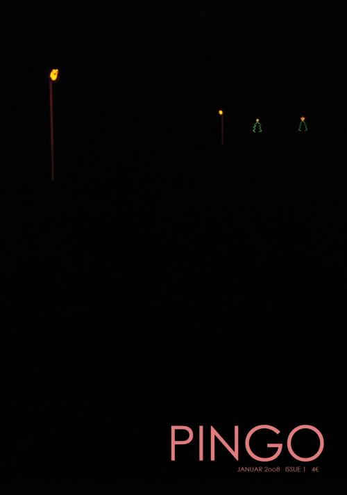
PINGO is a biannual fine art magazine based in Amsterdam. The magazine is published by kinder buenos, a non-profit organization devoted to contemporary art.
PINGO is distributed throughout Europe with its base in the Netherlands. It is comparable to other international photography titles such as Boris in Germany, Camera Austria and Katalog in Denmark.
The first issue was published in 2007 dealing then with drawings, book reviews and photojournalism. Since 2010 it is primarily concerned with fine art. In January 2011 PINGO relaunched in a new format.
Text von der Webseite
160 S., 29x23 cm, keine weiteren Angaben vorhanden mit einem Sonderteil über Textarbeiten auf gelbem Papier: A brief catalogue of lists & instructions in visual art. Visitenkarte des Verlegers eingelegt
24 S., 19x13 cm, Auflage: 60, numeriert, keine weiteren Angaben vorhanden Risographie und Siebdruck, aufgeklebter bedruckter Stoff auf dem Cover
ZusatzInfos
Dr. Olof Tarski, not yet widely known to the public, illustrated the effects of sympathomimetic drugs in his first booklet for Taube. For this cause, he uses slightly manipulated imagery and hidden short poems (in german) for which the reader needs to rub on the pages in order to read them.
Just like sex, indirect sympathomimetics almost cause the same symptoms. A frightening but yet fascinating fact in these days is that every physical symptom may also be produced artificially. The intention behind this work is to show how much drugs and medications are in a position to control our physical sensation.
32 S., 28,5x19 cm, Auflage: 2.000, 2 Stück. keine weiteren Angaben vorhanden Drahtheftung
ZusatzInfos
This one-issue-magazine released in april 2011 features infographics based on art market data. As an example the data was taken from all 44 galleries taking part at the gallery weekend 2011 in berlin. Combined are comments about the art market by artists, critics and gallerists. 44 galleries was released as part of an exhibition at NOTE ON
PANEL is an artist magazine from Vienna. Our intent is to have a platform for young artists who work in different disciplines, and bring them together. Instead of heaving a showroom, we ask people in our surrounding, who interest us, for their contribution.
Each issue presents around 13 works, in an edition of 100 copies, printed in colour in A5. New releases are published 2 to 3 times a year and sold in selected bookshops around Europe and the US
376 S., 23x17,4 cm, ISBN/ISSN 9783453267572 Hardcover
ZusatzInfos
Als gnadenlose Anatomie unserer Gesellschaft provoziert das VICE Magazine nicht nur mit abgedrehten, politisch unkorrekten Features über Kunst, Party und Underground: Dank der ungeschminkten Insider-Berichte von den Brennpunkten der Welt gilt VICE als letzte Bastion des investigativen Journalismus. Aus dem Kult-Magazin ist ein weltweites Imperium geworden. Dieser Band enthält das Beste aus dem VICE -Universum.
Als Gegenstimme zum selbstgefälligen, glattgebügelten Mainstream der neunziger Jahre steht bei VICE Geschmackloses neben Kunst, politischer Insiderbericht neben Underground und Durchgeknalltem. Schon lange vor WikiLeaks hat sich VICE als unabhängiges Organ des Enthüllungsjournalismus etabliert. Namhafte Fotografen und Künstler arbeiten für VICE , Reporter schreiben aus allen Teilen der Welt. Provokant, überdreht, faszinierend, erschütternd, schrill: Erleben Sie die Welt von VICE zwischen Porno, Party, Rock n Roll und den Abgründen unserer Zeit. Schonungslose Reportagen aus dem Iran, Afghanistan oder Nordkorea, Fashionstrecken mit Berliner Punks, Obskures aus Deutschland, bizarre Underground-Features, Folter im Selbstversuch, Drogentester, Sexwettbewerbe, schockierende Fotos von den Krisenherden der Welt, syrische Bordelle oder afrikanische Horrorfilme, und schließlich die legendären Interviews mit Szenegrößen und Ikonen wie Karl Lagerfeld, Lemmy, Bret Easton Ellis oder Christian Anders: Sollten Sie VICE noch nicht kennen, wird es jetzt höchste Zeit. In diesem Sinne: Willkommen in der Welt von VICE Sie werden sie lieben!
Fotografie von Roger Ballen, Rhona Bitner, Miriam Schwedt, Ivars Gravlejs, Sarah Small und Luca Desienna, Illustration von Ken Garduno, ein Grafik-Design Portfolio von Chris Bell, Besprechungen von Zines und Bücher, … Und wieder mit Aufklappseiten!
44 S., 29x22,5 cm, ISBN/ISSN 9781935202783 Softcover Drahtheftung
ZusatzInfos
Specially created by Maurizio Cattelan in collaboration with fellow countryman Pierpaolo Ferrari for Cattelan's major retrospective at the Guggenheim Museum in New York City, Toilet Paper 4 is a brilliant new creation from the aberrant, animated mind of the Italian-born provocateur, mischief-maker and macabre witness to our times. Published by Deste, this part artist's book, part magazine contains no text. only full spreads of color photographs with imagery that often appropriates the slick production values of commercial photography to deliver dreamlike (or nightmarish) images that are as appropriate for the coffee table as they are for the WC. In an interview with Vogue Italia, Ferrari said that "the magazine springs from a passion/obsession that Maurizio and I have in common. Each picture springs from an idea, even a simple one, and then becomes a complex orchestration of people who build tableaux vivants. This project is also a sort of mental outburst."
44 S., 29x22,5 cm, ISBN/ISSN 9781935202608 Drahtheftung
ZusatzInfos
Brought to you by the aberrant, animated mind of Italian-born provocateur, mischief-maker, and macabre witness to our times Maurizio Cattelan, Toilet Paper 2 follows closely on the heels of the inaugural issue of Cattelan's most recent print extravaganza. "The magazine springs from a passion/obsession that Maurizio and I have in common," collaborator photographer Pierpaolo Ferrari said in an interview in Vogue Italia. "Each picture springs from an idea, even a simple one, and then becomes a complex orchestration of people who build tableaux vivants. This project is also a sort of mental outburst." Published by Deste, this part magazine, part artist's book blends commercial photography with warped narratives and surrealistic imagery, creating a series of powerful images that are as appropriate for the coffee table as they are for the WC
44 S., 29x22,5 cm, ISBN/ISSN 9782840665311 Softcover Drahtheftung
ZusatzInfos
Made by Maurizio Cattelan in collaboration with fellow countryman Pierpaolo Ferrari, Toilet Paper 5 is a brilliant new creation from the aberrant, animated mind of the Italian-born provocateur, mischief-maker and macabre witness to our times. Published by Le Dictateur, this part artist's book, part magazine contains no text. only full spreads of color photographs with imagery that often appropriates the slick production values of commercial photography to deliver dreamlike (or nightmarish) images that are as appropriate for the coffee table as they are for the WC. In an interview with Vogue Italia, Ferrari said that "the magazine is born of a passion/obsession that Maurizio and I have in common. Each picture springs from an idea, often a simple one, and through a complex orchestration of people becomes the materialization of the artists' mental outburst."
100 S., 21x14,8 cm, Auflage: 100, numeriert, keine weiteren Angaben vorhanden 2 Büchlein, 4 Heftchen mit Übersetzungen, 1 Blatt mit der Übersicht der Grafiken, in transparenter Hülle
We should be taught on loss so this is human’s fate: to lose everything.
First book: 76 pages, 14,8x21cm, full colour, sewn book
Second book: 24 pages, 14,8x21cm, black and white, saddle stiched
this book is a book project published by Viaindustriae that involves contemporary artists in thematic exhibitions and side vents. There are studies and researches by operators, curators, publishers, and specific artist's interventions in the pages. The discussion panels opened within a series of workshops are included in the publication that treats the archiving criteria in the artist's book practice. The operation focuses on three sections: INbook (filing and actions), OUTbook (multiplication and digression), IFbook (artist's book and infinite hypothesis). There are texts by Emanuele de Donno, Giorgio Maffei, and specific pages projects by Celine Comporelli, Imvermomuto, Dubbin/Davidson, Amedeo Marteghni, M+M, Daniela Comani, Banu Cennetoglu, Markus Miessen, Daniel Eatcock, Helen Sommer, Edamimomda/Cramer, and Documentation Celine Duval.
from the publisher
Atem Books is an independent publishing house based in Catalunya focused on photography & illustration, contemporary drawing and thinking created by emerging artists from around the world. Our aims are: to help emerging artists to get their work more known, create a collection of contemporary works, to gather illustrators, photographers & art lovers. Atem Books has been publishing Carpaccio Magazine since April 2009. Atem Books is a non-profit organization, so all the money earnt is always invested in new publications.
Why ‘Atem’?
‘Atem’ stands for “wind, breath” in german. This word is inspired by an illustrated poetry book published by Paul Celan (poet) and Gisèle Celan (illustrator) called Atemkristall.
Who we are
Atem Books curators are María Cerezo and Emma Llensa. We both do all the works involved with mantaining Atem Books.
What we can do
We’re also offering our services to help you self-publish your book (both digital -pdf, epub, mobipocket-, Ipad and Iphone apps and print). Whether if you need advise on how to start self publishing a book or you need our services as curators, designers, layouters and image retouchers, just ask us what we can do for you.
We’re also offering our services to help you create your own website and, if you need one, how to create an e-commerce to sell your own goods. And, of course, we can give you marketing and self-promotion advises and guidelines.
Atem Books is 100% independent!
We don’t receive any external money. This project survives with the earns we do selling our publications.
Von der Webseite
Hundert Jahre nach Marcel Duchamps dreimonatigem Besuch in München (1912) wird ... eine ... Lücke ("le mystère") im kunsthistorischen Wissen zu füllen versucht. ... mit einer Ausstellung, gut organisiert vom Lenbachhaus, zwei beachtlichen Publikationen, einem Duchamp Journal und einem seltsam gekippten Wohnungsmodell neben der Alten Pinakothek, das dem Betrachter mit 'kalten' Wänden in etwa Duchamps ehemalige Wohnsituation in der (später ausgebombten) Barerstr. 65 vorführt. Dieses Modell ist das Werk des Bildhauers und promovierten Kunsthistorikers Rudolf Herz, der auch eines der beiden Veröffentlichungen und das Journal verantwortet ...
Text von der Webseite: www.sehepunkte.de
On June 21, 2012, precisely one hundred years will have passed since Marcel Duchamp arrived in Munich. He spent three months in the city, three months that were to radically change his art and turn him into one of the most influential artist of modernism. He is regarded as pioneer of conceptual art influencing numerous artists from Sol LeWitt to Ai Weiwei and still today continuously inspires new generations of artists.
On the anniversary of the French artist’s arrival, Munich’s Architecture Museum is presenting Rudolf Herz’s latest art project “Marcel Duchamp – Le mystère de Munich”, in which the artist investigates the background story of his predecessor’s stay in the Bavarian capital. The project includes a sculpture as well as a new book.
Text von der Webseite duchamp-munich.org
42 S., 22x16,5 cm, keine weiteren Angaben vorhanden eingelegt eine Rubbelkarte und ein Verzeichnis der Läden, Cover mit geschäumter Farbe
ZusatzInfos
Agentur: Wieden+Kennedy Amsterdam
Originaly call “Let the bitch out” No more miss nice guy is a 42 pages book capturing the theme of the rebel aspect of women in sports, pictured in a colorful and funny way, it catch the subtil attitude of sometime mad girl practicing sports. The idea of book/catalogue was firts adopte to suit better the fashion aspect of the whole project than normal press ads and created a collectable factor.
The photography playing a big role,in this sens, it was given to star photographer Elaine Constentine.
No More Miss Nice Guy was first made in english and specificaly adapted to the 7 main languages to fit the europeen market.
Text von www.cargocollective.com
10 S., 29,7x21 cm, keine weiteren Angaben vorhanden Verkaufsprospekt zu einer Sammlung von Büchern und Zeitschriften, Farbloserkopien nach PDF, Blätter lose ineinander gelegt
ZusatzInfos
Edgardo Antonio Vigo, graveur sur bois, poète expérimental, constructeur d’«objets inutiles» et de «machines bizarres» fut l’une des figures majeures de la poésie concrète et visuelle sud américaine. Parallèlement à son activité artistique personnelle il créa et dirigea les revues «Diagonal Cero» et «Hexagono» qui contribuèrent aux échanges entre poètes sud américains et européens.
A ce titre, il participa à l’exposition «Avant-garde publications» organisée par le magazine uruguayen «OVUM 103» en 1970. Il fut également l’un des principaux animateurs du mouvement international «Mail Art» avec la publication de «Libro Internacional. International Book. Livre International» en 1976 et de «Nuestro Libro Internacional de Estampillas Y Matasellos/Our International
Book Of Stamps/Cancelled Seals» en 1979
21x16,3 cm, keine weiteren Angaben vorhanden eingelegt ein Blatt mit lieferbaren Titeln bei EFA
ZusatzInfos
Jim Avignon geb. 1968 in Schweden, Schulbusfahrer, danach Künstler.
Cartoon poet, speed painter and performance artist between cheap art and high-paying commercial work, regards himself as a storyteller and illustrator of modern times, expressing complex relationships with the simplest of means. Well observed and a little crazy Avignon crafts a gentle, visual critique of society, exposing everyday absurdities between business and lovesickness with an apt, sympathetic bite. "Attack Delay", a personal magazine in a book format, presents this hero of modern multitasking in his unmistakable technicolor cartoon style
LINE IS AN ENTITY BORN FROM RESTLESS MOVEMENT, THE NECESSARY CONSECRATION OF THE PASSAGE FROM STILLNESS TO MOVEMENT DUE TO THE ACTION OF SEVERAL FORCES ON THE SAME POINT.
ITS ASSUMPTION IS TO TRACE A PATH THROUGH THE DIFFERENT CREATIVE AND EXPRESSIVE FIELDS OF HUMANKIND (FASHION, MUSIC, ART, PHOTOGRAPHY, CINEMA, AMONG OTHERS) AND TO ANALYZE THE INTERSECTIONS WHERE THESE DIFFERENT EXPERIENCES ARE FOUND TO HAVE A MOMENT THEY SHARE, AS A SOURCE WHOSE WATERS SCATTER IN DIFFERENT DIRECTIONS.
LINE IS A NEW MAGAZINE ABOUT ART, MUSIC AND FASHION. IT WILL BE A BIANNUAL PUBLICATION SUPPORTING YOUNG TALENTS WITH A STRONG IDENTITY. THE PRODUCTION WILL SUPPORT EVERY FORM OF CREATIVE EXPRESSION THAT MAY REFLECT THE UNICITY OF THE INDIVIDUAL CREATOR AND THAT IS, THEREFORE, ORIGINAL.
Text von der Webseite
Fotografie von Alisa Resnik, Justin Maxon, Leon Kirchlechner, Laura Morche, Denis Dailleux, Marco Vernaschi, Zeichnungen von Sophie Jodoin, ein Grafik-Design Portfolio von Benno Ludwigs, jede Menge Fotobuch- und Magazinvorstellungen
This new artists’ book by the celebrated Swiss artist-duo gathers 800 images taken from worldwide magazine advertisements. Designed by NORM in close collaboration with the artists, the book, stemming from Fischli/Weiss’ contribution to the Ringier AG Annual Report 2007, is a very generous if slightly nauseating collection of photos, slogans, and messages that constitute our contemporary media landscape. Organized in loose categories, they plunge the reader in a flow of images whose commercial dimension recedes to let their (often unplanned) narrative qualities freely develop into an unlikely account of life’s journey.
Text vom Verlag
Kostenlose Zeitung zur Ausstellung im Zentralinstitut für Kunstgeschichte in München, mit Texten von Rüdiger Hoyer, Daniela Stöppel und Hubert Kretschmer, alle Abbildungen in Farbe. Gestaltung Johannes Bissinger
48,5x35x1,3 cm, ISBN/ISSN 14791404 3 gefaltete Hefte in Faltkarton
ZusatzInfos
A collaboration with Roni Horn - featuring Juergen Teller, John Waters & Adrian Searle.
Issue 13 of Kilimanjaro is an unofficial catalogue of sorts, whose theme is A Love Letter To Roni Horn. It is the first edition of the magazine which has been created with a single artist, and is a kind of visual & textual retrospective.
Using the traditional format of a magazine publication, comprised of interviews, essays and art criticism, we have curated an overview both of the DNA of Horn’s work, and – through the words of our selection of her friends, collaborators and admirers – of Roni Horn herself. The issue features: JUERGEN TELLER, ADRIAN SEARLE, JOHN WATERS.
Text von der Webseite
92 S., 24x17 cm, Auflage: 500, keine weiteren Angaben vorhanden Display Nummer
ZusatzInfos
MOTLEY is a publication created to inspire, to present creative imagery in an innovative and unorthodox way. We have no set production schedule, it is created when the mood feels correct. Each new issue of Motley will be unique in design and feature the work of new and established artists, Worldwide. The premier issue launched in Summer 2010. Graphic Design by Umlaut.
Issue one features the work of nine international photographers and a graphic code, printed on the cover, allows the reader to identify the work of each featured photographer.
Featured photographers: Brendan Austin, Paola De Grenet, Sandra Freij, Anthony Hill, Samuel Hodge, Simon Howell, Lena Modigh, Benn Northover, Danny Schissler
The official monthly student magazine of University College Cork
40 S., 28,5x20,5 cm, Auflage: 2.600, numeriert, ISBN/ISSN 20148542 Drahtheftung, Fanzine Deluxe Limited Edition Number
ZusatzInfos
This is an innovating project with personality..!
Box1466 concept is directly related to new tendencies, being music and visual arts in general the leitmotiv of each issue.
Photography, music, fashion, illustration, drawing, words and fantasies…!
Seeing, looking, reading, watching, listening..
Thanks to all those QR codes you will find in the magazine, you will be directly guided to more information online..!
The new concept of Box1466 is in its interactivity, that made it totally fresh and different to any other publication.
A new endless way to discover, to learn, to find out..
The aim of Box1466 is to transmit and divulge from an original point of view, its contents of interviews and visual proposal of fashion.
Box1466 is an Arty numbered deluxe limited edition independent publication.
Text von der Webseite und facebook
OZON Magazine is an urban fashion magazine that has had a stable and significant reputation as an independent publication since 1996. OZON is a different form of fashion periodical that focuses on urban youth culture, modern fashion, art and music.
The new international issue of OZON is devoted to our personal shelters all over the universe. You will gaze at beautiful pictures and read beautiful minds in search of tranquility and introspection. We discover forgotten places and wonder whether our shelters look alike.
Interviews with: Anders Petersen, George Pitts, Steven Tai, Wes Lang, Martin Stranka, Phoebe English and more. Photography by Alena Jascanka, Yorgos Mavropoulos, Sonia Szóstak, Rita Lino, Nikolas Ventourakis, Hayley Louisa Brown, Sophie Van Der Perre, Winter Vandenbrink.
Text von der Webseite
30x22,8 cm, ISBN/ISSN 17668832 Cover mit Prägedruck, zusammen mit zwei Heften von Richard Prince
ZusatzInfos
We launched Purple Prose in the early 1990s without any means, and without any experience, because we wanted to make a magazine that was radically different. We wanted to support the artists around us that noone else supported, much less talked about. [..] It would be a form of opposition of our own, different from the critical jargon of the generation of '68. [..] From a visual standpoint, we represented the break from '80s imagery (like Richard Avedon's photography for Versace, for example). From an artistic standpoint, the artists of the early '90s were rising up against art as capital fetish [..]. In saying that Purple is the portrait of a generation, I mean it's a portrait of those who embody their times. At the same time, it's a portrait of myself and Elein Fleiss, our ideas, our lives, and our aesthetics.
aus Wikipedia
78 S., 29,7x21 cm, keine weiteren Angaben vorhanden Farbkopien nach PDF, lose ineinander gelegt, Dokumentation der Ausstellung
ZusatzInfos
This survey of experimental art and design magazines published since 2000 explores the various ways in which contemporary artists and designers utilize the magazine format as an experimental space for the presentation of artworks and text. Throughout the 20th century, international avant-garde activities in the visual arts and design were often codified first in the informal context of a magazine or journal. This exhibition, drawn from the holdings of the MoMA Library, follows the practice into the 21st century. The works on view represent a broad array of international titles within this genre, from community-building newspapers to image-only photography magazines to conceptual design projects. The contents illustrate a diverse range of image-making, editing, design, printing, and distribution practices. There are obvious connections to the past lineage of artists’ magazines and little architecture and design magazines of the 20th century, as well as a clear sense of the application of new techniques of image-editing and printing methods. Assembled together, these contemporary magazines provide a first-hand view into these practices and represents the MoMA Library’s sustained effort to document and collect this medium.
Text von der Webseite
der:die:das: Is a mono thematic magazine based in Zurich. It draws its inspiration from objects of everyday life. Our relationship with the mundane is put to question and deconstructed through the investigation of objects, ideas and stories. The familiar is staged in an unfamiliar way while the alien in the usual is discovered.
Text von der Webseite
144 S., 23x17,2 cm, ISBN/ISSN 16474198 Eingelegt ein gefaltetes Blatt von Luisa Alpalhao (Telling of). Eingeklebt ein Leporello von Tiago Patricio (Twenty fingers on a piano)
Cine Qua Non is an arts magazine of the University of ULICES built up by movements in written form that freely crisscross reflections, reviews or essays, movements that relate music to visual arts, dance to theatre, cinema to literature. This publication intends to submit its readers to a unique editorial approach that gathers artists, researchers and teaching staff, Portuguese or foreign, proposing texts of different nature about diverse artistic expressions. Cine Qua Non is, since its first printed issue, an entirely bilingual publication (Portuguese/English) that is presented in both versions: an online edition and a printed one.
Text von der Webseite
12,5x12,5 cm, keine weiteren Angaben vorhanden CD (Compilation) in Papierhülle. 16 Stücke
ZusatzInfos
Genre: Electronic, Hip Hop, Rock
Style: Alternative Rock, Downtempo, Ambient, Acid
Compiled By – Imrich Végh, Mastered By – C-Drík
Sold as part of magazine Vlna 53/2013
Back Cover is a French magazine about graphic design and typography. Back Cover is an open place for personalities from all countries who make or analyse our visual environment. Back Cover does not deal with news and does not present portfolios. It contains thoughts, critical or historical analysis and individual or collective experiences in graphic design, typography, illustration and visual arts. Each issue brings together contributions by international actors in the mentioned areas: graphic designers, typographers, art critics and historians, journalists, under different shapes: interviews, diaries, theoretical articles, transcripts of lectures…
[12] S., 29x19,2 cm, keine weiteren Angaben vorhanden Exhibit Catalog. Directory to over 30 alternative magazines, newspapers, and newsletters. Blätter lose zusammengelegt
[270] S., 27x20,8 cm, Auflage: 3.000, ISBN/ISSN 9780978869786 verschiedene Papiere, erste Seite mit Schablone gesprüht
ZusatzInfos
Facsimile edition of Destroy All Monsters Magazine including remnants of the "lost" seventh issue, which was never released. Destroy All Monsters Magazine features work by Mike Kelley, Cary Loren, Niagara, and Jim Shaw.
Destroy All Monsters Magazine was edited by Cary Loren and contained artwork, photographs, and flyers from band mates Mike Kelley, Cary Loren, Niagara, and Jim Shaw. Printed using any papers and techniques available to the band, the issues combine the cut and paste tactics of punk zines with a psychedelic affinity for color. Destroy All Monsters Magazine functions as a kind of manifesto, providing insight into the band through densely layered pages with movie imagery, kitsch, cartoons, delicate drawings, and counter-culture collages. While Destroy All Monsters has been the subject of recent exhibitions and partial reprints, this is the first time that all issues have been reprinted.
Text von der Verlagswebseite
This publication contains a selection of 60 photographs from the documenta Archive, one of the oldest and most esteemed exhibition of contemporary art in the world. The photographs — belonging to different ages — depict the two elements that make art history possible: artwork and spectator. This amazing journey through time not only concerns the history of one of the most important exhibitions in the world, but also traces the evolution, customs, and traditions of the society that created it. The book portrays a love story between two subjects — a human being and an inanimate element — that are capable of a relationship even if they speak a different language. The photographs capture the moment of these encounters, and this is what their distinctive feature consists in. Of course we are not able to listen to the dialogues, but we can still imagine them.
Text von der Verlagswebseite
2 S., 58x40 cm, keine weiteren Angaben vorhanden Beitrag in der Süddeutschen Zeitung Nr. 178, S. 18-19 über die Ausstellung "Paper Weight — Stilbildende Magazine von 2000 bis heute" im Haus der Kunst München
Die Ausstellung "Paper Weight. Stilbildende Magazine von 2000 bis heute" ermöglicht einen frischen Blick auf unabhängiges Publizieren im 21. Jahrhundert. Kernstück der Präsentation sind 15 Magazine, die seit dem Jahr 2000 gegründet wurden - jedes von ihnen stilbildend und unabhängig, d.h. keines gehört einer großen Verlagsgruppe an. Oft getragen von der Vision und der Leidenschaft einer starken Persönlichkeit, haben die ausgewählten Magazine ein breites Spektrum an Themen wie Architektur, Kunst, Design, Mode, Essen, Sex oder Kulturpolitik: "032c", "Apartamento", "Bidoun", "BUTT", "Candy", "Encens", "EY! Magateen", "Fantastic Man", "PIN-UP", "Sang Bleu" oder "Toilet Paper"
Text von der Webseite des HdK
[36] S., 27,5x20,9 cm, Auflage: 125, numeriert, keine weiteren Angaben vorhanden Drahtheftung, vier eigenständige Heftteile in einem Leporello-Umschlag angeheftet, Erstausgabe, in beklebter Papierhülle
[132] S., 28x21 cm, Auflage: 1.000, ISBN/ISSN 9781908806017 Drahtheftung, eingelegt ein Werbeflyer
ZusatzInfos
Estate Of is the new publication series from Antenne Publishing. Published twice a year in a magazine-like stapled format, each edition is given to a single artist working with photographs as a space to realise projects. Estate Of aims to become a meeting point between an informal physical object, and a substantial body of work from an individual artist.
Kronos by Victor Boullet is the first publication in the Estate Of series.
Victor Boullet’s title refers to the Greek god Kronos, a deity known for its doublesidedness, a concept closely connected to his project The Institute of Social Hypocrisy. The publication Kronos is a means to carry his work forward into a newer form of expression, whilst maintaining a constant sense of dichotomy.
Text von der Webseite
60x42 cm, 2 Stück. keine weiteren Angaben vorhanden Plakat zum Magazin, zweimal gefaltet
ZusatzInfos
gefunden in der Ausstellung Paper Weight im Haus der Kunst.
GIRLS LIKE US is an independent journal turning the spotlight on an international expanding community of women from all genders within arts, culture and activism. Through personal stories, essays and vanguard visuals GIRLS LIKE US unfolds feminist legacies in arts and writing. Mixing politics with pleasure, the magazine is mapping new routes towards a feminist, post-gender future.
Text von der Webseite
[28] S., 28,5x14,5 cm, Auflage: 120, numeriert, 2 Stück. keine weiteren Angaben vorhanden Pogobooks #047, Drahtheftung, Schwarz-Weiß-Xeroxkopien, in Transparenthülle
ZusatzInfos
a collection of drawings made in tokyo in 2012.
Text von der Webseite
[94] S., 21,3x15 cm, Auflage: 500, ISBN/ISSN 9780982055922 Katalog zur Ausstellung
ZusatzInfos
A 3 person artists' book made on the occasion of Kennon and Lipomi's 2 person show at Mesler&Hug in New York. She Has a Hot Ass combines a collection of the magazine spreads that generated Kennon's photographs and prints for the exhibtion, digitally produced collages that run parallel to Lipomi's paintings and additional texts and images by Bader.
Text von der Webseite
[60] S., 25x19 cm, Auflage: 200, keine weiteren Angaben vorhanden Vorder- und Rückseite mit Siebdruck in Gold
ZusatzInfos
Sourcebook presents the detritus and collected imagery of a year of contemplation, frustration and ambivalence with the nature of photography. From an initial starting point of the typographic reference book, within its pages a myriad of situations and pictures present themselves - each at once recognisable and indecipherable.
Drawing heavily on ideas of representation and the 'reading' of an image, the work within is open-ended, a liquid, unstable mix of ideas and images that attempt to elude the conclusive, finite nature of the captured image or the printed photo. Instead, Sourcebook aims to be fluid - at once a source of reference and stimulation for future creative processes, and a photographic document littered with unanswered questions, oblique strategies and glimpses of meaning.
Text von der Verlagswebseite
[96] S., 20,4x17 cm, keine weiteren Angaben vorhanden
ZusatzInfos
BOLO 1 includes the contributions from 45 artists and is distributed in the most important cities in Europe, US, and available on the website. Printed in 2 colors, 100 pages of graphics, photography, illustration and typography, all mixed together. Different techniques, combined by a main theme.
Text von der Webseite
21x9,7 cm, keine weiteren Angaben vorhanden Einladungskarte zur Ausstellung im Rahmen der Open Art
ZusatzInfos
Ab dem 24.07.2013 eröffnet in der Maximilianstraße 33 in München das Haeppi Piecis, ein Design Concept Store mit angeschlossener Galerie.
Dieses temporäre Projekt ist das Produkt einer Zusammenarbeit der Münchner Kreativszene: Mode-, Produkt- und Schmuckdesigner, Musiklabels und junge Buchverlage haben sich mit Grafikdesignern und Künstlern zusammengetan und ein gemeinsames Gesamtwerk erschaffen.
Hamann & van Mier betreiben hier einen Shop für Künstlerbücher und Magazine.
Text von der Webseite
... featuring, among others Asger Carlsen’s “Wrong” series (also the cover story), and more photography by Chinese photographer Ren Hang, by Palíndromo Mészáros, Julia Sonntag, Scott Typaldos, “unlikely” objects by Giuseppe Colarusso, a design Portfolio by Sfia Brajal, photo book reviews, …
50 S., 35,2x25,7 cm, Auflage: 1.500, keine weiteren Angaben vorhanden Blätter lose zusammengelegt.
ZusatzInfos
Erschienen anlässlich des Festival of Independents im Haus der Kunst
Gomma ist ein Musiklabel aus München, das von Mathias "Munk" Modica und Jonas "Telonius" Imbery gegründet wurde. Neben der Musik junger elektronischer Künstler aus der ganzen Welt ist das Label auch für seine visuellen Ideen bekannt, die sich in Form von T-Shirts, Poster, Artworks, Videos, Stickern, Fanzines und Ausstellungen manifestiert haben. Gestaltet sind diese von den beiden Gomma Graphikern Mirko „Smal“ Borsche & Thomas "Paze" Kartsolis und Gomma Chef Modica. Für ihre Projekte haben Gomma vielfach mit Künstlern kollaboriert unter anderem mit Michael Sailstorfer, Parra, Frauke Finsterwalder, The Rammellzee, Heji Shin, P.A.M., Kostas Murkudis, Daniel Josefsohn, Martin Fengel und anderen.
Gomma veröffentlicht in unregelmäßigen Abständen auch das limitierte Amore Postermagazin, ein 50-seitiges Magazin, das ausschließlich aus visuellem Material besteht. Für das "Festival of Independents" im Haus der Kunst hat Gomma ein Universum: Gomma – Magazin geschaffen. Es ist ein Mash-Up von Arbeiten, die Borsche & Kartsolis zwischen 2000 und 2013 für Gomma gemacht haben
kostenlose Zeitung zur Ausstellung im Zentralinstitut für Kunstgeschichte in München vom 07.12.2013 - 31.01.2014,
mit Texten von Rüdiger Hoyer, Daniela Stöppel, Ulises Carrión und Hubert Kretschmer, alle Abbildungen in Farbe. Johannes Bissinger
8 S., 21x14,8 cm, Auflage: 200, numeriert, signiert, keine weiteren Angaben vorhanden Leporello als Weihnachtsgruß der Galeristinnen Barbara Gross, Anna Geuder und Franziska Koch, in Briefumschlag
ZusatzInfos
Abbildungen aus: Katharina Gaenssler, UN 242, 2010/2012. Book object, 242 photographs, 242 pages, Pigment print on polyethilen - Buchobjekt, 242 Fotografien, 242 Seiten , Pigmentdruck auf Polyethylen, Umschlag Siebdruck. 68×51×4 cm
500 S., 29,7x21 cm, ISBN/ISSN 9783950237269 Softcover. 1900 gr
ZusatzInfos
WTF is monochrom print? monochrom is a magazine object appearing in telephone book format, which is published by the art/tech group of the same name. monochrom came into being in the mid-1990s as a fanzine for cyberculture, science, theory, cultural studies and the archaeology of pop culture in everyday life. Its collage format is reminiscent both of the early DIY fanzines of the punk and new wave underground and of the artist books of figures such as Dieter Roth, Martin Kippenberger and others. With a great deal of forced discontinuity, a cohesive potpourri of digital and analog subversion is pressed between the covers of monochrom. Each issue is an unnostalgic amalgam of 125 years of Western counterculture cocked, aimed and ready to fire at the present. It is a Sears catalog of subjective and objective irreconcilability -- the Godzilla version of the conventional coffee table book.
Text von der Webseite
100 pages, 133 photos, 22 texts from 136 artists coming from more than 50 countries. Again, we’re happy to present to you a sensitively layouted magazine containing carefully curated image and text.
Text von der Webseite.
16 S., 13,6x12,8 cm, Auflage: 65, numeriert, keine weiteren Angaben vorhanden Drahtheftung, Seitenbögen beidseitig bedruckt, einmal gefaltet zusammengehalten, in transparenter Kunststoffhülle
ZusatzInfos
Pamphlet printing of Jake Marx's index to Fuck You/ a Magazine of the Arts. Newly revised and expanded by Gabriel Mckee, this booklet provides a comprehensive, alphabetized list of the magazine's contributors, the titles of their works, and the issues of the magazine in which they appeared.
Text von der Webseite
[80] S., 14,2x19 cm, ISBN/ISSN 9783037640838 eingelegt ein kleinerformatiges, geklammertes Heft
ZusatzInfos
"Odessa Staircase Redux" is a kind of flipbook revisiting the well-known film sequence from Sergei Eisenstein's "Battleship Potemkin." The first frame of every cut is drawn in black ink by hand. The ensuing series of 158 ink drawings is organized to form a typology of camera angles and subject matter that in turn creates a new animation of the scene in the mind of the viewer. The book comes with a 16-pages saddle-stitched bonus booklet of archival films stills depicting a protest by UC Berkeley students against a House Un-American Committee meeting at San Francisco City Hall in 1961.
Text von der Webseite
H1N1 – Pret à Porter is a pamphlet with photographs of japanese women wearing masks to protect themselves from H1N1 taken in November 2009 in Fukuoka, Japan. The pamphlet contains 24 pages with an introduction by Martina Merten in English and Japanese.
Text von der Webseite
56 S., 40,1x29 cm, ISBN/ISSN 20442726 eine Ausgabe bestehend aus 3 Zeitungen, Blätter lose zusammengelegt in transparenter Kunststoffhülle
ZusatzInfos
Eight:48's ninth issue has been renamed Counter-Print, now consists of three papers and runs to 56 pages.
Paper #01 focuses on the art and design of freight, Paper #02 entitled, new work, offers a snap shot of some of the best work out there and Paper #03 is a brief montage of new and old articles, drawn from issues one to eight offers a timely look back on all eight themes that have shaped the papers so far.
Text von der Webseite
Design Anne Pfeiffer.
Ausstellung mit ArtZines, seltenen Zeitschriften, Heften, Künstlermagazinen u. a. aus Barcelona, London, Berlin und München und Publikationen von vielen Einzelkünstlern.
Mit Livemusik von Norbert R. Stammberger: Sopransaxophon, Karina Erhard: Flöte, Gregor Karger: Kontrabass mit Kompositionen von John Cage (*1912-?1992),
Norbert Stammberger (*1958), Michael Emanuel Bauer (*1974) und Christoph Reiserer (*1966)
Wer verstehen will, wonach die Jugend in Berlin nach 1989 suchte, findet hier die Antworten (SZ):
Berlin Flyers. 1994-2014.
xavierlaboulbenne. Bis 2. August
Richard Prince. Motto
Pablo Larios. Celebrity Interviews with Tom Kummer. Tanya Leighton. Bis 5. August
WET. The Magazine of Gourmet Bathing. Udolpho. Bis 21. September
von der Webseite der SZ
[20] S., 29,7x21 cm, Auflage: 100, keine weiteren Angaben vorhanden Leporello mit kleinem Heft, Fadenheftung, Cover mit Aufkleber, Offset
ZusatzInfos
The »About Series« is a mobile space exhibiting visual artists. Each issue consists of a leporello with four pages like a room with four walls and a small booklet with texts and a »floor plan«. It is the first periodical artzine published by Gloria Glitzer.
Text von der Webseite
352 S., 21x15 cm, ISBN/ISSN 9782915859416 Broschur mit Banderole, eingelegt ein Informationsblatt
ZusatzInfos
Originalausgabe erschienen bei Artists Press, Bern, 1980.
This book is the third and final version of the first artist’s book published in 1960 by herman de vries, who is currently the author of more than one hundred publications.
The story of this book dates back to 1960. Closely associated with the Zero Group, but also drawn to the buddhist concept of emptiness, herman de vries had just produced a series of white monochromes when he self-published a twenty-page booklet in Arnhem. It had no title, its cover was blank and its pages were unprinted. It contained nothing but a short final poem celebrating, in four languages, the superabundance of white: “wit is overdaad”. In 1962, this manifesto appeared in another version, now entitled wit: two hundred blank pages, four white collages by the artist and an introduction, itself completely blank, by the poet J. C. van Schagen, published in arnhem in only five copies by M. J. Israel. It was followed in 1967 by a second “revised” edition, wit weiss: two hundred and fifty blank pages, pocket-sized, in five hundred copies, published by Hansjörg Mayer in Stuttgart. The only printed elements were the artist’s name, the title and the publisher’s name on the cover, the word “introduction” and the name of its author on the very first page and a colophon on the final page. In 1980 the Artists Press in Berne published the “third revised edition”, in a larger format and with more pages. The original title wit was translated into english and japanese and into sanskrit with a word that means “white” in the sense of bright, pure, immaculate. The title itself does not appear on the book, which remains completely blank. It is printed with the paratext on a broad strip of paper in the form of a detachable publicity strip. The inside flap contains a brief statement initially dating back to the 1962 edition, stating that this book incorporates all aspects of reality. Of the five thousand copies advertised, only a hundred were published. It is this last edition, the most radical, which is republished here, the only addition being the french translation of the statement.
On 1 april 2012, herman de vries wrote of his book, insisting on the importance of the final comma:
white is white
0 = 0
no name
no idea
not even emptiness,
[106] S., 31x22 cm, Auflage: 200, numeriert, signiert, 2 Stück. keine weiteren Angaben vorhanden Hartpappeeinband mit Siebdruck, Text von Leo Lencsés und Matthias Glas, eingelegt eine Originalzeichnung. Ein Exemplar mit beigelegtem Anschreibener Version des Textes, einmal ein
Erschienen zur Debütantenausstellung in der Akademie der Bildenden Künste in München am 8.04.2014
The artist‘s book “Die Chronologie der Zelle“ shows and analyzes the cyclic working process of sculptor Matthias Glas. 80 pages covering a photo spread of art works are completed by a text section which takes up the preceding flow of images based on a chain of the artist`s thoughts. Additional meta text passages structure the workflow into chapters and give further information on the artistic practice. Each book has an individual screen-printed cover and includes an original drawing by Matthias Glas
10 S., 14,8x21 cm, Auflage: 111, numeriert, 2 Stück. ISBN/ISSN 9783941601970 Spiritusumdruck = Hektografie, blaue Farbe auf weißem Papier, Drahtheftung, ein Exemplar ohne Numerierung
ZusatzInfos
a variation of a SONNET written by Rossetti in 1871, re-written by Carrión in 1972 and subsequently re-written by Pichler since 2009.
It is exploring the materiality of language, how books travel into the world, and how a fragmented printrun can still constitute an organic piece.
It is awkward to read, and the awkwardness certainly is half of its charme. Due to their rotated binding and blurring through the pages, they also look like Rorschach-drawings.
Text von der Webseite
48 S., 28x21 cm, keine weiteren Angaben vorhanden Drahtheftung
ZusatzInfos
Katalogheft zum 620 Reading Room with magCulture and Postcard Teas at Vitsoe London. Beteiligte Magazine: Alpine Review, Another Escape, Delayed Gratification, FAT, Flaneur, The Gentlewoman, The Gourmand, The Green Soccer Journal, HOLO, Intern, Inventory, mono.kultur, Motherland, Offscreen, The Outpost, The Pitchfork Review, Printed Pages, Riposte, Shelf Journal, Vestoj
300 S., 19,8x12,8 cm, Auflage: 750, signiert, ISBN/ISSN 9781907468155 Broschur
ZusatzInfos
Inspired by Georges Perec’s musings on reading, which he likens to “a pigeon pecking at the ground in search of breadcrumbs”, Simon Morris’ latest book sets exactly those feral avians to work on the very surface of Perec’s celebrated text “Reading: A Sociophysiological Outline”. In the process he puts pressure on all of the terms in Perec’s title: what does it mean to engage a text physically — looking at print, flipping pages, processing language, vocalizing, responding — without any of the social practices or semantics we usually associate with “reading.” Or, to put this as Wittgenstein might: what activities still embody a grammar of reading even in the absence of what would seem to be its defining features.
Text von der Webseite
324 S., 19,8x12,8 cm, Auflage: 500, ISBN/ISSN 9781907468216 Softcover, Taschenbuch
ZusatzInfos
Getting Inside Simon Morris’ Head is a performative retyping of Simon Morris’ conceptual bookwork Getting Inside Jack Kerouac’s Head. Like Morris’ original performance of retyping the scroll edition of Jack Kerouac’s On the Road, Joe Hale’s project first appeared as a blog. At the rate of one page per day, like Morris retyping Kerouac before him, Hale retyped Morris’ entire book and in doing so re-retraces Kerouac’s famous adventure. Morris gave us all of Kerouac’s pages in reverse order: each blog post presented one page and the default settings of the blog platform organised his posts in reverse order, from the newest to the oldest. Now inverted again, as a double negative, Hale has restored the direction of travel to the story and produced a wholly (un)original new text. This first printed edition takes the imitative gesture to a new extreme. It features an introductory essay by poet Kenneth Goldsmith and reuses Morris’ paratext. From the cover design to the choice of paper, Hale tests the limits of conceptual extension.
Text von der Webseite
192 S., 24x17 cm, Auflage: 500, keine weiteren Angaben vorhanden Broschur
ZusatzInfos
A Nice Magazine is a collaborative platform for emerging and established talent, including work from a group of friends, and names such as Tyrone and Mark Lebon. A space that aims to define a counter culture through imagery and humour, A Nice Magazine rejects seriousness, whilst celebrating collaboration and being young!
Abschlussarbeit bei Central Saint Martins
112 S., 24x16,5 cm, keine weiteren Angaben vorhanden Broschur
ZusatzInfos
We Are Dublin is a magazine dedicated to the city. We combine the lo-fi and the high-end - expect long form journalism, poetry, humour and short stories, as well as striking photography. This is immersive publishing at its finest - a long-form postcard from one of the most interesting cities in the world. Published every three months, the magazine is available to buy online and in selected retailers in Dublin and around the world.
Text von der Webseite
82 S., 24,3x17,2 cm, keine weiteren Angaben vorhanden Broschur
ZusatzInfos
From what started as a music blog aimed at sharing the best music acts of ‘tomorrow’, nearly 3 years on, TMRW is not only a quarterly printed lifestyle magazine, but an industry-recognised brand and voice.
As a fresh faced, naïve 21 year old, Founding Director and Editor, Joe Brine was oblivious to the potential of what he had incepted. Having made the conscious step in to the world of print, Joe adopted a simple but effective design, which would give TMRW a niche and set the magazine apart from any other on the market. The attention to detail shows exactly this. The thicker paper stock and the smaller size made the quarterly print high quality and aesthetically pleasing, because of this the magazine is more sought after and such is looked after more by readers and shared around with friends and family. For any brand associated with TMRW it means that the reader is more inclined to notice and is more inclined to make a purchase.
Text von der Webseite
142 S., 27x20 cm, ISBN/ISSN 20444419 Blätter lose ineinander gelegt und mit rotem Gummiband zusammen gehalten
ZusatzInfos
This issue is about Pressure Points: physical, metaphorical, real, imaginary... This nearly entirely visual issue's contributors include Lea Colombo, Socrates Mitsios, Maya Rochat, Constantine Tsapaliras, Erik van der Weijde and many more.
Text von der Webseite
14,8x10,5 cm, Auflage: 1.000, 2 Stück. keine weiteren Angaben vorhanden InfoKarte zur Ausstellung zines #3, Hinweis zum Vortrag
ZusatzInfos
Künstlerzeitschriften aus der Sammlung Hubert Kretschmer im Zentralinstitut für Kunstgeschichte in München von 1980-1986.
Gestaltung Johannes Bissinger
Kostenlose Zeitung zur Ausstellung Zines #3 1980-1986 im Zentralinstitut für Kunstgeschichte in München, vom 06.02.-31.03.2015.
Mit Texten von Rüdiger Hoyer, Daniela Stöppel und Hubert Kretschmer, alle Abbildungen in Farbe und Originalgröße. Gestaltung Johannes Bissinger
84,1x59,4 cm, Auflage: 100, 2 Stück. keine weiteren Angaben vorhanden Plakat zur Ausstellung Zines #3 1980-1986 im Zentralinstitut für Kunstgeschichte (München), Druck auf Affichenpapier
Inhalt: Einzelblatt (Manifest contra el Populisme Pervers), gefaltete Pappe mit Baumwollsocke, 3 Hefte, Leporello, Heft mit Originalnegativ, geschlossener Umschlag, gefaltetes Poster mit Sand, Folder.
In the wake of the worldwide glorification of Barcelona via the 1992 Olympics Games, a group of publishers felt that it was time to revive the creative and critical spirit at a cultural level, in the form of a magazine, in order to demonstrate the prevailing level of creativity - via manifestos and works without intermediaries. As a result, Vicenc Altaió, Claret Serrahima, Manel Guerrero, Joaquim Pibernat and Manel Sala launched the magazine, Cave Canis, (which literally means "beware of the dogs") in Barcelona, in 1996.
Starting with its first edition the magazine announced that it would have a short-lived existence - only 9 issues were published, each corresponding to one letter of the publication’s name. The magazine was constituted by a cardboard box, designed by Claret Serrahima, a manifesto, an artist’s book and sometimes contained CDs with recordings and other artistic objects, all associated with the same monographic topic. Each issue had a letter on the front cover designed by an artist. Cave Canis wasn’t available in the usual retail outlets. Each issue was presented in an unusual place in the city, where the manifesto was read, copies were distributed and the magazine then disappeared from sight. The last issue was published in 1999.
Text von der Website
28 S., 35x25,6 cm, keine weiteren Angaben vorhanden Blätter lose ineinander gelegt, einmal gefaltet
ZusatzInfos
streem (ehemals "streetmag") ist ein Berliner Kunst & Lifestyle Straßenmagazin und dient als Plattform für Künstler aller Genres. Jeder talentierte, bislang unentdeckte oder bereits etablierte Künstler, Autor, Fotograf, Illustrator etc. kann seinen Beitrag einreichen und seine Werke publizieren.
streem wird von obdach- und mittellosen Mitmenschen auf der Straße vertrieben. Die Verkäufer erhalten streem gratis und somit den kompletten Verkaufserlös. Den Preis bestimmen die Käufer (empfohlen 1,50 Euro), der dem Straßenverkäufer zu 100% zu Gute kommt.
Text von der Webseite
720 S., 21x15x4.5 cm, Auflage: Print on demand, keine weiteren Angaben vorhanden Softcover, Schwarz-Druck auf Papiere, Titel und Autor in weißer Schrift auf dem Buchrücken. Gedruckt bei Lulu
Ink used for digital printing is one of the most precious substances in the world. A single gallon of ink costs over four thousand dollars and this is one reason why digitally printed books are so expensive.
However, the price of a book is not calculated according to the amount of ink used in its production. For example, a Lulu book of blank pages costs an artist as much to produce as a book filled with text or large photographs. Furthermore, as the number of pages increases, the price of each page decreases. A book containing the maximum number of pages printed entirely in black ink therefore results in the lowest cost and maximum value for the artist.
Combining these two features, buyers of The Black Book can do so with the guarantee that they are getting the best possible value for their money.
Text von der Webseite
19x13.5 cm, ISBN/ISSN 9788890713224 Drahtheftung, mit Papierumschlag
ZusatzInfos
The selection of analogue photographs is a work in progress started by Alessandra Spranzi in 2007, today counting more than 500 images. The source is a small ads magazine available on news-stands, in which the original images appear in a 30x45 mm format.
Text von Website
113 S., 27,5x22 cm, Auflage: 1.500, keine weiteren Angaben vorhanden Broschur, Cover mit aufgeklebtem Bild von Jake und Dino Chapman (mit 13 Wasserfarben übermaltes Bild von A. Hitler), mit eingelegtem Poster,
Archivo explores remarkable archives, each issue consists of two folio paper quires devoted to the personal archive of a photographer.
Text von Website
Spezial mit deutschen und finnischen Künstlerbeiträgen, Ausgabe einmal in Finnisch und einmal in Deutsch erschienen, beide jeweils untertitelt mit englischer Übersetzung. Mit einem Artikel zur deutschen Comicszene von Brigitte Helbling.
KUTI is a quarterly 4-colour tabloid focusing on comics and their authors. The main reader group of the magazine are culturally active young adults. Kuti does not present any political or religious connections. The magazine is circulated through cafes, galleries, comic stores, schools, restaurants, book and comic fairs. In Finland the circulation covers ca. 250 places in 11 cities - Helsinki, Tampere, Turku, Lahti, Joensuu, Jyväskylä, Kuopio, Oulu, Pori, Imatra and Lappeenranta. Abroad Kuti is distributed in several countries through our partners in crime.
Text von der Webseite
36 S., 30x25,5 cm, Auflage: 2.500, keine weiteren Angaben vorhanden Gedruckt mit Extrapool Ricoh priport JP8500 auf 150 gr Munken Artic White mit 12 Farben, in bedruckter Papiertüte
ZusatzInfos
The daily magazine of the international arts festival Wereld Van Witte De With. De With is the daily paper full of news, interviews, reviews and secret tips. An exciting cooperation between dutch art blog Trendbeheer.com and the Letterproeftuin. Editing, writing, designing, printing and distributing from the festival floor, the project became a self-sustaining magazine
96 S., 38x27,2 cm, keine weiteren Angaben vorhanden Drahtheftung
ZusatzInfos
the first edition of PLATOON MAGAZINE will be exclusively unveiled at the launch event at PLATOON KUNSTHALLE Berlin.
With PLATOON MAGAZINE we invite you to explore our worldwide network through the outstanding projects of some of our 7500 PLATOON MEMBERS across more than 50 countries. Each quarterly print publication not only highlights the creativity we see on a daily basis within the PLATOON NETWORK, it also includes a theme — an artistic topic of global relevance. First on our agenda: wearable technology. Ultimately, this magazine is for inspiration—another channel to reach our goals of culture development, in addition to our creative spaces in Berlin and Seoul.
Text von der Webseite
Design Julian Rothenstein.
Bananas is a British literary magazine that ran for 25 issues from January 1975[1] until 1979. It was initially published and edited by the novelist Emma Tennant but later issues were published and edited by the poet Abigail Mozley. Tennant chose to name the magazine after the motion picture Bananas (1971), directed by Woody Allen. (aus Wikipedia)
This magazine changes its font with each issue. The name of the font becomes the issues' title. Published so far: Chicago, Times, Plotter, Helvetica, DIN, Techno, Löhfelm, RR_02, Univers, Tiffany, Circuit, Memphis, Gringo, Zeus, The Mix, Princess Lulu, Pigiarniq, Paper, Libertine, Trixie, Déjà Vu, Auto, Rediviva, Acid, Wanda, Loraine, Hallo, Korpus, Spiegel and Zeitschrift
Zum Teil mit kryptischem Nonsense. Finally - after a long break - Munich's Best Underground Magazine Trennlinie Zwischen Gesten is back again with Volume 3. The artwork changed from A5 format to a sexy square-like individual cutting. This time the magazine is even "more arty" and includes several great german product reviews of the super-special kind. Still very obscure Pasing-scene stuff. Forget Berlin - the dead corpses walk around the Pasing Arkaden in Munich's worst district. Surely nothing for industrial listeners or other narrow-minded people. This one is for true aliens.
Text von der Webseite
Die BUTT-Herausgeber lassen mit der gut bestückten Anthologie FOREVER BUTT einige der besten und aufregendsten Momente aus über zehn Jahren BUTT Magazine Revue passieren: Material aus inzwischen raren Sammlerausgaben von BUTT, coole Bilder und Interviews mit Stilikonen wie Gore Vidal, François Sagat, Marc Jacobs und Perez Hilton. In typischer BUTT-Manier zelebriert das Buch Sex als heiter-lässige, soziale und auch Albernheiten nicht abgeneigte Angelegenheit, ist aber, wie Wolfgang Tillmans in seiner Einleitung schreibt, zuallererst einfach faszinierender Lesestoff.
Text von der Webseite
This year the Vienna Ringstraße is celebrating the 150th anniversary of its existence. For this occasion the BAWAG P.S.K. is publishing a special edition of the Parabol Art Magazine. Parabol is duly inviting the architecture curator Oliver Elser to analyse via this medium one of the most striking and prominent buildings in the Ringstraße ensemble, Otto Wagners Postsparkasse. Together with the architecture photographer Hagen Stier, Elser pays tribute to this paragon of Viennese Modernism.
Text von der Webseite
Die Arbeit an dieser Ausgabe von Starship begann mit einer Beobachtung: Es gibt mehr Sexismen und sie scheinen vehementer als früher. Woran liegt das? Was tun? Wenn wir die Beobachtung akzeptieren, dann müssten wir auch nach Antworten für die Fragen suchen. Starship 7 hat den Titel Y. Ein großer Teil des Heftes ist Frage oder Antwort zu dieser Beobachtung, die wir Y nennen, weil die Koordinaten noch nicht festgelegt sind. Y steht für die Vielfältigkeit von Sexismen, ihre Begrenztheit, ihr diffuses Auftreten und ihre hartnäckige Monotonie. Y ist ein Modus, der von allen, die damit etwas anfangen können, weiterentwickelt und benutzt werden kann.
Text von der Webseite
158 S., 29,3x23 cm, ISBN/ISSN 9780976164197 Broschur, diverse Papiere, teilweise zum Ausklappen, mit eingelegter CD und eingestecktem Heft von Kay Rosen
ZusatzInfos
As usual, the magazine contains a multidisciplinary mix of contemporary artists’ projects, critical writing, creative nonfiction, visual essays, and a themed CD of brand-new music. Some highlights include projects by Kay Rosen, Charlie White, and Sarah Malakoff, and a deconstruction of crossword-puzzle science by New York Times crossword genius David Quarfoot, as well as new installments in the magazine's regular series.
For our 9th CD, “Dreams,” readers submitted transcripts of their dreams, which were then passed along to musicians, each of whom picked one to serve as the basis for a song. The 11 musical acts, including White Whale, Ida, Dirty Projectors, Califone, and Paavoharju, chose from over 100 submissions. Transcripts of the selected dreams appear in Esopus 9 alongside five illustrations by New York–based artist Daniel Gordon.
Text von der Webseite
The launch issue hits newsstands on March 9 with an April/May cover, and will have 120 pages. The redesigned site will go live, without a paywall, on March 7, the same day that the social accounts and the app will revert from Intelligent Life to 1843. 1843 will, like Intelligent Life before it, publish six issues a year.
Newly appointed editor Emma Duncan has come on board from The Economist where she was deputy editor. At 1843, she leads a team of 25 across editorial and commercial, and also can pull on the wider global Economist team.
Text von der Webseite
A new magazine of ideas, lifestyle and culture
[20] S., 23x18x6,5 cm, Auflage: 8, numeriert, signiert, keine weiteren Angaben vorhanden fadengeheftet, Umschlag Bitumen auf Styrodur, innen Anklebevorsatz aus schwarzem Tonpapier und Seiten aus Transparentpapier, beigelegt ein zweiseitiges Anschreiben
ZusatzInfos
This book works by haptics. You can read it eyes closed. The hardcover is made by a thick bitumen surface on styropor. For this reason the book is not heavy. Inside the book are ten pages of transparent paper with abstract illustrations that assosciate to biological structures. The topic of the book is about the sensitive creatures that live in the sea and oil shipping disasters
132 S., 23x16,5 cm, keine weiteren Angaben vorhanden Softcover, Broschur
ZusatzInfos
RIZE ist ein crossmediales Premium-Lifestyle-Magazin (Print & Online) für eine moderne, dynamische, kosmopolitische Zielgruppe. Das Magazin bringt viermal pro Jahr relevante Themen aus Kunst, Kultur, Kulinarik, Mode, Design und Automobil und lebt von aufwändig produzierten Fotostrecken und individueller, ansprechender Optik.
Text von Website
Arbeiten nach Wittgensteins Tractatus 2.0131.
Dans ce projet datant de 1968, herman de vries se réfère au Tractatus logico-philosophicus de Wittgenstein, et c'est la façon dont il le fait - surprenante et amusante - qui fonde l'idée de ce livre.
argumentstellen confronte l'expression quelque peu énigmatique du Tractatus au sens tangible des références que le discours wittgensteinien met en scène, à l'imaginaire qu'il mobilise. C'est ce travail du concret et du tangible, aussi " minimaliste " soit-il, qui met le lecteur sur la voie de la recherche du sens de l'énigme. " Avant de philosopher, il faut vivre ", dit Henri Bergson.
Dans la simplicité stupéfiante de son approche, le livre de de vries propose une piste nouvelle et originale pour relire Wittgenstein, et peut-être aussi pour confronter l'art à la pensée philosophique en général.
Ainsi, les 48 pages de ce livre affichent chacune un seul point, distribué dans l'espace vide de la page, preuve que "l'objet spatial doit se trouver dans un espace infini, le point spatial est une place pour un argument."
Text von der Webseite
[40] S., 33x23 cm, Auflage: 1.000, ISBN/ISSN 9782914291569 Softcover, Drahtheftung
ZusatzInfos
Au printemps 1998, bénéficiant d'un petit bureau au James Joyce Centre de Dublin, j'ai photocopié la plupart des couvertures et quelques pages intérieures, des traductions mondiales d'Ulysse. Vitement réalisées et à des fins documentaires, ces photocopies sont parcourues de bruits (déplacement du livre, agrandissement aléatoire, présence furtive de la main, rayures, etc) comme autant d'ornements ajoutés à la polyphonie de l'œuvre. Enfin, ce projet s'accompagne aujourd'hui d'une réflexion insoupçonnable à l'époque : le traitement fait aux livres dans le cadre de leur numérisation sauvage.
Text von der Webseite
Ce livre s'ouvre sur une photographie montrant l’artiste nu, faisant face à l’étendue de la mer. S'y succède un texte, composé de ces trois mots : infinity in finity, répétés à l’infini. Où est donc l’infini ainsi évoqué ? dans l’horizon de la mer ? dans les pages du livre ? dans le texte lu ou dans l’expérience de l’art ? Le texte décliné sur l'ensemble des pages existe sous une forme orale. Déclamé à trois voix par Cees de Boer, herman de vries et Katharina Winterhalter, il accompagne la publication
Text von der Webseite
Les uns après les autres, défilent sur les pages de ce livre les artistes qui ont volontairement détruit leurs propres œuvres. Convoqués par des formules brèves et sobres, mais non sans commentaire discret de l'auteur, les quatre-vingt-dix-neuf cas de destructions interrogent la création dans ce qu'elle a d'essentiel: objet? processus? attitude à l'égard du monde? Le livre qui se veut lui-même vulnérable, sans couverture ni page de titre, consacre sa centième formule à sa propre présentation.
Text von der Webseite
The food industry has provided us with some of the most funny, hilarious and absurd logos and illustrations to promote their products. The good thing, they are everywhere. And we collected a big bunch of them, some well known, but most of them not. In this 80 page extended issue of BLAD we give you our best finds, sliced and in pieces! The magazine also includes a text by Erlend Hammer. Hope you enjoy a nice meal after reading this issue.
Text von der Webseite
[52] S., 13,5x9,5 cm, Auflage: 300, ISBN/ISSN 09620074 Drahtheftung, Rückseite mit Silberprägung, in transparenter Kunststoffhülle mit beigelegtem Blatt, Aufkleber
ZusatzInfos
In our fifth issue of BLAD we asked Ian Stevenson if he would make enough drawings for us to fill a whole magazine. And we can proudly say that he did! The issue is called Enter Ian Stevenson, and it's a very fine and funny tour through Ian's characteristic and very humorous world of drawings. As he says himself "48 pages of drawings, each one created only for you".
Text von der Webseite
[64] S., 13,5x9,5 cm, Auflage: 250, ISBN/ISSN 09648973 Drahtheftung, leere Seiten, Rückseite mit Metallfolienprägung, in transparenter Kunststoffhülle mit beigelegtem Blatt, alle Seiten sind weiß
ZusatzInfos
Plain Pages is the name of our brand new release. A 52 page booklet of arctic white paper. In this edition the owner has the possibility to elaborate their own content. A 100% democratic booklet in other words. Tee se itse lehti. Released 2011.
Text von der Webseite
[52] S., 13,5x9,5 cm, Auflage: 300, keine weiteren Angaben vorhanden Drahtheftung, Rückseite mit Metallfolienprägung
ZusatzInfos
Issue 13 of BLAD, Bastards shows drawings by the Norwegian artist Johannes Høie. This booklet gives you a peak tour into the dark, dramatic, surrealistic and also sometimes comical world of Høie's universe of drawings. Executed in a beautifull classical virtouso hand style manner, this issue gives you a taste of his latest productions. Some of the drawings in this magazine are wall drawings and based on previous limited edition printed posters, specially selscted to fit into this issue of BLAD.
Text von der Webseite
Twelve years after the first AIDS issue, an update on the evolution of the problem and its new geography, with a focus on both personal stories and general issues. On the cover the portrait of Nyameka J. Matiayana, one of over three million people who died of AIDS-related causes in 2005. Text von der Website
In frei künstlerischer Form werden aktuelle Themen der Gegenwart behandelt. Dabei geht es nicht um einen objektiv analytischen Blick, sondern um eine künstlerische Interpretation der conditio humana am Beginn des 21. Jahrhunderts.
Im Sinne eines Jetztarchivs werden Themen wie Gegenwart, Identität, Existenz und Erinnerung aufgeworfen und die Stellung des sozusagen fragilen Ichs in einer globalen Welt befragt. Es ist der Versuch ein Stück Welt – einen Abdruck von Welt abzubilden und sichtbar zu machen.
Text von der Website.
Abbildungen: aus der Serie Existenzblätter, aus der Serie the waste city - a civilian occupation, Filmstills: palace of memory, from theshold to theshold, roadside picnic, Found Footage: FAZ, Die Zeit, diverse Magazine.
Texte: Auszüge aus testamento del corpo, Fragmente, 2013-14
Rampike magazine, in print since 1979, featuring stellar international writers, critics and artists invites you to subscribe and/or submit articles both creative and scholarly (juried). Edited by Karl Jirgens, featuring post-modern art and writing from around the world with a strong focus on Canadian expression. The journal has received substantial support from the Canada Council and the Ontario Arts Council and has published interviews and works by internationally acclaimed figures ... . Rampike has been praised by critics such as Wayne Grady (Globe & Mail), and Marjorie Perloff (Stanford U) and is distributed internationally.
Text von der Website
Reich an Ideen - Schön aussehen allein reicht vielen Ausstellern auf der Indiecon nicht mehr. Ihre Magazine sollen auch inhaltlich relevant sein. Ein Messe-Rundgang
Schorr then draws from professional reportage pictures, so as to describe, literally sketch out, one monumental trip from Queens to Vietnam and back. These drawings are contrasted by reproductions of vintage car magazine articles and Schorr's own photograph portraits. There I Was is a complex and multi-faceted look at escape, culture, dreams and mortality, conjuring up an expressionistic portrait of the dichotomies of the late 1960s in a fractured wartime America. Text von der Webseite
Publikation zur gleichnamigen Ausstellung vom 15.10.2014-02.03.2015.
The exhibition catalogue of republic brings together a broad selection of works by Juan Luis Moraza that explore the museum as a system of conventions and possibilities of citizenship. If one of the problems of contemporary democracy is the dilemma facing each citizen – between passivity and the possibilities of participation in social life – in the museum Moraza finds a space of convergence between the citizen-artist and citizen-spectator. Texts by the artist, in addition to a glossary and conversation, both developed by the show’s curator João Fernandes, are presented. The publication is arranged into two complementary parts: the odd-numbered pages comprise a catalogue of works, documents and literary works selected by the artist, while the even pages make an essay about republic.
Text von Website
44 S., 28,8x22,5 cm, ISBN/ISSN 9788862084901 Drahtheftung
ZusatzInfos
nur Bilder, ohne Text
The 13th issue of Maurizio Cattelan and Pierpaolo Ferrari's surrealist and provocative magazine Toilet Paper presents 22 new surreal scenes. After his final rétrospective at the Guggenheim Museum, New York, in early 2012, Maurizio Cattelan now focuses on his new magazine/artist's book project Toilet Paper together with photographer Pierpaolo Ferrari (Le Dictateur). In the wake of his previous cult magazines (Permanent Food, Charley), Maurizio Cattelan subverts the codes of established media iconography, digging into fashion, ads, movies & commercial photography to investigate our contemporary obsession with images, our overdose of visual consumption
Das Magazin "Salon" wurde im März 2016 wiederbelebt, nach dem dieses zwischen 1977 und 1982 publiziert wurde. Jedes Jahr werden zwischen 3-4 Magazine herausgebracht.
CURRENT RESIDENT, a collaborative book by Kenny Komer and Marysia Gacek, comprises solely of computer generated imagery inspired by interior design catalogues and magazines. Based on interiors seen in Architectural Digest and Ikea catalogues, the book depicts a fictional, contemporary residence mimicking current tendencies to replace photography with 3D modeling computer software producing photo realistic images. Views of the apartment are generated via computer algorithms with the same techniques used in the advertising industry. A reader is invited to take a tour of the space while a number of mysterious activities unravel before her/his eyes.
Kenny Komer (b.1984) is an interdisciplinary multimedia artist who lives and works in Brooklyn, NY. He received a BFA from the School of Art, Cooper Union, New York, NY in 2006. He has exhibited at galleries in New York (Gavin Brown's enterprise, Rush Arts Gallery, Carriage House Center and White Box Gallery) and Tokyo, Japan (Motus Fort). Komer is a founding member of the guerrilla street-art collective, Concerned New Yorkers, whose work has been featured in the New York Times, New York Magazine, the Brooklyn Rail, the Village Voice, CNN, and the Daily Telegraph.
CURRENT RESIDENT, ein gemeinsames Buch von Kenny Komer und Marysia Gacek, besteht ausschließlich aus computergenerierten Bildern, die von Katalogen und Zeitschriften für Innenarchitektur inspiriert sind. Auf der Grundlage von Inneneinrichtungen aus Katalogen von Architectural Digest und Ikea zeigt das Buch eine fiktive, zeitgenössische Wohnung, die die aktuelle Tendenz nachahmt, Fotografien durch 3D-Modellierungssoftware zu ersetzen, die fotorealistische Bilder erzeugt. Die Ansichten der Wohnung werden mit Hilfe von Computeralgorithmen generiert, die auf denselben Techniken beruhen, die auch in der Werbeindustrie verwendet werden. Der Leser wird eingeladen, einen Rundgang durch den Raum zu machen, während sich vor seinen Augen eine Reihe mysteriöser Aktivitäten entfalten. Kenny Komer (geb. 1984) ist ein interdisziplinärer Multimedia-Künstler, der in Brooklyn, NY, lebt und arbeitet. Er erhielt 2006 einen BFA von der School of Art, Cooper Union, New York, NY. Er hat in Galerien in New York (Gavin Brown's Enterprise, Rush Arts Gallery, Carriage House Center und White Box Gallery) und Tokio, Japan (Motus Fort) ausgestellt. Komer ist Gründungsmitglied des Guerilla-Straßenkunstkollektivs Concerned New Yorkers, dessen Arbeiten in der New York Times, dem New York Magazine, dem Brooklyn Rail, der Village Voice, CNN und dem Daily Telegraph veröffentlicht wurden. Text von der Webseite
Text von der Webseite, übersetzt mit DeepL
Rampike magazine, in print since 1979, featuring stellar international writers, critics and artists invites you to subscribe and/or submit articles both creative and scholarly (juried). Edited by Karl Jirgens, featuring post-modern art and writing from around the world with a strong focus on Canadian expression. The journal has received substantial support from the Canada Council and the Ontario Arts Council and has published interviews and works by internationally acclaimed figures ... . Rampike has been praised by critics such as Wayne Grady (Globe & Mail), and Marjorie Perloff (Stanford U) and is distributed internationally.
Text von der Website
Cover art: Ints Plampe
"A Set of Lines, A Stack of Paper" is the second in a series of exhibitions and publication based on a wide-reaching research about writing with the title 'Possible Content for 18 Pages'. The original typewritten manuscript of Vilém Flusser's essay 'The Gesture of Writing' provides the thematic and formal-aesthetic foundation for reflecting the act of writing at the intersection of linguistic, visual, physical and spatial communication. 'To write,' says the philosopher about the basic requirements that should lead to a complete piece of writing, we need 'a blank surface, for instance a white leaf of paper, an instrument which contains a matter that contrasts with the whiteness of the paper, the letters of the alphabet, the convention which gives a meaning to the letters, 'orthography' = correct writing, the rules which order that language, what is called 'grammar', an idea to be expressed in a language, and a motive to express that idea'. Understanding the act of writing as a culturally embedded gesture, 'A Set of Lines, A Stack of Paper' covers artistic, literary, as well as curatorial and editorial fields of action and combines them. The book is published on the occasion of the correspondent exhibition at KARST, Plymouth (June 5 - July 5, 2015). The publication comprises an exhibition documentation with installation views and a curatorial statement. Furthermore, the author Maria Fusco situates the concept of the exhibition in an actual context of literature.
The participating visual artists expand the topic of the exhibition with artistic contributions especially made for the book.
Text von der Webseite
Publikation zur Ausstellung: This Page Intentionally Left Blank im Akbank Art Centre, Istanbul, 19.03-17.05.2014
„This Page Intentionally Left Blank“ ist das erste einer Reihe von Ausstellungs- und Publikationsprojekten, die dem Akt des Schreibens an der Schnittstelle von sprachlicher, visueller, körperlicher und räumlicher Kommunikation nachgehen. Als Grundlage für das breit angelegte Rechercheprojekt mit dem Titel „Possible Content for 18 Pages“ dient Vilém Flussers Essay „Die Geste des Schreibens“, dessen mit Schreibmaschine getipptes Manuskript sich nicht nur als fotografische Reproduktion im Buch befindet, sondern das ebenso die Struktur der Recherche bestimmt.
Text von der Webseite
“Lorem Ipsum Dolor Sit Amet” is the third in a series of exhibitions and publication based on a wide-reaching research about writing with the title “Possible Content for 18 Pages”. The original typewritten manuscript of Vilém Flusser’s essay “The Gesture of Writing” provides the thematic and formal-aesthetic foundation for reflecting the act of writing at the intersection of linguistic, visual, physical and spatial communication.
“To write,” says the philosopher about the basic requirements that should lead to a complete piece of writing, we need “a blank surface, for instance a white leaf of paper, an instrument which contains a matter that contrasts with the whiteness of the paper, the letters of the alphabet, the convention which gives a meaning to the letters, ‘orthography’ = correct writing, the rules which order that language, what is called ‘grammar’, an idea to be expressed in a language, and a motive to express that idea”.
Understanding the act of writing as a culturally embedded gesture, “Lorem Ipsum Dolor Sit Amet” covers artistic, literary, as well as curatorial and editorial fields of action and combines them. The book is published on the occasion of the eponymous performance by Lois Bartel at the Akademie der Künste in Berlin (June 11, 2016) and contains a curatorial-editorial statement by Franz Thalmair. Furthermore, the artist Michalis Pichler and the professor for media theory and aesthetics Oliver Ruf situate the publication in an actual context of literature and criticism. The participating visual artists expand the topic of the research with artistic contributions especially made for „Lorem Ipsum Dolor Sit Amet“.
Text von der Webseite
Man kennt sich - Hubertus Becker und Mirko Hecktor machen seit sieben Jahren das aufwendig produzierte Stadtmagazin Super Paper. Was es genau ist, wissen sie selbst nicht
Die erste Ausgabe des Super Paper erschien im November 2009. Seitdem sind 83 Magazine gefolgt, in einer steten Auflage von 15 .,000 Exemplaren. Das Heft liegt in Münchner Bars, Museen, Restaurants und Clubs umsonst aus. Die Chefredakteure Mirko Hecktor und Hubertus Becker werden von freien Autoren und ihrem Münchner Netzwerk unterstützt.
Text von der Webseite
Mag Dossier is a celebration of contemporary magazine publishing. Lean-back submission to beautifully printed, exceptionally designed, carefully edited and toughtfully orchestrated visionary magazines from across the world. 20.12.2012-26.01.2013.
Text aus dem Heft
Candences: A Journal of Literature and the Arts in Cyprus is a multilingual literary magazine, publishing poetry, short fiction, life writing, experimental work, reviews, and other writings in all the languages of the island of Cyprus and of its visitors. Writers in Cyprus think, feel, and express themselves in several languages, with Greek, Turkish, and English being three of the most prominent. Cancences is a bridge between them, a meeting point at which writers of the diverse communities of the island may find each other, and learn from their encounters with difference.
Text aus dem Heft
A survey of the work of Michael Gibbs whose activities included poetry, performance, film, and publishing, and his immersion in what he called “a genuinely ‘underground ’ culture… which owed nothing to the official art establishment ”. As well as visual poetry and texts, the book includes his major study of blank books ‘All or Nothing ’, written in 2005, a selection of critical writing that originally appeared in Kontexts, and Artzien, journals that he edited and published, as well as articles from the photography journal Perspektief, and Art Monthly, for which he wrote a regular column. A chronology of examples of his visual and concrete poems, books and photography is reproduced, along with documentation of performances.
Text von der Website
Katalog, publiziert anlässlich der Ausstellung "Hans-Peter Feldmann. Art Exhibition", einer Koproduktion der Fundació Antoni Tàpies, Barcelona, dem Centre national de la photographie, Paris, dem Fotomuseum Winterthur und dem Museum Ludwig, Köln. Hrsg. v. Helena Tatay, Design von Salvador Saura und Ramon Torrente, nach einer Idee von Hans-Peter Feldmann.
Der Gedanke, dass wir die Realität über die Vorstellung konstruieren, ist grundlegend in Hans-Peter Feldmanns (*1941) Werk. Er gliedert das Buch nach Stichworten wie etwa Time Series, Interviews/No Interviews, Books, Coloured Works, Picture Collections, Works, Magazines, Jokes, Unfinished Works. Text von der Website
In den letzten 60 Jahren haben sich insbesondere Künstlerinnen intensiv mit der Transformation des Körpers in vielfältigsten Formen und Medien beschäftigt. Dabei wird der Körper als lebendes Medium und künstlerisches Material verstanden. Auch aktuell findet ein veränderter Umgang mit der Wahrnehmung des eigenen Körpers statt. Durch Prozesse der Fragmentarisierung und Zerstückelung wird die Verletzlichkeit des Körpers gezeigt. Durch Selbstexperimente und Untersuchung des Verhältnisses von Körper und Raum, Subjekt und Objekt wird sich der eigenen Körperlichkeit vergewissert sowie Fragen nach Bildmedien, Wahrnehmung und dem Verständnis von Repräsentation gestellt.
Text von der Webseite.
Für die vierte Ausgabe des Cuadro Art Magazine hat Herausgeber Mario Hergueta, selbst Künstler, vier Künstlerinnen aus den USA, Finnland, England und Deutschland eingeladen, das quadratische Format des Magazins für ihre künstlerischen Konzepte zu nutzen.
Originally issued in parallel to Art Basel, I Never Read Art Book Fair Basel involved international independant publishers in its Art Magazine and Zine Fair. I Never Read was also presented during the 2012 NY Art Book Fair.
Text von der Website
Erschienen zu einer Ausstellung von 9 Künstlern im Städtischen Garten in Nikosia 04.02.-02.03.2012, mit Texten der Herausgeberin Elena Parpa. Beteiligt u. a. The infinite Library von Daniel Gustav Cramer und Haris Epaminonda. It is primarily an expanding archive of books, each created out of pages of one or more found books and bound anew. The online catalogue serves as an index.
Bericht über zwei Künstlermagazine, die in Berlin und Wien gemacht werden.
... Starship dürfte jedenfalls als Vorreiter dessen gelten, was heute von Kunstwissenschaftlern gern mit Publishing as Artistic Practice beschrieben wird. ... Die Literaturwissenschaftlerin Annette Gilbert erklärt in dem kürzlich von ihr herausgegebenen Sammelband mit eben jenem Titel (Sternberg Press Berlin), dass das Selbstverlegen unter Künstlern, Grafikern und Autoren in den letzten Jahren zu einer eigenen künstlerischen Ausdrucksform geworden ist. ...
... Dazu gehört dann auch die schöne Feier der marktwirtschaftlichen Unvernunft, wie sie etwa das 2002 in Wien gegründete und heute teilweise in Berlin produzierte Künstler-Magazin ztscrpt regelmäßig versprüht. Von dem in einer Auflage von 300 Stück erscheinenden Heft im Schwarz-Weiß-Layout weiß man nie so genau, wie es eigentlich heißt, da jede neue Ausgabe nach der jeweils verwendeten Schriftart benannt wird. ...
Text aus der Zeitung
Zur Ausstellung und Performance in der Galerie hipol in Odzaci. Anti-embargo is a term given to a group of actions by Yugoslavian (Serbia & Montenegro) Mail-artists, after they were imposed on an international blockade on June the first 1992. This embargo was imposed by the United Nations with the aim of stopping the involvement of Yugoslavia in the civil war of Bosnia-Herzegovina. May 31 was the deadline for the Yugoslavian army to withdraw from Bosnia-Herzegovina. ...
Text von der Webseite
Two years of embargo 31.05.1992-31.05.1994
Beiliegend ein zur Publikation passendes Plakat.
70 ca. S., 30,4x22 cm, Auflage: 75, numeriert, keine weiteren Angaben vorhanden über 35 Originalbeiträge in fester Papiermappe, Stempeldrucke, verschiedene Papiere und Techniken, Collagen, Zeichnungen, angeklebte niederländische Fahne,
ZusatzInfos
Studentenprojekt, die Mail Art-Beiträge werden in der Akademie ausgestellt. Mit einer Liste von Magazinen und Künstlerarchiven. Ein signiertes und numeriertes Heft (Siebdruck) von Peter I. Paalvast und Wiskerke (nr. 22/100)
29,7x21 cm, 26 Teile. keine weiteren Angaben vorhanden SW-Laserdrucke und farbige Inkjetdrucke, Blätter lose
ZusatzInfos
Projektentwürfe, Vitrinenkonzept, Anschreiben an die Magazinmacher, Emailliste u. a. zur Ausstellung in der ehemaligen Giesinger Stadtteilbibliothek im Rahmen von FLOsten** vom 10.-26.02.2017, mit einem aktuellen Teil mit Magazinen zum Anfassen und einem historischen Teil an den Wänden und in Vitrinen.
Eingeladene Magazine für den Aktueller Teil:
[kon], Ahmadinejad, Awareheft, boris, browninthehouse, cogito, Comicaze, Crap, edition: abenteuer, Florida, Fragmente, Gaudiblatt, Igitte, Irregular Magazin, Kunstbüro Reilpalast, M+M, MO:DE, München ist Dreck, muss sterben, on fleek, Plastic Indianer, Salopp, Schrottland, Sigi Götz Entertainment, SOUTH BAVARIAN MORNING POST, so-viele.de, super paper, TAM TAM, Tapefruit, terrain vague, The Heft, This Week, Trennlinie zwischen Gesten
Historischer Teil:
Blatt, Gang Time, Mode & Verzweiflung, Der Tod, Der Bote, Der Feminist, S!A!U!, Glasherz, Zeitung, Der Sprengreiter, Kunst redet, 59 to 1, Malerei.Painting.Peinture, Strapazin, Plastic Indianer, ontos
Inhalte: Bruno Munari - Qu'est-ce qu'un fricomacer, entretien avec Irmeline Lebeer, 5 pages avec de nombreuses illustrations sur Bruno Munari - Entretien entre Mario Merz et Harald Szeemann, 3 pages illustrées - Henry Martin : Giulio Paolini, l'absolu est inexplicable - Hubert Damisch : Valerio Adami, un portrait, 3 pages - Marc Le Bot : Cremonini, les plans du visible - Marie-Claude Volfin : Le massacre d'Astérix ou l'archéologie française à la dérive - Demetrio Enrique : A Nova cultura em Portugal (La nouvelle culture au Portugal), 3 pages - Cinéma, Notes sur la cinéphilie, l'esthétique et la politique - Super 8 et capitalisme - Cinéma Italia - Théâtre : Baal de Berthold Brecht
Untertitel: Links der Mitte gründen sich derzeit auffällig viele neue Magazine, die gegen die Verengung der Debattenräume anschreiben wollen. Wechselt der Kampf gegen Sprechverbote gerade die Seiten?
Sie sind jung, tapfer und wollen eine offene Debattenkultur: Die Redaktion des Literaturmagazins Berlin Review und Lukas Scholle, Gründer des Wirtschaftsmagazins Surplus.
... Eine der politisch ertragreichsten Metaphern des rechten Kulturkampfes ist die „Cancel Culture“. Sie beschreibt den Gedanken, dass von links eine Säuberungswelle durch die Institutionen rollt, der man sich mit allen Mitteln entgegenstellen müsse, wenn einem an der Meinungsfreiheit gelegen sei. Wie diese Mittel im Zweifel aussehen, lässt sich zurzeit in den USA beobachten, wo diese Institutionen jetzt zur Sicherheit reihenweise aufgelöst werden. ...
... Man habe die Berlin Review gegründet, schrieben die Herausgeber in ihrem ersten Editorial, um „literarisches Wissen, Mut zur Genauigkeit, vielleicht auch Schönheit, Ablenkung und Nerdiness“ in eine deutsche Debattenkultur einzubringen, die vor allem darin bestehe, „einander niederzureden“. ...
... Tobias Haberkorn, einer der Herausgeber der Berlin Review, hat in seinem Newsletter kürzlich geschrieben, dass die Redaktion Dutzende Texte erreichten, „die von deutschen Medien oder Institutionen erst beauftragt, dan aus politischen Gründen für unpublizierbar befunden und wieder abgesagt wurden“. ...
... Deutschlands bedeutendster Poptheoretiker Diedrich Diederichsen etwa schreibt jetzt in der Berlin Review, genauso wie der Büchner-Preisträger Clemens Setz oder der renommierte Holocaust-Forscher Omer Bartov. ...
Textzitate aus dem Artikel
70 ca. S., 30,4x22 cm, Auflage: 100, numeriert, signiert, keine weiteren Angaben vorhanden über 60 Originalbeiträge in fester Versandtasche mehrfarbig bedruckt (Siebdruck), Stempeldrucke, verschiedene Papiere und Techniken, Collagen, Zeichnungen, Materialien, mehrfach gefaltetes Plakat mit allen Teilnehmern
ZusatzInfos
Studentenprojekt. Ausschreibung von internationalen Mail Art Projekten
44 S., 28,8x22,5 cm, ISBN/ISSN 9788862085366 Drahtheftung
ZusatzInfos
nur Bilder, ohne Text. Creative Director: Mirko Borsche.
Number 14, powered by BMW, is the collection of pictures made for Zeit magazine. The magazine contains no text, each picture springs from an idea, often simple, and through a complex orchestration of people it becomes the materialization of the artists’ mental outbursts.
Text von der Webseite
[44] S., 11,8x17,2 cm, Auflage: 40, numeriert, signiert, keine weiteren Angaben vorhanden Karton mit Stecklaschen, farbig bedruckt und bestempelt. Mit 21 Originalarbeiten, Malerei, Zeichnung, Collage, Stempeldrucke, Aufkleber, div. Drucktechniken, Fotografie, Fundstücke. Blatt mit Teilnehmerliste
Loose Associations is a periodical, book format publication from The Photographers’ Gallery offering a diverse set of reflections on photography and image culture. Loosely inspired by the gallery’s exhibition programme, LA includes essays both written and visual, artist pages, images, interviews, fiction and philosophy from a wide range of contributors.
In this issue, the first to focus on the work of a single artist, we have brought together a selection of Roger Mayne’s photographs, alongside newly commissioned writing by Anna Douglas, Owen Hatherley and Bob Stanley. This publication is an accompaniment to our exhibition Roger Mayne, 3 March – 11 June 2017.
Text von der Webseite
Originalausgabe von 2011.
During the 1960s and 1970s, magazines became an important new site of artistic practice, functioning as an alternative exhibition space for the dematerialized practices of conceptual art. Artists created works expressly for these mass-produced, hand-editioned pages, using the ephemerality and the materiality of the magazine to challenge the conventions of both artistic medium and gallery. In Artists’ Magazines, Gwen Allen looks at the most important of these magazines in their heyday (the 1960s to the 1980s) and compiles a comprehensive, illustrated directory of hundreds of others.
Among the magazines Allen examines are Aspen (1965–1971), a multimedia magazine in a box—issues included Super-8 films, flexi-disc records, critical writings, artists’ postage stamps, and collectible chapbooks, Avalanche (1970-1976), which expressed the countercultural character of the emerging SoHo art community through its interviews and artist-designed contributions, and Real Life (1979-1994), published by Thomas Lawson and Susan Morgan as a forum for the Pictures generation. These and the other magazines Allen examines expressed their differences from mainstream media in both form and content: they cast their homemade, do-it-yourself quality against the slickness of an Artforum, and they created work that defied the formalist orthodoxy of the day. Artists’ Magazines, featuring abundant color illustrations of magazine covers and content, offers an essential guide to a little-explored medium.
In den 1960er und 1970er Jahren wurden Zeitschriften zu einem wichtigen neuen Ort der künstlerischen Praxis und fungierten als alternativer Ausstellungsraum für die entmaterialisierten Praktiken der Konzeptkunst. Künstler schufen Werke speziell für diese massenproduzierten, von Hand herausgegebenen Seiten und nutzten die Vergänglichkeit und Materialität der Zeitschriften, um die Konventionen sowohl des künstlerischen Mediums als auch der Galerie in Frage zu stellen. In Artists' Magazines befasst sich Gwen Allen mit den wichtigsten dieser Zeitschriften in ihrer Blütezeit (1960er bis 1980er Jahre) und stellt ein umfassendes, bebildertes Verzeichnis von Hunderten weiterer Zeitschriften zusammen.
Zu den von Allen untersuchten Magazinen gehören Aspen (1965-1971), ein multimediales Magazin in einer Box - die Ausgaben enthielten Super-8-Filme, Flexi-Disc-Schallplatten, kritische Schriften, Briefmarken von Künstlern und Sammelbücher, Avalanche (1970-1976), das durch seine Interviews und von Künstlern gestalteten Beiträge den gegenkulturellen Charakter der aufstrebenden Kunstszene von SoHo zum Ausdruck brachte, und Real Life (1979-1994), das von Thomas Lawson und Susan Morgan als Forum für die Generation Pictures herausgegeben wurde. Diese und die anderen von Allen untersuchten Magazine unterschieden sich in Form und Inhalt von den Mainstream-Medien: Sie stellten ihre hausgemachte Do-it-yourself-Qualität der Glätte eines Artforums gegenüber und schufen Arbeiten, die sich der formalistischen Orthodoxie der Zeit widersetzten. Artists' Magazines, mit zahlreichen Farbabbildungen von Titelseiten und Inhalten, bietet einen unverzichtbaren Leitfaden für ein wenig erforschtes Medium.
Übersetzt mit www.DeepL.com/Translator, Text von der Webseite
Erwähnt werden neben vorwiegend amerikanischen Magazinen auch europäische Magazine
Das Buch beschäftigt sich mit der Privatsammlung des Soren Berggreens. Es befindet sich ein unterschriebenes Anschreiben von Martin Bergreen -Claussen dabei. 1963 gründete das Ehepaar Jytte und Søren Berggreen die Kunstsammlung der Familie mit über 80 Gemälden, 20 Skulpturen, Keramik- und Glaskunst mit Werken von Christian Dotremont, Asger Jorn, Karel Appel, Corneille, Egill Jacobsen, Carl-Henning Pedersen, Pierre Alechinsky, Reinhoud d’Haese, Lucebert, Anton Rooskens, Jean Dubuffet, Antonio Saura, Picasso, Robert Jacobsen, Peter Brandes, Jens Søndergaard, Albert Bertelsen, Børge Jørgensen, Jeppe Hagedorn Olsen, Peter Nagel, Andrej Kolkoutine, Walasse Ting, Yasse Tabuchi, Albert Bitran, Mostra di Franceso, Mauro Ciccia, David Spiller, James Grainger, Knud Erik Færgemann, Hans Muhr, Aris Kalaizis, Franz Hitzler und Jan Voss.
Ausstellung vom 03.07.-28.07.2017 in der Halle der PLATFORM. ERÖFFNUNG DER AUSSTELLUNG am Sonntag 02.07.2017 um 12 Uhr, WORKSHOP „SNIFFIN‘ GLUE“ mit dem beißpony Artwork-Team um 14 Uhr. LESUNG am Donnerstag 13.07. um 19 Uhr.
Über 30 Hefte, die sonst nur in Off-Spaces, Clubs oder ‚unter der Hand‘ weitergereicht werden, können durchgeblättert, entdeckt und gelesen werden. Neben aktuellen Magazinen werden alternative, kuriose und hochpolitische Hefte seit den 1970er-Jahren gezeigt, die der Sammler Hubert Kretschmer für sein Archive Artist Publications aufgespürt hat, so wie queere Zines aus dem Archiv des forum homosexualität münchen e.V. und Punkmagazine aus den frühen 80ern aus dem Bestand von Wolfgang Diller.
Text von der Karte
8 S., 21x10 cm, keine weiteren Angaben vorhanden Leporello
ZusatzInfos
Flyer beinhaltet Informationen zu den Veranstaltungen
Visionen gestalten - GegenKultur, Münchner Independent Magazine - Philipp Gufler, wanna give you devotion - Andreas Pfeiffer - Open Studios - Neue Allianzen - Akademie der Platform mit workshops
nur Bilder, ohne Text
TOILETPAPER is an artists’ magazine created and produced by Maurizio Cattelan and Pierpaolo Ferrari, born out of a passion or obsession they both cultivate: images. The magazine contains no text. each picture springs from an idea, often simple, and through a complex orchestration of people it becomes the materialization of the artists’ mental outbursts. Since the first issue, in June 2010, TOILETPAPER has created a world that displays ambiguous narratives and a troubling imagination. It combines the vernacular of commercial photography with twisted narrative tableaux and surrealistic imagery. The result is a publication that is itself a work of art, which, through its accessible form as a magazine, and through its wide distribution, challenges the limits of the contemporary art economy. Text von der Webseite
Zweite Auflage der Ausgabe mit einer Malerei von Sophia Süßmilch auf der Rückseite. Mit einer Seite Werbung für die Ausstellung GEGEN KULTUR - Münchner Independent Magazine, die vom 02.-28.07.2017 in der PLATFORM München stattfand.
nur Bilder, ohne Text
TOILETPAPER is an artists’ magazine created and produced by Maurizio Cattelan and Pierpaolo Ferrari, born out of a passion or obsession they both cultivate: images. The magazine contains no text. each picture springs from an idea, often simple, and through a complex orchestration of people it becomes the materialization of the artists’ mental outbursts. Since the first issue, in June 2010, TOILETPAPER has created a world that displays ambiguous narratives and a troubling imagination. It combines the vernacular of commercial photography with twisted narrative tableaux and surrealistic imagery. The result is a publication that is itself a work of art, which, through its accessible form as a magazine, and through its wide distribution, challenges the limits of the contemporary art economy. Text von der Webseite
26 S., 28x21 cm, keine weiteren Angaben vorhanden 13 Blätter mit Spiralbindung, einmal gefaltet
ZusatzInfos
The Toiletpaper wall calendar features photographs conceived by Maurizio Cattelan and Pierpaolo Ferrari taken from their magazine Toiletpaper, an image-only publication devoted to the combination of the height of attractiveness with that of ugliness.
Text von der Website
Liste belgischer Fanzines und Magazine. Aufruf an die belgischen und französischen befreundeten Buchhandlungen, sich zusammen zu schließen zu einer europäischen Kooperative um den gemeinsamen Wirkungskreis zu erweitern.
31x23,6x1,5 cm, signiert, keine weiteren Angaben vorhanden Kassette mit losen Einzelblättern, teils ausgeschnitten, beklebt und beschrieben mit Signatur der Herausgeberin, Mappe mit Werbeheften und Einzelblättern ("Our Ad Gallery") und fünf Heften mit Drahtheftung
Das zwischen 1965 und 1971 veröffentlichte Multimedia-Magazin in einer Schachtel war eine Initiative der amerikanischen Verlegerin Phyllis Johnson. Von den Herausgebern als "erstes dreidimensionales und multimediales Magazin" bezeichnet, erschienen die zehn Ausgaben in unregelmäßigen Abständen. Jede Ausgabe erschien in einer anderen Schachtel oder Mappe, die mit Materialien in verschiedenen Formaten gefüllt war, darunter Broschüren, Postkarten, Flexidisks, Poster und Super-8-Filme. Zu den Herausgebern, Gestaltern und Autoren gehörten viele Pioniere der zeitgenössischen Kunst in Nordamerika und Europa.
The subject matter of issue number 1 stayed close to the magazine's namesake ski spa, with features on Aspen's film and music festivals, skiing, mountain wildlife, and local architecture. Themen: "Jazz: A Cool Duel. Three perspectives on jazz, from three active musicians", Vinyl "Two sides of jazz" mit Aufnahmen von Peanuts Hucko, Yank Lawson, Clancy Hayes, Lou Stein, Lou McGarrity und Morey Field und Bill Evans (fehlt), "Ski-Roaming, Lift-Shunning, Mountain-Touring", "Configurations of the New World. Extracts from thirteen papers presented at the 15th annual International Design Conference in Aspen."
Elektronische Version von Aspen, erhältlich im Internet bei Ubuweb http://www.ubu.com/aspen/
zur Bielefeld-Biennale, 06.07.-20.08.2017. message: Plakartive Writing Pictures ist ein Magazine zu den Bildern, die in der Bielefelder Innenstadt (Mindener Str.) aushängen.
Planungsunterlagen zur Ausstellung vom 03.07.-28.07.2017 in der Halle der PLATFORM. Ausgelegter Text zur Ausstellung mit Kurzinfos zu den einzelnen Magazinen
31x23,6x1,5 cm, keine weiteren Angaben vorhanden Kassette mit zwei gefalteten Einzelblättern, beidseitig bedruckt, eins davon Werbemappe mit Werbeheftchen für Gordon's und Newsletter der Something Else Press, drei Poster, drei Hefte mit Drahtheftung und eine Schallplatte.
Ausgabe gestaltet von Quentin Fiore. Ausgabe besteht aus 9 Teilen: 1. Box, 2. "The Medium Is the Massage" Poster-sized mosaic of pages from The Medium Is the Massage by McLuhan and Quentin Fiore, 3. "The TV Generation" Poster of a color photo taken at the Tribal Stomp at San Francisco's Avalon Ballroom, 4. "Diary: How to Improve the World (You Will Only Make Matters Worse)" Random observations by John Cage, 5. "The Electronics of Music" Essay on electronic music by Faubion Bowers and Daniel Kunin, 6. Phonograph recording. A Recorded Sampler of Electronic Music. Side A: In Memoriam of Edgar Varèse, by Mario Davidovsky. Side B: Horn, by Gordon Mumma, 7. "The Braille Trail" Bob Lewis and Alfred Etter describe a nature trail for the blind, 8. "Psycles" Excerpts from The Bikeriders, Danny Lyon' book about the Chicago Outlaws motorcycle club. Prefaced by a meditation on motorcycling by Bob Chamberlain, 9. Mappe mit Werbung mit einem Werbeheft für Gordon's und Newsletter der Something Else Press (Something Else Newsletter Volume 1, Number 6: May, 1967), weitere Werbehefte der Originalausgabe fehlen.
31x23,6x1,5 cm, keine weiteren Angaben vorhanden Kassette mit Stegen, mit zwei Heften mit Drahtheftung, einem Heft mit eingeklebtem Leporello, einem Heft mit eingeklebtem, mehrfach gefalteten Einzelblatt, Sammelmappe mit 14 Einzelblättern und einer Schallplatte.
Zweite Ausgabe, bestehend aus 7 Teilen: 1. Box, 2. "Scriabin: Again and Again" Faubion Bowers on the work and life of Russian composer Alexander Scriabin, 3. "Phonograph recording. Works by Alexander Scriabin, performed by Daniel Kunin" Recorded by Aspen Magazine March 23, 1966, at Steinway Hall, 4. "Ski Racing: Edging the Possible" Martin Luray on the mystique of downhill skiing, 5. "The Robert Murrays. A visit with the residents of a simple, site-friendly mountain home" by Pegggy Clifford, 6. "Farewell to a Canyon" The demise of Glenwood Canyon, documented by an anonymous author, 7. "The Young Outs vs. The Establishment" Seventeen excerpts from papers presented at the Aspen Film Conference.
Techno-somatics and physical experience - Memory on the Internet - Our ears open a whole world to us: about the experiment to program an exhibition on a vinyl record
‘Curated by Weekly’ is a digital art project. It aims to raise questions regarding online formats, web-based distribution and the acceleration of digital platforms in contemporary art. The project is made up of a website and a magazine, which will be released in irregular intervals. The latter will include essays and interventions about digital exhibition formats, the experiences of digital curation and the questions about media and matter in the post-analogue space. Every week, an artwork will be “curated” and published on the website. In cooperation with different individuals, institutions and independent projects from the art field, artistic positions and works will be displayed. They can function as pieces of art in the digital sphere as well as be critical about it, or to contrast itself with the functions of the web. The project’s pace and composition orientates itself around the relevant visual environment of the present day.
The format of the website is consciously purely visual, while complementary content will be published in the magazine. This content will consist of essays and contributions around certain questions. For example: How new formats will be established in contemporary art, which technological tools are required or how curation is practiced in a digital space. What should particularly be highlighted is determining which artistic media, surfaces and materialities provide an adequate digital environment.
'Curated by Weekly' aims for an experimental format, which uses the speed and the possibilities of the digital space, but instead of reproductions and documentations we want to show artistic work itself, to address availability in the digital space and to use catchy visual surfaces. At the same time, the discourse and the self-reflection of the format is discussed in the appearing magazines/readers online and offline.
Text von der Webseite
So, here we are again. dienacht is not just a portfolio magazine, but also a personal project. That's why some personal circumstances lead to the fact that this issue is released much later as it should have been – but now it's here, on the last days of the year 2014!
We have, once again, outstanding photographers and artists, like Birgit Krause and her out-of-this-world-series "Pláně.tes", Jean-Marc Caimi showing a selection from "Daily Bread", Zhe Chen and her painfully intimate diary "The Bearable", the funny childhood memories translated into photography by Vendula Knopová, Magdalena Sawicka's raw but precise illustrations, Elena Montemurro's "Coming of Age" (which is also this issue's cover story) and many more incredible photographers and photobook reviews.
Text von der Webseite
Calin Kruses Auswahl von Projekten, in dieser Sonderausgabe des dienacht-Magazins mit dem Titel "Junge polnische Fotografen", präsentiert eine Außensicht auf die Arbeit von jungen Fotografen der polnischen nationalen Filmschule in Lodz.
[161] S., 42x29,7 cm, Auflage: Unikat, keine weiteren Angaben vorhanden Klebebindung mit Leinenstreifen, Farbkopien nach PDF, Hartpappe, Transparentfolie
Angefertigt zur Ausstellung vom 03.07.-28.07.2017 in der Halle der PLATFORM, GEGENKULTUR - Münchner Independent-Magazine.
Blatt, Gang Time, Mode & Verzweiflung, Der Tod, Der Bote, Der Feminist, S!A!U!, Glasherz, Zeitung, Der Sprengreiter, Kunst redet, 59 to 1, Malerei.Painting, Plastic Indianer, Strapazin, ontos u. a.
[78] S., 42x29,7 cm, Auflage: Unikat, keine weiteren Angaben vorhanden Klebebindung mit Leinenstreifen, Farbkopien nach PDF, Hartpappe, Transparentfolie
Angefertigt zur Ausstellung vom 03.07.-28.07.2017 in der Halle der PLATFORM, GEGENKULTUR - Münchner Independent-Magazine nach Leihgaben des forum homosexualität München.
kellerjournal, Liesebuch, HAM Homosexuelle Aktion München, Frauenzeitung München, Frauenoffensive, Südwind, Medusa, OUR Munich, Leo, Die Krake, Anarcha, Zeitung für Kastration der Zerstörungspotenz und Herrschaft, Blut Sex Busen, Münchner Frauenzeitung, Einer ist schwach. Vereint sind
wir stark, rosa fisten
13,5x7,2 cm, 5 Teile. keine weiteren Angaben vorhanden Fünf Künstlerbriefmarken, Farblaserkopie, aus Bogen herausgetrennt, perforiert, Rückseite gestempelt
I printed up some invites & Envelopes, going thru my old adress books, & Lo & Behold ! Klaus Groh is sending stuff, but not only that, He's still Alive! wow. sometimes, things change, & you got other stuff to do. But, Klaus got the Invite & sent this Picture, after sending snail mail, & for my computer to print the Portrait he sent on the e-mail, would have taken my computer 4 pages, so I just photoed him, while he was on my TV.
Text vom Blatt
2004 winner of I.D. Magazine's Design Distinction award, Absence is the third book to come out of Printed Matter’s Publishing Program for Emerging Artists, a program made possible through the generous support of New York City's Department of Cultural Affairs, The Andy Warhol Foundation for the Visual Arts, the Elizabeth Firestone Graham Foundation, and the Heyday Foundation. The generosity of Whitney trustees Melva Bucksbaum and Raymond J. Learsy was instrumental to the Museum’s participation in the publication of this exciting new work.
Both a book and a sculptural object, Absence is a memorial to the twin towers of the World Trade Center. Yoon, an architect and designer who is currently an Assistant Professor of Architecture at the Massachusetts Institute of Technology, chose not to produce a traditional design proposal for the World Trade Center Memorial Competition. Instead she created a non-architectural, non site-specific space of remembrance: a portable personal memorial in the form of book.
At almost two pounds, Absence has a considerable physical presence, but it is in every way the ghost of a presence, and it is this ghostliness that gives it its particular emotional weight. A solid white block of thick stock cardboard pages, the book’s only "text" consists of one pinhole and two identical squares die-cut into each of its one-hundred-and-twenty pages – one for each story of the towers including the antenna mast. These removed elements lead the reader floor by floor through the missing buildings towards the final page where the footprint of the entire site of the World Trade Center is die-cut into a delicate lattice of absent structures.
Of all of the proposed monuments and grand designs for the twin towers to emerge in the last two years, Absence is remarkable for its employment of an under-used strategy: restraint. The simplicity of Yoon’s materials and her use of repetition speak, without words, about unspeakable loss. Quiet, respectful, mournful, the book does not aim to represent the magnitude of the disaster. Instead it appeals to the vastness of the reader’s imagination and capacity to grieve. The human scale of her memorial operates on a personal level – it delivers the memory of lives lost into the reader’s hands. At the same time, as a scale model of a vanished architectural site, it operates on a larger cultural level by commemorating the site itself.
Text von der Webseite. Fotos Xenia Fumbarev
Speeches that George W. Bush made shortly after the 9/11 attacks, are turned into poetry in this book. The tone varies as we witness consolatory words and war speech. What does not change is the intensity of the rhetoric used. The poems first appeared in the Dutch literary magazine Armada, tijdschrift voor wereldliteratuur, No. 24, December 2001. The edition is printed on a paper that adds its own voice to the project in the form of a watermark. It reads “conqueror”, the brand name of the paper. Not only does that word seem to describe the voice in the book, it is also a description of itself. the watermark as a rhetoric, as a conquest.
30 S., 29,7x21 cm, 6 Teile. keine weiteren Angaben vorhanden Programm der Messe, Timeline 1969-1979, Messeinfos, Emails, Powerpoint Präsentation. Schwarz-Weiß-Laserausdrucke in Pergamintasche
Materialien zur Messe und zum Vortrag am 02.09.2017. Hubert Kretschmer: GegenKultur entdecken – Beispiele aus dem Archive Artist Publications von den 60ern bis heute, Powerpoint-Präsentation und zum Anschauen Münchner unabhängige Magazine und Münchner PunkZines aus den 80ern.
Magazin inklusive digitalem Album zum Download auf der Website. Magazine for non-DJ culture and analytical approach of Qualdreher/Brennfinger concepts. (Selbstbeschreibung von Facebook)
Infoheft zur gleichnamigen Ausstellung, Kunsthalle Wien, 08.11.2017-28.01.2018. Mit Informationen zum Rahmenprogramm und den einzelnen Kapiteln der Ausstellung: Artists' Library, Artist-run Magazines (The Magazine as Medium), The Message as Medium, Autoretrospective, The Bookshop as Medium, In Between The Library as Medium, Expanded Publishing, Post Digital Publishing Archive, Design as Medium, The Artist & The Publishers, Magazines as Publishers
Infoblatt zur gleichnamigen Ausstellung, Kunsthalle Wien, 08.11.2017-28.01.2018. Mit Informationen zum Rahmenprogramm und den einzelnen Kapiteln der Ausstellung: Artists' Library, Artist-run Magazines (The Magazine as Medium), The Message as Medium, Autoretrospective, The Bookshop as Medium, In Between The Library as Medium, Expanded Publishing, Post Digital Publishing Archive, Design as Medium, The Artist & The Publishers, Magazines as Publishers
Die Welt als Performance - "The world as performance" (in 15 Teilen)
"This 13th isssue of COS magazine celebrates the power of performance and the art of preparation.", Seite 4
Inhalt: "Equipment" series
Stickers have become an essential element of contemporary street art used by the most underground of artists. With stickers, anyone can plant their flag, gain notoriety, recognition and attain instant coverage while the action itself is inconspicuous. This book documents the best submissions from the first international sticker awards which have been established to record this constantly evolving movement.
Low-tech and prepared in advance, stickers are made from a multitude of materials and techniques from hand, photocopies, posters and wheat pastes to walls. From drainpipes and crosswalk boxes to street signs and walls, stickers can be found almost anywhere at eye level on public surfaces blending into and becoming part of the streets. Motifs vary from scribbles and characters to intricate figurative images, often personal logos or tags functioning as trademarks. Stickers have created a revolution in communication – proving to be effective tools in establishing dialog, inspiring reaction and feature messages that are subversive, fun and often cryptic.
This extensive volume presents over 800 examples from around the world and includes 2 pages of award winning real stickers for the reader’s enjoyment.
Text von der Webseite
Sticker aus Asien, Israel, Latein- und Süd-Amerika, Nordamerika, Europa
Dritte Auflage.
Consider these facts. In Italy the right to worship, without discrimination, is enshrined within the constitution. There are 1.35 million Muslims in Italy and yet, officially, only eight mosques in the whole country. One consequence is that the Muslim population have accumulated a huge number of makeshift and temporary places of worship. These are housed in a variety of buildings including lock ups, garages, shops, warehouses and old factories. This shortage of places to worship is particularly acute in north east Italy – where the photographer Nicolò Degiorgis lives – home to many anti-Islamic campaigns headed by the right wing party Lega Nord. The dull images of the many and diverse buildings that house the makeshift mosques are printed on folded pages. You open up the gatefold to reveal the scenes inside the mosques, shot in full colour. The size of the gatherings varies, from large crowds who sometimes pray outside to a small room full to bursting, or to intimate groups of two or three Muslims. Degiorgis provides a fascinating glimpse of hidden world and leaves the conclusions about this project entirely in our own hands.
In 2014 Hidden Islam was awarded the Gold Award - Deutscher Fotobuchpreis, First Book Award - Paris Photo/Aperture Foundation and Author Book Award - Les Rencontres des Arles.
Text aus dem Vorwort von Martin Parr.
Aboformulare des Source Magazines, Vorderseite gestaltet von Joachim Schmid mit Postkartenmotiven verschiedener bekannter Fotografen aus Japan, Deutschland, England und den Vereinigten Staaten von Amerika, sortiert nach Ländern.
Dillon DeWaters’ new book, Weapon, Shapely, Naked, Wan, is a rumination on the uncanny, on the anomalous phenomena within the everyday. Taking as their starting point a text, Walt Whitman’s “Song of the Broad-Axe,” and a place, Brooklyn’s Fort Greene Park, the photographs build a world of the unfamiliar within the recognizable. Using techniques of in-camera masking and multiple exposures, DeWaters creates a fictive world wherein memory becomes palimpsest, overwritten, erased, perhaps apocryphal. The places contained herein are supernatural, perhaps preternatural, on their surface but, beneath, there is a sense of the cozy, the familiar, even the banal. DeWaters is reordering our geometries and our color palettes to create in us a new vision, a new way of seeing. Is it our eyes that are turning space inside out? We watch, through the continuous image stream within the pages, as Whitman asserts, “The shapes arise!”
Text von der Webseite
nur Bilder, ohne Text
Toiletpaper is an artists’ magazine created and produced by Maurizio Cattelan and Pierpaolo Ferrari, born out of a passion or obsession they both cultivate: images. Number 15, powered by Perrotin. The magazine contains no text. each picture springs from an idea, often simple, and through a complex orchestration of people it becomes the materialization of the artists’ mental outbursts. Since the first issue, in June 2010, ‘Toiletpaper’ has created a world that displays ambiguous narratives and a troubling imagination. It combines the vernacular of commercial photography with twisted narrative tableaux and surrealistic imagery. The result is a publication that is itself a work of art, which, through its accessible form as a magazine, and through its wide distribution, challenges the limits of the contemporary art economy.
Text von der Webseite
[52] S., 26,2x21,1 cm, Auflage: 500, numeriert, ISBN/ISSN 9781590052464 Hardcover mit Leineneinband und transparentem Schutzumschlag, bedruckt. Seiten jeweils linksseitig beklebt
Copied pages from Jean-Paul Sartre’s philosophical main work "Being and Nothingness", are glued into John Divola’s new book, references are highlighted by a marker, their content is respectively visualized by a photography by Divola. The pictures do not seem to add something, they simply show a visual translation of the things described in words – ONE translation. If one only reads, the pink cake can take shapes in diverse forms. Now it has the form, which is visible in the photograph.
Alle Fotografien wurden zwischen 1995 und 1999 angefertigt.
Text von der Webseite.
This gorgeously illustrated deluxe volume shows the full range of Warhol’s work for magazines—which will surprise even his most ardent fans—and includes cover art, editorial illustration, and ad work.
Beginning with the cover of a 1948 issue of Carnegie Tech’s student magazine, Cano, and ending with a 1987 issue of Jet Society International, this stunning book explores, for the very first time, the full story of Warhol’s collaborations with some of the most influential publications of the 20th century, including Harper’s Bazaar, Vogue, Time, TV Guide, Vanity Fair, and Playboy. Generously illustrated with images of the magazine layouts, this landmark publication collects more than 400 issues, revealing the artist’s full range of styles while also charting his artistic development over the decades. From charming drawings of shoes, hats, flowers, and cats to iconic illustrations of cars and cosmetics, from glitzy celebrity portraits to sexy pinups made with collaged Polaroids, this catalogue raisonné sheds new light on the influence of the media and consumerism on contemporary art (and vice versa) even as it offers a unique perspective on Warhol’s deep and lifelong connection to popular culture.
Text von der Webseite
Bonjour! en goedemorgen! Having made an indefinite amount of trips from Brussels to Gent every academic year, and while barely having any time to spare whilst hurrying to and from the station, I have time and again managed to stop for an eat on the move. Eat on the Move compiles one year of receipts from the railway station's bakery and includes an original croissant bag as end pages.
Text von der Website.
Zur Ausstellung Objekt-Magazine aus dem Archive Artists Publications im kunsTTempel Kassel, 04.05.–10.06.2018.
Mit der Ausstellung Objekt-Magazine präsentiert die Galerie Kunsttempel erstmals 39 herausragende Titel mit über 100 Ausgaben von Objekt-Zeitschriften, die von 1965–2016 publiziert wurden. Die Ausstellung gibt mit dieser Bandbreite an Titeln aus dreizehn unterschiedlichen Ländern (Australien, Belgien, Deutschland, Frankreich, Italien, Japan, Niederlande, Österreich, Polen, Schweiz, Spanien, USA, Zypern) einen repräsentativen Überblick über diese Sonderform künstlerischen Verlegens. Einige der ausgestellten Magazine sind raumgreifend und regelrechte Skulpturen, andere zeigen sich in ungewöhnlichen Verpackungen wie Dosen, Mützen, Kleidungsstücken oder Flaschen. Es werden auch Magazine gezeigt, die noch dem herkömmlichen Zeitschriftenformat ähneln, jedoch sind auch diese mit Materialien durchsetzt und zeigen oftmals auf dem Cover applizierte Gegenstände. Die ausgestellten Objekte lassen sich den Kunstrichtungen Mail Art, Neo-Dada, Post-Fluxus und neueren Stilrichtungen zuordnen.
Gezeigt werden Ausgaben von
Aspen, 1965-1971, AXE, 1975-1976, Reaktion, 1975-1983, Lightworks, seit 1975 oder 1976, TAU/MA, 1976-1981, Plages, 1978-2011, Arte Postale!, 1979-2009, Brauchbar/Unbrauchbar, 1980/1981, Museum Rost, 1980-1983, Art/Life, Artlife, 1981-2006, Artfusion, 1979-1982, Toi et moi pour toujours, 1982 bis ca. 1985, CAPS.A., 1982-1985, CARE, ab 1982, Canoe, ab 1983, Tango, ab 1983, Tra, frühe 1980er Jahre, Normal, 1984-1988, smile, ab 1984, Tiegel & Tumult, 1986-1992, PiPs, 1986-2009, DOOS, 1988 bis ca. 1992, Miniature obscure, 1991-2007, Skola, 1991 bis ca. 1993, No News, 1993-1998, La Más Bella, 1993-2014, Cave Canis, 1995-1999, Boxhorn, 1998 bis heute, Achse Kassel-Bern, 1999-2007, Bella Triste, 2003 bis heute, Esopus, 2003 bis heute, Papermind, ab 2005, KART, 2006 bis heute, Landjäger, 2007 bis heute, Wipe, schon vor 2009 bis heute, Tigre énorme, ab 2010, Matchbook Stories, 2012 bis heute, RUW, 2013 bis heute.
Zur Ausstellung erscheint ein Katalog in einer Normal- und einer limitierten Vorzugsausgabe im icon Verlag.
Zur Ausstellung Objekt-Magazine aus dem Archive Artists Publications im kunsTTempel Kassel, 04.05.–10.06.2018.
Enthaltene Magazine:
Aspen, 1965-1971, AXE, 1975-1976, Reaktion, 1975-1983, Lightworks, seit 1975 oder 1976, TAU/MA, 1976-1981, Plages, 1978-2011, Arte Postale!, 1979-2009, Brauchbar/Unbrauchbar, 1980/1981, Museum Rost, 1980-1983, Art/Life, Artlife, 1981-2006, Artfusion, 1979-1982, Toi et moi pour toujours, 1982 bis ca. 1985, CAPS.A., 1982-1985, CARE, ab 1982, Canoe, ab 1983, Tango, ab 1983, Tra, frühe 1980er Jahre, Normal, 1984-1988, smile, ab 1984, Tiegel & Tumult, 1986-1992, PiPs, 1986-2009, DOOS, 1988 bis ca. 1992, Miniature obscure, 1991-2007, Skola, 1991 bis ca. 1993, No News, 1993-1998, La Más Bella, 1993-2014, Cave Canis, 1995-1999, Boxhorn, 1998 bis heute, Achse Kassel-Bern, 1999-2007, Bella Triste, 2003 bis heute, Esopus, 2003 bis heute, Papermind, ab 2005, KART, 2006 bis heute, Landjäger, 2007 bis heute, Wipe, schon vor 2009 bis heute, Tigre énorme, ab 2010, Matchbook Stories, 2012 bis heute, RUW, 2013 bis heute.
Ein Überblick über 50 Jahre Objekt-Zeitschriften, mit 38 Titeln und über 170 Ausgaben und Hunderten von Einzelelementen aus dem Bestand des Archive Artist Publications (Sammlung Hubert Kretschmer) in München.
„Die Objektzeitschriften erweitern den Rahmen der zweidimensionalen, gedruckten Künstlerzeitschriften ins Skulpturale und Materielle. Jede Ausgabe an sich ist ein Objekt, eine Skulptur oder ein objekthaftes Multiple.“
Rolf Dittmar und Jürgen O. Olbrich
[244] S., 24,3x16,8x6,5 cm, Auflage: 12, numeriert, signiert, keine weiteren Angaben vorhanden Katalog ObjektMagazineObject, Heft in Braille (Drahtheftung), Graupappe mit 7 applizierten kleinen Schachteln, mit 2 grünen Gummibändern zusammen gehalten
29,7x42 cm, 21 Teile. keine weiteren Angaben vorhanden Farblaserkopien
ZusatzInfos
Für die Ausstellung Objekt-Magazine aus dem Archive Artists Publications im kunsTTempel Kassel, 04.05.–10.06.2018. Vorgesehen zum Tapezieren de Wand im Eingangsbereich, Motive der Ausstellungsobjekte
[244] S., 24,3x16,8x6,5 cm, Auflage: 12, numeriert, signiert, 2 Stück. keine weiteren Angaben vorhanden Katalog ObjektMagazineObject, Heft in Braille (Drahtheftung), Graupappe mit 8 applizierten kleinen Schachteln, mit 2 Gummibändern zusammen gehalten
Obwohl das Oberthema unserer dritten Ausgabe des CORRECTIV-Bookzines „Veränderung“ heißt, bleibt das Prinzip beim Altbewährten: investigative Recherchen innovativ aufbereitet auf 232 anzeigenfreien Seiten im Hardcover.
Der Rest ist neu: ein großartiges Cover mit Illustrationen des Berliner Comiczeichners Jens Harder, Undercover-Recherchen als todkranker Krebspatient im Geistheiler-Milieu, Geständnisse eines Mafiakillers auf der Flucht, Infografiken zu den Bestimmern unserer Klimapolitik und Steuerverschwendung im Fußballbetrieb. Ein Psychiatrie-Revolutionär zwischen Zwangseinweisung und Überbelegung, der Kampf im Zeichen der Informationsfreiheit gegen die Blockadepolitik der Regierung und beeindruckende Fotostrecken von ungebrochenen Kriegsveteranen und lebensfrohen Rentnerparadiesen in Florida. Und natürlich vieles mehr.
Text von der Webseite
Dieses Bookzine ist eine neue Mischung aus Buch und Magazin. Es ist ein Strang von vielen, der den Gedanken von CORRECTIV trägt. Wir wollen Grenzen überschreiten, um Neues zu schaffen. Wir probieren Erzählweisen aus, mit Grafiken, Illustrationen und Fotos. Wir veröffentlichen zum Beispiel eine Reportage über das Leben auf Güterzügen, Hintergrundstücke zu Keimen in Krankenhäusern, zu Mobbing und Partypeople. Wir beschäftigen uns mit Nietzsche und mit Milliardenbetrügereien
Text von der Webseite
nur Bilder, ohne Text
"Toilet Paper" is an artists' magazine created and produced by Maurizio Cattelan and Pierpaolo Ferrari, born out of a passion or obsession they both cultivate: images. The magazine contains no text - each picture springs from an idea, often simple, and through a complex orchestration of people it becomes the materialization of the artists’ mental outbursts. Since the first issue, in June 2010, "Toilet Paper" has created a world that displays ambiguous narratives and a troubling imagination. It combines the vernacular of commercial photography with twisted narrative tableaux and surrealistic imagery. The result is a publication that is itself a work of art which, through its accessible form as a magazine, and through its wide distribution, challenges the limits of the contemporary art economy". A brand new, pristine example of the eighth issue of this fascinating, irregularly issued artist's project.
Text von der Webseite
nur Bilder, ohne Text
The 11th issue of Maurizio Cattelan and Pierpaolo Ferrari's surrealist and provocative magazine Toilet Paper presents 22 new surreal scenes. After his final rétrospective at the Guggenheim Museum, New York, in early 2012, Maurizio Cattelan now focuses on his new magazine/artist's book project Toilet Paper together with photographer Pierpaolo Ferrari (Le Dictateur). In the wake of his previous cult magazines (Permanent Food, Charley), Maurizio Cattelan subverts the codes of established media iconography, digging into fashion, ads, movies & commercial photography to investigate our contemporary obsession with images, our overdose of visual consumption.
Text von der Webseite
Nur Bilder, ohne Text. KENZINE ist eine Kollaboration zwischen TOILETPAPER Magazine und KENZO.
“For the third installment in our collaboration with TOILETPAPER for our advertising campaigns, we worked with Maurizio, Micol and Pierpaolo to take people on a mysterious journey to an unfamiliar world. A place where the ordinary is slightly disorted, mirrors lead to other dimensions and the strange and beautiful coexist in singular harmony. We love that David Lynch’s (the inspiration for our collections) skewed and somewhat disruptive sense of storytelling seamlessly fits with how the TOILETPAPER approach image making and the final results speak for themselves. Needless to say we’re delighted with the out come and hope everyone else enjoys the images as much as we do.” Carol Lim & Humberto Leon
Text von der Webseite
Since 1975, Tina Barney (*1945) has been producing large-scale photographs of family and friends. Her meticulous tableaux chronicle the complexity of interpersonal relationships. In Players, Tina Barney expands her subject matter to include fashion, performers, and actors, as well as her own circle of friends. Emboldened by the cacophony when photographing on stage, Barney has embraced a more casual aesthetic that is visually exhilarating. Editor and designer Chip Kidd has translated this excitement to the pages of this new book. And Michael Stipe has contributed his poetic vertigo.
Text von der Webseite.
72 S., 27,7x21,7 cm, ISBN/ISSN 01614223 Drahtheftung, mit eingeklebten Sandpapierstreifen, die Seiten 23 bis 32 sind mit einer kleinen Lasche zusammengeklebt, Co-Edition mit Artpolice
96 S., 28x21,7 cm, ISBN/ISSN 01614223 Klebebindung, mit Audio CD "Ray Johnson" by Nick Maravel (1987-1988), Postkarte mit "Correspondance from Ray Johnson postmarked 7. January 1976" und Visitenkarte von Charlton Burch beiliegend
"This is not the document of Ray Johnson wall art. It's not about his famous collages or what remains in museums and for sale in galleries. It's an issue about the atmosphere of Ray Johnson - the element, the ambient specifics of who he was and what he did. Years in the making, it's an homage to the Ray Johnson who made communication, letter writing, and otherwise unlikely creative gestures his art. It's about Ray's correspondences seen and not seen, sent or otherwise, and his notions of the world that he caused to flow between islands of friends, acquaintances and strangers."
Charlton Burch, Editor
Excerpt from the editor's letter
„Dies ist nicht das Dokument der Wandmalerei von Ray Johnson. Es geht nicht um seine berühmten Collagen oder um das, was in Museen und Galerien zum Verkauf steht. Es geht um die Atmosphäre von Ray Johnson - das Element, die Besonderheiten der Umgebung, wer er war und was er tat. Es ist eine Hommage an den Ray Johnson, der Kommunikation, Briefeschreiben und andere unwahrscheinliche kreative Gesten zu seiner Kunst machte. Es geht um Rays gesehene und ungesehene, gesendete oder nicht gesendete Korrespondenzen und seine Vorstellungen von der Welt, die er zwischen Inseln von Freunden, Bekannten und Fremden fließen ließ.“
Charlton Burch, Herausgeber
Auszug aus dem Brief des Herausgebers
Übersetzt mit DeepL
Titelzusatz: The Sky Art Issue
"Simply defined, sky art is flying images. It is communication traveling through space ...", Elizabeth Goldring, Inhaltsverzeichnis entnommen
Kopie von 2018 der ersten Ausgabe der "lightworks", die aus nur vier Blättern bestand und mit dem Text "An introduction to something new" die neue Zeitschrift ankündigte.
5x8,9 cm, keine weiteren Angaben vorhanden Beidseitig bedruckte Visitenkarte von Charlton Burch / Lightworks / Third Story Archive, mit Postkarte in gestempeltem Umschlag.
21,8x24,8x6 cm, Auflage: 100, signiert, 86 Teile. keine weiteren Angaben vorhanden Konvolut mit 17 Heften (Drahtheftung, geklammert, Fadenheftung, genäht), ein Bogen mit 42 Künstlerbiefmarken mit unterschiedlichen Motiven, 8 Einzelblätter, ein Papiertütchen mit Karten, 8 Leporellos/selbstgemachte Zines. Zwei eigene Konvolute: 8 Miniheften in transparenter Plastiktüte und Leporello in Papiertüte, mit Plastikklammern verschlossen und beklebt.
Alles nummeriert und meist signiert, teils beklebt, bestempelt, mit angeheftete Objekten o.a. Alles in beklebtem Karton.
The International Society of Copier Artists (I.S.C.A) was a non-profit group founded by Louise Neaderland in 1981, intended to promote the work of copier artists and to advocate for the recognition of copier art as a legitimate form. The group is best known for producing The I.S.C.A Quarterly as well as for coordinating exhibitions of xerographic artwork, and the distribution of "The I.S.C.A Newsletter". Women made up the majority of society's membership.
The I.S.C.A. Quarterly was published from 1982-2003. Typically, issues were produced in limited editions of 200 copies, with an average of 45 pages of original copier art supplied by I.S.C.A. members. Over the years the form of the Quarterly mutated from a collection of unbound pages to a spiral bound journal with an Annual Bookworks Edition composed of a box of books made by I.S.C.A. members. The work produced for the Quarterly ranged widely in focus from social and political issues to personal and emotional themes. The final issue (Volume 21, #4) was published in June 2003.
Text von Wikipedia
29,7x42 cm, Auflage: 2, 20 Teile. keine weiteren Angaben vorhanden Farblaserkopien, tapeziert und von der Wand abgelöst, nach Farbfotografien für den Ausstellungskatalog
This is the first in a series of reprint programme of the most representative titles from the TRAX catalogue, one for each letter of the name: T for Traxman, the comics series created for Frigidaire magazine by Massimo Giacon and Vittore Baroni. R for Rednight, a collective homage to the work of William S. Burroughs. A for Anthems, alternative national hymns for real and imaginary countries. X for Xtra, audio works composed at distance through a process of crossed interferences. Each reprint, accompanied with old and new texts, contemplates a digital remastering of the original works with the addition of remixes, remakes or new compositions created in concordance with the peculiar and distinctive "modular" approach of TRAX.
A version of this book was published in installments on the Internet during 1996 and 1997.
It’s nearly 50 years ago that my book of conceptual instructions Grapefruit was first published. In these pages I’m picking up where I left off. Now it's being published in book form. I'm riding a time machine that's going back to the old ways! Great! I added my dot drawings to give you further brainwork. I’m just planting the seeds. Have fun.
Text aus dem Buch.
[28] S., 33x23,5 cm, Auflage: 50, numeriert, signiert, keine weiteren Angaben vorhanden geklammerte Einzelblätter in Hartpappe-Umschlag Digitaldruck, verschiedene Drucktechniken auf verschiedene Materialien: Papiere, Stoff, Collage
A magazine which consist of only handmade prints. RUW! is the combination of the word ‘raw’ , as in the American magazine ‘RAW’, founded in the 80’s by Art Spiegelman and Francoise Mouly and the German word ‘rau, pronounced as the Dutch word ‘ruw’. It emphasizes madness as the madness in ‘Tales of ordinary Madness’ by Charles Bukowski.
Text von der Website.
9th issue focuses on queer life in Czechoslovakia. a fascinating issue about a very specific place in history.
Karol Radziszewski is the founder, publisher and editor-in-chief of DIK Fagazine, a periodical that has been in circulation since 2005. It is the first and the only artistic magazine from Central and Eastern Europe concentrated on homosexuality and masculinity.
Text von der Website.
This special issue was designed by Rafaela Drazic.
Karol Radziszewski is the founder, publisher and editor-in-chief of DIK Fagazine, a periodical that has been in circulation since 2005. It is the first and the only artistic magazine from Central and Eastern Europe concentrated on homosexuality and masculinity.
Text von der Website.
Special Issue: Horse-Série
Published in the frame of the international Conference "Communist Homosexuality 1945-1989", 02.02.-03.02.2017 at Université Paris-Est Créteil Val-de-Marne, EHESS, Université Paris-Sorbonne.
Karol Radziszewski is the founder, publisher and editor-in-chief of DIK Fagazine, a periodical that has been in circulation since 2005. It is the first and the only artistic magazine from Central and Eastern Europe concentrated on homosexuality and masculinity.
Text von der Website.
12th issue focuses on queer life in Belarus. Karol Radziszewski is the founder, publisher and editor-in-chief of DIK Fagazine, a periodical that has been in circulation since 2005. It is the first and the only artistic magazine from Central and Eastern Europe concentrated on homosexuality and masculinity.
Text von der Website.
256 S., 24x16 cm, ISBN/ISSN 18676510 Klappbroschur. Verschiedene Papiere. Hinten eingelegt ein 48-seitiges Booklet mit Contemporary Typefaces, international und arabisch
Im Frühjahr 2018 warf das Slanted Team einen Blick auf die zeitgenössische Designszene Dubais. Eine Stadt – so die Meinung vieler – mit zu viel Glanz und zu wenig Seele. Aber Dubai und die gesamte Region – ursprünglich nur Wüste und von Beduinen bevölkert – durchläuft einen rasanten Wandel. Die Region wurde über Nacht zum Zentrum des Handels, der Finanzen, des Tourismus und … der Kultur! Überall entstehen Initiativen, Festivals, Konferenzen, Agenturen und kleinere Büros, Museen, Gallerien und Künstlerforen. Mehr als nur eine Vergangenheit haben die Golfstaaten eine spannende Zukunft vor sich. Die Konturen dieser Zukunft sind in dieser Slanted-Ausgabe sichtbar.
Die Ausgabe wird thematisch ergänzt durch Illustrationen, Fotografien, Interviews und Essays
56 Broken Kindle Screens is a print on demand paperback that consists of found photos depicting broken Kindle screens. The Kindle is Amazon’s e-reading device which is by default connected to the company’s book store.
The book takes as its starting point the peculiar aesthetic of broken E Ink displays and serves as an examination into the reading device’s materiality. As the screens break, they become collages composed of different pages, cover illustrations and interface elements.
Text von der Webseite
40 S., 17,5x10,8 cm, Auflage: Print on Demand, ISBN/ISSN 9781471068560 Broschur
ZusatzInfos
Print on Demand technology allows to make a book without the intermediation of a publisher, setting autonomously size, amount of pages and price. Blank on Demand is an experiment that aims to probe the limits imposed by this production process. The two volumes constituting the project are produced through the self-publishing platform Lulu.com. The volumes’ formats correspond respectively to the maximum and minimum dimensions currently available for the print. similarly, page amount and price are set according to the limit values allowed by the platform. The two volumes are completely blank, except for the presence of the ISBN code. The experiment investigates the influence of the current technological context on the materiality of the book object.
Text von der Webseite
Dieses Büchlein ist das kleinste Produkt das LuLu anbietet. Das teuerte Blank on Demand von Silvio Lorusso & Giulia Ciliberto is in Hardcover, hat 740 Seiten und kostet den größtmöglichen Preis von 999.999,99 € (exkl. MwSt)
Being accustomed to the freewheeling flow of information on the Internet and the immaterial quality of the digital age there is a tendency to overlook the physical embodiment of data. Silvio Lorussoʼ.s work seeks to demonstrate that data has a material reality. When Google published images of its numerous data centres last year they revealed that it is a vast physical network that allows for 20 billion web pages to be indexed per day by its search engine. By creating websites which refer only to the site at which the data of the image you are looking at is stored Lorusso brings a transparency to the experience of being online. He also draws our attention to the implications of these storage sites in terms of the vulnerability of private documents and files and their hidden impact in terms of energy consumption. ʻ.Data Centers Grand Tour (This Data Belongs Here)ʼ. creates a direct connection between the physicality of data and its digital representation.
Text von der Webseite
Begleitpublikation zur Ausstellung "Daniel Knorr - Scherben bringen Glück" in der Kunsthalle Fridericianum Kassel, 07.12.2008-04.01.2009, und der Ausstellung "Daniel Knorr - Led R. Nanirok", Kunsthalle Basel, 20.09.–15.11.2009.
The book is the first monograph on Daniel Knorr, one of the most important Romanian artists of the younger generation. Designed by Ludovic Balland in close collaboration with the artist, the publication is produced as an independent project alongside with Knorr's comprehensive survey exhibition at Kunsthalle Basel.
Text von der Webseite
Lieferverzeichnis des Backworks Buchladen Januar 1977. Co-owners Moore and Hendricks established Backworks in SoHo in 1976, based on their mutual curatorial interest in the objects and events of the downtown art and performance scenes, particularly by artists associated with the Rueben Gallery, Judson Memorial Church, Happenings and Fluxus, with which they were both connected as collaborators and curators. Moore and Hendricks, each of who has written extensively about figures such as George Maciunas, Yoko Ono, Allan Kaprow and Ben Vautier, among others, have been instrumental in the development of major collections, including the Gilbert and Lila Silverman Fluxus Collection at MoMA, and the Barbara and Peter Moore Fluxus Collection at Harvard. Backworks closed in 1983.
Text von der Website.
Lieferverzeichnis des Backworks Buchladen 1976. Documents and Relics of Experimental Art 1952-1970. Table of contents: Fluxus and related objects and documents, Reuben Gallery, other performances and events (Musik, Dance, Happenings).
Co-owners Moore and Hendricks established Backworks in SoHo in 1976, based on their mutual curatorial interest in the objects and events of the downtown art and performance scenes, particularly by artists associated with the Rueben Gallery, Judson Memorial Church, Happenings and Fluxus, with which they were both connected as collaborators and curators. Moore and Hendricks, each of who has written extensively about figures such as George Maciunas, Yoko Ono, Allan Kaprow and Ben Vautier, among others, have been instrumental in the development of major collections, including the Gilbert and Lila Silverman Fluxus Collection at MoMA, and the Barbara and Peter Moore Fluxus Collection at Harvard. Backworks closed in 1983.
Text von der Website.
2 S., 841x1189 cm, 2 Stück. keine weiteren Angaben vorhanden mehrfach gefalteter Bogen, beidseitig bedruckt, in gelber Versandtasche, mit Karl Marx Briefmarke
Erschienen anlässlich der Ausstellung Im ICA, Amsterdam, 1993. Mit Biographie. Tosh Berman mit Text ist Sohn von Wallace Berman. Vertrieb durch Distributed Art Pub
The Bermuda Love-Triangle, from 1988, is Tom Grothus's most elaborate production. The printing is all offset-lithography on quality stock. The black, red, and yellow cover includes some spot varnish highlights. The 24 leaves inside are printed in blue and black ink, for 48 pages of content. Interspersed among the pen-and-ink drawings are several beautiful duotones of pencil and ball-point-pen drawings. Some of the images in this book are like those of a dream that haunts you with an elusive meaning. The common literary thread throughout is a list of various proposed freedoms, such as the "Freedom to Obey Puppets." These may fill in some of the gaps left in the U.S. Constitution by that nation's founding fathers. Editor's Note: Gripping, lovely, haunted, serene, and impeccably surreal, this book of gentle hallucinations defies categorization. You might call them cartoons, but they will make you laugh silently for weeks. This is one of the nicest books we have ever held.
Text von der Website.
This book was made by sending the entire text of Bret Easton Ellis' American Psycho between two GMail accounts page by page. We saved the relational ads for each page and added them back into the text as footnotes. In total, we collected over 800 relevant ads for the book. The constellations of footnoted ads throughout these pages retell the story of American Psycho in absence of the original text. This retelling reveals GMail's unpredictable insensitivity to violence, racism, and sex. It serves as a blurry portrait of an algorithm that exists in our everyday communication simultaneously forming a new portrait of the lead character, Patrick Bateman.
Text von der Webseite
Schwarz-Weiß-Drucke, Nr. 001 aus der Reihe 100for10.
Harmsen lives and works in Munich as creative director at Melville Brand Design. He launched the fontlabel Volcano-Type and is editor/publisher of Slanted blog and magazine, related to design and typography. He is also professor of typography and design at the University of Applied Sciences
and Arts Dortmund.
Schwarz-Weiß-Drucke, Nr. 004 aus der Reihe 100for10.
Katharina Gschwendtner is an illustrator from Hamburg and co-publisher of spring magazine for illustration between art and comic. She works for several international publisher and agencies. Her beautiful book she dreams of horses (Michael Weins, Katharina Gschwendtner, Mairisch Verlag) just got published.
Schwarz-Weiß-Drucke, Nr. 014 aus der Reihe 100for10.
After graduating with a degree in Graphic Design (London and Augsburg) Mirko Borsche worked as an art director for advertising agency Springer & Jacoby where he was responsible for several campaigns. From 1999 to 2002 he was art director of jetzt magazine (spin-off of Süddeutsche Zeitung). From 2002 M. Borsche was art director for Mini-International BMW Group for several years. Also in 2002 he launched the youth magazine NEON for Stern/Gruner+Jahr as art director. In 2004, he returned to jetzt for the magazine’s relaunch and stayed until 2007. Since 2007 he is creative director for weekly newspaper DIE ZEIT and every other publication of the Zeit-Verlag such as Zeitmagazin and Zeit Wissen. In 2007 Borsche also founded his design studio Bureau Mirko Borsche in Munich. His clients hail from all fields, from culture and media to business: Bavarian State Opera, Bavarian Radio Symphony Orchestra, Thalia Theater, Harper’s Bazaar, Audi, BMW Group, Saskia Diez, Stefan Diez, Kostas Murkudis, Nike… Mirko Borsche received numerous national and international awards for his work. Amongst many national exhibtions, his work was exhibited in Amsterdam, Barcelona, Florence, Stockholm, Seoul and Tokyo.
Schwarz-Weiß-Drucke, Nr. 017 aus der Reihe 100for10.
Tokyo-based photographer born in the south of Brazil. Moved to England as a child and back to Brazil in his teenage years. Started to photograph the things around him from an early age. At the age of 18 left Brazil again to see and experience the world and to find a place he could feel at home. Traveling has always been a strong source of inspiration. Tokyo/Japan has been his current base since 2009. Besides his film photography he is also an art director, production designer and owner and editor-in-chief of the independent JAGR web-magazine.
Text von der Webseite.
Schwarz-Weiß-Drucke, Nr. 022 aus der Reihe 100for10.
Living in Paris, Étienne Hervy is art director of Chaumont design graphique where he has in charge the programmation of the Festival and prefigures a permanent center related to graphic design. He is also freelance curator and writer, some other times teacher or workshop animator. In a way, he loves to be involved in various projects working together with graphic designers and clever people. He is convinced that graphic design has no interest but he’s quiet interested in its effects. Before this, he has been chief editor of étapes: magazine.
Schwarz-Weiß-Drucke, Nr. 024 aus der Reihe 100for10.
Alexander Branczyk, born 1959, studied visual communication at HfG Offenbach in Germany. From 1988 until 1994, he was project manager at Erik Spiekermann’s MetaDesign. Since 1994 Alexander is partner and managing director of xplicit Gesellschaft für visuelle Kommunikation mbH based in Frankfurt/Main and Berlin. In addition he is art director emeritus of the 1990s cult magazine “Frontpage” and founding member of the collaborative type’n’typo project Face2Face. Alexander Branczyk was from 2003 until 2005 professor for typography at the Bauhaus University Weimar and since 2012 at FH Dortmund, University of Applied Sciences and Arts.
Schwarz-Weiß-Drucke, Nr. 026 der Reihe 100for10.
Christopher is a graphic designer living and working in Atlanta. In 2014, he established Christowerks as a studio for graphic design. Before opening Christowerks, he worked at the studios of Laurie Rosenwald, Young Professionals and completed major work for Sony Music Entertainment. He has taught design at PI Art Center in Manhattan and his work has been featured in Print Magazine and The New York Art Book Fair 2014. He graduated in 2012 from The Creative Circus in Atlanta.
Schwarz-Weiß-Drucke, Nr. 028 aus der Reohe 100for10.
Christopher is a graphic designer living and working in Atlanta. In 2014, he established Christowerks as a studio for graphic design. Before opening Christowerks, he worked at the studios of Laurie Rosenwald, Young Professionals and completed major work for Sony Music Entertainment. He has taught design at PI Art Center in Manhattan and his work has been featured in Print Magazine and The New York Art Book Fair 2014. He graduated in 2012 from The Creative Circus in Atlanta.
Schwarz-Weiß-Drucke, Nr. 030 aus der Reihe 100for10.
Eduardo Sarmiento is an artist working in the mediums of painting, drawing, design & illustration. His work is in the permanent collection of various museums and it has been shown in Miami, New York, Los Angeles, Oaxaca, Londres, Kiev, Munich, Santo Domingo, Quito, San Jose and Havana. Sarmiento’s work has been published in The New York Times, Texas Monthly, ESPN, Slanted, El Nuevo Herald, Miami New Times & ArteCubano Magazine among others.
Schwarz-Weiß-Drucke, Nr. 036 aus der Reihe 100for10
Markus Burke was born in 1978. He studied photography at the University of Applied Science in Munich. Since his graduation in the year 2007 he lives in Munich and works everywere as freelance photographer. He photographs for Magazines like SZ Magazine, NEON, Vice, Musikexpress, FRAME, GQ etc. and doing music videos for Gomma Records.
Text von der Webseite.
Schwarz-Weiß-Drucke, Nr 038 aus der Reihe 100for10.
75 g/m² started as a black and white photocopy exhibition. The project was initiated by Maycec, a photographer, self-publisher and graphic designer who draws inspiration from alternative culture and her personal life. She is co-founder of Vesselroom Project and Atelier29. The first 75 g/m² exhibition took place in Berlin in 2014 with Maycec alongside Vonverhille and Damien Sayer whom both grew up in the suburbs of Paris. Vonverhille started in the graffiti scene in the 90s. He diversified his means of expression and explored photography and experimental electronic music. He now lives in Berlin where he founded Erratum galerie. Damien Sayer has photographed his family, friends and encounters over the course of five years. His small format pictures remain simple documentary pages, simple facts or portraits recorded on a sheet of paper. Alizee Lenox joined the exhibitions 75 g/m2 part II and part III. She is a poet DeepLy influenced by Pop Culture mostly because you cannot not be influenced by a soft machine that creates so many idols you can hate and worship at the same time. She is currently working on her first chapbook manuscript.
Schwarz-Weiß-Drucke, Nr. 044 aus der Reihe 100for10
Silke Werzinger is a freelance illustrator with home in Berlin. She illustrated several books and has worked for various clients such as Condé Nast, L’Oréal, Daimler, Die Zeit and Neon Magazine.
Schwarz-Weiß-Drucke
Stephanie Wunderlich studied Communication Design at both FH Augsburg and ISIA Urbino. Based in Hamburg she works as a freelance illustrator for international magazines and publishers of books. She also teaches illustration, most recently at the FH Mainz. Her favourite materials are scissors and glue with wich she realises collages using a combination of manual an digital techniques. She’s received awards from Art Directors Club Deutschland, American Illustration and 3×3 Magazine.
Schwarz-Weiß-Drucke
Ariane Spanier was born in Weimar, Germany. She studied visual communication at the Art Academy Berlin-Weißensee. After that she went to New York to intern at Sagmeister Inc. and she opened her own design studio in Berlin in 2005. Many of Ariane Spanier’s clients have a cultural background such as galleries, artists, publishers and architects. The studio’s focus lies on the design of books, catalogues, posters, but also branding, animation, illustration and websites. Since 2006 she has been the creative director of Fukt, an annual magazine for contemporary drawing. Her playful approach to typography and image explores the perception of depth, gravity and weightlessness, revealing the underlying and hidden.
Schwarz-Weiß-Drucke
C100 is a creative studio working for global brands, small businesses and private projects. It is headed by Christian Hundertmark who founded the studio in 2003. Specialised in delivering inventive and precise visual solutions C100 Studio implements each project with enthusiasm, dedicated hands and a individual style which is evident in the diverse output. Over the years C100 Studio’s work was published in many books and magazines. French publishing house Pyramyd released an edition in their ‘Design & Designers’ book series. From 2007-2011 C100 Studio was European correspondent for Hong Kong based IdN design magazine.
Die Ausstellung ist ein Kooperationsprojekt der Hasselblad Foundation, der Valand Academy, der Kunsthal Aarhus und C/O Berlin. Sie wurde kuratiert von Louise Wolthers und Dragana Vujanovic (Hasselblad Foundation), Niclas Östlind (Valand Academy) sowie Ann-Christin Bertrand (C/O Berlin). Sie ist Teil eines von der Hasselblad Foundation initiierten Projekts zu Überwachung, Kunst und Fotografie in Europa nach der Jahrhundertwende. Die begleitende Publikation, erschienen in der Verlagsbuchhandlung Walther König, enthält Kunstwerke von vierzig Künstlern, daneben Aufsätze von zahlreichen Wissenschaftlern und wurde erst im November vom Time Magazine in der Kategorie „Best Photobooks of 2016“ ausgezeichnet.
Überwachung total? Videokameras in Banken, Kaufhäusern und an öffentlichen Plätzen, von Algorithmen gesteuerte Werbung und persistente Cookies im Internet, staatliche Vorratsdatenspeicherung und private Cloud-Speicherdienste – im Alltag sind permanente Beobachtung und Data Sharing heute selbstverständlich. Tagtäglich nutzen wir Dienste wie Google Maps, schauen uns Live-Streams an und begeistern uns über Health-Apps und ungeahnte Möglichkeiten der Selbstkontrolle. Wir verfolgen unsere Freunde und wildfremde Menschen auf Facebook, Twitter und Instagram und werden selbst kontinuierlich getrackt. Wir profitieren von den neuen digitalen Techniken und Angeboten und sind dafür bereit, unser Privatleben immer öffentlicher werden zu lassen. Überwachung und Big Data sind längst zu einem großen gesellschaftlichen Thema geworden.
Text von der Webseite
Dieses Bookzine ist eine neue Mischung aus Buch und Magazin. Es ist ein Strang von vielen, der den Gedanken von CORRECTIV trägt. Wir wollen Grenzen überschreiten, um Neues zu schaffen. Wir probieren Erzählweisen aus, mit Grafiken, Illustrationen und Fotos. Wir streben nach Freiheit. Das ist das Thema unseres zweiten Bookzines. Diesmal noch mehr Book als Zine. Hardcover, 232 Seiten, werbefrei: Eine grafische Story über Joß Fritz, den ersten Freiheitskämpfer Deutschlands. Eine Fotoreportage über Russlands neue Krieger. Und natürlich eine Enthüllungsstory über Wladimir Putins Spionagezeit in Dresden. Wir schreiben über Henry David Thoreau - und seinen Aufruf zur "Pflicht zum Ungehorsam gegen den Staat". Wir schreiben über das Leben in der Illegalität und über gruppendynamische Seelenstrips.
Text von der Webseite
Dieses Bookzine ist eine neue Mischung aus Buch und Magazin. Es ist ein Strang von vielen, der den Gedanken von CORRECTIV trägt. Wir wollen Grenzen überschreiten, um Neues zu schaffen. Wir probieren Erzählweisen aus, mit Grafiken, Illustrationen und Fotos. Im vierten CORRECTIV-Bookzine geht um Ziele. Deine, Unsere. Wir haben investigative Recherchen kombiniert mit aufwändige Illustrationen. Wir sind in weit entfernte Dörfer Nordafrikas gezogen und in das brandenburgische Flachland. Wir haben zugeschaut wie der Hippietraum in der Caribik zerbricht und wie Väter ihre Söhne an die Waffen führen. Wir haben dem Meer nachgespürt und dem Kohlendioxid. Wir sind der Frage nachgegangen, welche Vorurteile in der Medienbranche gepflegt werden und was das mit uns allen zu tun hat.
Text von der Webseite
Dieses Bookzine ist eine neue Mischung aus Buch und Magazin. Es ist ein Strang von vielen, der den Gedanken von CORRECTIV trägt. Wir wollen Grenzen überschreiten, um Neues zu schaffen. Wir probieren Erzählweisen aus, mit Grafiken, Illustrationen und Fotos. Mensch – nach Freiheit, Veränderung und Ziele schließt das Oberthema Mensch unseren ersten Bookzine-Zyklus. Das Besondere an dieser Ausgabe: Das Bookzine fasst die Semesterarbeiten von rund zwei Dutzend Studenten, die wir redaktionell begleitet, sie nicht einfach mit Grafiken beauftragt, sondern mit ihnen gemeinsam Geschichten erdacht haben. Die Inhalte basieren auf den besten CORRECTIV-Recherchen des vergangenen Jahres, entstanden sind so aber völlig neue Ansätze und Erzählweisen. Der Fall der gepanschten Krebsmittel aus der Alten Apotheke in Bottrop wird in Schrift und Bild aufgearbeitet, ein persönlicher Aspekt unserer Recherche zu den steigenden Meeresspiegeln aufgegriffen und unsere Serie zum Leben in deutschen Gefängnissen als Grundlage für eine 20-seitige Grafische Reportage genutzt. Ganze Themenschwerpunkte wie zum Beispiel zu Nitratbelastungen oder Minijobs werden allein in Grafikstrecken erzählt. Die Studenten sind mit anderen Augen an die Themen gegangen, mit Unbefangenheit, eigenen Blickwinkeln und Denkansätzen. Ein Potenzial, das in vielen Redaktionen nicht erkannt oder genutzt wird. Das Ergebnis sind Synergien und Symbiosen. Und damit haben wir uns auch in unserem Oberthema gefunden: Denn Mensch zu sein, bedeutet weit mehr als nur Körper und Geist – wie die beiden großen Kapitel der kommenden Ausgabe heißen. Am Ende kommt es auf die Einheit an.
Text von der Webseite
Errata contains 24 pages of the pen-and-ink drawings, plus assorted captions and aphorisms. Tangential from main-stream panel cartoons, the point of many of these drawings is as much about the conventions of graphical language as about human folly. The pages are printed in black ink on white 20-pound bond paper - the type of paper used in copy machines at your corner quick-print shop. But the lithographic ink used is more permanent than the toner used in electrostatic processes. The 2-color cover, on cover stock, is also offset lithography.
Text von der Website.
Erscheint anlässlich der Ausstellung “Joseph Beuys – Difesa della Natura”, 13.05.-14.08.2011, Kunsthaus Zürich, herausgegeben von der Züricher Kunstgesellschaft/ Kunsthaus Zürich. 3 Ausgaben, italienisch, deutsch, englisch.
12 May 2011 is the 90th anniversary of the birth of Joseph Beuys (1921-1986), one of the key figures in the artistic scenario of the last century. The Kunsthaus in Zurich is paying tribute to the German master by staging an important international event that forms an integral part of the exhibition entitled “Joseph Beuys – Difesa della Natura” (Joseph Beuys – Defense of Nature), curated by Lucrezia De Domizio Durini and Tobia Bezzola. This book marking the birthday of this German painter and sculptor, who was one of the most authoritative and innovative voices of post-war society, is also being published in English and German. The book, about 1,000 pages long, containing more than 200 illustrations from the historical archive of De Domizio Durini, describes the Living Sculpture which made Beuys famous, together with the historical background that is fundamental to comprehending his thinking and work.
Text von der Webseite
Chances are that you will be far more familiar with Brian Eno and his work than you might realise. Whether you know him as a founding member of the gloriously influential 1970s art-rock outfit Roxy Music, or as the inventor of ambient music, in one breathless career Eno has actually released no less than 25 solo albums and contributed to countless projects and collaborations, but also left his fingerprints on dozens of seminal albums as a producer – think U2, Talking Heads or Coldplay, to name but a few – composed several film scores not to mention the start-up theme for Microsoft’s Windows 95. All of which is to say that it is hard to not be in earshot of his musical influence in one way or another. With mono.kultur, Brian Eno talked about the impact of technology on culture, the similarities between producing music and parenting, and why they called Elvis ‘The Pelvis’. Given Brian Eno’s interest in how art can affect moods and emotions, our new issue turned into somewhat of an experiment in chromatics, with the pages gradually traveling the entire colour spectrum from yellow to blue and back again, which not only affects the optical perception of the yellow text, but also how one responds to the content of the interview. Suffice to say: this must certainly rank as the most colourful mono.kultur to date.
Text von der Website.
Politics and the dance floor make for uneasy bedfellows, and it is this uneasiness that drives most of the work of Terre Thaemlitz, confronting head-on issues that are usually off limits in electronic music. Thaemlitz is a producer and DJ, also known under their monikers of DJ Sprinkles, Social Material, and K-S.H.E, among others. But they are also a writer, educator and activist of sorts, with very fluid notions of gender, switching continuously between male and female drag. Born in 1968, Terre Thaemlitz left the rigidly conservative and violently homophobic environment of their home state, Missouri, in the mid-1980s for New York. They became involved in the queer and transgender scenes both socially and musically at a time when house music was not a genre but simply the wide open sound of a specific social and political space. As New York’s underground queer music scenes dissolved under gentrification, Thaemlitz eventually relocated to Tokyo at the beginning of the ’00s. In a challenging interview with mono.kultur, Terre Thaemlitz talked about the politics of sexuality, his disillusion with the music industry, and why roller disco was so amazing. Visually, the issue is a dark affair, steeped in a dirty, gritty black. Printed on no less than six different paper stocks and juxtaposing several grids and graphic systems, it creates its own visual logic – only to disturb our most fundamental habits of reading and navigating a magazine by opening backwards, from right to left.
Text von der Website.
Meg Stuart’s work is not about the elegance and beauty of dance, or at least not in the conventional sense. It is about exploring the outer edges of movement, where bodies age, fail, and surrender, where individual spaces disintegrate and bleed into each other, where physical memories are exposed like open wounds. Meg Stuart’s work is located at the vanishing point where dance meets visual arts. Within just two decades, Stuart’s dance company Damaged Goods, which she founded in 1994, have produced a lengthy and diverse list of projects, ranging from countless full-length feature works to multi-disciplinary dance installations, improvisations, and films that spread far beyond the theatre stages of the world, into museum spaces, film festivals or the wide open street. With mono.kultur, Meg Stuart talked about her first physical memories, the healing power of dancing and the thrill of disorientation. Following Meg Stuart’s interest in abundance and complexity, the design discards all notions of top or bottom, left or right, with text and images set in different and ever-changing directions. A magazine as a physical object that wants to be handled and turned. Reading as a dance.
Text von der Website.
Copyrighthinweis: Das Copyright für die abgebildeten Publikationen bleibt bei den jeweiligen Rechteinhabern (Autoren, Künstlern, Fotografen, Gestaltern, Publizisten). Die Abbildungen und Textzitate dienen der künstlerischen und wissenschaftlichen Recherche.
Hier werden Werke dokumentiert, die sonst nur schwer oder gar nicht zugänglich wären. Wer nicht damit einverstanden ist, dass sein Werk auf dieser Webseite gezeigt wird, kann die Abbildung umgehend durch mich löschen lassen.
Für wissenschaftliche Recherchen können die großen Abbildungen auf Antrag freigeschaltet werden.
Wenn Sie als Rechteinhaber möchten, dass Ihre Abbildungen bei Klick größer gezeigt werden (Höhe x Breite = ca. 800 x 1200 Px), dann melden Sie sich bitte bei mir: