|
Titel
-
The Artist's Book: The Text and its Rivals
Technische
Angaben
-
334 S., 23x15 cm, 2 Stück. keine weiteren Angaben vorhanden
Volume 25 2/3 von Visible Language
|
Titel
-
Art-Language volume 4 Number 3 - Ways of Seeing
Technische
Angaben
-
126 S., 20,7x14,8 cm, keine weiteren Angaben vorhanden
Broschur
ZusatzInfos
-
Art & Language, Volume 4, Number 3 is an attempt to produce a guide to Ways of Seeing by John Berger et al.
Art-Language, Volume 4, Number 3 is an attempt to produce a guide to 'Ways of Seeing' by John Berger et al. It might be argued that 'Ways of Seeing' has already been dispensed with, that it is obvious to anyone worth talking to that it is a bad book, etc. But it is a paradigm of sorts. It pricks the liberal conscience from the Left and enlightens the inert mass from above. It is widely recommended to art students and to others studying the arts. It suffers from an almost incredible number and variety of defects. Some of them were pointed out long ago, others are made explicit here for the first time. An adequate criticism of 'Ways of Seeing' will be in part the criticism of a paradigm. It will be clear to many readers that this is more than just a criticism stuck to the text. It is a detailed examination of a broad range of attempts at mystification and the conditions of their occurrence.
authors statement
|
Technische
Angaben
-
[334] S., 18,5x13,5 cm, ISBN/ISSN 9781851498857
Broschur mit aufklappbarem Cover und Bauchbinde, Fadenheftung, teils aufklappbare Seiten.
ZusatzInfos
-
This award-winning contemporary art book is made completely from the perspective and language of bugs, from the front page to the final chapter, with no human writing and text, only the "writing" of bugs. Inspired by the marks left behind by a cicada walking across his sketchbook, contemporary artist Zhu Yingchun placed boards and "ink ponds" of dark-coloured vegetable juices in his garden for the bugs to crawl through. The resulting marks, were thousands of twisted characters, each with a charm of its own - the language of the bugs. The accompanying booklet explains the artist's concept and QR code links the reader to a video of the process.
"The bugs seem insignificant, but their strokes are beautiful," says Zhu Yingchun. "Art is not just those pieces hanging on walls and placed in exhibition halls. Everything in the world, including every life in nature, has the power to create beauty, and art is all around us.
Text von der Webseite.
|
Titel
-
Sichtbare Unsicherheit und Unsicherheit des Sehens - Visible Uncertainty and Uncertainty of Vision
Technische
Angaben
-
48 S., 21x15 cm, Auflage: 200, 2 Stück. ISBN/ISSN 9783947250301
Broschur
ZusatzInfos
-
Dieses Künstlerbuch von Elke Dreier befasst sich mit Wahrnehmung, konkret der Diskrepanz zwischen Selbst- und Fremdwahrnehmung. Zwei Exemplare, eines in deutscher und eines in englischer Sprache.
|
Titel
-
Working Drawings and Other Visible Things on Paper Not Necessarily Meant To Be Viewed
Technische
Angaben
-
194 S., 29,7x21,8 cm, Auflage: 600, ISBN/ISSN 2912483573
Xerox Schwarz-weiß, Spiralbindung, Deckblätter aus transparenter Folie
ZusatzInfos
-
Eine konzeptionelle Sammlung von Xeroxen von Zeichnungen, Notizen und anderem Material von Künstlern und anderen Personen, zusammengestellt von Michalis Pichler. Der Titel ist eine Paraphrase von Mel Bochners wegweisendem Projekt aus dem Jahr 1966, das in Zusammenarbeit mit der SVA organisiert wurde und heute als die erste Ausstellung konzeptueller Kunst gilt. Die letzten beiden Worte "As Art" wurden im Originaltitel weggelassen. Produziert während eines Aufenthalts in der maison flottante, Chatou, auf den Fotokopierern des CNEAI, nämlich einem Toshiba e-studio 210c, einem Konica 2223 und einem Toshiba e-studio 120.
Die gesamte Ausgabe mit ihren mehr als 100.000 Fotokopien dient auch als Enzyklopädie der gelegentlich auftretenden Xerox-Fehler (Papierstaus, Hitzeflecken, verschmierte Tinte usw.).
Text von der Webseite, übersetzt mit DeepL
|
Titel
-
Legible – Visible - Between the Film Frame and the Page
Technische
Angaben
-
92 S., 24x18 cm, ISBN/ISSN 9788494423437
Broschur
ZusatzInfos
-
Katalog erschienen zur Ausstellung in Arts Santa Mònica, Barcelona, 06.04.-28.05.2017
Legible-Visible. Between the Film Frame and the Page explores the relationship between print publications and audio-visual documents, two of the most important media underpinning the social and cultural landscape of our time which also define the evolution of contemporary art in the 20th and 21st centuries.
The emergence of relatively inexpensive home video technologies in the 1970s brought with it an alternative model for the creation and diffusion of artist publications, and a prolific period of exploration, reflected in the work of Baldessari, Gilbert & George, Boltanski, Carrión, Rucha and Rosler, among others. The popularization of digital media at the beginning of the 21st century sparked a revolution in the systems of production of both audio-visuals and books, exemplified by a new generation of artists, such as McGeorge, Kentridge, Cine Quieto or Van Leijsen.
Mela Dávila proposes a theoretical and historical framework for works that the market long dismissed as secondary on account of their serial nature. This characteristic, together with the particular space of experience they generate, and the linearity and temporality common to both media, have opened up a range of new narrative (or anti-narrative) possibilities which have enabled artists to redefine contemporary art.
Starting from a detailed study of 24 double works, Maite Muñoz looks at how different artists have taken advantage of the permeability between publications and audio-visuals, in which ideas and strategies of narration and editing intrinsic to both mutually infect and enrich one another through the play of opposition, complementarity and dialectics.
Text von der Webseite
|
Titel
-
The Polar Tombola: A Book of Banished Words
Technische
Angaben
-
128 S., 15,5x23 cm, Auflage: 300, numeriert, ISBN/ISSN 9780992809126
Broschur
ZusatzInfos
-
gedruckt in Northumberland.
When we hear about change in the Arctic, it’s often related to climate, but Arctic regions are also experiencing dramatic cultural change. In the last two centuries 21 indigenous Arctic languages have become extinct, and even more are now considered endangered. Even the official language of Greenland is ‘vulnerable’ according to UNESCO’s Atlas of World Languages in Danger.
The Polar Tombola explores the issue of endangered languages from the perspective of a poet and book artist. What happens to an individual’s experience of the world when their language begins to disappear? How will future scientists study the Arctic ecosystem without access to specialist vocabularies? What role has the printed word played in the evolution of dialects? How might we visualise language loss? ...
Text von der Webseite
|
Titel
-
Language Decoy - 230 statements, 40 questions and severtal ideas
Technische
Angaben
-
[158] S., 29,1x23,3 cm, Auflage: 100, signiert, keine weiteren Angaben vorhanden
79 Blätter in Karton, aufgeklebter Titel, Niete, Stempel, Bindfadenverschluss
ZusatzInfos
-
Exhibiting the arbitrary nature and inherent power structures of language, Sutherland's folder-bound artist's book contains 158 brief statements followed by a bracketed commentary. (e-artexte)
|
Titel
-
NACH BILDENDE KUNST / AFTER FINE ART Works presented in the German Language / Arbeiten vorgestellt im deutschsprachigen Raum
Technische
Angaben
-
200 S., 24,1x16,7 cm, ISBN/ISSN 9783775729796
Broschur
ZusatzInfos
-
Edited by Gabriele Wix, By Gabriele Wix, graphic design by Lawrence Weiner, Anja Lutz.
Most of his oeuvre, which comprises more than a thousand language-related works, has already been presented in the German-speaking world—some of it either translated by Weiner himself or conceived using German as a basis. Featuring over 350 works, this is the first list of the English/German works. The artist assumed responsibility for the typography and cover design, as if the publication were one of his own works. Accompanying text and visual documents shed light on the creative process, in-situ installations, and Weiner’s way to work with text.
Text von der Webseite
|
Titel
-
wordpharmacy - Adjectives - Contens: 238
Technische
Angaben
-
18x30 cm, ISBN/ISSN 9783943196054
Kartonbox 10x11,5x7,5 cm (HxLxB, auseinandergefaltet 18x30 cm, mit Beipackzettel A4 gefaltet auf 4x7 cm
ZusatzInfos
-
Wordpharmacy combines the structure of language with the healing principles of various medicaments. Like pills, language is something to be consumed by the body, and in turn it does not only affect our conceptions of things, but it also comes to designate our very corporal movability in the world. Consequently, words are not only something we consume, they are refractory entities that in turn define and consume us. Wordpharmacy can be seen as a poetical gesture endeavouring to let words work their magic from within the body itself. The Wordpharmacy is written and produced by the danish poet Morten Søndergaard. The Wordpharmacy has be shown in several cities like Paris and London and Berlin and Bangor and Tromsø and Voss. The Wordpharmacy is translated into English by Barbara Haveland and designed by Christian Ramsø and is now available in six languages.
Text von der Webseite
|
Titel
-
wordpharmacy - Nouns - Contents: 431
Technische
Angaben
-
18x40,5 cm, ISBN/ISSN 9783943196054
Kartonbox 10,5x11,8x7,5 cm (HxLxB, auseinandergefaltet 18x40,5 cm, mit Beipackzettel A4 gefaltet auf 7x7,7 cm
ZusatzInfos
-
Wordpharmacy combines the structure of language with the healing principles of various medicaments. Like pills, language is something to be consumed by the body, and in turn it does not only affect our conceptions of things, but it also comes to designate our very corporal movability in the world. Consequently, words are not only something we consume, they are refractory entities that in turn define and consume us. Wordpharmacy can be seen as a poetical gesture endeavouring to let words work their magic from within the body itself. The Wordpharmacy is written and produced by the danish poet Morten Søndergaard. The Wordpharmacy has be shown in several cities like Paris and London and Berlin and Bangor and Tromsø and Voss. The Wordpharmacy is translated into English by Barbara Haveland and designed by Christian Ramsø and is now available in six languages.
Text von der Webseite
|
Titel
-
Struggling with Language - Arbeiten aus der Sammlung Wenzel
Technische
Angaben
-
9,7x21 cm, keine weiteren Angaben vorhanden
Postkarte
ZusatzInfos
-
Einladung zur Ausstellung Peter Hutchinson: Struggling with Language im Kunsttempel Kassel, vom 29.05.-28.06. 2015
|
Titel
-
Reflektor M Digest #12 - Landscape Chart
Technische
Angaben
-
[106] S., 21,5x14 cm, keine weiteren Angaben vorhanden
Broschur
ZusatzInfos
-
On a full Moon there must be thousands, maybe millions of photos of the night sky being sent by smart phones. The busy Moon moves much faster around the world these day. At the end of 19th century, N (a student of English literature, who would become very well known as an author of many great works), found himself in London. Since the 17th century, the Edo government had prohibited international trade and travel except with China and Holland for over 200 years. It was only when Matthew C. Perry came to Uraga in 1853 and succeeded with his negotiations, what Japan's new history of forgeign affairs began. Gradually the English language was introduced into the intellectual elite, and a few members were sent overseas to learn the language in order to respond to the needs of the new age. N was one of them.
Text von der Webseite
|
Titel
-
Art & Language - Artists Talking 2
Technische
Angaben
-
19x13,6 cm, ISBN/ISSN 9783960982449
DVD in transparenter Hülle mit Booklet, 163 Min.
ZusatzInfos
-
Art and Language präsentiert acht Künstler/innen, die über ihr Werk und Themen wie Sprache in der Kunst, Minimalismus, Tattoos und Mahnmale sprechen. Das Langzeit-Interview-Projekt wurde 1992 von Peter Kogler und "museum in progress" initiiert. Cover gestaltet von Lawrence Weiner.
|
Titel
-
Bulletins of The Serving Library #3, Ecstatic Alphabets/Heaps of Language
Technische
Angaben
-
224 S., 23,5x16,5 cm, ISBN/ISSN 9783943365184
ZusatzInfos
-
This issue of Bulletins of the Serving Library doubles as a catalog of sorts to "Ecstatic Alphabets/Heaps of Language," a group exhibition curated by Laura Hoptman at the Museum of Modern Art, New York, from May 6 to August 27, 2012. It is a *pseudo*-catalog in the sense that, other than a section of images at the back, it bears no direct relation to the works in the exhibition. Instead, the bulletins extend in different directions from the same title, and could be collectively summarized as preoccupied with the more social aspects of Typography.
Text von der Webseite
|
Titel
-
Possible Content for 18 Pages - Volume II - A Set of Lines, A Stack of Paper
Technische
Angaben
-
[80] S., 29,7x21 cm, Auflage: 500, ISBN/ISSN 9783957632746
Broschur, mit zahlreichen Abbildungen, drei Bände in Banderole,
ZusatzInfos
-
"A Set of Lines, A Stack of Paper" is the second in a series of exhibitions and publication based on a wide-reaching research about writing with the title 'Possible Content for 18 Pages'. The original typewritten manuscript of Vilém Flusser's essay 'The Gesture of Writing' provides the thematic and formal-aesthetic foundation for reflecting the act of writing at the intersection of linguistic, visual, physical and spatial communication. 'To write,' says the philosopher about the basic requirements that should lead to a complete piece of writing, we need 'a blank surface, for instance a white leaf of paper, an instrument which contains a matter that contrasts with the whiteness of the paper, the letters of the alphabet, the convention which gives a meaning to the letters, 'orthography' = correct writing, the rules which order that language, what is called 'grammar', an idea to be expressed in a language, and a motive to express that idea'. Understanding the act of writing as a culturally embedded gesture, 'A Set of Lines, A Stack of Paper' covers artistic, literary, as well as curatorial and editorial fields of action and combines them. The book is published on the occasion of the correspondent exhibition at KARST, Plymouth (June 5 - July 5, 2015). The publication comprises an exhibition documentation with installation views and a curatorial statement. Furthermore, the author Maria Fusco situates the concept of the exhibition in an actual context of literature.
The participating visual artists expand the topic of the exhibition with artistic contributions especially made for the book.
Text von der Webseite
|
Titel
-
Possible Content for 18 Pages - Volume III - Lorem Ipsum Dolor Sit Amet
Technische
Angaben
-
[200] S., 29,7x21 cm, Auflage: 500, ISBN/ISSN 9783957633453
Fadenheftung, mit zahlreichen Abbildungen, drei Bände in Banderole, Anschreiben liegt bei,
ZusatzInfos
-
“Lorem Ipsum Dolor Sit Amet” is the third in a series of exhibitions and publication based on a wide-reaching research about writing with the title “Possible Content for 18 Pages”. The original typewritten manuscript of Vilém Flusser’s essay “The Gesture of Writing” provides the thematic and formal-aesthetic foundation for reflecting the act of writing at the intersection of linguistic, visual, physical and spatial communication.
“To write,” says the philosopher about the basic requirements that should lead to a complete piece of writing, we need “a blank surface, for instance a white leaf of paper, an instrument which contains a matter that contrasts with the whiteness of the paper, the letters of the alphabet, the convention which gives a meaning to the letters, ‘orthography’ = correct writing, the rules which order that language, what is called ‘grammar’, an idea to be expressed in a language, and a motive to express that idea”.
Understanding the act of writing as a culturally embedded gesture, “Lorem Ipsum Dolor Sit Amet” covers artistic, literary, as well as curatorial and editorial fields of action and combines them. The book is published on the occasion of the eponymous performance by Lois Bartel at the Akademie der Künste in Berlin (June 11, 2016) and contains a curatorial-editorial statement by Franz Thalmair. Furthermore, the artist Michalis Pichler and the professor for media theory and aesthetics Oliver Ruf situate the publication in an actual context of literature and criticism. The participating visual artists expand the topic of the research with artistic contributions especially made for „Lorem Ipsum Dolor Sit Amet“.
Text von der Webseite
|
Titel
-
Poesis - Sprachkunst - Language Art
Technische
Angaben
-
136 S., 23x20 cm, Auflage: 300, 4 Teile. ISBN/ISSN 9783959780780
Broschur, Sonderausgabe mit Beilagen von Lisa Spalt, und Karten von Jürgen O. Olbrich und connex-io.de/play
ZusatzInfos
-
Zur Ausstellung im Kunsttempel, Kassel vom 30.08.-06.10.2019.
Die Ausstellung im Kunsttempel zeigt eine Momentaufnahme internationaler Sprachkunst. Mit einer post-digitalen Perspektive werden Arbeiten von gut 60 Künstlerinnen und Künstlern aus 17 Ländern präsentiert, die Kunst mit Sprache entwickeln und alle in den letzten zwei Jahrzehnten schon einmal im Kunsttempel ausgestellt haben. Zur Ausstellung erscheint ein Katalog im Kasseler Verlag Jenior.
Kunst mit Sprache ist im Zeitalter von Digitalisierung, Big Data und Social Media besonders gefordert. Individueller Sprachgebrauch kann nicht mehr hinter die Spannung zwischen maschinellem und menschlichem Handeln zurück, das betrifft selbst den Einsatz von Stimme oder Handschrift. Denken und Handeln sind für jeden einzelnen und in allen Gesellschaftsbereichen von Sprache geprägt. Sprachkunst macht diese Entwicklung und Umstände hervorragend anschaulich und reflektiert sie. Sie ist daher zugleich ein sensibles, ästhetisches wie auch hochpolitisches Medium für poetische Erkenntnis und Bildung – sowie für Genuss und Freude. ...
Text von der Webseite
|
Titel
-
Artist Lecture Series Vienna Opinion - Adriana Lara
Technische
Angaben
-
24 S., 21x14,8 cm, ISBN/ISSN 9783903288010
Drahtheftung
ZusatzInfos
-
The art world is not a perfect one. This text is thus a reflection, triggered by a personal experience that concerns language, politics, and art. Through it, I hope to bring to light another perspective on how the language and terms we use within institutional discourses and beyond shape our experience.
Text aus dem Heft.
|
Titel
-
Kaldron - a journal of visual poetry and language art, Nr. 15
Technische
Angaben
-
[20] S., 44,5x29 cm, 2 Stück. keine weiteren Angaben vorhanden
5 Bögen und lose ineinander gelegt, zahlreiche Abbildungen, Zeitungsdruck
ZusatzInfos
-
Die publizierten Künstlerarbeiten stammen von der Messe visual poetry-language-art-postal-art show, Kalifornien, 01.08.-22.09.1982. Mehr als 220 Künstler aus 28 Ländern stellten hier aus.
|
Titel
-
Kaldron - a journal of visual poetry and language art, Nr. 18
Technische
Angaben
-
[32] S., 44,5x29 cm, 2 Stück. keine weiteren Angaben vorhanden
8 Bögen und lose ineinander gelegt, zahlreiche Abbildungen, Zeitungsdruck
ZusatzInfos
-
Die publizierten Künstlerarbeiten stammen von der Messe visual poetry-language-art-postal-art show, Kalifornien, 11.10.-08.11.1984. Mehr als 220 Künstler aus 28 Ländern stellten hier aus.
|
Titel
-
Workings Drawings and Other Visible Things on Paper Not Necessarily Meant to Be Viewed As Art
Technische
Angaben
-
274 S., 28x22 cm, Auflage: 450, 5 Teile. ISBN/ISSN 3883752649
4 identische Bücher, je 100 Blätter, Beiheft
ZusatzInfos
-
1966 kuratierte Bochner eine Ausstellung von Arbeitszeichnungen, die er von Künstlerfreunden und Kollegen zusammengetragen hatte. Diese bahnbrechende Schau der konzeptionellen Zusammenarbeit umfasste Arbeiten von Donald Judd, Robert Smithson, Eva Hesse, Sol LeWitt, Robert Mangold, Dan Graham, John Cage und anderen. Hinzu kamen Beiträge von Komponisten, Mathematikern, Choreographen und Ingenieuren. Die Arbeiten wurden vervielfältigt und anschließend in vier identische Bände gebunden, die auf Sockeln in der Mitte der Galerie aufgestellt wurden.
Übersetzt mit DeepL
|
Titel
-
Visible Vehicle Repair - Every time I hear ...
Technische
Angaben
-
2 S., 59,4x42 cm, 2 Stück. keine weiteren Angaben vorhanden
gefaltetes Plakat
ZusatzInfos
-
"... Focusing on auto repairs where an identical part from another vehicle of the same model, but of a different color, is substituted, Eatock's photographs focus on a practice in plain sight, on economic and transparent fixes. ..."
Text von der Webseite.
|
Technische
Angaben
-
[42] S., 28,9x22,2 cm, Auflage: 200, numeriert, signiert, keine weiteren Angaben vorhanden
Fadenheftung, sechsfarbiger Risographie, letzte Seite ausklappbar
ZusatzInfos
-
Rage, Heal, Root, Grow is a celebration of the chaos and complexity of life and one person’s process of adapting to it. Johnson’s postpartum years were challenging. She was fearful of what she saw happening—that she was disappearing as her male partner was becoming more visible. She struggled to find the time and space necessary to heal her body, and to reconcile the intense inequity of a child-rearing partnership when one partner (her) was nursing. A unique postpartum tale that refuses the female body as its central character. In its place: that body’s voice, and the bespoke flotsam of daily life.
Rage, Heal, Root, Grow was created on a shared Risograph duplicator over many months while Johnson’s child slept in a stroller nearby. She scanned and printed drawings they had made together with markers, watercolors, crayons, pencils, and lots of stamps into symphonic six-color prints. A narrative text describes her experience of raging, healing, rooting herself, and subsequently growing in a new direction.
|
Technische
Angaben
-
21x14,8 cm, keine weiteren Angaben vorhanden
Karte
ZusatzInfos
-
Erscheint zur Ausstellung in der Galerie Esther Schipper, 17.01.-22.02.2020
Esther Schipper is pleased to announce Ku Lak, Matti Braun's sixth solo exhibition with the gallery. The exhibition will include 16 works from a new series of silk paintings and approximately 25 new glass works, the latter presented on three circular plinths designed by the artist. Matti Braun's practice is characterized by a constant negotiation between concrete references and general allusions, between poetic ephemerality and an uncanny sense of visceral immediacy. His work investigates the unexpected, often little known, effects of cross-cultural dynamics, making visible patterns of artistic migrations and cultural misrecognitions.
Text von der Webseite
|
Technische
Angaben
-
[20] S., 20,2x13,1 cm, Auflage: 100, numeriert, signiert, keine weiteren Angaben vorhanden
Fadenheftung, handnummeriert
ZusatzInfos
-
Büchlein des japanischen Künstlers Sayo Senoo, bestehend aus verfremdeten Bildern, die der Künstler von japanischen Sex-Business-Webseiten heruntergeladen hat. Auflage von 100, die alle nummeriert und signiert sind.
"Bodies that shed tears 3" is a sequel to "Bodies that shed tears" and "Tachinbo". This little book is made from my collection of photos downloaded from various sex related business websites in Japan. I worked in this kind of company to pay for my art studies. These jobs are mentally and physically heavy. But the high pay prevents most of us from quitting before their health is damaged.
The images are transformed through several processes using inkjet printers to make visible these physical and mental damages, the fatigues and the pains, that hide behind the seductive poses and smiles of the people in the photos. The book is printed on an incompatible paper with my printer, so that the images are ephemeral and fragile like as our body.
Text von der Webseite
|
Titel
-
The Green Of This Notebook
Technische
Angaben
-
[52] S., 26,2x21,1 cm, Auflage: 500, numeriert, ISBN/ISSN 9781590052464
Hardcover mit Leineneinband und transparentem Schutzumschlag, bedruckt. Seiten jeweils linksseitig beklebt
ZusatzInfos
-
Copied pages from Jean-Paul Sartre’s philosophical main work "Being and Nothingness", are glued into John Divola’s new book, references are highlighted by a marker, their content is respectively visualized by a photography by Divola. The pictures do not seem to add something, they simply show a visual translation of the things described in words – ONE translation. If one only reads, the pink cake can take shapes in diverse forms. Now it has the form, which is visible in the photograph.
Alle Fotografien wurden zwischen 1995 und 1999 angefertigt.
Text von der Webseite.
|
Titel
-
snoot fotozine 2 - Intimidad Visible
Technische
Angaben
-
32 S., 20,9x14,8 cm, Auflage: 100, keine weiteren Angaben vorhanden
Drahtheftung
ZusatzInfos
-
Segundo fotozine de Snoot colectivo a la venta en Madrid, Valencia y Barcelona
SNOOT colectivo fotográfico es la consecuencia de un deseo, la de reunir a un grupo de fotógrafos para tener la oportunidad de hacer fotografías y dialogar acerca de dicha experiencia.
Text von der Webseite
|
Technische
Angaben
-
[24] S., 21x14,8 cm, Auflage: 50, numeriert, keine weiteren Angaben vorhanden
Drahtheftung, zwei verschiedenfarbige Papiere
ZusatzInfos
-
Begleitheft zur Ausstellung vom 19.09.-31.10.2013 in der Galerie Espacio Visible in Barcelona
Jacob invites us into an intimate space that serves as a shelter for a nomadic subject, the pilgrim. Free of any territorial attachment, this figure sets out on a devotional journey, motivated by the desire to seek the sacred. Thus, the pilgrim wanders into inhospitable lands, submitting himself to absolute isolation. A solitary exodus towards uncertainty, far away from the worldly, from society, and in a way, from the self. This figure of the pilgrim becomes the leitmotiv of Jacob’s work - its isolation, loss of identity, but also, its vitality. Concepts which she also invokes in her intuitive drawings, that are aesthetically close to Art Brut. "The Room of the Pilgrim" explores the liberty and emancipation that arises from this retreat. In that way, the abandoned refuge built by Jacob speaks of lost rights. The rights to anonymity and intimacy being some of the most recently expropriated and commodified values.
Text von der Webseite
|
Titel
-
Nice Times, Good Wine, Bad Art, Poor Hippies
Technische
Angaben
-
[24] S., 20,2x14,2 cm, Auflage: 50, numeriert, keine weiteren Angaben vorhanden
Drahtheftung, Schwarz-Weiß-Fotokopien
ZusatzInfos
-
Begleitheft zur Ausstellung vom Juni 2013 in der Galerie Espacio Visible in Barcelona
|
Titel
-
An Abecedary of a Certain Time in Digital Media
Technische
Angaben
-
[32] S., 14,8x10,5 cm, keine weiteren Angaben vorhanden
Drahtheftung
ZusatzInfos
-
Heft mit einem "fotografischen Alphabet" bestehend Schwarz-Weiß Bildern, die bei der Buchstabensuche als erstes Ergebnis bei Google Bildern erschienen sind.
"Nowadays the alphabet, like other cultural paradigms and communication evolutions, hosts a new series of menaings. The digital era, despite it being liked by some and not by others, has arrived and not only that, but is there to stay. The following document tries to be an object of reflection, and the same time, a file for the posterity, as this precise digital era raises doubts about the sustainability of our culture over time that is to come, and the intangibility of it. With this document we capture the past in order to project it into the future. Based on a series of temporary parameters (pictures uploaded in the last 24 hours) and a format (black and white photography, medium size) we extract the following pictures to create the photographic alphabet of Google Images. This confirms the initial concept; the documentation which is exhibited here never again belonged to the momentary alphabet on the 3th of December in the present year, so we manage to capture the present (already the past as you read these precise words) and we leave it physically alive in the future, making the common belief of printing as old fashioned and didgital as actual lose its sense, finding the way to make contemporary, in other words, tangible or visible today, something which doesn't exist on the web anymore."
Text aus dem Heft
|
Technische
Angaben
-
96 S., 12,5x9 cm, Auflage: 100, numeriert, signiert, keine weiteren Angaben vorhanden
Klebebindung, Schutzumschlag, Fotografie eingelegt
ZusatzInfos
-
Buchhandling ist eine ortsspezifische Installation, die in die Struktur der Buchhandlung Josua Strass in Baden-Baden eingreift. Claudia de la Torre nimmt die Position der Titel in den Regalen als Ausgangspunkt: alle Titel, die normalerweise ihren Rücken zeigen, werden nach innen gedreht, so dass der Rand des Buches sichtbar ist und der Titel somit verborgen bleibt. [...] Diese Ausgabe enthält eine Liste aller Bücher in chronologischer Reihenfolge, die in ihre ursprüngliche Position umgedreht wurden.
Buchhandling is a site-specific installation that interferes with the structure of Josua Strass bookshop in Baden-Baden. Claudia de la Torre takes the position of the titles on the shelfs as a starting point: all titles which usually show their spine to the public, are turned inwards so that the edge of the book is visible and the title therefore hidden. [...] This edition contains a list of all books in chronological order which were turned around to its original position.
Text von der Webseite
Übersetzt mit Deepl
|
Technische
Angaben
-
[24] S., 20x14,1 cm, Auflage: 50, numeriert, keine weiteren Angaben vorhanden
Drahtheftung, Schwarz-Weiß-Fotokopien, eine Seite gemalt,
ZusatzInfos
-
Begleitheft zur Ausstellung vom März 2013 in der Galerie Espacio Visible in Barcelona
|
Titel
-
SIX HANDS AND A CHEESE SANDWICH
Technische
Angaben
-
[20] S., 18x14 cm, Auflage: 3.000, ISBN/ISSN 9783868740080
Drahtheftung
ZusatzInfos
-
Ruscha der Fischotter aka: Printed Matter And Other Visible Things On Paper Not Necessarily Meant To Be Viewed As After Ruscha aka: One Hundred Views Of One Hundred Views Of Mount Fuji, If Someone Says So aka: SIX HANDS AND A CHEESE SANDWICH is a book about books, a catalogue and an art/bookwork in its own right.
Content: By now the appropriation and paraphrasing of Ed Ruscha constitutes a genre of its own. The first were 1968 Bruce Nauman with 'Burning Small Fires' and 1971 'Ed Ruscha' (actually Joel Fisher) with 'Six Hands and a Cheese Sandwich', with further appropriations or hommages over the decades, and in the last years it almost became fashionable, the evidence is massive.
Text von der Webseite
|
Titel
-
Chroniques de L'Art Vivant, No. 53 - Special Italie
Technische
Angaben
-
52 S., 29x28 cm, ISBN/ISSN 00043338
Drahtheftung, mit zahlreichen Abbildungen,
ZusatzInfos
-
Inhalte: Bruno Munari - Qu'est-ce qu'un fricomacer, entretien avec Irmeline Lebeer, 5 pages avec de nombreuses illustrations sur Bruno Munari - Entretien entre Mario Merz et Harald Szeemann, 3 pages illustrées - Henry Martin : Giulio Paolini, l'absolu est inexplicable - Hubert Damisch : Valerio Adami, un portrait, 3 pages - Marc Le Bot : Cremonini, les plans du visible - Marie-Claude Volfin : Le massacre d'Astérix ou l'archéologie française à la dérive - Demetrio Enrique : A Nova cultura em Portugal (La nouvelle culture au Portugal), 3 pages - Cinéma, Notes sur la cinéphilie, l'esthétique et la politique - Super 8 et capitalisme - Cinéma Italia - Théâtre : Baal de Berthold Brecht
|
Titel
-
Parallelogramme Vol. 15 No. 04 - Films by women of colour & third world women - authorship & women's film
Technische
Angaben
-
104 S., 27,4x21 cm, ISBN/ISSN 07038712
Drahtheftung,
ZusatzInfos
-
U. a. über Isthe Dead author a woman? Some thoughts on feminist authorship. Making the Invisible Visible. Art Wars: The battle of art & identy in Newfoundland.
Liste der Mitglieder des ANNPAC
|
Titel
-
The relativity of language as the enigma of art
Technische
Angaben
-
15,2x21,3 cm, Auflage: 250, numeriert, signiert, keine weiteren Angaben vorhanden
zwei Bände, abwechselnd schwarze und weiße Seiten, ein Buchan drei Seiten gelöchert, einige Stempeldrucke
|
Technische
Angaben
-
Auflage: 950, keine weiteren Angaben vorhanden
mit eingeklebten farbigen Abbildungen, Brief an Manfred Grossmann
|
Titel
-
mobile two structures language piece 3
Technische
Angaben
-
numeriert, keine weiteren Angaben vorhanden
|
Technische
Angaben
-
[112] S., 18,3x17,4 cm, Auflage: 900, keine weiteren Angaben vorhanden
Broschur
ZusatzInfos
-
Using stills from his DVD movie in combination with pages of text and graphics, he brings the complexity, subtlety, and play of his language propositions to bear on terrain of human relations.
Text von der Webseite
|
Titel
-
Duchamp Journal - Le Mystère de Munich
Technische
Angaben
-
[32] S., 47x32 cm, 2 Stück. keine weiteren Angaben vorhanden
Druck auf Zeitungspapier, Blätter lose ineinander gelegt
ZusatzInfos
-
Hundert Jahre nach Marcel Duchamps dreimonatigem Besuch in München (1912) wird ... eine ... Lücke ("le mystère") im kunsthistorischen Wissen zu füllen versucht. ... mit einer Ausstellung, gut organisiert vom Lenbachhaus, zwei beachtlichen Publikationen, einem Duchamp Journal und einem seltsam gekippten Wohnungsmodell neben der Alten Pinakothek, das dem Betrachter mit 'kalten' Wänden in etwa Duchamps ehemalige Wohnsituation in der (später ausgebombten) Barerstr. 65 vorführt. Dieses Modell ist das Werk des Bildhauers und promovierten Kunsthistorikers Rudolf Herz, der auch eines der beiden Veröffentlichungen und das Journal verantwortet ...
Text von der Webseite: www.sehepunkte.de
On June 21, 2012, precisely one hundred years will have passed since Marcel Duchamp arrived in Munich. He spent three months in the city, three months that were to radically change his art and turn him into one of the most influential artist of modernism. He is regarded as pioneer of conceptual art influencing numerous artists from Sol LeWitt to Ai Weiwei and still today continuously inspires new generations of artists.
On the anniversary of the French artist’s arrival, Munich’s Architecture Museum is presenting Rudolf Herz’s latest art project “Marcel Duchamp – Le mystère de Munich”, in which the artist investigates the background story of his predecessor’s stay in the Bavarian capital. The project includes a sculpture as well as a new book.
Text von der Webseite duchamp-munich.org
|
Titel
-
Suite for Ordinary Machinery - music for cello
Technische
Angaben
-
[4] S., 28x20,3 cm, Auflage: 500, ISBN/ISSN 9788493695613
Drahtheftung, in transparenter Kunststoffhülle, verschweißt,
ZusatzInfos
-
Musical score written through the transcription of a daily occurrence. The composition was written from the translation –to musical language– of an elevator's movement for ninety minutes. Specific parameters (tempo and tone) were assigned to the passengers' variants (floor and age).
The score is meant to be performed on a cello because of the similarity between this string instrument and the mechanism that makes the elevator work.
Text von der Verlagswebseite
|
Titel
-
Language Decoy - Say Something Original (is this possible?) - Do Not Read This (it contains no information)
Technische
Angaben
-
3,2x3,2 cm, signiert, 2 Stück. keine weiteren Angaben vorhanden
Buttons
|
Titel
-
Have you been Duchamp'd? parts 1, 2 and 3
Technische
Angaben
-
[58] S., 29,1x23,3 cm, Auflage: 100, signiert, keine weiteren Angaben vorhanden
29 Blätter in Karton, aufgeklebter Titel, Niete, Stempel, Bindfadenverschluss
ZusatzInfos
-
Meditating on language and symbol, Sutherlands three-part bookwork evolves from a predominant use of text over image to the reverse. (e-artexte)
|
Technische
Angaben
-
[48] S., 8,9x12,2 cm, ISBN/ISSN 0930257022
Softcover, Drahtheftung, Offset-Druck
ZusatzInfos
-
Errata contains 24 pages of the pen-and-ink drawings, plus assorted captions and aphorisms. Tangential from main-stream panel cartoons, the point of many of these drawings is as much about the conventions of graphical language as about human folly. The pages are printed in black ink on white 20-pound bond paper - the type of paper used in copy machines at your corner quick-print shop. But the lithographic ink used is more permanent than the toner used in electrostatic processes. The 2-color cover, on cover stock, is also offset lithography.
Text von der Website.
|
Titel
-
DIE SCHLANTZ, DIE KURED, DIE KON
Technische
Angaben
-
19x19 cm, Auflage: 200, ISBN/ISSN 9783948200022
Schallplatte (7 inch) in Hülle mit Umschlag und Beiheft, geklammert, in Klarsichthülle. Mit beigelegten Zetteln mit aufgedrucktem Downloadlink
ZusatzInfos
-
”Hhhh Minne, off you go, she’s coming! The deadline is in 5 minuties. If the Mayonnage hears that I’m only just starting. Woah my heart is catching fire. Close the curtain, yes.“ As the mayonnage approaches, the excitement grows. Without ever taking on a tangible form, her presence in Verena Buttmann‘s audio piece „Die Schlantz, die Kured, die Kon” (The Slutch, The Khored, The Quee) lies above everyday events. The mayonnage is many things: the object of fear, the last salvation, the state of oppression, the bridge to a remote world or a dreamlike projection. On her record, the artist Verena Buttmann creates a social cosmos between theatre-like staging and private space. A dialogical poem and a scenic piece of music reveal a narrative that follows a peculiar temporal dimension and linguistic logic. Verena Buttmann takes language to the edge of meaning, where its musical quality unfolds. The publication contains a 7‘ inch vinyl record, a brochure with the original text in German and the English translation, as well as a download link.
Text von der Webseite
|
Titel
-
Buch 09 - The Black Series
Technische
Angaben
-
28 S., 14,8x14,8 cm, ISBN/ISSN 9783940548276
Drahtheftung, in Transparenthülle
ZusatzInfos
-
The colorful and almost symbolic forms are scratched out of a black vibrating surface reminding one of spaceships, architecture, prehistoric and indian symbolism seamlessly blending a contemporary or even futuristic pictographic language with the most basic forms
|
Technische
Angaben
-
13x13 cm, keine weiteren Angaben vorhanden
Musik-CD in Papphülle und transparenter Kunststoffhülle, cover art: Stephane Leonard
ZusatzInfos
-
recorded in 2007 at the Leo Mars studio.
´Lightears´ is the long awaited debut album by Berlin duo Leo Mars. After a year of trial and error, a lot of sessions, sound collecting and analysation of possibilities a precisely crafted, yet astonishingly free floating album came to life. In times of almost infinite sounds, instruments and styles it took the duo some time to come up with the basic material, form a language and then of course learn to speak it. Hours were spent in the studio and their favourite lebanese restaurant discussing the world of sound.
´Lightears´ intelligently smudges the borders between a classic drone, an underground noise, a playful improvisation and an old fashion musique concrete record. All the genres fall into place rather unpretentious with pure sound excitingly assembled to challenge ones listening habits.
It is a rather harsh production always bouncing back and forth between digital, crisp electronics and field recordings pushed way over the edge.
With minimal gear and set up Leo Mars managed to manoveur themselves somewhere inbetween a bedroom thrashing noise keyboard project and a theoratical paper score composer duo. Performing in a trance - allowing things to happen - awaken - making a conscious decision - slipping back into space
|
Technische
Angaben
-
390 S., 29,7x21 cm, keine weiteren Angaben vorhanden
Klebebindung
ZusatzInfos
-
Künstlerbuch-Zine in A4-Format, monochrom (s/w). Beiträger*innen (Künstler*innen, Autor*innen, Kurator*innen etc.) wurden eingeladen, ihre Interpretation des Formats „Art Book“ visuell und textlich umzusetzen – von Zeichnungen über Skulpturideen, Performance-Elemente bis hin zu Audio/Video-Konzepten, solange das Ergebnis letztlich druckbar war.Es handelt sich dabei um ein gedrucktes, thematisch aufbereitetes Zeitdokument, welches bei einem „Artist Books Weekend“ im Mews Project Space / Whitechapel Art Gallery in London veröffentlicht wurde.
|
Titel
-
Deute Neuland, Deutschland!
Technische
Angaben
-
9,3x13,4 cm, Auflage: Unikat, keine weiteren Angaben vorhanden
gefaltete Schwarz-Weiß-Fotokopie mit Collage aus Landkartenteilen und Textzeilen, eingelegt ein kleines Blatt mit Text zur Faltung
ZusatzInfos
-
Beilage des Kataloges Poesis - Sprachkunst - Language Art, Kassel 2019, Kunsttempel
|
Titel
-
Flyer aus Wiener Ausstellungshäusern von 2020 - Konvolut
Technische
Angaben
-
[80] S., 21x10 cm, 10 Teile. keine weiteren Angaben vorhanden
Flyer aus Papier, gefaltet, Drahtheftung, Karte
ZusatzInfos
-
1 Faltblatt zur "Family Matters" Ausstellung im Dom Museum Wien, 1 Faltblatt zur Ausstellung von Herbert Brandl im Belvedere21, 1 Faltblatt zur Ausstellung "Schow Off" im MAK, 1 Faltblatt zur Ausstellung "Thonet, das moderne Mösbeldesign" im MAK, 1 Faltblatt zum Ausstellungshaus Wiener Secession, 1 Heft zur Wiens Architektur "Vom Jugendstil bis zur Gegenwart", 1 Flyer "Europas beste Bauten" im Architekturzentrum Wien, 1 Faltblatt zur Ausstellung "Wonhhäuser für Kalifornien" von Richard Neutra im Wien Museum Musa, 1 Faltblatt zur Ausstellung "Photography is a language" von Alec Soth im Kunst Haus Wien, 1 Heft zur Ausstellungen von Verena Dengler, Michael E. Smith, Suellen Rocca in der secession
|
Titel
-
Mir wurde gekündigt, weil ich der Meinung bin, daß Kunst im Grunde sinnlos ist.
Technische
Angaben
-
1 S., 59x42 cm, 3 Teile. keine weiteren Angaben vorhanden
3 Plakate mit "Mir wurde gekündigt, weil ich der Meinung bin, daß Kunst im Grunde sinnlos ist." in deutsch, englisch und französischer Sprache, beiliegend Postkarte mit persönlicher Widmung
ZusatzInfos
-
Ein Zufallsgenerator, der Sätze zur bildenden Kunst erzeugt, 1989
Installation für zwei Rechner
The Artists Beautiful Language, Galerie Anselm Dreher, Berlin 1992
Die Orte der Kunst, Sprengel Museum, Hannover 1994
»Mir wurde gekündigt, weil ich der Meinung bin, dass Kunst im Grunde sinnlos ist.«, »Meine Recherchen haben ergeben, dass Joseph Beuys doch nicht so gut war.«, »Wenn Sie sich als Kunstkenner ausgeben wollen, erzählen Sie ruhig, dass die Telefonbilder von Moholy-Nagy latent auch erotische Probleme thematisieren.«, »Ist es wahr, dass Marcel Duchamp an seinen Fingernägeln kaute?«, »Fein, dass Daniel Buren vom Marketing viel Ahnung hat.«, »Irgendwie glaube ich, dass Fontainbleau gerne Bouillabaisse aß.«, »Schon meine Großmutter hat immer gesagt, dass Emil Nolde über die immanente Wahrheit seiner eigenen Bilder gestolpert sei.« ...
»Das Lächeln des Leonardo da Vinci«, entstanden 1989, konnte in der ersten Fassung ca. 7 Millionen deutschsprachige Sätze zur bildenden Kunst zufällig erzeugen. Die zweite Fassung des Zufallsgenerators (1990–91), produzierte jeweils ca. 30 Millionen deutsch- oder englischsprachige Kommentare non-stop. Als Installation für zwei Rechner wurde »Das Lächeln ...« ausgestellt und war zugleich als Diskettenversion für die heimische Satzproduktion erhältlich.
Text von der Website
|
Technische
Angaben
-
[60] S., 13,4x28,5 cm, Auflage: 750, ISBN/ISSN 3897701138
Broschur, hinten Umschlag ausklappbar, CD und Beiheft eingelegt
ZusatzInfos
-
Beigegeben ein zwölfseitiges Beiheft mit dem Text "Language of Colour. Olaf Nicolais Modelle und Muster zwischen Sinn und Sinnlichkeit, Olaf Nicolais models and patterns between sense and sensuality" von Annelie Pohlen sowie der beiliegenden CD von To Rococo Rot, 30 Farben. Sound für "pantone wall, instrumented" von Olaf Nicolai. Erschien anläßlich der Ausstellung "pantone wall, instrumented" von Olaf Nicolai im Bonner Kunstverein vom 11.10.-26.11.2000
|
Technische
Angaben
-
90 S., 29,6x20,9 cm, Auflage: 400, ISBN/ISSN 9783868740097
Broschur. Mit Sticker auf dem Cover
ZusatzInfos
-
In 1972, Ulises Carrión produced his first artist's book "SONNET(S)" which consists of a 44 variations of a sonnet by Dante Gabriel Rosetti titled "Heart"s Compass".Using the langage like a material, Carrión writes Rossetti's poem over and over again on a typewriter, in slightly different versions. This book today is considered Carrión’s first “artists book”, where he still uses language, but quite differently.
In 2009 Michalis Pichler, in a similar approach but using a computer, probably word or open office, created 44 new variations and published a book titled "SOME MORE SONNET(S)". - On the last page of this book announced a multitude of OTHER SONNET(S), mostly imaginary.
Text von der Webseite
|
Technische
Angaben
-
12.5x14.5 cm, keine weiteren Angaben vorhanden
2 CDs mit Booklet
ZusatzInfos
-
Sutherland claims to make poetry that is visual art, visual art
that is music, and music that is poetry — all of my objects, texts,
performances, videos and audio - visual installations investigate the
play of signs found in conflicting principles of authority between
language, sound, images and objects.
Text von der Webseite
|
Titel
-
Photograph Converted into Base64 Code
Technische
Angaben
-
24 S., 20x14 cm, Auflage: 100, numeriert, keine weiteren Angaben vorhanden
Drahtheftung. Schwarz-Weiß-Digitaldruck
ZusatzInfos
-
This publication is part of the Tate Gallery special collection.
A photograph of a sculpture, made as part of an installation, converted into Base64 code. The code represents the image, and the sculpture yet is indecipherable. The code becomes an object on the page, a new language and text that cannot be read. Only the form can be read. The code is presented at a width of 72 characters using Courier. The width and font understood by the encoding software.
Text von der Webseite
|
Titel
-
documenta 1955-2012 - The Endless Story Of Two Lovers
Technische
Angaben
-
60 S., 28x21 cm, Auflage: 200, ISBN/ISSN 9788897503156
Drahtheftung, goldener Umschlag
ZusatzInfos
-
Publikation anlässlich der dOCUMENTA (13)
This publication contains a selection of 60 photographs from the documenta Archive, one of the oldest and most esteemed exhibition of contemporary art in the world. The photographs — belonging to different ages — depict the two elements that make art history possible: artwork and spectator. This amazing journey through time not only concerns the history of one of the most important exhibitions in the world, but also traces the evolution, customs, and traditions of the society that created it. The book portrays a love story between two subjects — a human being and an inanimate element — that are capable of a relationship even if they speak a different language. The photographs capture the moment of these encounters, and this is what their distinctive feature consists in. Of course we are not able to listen to the dialogues, but we can still imagine them.
Text von der Verlagswebseite
|
Technische
Angaben
-
300 S., 19,8x12,8 cm, Auflage: 750, signiert, ISBN/ISSN 9781907468155
Broschur
ZusatzInfos
-
Inspired by Georges Perec’s musings on reading, which he likens to “a pigeon pecking at the ground in search of breadcrumbs”, Simon Morris’ latest book sets exactly those feral avians to work on the very surface of Perec’s celebrated text “Reading: A Sociophysiological Outline”. In the process he puts pressure on all of the terms in Perec’s title: what does it mean to engage a text physically — looking at print, flipping pages, processing language, vocalizing, responding — without any of the social practices or semantics we usually associate with “reading.” Or, to put this as Wittgenstein might: what activities still embody a grammar of reading even in the absence of what would seem to be its defining features.
Text von der Webseite
|
Technische
Angaben
-
[124] S., 18x13,5 cm, ISBN/ISSN 9782954197401
Broschur, Buchrücken aufklappbar, gefaltetes Plakat in eingeklebter Papierhülle, Posterformat 85,4x64cm, in Schutzhülle mit Aufkleber
ZusatzInfos
-
A journal written at the third person that seeks to depict Antoine d’Agata’s quest – the inexorable course from void to void.A literary and photographic experiment where words, sometimes descriptive, sometimes poetic, intersect with images in a narrative continuity. An example of the photographer’s existential choice and form of resistance which leads toward the subject’s disappearance and the ego’s negation within the neutral spectrum of the image while insisting on an intimate involvement with its matter and a perfect superposition of art and life. The pictures have been treated and reduced to the simple black and white contrast, following the main axis of this editorial project: shaplessness and the sense of fading-out. This flattening to a drawing effect releases the image as a shadow, a border between a recognizable sign and a blurry, ambiguous one, so that the photograph is both “trace” and “other”. The book, whose main language is English, also foresees a separate and folded poster, including texts in French on one side and, for the first time, in Italian on the other printed on a background colour image. The two languages allow to include texts in their original version, but allude as well to the artist’s double origins. In line with the book, the poster also reflects d’Agata’s search direction towards the interlacing of word and image and it finally refers to the idea of a topographic description of passions. Member of the Magnum agency, Antoine d’Agata (1961) is one of the most influential photographers of his generation. He lives in both Paris and Marseilles and he works around the world. He is represented by the gallery Les Filles du Calvaire, Paris.
Text von der Webseite.
|
Technische
Angaben
-
[64] S., 25x21,5 cm, Auflage: 1.000, ISBN/ISSN 978046579634
einzelne Blätter lose ineinander gelegt, in transparenter Hülle
ZusatzInfos
-
"The Anatomy of Business examines the visual language of business through the appropriation of an archive of 1980's financial newspaper photographs, acquired by the artist in early 2008."
Louis Porter website.
|
Titel
-
Language in the Darkness of the World Through Inverse Images
Technische
Angaben
-
224 S., 24x16 cm, Auflage: 100, numeriert, keine weiteren Angaben vorhanden
Klebebindung, Schutzumschlag innen auch bedruckt, handnummeriert. Risodruck
ZusatzInfos
-
Eine Sammlung an Schwarz-Weißen Bildern, die die Künstlerin in ihren vergangenen Jahren gesammelt und teils auch für und in ihren Arbeiten verwendet hat. Dieses Buch soll die Entwicklung von der Idee und dem Ursprungsbild bis zum fertigen Kunstwerk, bzw. den Einfluss der Semantik des Rohmaterials bis hin zum fertigen Produkt versuchen zu fassen.
|
Technische
Angaben
-
59x42 cm, keine weiteren Angaben vorhanden
Plakat,
ZusatzInfos
-
The Office gallery is delighted to present the most recent work from the controversial, British artist/taxidermist Polly Morgan titled ‘FOUNDATIONS AND REMAINS’. Since 2005 the London based artist has managed to create a visual language of her own through the use of animals as raw materials of her work and their placement as protagonists in scenes that are unnatural to them.
Though her peculiar work, she is forcing us to look at the animals used, as if for the first time, free from previous associations, deliberately challenging the fragile relationship between humans and animals.
The major work of the exhibition titled ‘FOUNDATIONS/REMAINS’ has been made using 2428 cast crow femurs that are each painted by hand. The glue used is identical in colour to the fat present in the joints of bones, so it bears the same colour and consistency of a real animal skeleton. This work is inspired by Charnel Houses (Ossuaries) which were decorative buildings essentially used to pile high skeletons in order to save space. The structure was built using plans from Sol Lewitt's spiral tower “Untitled” 1989.
Text aus der Presseerklärung
|
Technische
Angaben
-
47 S., 21x14,8 cm, Auflage: 300, keine weiteren Angaben vorhanden
Broschur
ZusatzInfos
-
The project “Enseignement Universel” consists of a series of new textual compositions made by re-organizing the words of three original texts that were involved in Professor Jacotot’s experience (1824). The criterions that I followed are the ones which are common in the process of learning and understanding a language (the alphabetical order, grammatical categories, types of phrases, synonims, among others). The original texts that have been recomposed during the elaboration of the project are: “Enseignement Universel. Langue étrangère”, by Joseph Jacotot; “Le Maître ignorant. Cinq leçons sur l’émancipation intellectuelle”, by Jacques Rancière; and “De Gevallen van Telemachus”, by Fénelon.
Text von der Webiste.
|
Titel
-
24 copies - 555 Schnapspresse Sonnets, folded, stapled and sold in chunks of 5
Technische
Angaben
-
10 S., 14,8x21 cm, Auflage: 111, numeriert, 2 Stück. ISBN/ISSN 9783941601970
Spiritusumdruck = Hektografie, blaue Farbe auf weißem Papier, Drahtheftung, ein Exemplar ohne Numerierung
ZusatzInfos
-
a variation of a SONNET written by Rossetti in 1871, re-written by Carrión in 1972 and subsequently re-written by Pichler since 2009.
It is exploring the materiality of language, how books travel into the world, and how a fragmented printrun can still constitute an organic piece.
It is awkward to read, and the awkwardness certainly is half of its charme. Due to their rotated binding and blurring through the pages, they also look like Rorschach-drawings.
Text von der Webseite
|
Technische
Angaben
-
59x42 cm, keine weiteren Angaben vorhanden
Plakat,
ZusatzInfos
-
The Office gallery presents new works by the Austrian artist Bernhard Hosa in his exhibition Hyperkinesia, starting on June 30, 2016.
Hosa's photo collages, objects and installations are reduced, almost minimalist in appearance and usually based on concrete themes. His starting point is the tension between the individual and a normative society. Based on an engagement with the biological view of the inside and of the outside, on man as an object of scientific study and on the measurement of the human body, he develops his own formal language on the interface between conceptual art and an aesthetic approach. Hosa deconstructs his reflections with artistic strategies such as reproduction, variation or sequence, and practices such as dissection and the creation of new compositions. The resulting series of collages or objects and stringent arrangements of the space adopt the character of the contents of his research.
Text aus der Presseerklärung
|
Technische
Angaben
-
256 S., 16,7x10,3x3,3 cm, 8 Teile. ISBN/ISSN 9782365680127
8 Büchlein in Schuber, Fadenheftung, Beiblatt
ZusatzInfos
-
1. Auflage
The author discusses the impasses and shortcomings of translation, this “approximation of discourse that produces a new discourse” and he opposes the notion of displacement, a phenomenon born of globalization: if people and objects are moved, so it will for language. Using the example of the inffuence of advertising, information flow and the effects of networking, Kenneth Goldsmith shows the obsolescence of the act of translation and reflects on the idea of movement. Movement is the new reality which tends to impose its standard upsets linguistic structures, social and political worlds, and profoundly changes our cultural practices.
Following Theory – a sum of 500 texts printed and assembled in the form of a ream of paper –, Against Translation is the second book of Kenneth Goldsmith published by Jean Boite Éditions.
Text von der Webseite
|
Titel
-
Taxidermy for Language-Animals
Technische
Angaben
-
21x14,8 cm, keine weiteren Angaben vorhanden
Werbekarte
ZusatzInfos
-
zum Buch über stuffed words, Rollo No. 43, ISBN 978-3-906213-10-1. Portrait des Parrot von Mara Truog
|
Technische
Angaben
-
[24] S., 21x15 cm, keine weiteren Angaben vorhanden
Drahtheftung, Farblaserdruck
ZusatzInfos
-
Poems by Bear Boy, Gedichte und Zeichnungen
|
Titel
-
Spuren - body-passion-language
Technische
Angaben
-
29,7x21 cm, keine weiteren Angaben vorhanden
Originalmalerei, Dokument mit anderen Dokumenten verklebt
ZusatzInfos
-
Teil des Mail Art Projekts Spuren von Wolfgang Rostek
|
Titel
-
Livres d' Artistes, Collection Semaphore
Technische
Angaben
-
160 S., 29x15 cm, 2 Stück. ISBN/ISSN 2733500856
Softcover, Fadenheftung, Index
ZusatzInfos
-
erschienen zur Ausstellung im Centre Georges Pompidou, Paris, 12.06.-17.10.1985. Ausstellung organisiert von der Bibliothèque publique d'information und der Bibliothèque Nationale.
Mit 10 Sichtweisen auf das Künstlerbuch verschiedener Autoren und Künstler.
Kretschmer & Großmann in Danksagung erwähnt.
|
Titel
-
Anthology of Concrete Poetry
Technische
Angaben
-
346 S., 24x16,2 cm, keine weiteren Angaben vorhanden
Hardcover mit Schutzumschlag.
ZusatzInfos
-
Originally published in 1967, it was the first comprehensive American anthology focusing on the international movement of Concrete Poetry, which began in the early 50s, taking shape in parallel form in Brazil, Sweden, Iceland, Germany and Austria.
Sourcing from seventy-seven poets from twenty countries, this anthology of over 300 selections of concrete poetry stands out in its scope in part from being assembled by Emmett Williams, a founder of this poetic movement. The international array of languages is supplemented by clear-cut explanations and translations. The typographical poems impart an engagingly mysterious insight into the inner workings of language through the intersection of its sonic and graphic components.
Text von der Website.
Ursprünglich 1967 veröffentlicht, war es die erste umfassende amerikanische Anthologie, die sich mit der internationalen Bewegung der Konkreten Poesie befasste, die in den frühen 50er Jahren begann und parallel dazu in Brasilien, Schweden, Island, Deutschland und Österreich Gestalt annahm.
Diese Anthologie mit über 300 ausgewählten Werken der Konkreten Poesie, die von siebenundsiebzig Dichtern aus zwanzig Ländern verfasst wurden, zeichnet sich durch ihren Umfang aus, auch weil sie von Emmett Williams, einem der Begründer dieser poetischen Bewegung, zusammengestellt wurde. Die internationale Sprachenvielfalt wird durch anschauliche Erläuterungen und Übersetzungen ergänzt. Die typografischen Gedichte vermitteln einen faszinierend rätselhaften Einblick in das Innenleben der Sprache durch das Zusammentreffen ihrer klanglichen und grafischen Komponenten.
Übersetzt mit www.DeepL.com/Translator (kostenlose Version)
|
Titel
-
WhiteWalls #13 - a magazine of writings by artists - Drawing in the 80s
Technische
Angaben
-
96 S., 21,7x14 cm, ISBN/ISSN 01909835
Broschur
ZusatzInfos
-
A Magazine of Writing by Artists.
Founded in 1978 in Chicago by artist Buzz Spector and writers Reagan and Roberta Upshaw, Whitewalls began as a publication for artists working with language. For the most part Whitewalls is a straight-up sampler of artists' experimental projects for the page: each issue contains from half a dozen to several dozen artists employing text, image, and other notations in various combinations. While Whitewalls featured an international cast of emerging and established artists, it also provided a showcase for the Chicago area's experimental art community, including artists such as Jeane Dunning, Joseph Nechvatal, and Christopher Wool. Text von der Website
Mit Texten u. a. von Richard Artschwager, Andrea Blum, Christo, Mike Kelly, Lawrence Weiner, Mark Staff Brandl, Rosemary Mayer, Paolo Colombo, Joel Hubaut
|
Titel
-
The Graphic Language Of Neville Brody
Technische
Angaben
-
160 S., 30x25 cm, ISBN/ISSN 0789306530
Classic Graphic Design, The 80s
|
Titel
-
Scenes from Zagreb: Artists' Publications of the New Art Practice
Technische
Angaben
-
40 S., 29,7x21 cm, keine weiteren Angaben vorhanden
Farbkopien nach PDF, lose ineinander gelegt
ZusatzInfos
-
The New Art Practice was a term created for a generation of artists in the former Yugoslavia active in the late 1960s and throughout the 1970s. These artists shifted their practice to spaces outside the traditional studio, onto city streets, into artist-run spaces, and in multimedia performances and experimental publications. Focusing on artists working in the city of Zagreb, this exhibition documents aspects of this shift and highlights the ability of artists' publications to record these often ephemeral gestures and ideas. While artists such as Goran Trbuljak, Braco Dimitrijević, Sanja Iveković, Mladen Stilinović, and Vlado Martek, among others, worked in a variety of mediums, they shared a common impulse to produce publications. These artists questioned and played with ideas about the place of an artist within this particular political and socioeconomic context. Their work often involved public participation and blurred traditional notions of authorship through collective activities, chance operations, and the appropriation of language and imagery from the state and commercial media. The materials in this installation resonate with other contemporaneous scenes in Eastern and Central Europe and with broader international trends, while also providing an insight into very local networks of experimental artists and writers in Zagreb. All materials are drawn from the collection of the Museum of Modern Art Library.
Text von der Webseite
|
Titel
-
Alphabet Prime #1 Scripting
Technische
Angaben
-
68 S., 23,3x15,1 cm, Auflage: 1.000, ISBN/ISSN 20003749
Drahtheftung
ZusatzInfos
-
Alphabet Prime is a new biannual arts journal presenting critical texts, artist contributions, and fictional works, among other content. The publication takes as its focus the problem of language in contemporary discourse, and its limitations within the established framework of “theory”.
Featuring Asli Cavusoglu, Goldin + Senneby, Jen Kennedy and Liz Linden, Ginny Kollak, F. Zahir Mibineh, Hans Ulrich Obrist, Sarah Rifky, Irit Rogoff, Johanne Nordby Wernø, Olav Westphalen
|
Titel
-
Future Fantasteek, Issue 13
Technische
Angaben
-
20 S., 21x15 cm, Auflage: 40, numeriert, signiert, keine weiteren Angaben vorhanden
Drahtheftung, Farbkopien auf verschiedene Papiere, 2 aufgeklebte Spielzeug-Augen auf Vorderseite, Rückseite mit Prägedruck
ZusatzInfos
-
Future Fantasteek! brings together a trichotomy of investigation. art-zines and independent publishing. artist as social commentator and drawing as a means of immediate visual communication. The series explores obdurate boundaries between journalism and authorial illustration using satire to reflect notions of ‘Britishness’. The series can be read as a sequence, from just prior to the ‘credit crunch’ through to the ‘age of austerity’. The series is independently published as a limited edition art-zine, with two issues per year. The approach is experimental, incremental and reflective focussing on both the microcosm and macrocosm of living in the UK. Visual humour is developed throughout as a vehicle for change, combining techniques such as pastiché, parody and socratic irony. Typography and images are juxtaposed to create new narrative possibilities. Language is explored using different ‘voices’ such as anecdotal, colloquial or profane. This text is then translated into drawn commentaries on etiquette, politics and advertising. The ‘anxiety of the individual’ is a running theme throughout the series with many reoccurring protagonists and antagonists soliloquizing their notions of ‘Das Unheimliche’. The series also explores changing technologies with regard to notions of ‘the book’ with online versions of Future Fantasteek! available via a blog and online PDF reader (issuu and .swf).
Text von der Webseite
|
Titel
-
bewegte sprache / language in motion
Technische
Angaben
-
88 S., 21x14,8 cm, ISBN/ISSN 9783901015649
Broschur
ZusatzInfos
-
raum für notizen 9.
Lyrik, Prosa, Grafik, Sound- und visuelle Poesie von den Mitwirkenden der transmedialen Literaturveranstaltung "bewegte sprache", die mit freundlicher Unterstützung der Grazer Autorinnen Autorenversammlung in Wien im Amerlinghaus, werkzeugH und Literaturhaus stattfand, sowie von einigen special guests.
Text von der Webseite
|
Technische
Angaben
-
48 S., 22,9x15,4 cm, Auflage: 300, keine weiteren Angaben vorhanden
KlappBroschur
ZusatzInfos
-
Ausstellung vom 08.09.-04.11.2007. The pieces in the show explored what you could call the visualization of language: mapping notation, shorthand forms, the alphabet, graffiti, the vocabulary of painting, missing things, and so on. Speaking of Which contains works in book form related to the pieces that were on display. Exhibition and book compiled with Louis Lüthi.
Text von der Webseite
|
Titel
-
Connect the dots (however you like)
Technische
Angaben
-
2 S., 11x16 cm, keine weiteren Angaben vorhanden
Postkarte
ZusatzInfos
-
Fabrica Features is the brand communicating the ideals and creative output of the Fabrica design studio. It is defined by the attitudes and creations of the young international people who work there, refreshed by the coming and going of studio members. Their process is informed by enquiry into rituals and materials, defining a language that is thoughtful, eclectic and alternative. The focus is on conceptual objects, limited collections and prototypes, produced under the brand – which is the meeting point between the studio and the outside world. Such encounters happen in galleries, museums, online and designated Fabrica Features spaces found throughout Europe. Text von Website
|
Titel
-
fair - Zeitung für Kunst & Aesthetik, Wien/Berlin - Nr. 06
Technische
Angaben
-
32 S., 45x30 cm, keine weiteren Angaben vorhanden
unterteilt in 4 Bücher (8 Seiten), lose ineinander gelegt, mittig gefalzt,
ZusatzInfos
-
Themen: Das Porträt in der Fotografie, Rothko - Giotti, What Language are you from? u. a.
Autoren: Juri Andruchowytsch, Peter Weiermayr, Georg Schöllhammer u. a.
Schwerpunkt über Zentral- und Osteuropa: Bosnien, Slowenien, Serbien
|
Titel
-
Signifying - Language - Thing / with the Manifestation of Attitude
Technische
Angaben
-
31x21,8 cm, keine weiteren Angaben vorhanden
Geklammert
ZusatzInfos
-
Heft zur gleichnamigen Ausstellung vom 06.11.-10.11.1974 im Kyoto Municipal Museum of Art. Ein independent project mit Symposium, Ausstellung, Katalog und Dokumentation
|
Titel
-
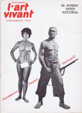
Chroniques de L'Art Vivant, No. 25 - Documenta Cassel Exclusif
Technische
Angaben
-
32 S., 38x28 cm, 2 Stück. ISBN/ISSN 00043338
Drahtheftung, mit zahlreichen Abbildungen,
ZusatzInfos
-
Inhalte: Houston De Luxe Show - Bruxelles, le dessin contemporain - Art-Language à Londres, et Terry Atkinson - Sol LeWitt - Abraham Moles - Esthétique numérique, concepts de base- Madrid, Centre de calcul - Eusebio Sempere - John Withney, Ordinateur et création animée - Gilles Aillaud - Bernard Dufour - Carlos Fuentes et l'impossible fête - Vladimir Forgeney - The Mood of Terry Riley - Amsterdam, 2nd Wet Dream Film Festival - Miro sur le vif (Filmfestival über pornografische Kunst)
|
Technische
Angaben
-
28x19,5 cm, 15 Teile. keine weiteren Angaben vorhanden
Broschur
ZusatzInfos
-
Heft Nr. 79, documenta 6 (Keine Besprechung der Künstlerbücher).
Heft Nr. 80, Politikum: Der Sammler Ludwig (Über Experimentalfilme).
Heft Nr. 81, Paolozzi.
Heft Nr. 82, Gerhard Johann Lischka: Das fotografische Bild, Was erwartest du von einer Galerie (Art & Language).
Heft Nr. 83, Wolfgang Max Faust: Bilder und Worte.
Heft Nr. 84, Joseph Beuys: Kunst und Staat (Ausstellung Künstlerbücher, Aufruf zur Teilnahme an einer Ausstellung in der Produzentengalerie München. INSTANT-Kunst Zeitung aus Wiesbaden. Künstlerbriefmarken Künststempel Künstlerpostkarten von Wolf Bickhard-Bottinelli, S. 51)
Heft Nr. 85, James Lee Byars.
Heft Nr. 86, Dennis Oppenheim, Kunst und Macht, Stephen Willats.
Heft Nr. 87, Die Stellung des Künstlers in der Gesellschaft (Sprachen jenseits der Dichtung, Gerhard Theewen, Wulle Konsumkunst, Annegret Soltau).
Heft Nr. 88 März 1980, Die soziale Dimension der Form (Künstlerbücher erster Teil, Seite 11, Text zu den Künstlerbücherausstellungen von Hubert Kretschmer in der Produzentengalerie Adelgundenstraße)
Heft Nr. 89, (Diter Rot, Bastelnovelle, von Wendelin Niedlich. Gerhard Theewen, Kunstmagazin Salon)
Heft Nr. 90, Osteuropäische Kunst (Johannes Stüttgen: Fluxus und der Erweiterte Kunstbegriff. Bruno Paulot, Biografisches. Jockel Heenes. Stephan Huber, Das Mehl)
Heft Nr. 91, (Künstlerinitiativen + Künstlerbücher, Produzentengalerie Adelgundenstraße. Jürgen O. Olbrich: Verbindung 6, Beschreibung einer Performance. Dietrich Helms: Tabula Rasa. Dirk van der Meulen)
Heft Nr. 92 (2x), Bildende Kunst und Kulturpolitik, Das rechte und das linke Volksempfinden (Präsenz München, Umstrukturierung der Produzentengalerie Adelgundenstraße. Gerhard Rühm. Ulrike Rosenbach. Anna Oppermann. Kunstmanifest: Michael Lingner)
|
Technische
Angaben
-
192 S., 28x24 cm, ISBN/ISSN 9783899553444
Broschur
ZusatzInfos
-
Die Entdeckung der klassischen Moderne im aktuellen Grafikdesign
Today’s designers and illustrators are synthesizing the best elements from past eras of graphic design to create a new visual language with a reduced and rational approach. The Modernist documents this uniquely contemporary, yet timeless aesthetic that is built upon the rediscovery and seamless melding of classical type elements and collage of the 1950s, the geometric patterns and graphic elements of the 1960s and 1970s, and the vector graphics and computer-aided montage of the 1990s. With its fresh perspective on the legacy of past craftsmanship and quality in outstanding current work, The Modernist expands our understanding of what modern graphic design can be.
Text von der Website
Der Zeitungsartikel "Die gestern erträumte Zukunft sieht einfach besser aus. In dem Bildband "The Modernist" simulieren Designer Menschen und Gebrauchsspuren" (Süddeutsche Zeitung) von Jan Füchtjohann liegt bei.
|
Titel
-
Fotografija NR. 1 (35) 2018
Technische
Angaben
-
[116] S., 27,5x23 cm, ISBN/ISSN 16487273
Broschur
ZusatzInfos
-
We are heading into a future where our choices will be shaped – if not outright determined – by algorithms and artificial intelligence. This coming state has been labelled “the new dark age” (James Bridle, 2018).
It remains to be seen what this brings to photography, and vice versa.
One thing, however, seems clear: photography, which has already changed significantly in the 21st century, is affected by – and in some important ways is part of – this development. This issue of “Fotografija” explores how programmes, apps and AI-related technologies shape and change the discourse of photography, challenging traditional boundaries of the medium.
Various programmes and services – Google, Photoshop, Flickr, Snapchat, visual recognition, etc. – provide new tools to conceive image-making and think photographically. Technological interfaces not only deliver instruments for making work but can become the very logic for creating photographic series.
The presented artists offer perspectives to raise questions and discuss these technological shifts. From dealing with traumatic events (Indrė Šerpytytė) and inaccessible sites (James Bridle) through technological mediation to playing with our expectations of an all-pervasive Photoshop manipulation (Erin E’Keefe). From exploring so-called smart surveillance systems (Esther Hovers) and censoring politically sensitive sites (Mishka Henner) to everyday glitches (Mantas Grigaitis). From playing with the copyrights of such collective websites as Flickr (Penelope Umbrico) to exploring the shared language of being in some of the most photographed places on earth (Thomas Albdorf). And from using Photoshop to create images (Aaron Hegert) to an image that is barely photographic (Zachary Dean Norman). The four essays (Kate Palmer Albers, Roksana Filipowska and Marijana Rayl, Ilaria Speri, Alise Tifentale) map out the works in broader social, historical and art contexts.
In short, the works deal with our technologized world. They talk about being in the middle of changes that few have envisioned. Being so immersed, one can feel it (almost) hurts.
Text von Paul Paper.
|
Titel
-
Talents 13 - Leaving again - Sebastian Stumpf / Stefanie Hoch - junge Fotografie / Kunstkritik
Technische
Angaben
-
[28] / 51 S., 23x16,7 cm, Auflage: 500, numeriert, ISBN/ISSN 9783422068490
Klebebindung, Doppelbuch
ZusatzInfos
-
Der Katalog erscheint anlässlich der Ausstellung "Leaving Again Talents 13 . Sebastian Stumpf, Stefanie Hoch", 11.10.-07.12.2008 bei C/O Berlin.
Wieso klettert jemand im urbanen Raum auf Bäume? Weshalb ahmt er mitten auf der Straße kopfüber Gehbewegungen nach oder rollt sich in letzter Sekunde unter automatisch schließenden Garagentoren hindurch? Mit solch’ inszenierten, alltagsentrückten Situationen konterkariert Sebastian Stumpf gewöhnliche Handlungen, konditioniertes Raumerleben und feste Sehkonventionen – und ruft durch die Auslassung jeglicher Antwort Irritationen hervor.
Text von der Webseite.
|
Titel
-
delta - Revue internationale pour la poésie nouvelle - NUMERO 54
Technische
Angaben
-
48 S., 21x14,8 cm, keine weiteren Angaben vorhanden
Drahtheftung, verschiedene Papiere
ZusatzInfos
-
poetry space "delta" is a magnetic field for new (avant-garde) poetry which illuminates & changes from inside the world, specifically enigmatic language.
Text von der Webseite
|
Titel
-
The BöhmKobayashi Encyclopedia Band Eins
Technische
Angaben
-
288 S., 15x11 cm, Auflage: 150, keine weiteren Angaben vorhanden
Broschur, Klappumschlag
ZusatzInfos
-
“Böhmkobayashi Encyclopedia” is an almanac covering the A to Z of Boehm/Kobayashi, from the projects they’ve done, places they’ve been, artists they’re connected to, books they’ve read and more. Entries appear in German or in the language in which they originated, including English, Japanese and French.
Text von der Webseite.
|
Technische
Angaben
-
128 S., 28,1x20 cm, ISBN/ISSN 9782840662488
Klebebindung. Weiß auf Weiß gedruckt.
ZusatzInfos
-
Eine Ansammlung an Text- und Bildbeiträgen bekannter Persönlichkeiten. Da alle Beiträge weiß auf weiß abgedruckt sind, sind diese nur mit Hilfe von UV-Licht deutlich lesbar.
|
Titel
-
Music Sound Language Theater - John Cage, Tom Marioni, Robert Barry, Joan Jones
Technische
Angaben
-
22,8x20,3 cm, keine weiteren Angaben vorhanden
Broschur
|
Titel
-
The Beautiful Formula Collective, 2022
Technische
Angaben
-
104 S., 21x14,8 cm, ISBN/ISSN 9783945296998
Broschur, ungestrichenes Papier, Umschlag Karton
ZusatzInfos
-
Enthält Projekte der Künstlergruppe 2012-2022, u.a. bei Ep.contemporary, Berlin 2022, kuratiert von Albert Coers, Galerie der Künstler, München, 2021, kuratiert von Ezgi Bakçay, und Baris Seyitvan, Karşi Sanat Çalişmalari, Istanbul 2020, kuratiert von Sophie-Charlotte Bombeck und Ezgi Bakçay, Digital Art Space, München, 2019, kuratiert von Karin Wimmer.
The Beautiful Formula Collective is about painting and creating collective works based on The Beautiful Formula Language. We use the combination of spontaneity, improvisation and logic of rhythm, which gives us structures and rules while painting. The Beautiful Formula Collective produces and stages group works not only in the studio, but also as a live painting performance in front of the public.
Text S. 3 und von der Webseite
|